Although initially tempted by current trends, Helen McLellan went for a quirky, eclectic vibe that is true to her own unique style to give her mid-century kitchen a twist.
She caught up with YourHomeStyle to tell us all about her amazing kitchen makeover... Read on to discover everything Helen had to say!
My makeover experience
'We bought this house in March 2019 and spent the first six months living in it before we made any décor decisions. For inspiration, we watched lots of TV programmes, such as Your Home Made Perfect.
I got absolutely tons of great ideas for the kitchen from one of the presenters, architect Robert Jamison, in particular.
Once we knew exactly what we wanted, we hired an architectural technician to draw up our plans. When the builders started work in March 2020, we moved into a friend’s flat in the centre of town and then lockdown happened.
Welcome to our home...
A bit about me I’m Helen McLellan, a civil servant. I live with my husband, James, who is also a civil servant, and our children, Skye, seven, Finn, four and Wren, three, plus our two cats, Ziggy and Willow. Our home is an extended 1930s bungalow in Edinburgh. I record our renovation journey on Instagram @retro_fungalow.
My problem kitchen The kitchen was tiny, more like a utility room, with a separate, very dark dining room. It just wasn’t practical for modern family life.
Three days later, we made the decision to move back into our house, realising that no progress was going to be made any time soon, as the builders had downed tools.
During this time, all three children were under five, which was tough going on occasions. I was on maternity leave, so at least I didn’t have to work on top of everything.
In the April of that year, I managed to break my ankle, tripping over the newly dug foundations in the garden. Honestly, you couldn’t make it up! In June, the builders started work again and we moved in with my parents in Cumbria, a few hours away.
A bit more about my home...
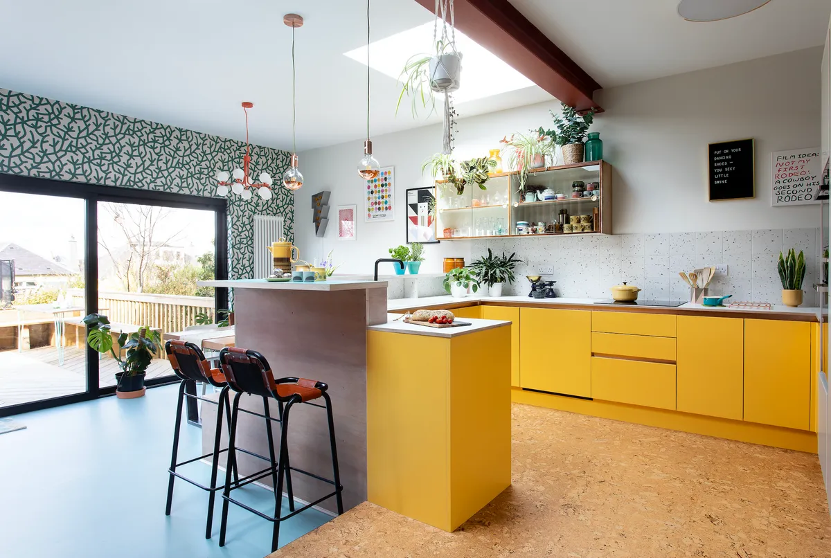
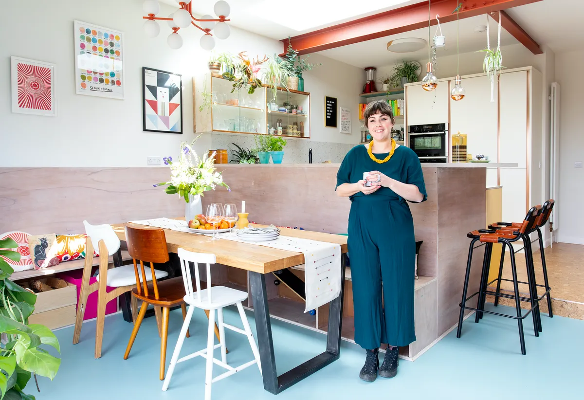
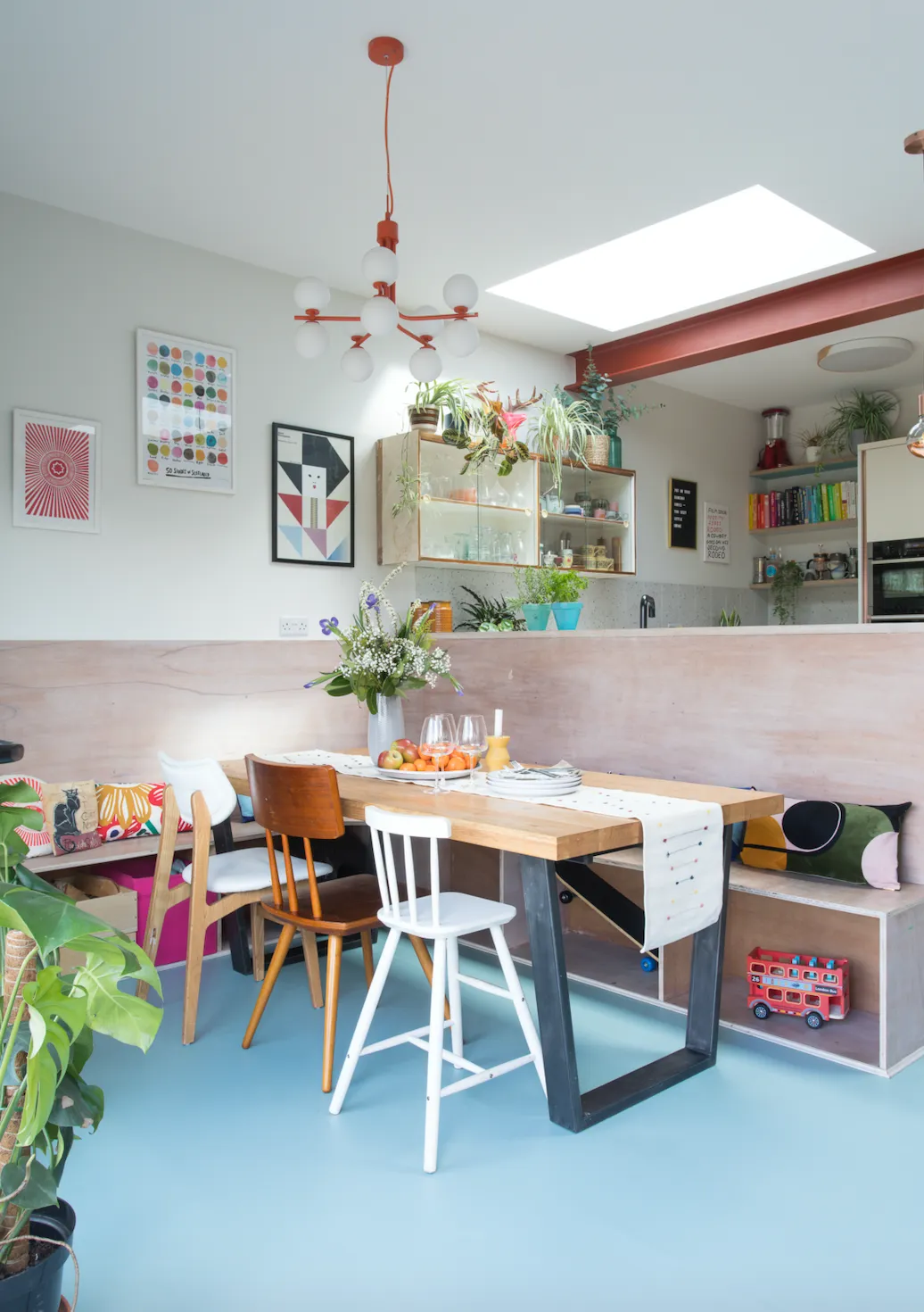
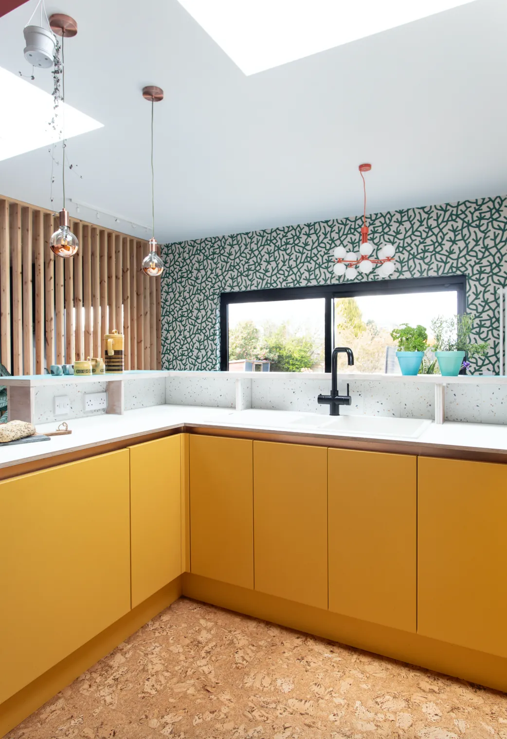
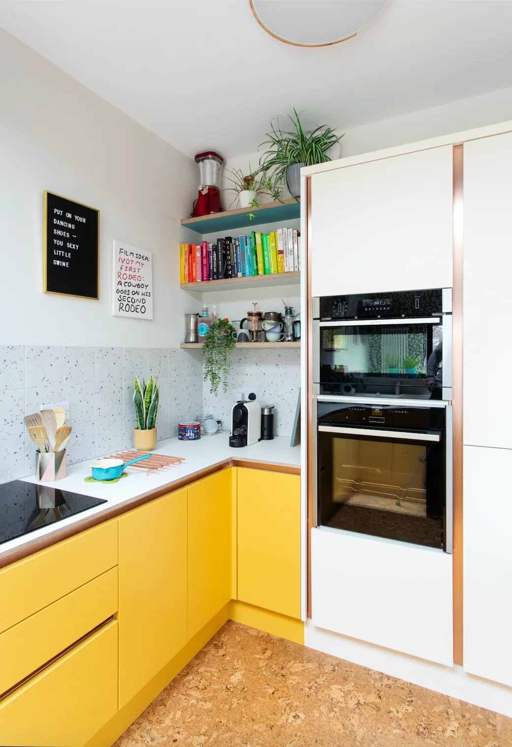
How I made it work We did an ambitious split-level extension so we could create a spacious kitchen-diner and connect the space to the garden with sliding patio doors. I added retro-style accessories and brought interest and colour to the space with yellow cabinets, blue vinyl flooring and patterned wallpaper.
My favourite part I love the fact that it’s broken-plan rather than completely open. Each area is so cosy and welcoming, and it works well for our family. We all feel connected, but can still enjoy privacy and quiet moments as well.
We made regular visits back to the site, just so that we could see how it was all going, and we moved back in August. There was no kitchen at that stage, that took another three weeks to complete, but it was summer, so we managed with a kettle and microwave and ate outside.
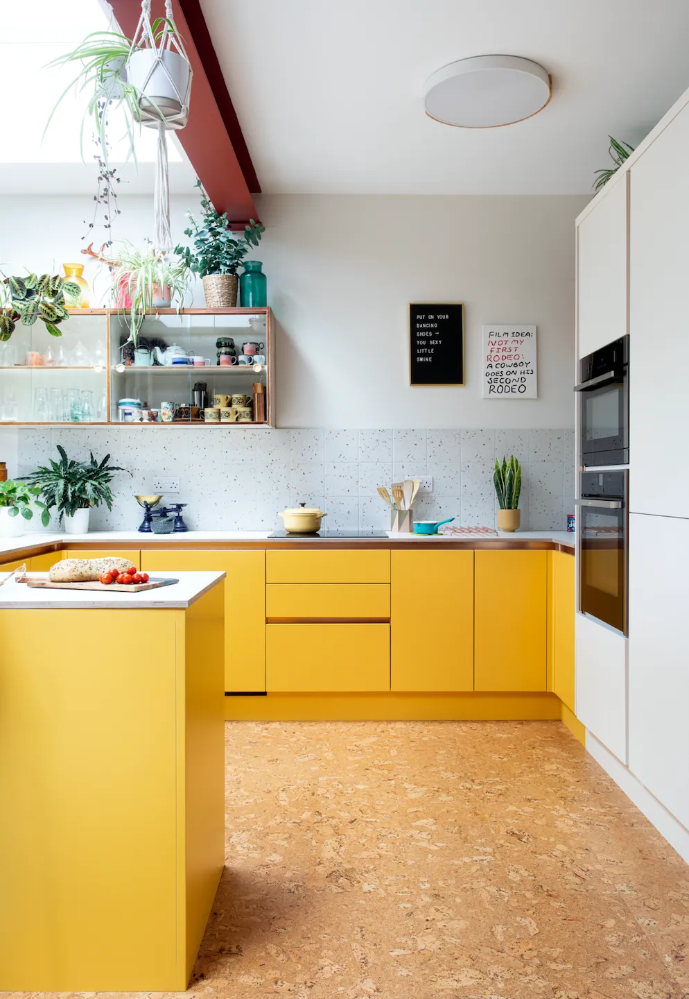
By September, we were the proud owners of our brand-new kitchen-diner, with beautiful views of our garden. We chose to leave the beams exposed for a contemporary, slightly industrial feel.
Our builders were surprised at some of our choices but in the end, they came round and loved the results as much as we did!
My style advice
Create levels
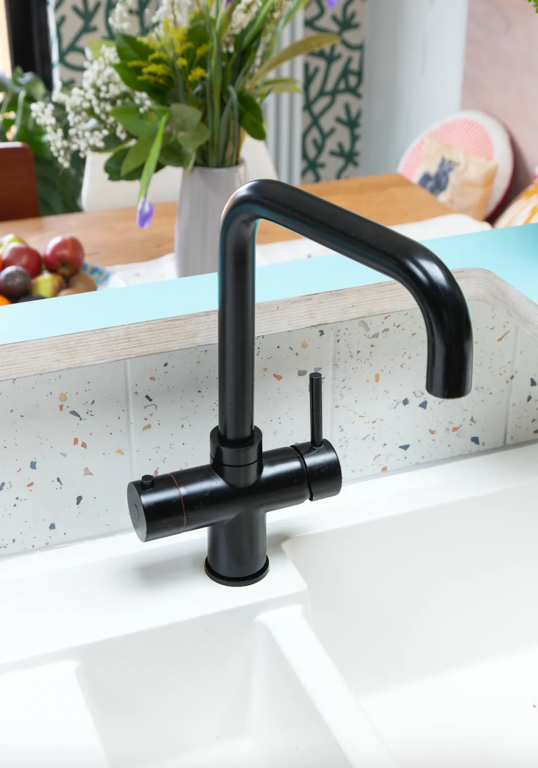
‘There is a step down from the kitchen to the dining room, and the split level is another good way of separating the two zones,’ Helen explains. The wrap-around breakfast bar hides the mess in the kitchen brilliantly, and herbs can be displayed on the worktop. It’s a great in-between area to sit and have a drink.
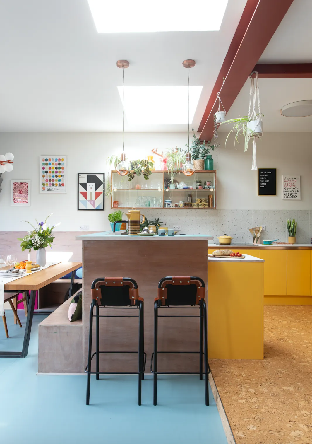
‘We decided to zone the spaces with two different types of flooring as well: a soft natural cork for the kitchen and a bright blue lino for the dining area.’
Display collectibles
This 1970s-style wall cabinet was salvaged from the original kitchen and was the starting point for the whole retro-inspired design. The glass sliding doors make it perfect for displaying Helen’s collection of mid-century crockery and glassware, which is always growing.
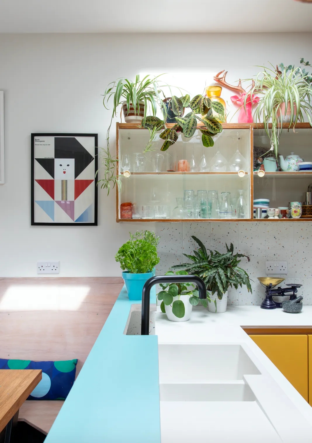
‘I’m definitely a collector,’ she says. ‘I was buying crockery before I even bought my first house!’ A mix of houseplants add interest and texture, but if your kitchen isn’t as light and bright as Helen’s, get a similar look with artificial plants.
Add personality with colour
‘We knew the kitchen was going to open onto a living space so we deliberately made colourful statement choices that would help the two areas to flow,’ Helen explains.
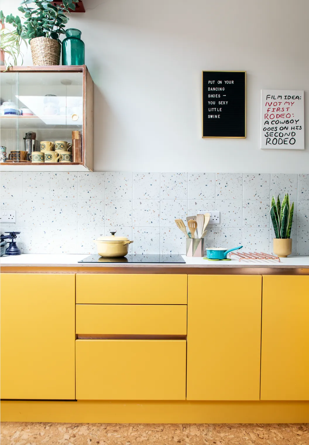
‘Handleless cabinets in bright yellow and a speckled tiled splashback, that tie the yellow and blue colours together, ensure that the final results were not too kitchen-y. Having wall art in the kitchen adds personality, too. The text on canvas is by artist Babak Ganjei and the pinboard is another fun touch – you can change it when you want!’
Feature and styling Alison Gibb. Photos Douglas Gibb.
