Moving into their first flat was really exciting for Nadia and her husband, Crae.
‘It was quite a mission finding a flat that ticked all the boxes. It had to be within handy transport links for work, have a second bedroom and be within budget. It took quite a while to find a flat we both loved, but we knew straight away this was the one,’ says Nadia.
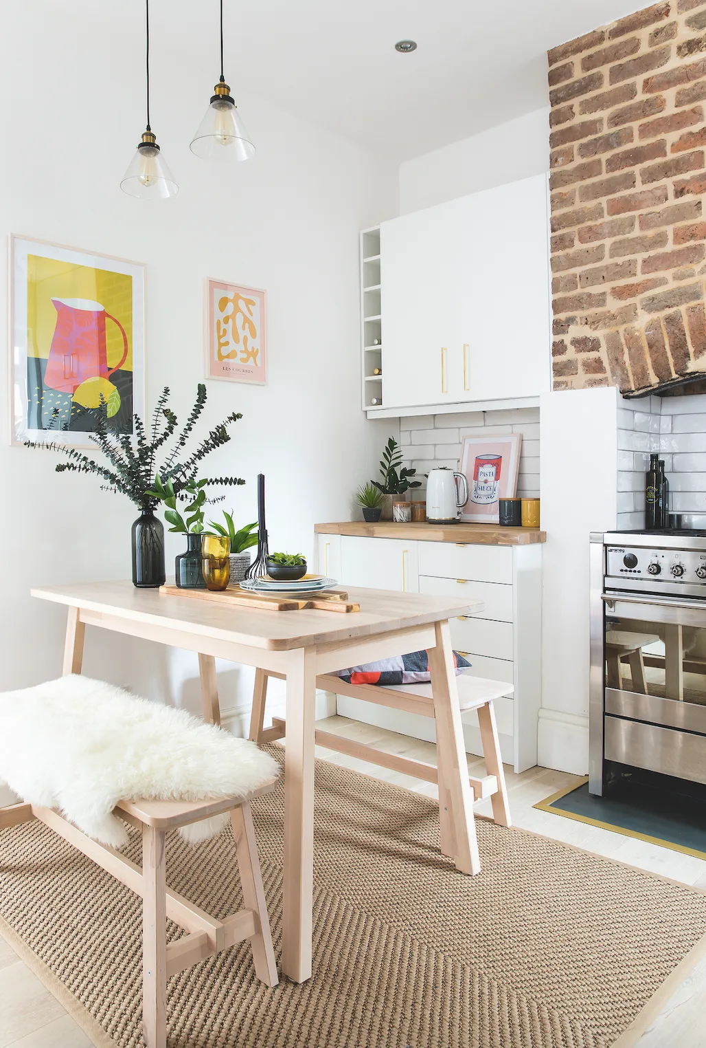
The couple wanted to make their mark on it, starting with the kitchen. ‘It was quite dated and not to our taste at all. I’m a big fan of neutral colours and I love all things Scandi, so I knew which direction the décor was going in,’ Nadia explains.
Welcome to our home...
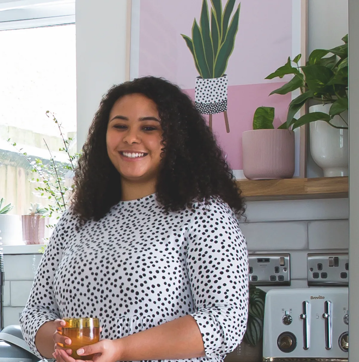
Who lives here? I’m Nadia Murdock, 25, a marketing manager, and I live with my husband, Crae, 26, in an Edwardian, two-bedroom flat in Woodford Green, Essex with our cat, Bumpkin. We moved in one year ago because we love the area and work close by.
What was updated? The whole kitchen was revamped with a fresh and light Scandi-feel kitchen. The units were ripped out and swapped for contemporary replacements and the old blue walls were painted and tiled in white instead, making the room feel much brighter.
The project
Their first job was to decide on the layout – and, luckily, the existing one worked for them, so they just needed to find new units
to fit the space. ‘We wanted to change up the kitchen units but by avoiding changing the layout, we kept installation costs down, plus it was practical and worked really well, too,’ Nadia says.
‘The old wood-effect cupboards, though, had seen better days and looked quite grubby.’ To maximise the feeling of space in the compact room, Nadia wanted to refresh the whole kitchen with plain white units to brighten it up. ‘It’s a small space so I wanted to go as light as possible to make it feel bigger,’ she explains.
A bit more about our home...
Why the change? The old kitchen felt dated and dark in the small space, and the old blue wall tiles made the room feel small, tired and cramped.
How long did it take? It took three weeks from start to finish and there were no real hiccups.

What we did
After a trip to IKEA to browse the kitchen designs on offer, Nadia and Crae agreed on getting plain white doors and updating them with their own handles. ‘Small details like adding customised handles can make all the difference,’ Nadia says. She decided to paint the walls white to match the units for a seamless, classic look she’ll keep for years:

‘I couldn’t wait to paint over the blue. The newly painted walls instantly made an impact.’ Then it was out with the old blue tiles, and in with much brighter, brick-shaped white ones with an interesting texture. ‘The Lampas range has a lovely rustic look that adds another layer to the room. White tiles can look quite clinical, but these have a lovely warm glow and quite an aged look, too,’ enthuses Nadia.
Nadia's style tips...
Warm up a white room by layering different materials, textures and natural tones to stop it feeling too stark.
Choose a durable rug in jute or another hard-wearing fabric for under the dining table to zone the space and withstand wear in a high-traffic room.
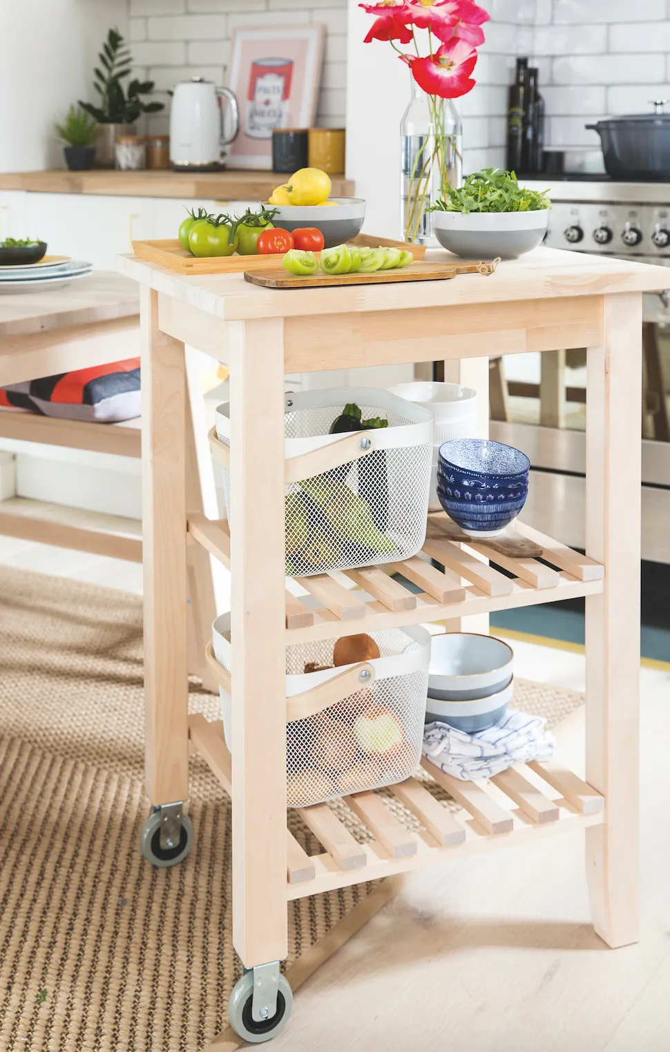
Get a free-standing trolley to give you a low-cost, additional versatile surface space in a small kitchen.

Highs and lows
They originally planned to keep the existing floor to keep costs down, but when they’d updated the rest of the kitchen it soon became apparent they’d have to change it. ‘Once the walls were white the floor looked even worse,’ explains Nadia. ‘It was quite worn and very yellow in tone, so we chose a new whitewashed oak floor that was much lighter.’
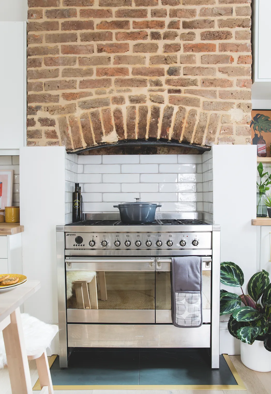
Crae fitted it over one weekend and the couple were absolutely thrilled with it, despite it not being in their original plan. ‘It was only against the white surfaces of the new kitchen that we realised how yellow the floor actually was. We love the new floor so much we’ve decided to redo the rest of our flat,’ Nadia says. Other than changing the floor, the revamp went ‘so smoothly. We tried to do a lot of the work ourselves and it was a great DIY learning curve for me.’
The final details
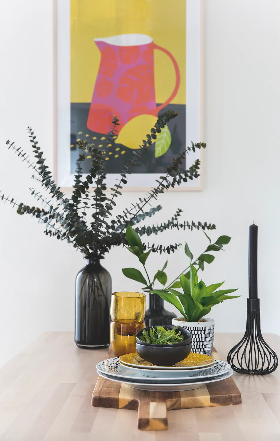
By adding colour with accessories, Nadia has proven an all-white scheme is anything but plain. ‘Choosing all the accessories was such fun. Filling up the shelves with pretty objects was my favourite part. I love how it’s all come together. White doesn’t need to be dull. It feels much bigger and really warm and cosy in here now. We love it!’
She chose gold handles from Amazon for the kitchen doors, which add a glam touch; framed prints and lots of green plants to finish off her Scandi look. ‘I can’t believe it’s the same kitchen. It looks a million times better,’ smiles Nadia.
Feature Emma Fishman. Photos Lizzie Orme.