Camellia and Evan Odojukan bought their Victorian terraced property knowing they’d need to completely renovate it. While every room needed an update, they decided to start with the living room, as it’s the space they spend the most time in together.
Like the rest of the place, the room was bland and in need of an injection of colour and character. ‘The house was liveable, but tired and neglected,’ says Camellia. ‘We wanted to give it some love and personality. With two young children, I soon realised that the living room was the priority.’
The makeover story...
The previous living room had uninspiring beige walls, a dark wood floor and an empty brick fireplace with alcoves on either side. Camellia and Evan used the room frequently for family time with their children – Abigail, eight, and Elon, three – and as a relaxing retreat for them as a couple once the kids were in bed.
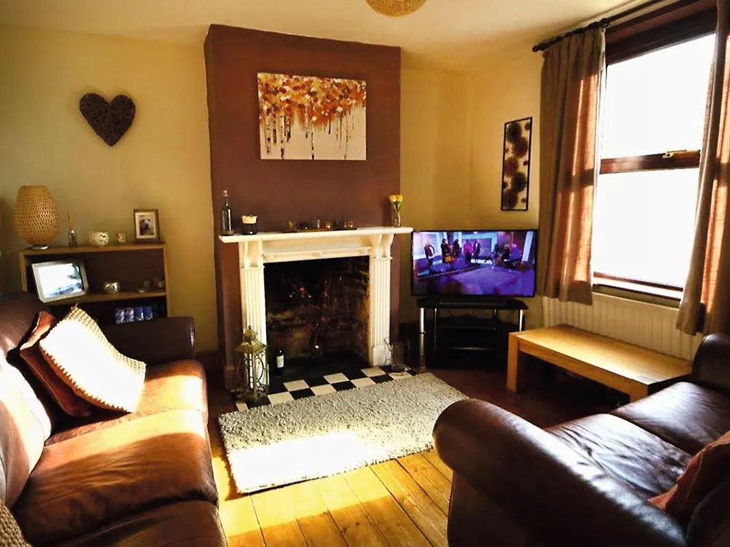
But the room didn’t quite work for them as a family on either a practical or an aesthetic level. ‘It felt dull and cold, but the biggest issue was a lack of storage. All the children’s things had to go into boxes every night, and there was nowhere to display books or accessories,’ says Camellia. ‘But I knew exactly how I wanted it to work and look.’
Welcome to our home...
Who lives here? I’m Camellia Odojukan, 38, an interior designer (@mrsodojukan), and I live in a Victorian terrace in Maidstone, Kent, with my husband, Evan, an IT consultant, and our children, Abigail, eight, and Elon, three.
What was updated? Our living room, the space we spend the most time together in as a family.
Why the change? The décor was bland and neutral, and it wasn’t suitable for life with two children. We needed to add plenty of useful storage but also make it a stylish space, too.
How long did it take? It took us around three months to finish the room, as I needed to learn new DIY and woodworking skills as we went along to build the shelving.

Camellia started by designing alcove cupboards for toys and games, with floating display shelves above, but quotes to build the furniture were outside the couple’s budget. ‘We didn’t have time to save up, and I’m very hands-on, so I measured and worked out the cost of making the furniture myself,’ she says.
‘It was much more affordable, so, even though I’d never done anything similar before, I went for it.’ Décor-wise, she planned her scheme around dark tones, to give the room warmth, with bright highlights to lift the mood.
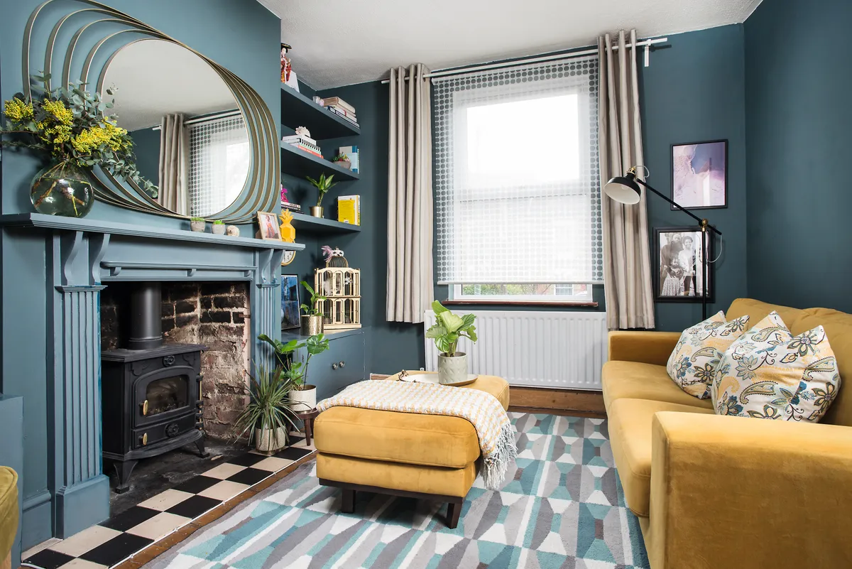
Camellia invested in woodworking tools and materials, and went online to find out how to hang the shelves and scribe the crooked walls so the furniture would fit neatly. The project took about three months and was a big undertaking for a novice, but it turned out even better than she’d hoped.
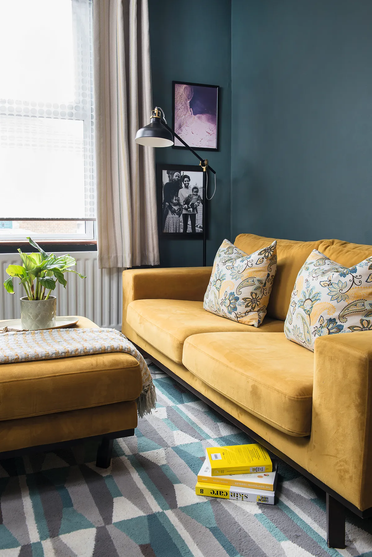
‘It was a massive challenge, and a hassle as we couldn’t really use the room until it was done, but it saved us money and I’m really proud of the results,’ she says. With her storage fitted, Camellia could start decorating. She decided on a dark, atmospheric palette.
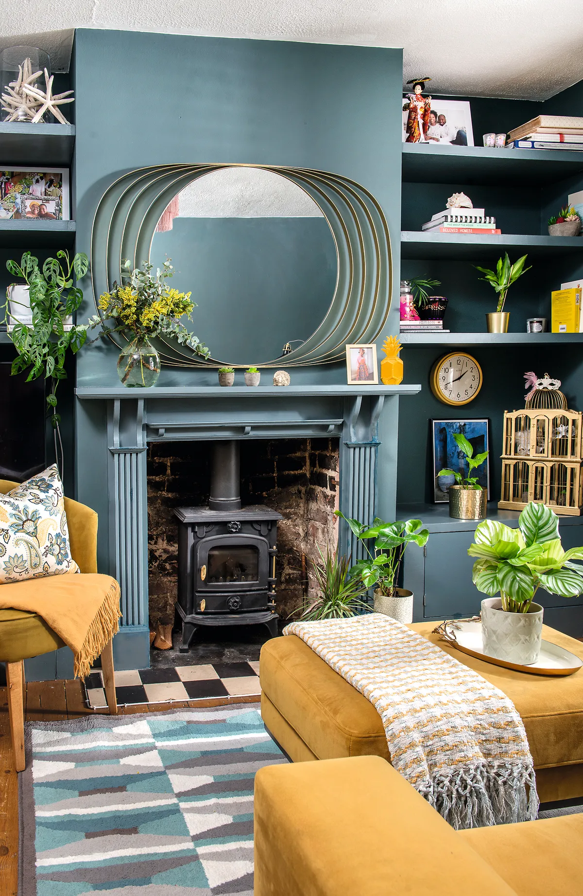
‘I wanted a rich bluey green for the walls and woodwork. I only painted the chimney breast, fire surround and the storage at first, but the room didn’t feel right.’ She could see she needed to extend the colour to all the walls, and although Evan was a bit unsure, they both love the result.
Camellia was now ready to layer on some bright colour and contrast. ‘I’m originally from the Caribbean and a bold palette is part of my personality,’ she says. ‘I was after something vibrant to lift the deep tones.’ To go with the sofa and footstool she already had, she boosted the impact by adding a gold accent chair she spotted in Homesense.
Living room DIY ideas
Create your own bold scheme, like Camellia’s, with these simple tips
1. Paint shelving, the mantlepiece and cupboards in the same colour as the walls for a cosy vibe.
2. Give fixtures, such as mirror frames and door handles, a coat of gold paint for an easy luxe update.
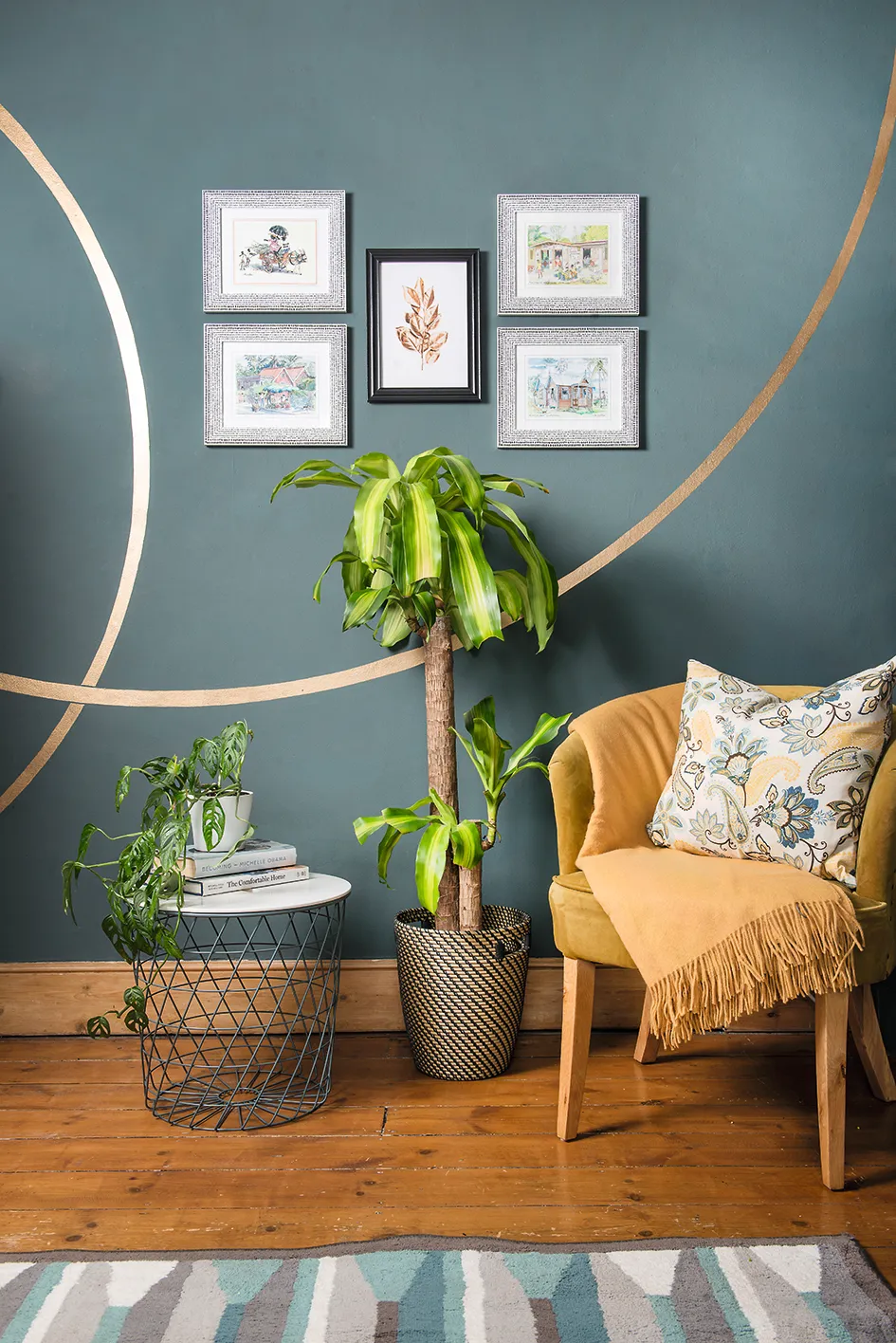
3. Draw curved lines using a pencil attached to a piece of string to copy Camellia’s feature wall.
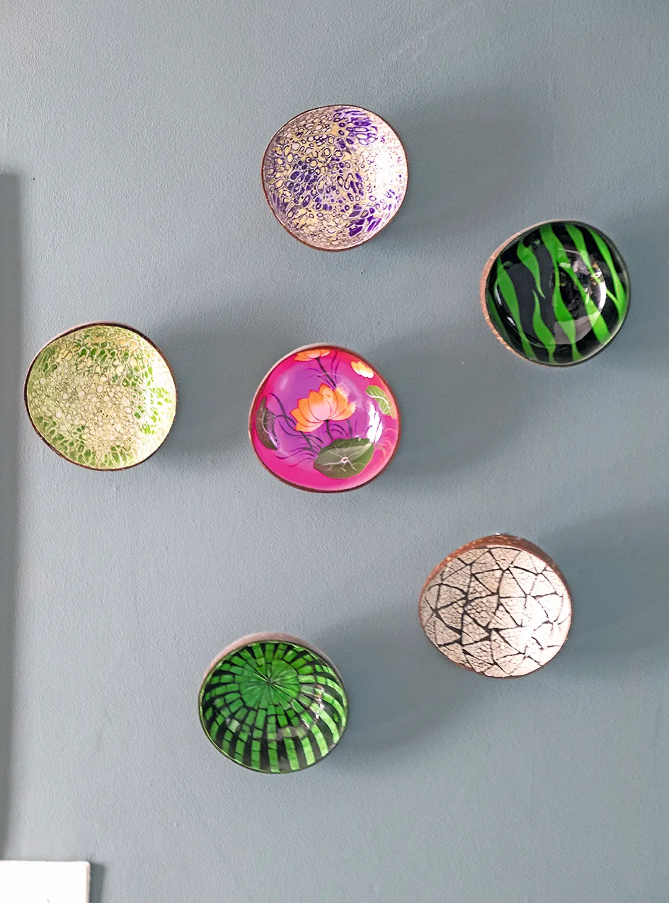
4. Colourful bowls, fixed to the wall with double-sided adhesive strips, make a bright 3D display against the blue wall.
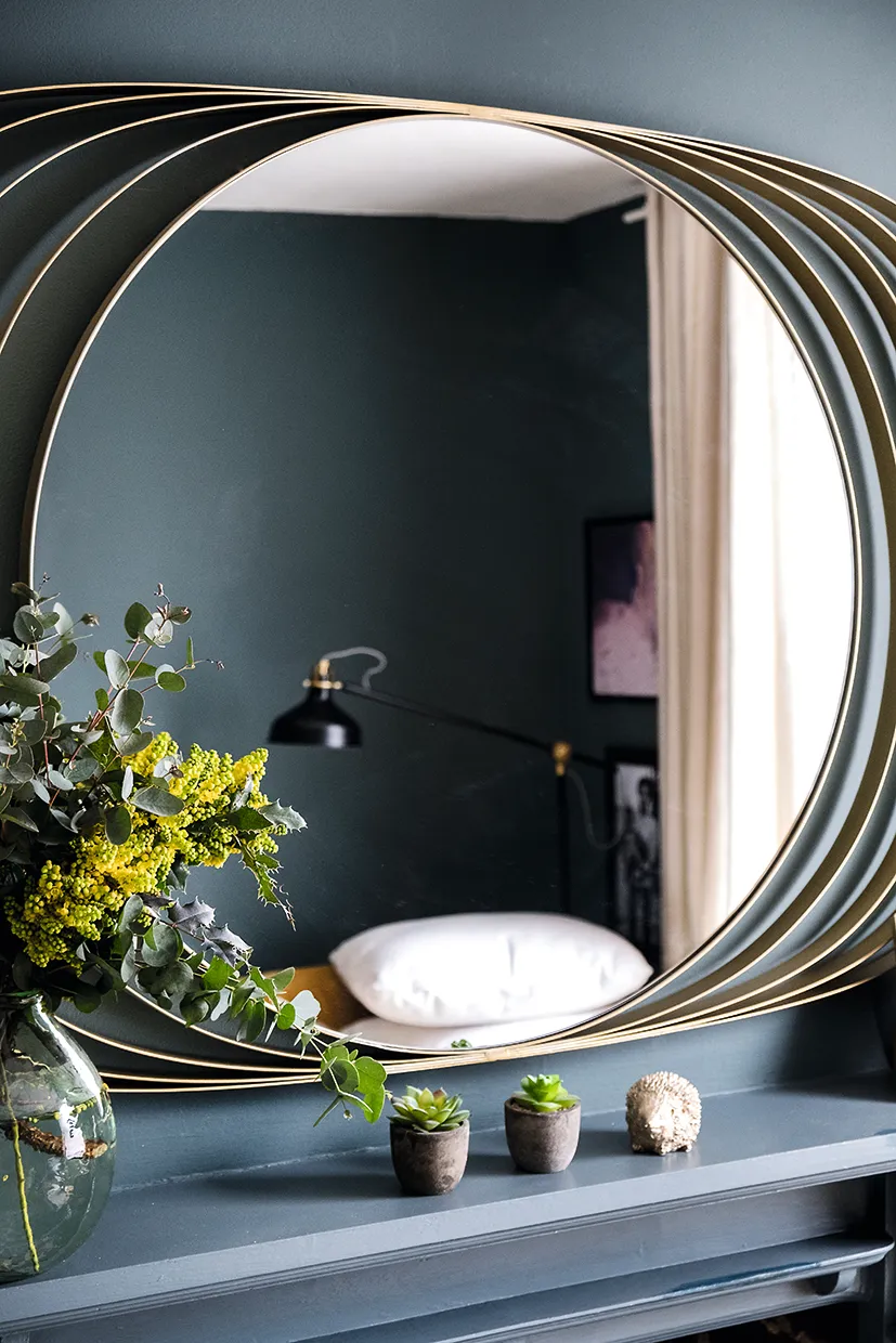
‘I still didn’t think the decorating was quite complete, though,’ she says. ‘One wall felt blank, and I wanted to bring in more details and accessories.’ Camellia found a striking gold-framed mirror to go above the fireplace. ‘I wanted a real statement piece and when I saw this, I knew it was perfect,’ she says.
Camellia then used a pencil attached to string to create interlocking arcs on the wall and painted them to echo the curves and gold finish of the mirror. She finished the scheme with leafy plants and pops of bright yellow. ‘We’re in here all the time now,’ she says, ‘and whenever friends come over, it gets compliments. I did everything myself, and that makes me appreciate it even more.
Feature Annabelle Grundy. Photos Colin Poole.
This is a digital version of a feature that originally appeared in Your Home magazine. For more inspirational home ideas, why not subscribe today?

