With a bit of design savvy, Lucy Young has created a small space bathroom full of colour, pattern and packed with simple storage solutions.
Here, she tells us all about her bathroom makeover experience...
My bathroom makeover
I fell in love with the outside of this place straight away, but the interior was a different story. The whole house needed an overhaul, but the bathroom was particularly bad, and it was filled with ugly orange pine and a design that didn’t make the most of the space.
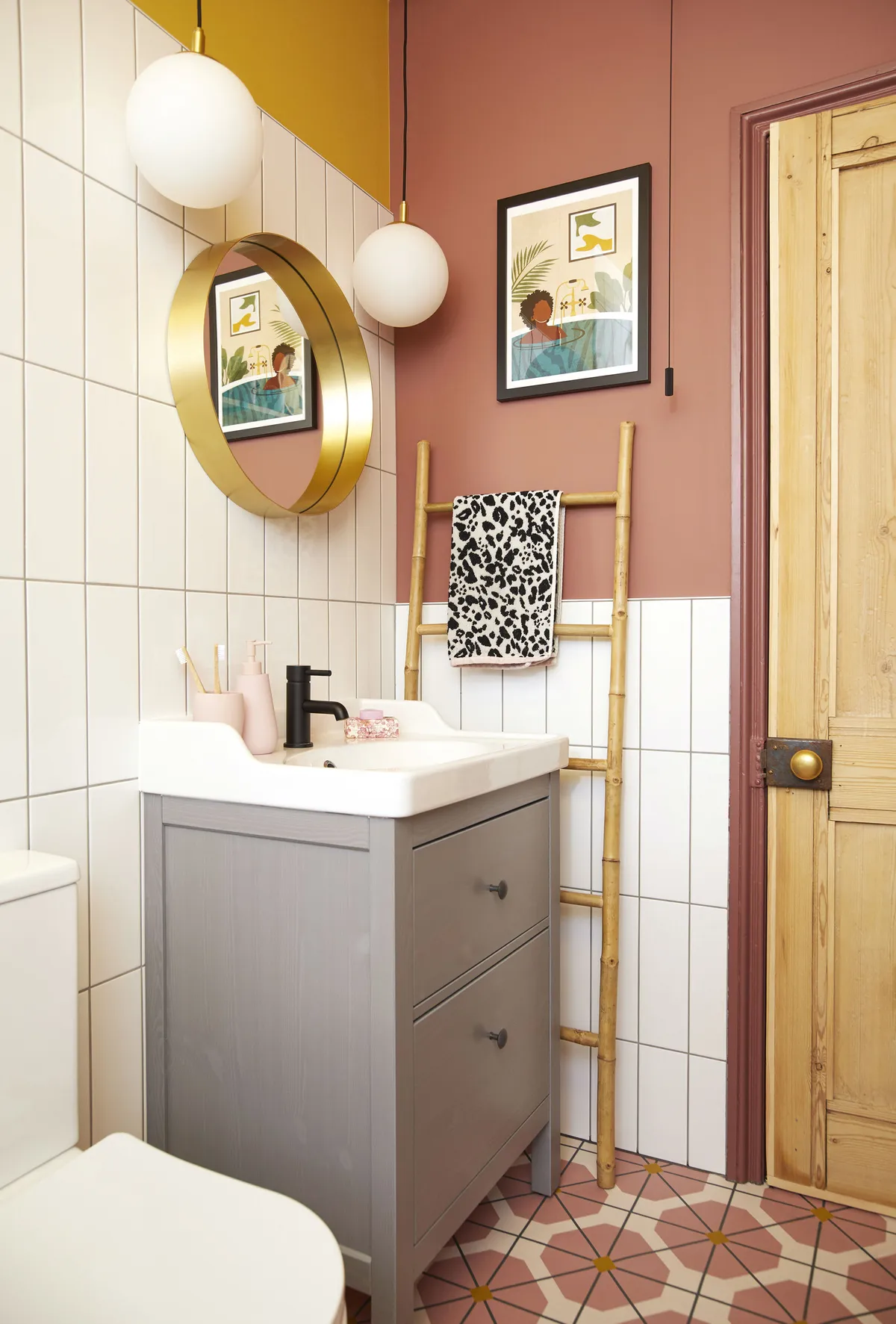
We moved the large water tank to another room, measured the space and then used a free online design system to rethink the space. We realised that placing the bath under the window would give us a lot more floor space, so we totally reconfigured the room, the sink being the only thing that stayed in its original place.
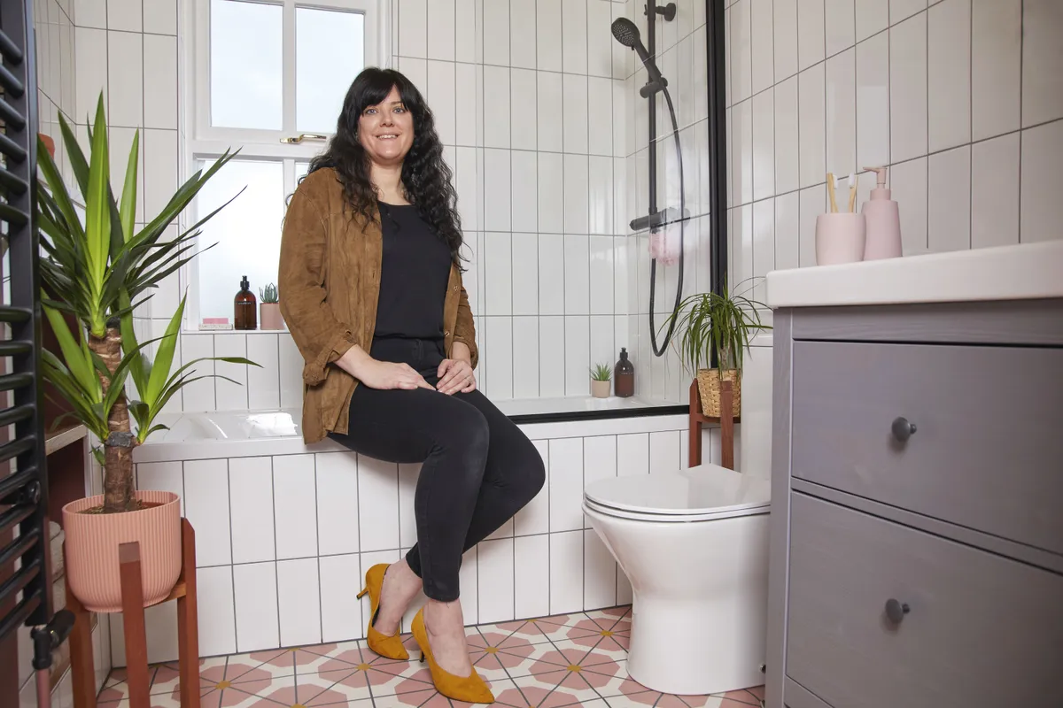
Our starting point for the décor was the black taps, and we chose neutral white tiles that would go with any colour scheme. Leon initially suggested arranging them in a classic subway design, but I thought they would look great placed upright to create a more geometric, modern feel.
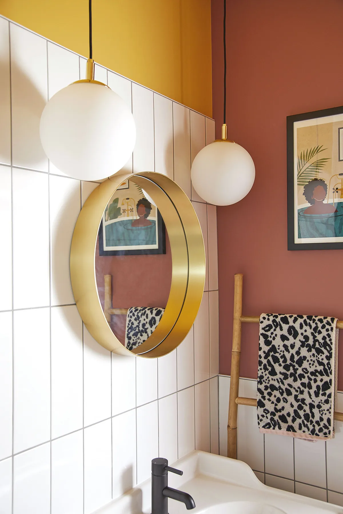
In the past, we’ve decorated a lot in monochrome so the blush pink on the walls is a bit different for us and it adds warmth and colour. Leon painted the ceiling with some leftover yellow that we had, which I love as it adds a splash of fun.
The main moment for me was when the stunning flooring went down and I could really see the room come together. It took a year to finish as Leon did all the work himself, and we’d just had Florence so he wanted to spend time with the family. Although it took longer than planned, it was a lot cheaper and he enjoyed doing it. The final result was definitely worth the wait.
Style advice
Hidden fixtures
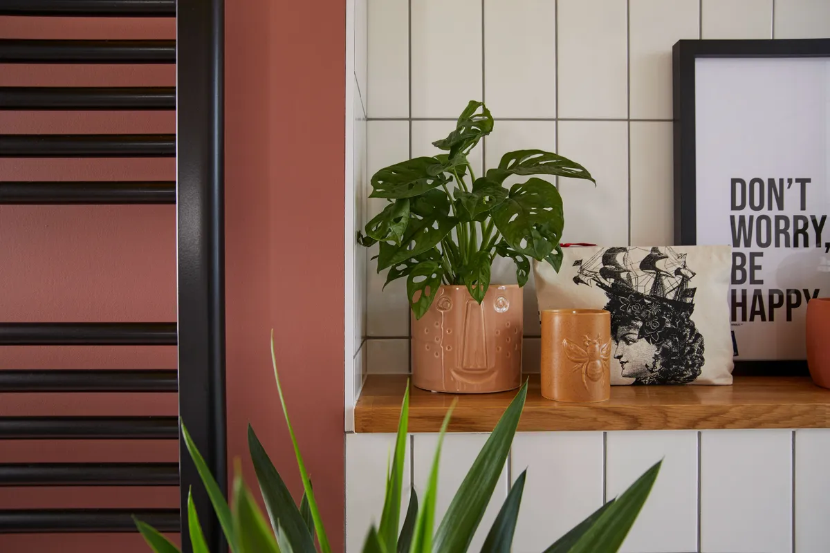
The plumbing runs along the bottom of the wall, a common feature in older properties, so the couple chose to box in the pipes and create a ledge to display their prints and cool collection of ceramics.
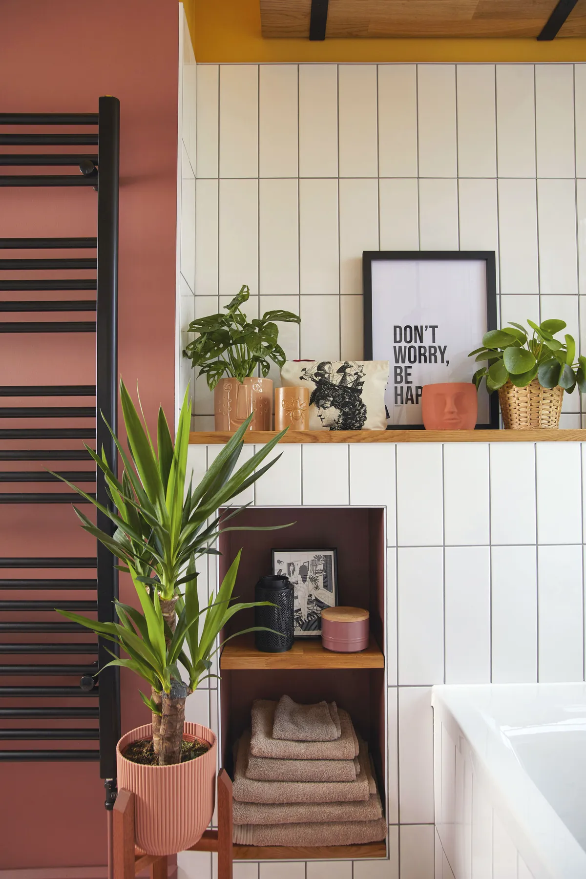
‘We thought about having a cupboard in the box but realised it wouldn’t work opening against the radiator, so we decided that open shelving would be a handy place to store towels,’ explains Lucy.
Funky flooring
‘I worried that tiles might be a bit slippery for our daughter, Florence,’ admits Lucy, ‘so we chose colourful vinyl instead, which is also a lot warmer underfoot, and cheaper.
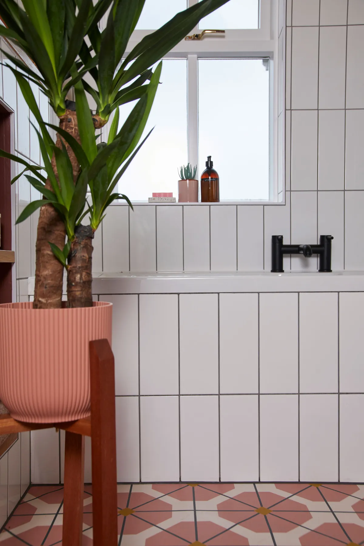
‘We went to For the Floor & More as they scale the pattern to perfectly fit each room, and then send a draft of the look before you have to commit to the final design. Also, vinyl allows more flexibility for change in the future, which is a big plus.’
Modern hardware
Matt black fittings are a stylish alternative to classic chrome, and although they add a sleek, modern edge, they have also become a staple option in recent bathroom designs, with no hint of going out of fashion.
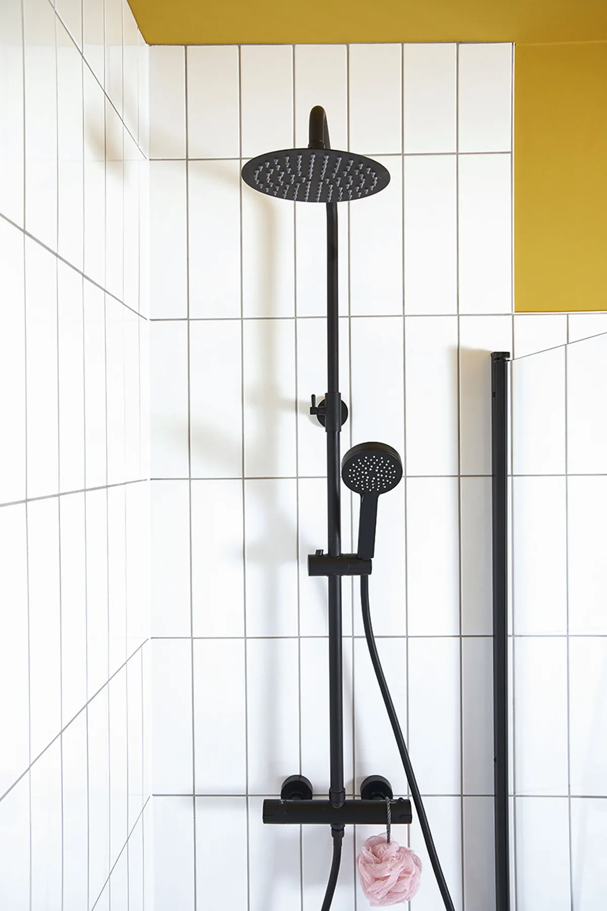
Being a neutral, black will also complement any pattern or colour, though bear in mind that it may show white limescale build-up more, so a commitment to regular cleaning is a must.
Feature and styling Lisa Moses. Photos Katie Jane Watson.
This is a digital version of a feature that originally appeared in HomeStyle magazine. For more inspirational home ideas, why not subscribe today?
