With a few budget quick fixes and an eye for accessorising, Nancy Straughan has transformed her Victorian maisonette into a stylish family home.
Here, she tells us all about her home makeover experience...
Nancy's makeover story
After 10 years in London, it was time to move back to my hometown of Newcastle. I’d always wanted to move home and, luckily, Simon was on board.
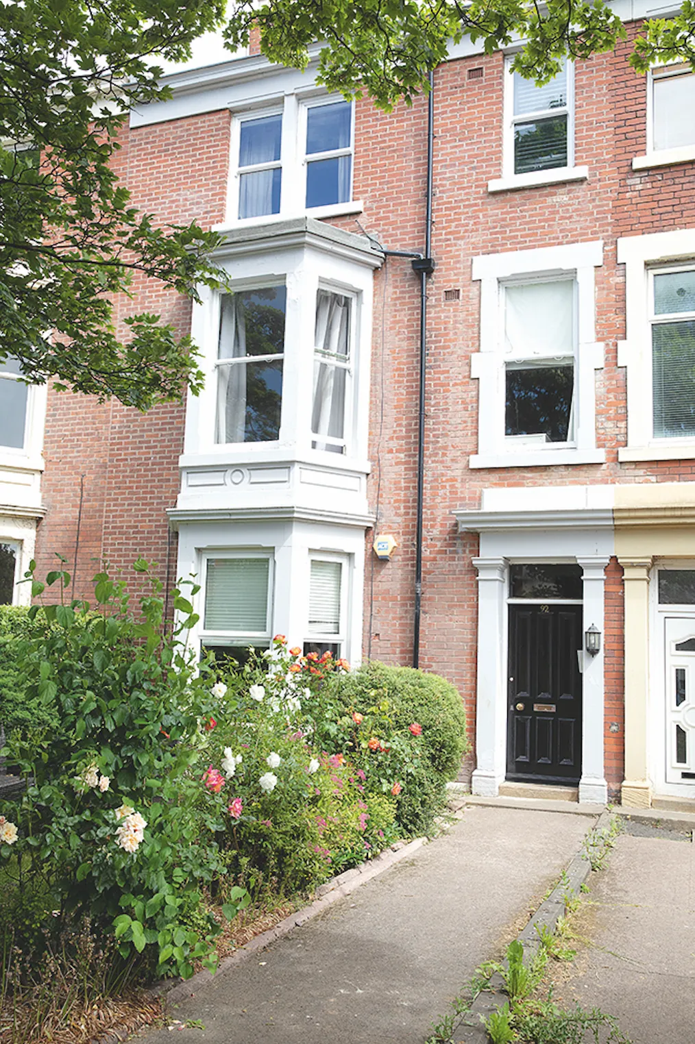
Just before our daughter Peggy was born we moved in with my mum, and a few months later we started renting this three-bed maisonette in the suburb of Jesmond. It’s at the top of a four-storey Victorian house, and feels like a palace compared to our tiny London flat.
Welcome to our home...
A bit about me I’m Nancy Straughan, 32, a photographer and stylist, nancy-straughan.com. I live with my husband, Simon, 36, an accountant, and our daughter, Peggy, two.
Where I live Our home is a rented Victorian three-bedroom flat in Jesmond, Newcastle, where we’ve lived since November 2019. I post home updates on my Instagram @nancy_straughan.
Our landlord has let us make whatever changes we want, like painting, wallpapering and updating the kitchen worktops. By accessorising, we’ve given the flat a bit more charm.
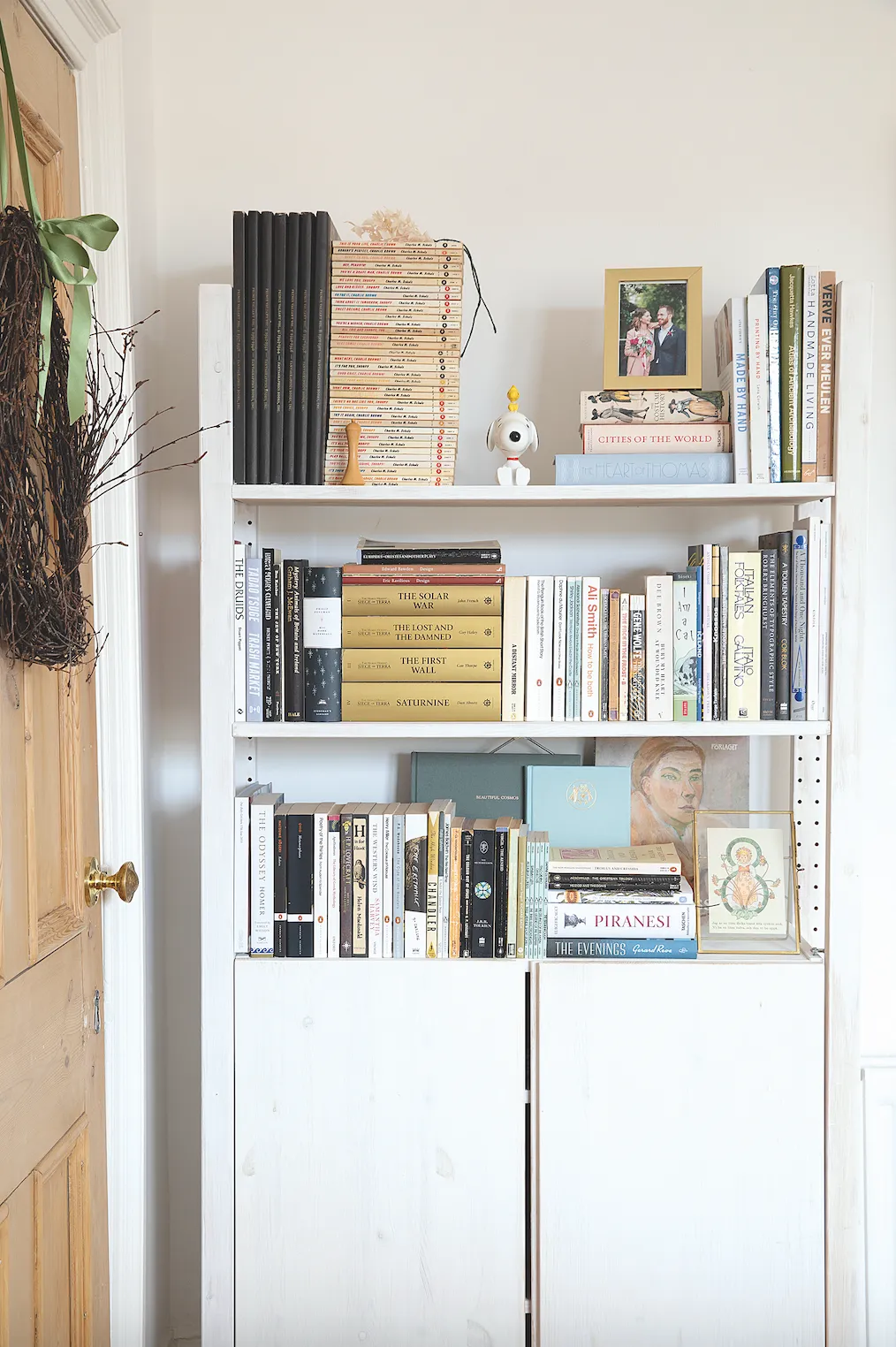
I’m quite a feminine decorator so there are dried flowers on virtually every surface and vintage-style filament bulbs everywhere, which give a warm glow. It’s a mix of cosy rustic and modern vintage.
Newcastle is a very green, outdoorsy city. Being around nature has definitely influenced the interior. The only thing missing is a private garden, but we’re lucky we have a small shared garden with two other flats.
A bit more about my home...
What I wanted to change The flat was spacious but very plain with a boring kitchen and bathroom, so we needed to inject some character and personality into it.
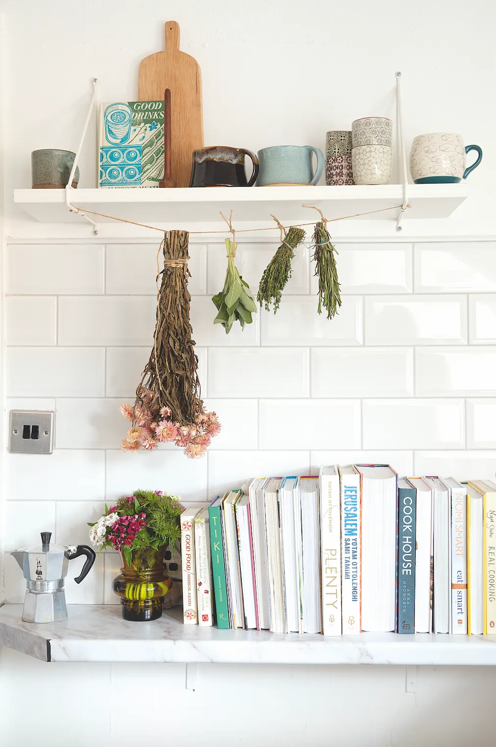
How I made it my own As we’re renting, we’ve used removable wallpaper and given the small kitchen a mini makeover with new handles and adhesive vinyl on the worktops. I’ve accessorised with vintage books, dried flowers and muted artwork.
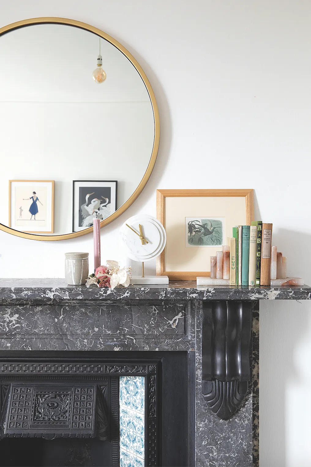
My favourite part The grey marble fireplace in our bedroom. I feel so lucky to have such a wonderful original feature and it makes a great backdrop for photos.
I run my business from home too, which involves styling and photographing products for independent online shops. Eventually, we might buy somewhere, but we’re very happy here for now. After a couple of years of uncertainty, I’m quite relaxed about where we’ll end up.
Living room
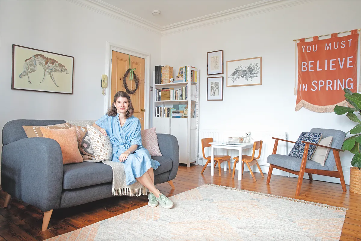
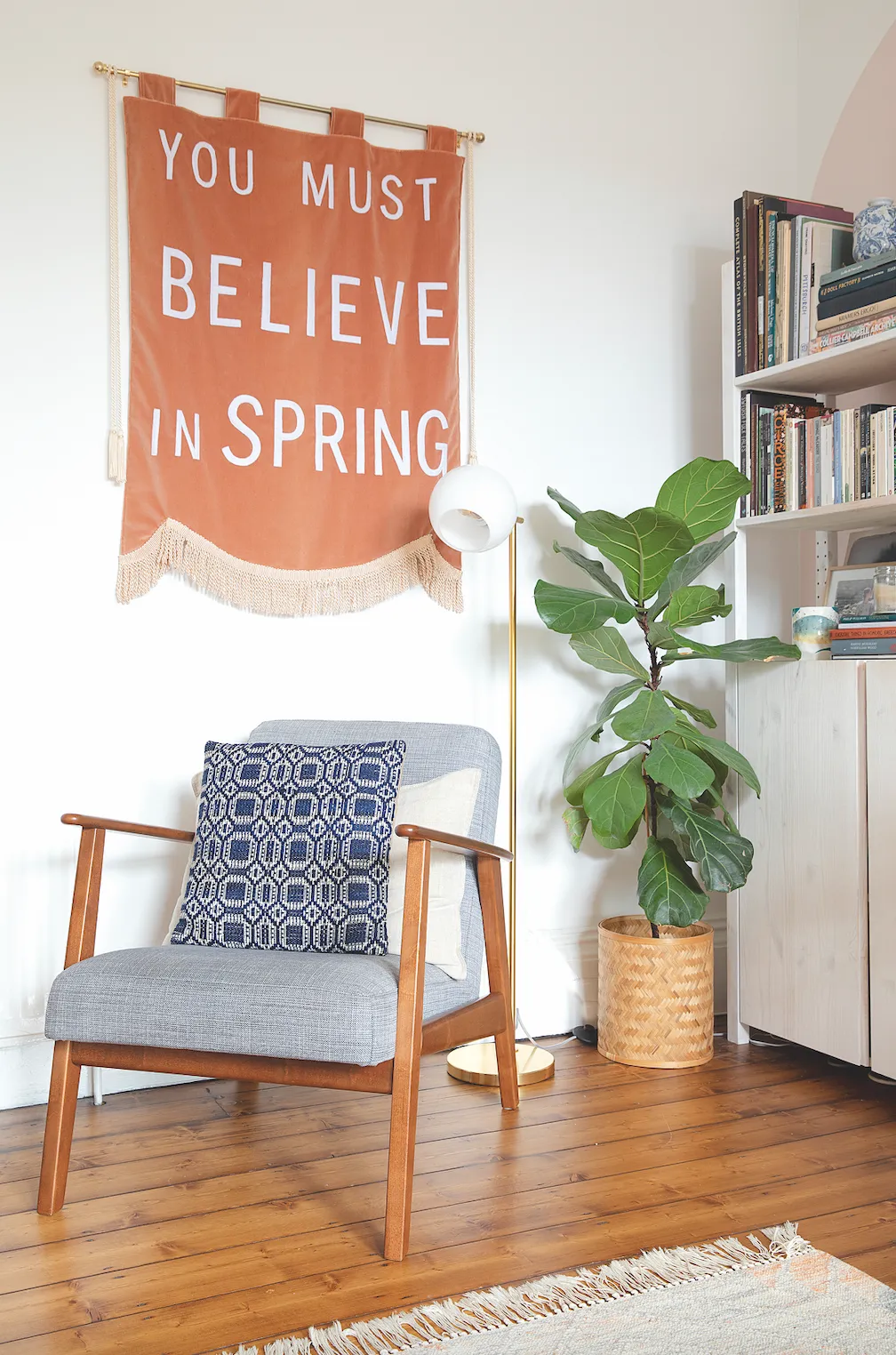
‘I love the original floorboards and pine doors in here, but the space is really long so I found it a real challenge to decorate. In our London flat, the rug filled up almost the entire space, but here it’s just floating. I believe in buying things you’ll love for at least 10 years and a bigger rug will be expensive, so I’d rather wait.
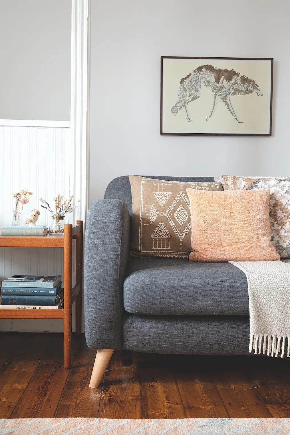
‘In future, I’d like to change the dark DFS sofa for a more natural stone colour, even though it’s probably not a great idea with a two-year-old! Technically, it’s probably too small for the room, but it doesn’t show stains and leaves Peggy lots of space to play on the floor. I might’ve broken a few style rules in this room, but it has to work for us on a practical basis too.’
Dining area
By painting arches in a muted pink shade called Hare by Crown, Nancy has added interest to the dining room alcoves. After moving the William Morris curtains to Peggy’s room, she’s put up grey linen curtains paired with an oatmeal linen tablecloth for a simple, natural feel.
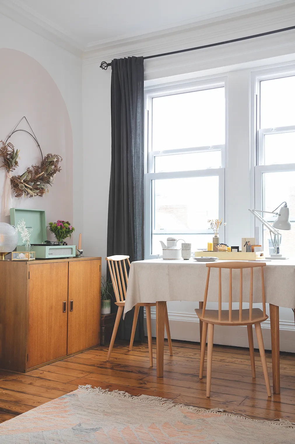
‘I prefer lighter soft furnishings, so I’ll probably change the curtains at some point. If we had a small downstairs loo, I’d probably paint that dark, but for main living spaces I like them to be light-filled, calming and airy.’
Kitchen
Stairs lead up to the kitchen, bathroom and office from the living room.‘This part of the house in the eaves would probably have been the servants’ quarters, as there’s no cornicing and really small skirting boards,’ says Nancy. ‘Although I like the sloped ceiling and stable door, I hated cooking in here when we first moved in as the lighting and black worktops made it feel gloomy.
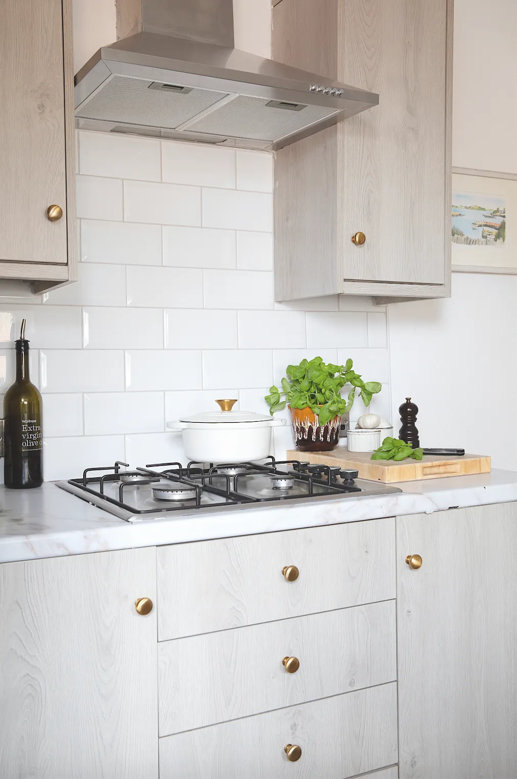
‘The first thing we did was change the blue-toned LED spotlights for warmer ones as we hate cold lighting. Then I bought some brass handles and marble contact paper from Amazon to cover up the worktops and added a lovely Roman blind from IKEA to make it feel cosier.’
Master bedroom
Nancy has kept the bedroom walls white to highlight the original fireplace and added accents of grey, terracotta, pink and sage green.
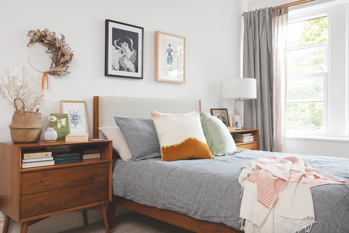
‘Most of our furniture is from West Elm, mixed in with things like vintage books and dried flowers that make the mid-century pieces feel a bit softer,’says Nancy.‘We have quite a lot of vintage books dotted about. They’re mostly picked up on holiday from an amazing second-hand book shop in the Yorkshire Dales.’
Peggy's nursery
‘This is my favourite room in the flat,’says Nancy. ‘It gets that golden hour light when the sun sets. I originally painted it sage green, but I soon went off it. I wanted something prettier without it being too cartooney and girly, so I used a lovely monochrome floral wallpaper instead.’
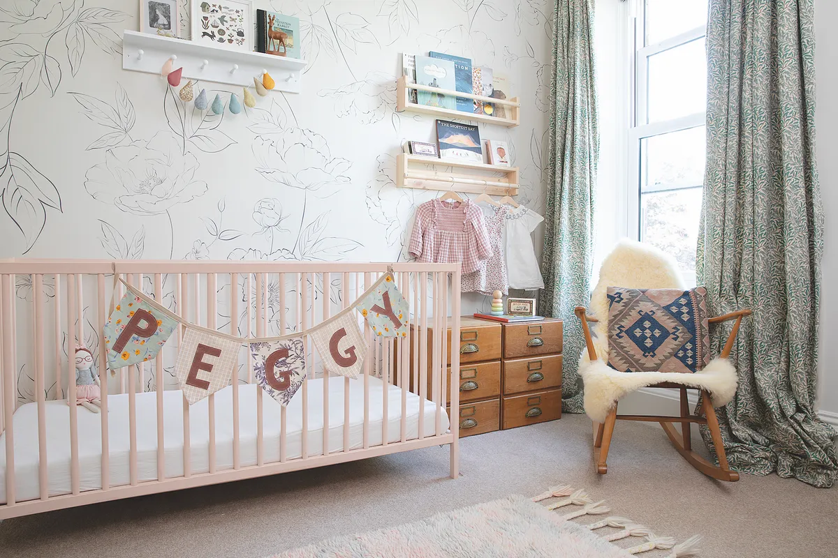
Since then, Nancy has added 1950s school chairs, an Ercol rocking chair, 1930s drawers from her mum and an IKEA cot that she painted pink. ’Mixing up different eras can look nice and eclectic but if you get it wrong, it can look messy. The key is using the same wood tone.’

Bathroom
Nancy has livened up her plain rental bathroom with artwork from Desenio, lots of plants and a warm brass towel rail from MADE.com to balance out the black floor. ‘As it’s so small, with only two shelves for storage, toiletries get put in the office next door,’ she says.
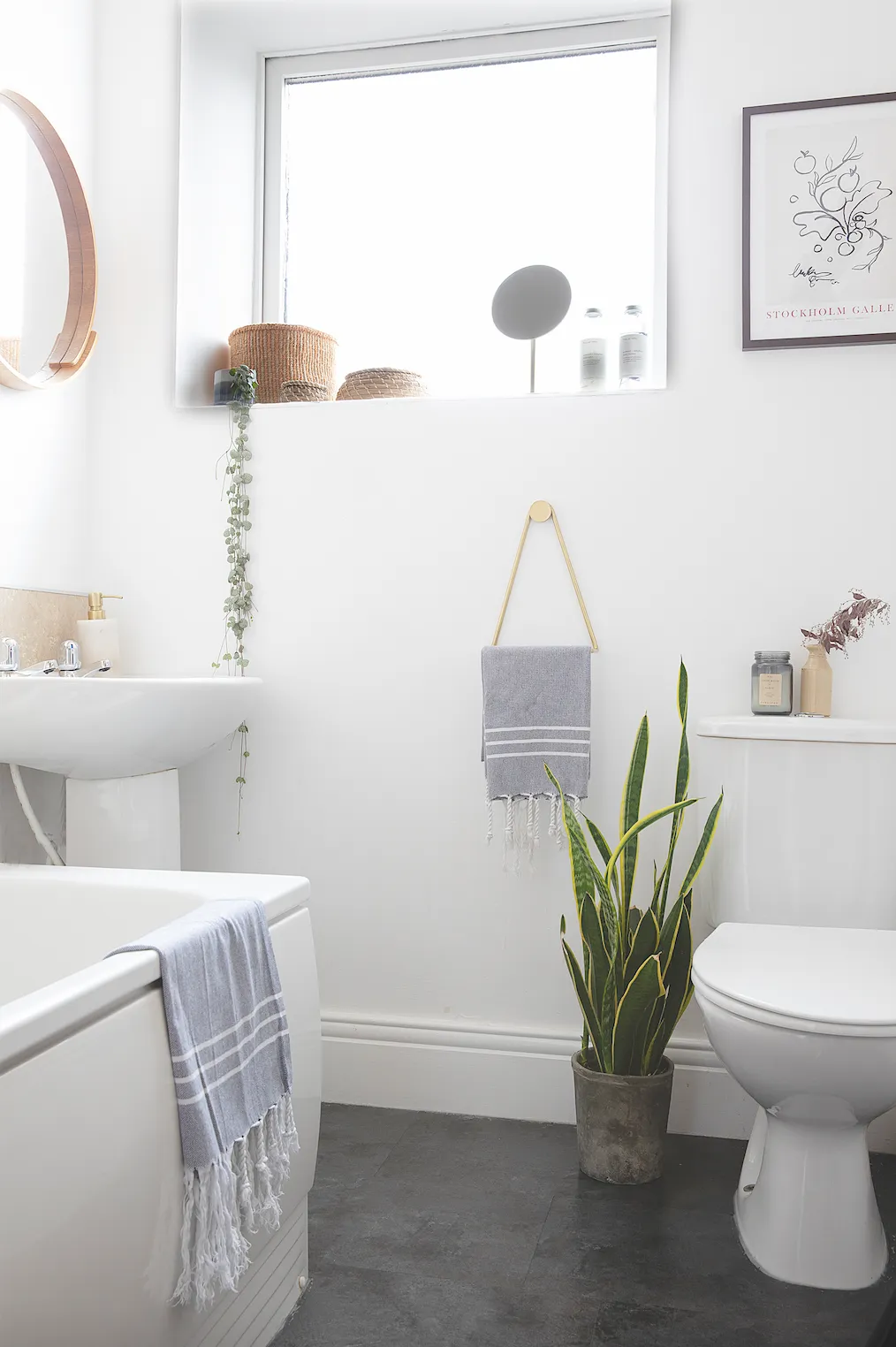
‘I’m a sucker for nice beauty product packaging, so anything on display has to look pretty. I store any ugly things like dental floss in IKEA wicker baskets. I’m tempted to add Moroccan floor tile stickers for a holiday spa feel, but I don’t know if it’s worth it, considering I don’t use this room for longer than 15 minutes.’
Feature Karen Wilson. Photos Katie Lee.
