'When I found out I was pregnant we decided it was time to move from the city to a more rural setting. When Dave’s dad suggested we move into a beautiful farmhouse that he was buying as an investment (and was near both our families) we jumped at the chance. What none of us realised was that the property was in such disrepair it needed demolishing. It worked in our favour though, as Nick always wanted to do a self-build, and we were excited to create the perfect family home.'
Welcome to my home
A bit about me
I’m Ruth Carroll, a primary school teacher. I live with my partner, David Hale, an estate agent, our son, Hugo, four, and my daughter, Ruby, who’s 16.
Where I live
Our home is a four-bedroom detached self-build in Bassaleg, Newport. We moved here in November 2016. I like to share our renovation journey on Instagram @homeatfoxfield.
What I wanted to change
While the original property was beautiful on the outside, it needed so much work that it wasn’t worth saving. The decision was taken to completely demolish and rebuild.
How I made it my own
It was going to be hard to create a charming new-build so I’ve added some traditional touches, such as a log-burner and panelling to get the best of both worlds: an inviting new-build that’s full of cosy corners.
My favourite part
I love the kitchen-diner-cum-snug. It works exactly as I hoped. It’s the hub of our home, and we spend most of our time in here when we’re together
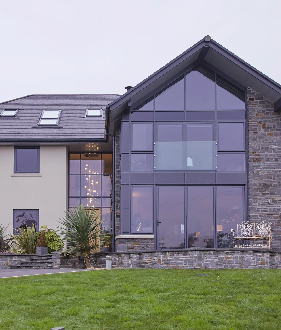
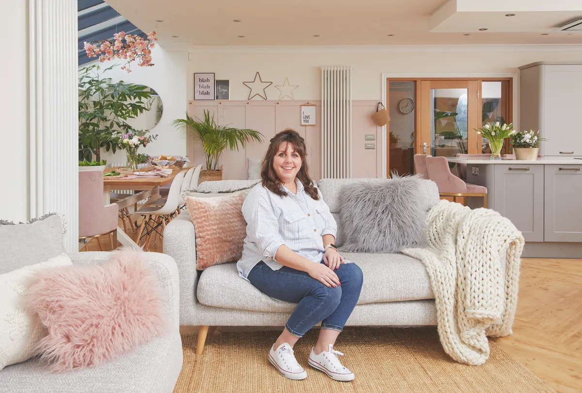
'We put together a portfolio for the architect, full of pictures and ideas we’d got from holidays, hotels and places we’d visited, though we had to prioritise, because of costs. Top of my wish list was a kitchen-diner with a snug area, but we also included features to add character, such as a chimney breast and log-burner, traditional skirting boards and lots of warm wood and big windows to enjoy the amazing views.
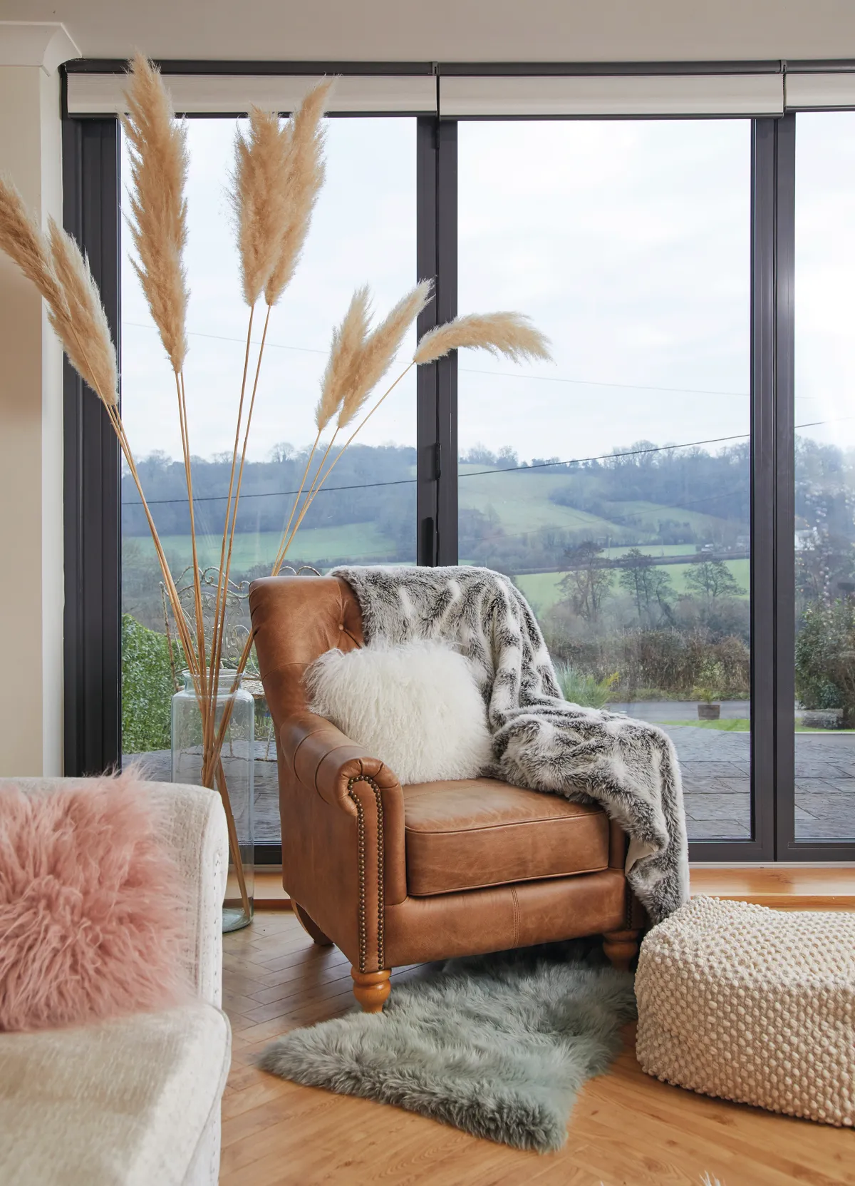
'It took a year for the build to be finished, but we visited when it was snowing and in the height of summer, which gave us a taste of what it would be like living here. On our first night in, eating fish and chips with both our families, I felt so grateful to have helped create such a beautiful home.'
Diner/snug

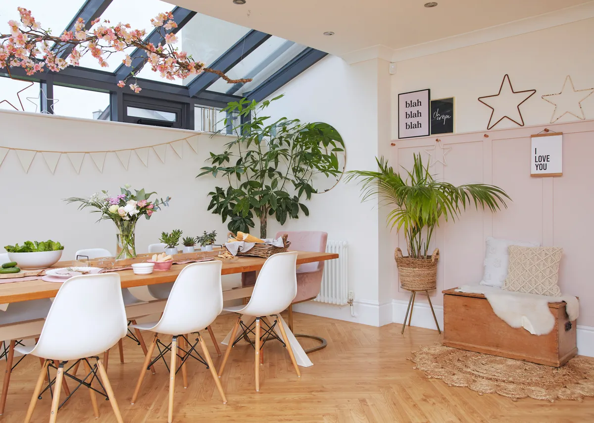
'I love real wood and I wanted herringbone planks running throughout the ground floor, but hearing friends’ bad experiences of maintaining wood in a high-traffic area worried me, so we chose Karndean vinyl flooring instead, which is more hard-wearing, but looks just as good.
'The table was originally going to be by the garden doors, but as the walls went up, we realised it made more sense to put the sofas there instead, as an area to relax in after a meal.
'The back of the room was really dark, so the architect designed the lantern ceiling to let light flood into the space. Then I added the panelling myself as the back wall looked really bland.
'I fitted some cheap wooden pegs to hang accessories from, and then attached the shelf to create space to display prints, and then finished it off with some leftover pink paint.'
Kitchen
'I was tempted to go for navy units with copper accents in here, but I was worried the look could date quickly. In the end I chose these classic Shaker-style units, from Sigma 3 Kitchens, thinking we could jazz them up in the future simply by swapping handles and changing accessories.
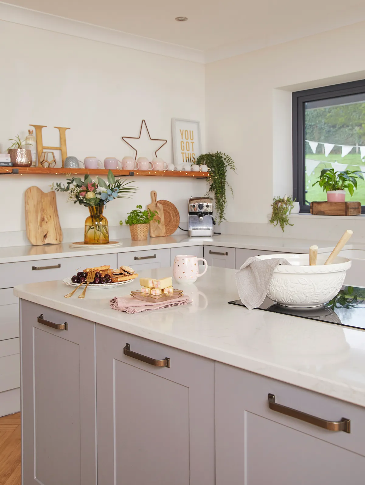
'We went for a design consultation and were given some different layouts, including a U-shaped kitchen, but my dream was an island that we could all sit at, and we do tend to eat most of our meals here now. I chose a bank of storage, including an eye-level double oven, which meant we could put the hob in the island, making cooking far more sociable.'
Living room
'I was worried about moving into a new-build, as myself and Dave were both used to living in period properties, and it felt like this room had no heart. We created a false chimney breast and installed a log-burner, then chose column radiators to add character.
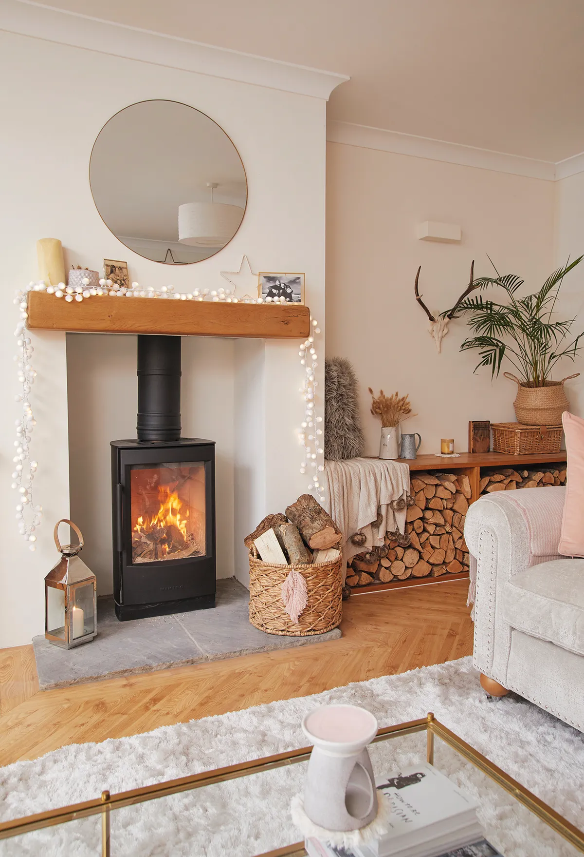
'We included warm textural elements into the design, such as the wooden door frames, to complement the modern country look, and although I wanted vertical log stores either side of the fire, we worried about safety, so I had a fitted built-in unit instead, which is a more practical use of space.
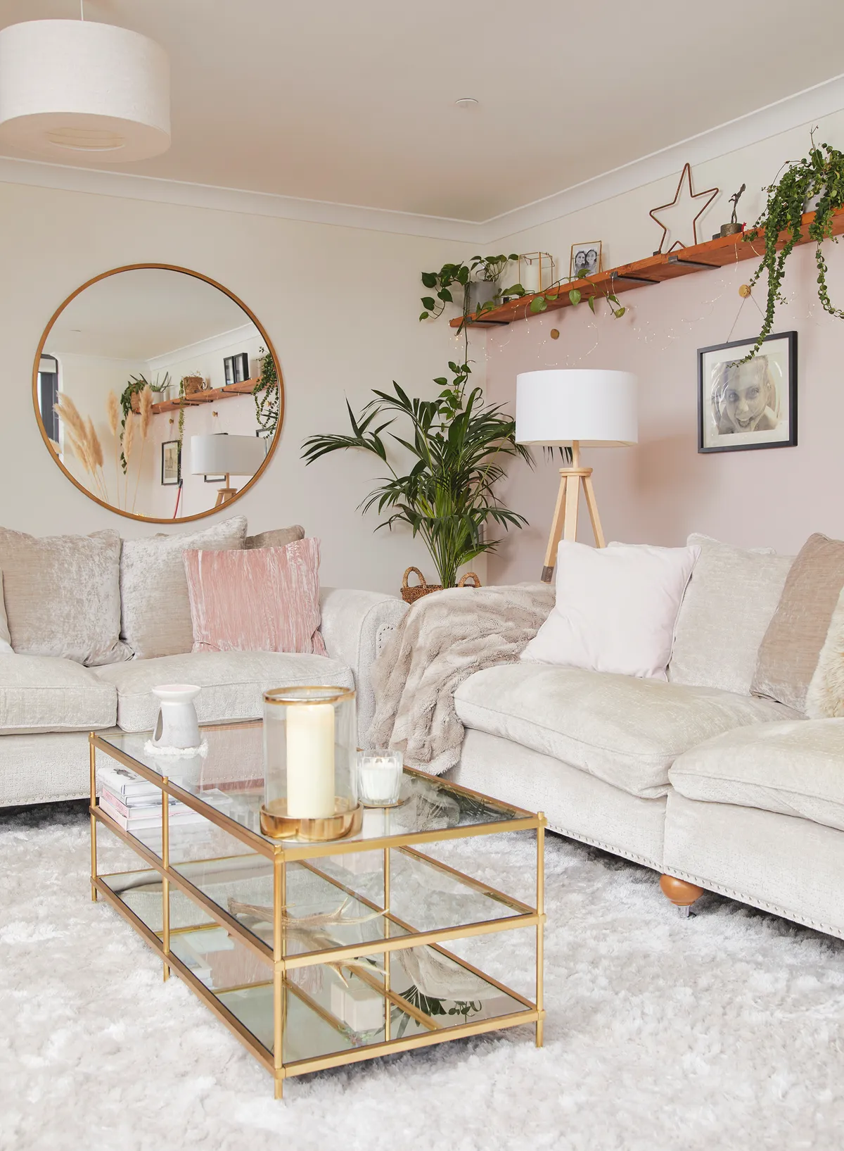
'I chose pink as an accent colour and painted the side wall in Farrow & Ball’s Calamine. It’s a subtle use of colour but cosies up the room.'
Bathroom
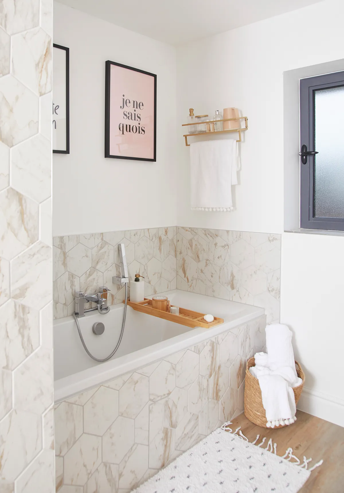
'We compromised on space in the bathroom to allow for bigger bedrooms and chose a smaller-than-average bath, which is fine, as I’m the only one who uses it.
'I wanted tiles that would add warmth and texture, as I was worried an all-white room would feel too stark, and this design from Topps Tiles is perfect. I would have liked gold fittings, but we kept to traditional chrome because this is our forever house, and I didn’t want to fill it with short-term trends that would need updating.
'We had a concealed access hatch fitted into the bath panel in case there was a future problem with the plumbing; for the floor, we chose wood-effect vinyl.'
Master bedroom
'This room initially felt really bare so I decided to add panelling to make it cosier. I’d seen people installing it themselves on Instagram so I decided to give it a go. I measured out what I needed, and ordered the wood from MDF Direct, which was easy as I only had to type in the measurements and the wood arrived cut to size. I was nervous about fitting it, but it was relatively straightforward, using just a bit of glue and some tacks.
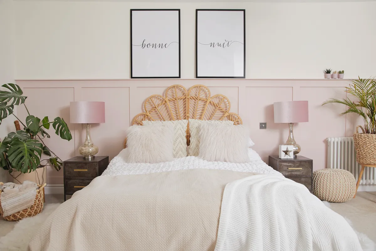
'I love the rattan look that’s popular at the moment, and the freestanding headboard, from Wayfair, was another way of softening the room, bringing in more natural elements. The first night we slept in here with everything finished, Dave said he felt like he was in a hotel.'
Ruby's bedroom
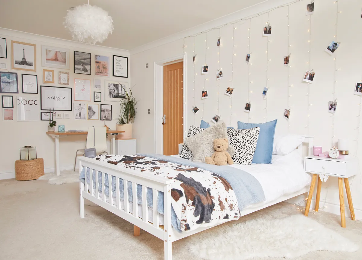
'This space was designed so that the bed faces the amazing views, which left a natural spot for Ruby to have a workstation in the corner, and a bespoke makeup bench opposite her bed. We chose a FlexiSpot desk, which is electric and programmable, so she can customise the height she wants to work at.
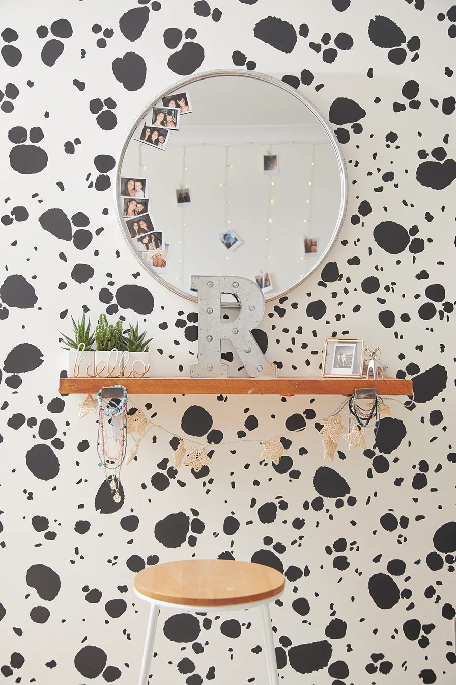
'Ruby wanted a wall of Dalmatian spots, and was happy to paint them herself, but I wanted to futureproof the room and I was worried they might be difficult to cover if she went off the look, so I found removable stickers, and her friend bought the animal print throw for her birthday.'
What I learned...
- Get the experts to do the hard work. Rather than spending time choosing and chopping the wood for the panelling myself, I sent the measurements to MDF Direct who sent the pieces precut to my exact specification, saving me time and the worry of making a mistake.
- Thoughtful style and design choices can add an air of quality to a room, without needing to be expensive. Rather than plain, shallow skirting boards, which is a classic budget-friendly look in a new-build, we chose deep skirting from the traditional range that looks great.
- Be prepared to change your mind and take any good advice offered from qualified professionals
Photos by Katie Jane Watson

