Phil Coe was just 23 when he built the house he lives in with his partner, Flo, on the site of an old farm building near York.
Using his skills as a joiner, and with the help of family and friends, he spent countless hours doing almost everything himself, from digging foundations, building the timber frame complete with larch-clad walls and roof, to creating the windows, laying floors and installing bi-fold doors.

‘My idea was to cram in as much as possible into the space, but the architect, Ric Blenkharn, showed me that by taking the main living area into the roof space, creating a mezzanine, and altering the size and shape of the windows, I could build something really fresh and contemporary,’ explains Phil.
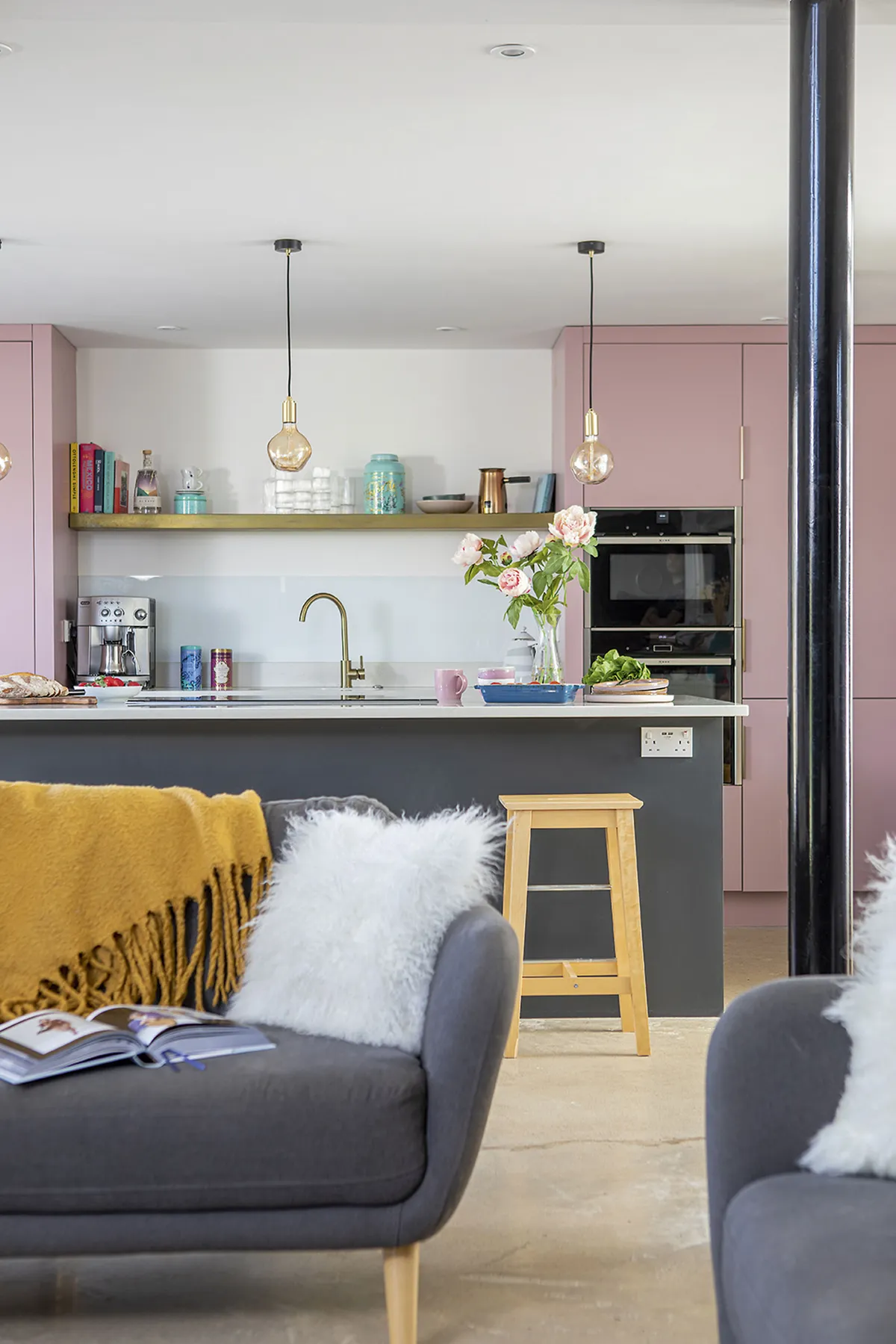
However, the biggest challenge was figuring out how to create a practical kitchen that worked with the open-plan setting but still retained its own identity.
The couple were also restricted by decorating on a very small budget. Fortunately, Flo’s eye for interior design and her ability to think outside of the box helped them to develop a kitchen that would be both homely and modern.
Welcome to our home...
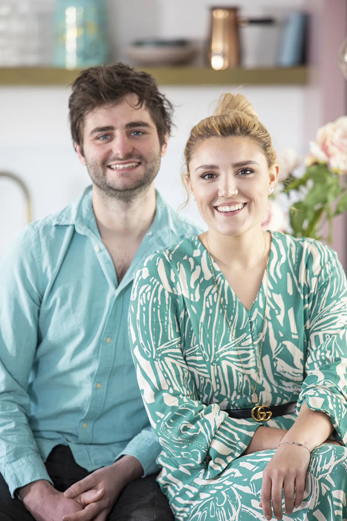
Who lives here? Flo Cooper, 26, and her partner, Phil Coe, 28. Together they run an interior design and build service called FloCoe. They built their contemporary timber-frame, two-bedroom home in 2017 on the site of an old agricultural shed in Phil’s parents’ garden.
What did you want from your kitchen? We wanted the kitchen to have its own identity, yet still be part of the open-plan living area on the ground floor. It had to be modern and minimal to match the rest of the space, while at the same time be imaginative and stylish.
How did you meet the challenges? We built a walk-in pantry and floor-to-ceiling wall cupboards to hide the clutter and then painted these units matt pink for visual impact. We added an island, containing the hob, which faces into the room so that we didn’t lose any of the social elements of open-plan living.
She used clever, functional design ideas to create plenty of storage and workspace and minimise clutter. ‘We decided to create a separate utility that doubles as a pantry,’ says Flo.
‘That left us with a wall for cupboards and a sink area, as well as an island looking into the living area for cooking and socialising.’
Once they had agreed the design, Phil spent his evenings and weekends making the units and fitting worktops, while Flo focused on sourcing everything for the scheme.
‘Creating our own perfect kitchen in what was a blank space makes the little pleasures of cooking even more enjoyable,’ she says.
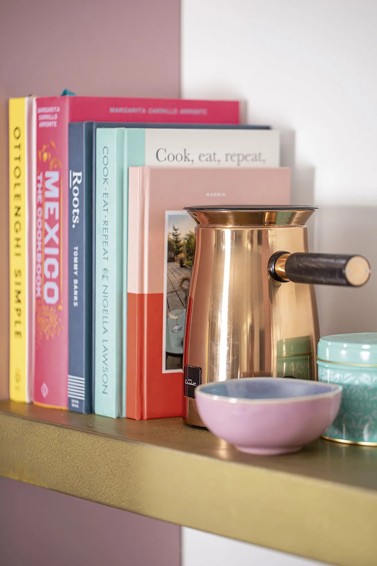
‘Everything was made to fit exactly what we wanted, like the spice rack inside the cupboard door and the feature shelf for displaying some of our favourite things.
‘The whole experience became a seamless delight and reinforces the notion that the kitchen can really be the heart of the home when designed for your specific needs.’
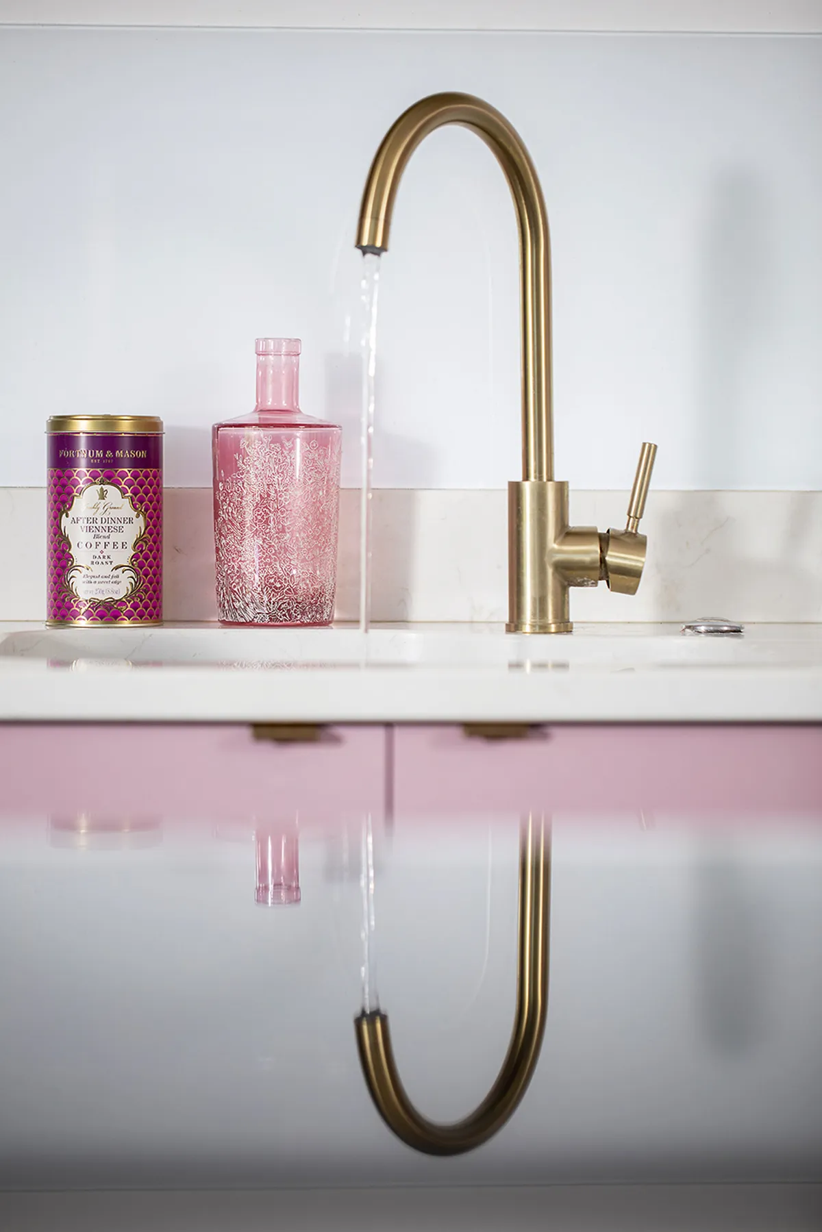
‘Our first time using the kitchen was fantastic,’ adds Flo. ‘For two years Phil spent every spare minute on the house, starting early in the morning and often working late into the evening. It was a significant turning point when we could actually cook our first meal and know we’d finally got our house to look like home.’
Feature Heather Dixon. Photos David Burton.
This is a digital version of a feature that originally appeared in Your Home magazine. For more inspirational home ideas, why not subscribe today?
