'I loved this house from the moment I walked through the front door on our first viewing. We had viewed quite a few properties by that point and none of them were right for us, but I knew straight away that this house was just perfect.
'What drew me was the size of the rooms and the layout of the whole property. It immediately reminded me of my childhood home, which was a Victorian house with large rooms – even though this place was practically a new-build it had the feel of a period property, which I absolutely loved.'

I’m Louise Mair, 54, a visual merchandiser and stylist. I live here with my husband, Charles, 56.
Our home is a four-bedroom detached house in County Antrim, Northern Ireland. It was built around 22 years ago – we’ve lived here for 18 years.

'After eventually moving in, it took us a while to make the home our own. We gradually painted every room in muted, pastel tones, and I remember my husband and I staying up very late one night painting the dark purple dining room a lovely pale pink before visitors arrived to stay the next day. It was quite hectic!
'It was worth it, though, to be able to have this space to share with our loved ones – particularly at Christmas time. It’s my absolute favourite time of year, and right from the start I could visualise how the house would look decorated for the festive season with twinkly lights, trees in every room and the living room fireplace being the focal point of our yearly celebrations. I like to make a real effort at Christmas, and I love opening up our home to family and friends this time of year.'
Hallway
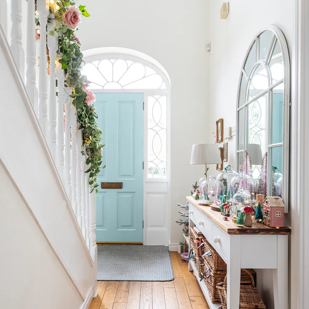
'The hallway is quite a bright space which gets flooded with plenty of natural light. It has oak flooring, which is ideal for all the traffic through the front door. Although, I’d love to change the flooring here to vintage-style tiles one day.
'I’ve kept the space light and airy by painting it in a warm white, and I had the door colour-matched to Ladurée blue. I took a Ladurée notebook that I bought in Paris to my local paint shop, and they matched it perfectly.'
'Decorating the banister takes quite a while but it’s always worth it in the end when the twinkly lights are on, and it reflects beautifully in the hall mirror.'
Kitchen
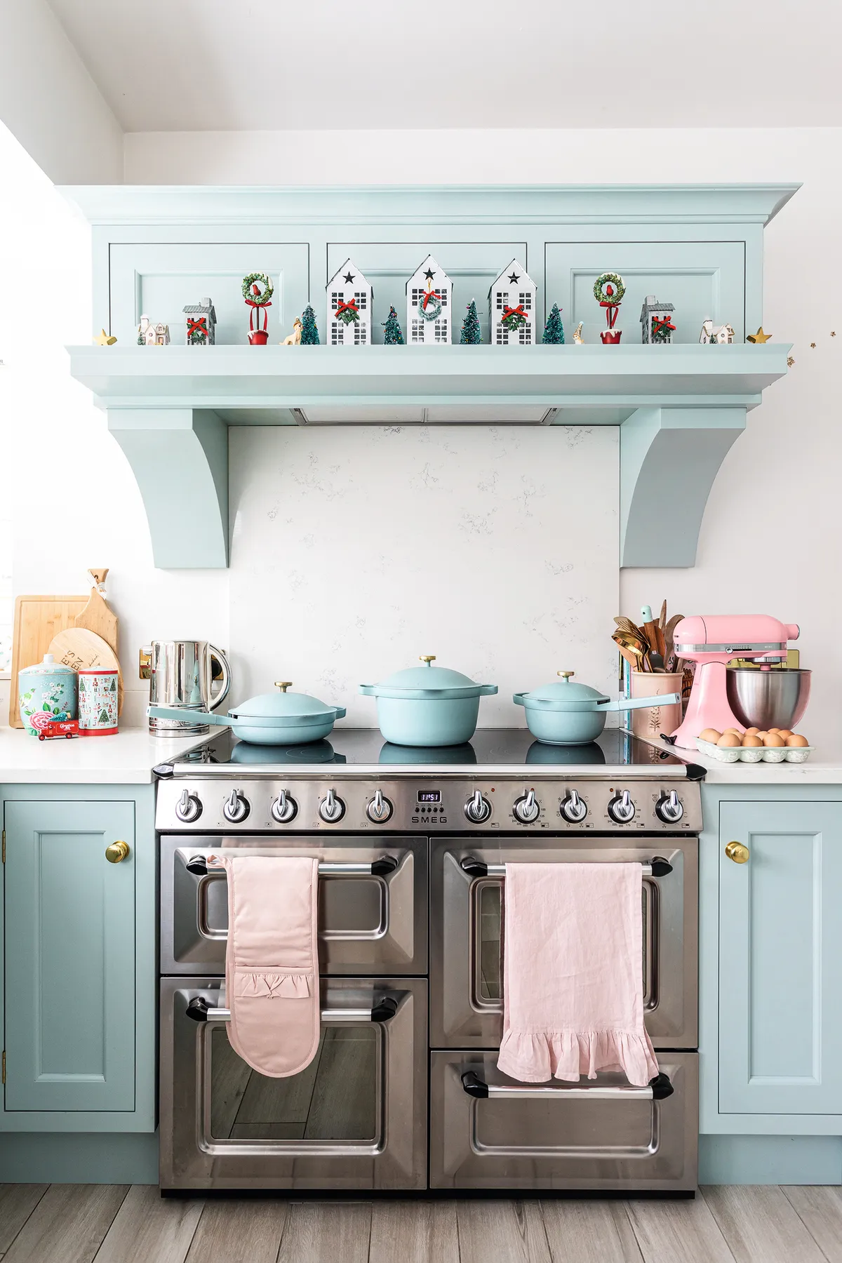
'The kitchen had pine units with orange walls, very bright multi-coloured tiles, and the floor was covered in farmhouse-style terracotta tiles. I loved the layout but hated the décor, so we eventually ripped out the whole kitchen four years ago and I had my dream kitchen installed in powder blue with brass hardware.
'I more or less kept the same layout, as it worked well, but made a few changes, such as installing a large stove (rather than an integrated oven) with a mantel above it and a baking cupboard.'
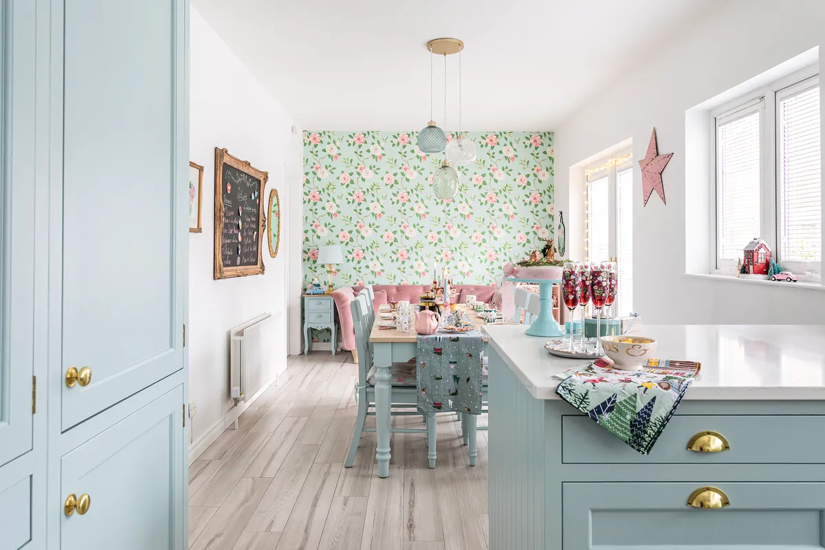
'The kitchen is definitely the heart of the home and I love to decorate the mantel at Christmas and dot festive touches around the room. I do lots of entertaining over the festive period and love to make my home a welcoming place.'
‘It took a while to find a light that I loved for the dining area of the kitchen. When I spotted this one in Dunelm, in the perfect colours, I was delighted – it finishes the space off perfectly!’
Dining room
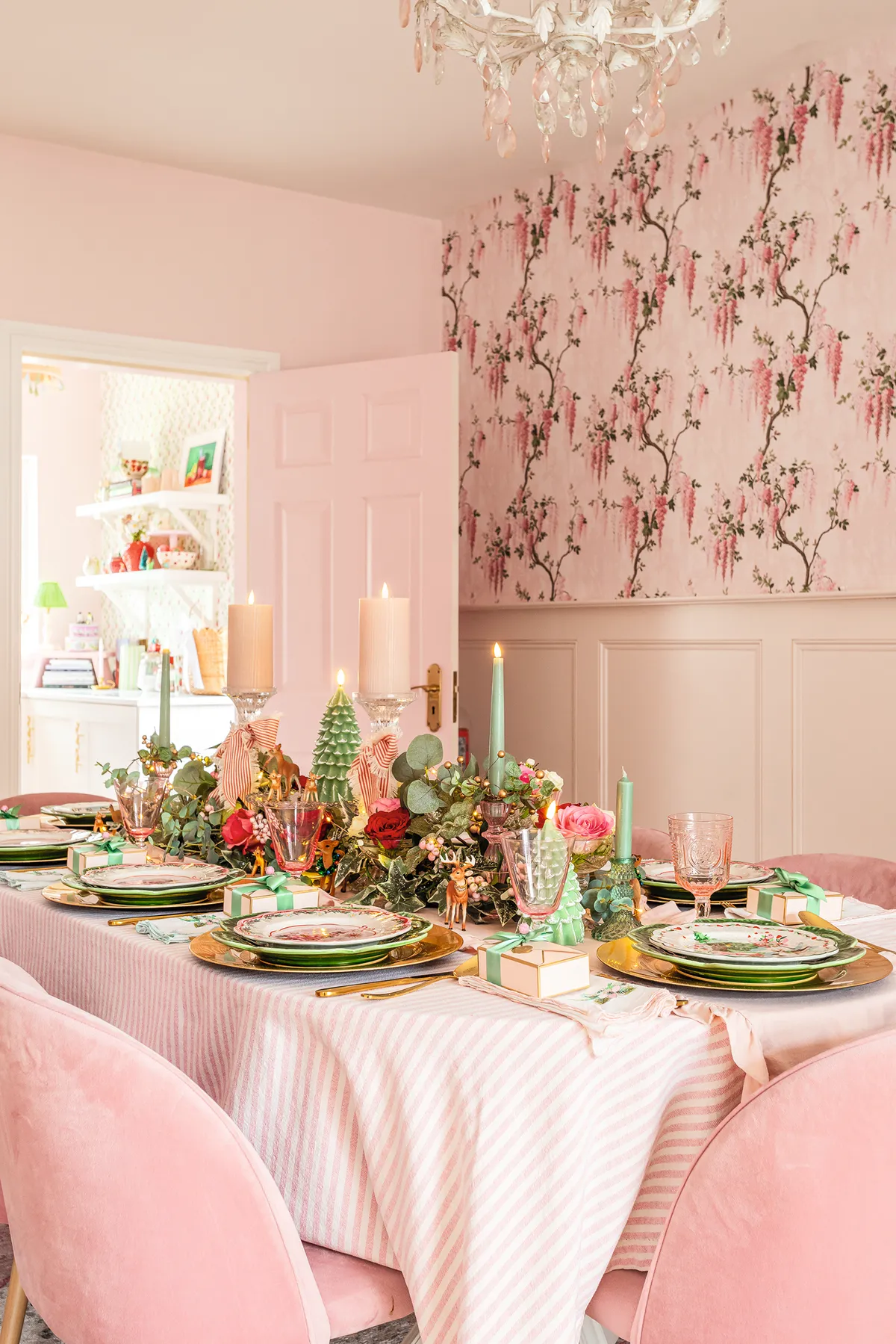
‘This room felt very dark and gloomy when we moved in as it was a deep purple tone. I painted the walls with a lovely colour called Ballet Pink from Homebase, and I had our 35-year-old mahogany table resprayed in Little Greene’s Rusling and replaced the chairs with pink velvet ones to update the look. My son-in-law panelled one wall for me, and we papered the wall above in Woodchip & Magnolia’s Wisteria Pretty Pink design. There used to be units along one wall housing my extensive vintage china collection (which my husband called the Great Wall of China), but I decided to have a huge clear out and sell most of it as I wanted to reduce clutter.’
Living room
'The living room has probably had the smallest transformation of all the rooms, as it was fairly neutral with an oak floor when we moved in. We painted it in antique white with a duck egg feature wall, and bought a large rug for the floor to make the space feel cosy.
'I hung a large mirror above the mantel, which I painted the same colour as the fireplace with some gold detailing and bought a French-style chandelier, too.
'My friend spotted the gorgeous fire screen with a gold bow on Facebook Marketplace at a bargain price and I snapped it up as it finishes off the fireplace perfectly!'
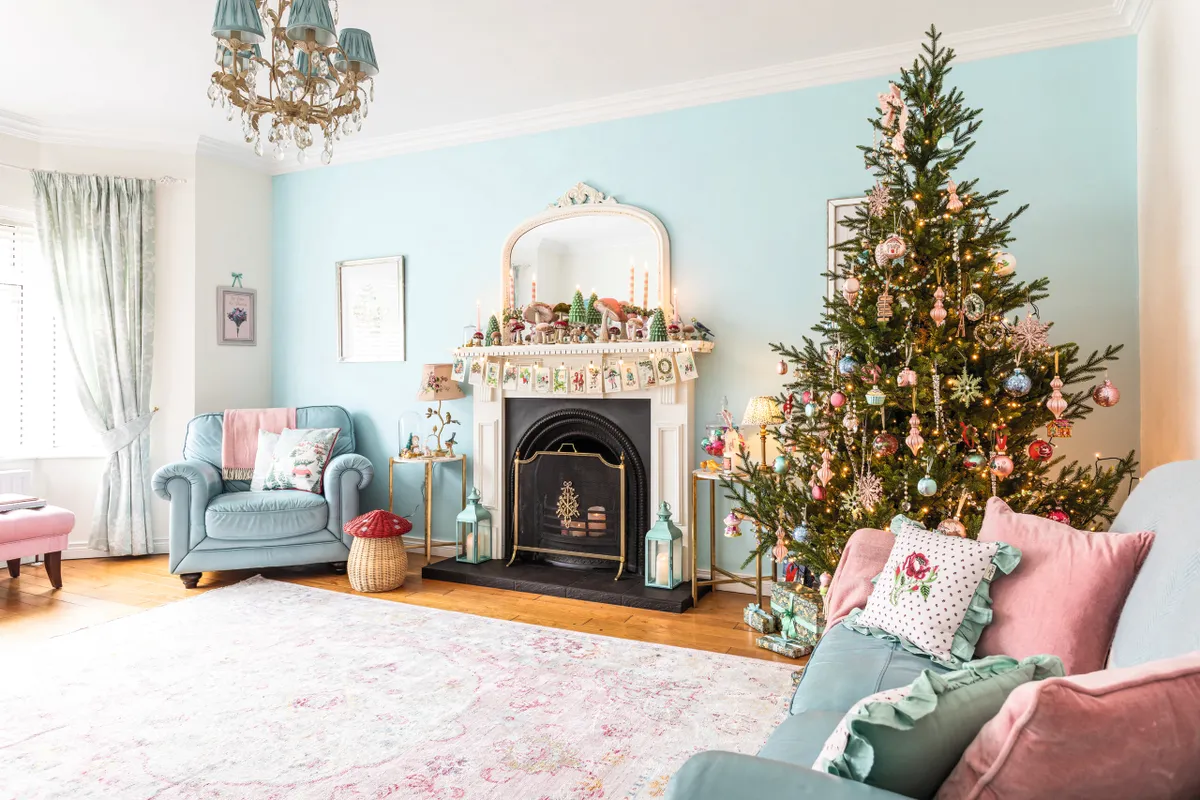
With the glittering tree, vintage decorations and roaring fire, the living room is Louise’s favourite space in the house at Christmas time.
'We always have a large tree at Christmas and I decorate the mantel with vintage postcards. For me, Christmas is all about happiness and nostalgia. I love to think that I’m creating these special memories for my own family – especially my grandchildren who love to come for festive hot chocolates with marshmallows and treats by the fire in the living room.'
Utility room

‘This was the last room in the house to be renovated. It was very dated in style – painted in a pale orange with pine units – and was a purely functional space. I fell in love with the block print strawberry wallpaper by Molly Mahon, and thought it would be perfect for the utility room, which leads out to the garden. James McCloy Joinery, who did my kitchen, also made and fitted the units in the utility.
'I always wanted a gold sink in this room and found the perfect one from Bathshack, which was much cheaper than others on the market.' The units in the utility are painted in Farrow & Ball’s Wimborne White, and the walls are painted in Alchemist Paint’s Powder Pink.
Main bedroom

'This room was painted in a very dark red and had fitted wardrobes around the bed, which I wasn’t keen on. We decided to completely revamp this space last year, which included the en suite and little dressing room, and I couldn’t be more delighted with how it all turned out.
'I wanted a room which had the feel of a hotel with a French twist, so we added panelling then painted it in Little Greene’s Gentle Sky. I chose gold Laura Ashley curtains and new bedroom furniture from Crown French Furniture, and found the armchairs at Dunelm. The bedside lampshades are Liberty from Pooky, and I found the French antique oval gilt mirror on eBay.
'The gold floral and marble shelves are from Anthropologie, and I have battery candles on them which make them look like little wall lights.'

'Our en suite was quite dated so we decided to rip it all out and start from scratch. I wanted it to be a continuation of the bedroom in terms of décor, so we panelled it and painted it in same colour. I ordered everything for the bathroom revamp from Bathshack – they also made me a small bespoke sink unit painted in Little Greene’s Gentle Sky with a sparkly marble top. I sourced the gold flower handles for it from Etsy.'
Guest bedroom
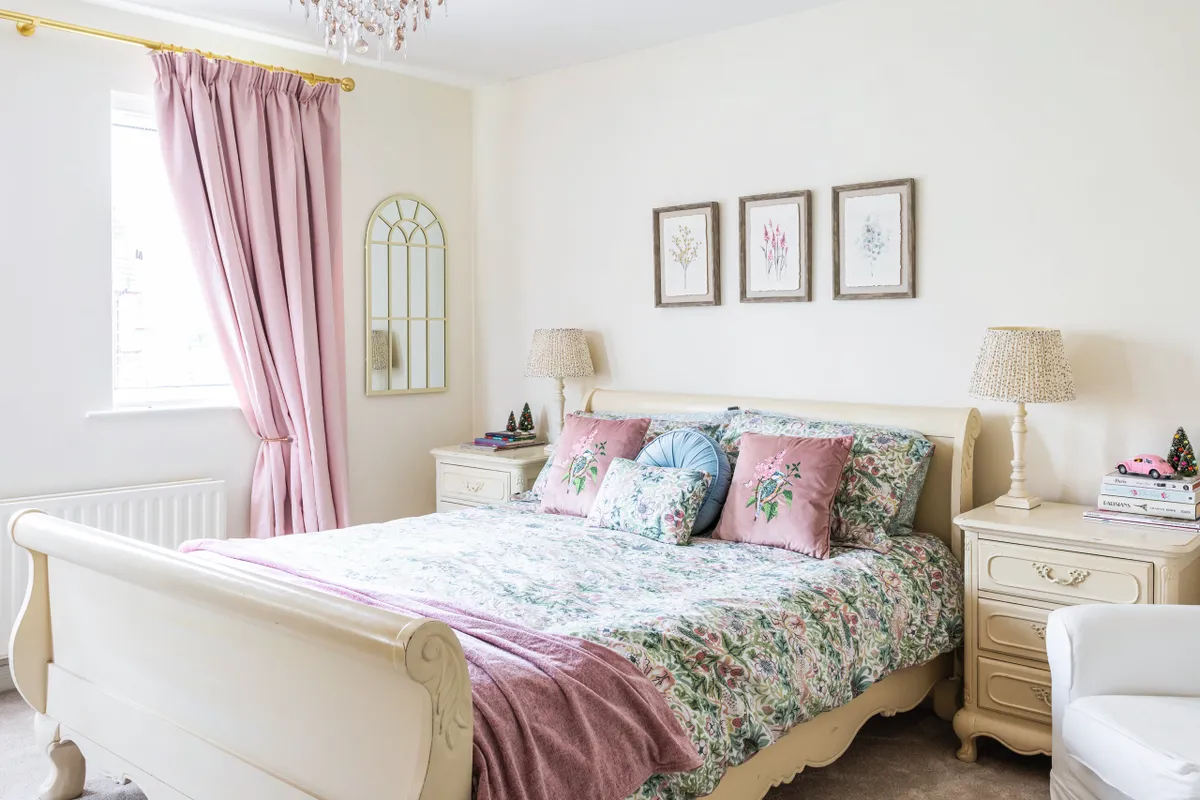
'We gave the guest bedroom a refresh last year by painting the walls in Farrow & Ball’s Wimborne White and laying a new carpet. The furniture was purchased locally when we bought the house, and it’s perfect for a guest room. As we’re originally from Scotland so we often have family over to stay with us, and I like to create a warm and welcoming space for them to relax in.
The botanical pictures above the bed and mirror are from Dunelm, and the bedside lamp base is Laura Ashley – the gold dotty shade is from Pooky.
Bathroom
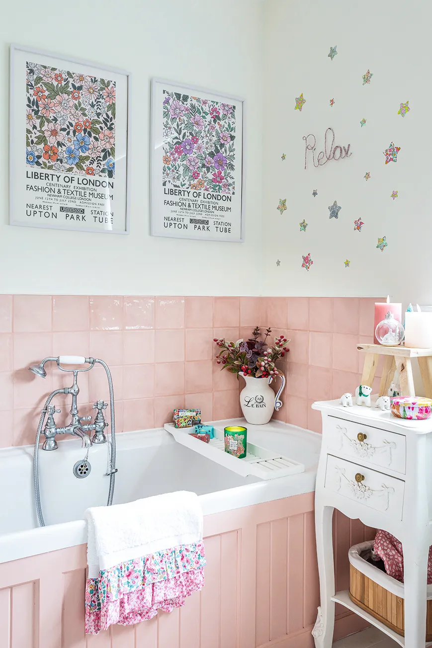
Louise gave her bathroom a new look with a fresh lick of paint and some choice accessories.
'We wanted to give this bathroom a refresh without a huge budget, so we decided to keep everything that was already there but changed the shower panels and tiles. We painted the walls in Farrow & Ball’s Wimborne White and the woodwork in Alchemist Paint’s Confetti.'
Photos Elyse Kennedy Styling Louise Mair
Explore
