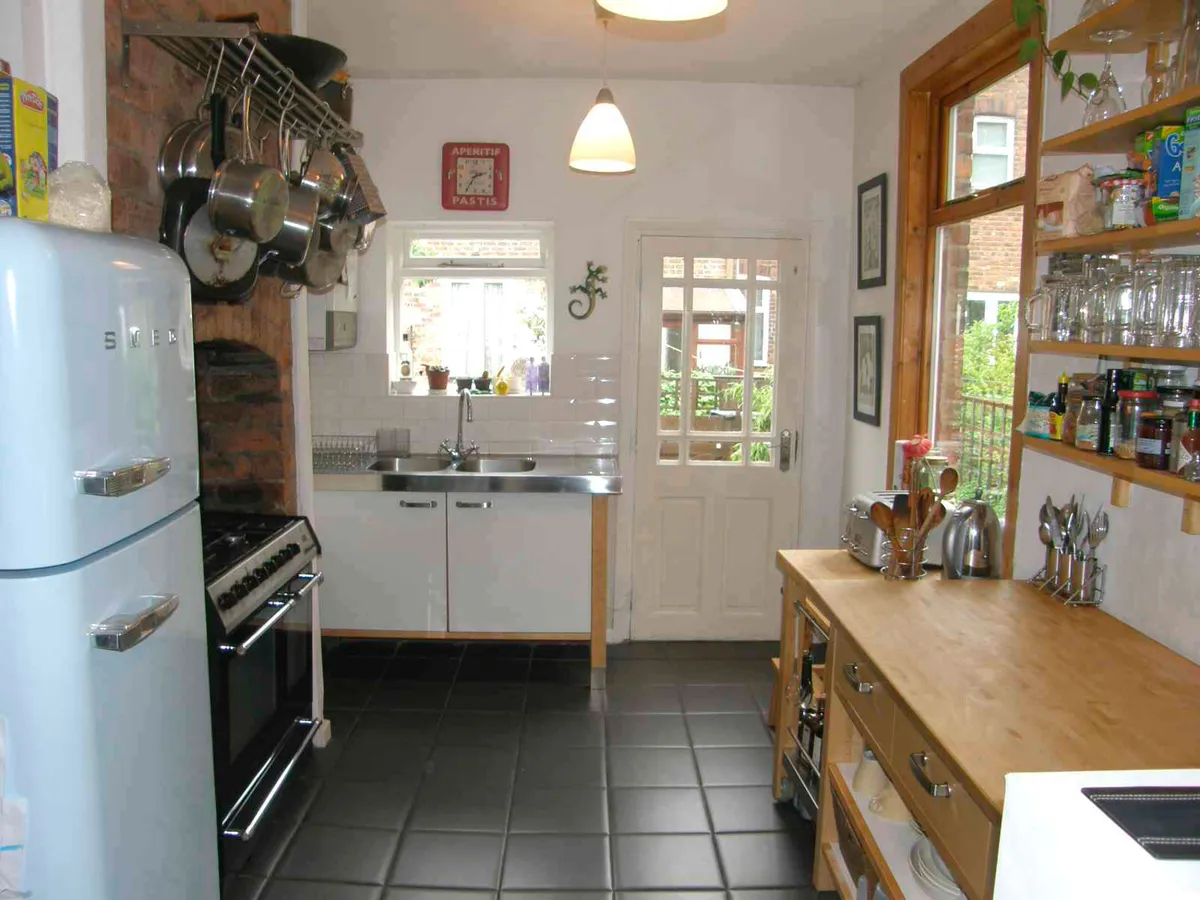
With little Edie on the way, Meriel and Jack quickly realised they needed more space in their terrace home. ‘Although the kitchen had already been opened up into the adjoining dining room, it was still too small and looked tired.
‘We wanted this area to be the main focus of our family life with more surfaces to prepare food and have a breakfast bar for quick snacks, plus we wanted to use it as a space to relax and dine in. We needed more light in the area too, but with no way to reconfigure the existing space, an extension was the answer,’ explains Meriel.
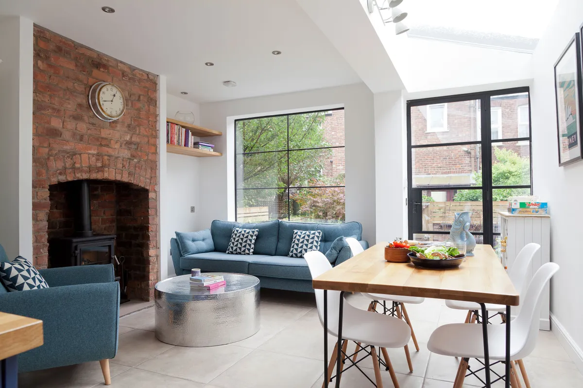
Although the couple’s plans seemed straightforward, the project wasn’t without its hitches. ‘The glass roof was the most problematic – the builder and I nearly cried when it shattered during the installation! When its replacement started slipping out of its frame, we thought the worst.
Welcome to our home...
Who lives here? Meriel Tolhurst-Cleaver, 33, and her partner, Jack Hodd, 34, live here with their young daughter, Edie, and cat, Susie. Meriel is a paediatric doctor and Jack is an intensive care doctor. They live in a Victorian terrace in Chorlton, Manchester.
What do you like most about the room? It’s so bright! We used to have to turn the lights on during the day as the space was so gloomy before.

However, with some urgent remedial work we were able to reinforce the fittings and a structural engineer has now signed it off, but that was pretty nerve-wracking at the time!’ recalls Meriel. ‘The glass roof, for all its challenges, is now one of my favourite features as it lets in so much light throughout the downstairs’.
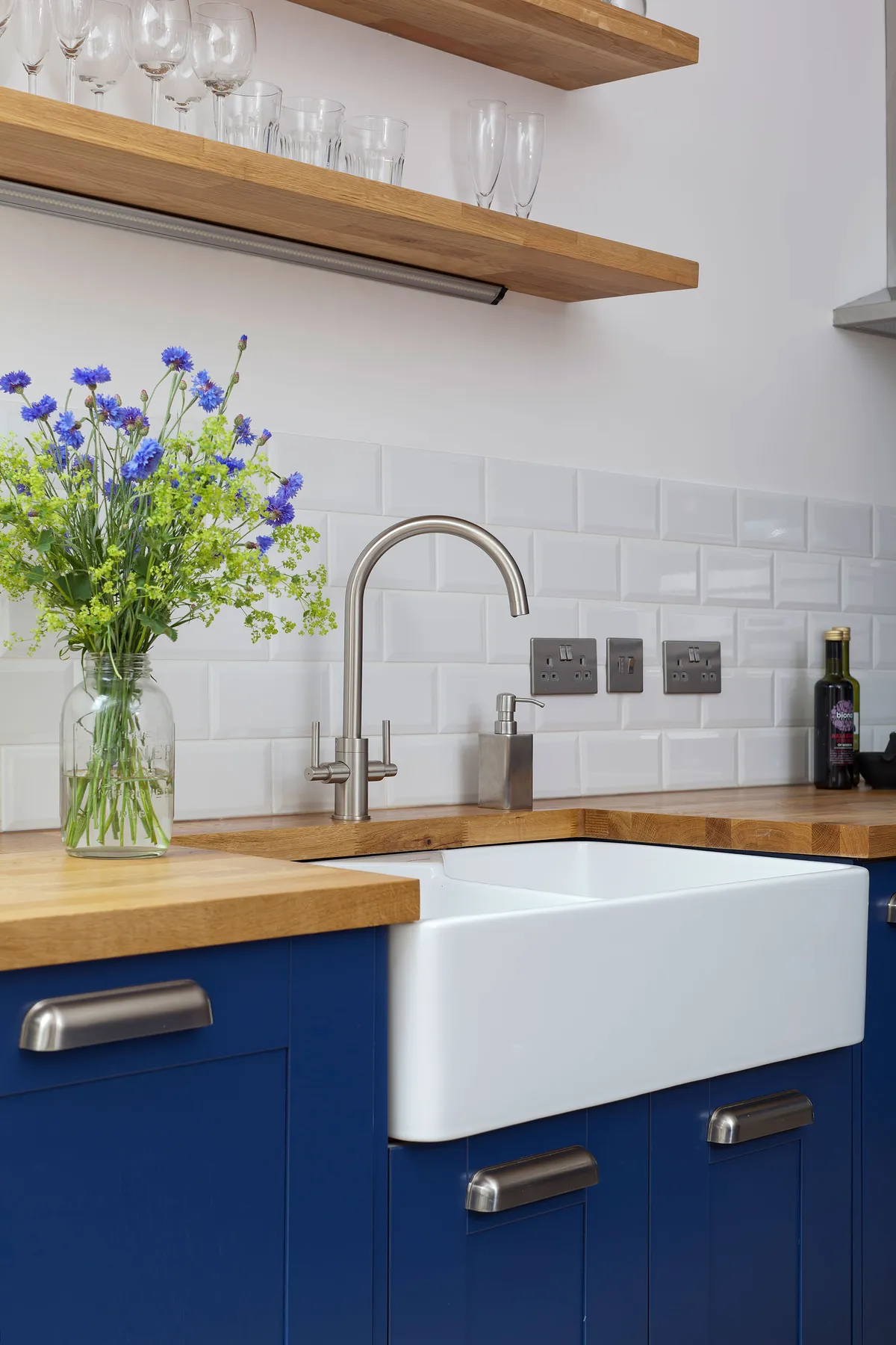
Meriel’s husband, Jack, has always loved Crittall-style windows and wanted them in the house, so the couple asked Jane Leach of iArchitect if there was a way to make them work in the space and get the area to seem twice as big.
‘Jane designed the glass door in between the kitchen, living room and hallway, which brought plenty of light to those spaces and made the area seem bigger,’ says Meriel.
A bit more about our home...
What are your top tips? Expect the unexpected. Our drains weren’t where we thought they would be, so they had to be tracked beneath the house, which meant we had to remove the chimney stack and shore them up the wall.
What was wrong with the old kitchen? It didn’t give us the multifunctional family space that we wanted, plus it was too dark during the day.
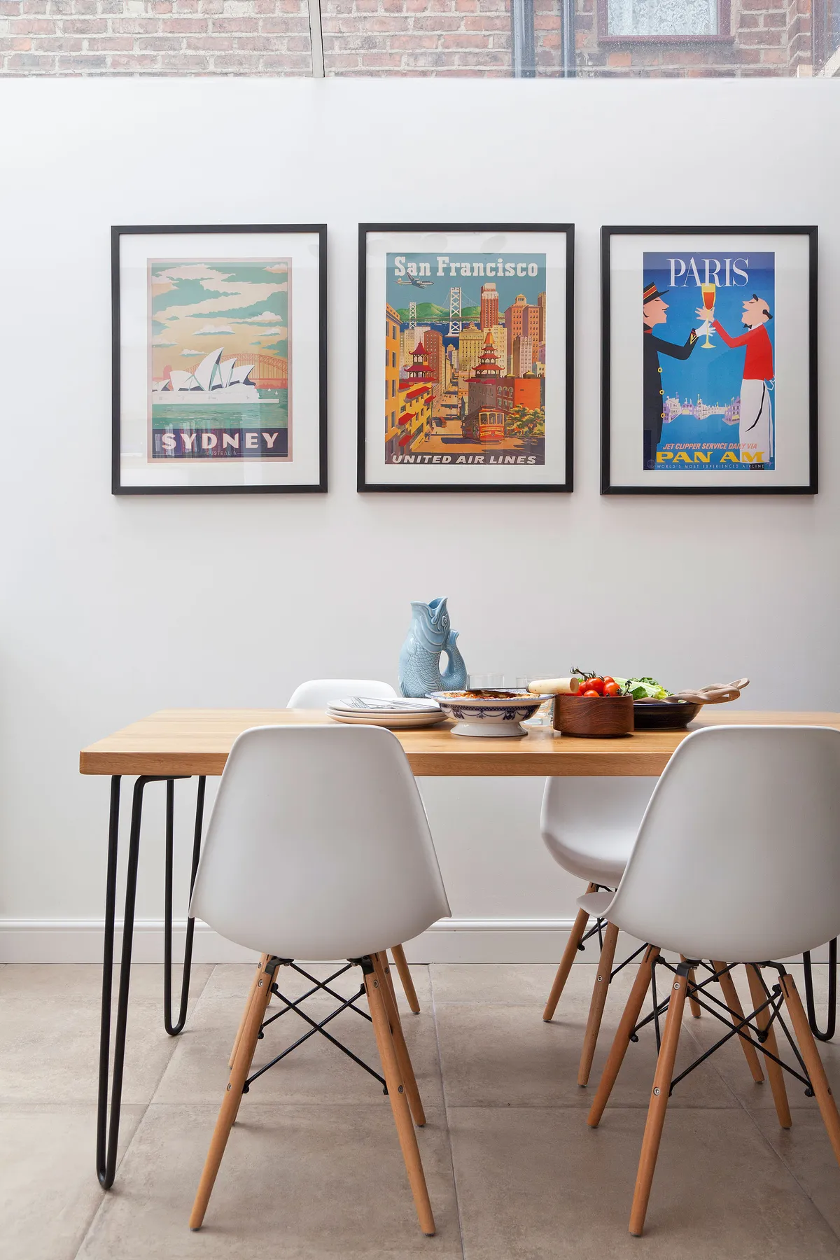
‘The roof, doors and windows appeal to the Scandi style I like, but we also wanted to highlight the period features of the house, so we made the reclaimed brick chimney breast in the living area the focal point as a nod to the house’s heritage.’
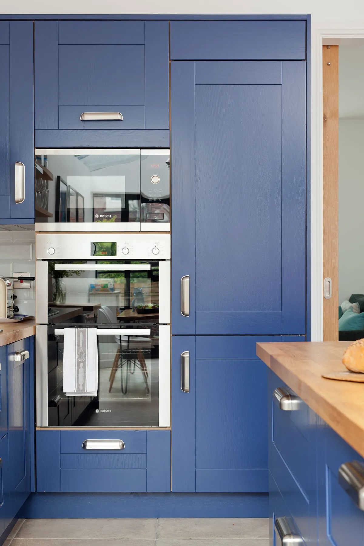
Now that the family have finished the work in the kitchen and have had a chance to make use of the space, they’re delighted with the outcome that they achieved on an affordable budget, but there is one thing they would still like to add to the space.
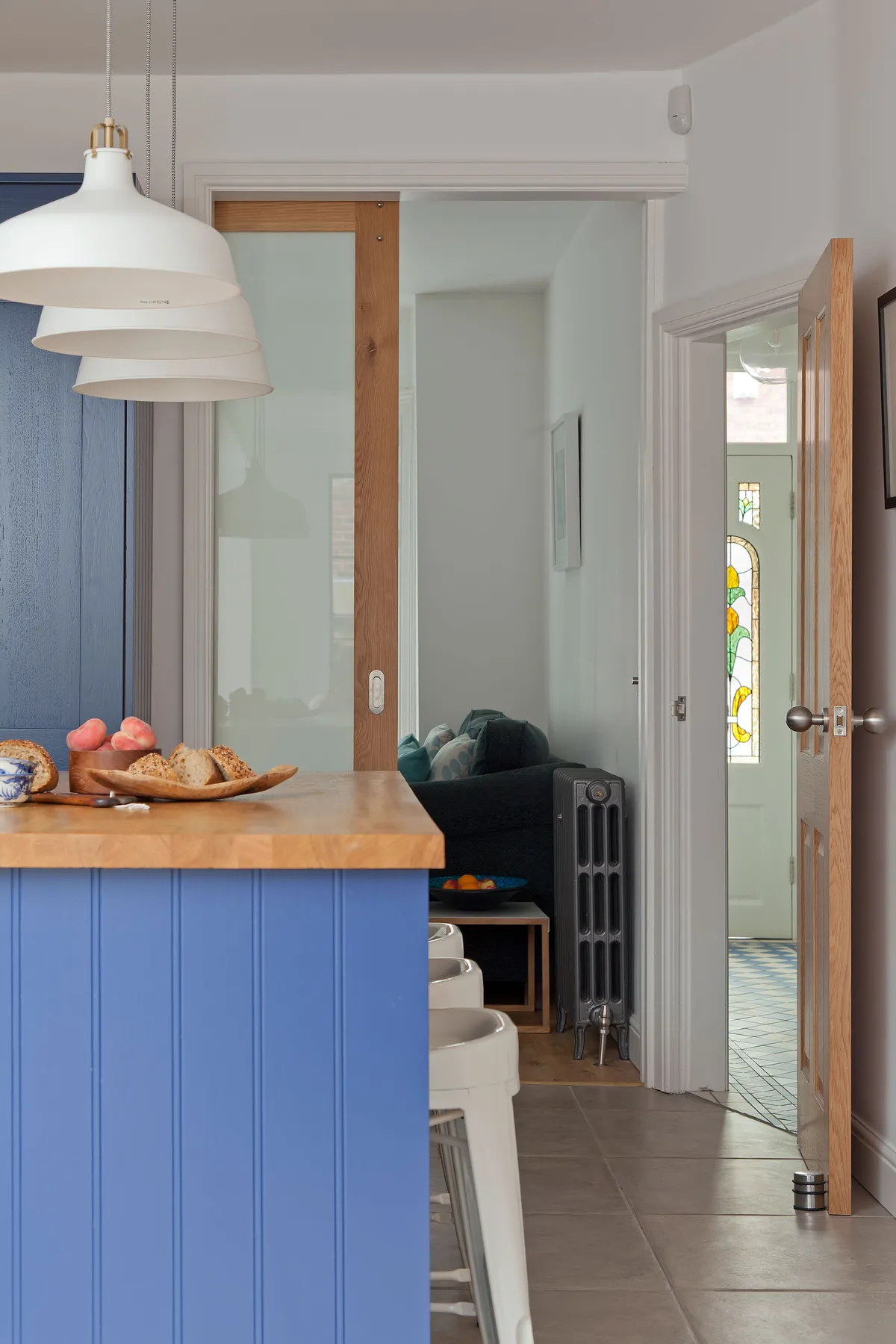
‘Since using the new space, we can safely say it’s delivered on every count, but the one thing we might add is an integrated blind on the roof lights as it can get very bright on a sunny day,’ admits Meriel, ‘but we shouldn’t really complain too much about the sunshine!’
Feature Mandi Millar. Photos Fiona Walker-Arnott.
This is a digital version of a feature that originally appeared in Your Home magazine. For more inspirational home ideas, why not subscribe today?
