An avocado bathroom suite, no central heating and woodchip were just three of the challenges Heena and Hinesh Mistry faced when they bought their new home in 2014. But the property’s potential far outweighed any outdated décor. Although the three-bedroom house was in excellent condition, the interior was dated and didn’t suit the couple’s taste.
‘When we bought it, we loved the area and thought it would make a perfect first home for us as newlyweds,’ says Heena. ‘We had no idea that a few years later we would have two kids and be renovating and extending the house to suit our family.’

The couple made various changes to make the house liveable, but it wasn’t until 2020 that they decided to go ahead with a much bigger renovation. In order to transform the house into the family home they needed, the Mistrys hired an architect and a local builder to design and build an extension that would give them another two bedrooms and more living space.
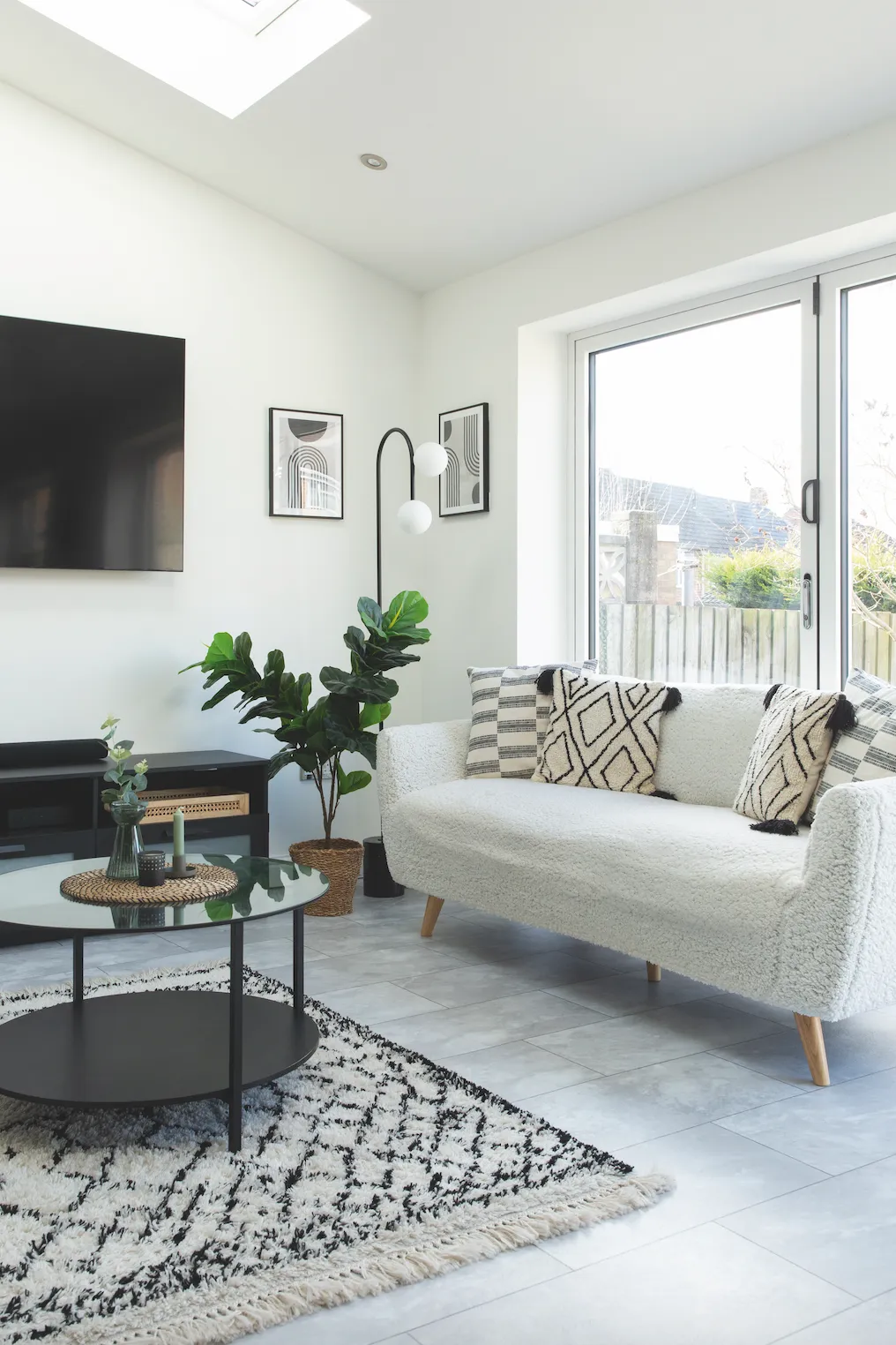
‘It took about a year to finish,’ says Heena, ‘and we did some of the work ourselves, such as the painting and decorating. It was a big job, with the new area extending four metres from the house, all new double-glazed windows, a new kitchen, flooring, underfloor heating and internal doors!’
Welcome to our home...
We are Heena and Hinesh Mistry, and we live here with our two boys. I’m a brand digital designer and Hinesh is a healthcare operations manager.
Our home is a five-bedroom, semi-detached house in Coventry, West Midlands. It was built in the 1960s.
We love living here as we’re really close to so many beautiful places, like Stratford-upon-Avon, Leamington Spa and Solihull.

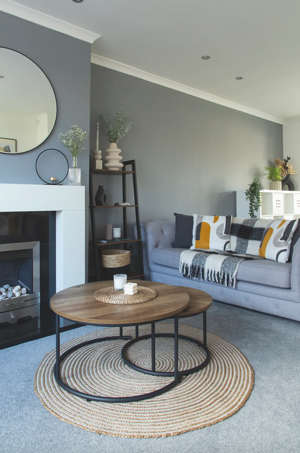
Able to live in the house throughout the build, the couple could see the progress each day. ‘Watching it all come together is an incredible feeling,’ says Heena, ‘and we’re really pleased with the outcome.’ It wasn’t without its challenges, however, and a huge oak tree in one of the neighbouring gardens proved a costly one.
‘The tree roots came all the way up to our house,’ says Heena. ‘When the council inspector looked, he advised us to change the foundations, which ended up costing an extra £10,000! We weren’t happy, but it was the safest way to ensure the foundations would be solid and strong enough to hold up the house.’
Add to that a period of torrential rain while the roof was being replaced, resulting in the nursery becoming water-logged and the ceiling having to be repaired (as well as the issues getting materials due to the pandemic), and it’s safe to say the couple had their fair share of problems.
A bit more about our home...
Our best idea To extend into the garden and garage to create more space, including two new bedrooms upstairs.
Our biggest mistake Not replacing the skirting boards in the existing rooms, and removing the fireplace to have the TV on the wall.

‘We also had a magpie stuck in our fireplace while they were replacing the windows,’ Heena remembers. ‘One day it flew out into the living room and we had to get one of the builders to set it free. They say magpies mean bad luck and the day it flew out of the fireplace was the day we were getting the screeding done in the kitchen, which didn’t go according to plan. We ended up with an uneven floor that had to be levelled out – so maybe they do bring bad luck!’
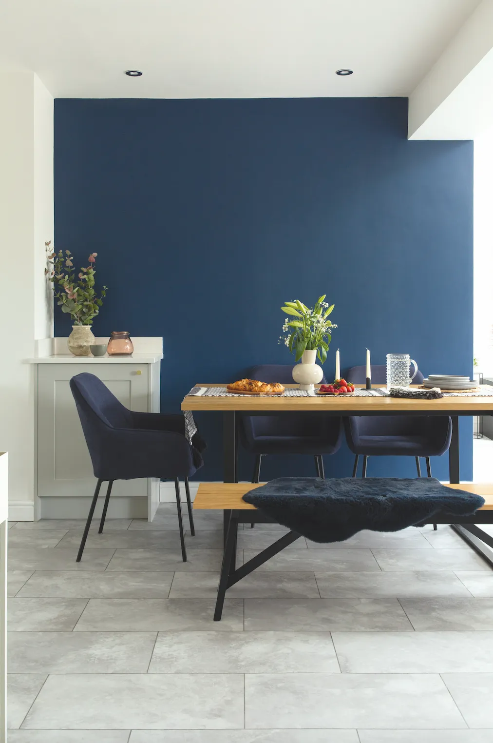
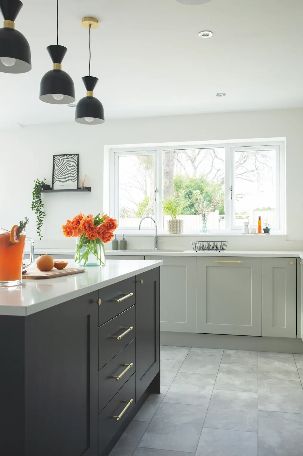
Luckily, the couple persevered and today the new layout works exactly as Heena and Hinesh had hoped, with a large kitchen and living space that the whole family can share. ‘I knew I wanted an open-plan kitchen-living area, with a large island and a pantry for all my spices and tinned foods,’ says Heena.
‘It’s my favourite room and because it’s all open-plan, I can see the kids playing while I’m cooking, which is great. Often, they’ll sit on the island and help me chop the veggies or do some baking. I also like the minimal style in here, with everything hidden away and few items out on the kitchen worktops.’
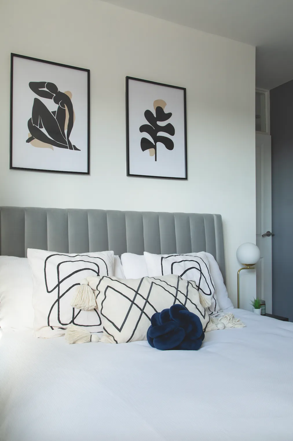
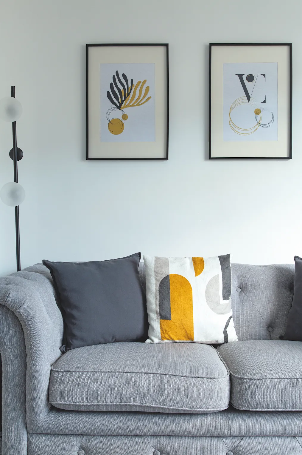
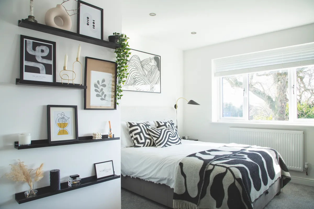
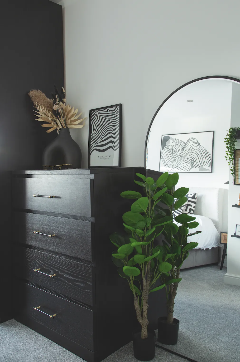
Having kept most of the walls in neutral earth tones throughout, Heena has added colour with the accessories. ‘I have a lot of accessories, but I’ve tried to spread them out around the house so that the rooms don’t feel crowded.’ She also has a passion for prints, including her own designs she sells on Etsy, and these are showcased in many of the rooms, along with various bowls and decorative pieces she’s made from clay.
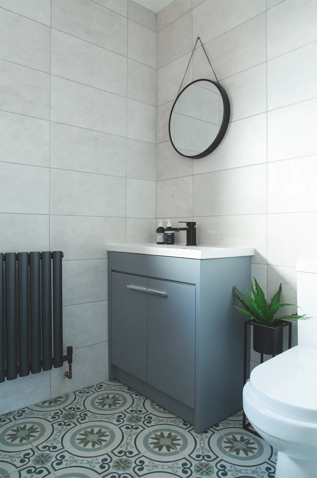
‘I think it’s important to have a clear vision of the space and how you want it to work for you and your family,’ says Heena. ‘Do your research – especially on the bigger buys, such as kitchen and bathroom fittings. Looking locally for these can help and it supports local businesses, too. We found a large double sink reduced to just £40 in our local Jewson store – originally it was £260!’
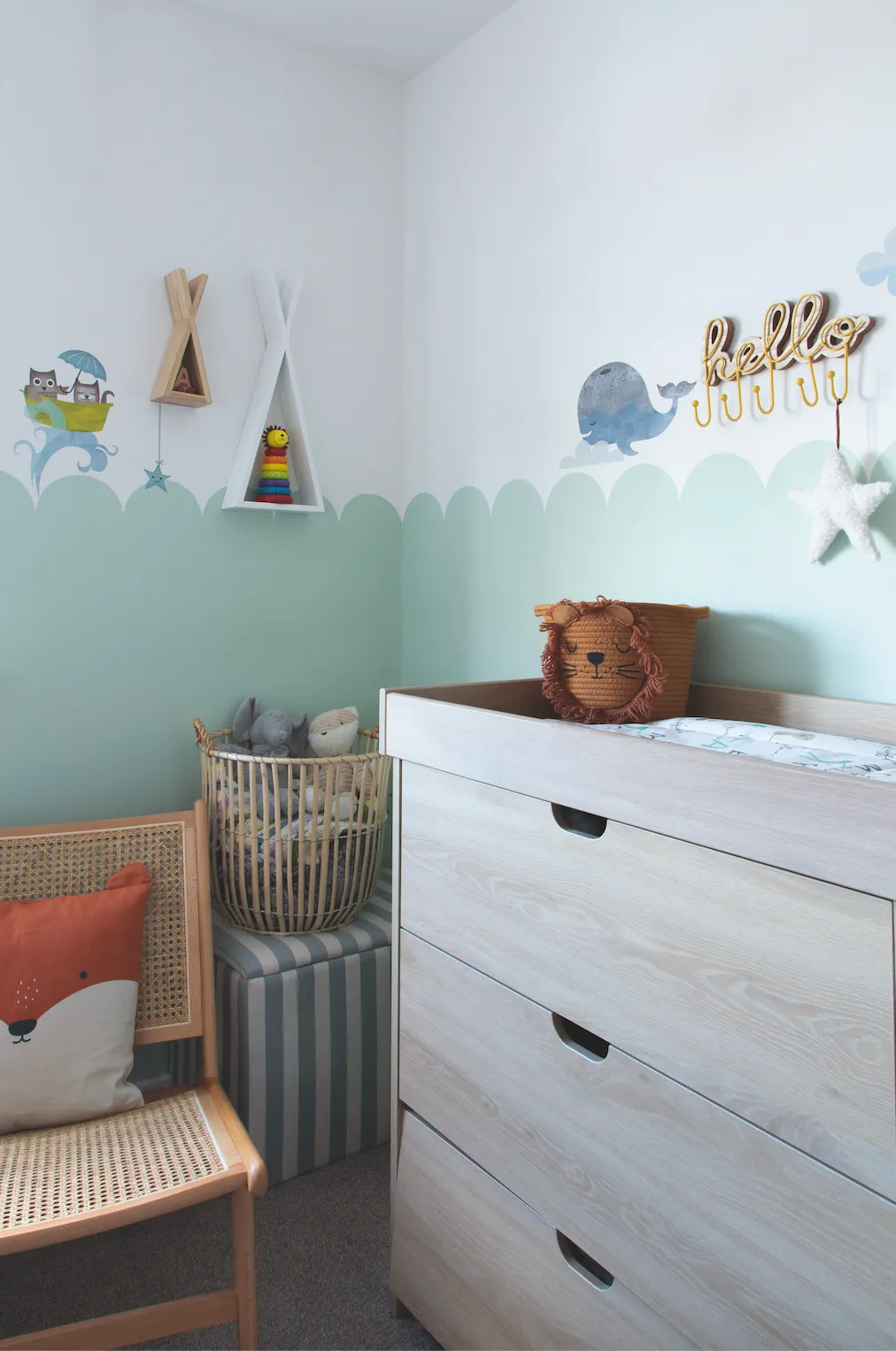
Heena was pregnant throughout the build and her youngest was born before everything was complete. ‘It was a struggle having a newborn in a house that lacked facilities, such as a washing machine and cooker,’ she says. ‘So, I’m especially proud of what we’ve achieved. The house has changed quite a lot since we bought it, but so has our style. We’ve still got jobs to do, but it’s a lovely, airy home with plenty of natural light. We learnt a lot and one day, further down the line, we look forward to taking on another project.’
Looking for more decor inspiration? Don't forget to check out the rest of our real home makeovers here!
Photos Georgia Burns.
