In 2016, Mim and Tom installed a new kitchen as part of an extension to the Leytonstone, east London, home where they have lived since 2013.
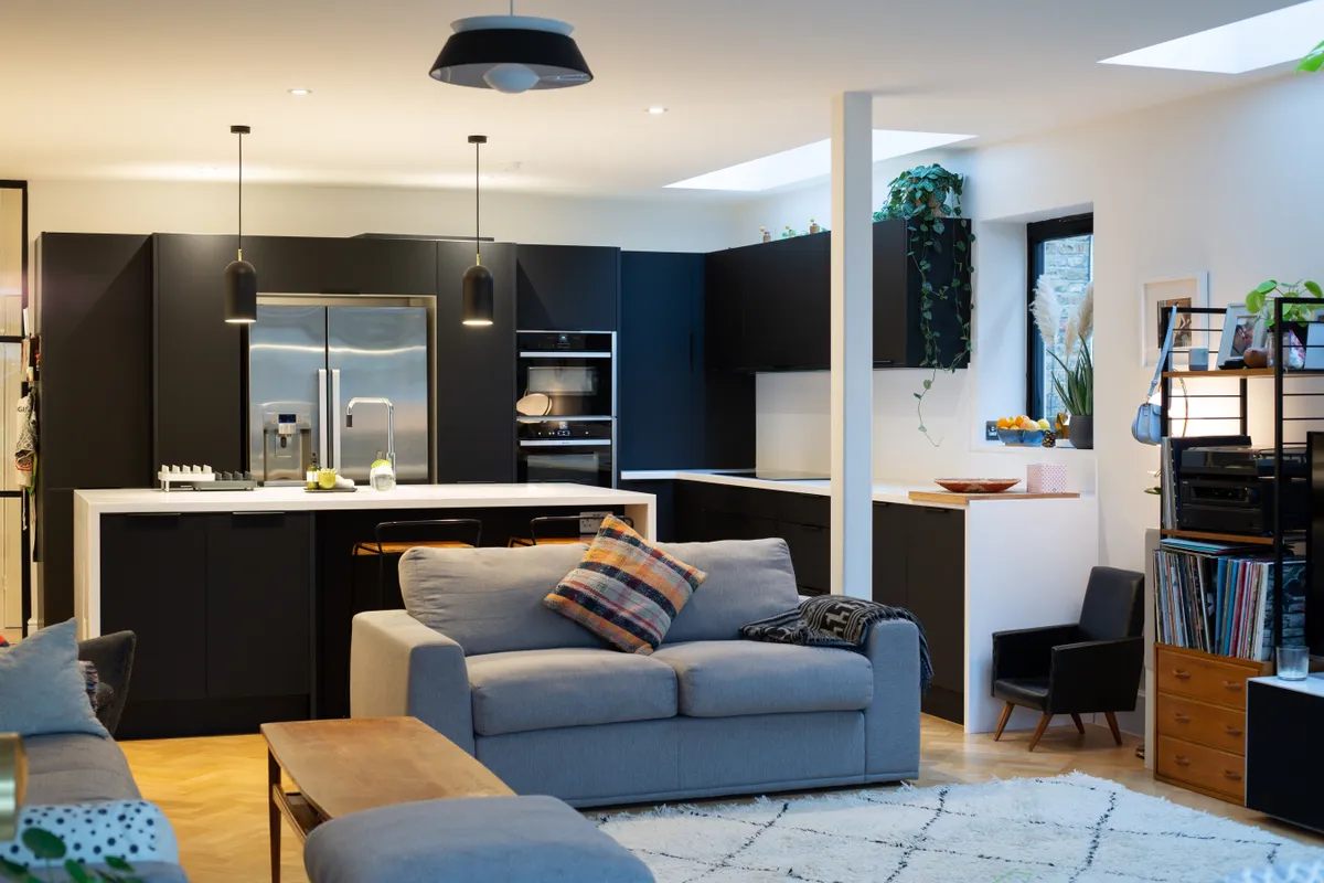
The ground floor, large L-shaped open plan kitchen with feature island sits in a space that also includes a family seating area.

Who are we?
Mim and Tom, from Leytonstone in east London. Tom works as head of merchandising at a fashion retailer and Mim owns a denim design and development company.
What did we want to change about the kitchen?
‘We wanted to make it bigger, more modern, minimalist, in contrast to our white room. Also we really liked the idea of matt black and sunlight reflecting from it.’
Although very happy with the quality of their Trend Interiors kitchen, over the next few years, Tom and Mim started to think twice about their choice of white gloss cabinets and dark worktops.
They decided to remodel the room with a more modern and minimalist vibe by reversing the balance of the monochrome scheme.

So they called in Anderson Sinclair, the retailer who had installed the original kitchen, and started planning a dramatic new look, with striking matt black doors and white worktops.
As it was still a relatively new kitchen, it made sense to change the look of the space through changing the elements that had the most impact over the aesthetic rather than starting from scratch.
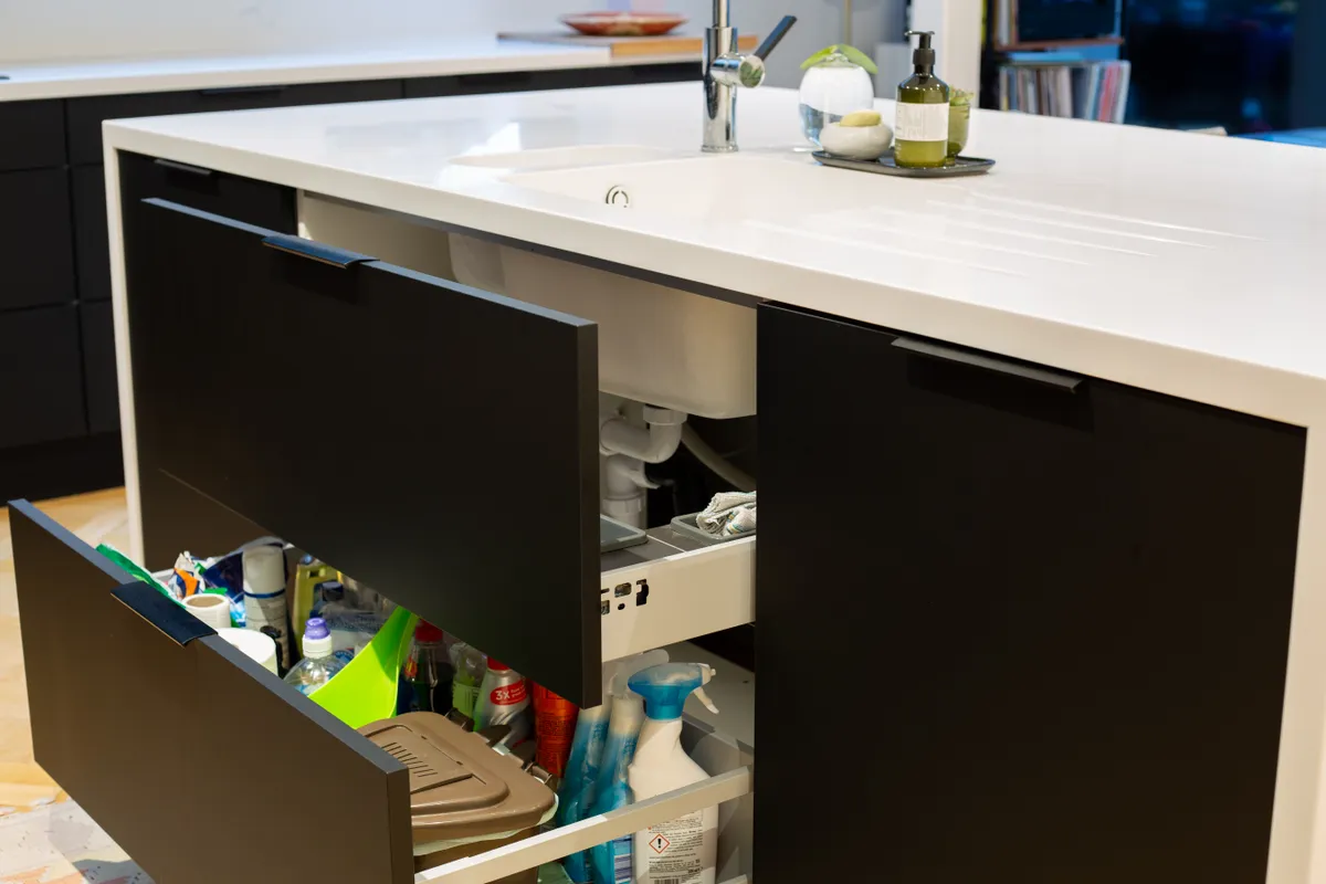
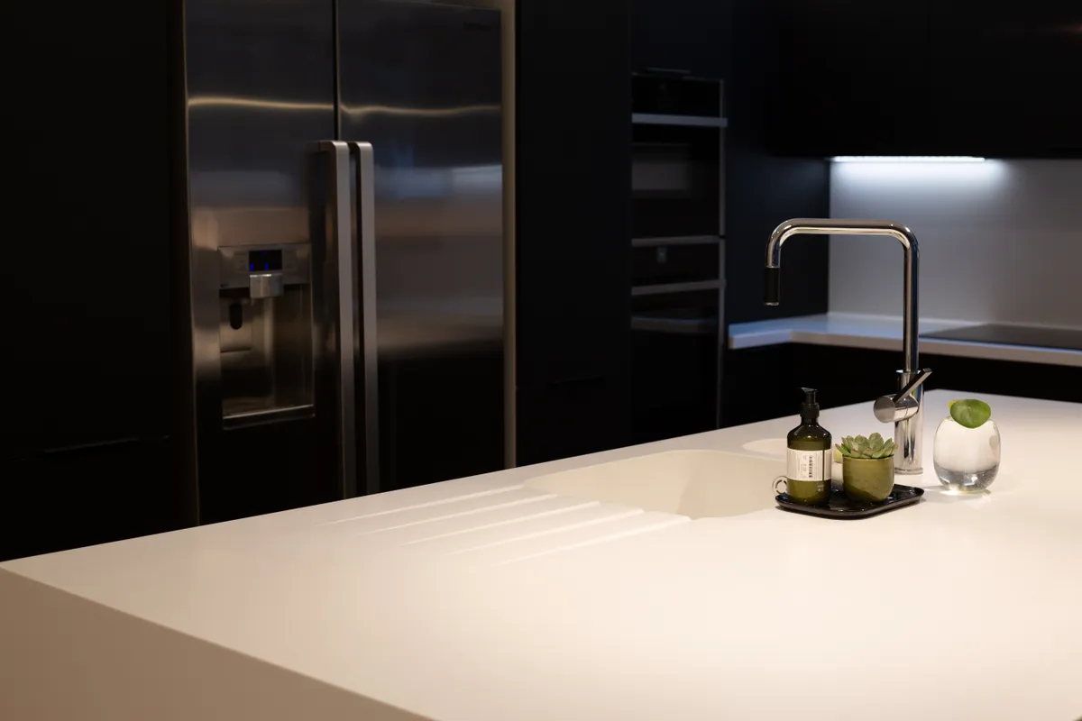
The original white gloss Trend Interiors doors were replaced by Matt Black Fenix doors by Deseo Living. Meanwhile. pure white Corian was used on all the worktops and to create the two drop-down legs on the island and overhang to create a breakfast bar seating area.

‘The Corian wraparound was a bit of a challenge due to replacing the spec of the last material in place with the parquet floor,’ says Mim.
Tom and Mim are keen entertainers, so as well as style, they were looking for maximised space. ‘We love cooking for our family and friends and have been known to have the odd party here too,’ says Mim.
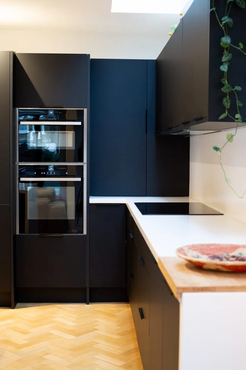
The couple were eager to address a troublesome corner that had been niggling them; a corner space which was extremely tight to get into, as all of the tall units had been made deeper to allow for the fridge.
During the remodel, the oven housing and opposite larder unit were pushed back to allow easier access to the corner, and to add a new inbuilt breakfast corner cupboard to make the most of an awkward space.

Tom and Mim love the more dramatic black and white contrast and available storage space meaning that all the appliances can be kept out of sight for a more minimal look.
What’s your favourite part of the remodel, and why?
‘The black/white contrast and minimal look, but also having more in the kitchen than we previously had in the room.’
Any advice to people thinking of doing something similar?
Gather as much information and as many ideas as possible. Make sure you 3D plan and spec everything, and cost everything exactly as you want it – start at the top and you’ll soon work out which elements you’ll be happy to substitute.
The original Trend Interiors kitchen was around £23k, including the furniture, appliances, quartz worktops and fitting. The replacement doors, worktop and hob came at £17.5k. To create this kitchen from scratch and in one go would have cost around £32k.
