When updating her plain living room, Erika Radford decided on a bold design with lots of colourful accessories, graphic art and a colour-pop teal sofa.
Here, she tells us all about her living room makeover experience...
My story...
Before, our living room didn’t have enough seating for the four of us. One of us used to end up lying on the floor as there was nowhere for all of us to sit.
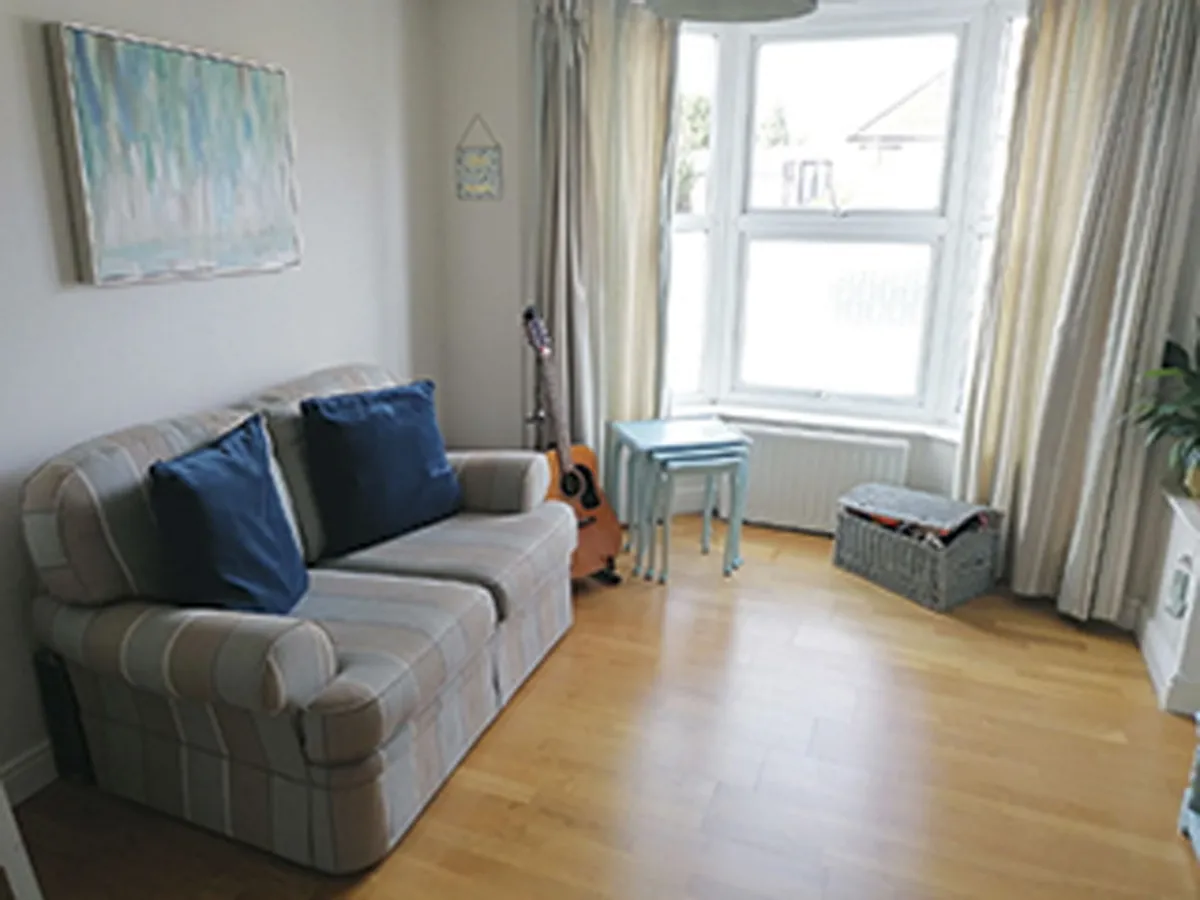
Overall, the décor was bland and lacked personality. The sofa, curtains and walls were all neutral colours, so everything seemed to blend in. With our boys growing up, we needed more storage to keep clutter under control.
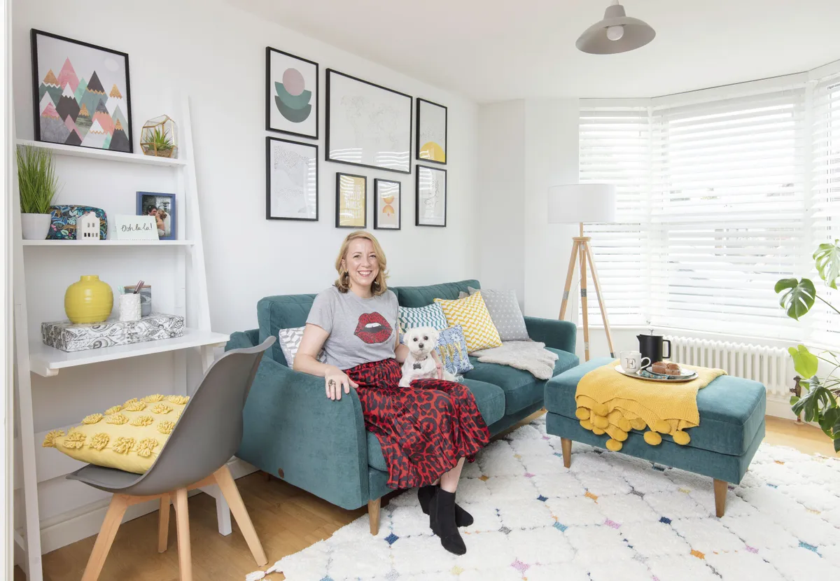
When we chose our new sofa, I decided it was time for a change. I wanted our room to reflect simple Scandi design with natural wooden touches, geometric prints and blocks of colour in teal and yellow.
Welcome to our home...
A bit about me I’m Erika Radford and I work for a UK charity. I live with my husband, Thorin, a civil servant and my two children, Dylan, 10 and Leif, six.
My problem living room While we were renovating the rest of the house, our living room was overlooked. Our second-hand sofa was too small for the whole family to sit on and the cream-coloured walls felt empty and bare. We had mismatched furniture that no longer worked, and the curtains made the room feel dark and gloomy. There was also no space for me to work from home.

I took down the curtains and track, which immediately made the room feel bigger. My carpenter installed white slatted blinds, which look stylish but still give us privacy.

With the curtains gone you could now see our ugly old radiator, so we replaced it with a modern column-style one that looks so much nicer.
A bit more about our living room...
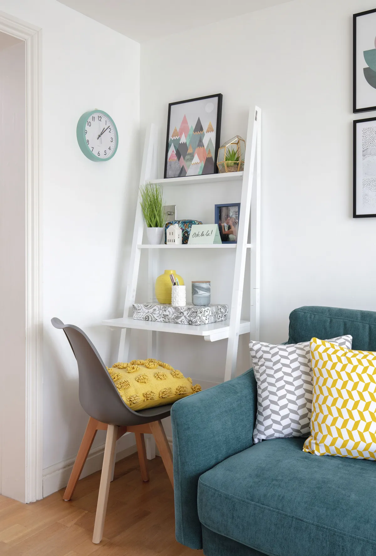
How I made it work I took down the curtains and put up neat blinds instead. I painted over the cream walls with a fresh white to brighten up the room and created a bold feature wall with a MissPrint Scandi-style wallpaper. We treated ourselves to a new sofa from Snug, which the entire family can fit on. Finally, we added lots of clever storage including a desk so I can work and a new sideboard.
My favourite part It has to be my new sofa and footstool. It’s the first time ever that we’ve had a sofa we can actually stretch out on.

I freshened up the drab walls with Shirting by Little Greene, a bright white shade makes the room feel lighter. It took ages to pick the right wallpaper, but I love our final choice from MissPrint as the design is so subtle and matches our sofa exactly.
The end result is a cosy and comfy living room that we love spending time in. It’s a very flexible space, which works for our young family. Friends and family have said how contemporary the room looks, and how my DIY hard work has paid off.
Style advice
Upgrade the essentials
‘If your ugly radiator is on show like mine was, then it’s worth replacing it with a designer one – we went for the Milano Windsor triple column radiator from BestHeating – and turning it into a feature in your room,’ says Erika.
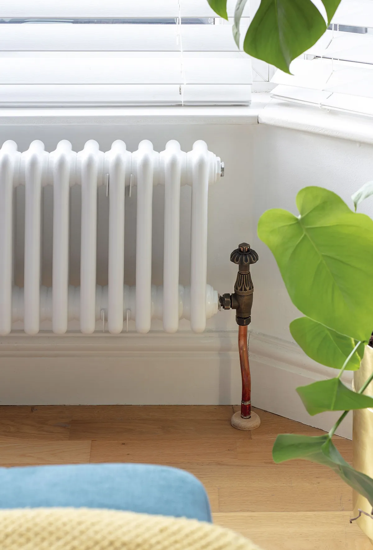
If you don’t want to buy new, you could always update your radiator with a cover or paint to make it blend in with – or stand out from – your walls. Swapping standard radiator knobs for prettier designs is also a quick and easy way to upgrade this home essential.
Pick hardworking furniture
Used as a working from home space and the hub of family life, Erika’s living room space needs to work hard, so she has picked furniture that has more than one use.
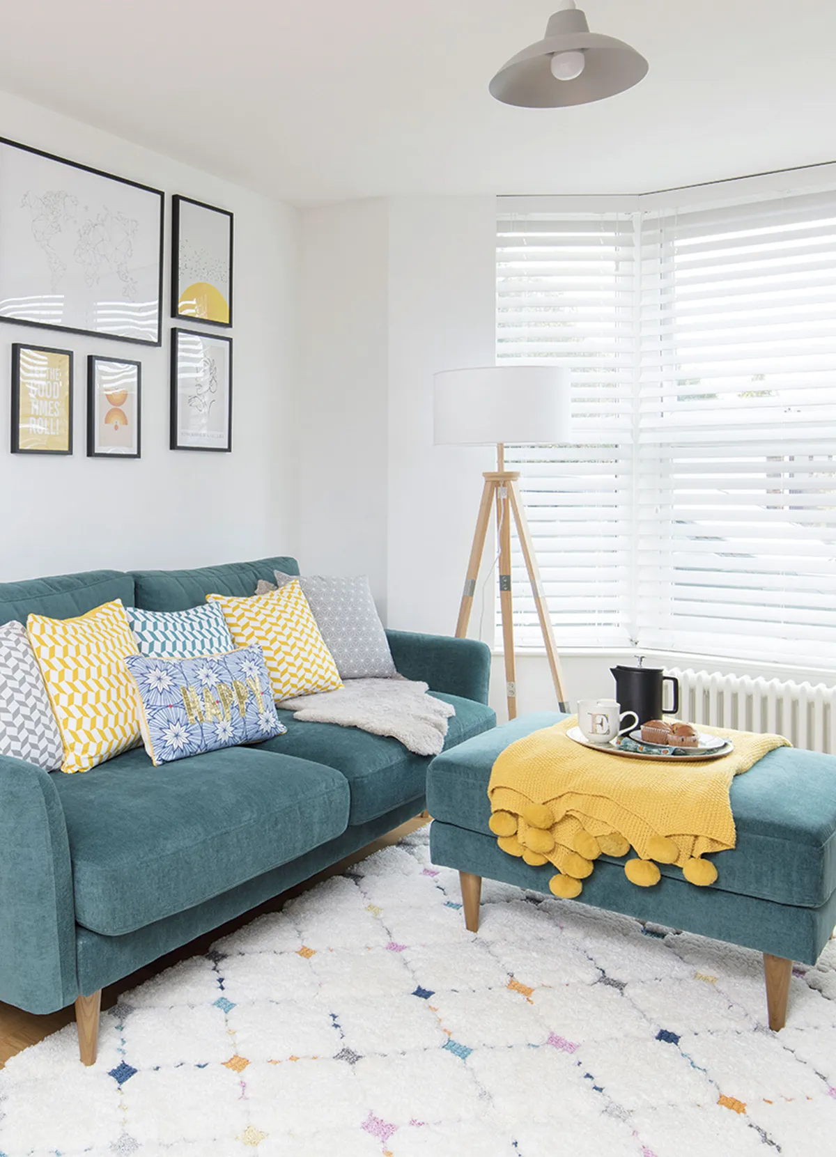
‘The padded footstool from Snug is ideal for busy family rooms as it can act as an extra seat, a coffee table or just a comfy place to put my feet up at the end of the day,’ she says.
Go for pieces like desks with shelf storage, sofas that can be turned into beds and sideboards that can be used as TV stands.
Swap curtains for blinds
Wide open windows are a great way to fill your space with light and can make a room feel much bigger than it is.
Make the most of them by ditching the heavy curtains and going for sleek, subtle blinds instead, like Erika. ‘Swapping the curtains for blinds has made our living room feel bigger and brighter,’ she says.
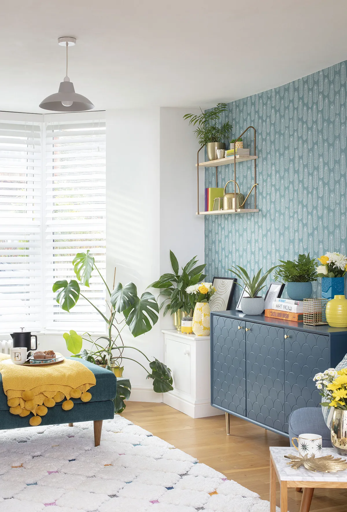
If making your space seem bigger is a priority, stick with lighter colours that complement the rest of the scheme. You could also consider other window treatments, like a self-adhesive film, which provides some privacy without losing too much sunlight.
Feature and styling Maxine Brady. Photos David Giles.
This is a digital version of a feature that originally appeared in Home Style magazine. For more inspirational home ideas, why not subscribe today?
