Buying an Edwardian house with two separate reception rooms just over 18 months ago, Lucy Hooker always knew she was going to open up the two spaces to bring flexibility.
Lucy, an interior designer, her husband David, a marketing director, and their twin sons, Felix and Jack, seven, moved from a large two-bed flat in Battersea into the four-bedroom semi in West Dulwich to get more space and a garden.
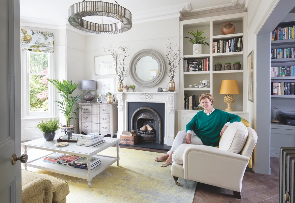
The front room was a good size, but dull, with an impractical cream carpet, while the back room was dark and dingy with an orange pine floor in a bad state. ‘I just knew if we didn’t do something, then the back room would become a dumping ground.’ Lucy used the skills honed through setting up her interiors business, Athelton Eve, to rethink both spaces and come up with a scheme that would tie the two rooms together.
Opening up the wall between the two rooms was the obvious first move, and Lucy and David had a builder in place to start in October. ‘We have made sure that the hole is exactly the size of double doors, if we decide we want to be able to screen the rooms off, particularly when the boys get older,’ said Lucy.
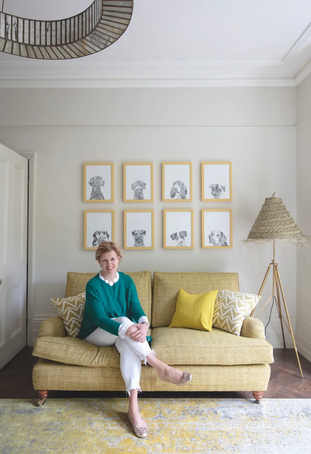
As the couple had brought serviceable sofas, a coffee table, a bow-fronted chest and some lamps with them from their flat, they had to decide where to spend the budget wisely. A solid oak floor was the big must for Lucy. ‘It’s our single most expensive purchase, but it’s so worth it. Parquet flooring has become popular again in the last 10 years, and it looks wonderful. We’ve gone for bigger sections than usual as it’s a large expanse to cover.’
The colour of the walls was next on Lucy’s list, but her first paint choice turned out to be a mistake. ‘We went for a dark grey in the hall, so we thought a lighter blue grey would be nice in both rooms. I painted them myself, the same colour, but it just didn’t work. It made the rooms look dingy.
'One of the things I loved about the living room was how bright it was, so we repainted the front room a very pale grey. It taught me a lesson which I pass onto clients, to retain the things you like about a room.’
The back room had been earmarked as a family snug, with the television being moved out of the living room for good. ‘Because of that, I decided to paint the back room the same dark grey as the hall for a cosier feeling.’
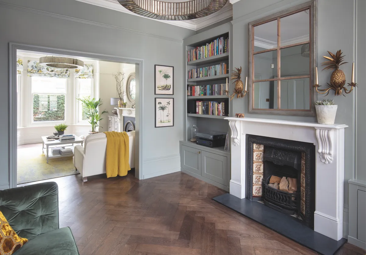
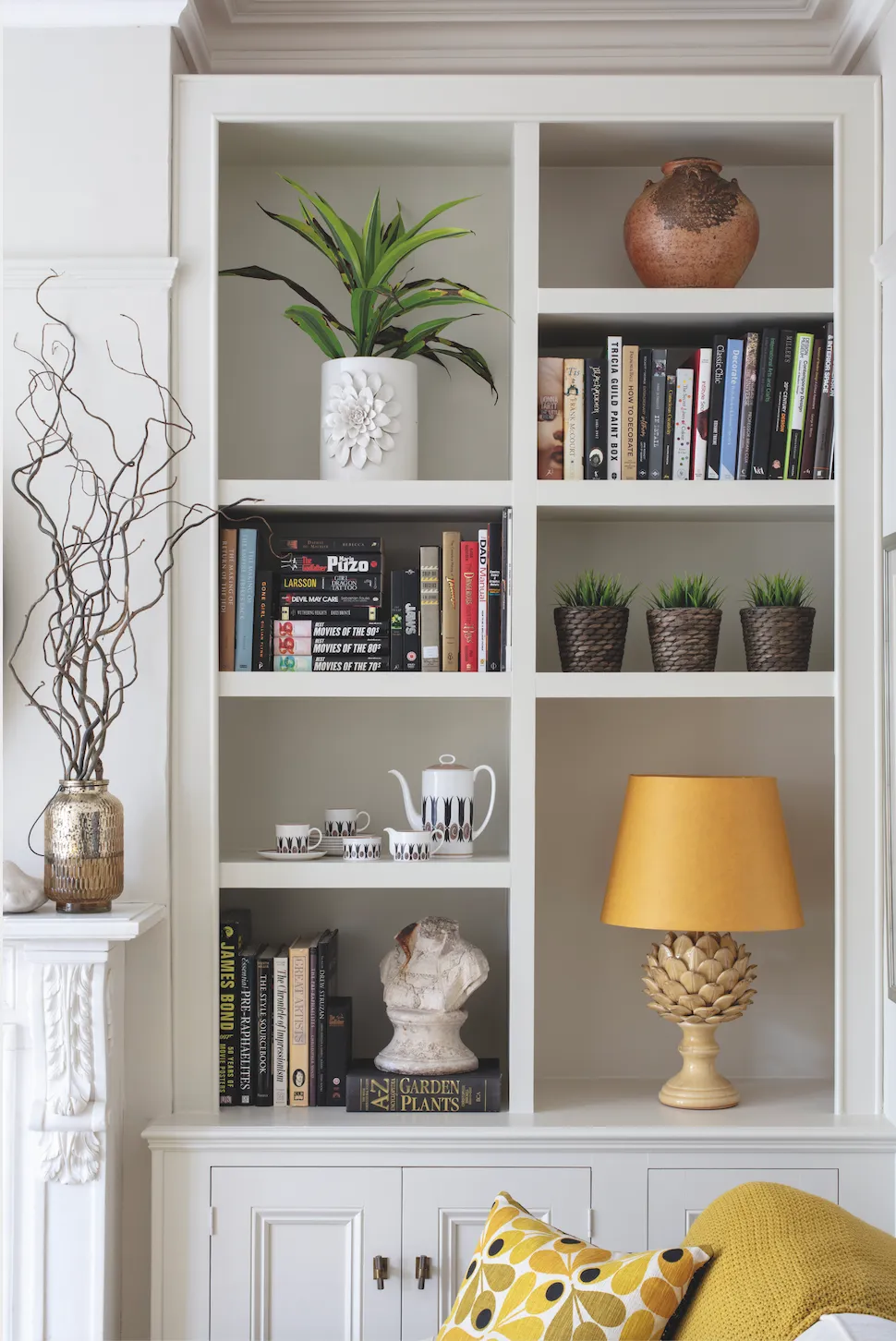
The couple got their carpenter to make new bookshelves in the snug, and the shelves in the living room were reconfigured to provide a wall of different-shaped boxes for display. ‘I really wanted to be able to show off my artichoke lamp with the yellow shade, so it’s got a cubbyhole all of its own.’
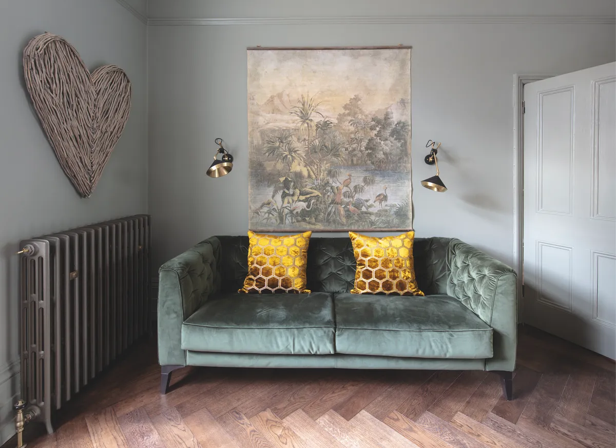
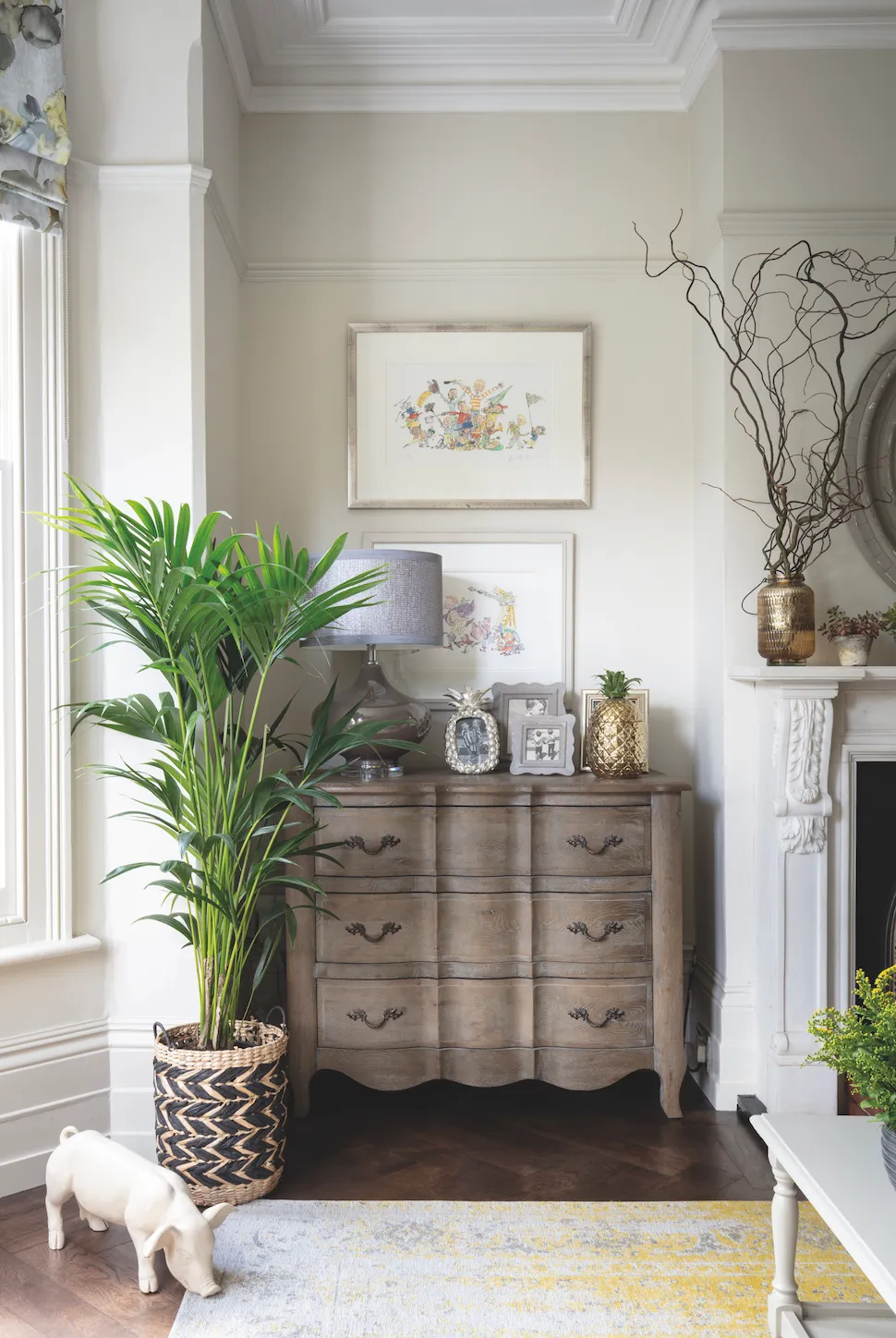
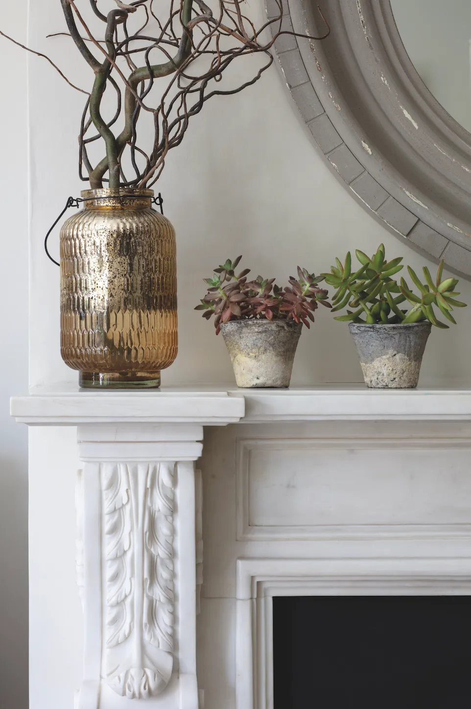
With the walls, lights and shelves in place, Lucy started accessorising the rooms in her chosen palette of yellow, green and grey. ‘I’d got the fabric for the blinds before I bought anything else, as I loved the combination of tones.’ Lucy painted the existing coffee table in a pale grey and brought in texture with different types of fabric in cushions and throws, as well as some metallic hints with vases and photo frames.
The last piece of the jigsaw was the rug. ‘I was thrilled to find a large rug with yellow and grey as the dominant colours. Now we’re using both rooms all the time.’
She’s documenting the house’s journey on Instagram @a_dulwich_diary.
This is a digital version of a feature that originally appeared in Your Home magazine. For more inspirational home ideas, why not subscribe today?
