Rebecca Shepherd, 36, an auditor, lives with her husband Chris, 36, and their two children, Chloe, six, and Alex, four, in her dream house in St Albans. But when she found it, she knew it needed a lot of TLC.
After moving in, she and Chris started to plan an extension to make it more spacious. ‘We loved the house so much and although it needed a complete overhaul, we could see the potential. It hadn’t been decorated for decades and only had two owners, so it was well loved,’ she says.
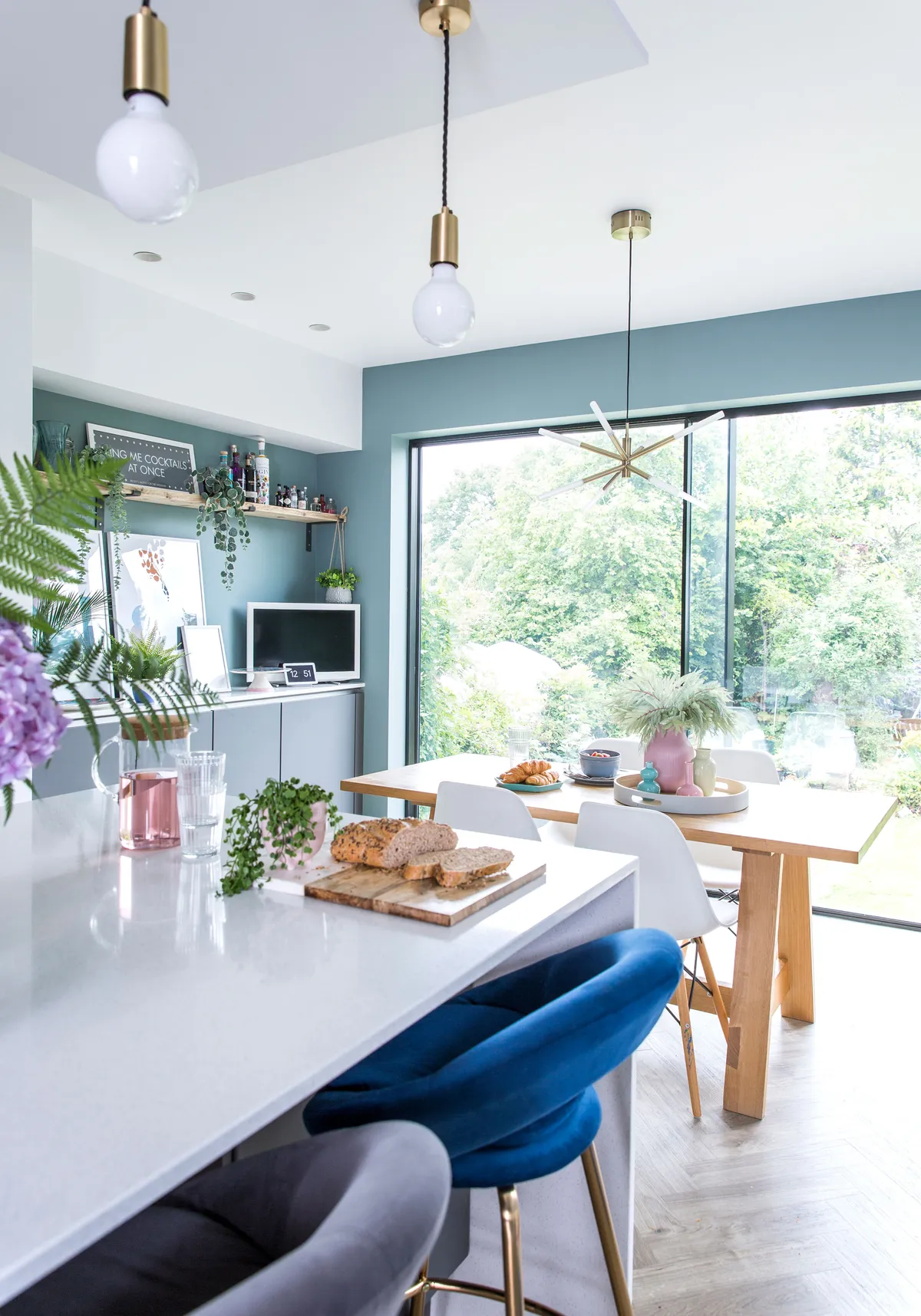
Every room was in dire need of redecoration, but none more so than the kitchen, which was so tiny that only one person could cook in it at a time. ‘The storage space was useless too, because the cupboards weren’t even deep enough to fit a dinner plate.’
Rebecca got busy with builders, architects and plans, and as soon as she had an idea of the size of the new room, she booked in an appointment at a local kitchen showroom. ‘We’d been looking through magazines and collecting ideas on Pinterest for a while so knew we wanted a clean, contemporary feel. We were just excited to get going to create our perfect family home.’
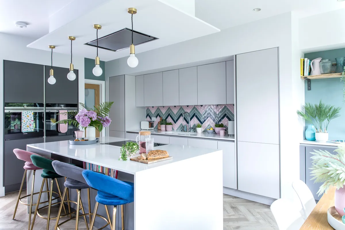
After doing a bit of research, Rebecca and Chris both realised that they wanted a handleless kitchen framed within a wall to keep it streamlined.
‘I don’t like it when wall-mounted cupboards look as if they’ve been just stuck on a wall. I want it to look like part of the room, an integral part of the space.’
After a few showroom visits Rebecca and Chris settled on a smart-looking kitchen with two-tone doors, some pale grey and some dark grey. ‘We were also thinking practically too.’
An easy-to-clean kitchen was a must with two small children, so Rebecca chose a simple design that wouldn’t take long to wipe down. Rebecca was thrilled to not only have space for plenty of storage cupboards, but also a large central island with bar stools. ‘It’s such a sociable layout and I love the idea that we can all be here cooking and eating together.’
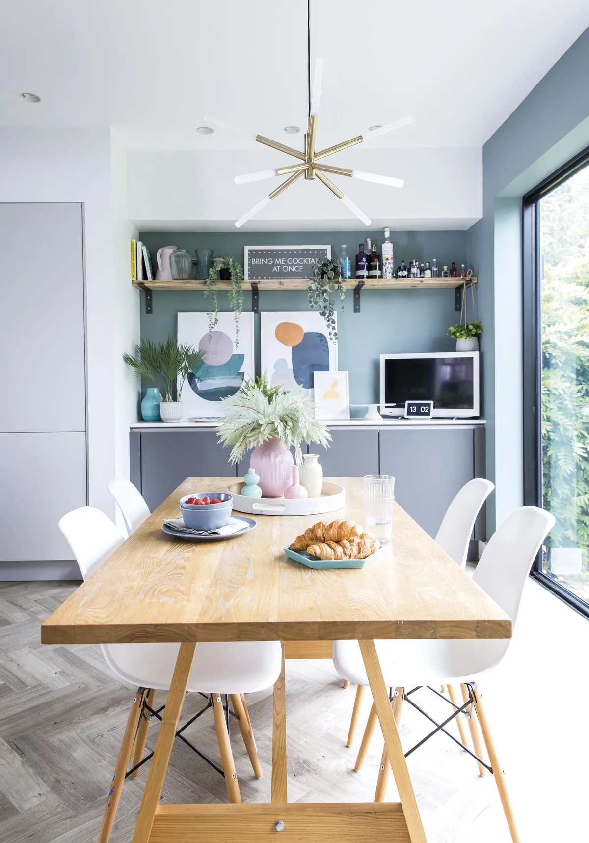
After picking the kitchen door colours and a practical layout to suit the new room, Rebecca started thinking about the flooring. She had always wanted wooden, herringbone-pattern flooring and knew it would look great in the kitchen space.
‘We love the warm tones of wood and thought it would prevent the room from looking too clinical.’ Rebecca found a well-priced herringbone floor in a light oak shade to float throughout the downstairs kitchen area.
Inspired by the flooring, Rebecca then started to think about the splashback too. She wanted to add some colour, but wasn’t sure how.
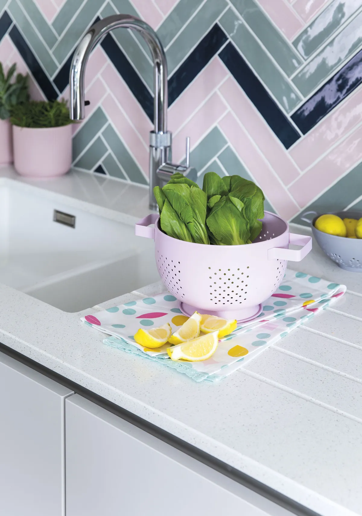
She started thinking about how to create an eye-catching splashback that wouldn’t be too overbearing. ‘I really love colour and started researching herringbone splashbacks in various colourways. I called in some kitchen tile samples and picked my three favourite shades and created a pattern.’
There was a slight hiccup though. The tiler was halfway through and Rebecca spotted that something wasn’t quite right. After looking closer, the tiler realised the angles were wrong and had to start all over again.
‘It was quite stressful, but the tiler was very apologetic.’ The walls were given a coat of fresh white paint combined with some teal to brighten up the space further.
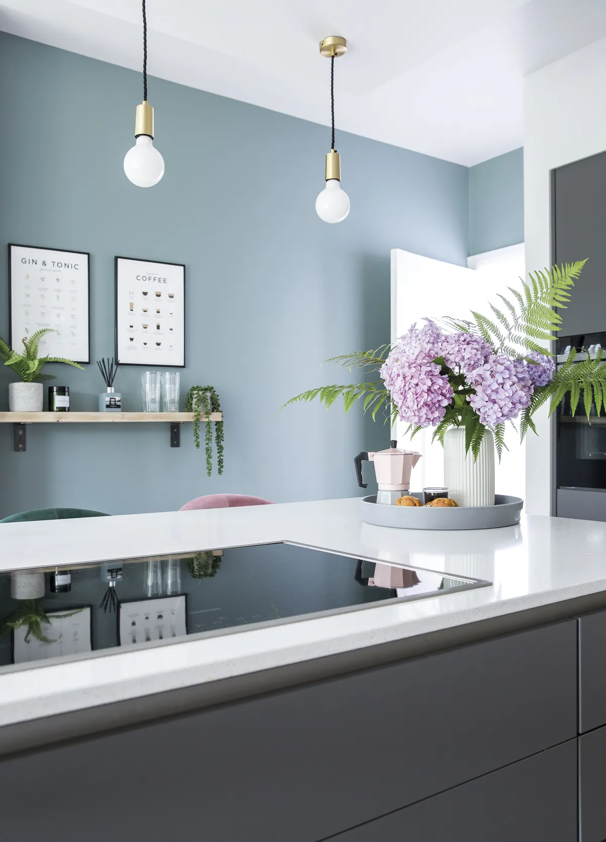
To finish the scheme, four ceiling pendant lights were positioned above the bar to keep the room feeling bright.
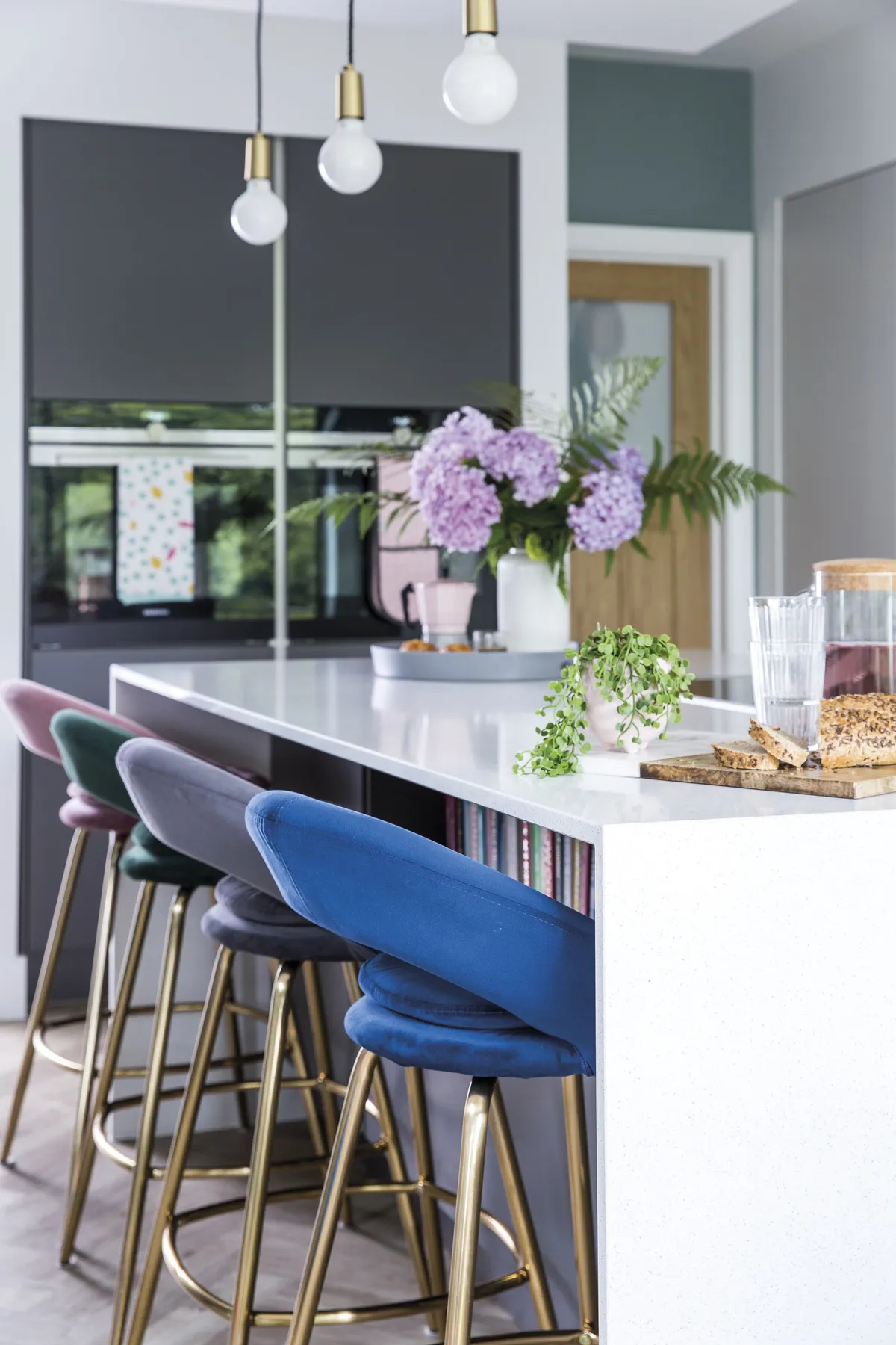
Rebecca chose multicoloured stools for the bar area with brass detailing to match the lights.
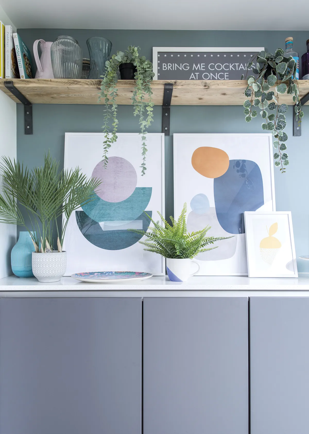
‘The room is unrecognisable from the old kitchen. For anyone afraid of having an extension, I’d say definitely go for it. It’s completely transformed our house and now there’s room for all of us. It’s been a blessing during lockdown,’ says Rebecca.
The couple were careful to stick to a strict budget during the build, but, after falling in love with the kitchen in the showroom, they decided to stretch a little further to create the space of their dreams.
‘We knew that costs could easily spiral, so we wanted to keep a close eye on our budget. Because we were able to save on other areas in the house it meant we could invest a little bit more on the kitchen and we’re so glad we did. It’s the best room in the house and it’s completely enhanced our family life.’
Shop the look
Nobilia kitchen in Touch Slate grey and Touch Satin Grey, £9,900, Audus Kitchens. Arctic solid worktop, £1800, Worktop Express. Siemens built-in electric oven, £530; Siemens induction hob, £659, both Appliances Direct. Vellamo undermount sink, £189.99; stainless steel mixer tap, £79.99, Tap Warehouse. Signature Light oak herringbone laminate flooring, £17.99 per sq m, Discount Flooring Depot. Splashback tiles: Giardinetto tiles in Pond, Shrub and Petal, 86p each, Claybrook Tiles. Sleek Edison brass pendants, £29, Industville. Stella bar stools, £69; Beau & Elliot blush oven glove, £15, both Dunelm. Proppmätt chopping board, £2.75; Vardagen glasses, £4 for six; IKEA 365+ carafe, £2.50; IKEA 365+ jug with cork lid, £6; Dinera bowls, £1.50 each; Dinera mug, £1.75; Dinera plate, £2; Ljuv tray, £5; Gradvis pink vase, £8; Gradvis turquoise vase, £7; Återtåg set of three vases, £7; Stilren white vase, £8; Fejka artificial hanging eucalyptus plant, £7; Fejka artificial string of pearls, £9; Fejka artificial fern, £7; Gradvis pink plant pot, £4; Himalayamix plants, £4.50 each; Uddig tea towels, £2.50 for two, all IKEA. Typhoon Café Concept espresso maker, £21.27; Typhoon café concept tray, £20.27; Typhoon Café Concept espresso cup, £12, all Amazon. Half Moon poster, £12.95; white picture frames, £26.95 each; Colour Shapes No1 poster, £16.77; Yellow dotted citrus poster, £8.95; white picture frame, £14.95, all Desenio. Nordic style kettle, £49.99; Nordic style 2-slice toaster, £39.99, Swan. Wanda LED chandelier, £169, Made.com. Walls painted in Albany Adam Durable matt emulsion and Cornish Cloud durable matt emulsion, £37.82 per 2.5l each, both Brewers Home. Pink colander, £6.99; grey colander, £4.99; mugs, £3.99; White round tray, £12.99, all Homesense.
