When Beckie first moved into her house, the idea was to extend both the front and back, joining the dining and utility rooms together and extending out into the garden.
Having priced up the full project, however, she decided that she would wait and do something medium-term instead, while still designing with the future in mind.
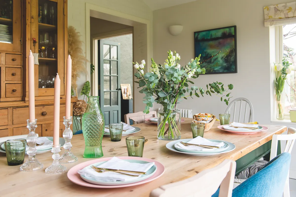
To immediately increase the sense of space in the kitchen, she knocked down the two small walls between the kitchen and dining area to create one room, in which she added a peninsular and a couple of stools.
Here, she recalls her renovation experience...
A bit about me
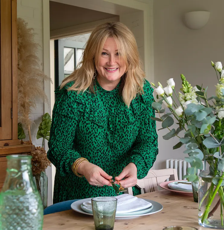
I’m Beckie Batchelor, a designer and upholsterer who also makes bespoke blinds. I live with my husband, Pete, and twin daughters, Mae and Evie, both 13. We also have a cockapoo, Margot.
My renovation experience...
Storage-wise, we took out the existing cabinetry and put in a run of L-shaped cupboards as well as floor-to-ceiling cupboards from IKEA on one side.
We used these in conjunction with whitewashed birch-faced plywood, which acts to strengthen the cabinetry and also gives them more of an individual look.
The new flooring is wide engineered oak wood, which was treated with a white oil. We used spot lighting where the doors open to the tall cupboards and simple white bulbs over the working areas.
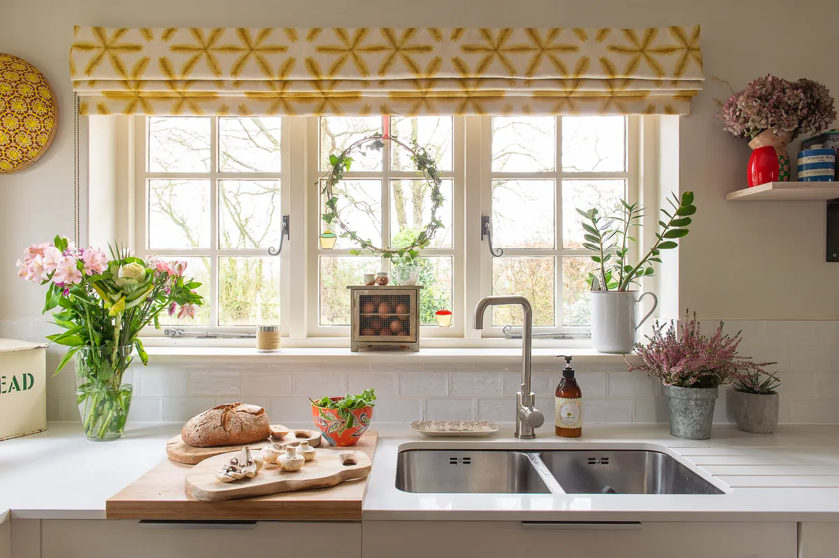
The worktops are a slim white quartz stone, which is totally bombproof and also reflects lots of light back into the room. We’re absolutely thrilled with the result.
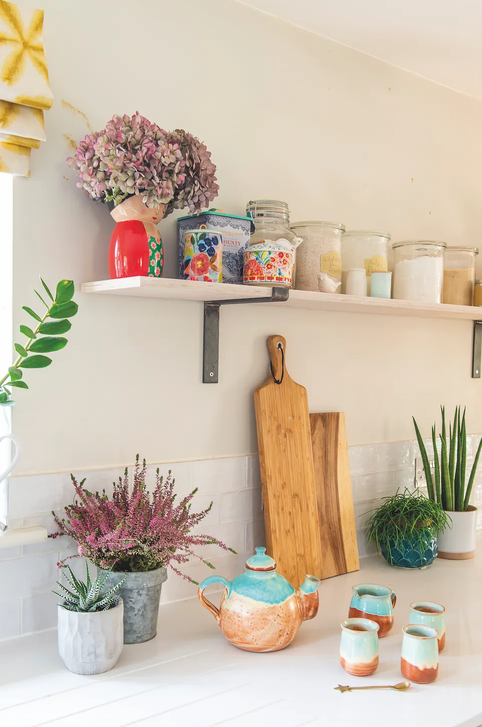
We feel we have created a really hardworking and efficient space that’s light, welcoming and calming. The best bit is that we also have the plumbing in place for future plans, with a peninsular that can be easily removed when the time comes for a bigger extension.
My style advice...
Three simple tricks to try in your own home
Go for hardworking cupboards

What’s particularly great about the IKEA carcass is that they give you so much more room inside than standard cupboards. These cupboards add invaluable space to the kitchen and are 40cm deep, which is the perfect depth for crockery, glasses and tableware – as well as offering handy larder ‘overflow’ space.
Treat floors with care
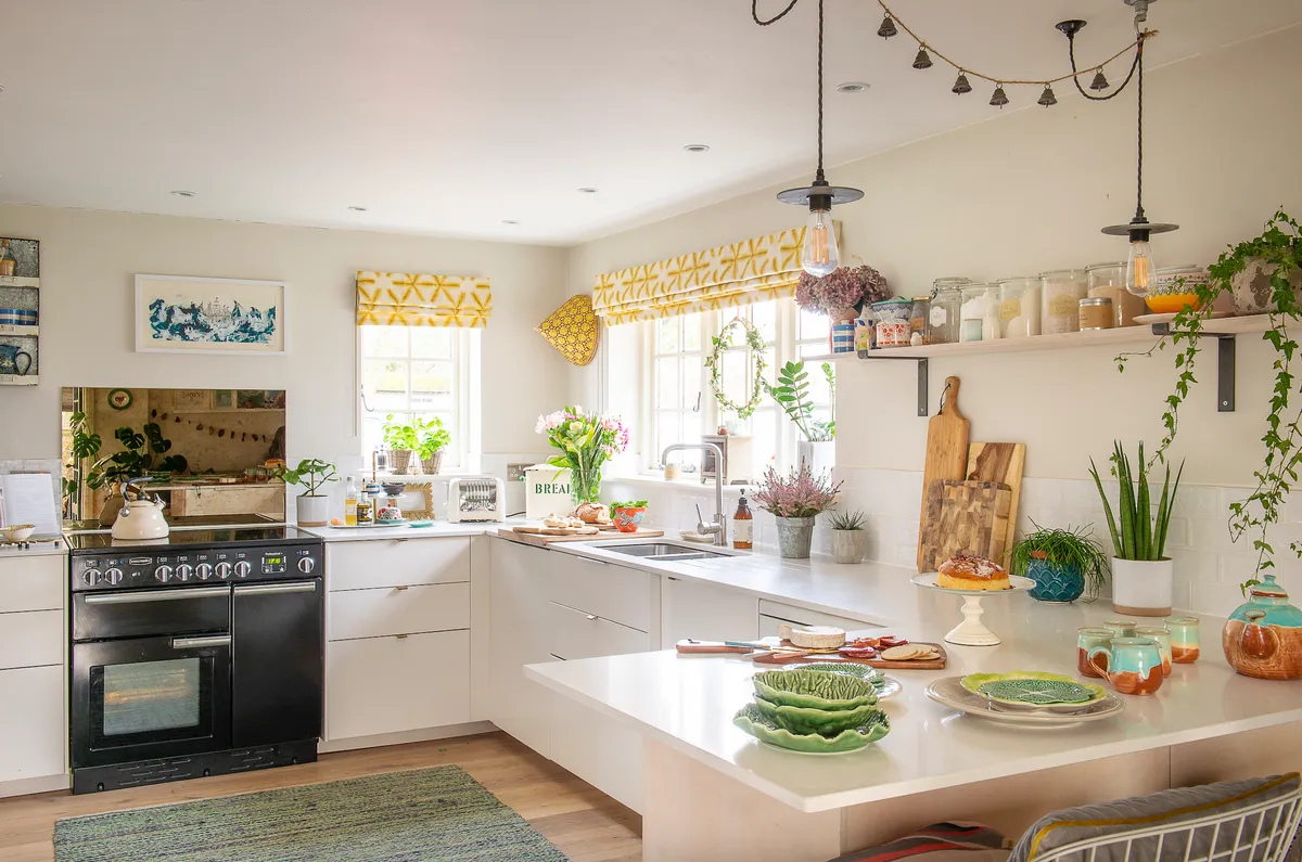
Our engineered oak boards are oiled rather than varnished, which is much easier to maintain. If an area needs to be treated, you just need to sand back and oil the affected area rather than redoing the whole floor. The oil also gives a more natural appearance.
Tailor furniture to suit the space
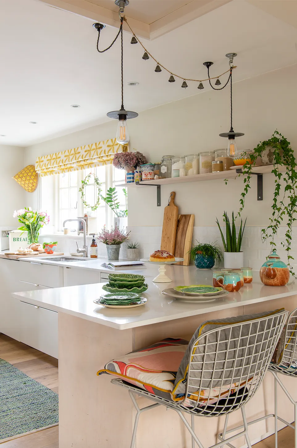
The chair stools were purchased for a song from an antique shed nearby. Originally, they were shiny silver, but I found a place locally that would powder coat them, so I had them changed to this lovely light grey, which gives more of a designer feel.
This is a digital version of a feature that originally appeared in HomeStyle magazine. For more inspirational home ideas, why not subscribe today?

