When Sally Hubbard, 45, and her partner Steven, 44, bought this 1930s four-bedroom house in Portslade, East Sussex, the first task on their DIY hit list was to reconfigure the layout of their new home to create a large, open-plan kitchen that they could entertain in.
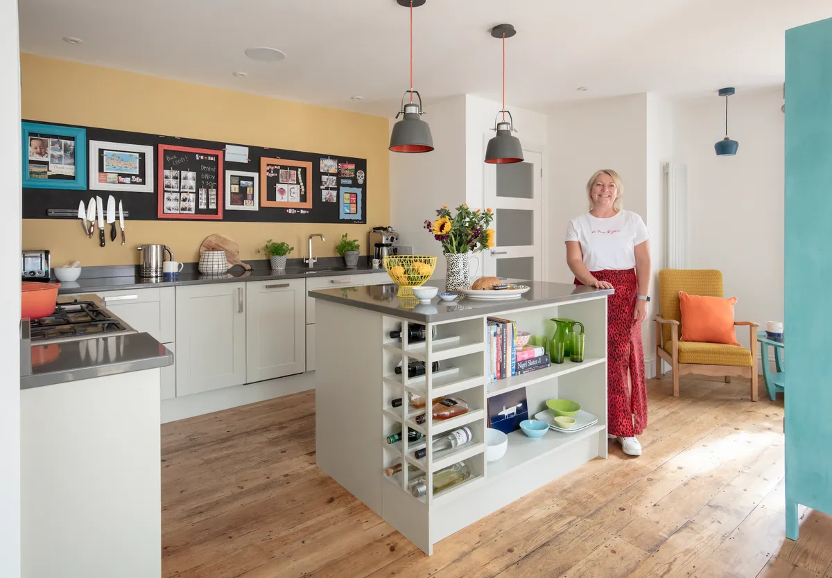
Minimal work had been done to the house by the previous owners, and the kitchen units dated back to the 1980s. The space they had inherited was narrow, with country-style cupboards and red tiles on the walls. The space was an impractical size for this couple, who love to entertain and cook for friends and family. With her years of experience as a letting agent, Sally knew she wanted a kitchen that was fresh, modern, timeless and, most importantly, durable.
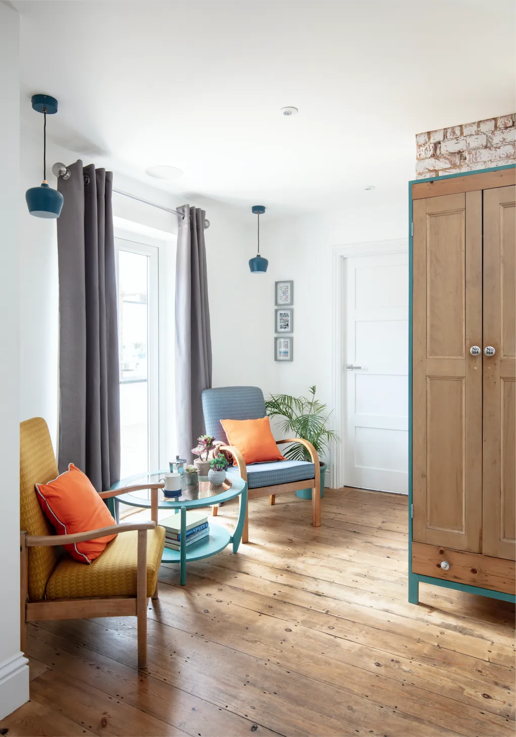
‘I’ve seen a lot of shiny white kitchens which can be hard to keep clean and free of fingerprints and marks,’ says Sally. ‘For my own home, I wanted matt units for a contemporary, sleek look.’ Also on her wish list was a large central island, a pantry and an area to relax in, as well as lots of room to cook and entertain. ‘I wanted our new kitchen to look homely, with pictures on the walls and space to hang out in.’
Before
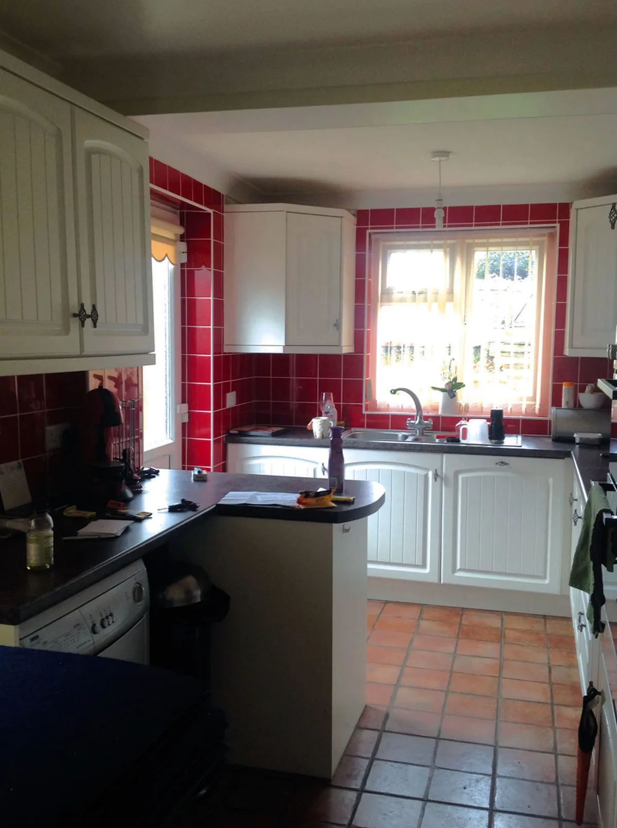
STEP 1
The couple took a hammer to the old kitchen so they could start again. They also knocked down the internal wall between the kitchen and dining room and built a wall between the open-plan living space and the dining room. The end result? A large space that ran the whole width of the back of the house.
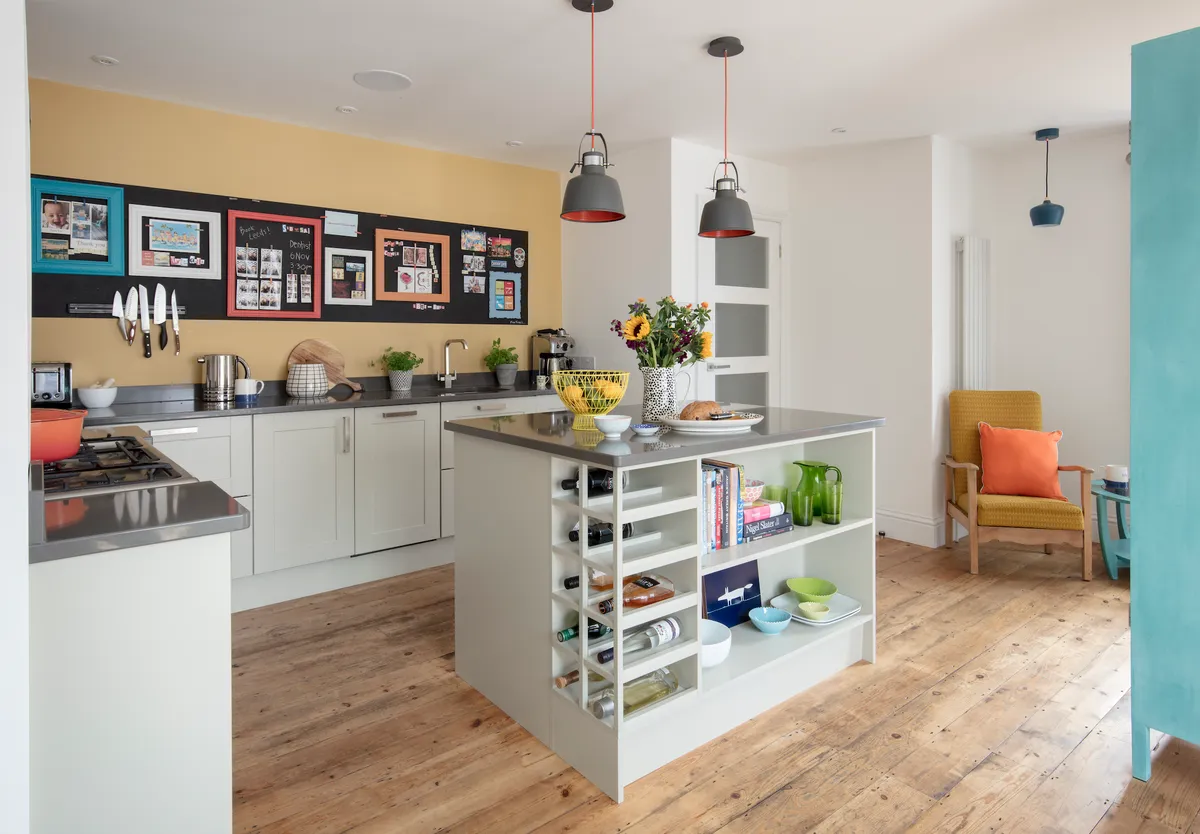
By keeping all the load-bearing walls, they avoided the tricky path of going through planning. ‘By changing the layout of the internal walls, we were able to open up the back of the house to make room for our new kitchen,’ explains Sally. ‘My boyfriend Steven is very handy, so we knew that with him doing most of the work we could afford to install our dream kitchen.’
STEP 2
Sadly, all of the original 1930s features of the house have been erased over the years, and that includes the fireplace in the former dining room. The couple decided to maximise and make a feature of this space by installing a range oven into the chimney breast.
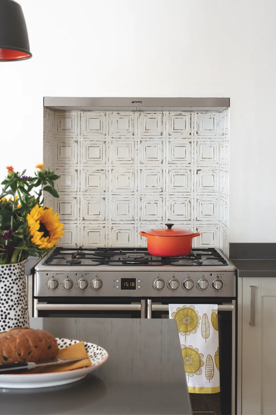
All of the original 1930s oak floorboards were carefully lifted up for the plumbing to go in. ‘As we were effectively moving the kitchen to the other side of the house, we had to run all the pipework across for drainage,’ says Sally. Steven’s dad is an electrician and he helped them install all the lights and the Sonos sound system in the ceiling. Once all of the big building work was done, the floorboards were put back down, carefully restored and insulated to keep the house feeling super cosy all year long.
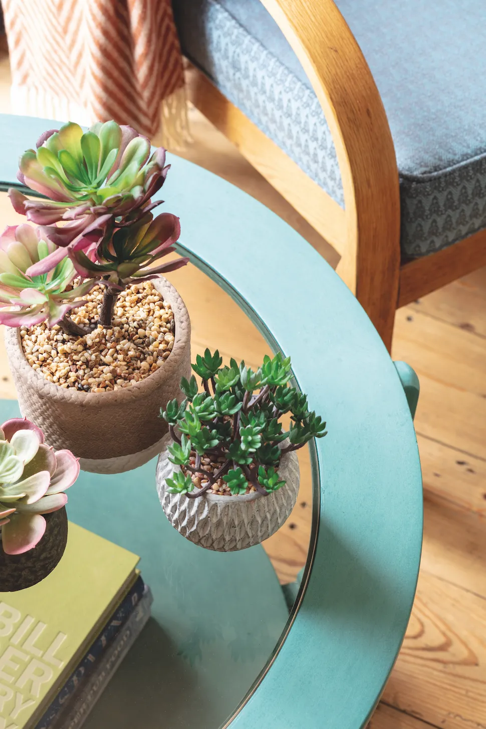
Steal Sally's look
STEP THREE
To create a sense of flow and continuity from the kitchen through into the garden, French doors were installed at the back of the house and double doors were added which open out onto the side return. It makes the most of the abundant natural light. ‘The room is south-west facing so it is sunny all year long. It was really important that the garden felt connected to the rest of the house,’ explains Sally.
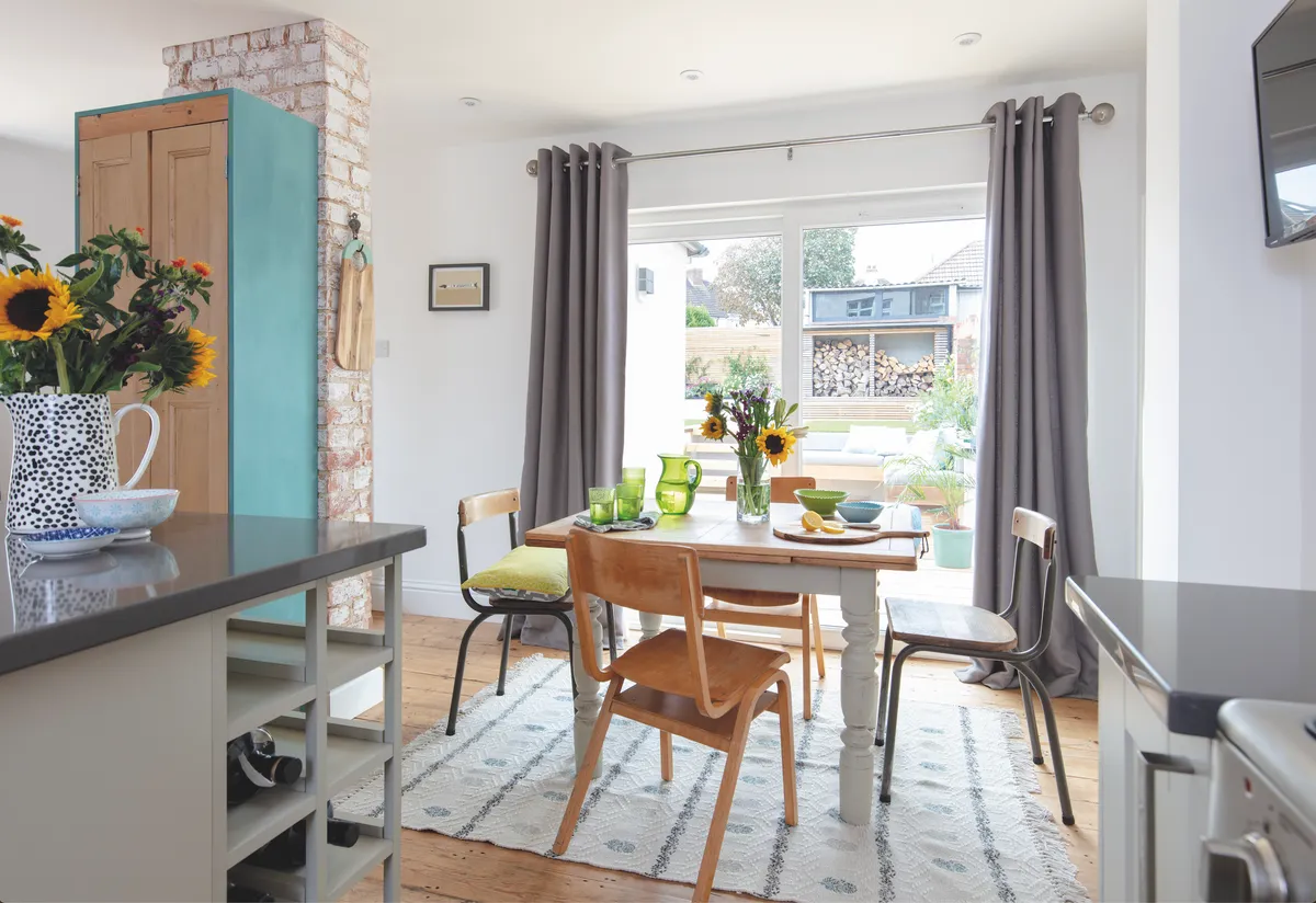
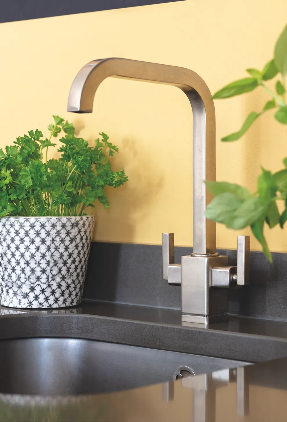
The couple saved hundreds of pounds by installing their Howdens’ kitchen themselves. ‘We used their basic design but made our tweaks to give our space a bespoke look.’ Sally shopped around for the quartz worktop to find a piece that was long enough for the run of the entire length of her kitchen. ‘Our biggest expense was the worktops because I knew that they would elevate the design of the kitchen. They make the room look more expensive than it is.’
STEP FOUR
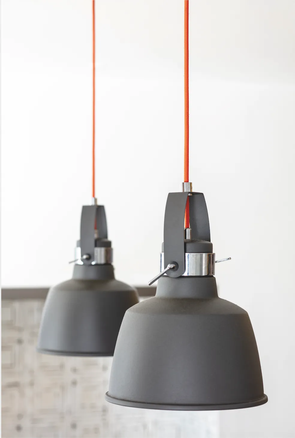
The room was decorated in clashing shades, with yellow walls and a variety of colourful accessories. ‘My home has accents of mustard and teal throughout, and I wanted to continue that into the kitchen. We didn’t want anything to match too much, so I’ve added splashes of red and orange with cushions, light fittings and artwork for a bold look,’ says Sally.
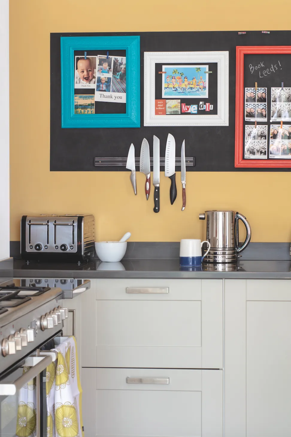
She furnished the rest of the space with vintage finds, including the old wooden school chairs and a painted wooden dining table. One of Sally’s favourite decorative touches in the room is the magnetic blackboard that runs across the back wall. ‘We collect magnets from our travels, and we don’t have a traditional fridge to stick them on, so this was a great alternative. It’s forever changing, which makes our kitchen feel different every time you step in there,’ she says.
And what does she think of the space now? ‘It is definitely the most used room in the house,’ she says. ‘We fling open the French doors in the summer which is ideal when our families come over for Sunday lunch. This room has changed how we live. It’s the perfect space to socialise, cook and hang out in,’ she says. ‘It makes entertaining easy as I can chat while cooking at the island and parties can easily overflow into the garden.’
This is a digital version of a feature that originally appeared in Your Home magazine. For more inspirational home ideas, why not subscribe today?

