When the Philpotts bought their house in April 2007, they had two children. But, after the arrival of two more and a dog, it became increasingly cramped. ‘The downstairs space just wasn’t working,’ says Bev.
‘The tiny galley kitchen lead to a conservatory that should have been our dining area, but it was too cold in winter and too hot in summer. The dining table ended up in our living area and we were all squashed into one space.’
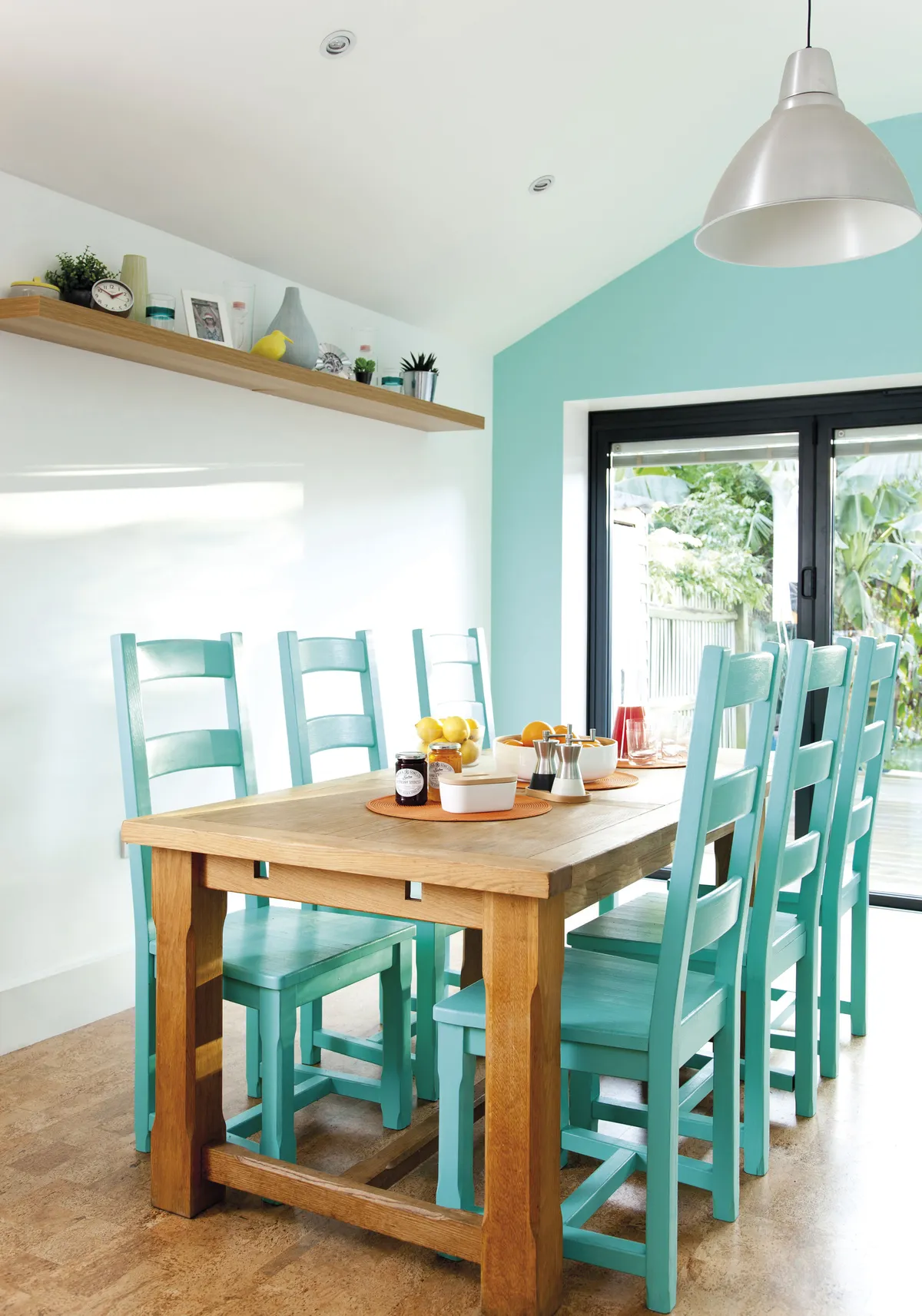
The house is perfectly located for the girls’ schools, so the couple concluded that the best plan was to extend both upstairs and downstairs to create more space, including transforming the kitchen-diner into a family hub.
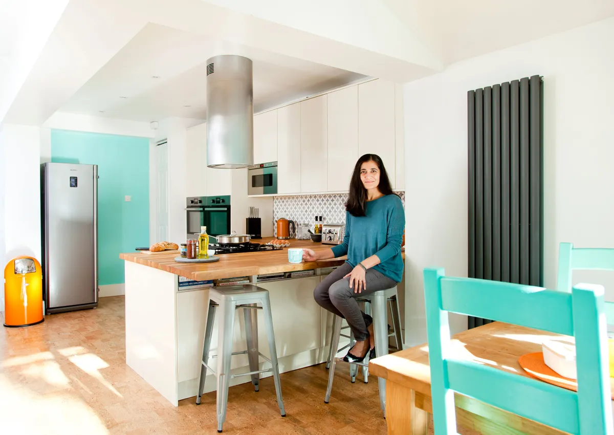
Our goal was to create an easy-to-clean, minimalist kitchen-diner with maximum storage that we could change with colour and accessories over time,’ says Bev.
‘To do this, we decided to knock down the conservatory and extend the kitchen over its footprint and out to the side of the house. It was a huge project that spanned virtually a whole summer. The extension started in April 2013, but we had to extend about half a metre more than expected, which meant a delay of around eight weeks as planning permission was needed.’
Because of the huge expense of the building work, furnishing the kitchen had to be done on a tight budget. The new room was 9 x 4m, so it was a big space to fill. ‘We reused our fridge, freezer and washing machine, bought a couple of CDA appliances and then everything else we needed came from IKEA,’ says Bev.
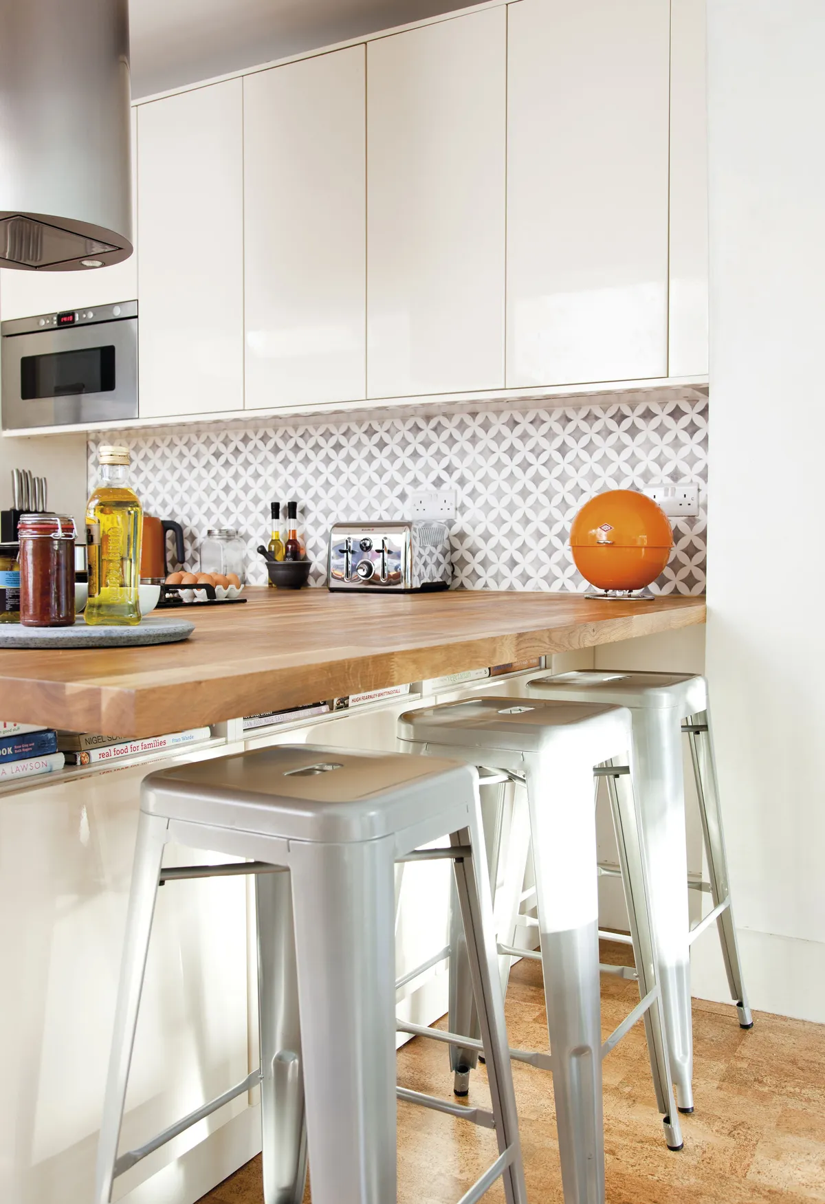
‘Shopping there meant we could have lots of units and budget to spare for a decent floor and worktops,’ she explains.
‘We designed it so that the sink run houses all the appliances that need water, such as the washing machine and dishwasher plus the fridge freezer, and then the island provides drawers for utensils and saucepans on one side and cupboards on the other. The wall and base units on the right-hand side provide further storage and oven housing.’
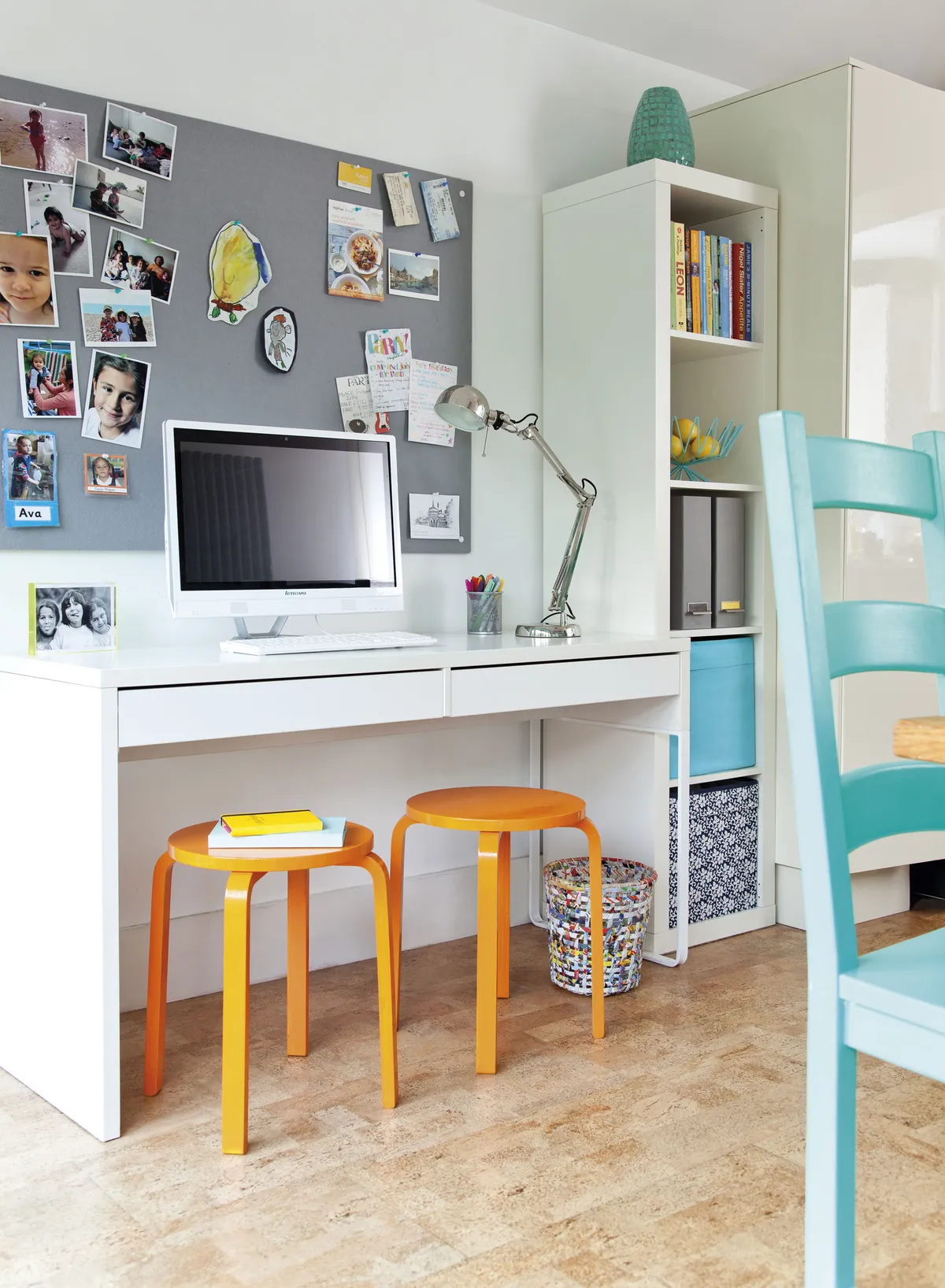
Choosing the floor for such a big space was another challenge. With it being a high-traffic, family-orientated area, a durable, easy-to-clean floor was key. ‘We didn’t want anything that would show the dirt or need maintaining,’ explains Bev.
‘Luckily, when we were looking online, we came across cork and loved the look, plus it ticked all our practicality and budget boxes. The cork is mounted on wood and comes as click-together planks so it’s really easy to lay.’
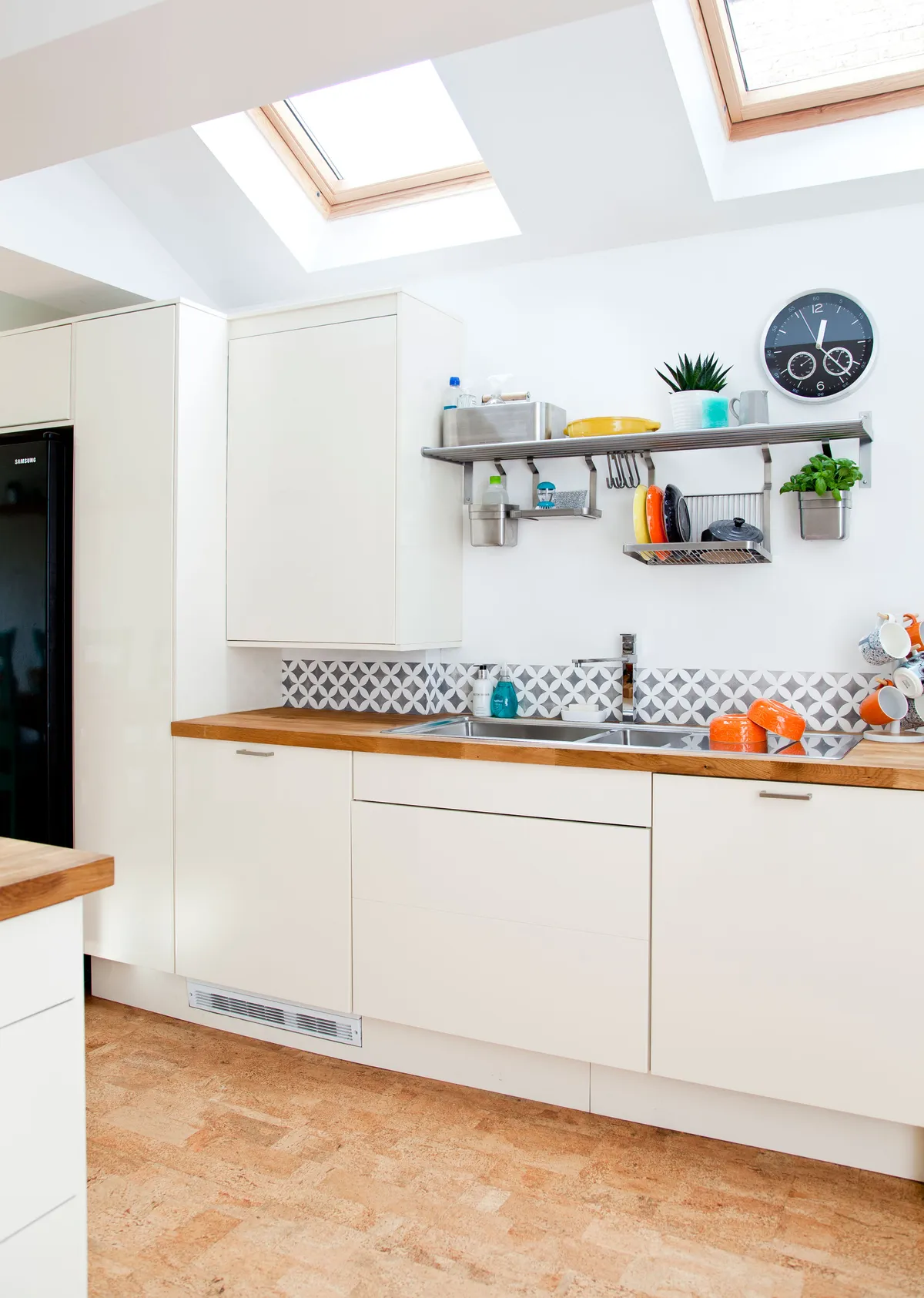
Initially, the walls were painted white and, with very little budget left, the Philpotts took their time deciding how to add personality to the space. The end wall was the perfect place to start.
‘The minty green works well with the orange tone of the floor. It brightens the room and gives it a Mediterranean, holiday feel,’ says Bev.
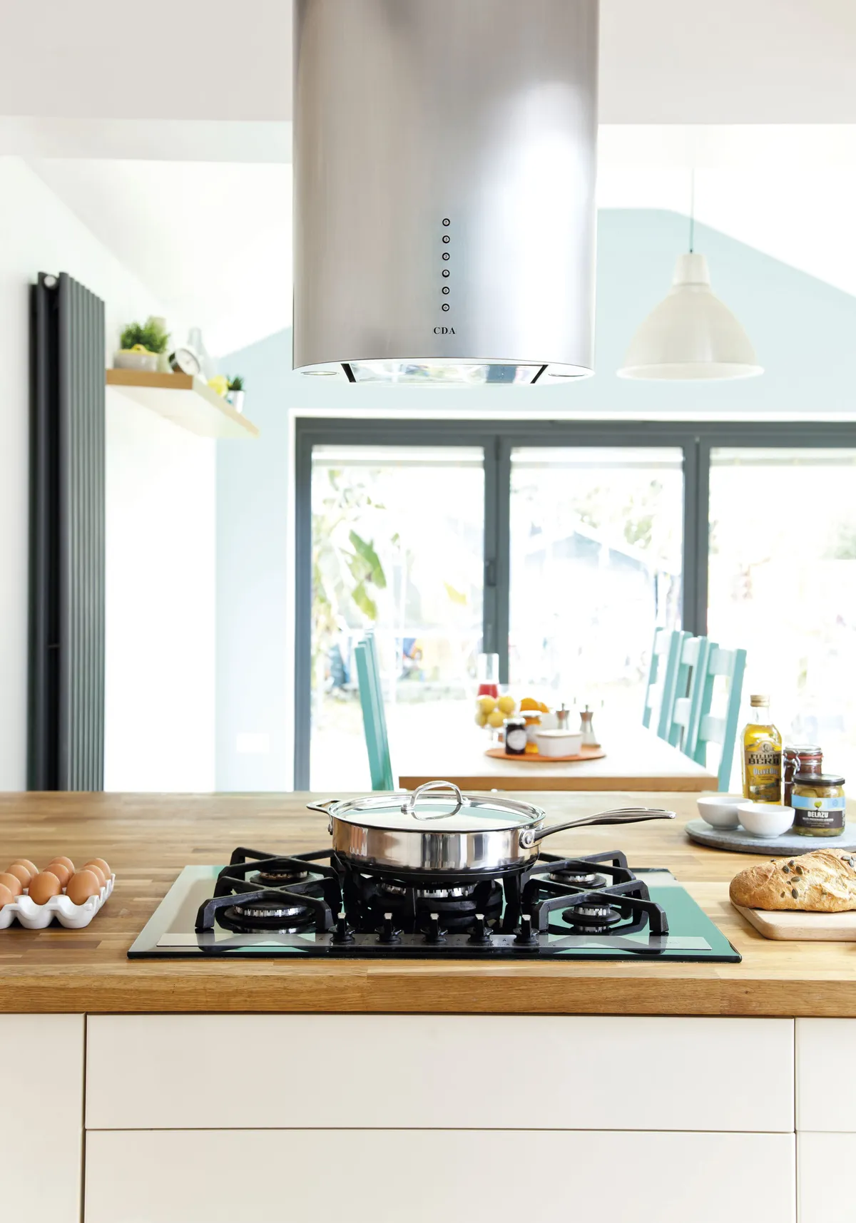
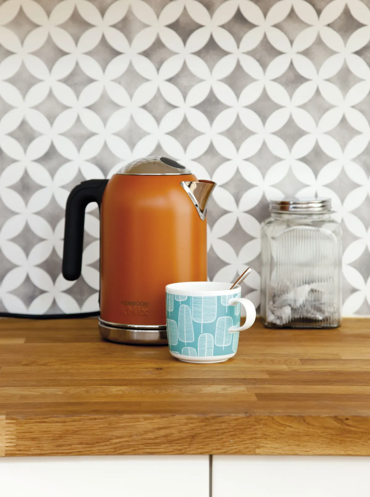
With no funds left for splashbacks, the walls looked bare, so a friend suggested stencilling to add some pattern. ‘The best stencils I found online were from an American company so I ordered one and couldn’t believe how much I enjoyed stencilling – and how much it has transformed the room,’ says Bev.
Thanks to their new kitchen, the Philpott family’s everyday life has changed completely. ‘It’s a bright, happy space,’ says Bev. ‘We live in here all year round because there’s plenty of room for all six of us to be together, but still have enough space to each be doing our own thing. Summer’s especially great because when we open the bi-fold doors onto the deck, it becomes even bigger!’
Shop the look
Ringhult/Metod white gloss kitchen, £165 for a 600mm base unit with shelves, for similar, try Vellamo Steel Horizon 1.5 Bowl Stainless Steel 1,000 x 520mm Sink & Waste Kit, £239.99; Vellamo Tasman dual lever Mono kitchen mixer, £79.99, both Tap Warehouse. For similar ovens, try Matälskare pyrolytic oven, £375, IKEA. CDA HVG720BL Gas on glass hob, £239.97, Ship It Appliances. CDA EVC4SS Designer 40cm chimney extractor, £469, Buywise Appliances. Prime Oak worktop, £76.50 per m, Worktop Express. City Cork Engineered Element Rustic Flooring, £49.40 per sq m, The Cork Flooring Company. Foto pendant light shade, £19, IKEA. Ximax Oceanus Duplex universal radiator, £341.22, Toolstation. Main walls painted in Pure Brilliant White, £22 for 2.5l; Green wall painted in Grecian Spa 2, £32.99 for 2.5l; Chairs painted in Grecian Spa 3, £16.42 for 500ml, all Dulux. Walls stencilled in Drury Lane marble matt emulsion, £27 per litre, Mylands. Nagoya allover craft stencil (medium), approx £15, Cutting Edge Stencils. Tolix bar stool, £39 each, Cult Furniture. Racking created for around £60 using the Grundtal shelf range from IKEA. For similar kettle, try GPC Electric Kettle in Orange, £92.60, Amazon. For similar toaster, try Breville polished stainless-steel 4-slice toaster, £22.49, Argos. 50L Pushboy bin, from £129.95; Superball round bread bin, £59.95, both Wesco. Micke Desk, 142 x 50cm, £70; for similar shelves, try Kallax shelving unit, £29; for similar stools, try Kyrre stools, £12 each, all IKEA. Eco Colour Aluminium Framed Noticeboard, 1,200 x 900mm, in Grey, £64.65, ESE Direct.
This is a digital version of a feature that originally appeared in Your Home magazine. For more inspirational home ideas, why not subscribe today?

