Kate Turner was no stranger to renovating – her parents had done up several houses when she was growing up – but even she was daunted by the state of the kitchen and dining room of her very first home.
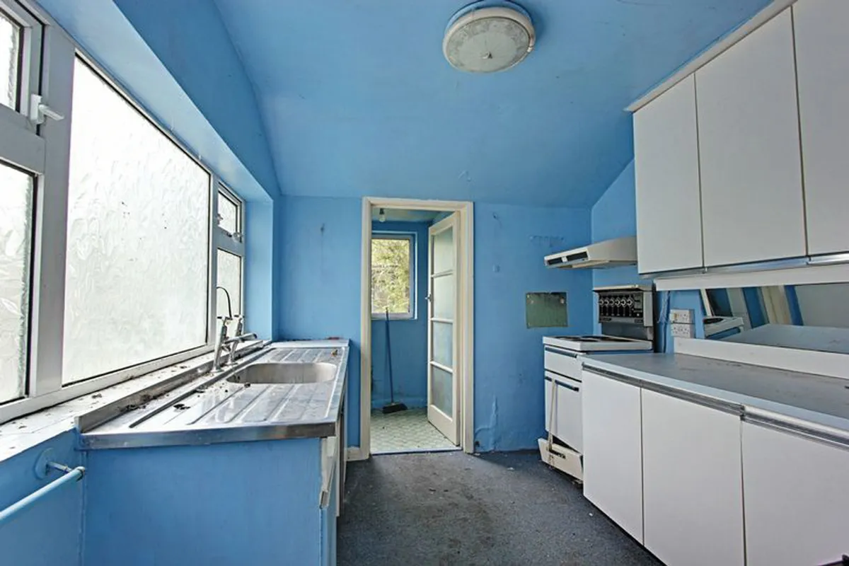
‘I bought it at a good price knowing it needed modernising, but the previous owner had done nothing to it in 40 years,’ says Kate.
‘The kitchen was unusable; it was so dated and not very clean. The dining room was small and dark and there was an odd little utility at the end of it. It wasn’t practical.’
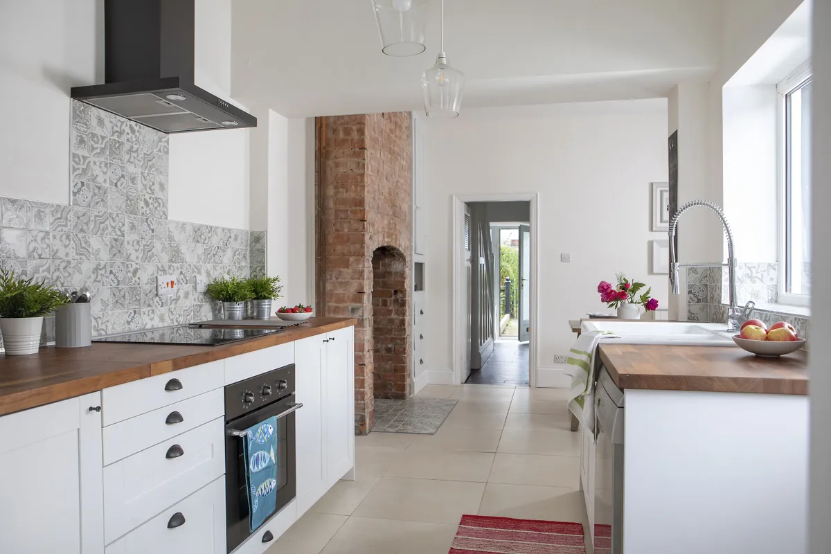
Kate lived with her parents nearby while she did the building work. ‘I couldn’t have lived here,’ she says. ‘It was a complete mess.’
Welcome to my home...
Who lives here? Office worker, Kate Turner, bought the two-bedroom terraced house in Hull in 2017.
What do you like most about the room? It’s a very sociable space and a really cheerful room to spend time in. I like being able to open the double doors in summer and step straight outside.

She hired a skip and stripped out the old units, carpets and fittings.
With the help of her dad and a family friend, she then knocked out the stud walls in between the three small rooms to create one large, L-shaped living space.
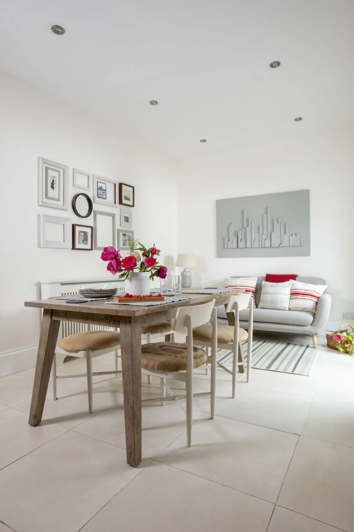
At the same time, they knocked down the low kitchen ceiling to make it look more spacious and turned the downstairs toilet at the end of the kitchen into a utility area.
The dining room window was rotten so they took it out and extended the opening so they could fit a concrete lintel in ready for the double doors. These open directly onto a small patio and allow a lot more natural light to flow into the room.
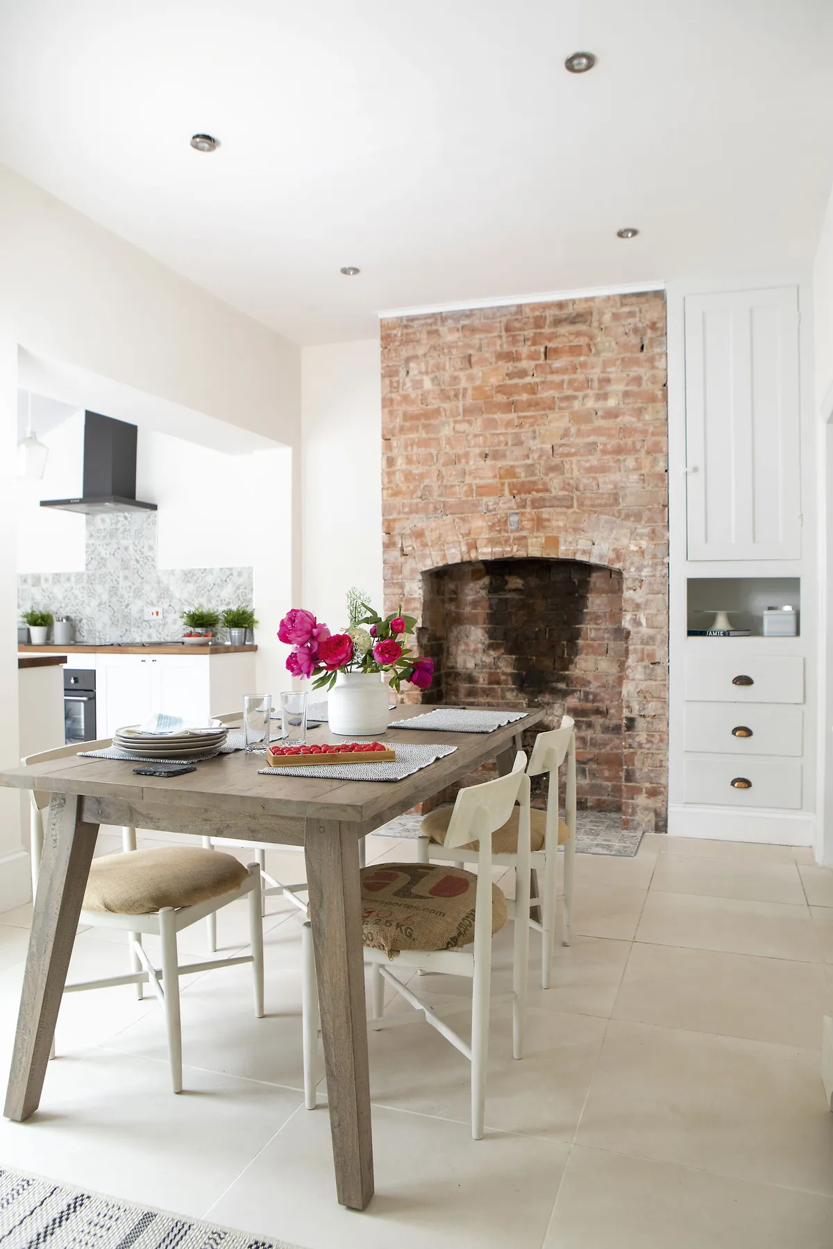
It took a whole day for Kate to knock off old plasterwork to reveal the original brick fireplace in the dining room, before she employed a plasterer to skim the rest of the space.
A bit more about my kitchen...
What did you learn from the project? Always budget for more than you think you will spend and allow for it taking twice as long as you thought it would.
What was wrong with the old room? It was all very dark and dingy, and everything felt very separate, narrow and closed-in. You had to go through the dining room to get to the utility space, which was very impractical.

‘I laid the floor tiles myself and straight away the room started to look exactly how I envisaged it from the outset – light, bright and modern,’ says Kate.
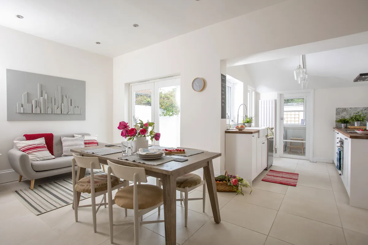
‘I was working to a pretty tight budget, so I shopped around for the units, sofa and table, which were the main pieces of furniture. I wanted to keep everything simple and uncluttered.’
Kate painted the whole room white to keep everything as light as possible and added finishing touches with wall tiles, artwork and soft furnishings.
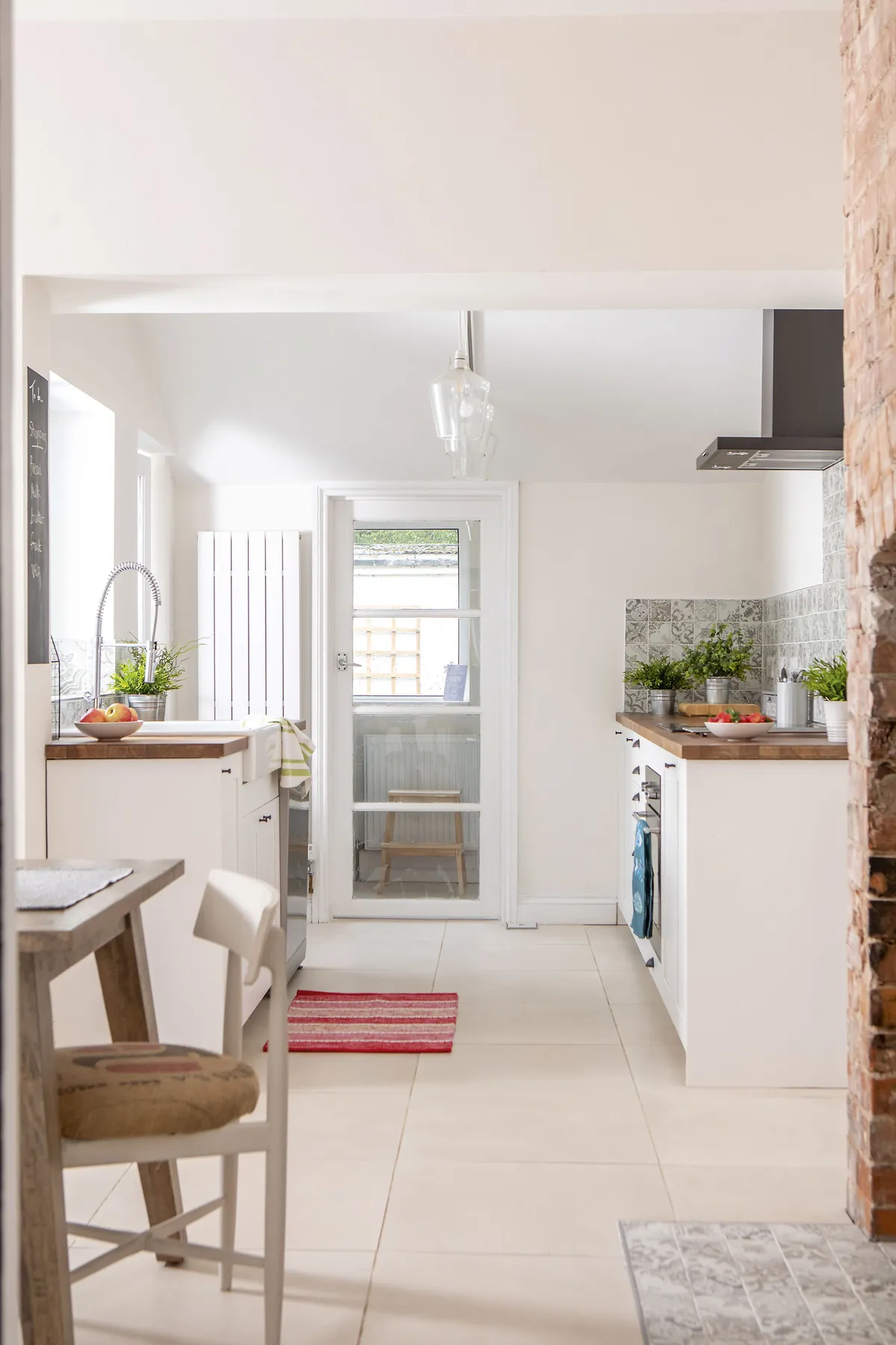
‘As soon as the kitchen was finished, I moved in,’ says Kate. ‘I was lucky to have the help of my dad and be able to stay nearby during the renovation – the weeks of hard work have paid off. It’s gone from being the worst part of the house to my favourite room.
Feature Heather Dixon. Photos Dave Burton.
This is a digital version of a feature that originally appeared in Your Home magazine. For more inspirational home ideas, why not subscribe today?


