When Sara Bryans, 44, bought this 1930s, three-bedroom, semi-detached house in Portslade, just outside of Brighton and Hove, four years ago with her wife, Lucy, she knew they were taking on a renovation project, and has enjoyed sharing their progress on Instagram.
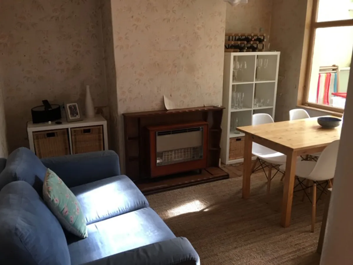
The house needed modernising from top to bottom, and the layout left much to be desired. The ground floor was sectioned into a pokey dining room with sliding doors leading into the tiny kitchen, an outside toilet and sunroom with a leaking roof. ‘The whole of the downstairs felt dark and brown.
The original kitchen only had room for a cooker, sink and two cupboards. It was so small we couldn’t both fit in here at the same time,’ explains Sara. ‘We love entertaining and hosting, so our idea was to create a sociable kitchen that we could cook, eat and relax in.’
Before they could start on the kitchen, the couple concentrated their energy on the upstairs, rewiring the electrics and putting in central heating.
‘We needed to turn the house into a home before we could start on the downstairs space. We wanted to have rooms to escape to while we were undergoing building works.’
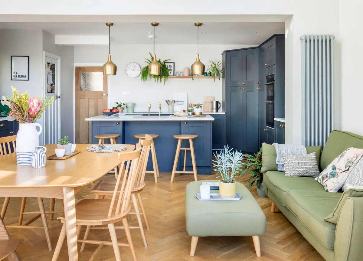
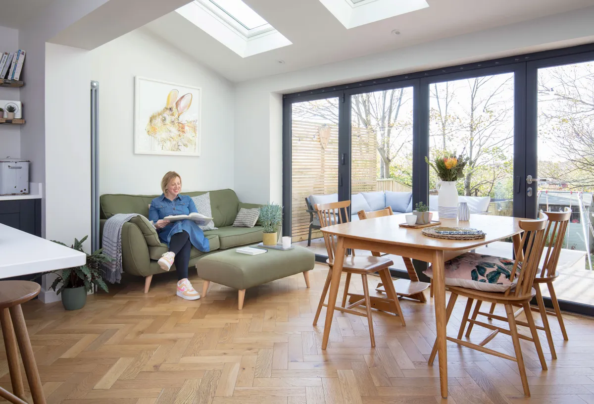
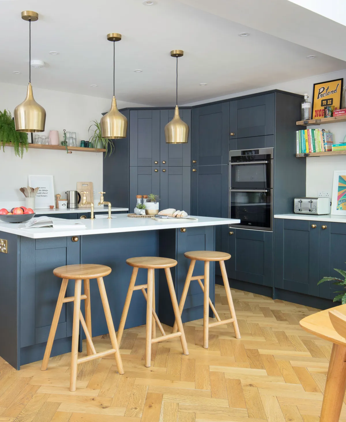
Once that was done, the big idea was to invest in changing the downstairs layout, creating a spacious family kitchen-diner that they could all relax in together. They wanted a central island with a breakfast bar, a large dining table for family mealtimes and a roomy sofa for chilling out and watching TV on.
They also wanted to install large, bi-fold doors, which would let natural light flood into the room. To kick-start the renovation, the couple hired an architect who gave them lots of ideas and inspiration.
‘We found their drawings helpful when it came to visualising how our house would look,’ says Sara. ‘We took the best elements so we could design a space that would work for us.’
As a way to save on costs, Lucy decided to project-manage the build at the same time as juggling her full-time job.
‘It was super stressful, but it was the only way we could afford to renovate the house,’ says Sara. ‘From the very start we were optimistic about the project and really motivated to get it finished within budget.’
First to go was the lean-to extension, and then the rear patio was levelled. ‘Our builders had to dig down deep to make new foundations for our kitchen.
The back of the house was taken off and steel supports put in for the bi-fold doors. They also ripped out the old kitchen and a stacked chimney breast. The area was stripped back to the brick to create a basic shell.’
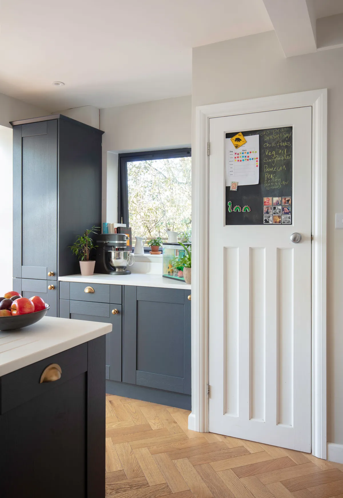
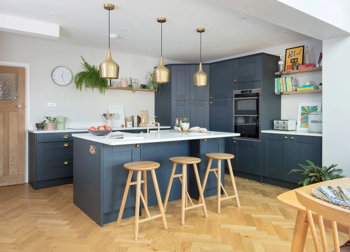
While the building work was ongoing, they started planning the kitchen design and details. Sara was keen to go for a modern look with traditional elements. They chose herringbone flooring throughout for continuity, and Sara set her heart on navy blue units and brass taps.
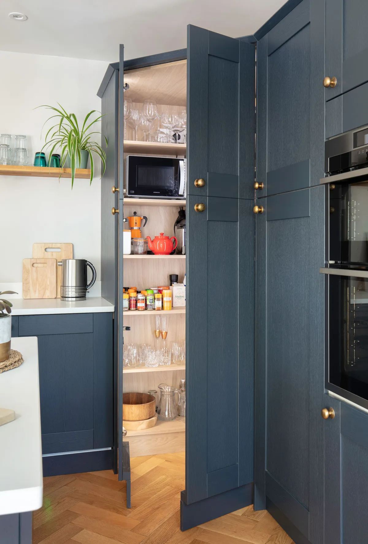
It took time to find a designer who could make their vision a reality, though. ‘We went to three kitchen companies until we found a designer that we "clicked" with,’ says Sara. ‘She didn’t challenge why I didn’t want wall cupboards cluttering up the space, and it was her idea to install the walk-in corner larder in the darkest corner.’
Hoping to get it installed and finished in time for Christmas, they had the kitchen delivered in mid-December and the flooring put down.
Sara grabbed a paintbrush to get stuck in and complete the project, but despite their hard work they missed their deadline by just a few weeks. ‘On the bright side, it was completed in time for my birthday at the end of January.’

The couple could now finally make their new space homely, creating the comfy family seating area they’d dreamed of and furnishing the space with a mix of new pieces and bargain vintage finds.
Sara says the finished scheme has changed her family’s lives drastically.
‘This room makes us so happy. We have so much space and we can all be in the same room at once even if we are all doing different activities. Our son, William, loves to play in here, running in and out of the garden. We cook more than ever before. It 100 per cent has changed our lives for the better. It was worth all the dust!’
Feature and styling Maxine Brady. Photos David Giles.
This is a digital version of a feature that originally appeared in Your Home magazine. For more inspirational home ideas, why not subscribe today?
