We take a peek inside the colourful home of Temi Johnson, from the hit BBC competition show Interior Design Masters!
Temi's house makeover story...
When Temi and her husband Benoit spotted this house, it was love at first sight. 'We were thrilled it came in within our budget. It has good links to London, yet you feel like you’re in the countryside with the nature reserve, canals and the river all on your doorstep.'
Welcome to my home
A bit about me I’m Temi Johnson, 36, a criminal defence lawyer. I'm also starring in the fourth series of Interior Design Masters on BBC 1! I live with my husband, Benoit, 40, an actor and teacher, and our three-year-old son, Phoenix. See more of my home on Instagram @ahousemadeofbrass.
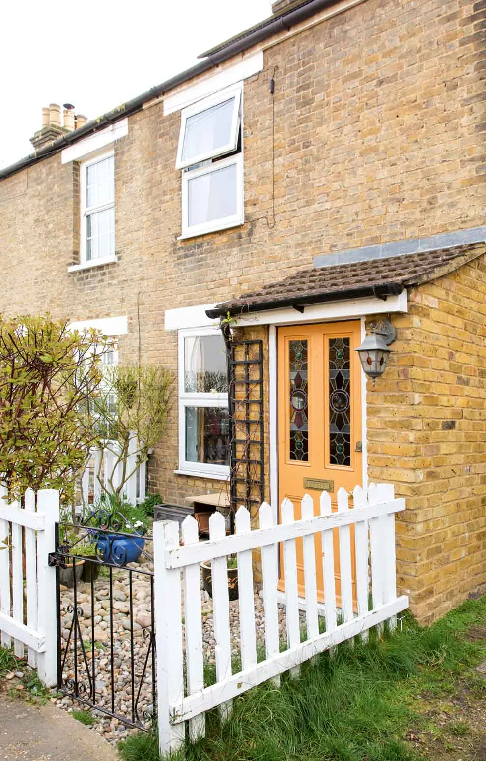
Where I live Our home is a two-bedroom, end-of-terrace house in Stanstead Abbotts, Hertfordshire. It was actually built in 1890 by the great-great-grandfather of one of our neighbours! We moved here in December 2018.

Kitchen
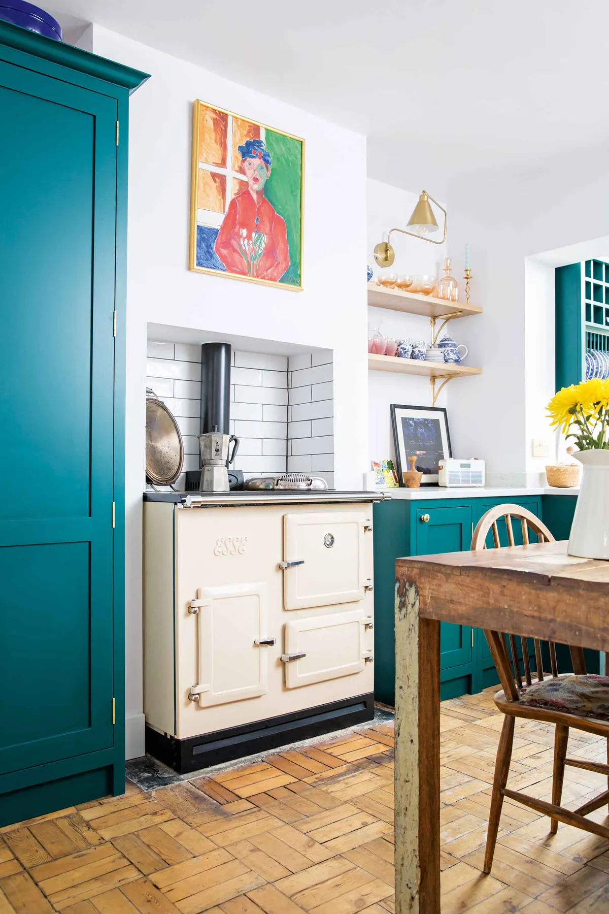
It wasn’t easy sailing, as the house needed a lot of work doing to it. Every room needed modernising and redecorating. That said, the original parquet flooring was still intact, and the previous owners had put in a small kitchen extension.
This extension on the back of the house allowed Temi a good-sized kitchen – something that was high on her wish list. ‘I knew I wanted a decent-sized kitchen as I love to entertain and for me, food is life,’ she says. The dining table was left by the previous owners – they’d made it from an old boat, which felt really fitting because we actually lived on a narrowboat before moving in here!’
Living room
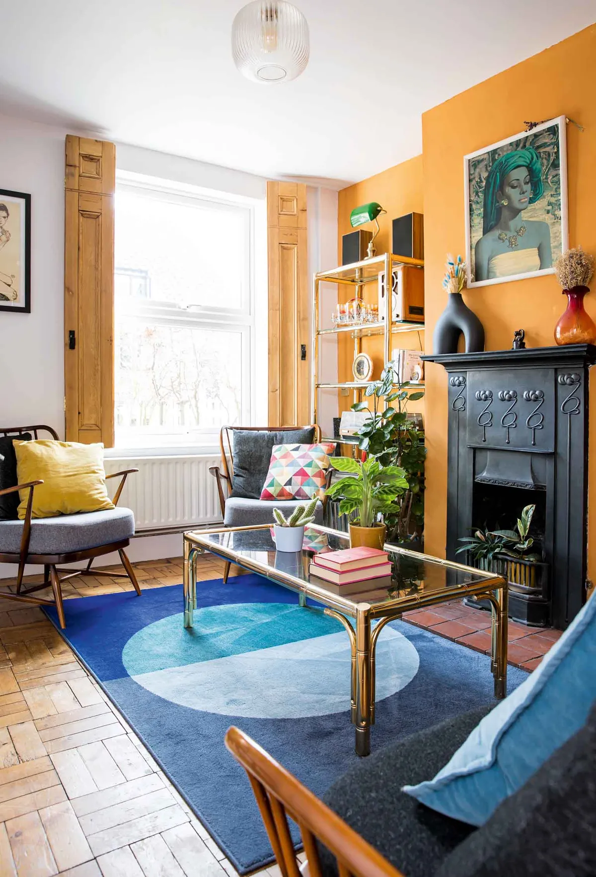
‘Because these houses are tiny, our aim was to use colour and furniture to make the space feel bigger and more inviting, and I think we’ve definitely achieved this in the living room,’ says Temi.
Check out our blue and orange styling ideas guide to get Temi's living room and hallway look
Hallway
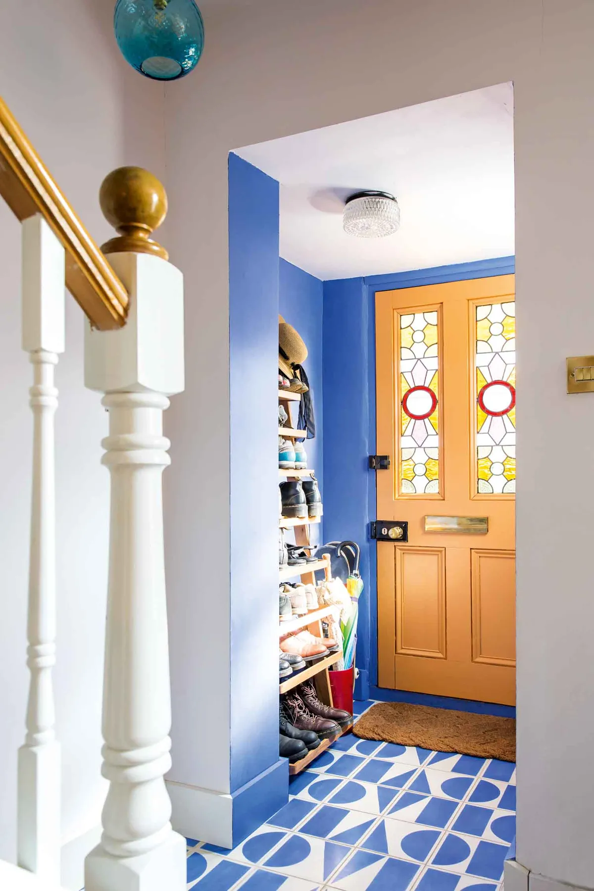
‘The hallway wasn’t the best when we moved in,’ says Temi.‘The original door frame had been left in without a door attached and the floor was covered with a loose piece of carpet. Underneath this was concrete. As a result, we knocked out the old door frame and I decided to tile over the floor.
We were lucky enough to have a door with stained glass, though I didn’t like the dark red colour of the wood so I painted it the same shade of orange as the living room. The door had to be painted in eggshell paint, which looks a bit lighter than the walls, then we painted the walls in a vibrant blue. I had the colour made up in B&Q to match the Bert & May floor tiles.’
A bit more about my home...
What I wanted to change The house definitely needed some work. The bones of it were good, but it needed modernising and most of the walls needed replastering.
How I made it work The biggest job was the kitchen. We took it out with the old shower room to create a kitchen and utility room with a downstairs loo. We completely redid the upstairs bathroom, and all the rooms were redecorated.
My favourite part Our bedroom, as it’s the room we’ve most recently revamped. I love the ‘funny doors’ on the wardrobe that I had built by a carpenter and how calm it feels in there.
Bedroom
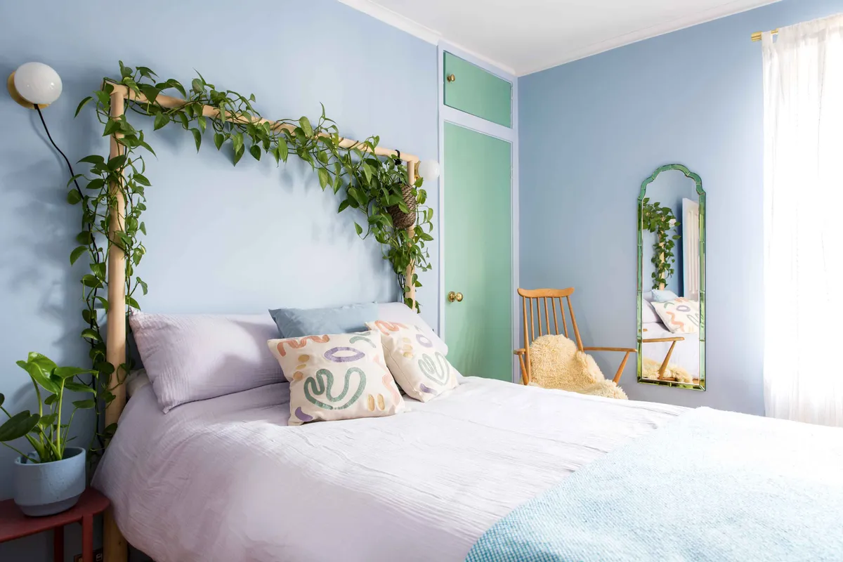
‘One of the first things I did when we bought our bed was buy a devil’s ivy plant to trail across the four-poster,’ says Temi. With a bit of love, she’s made a kind of canopy headboard and indoor garden in one!

‘The last owners had painted this room a purple-pink colour, but they had only used one coat of paint so you could see the original wallpaper underneath,’ says Temi. ‘I rushed to paint over it and made a bad choice with a dark blue feature wall. It wasn’t right and I hated it so much I had to paint over it again.’
Having painted the walls white until she was able to decorate properly, Temi has just finished redecorating the space for the third time. Now, it’s officially her new favourite room.
Bathroom
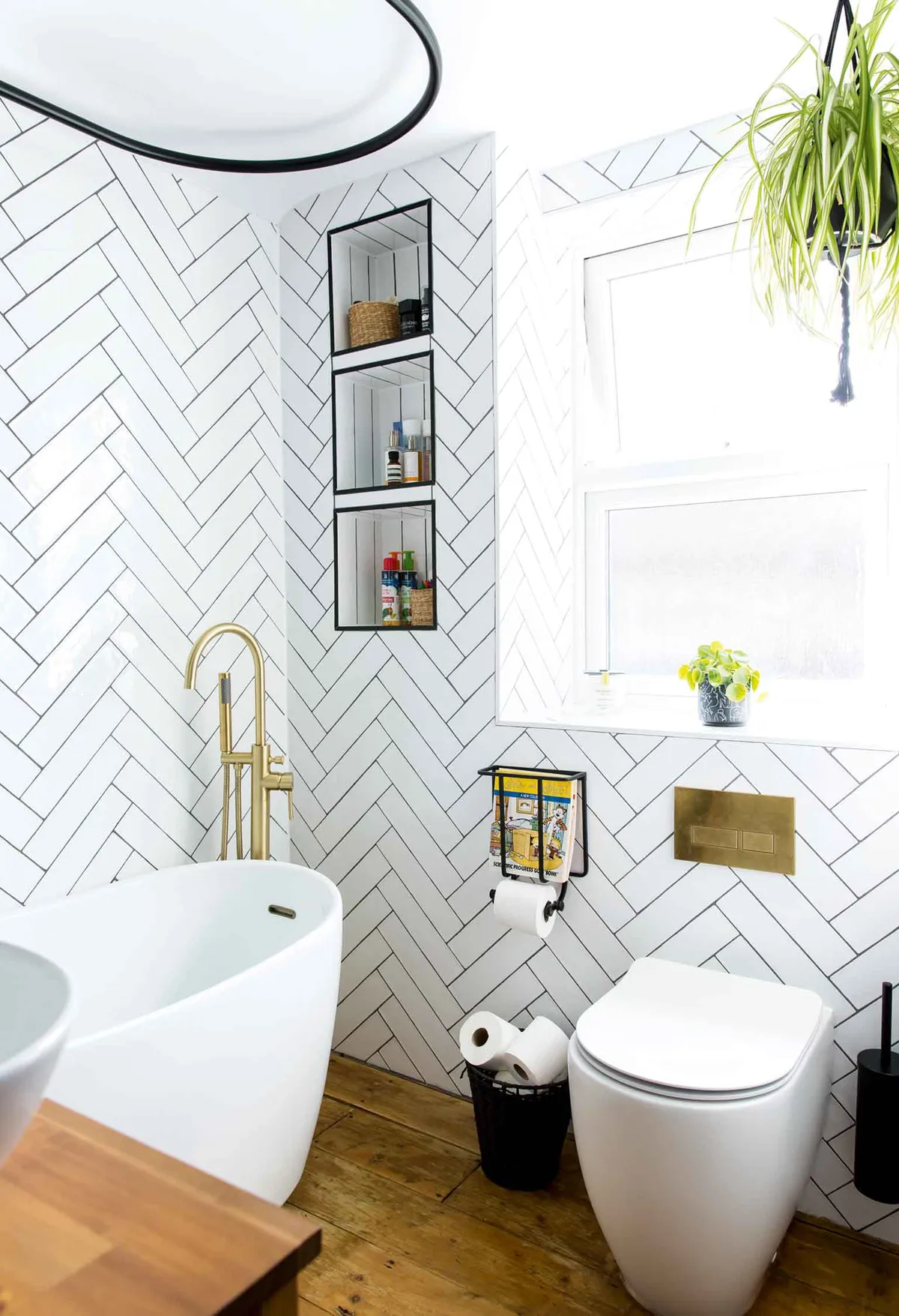
Temi has transformed the bathroom with a stylish monochrome scheme. ‘I bought the bath and sink second-hand on eBay, and then swapped out all the plumbing,’ she says.
Check out our black and white bathroom ideas guide for more inspiration
Kids room
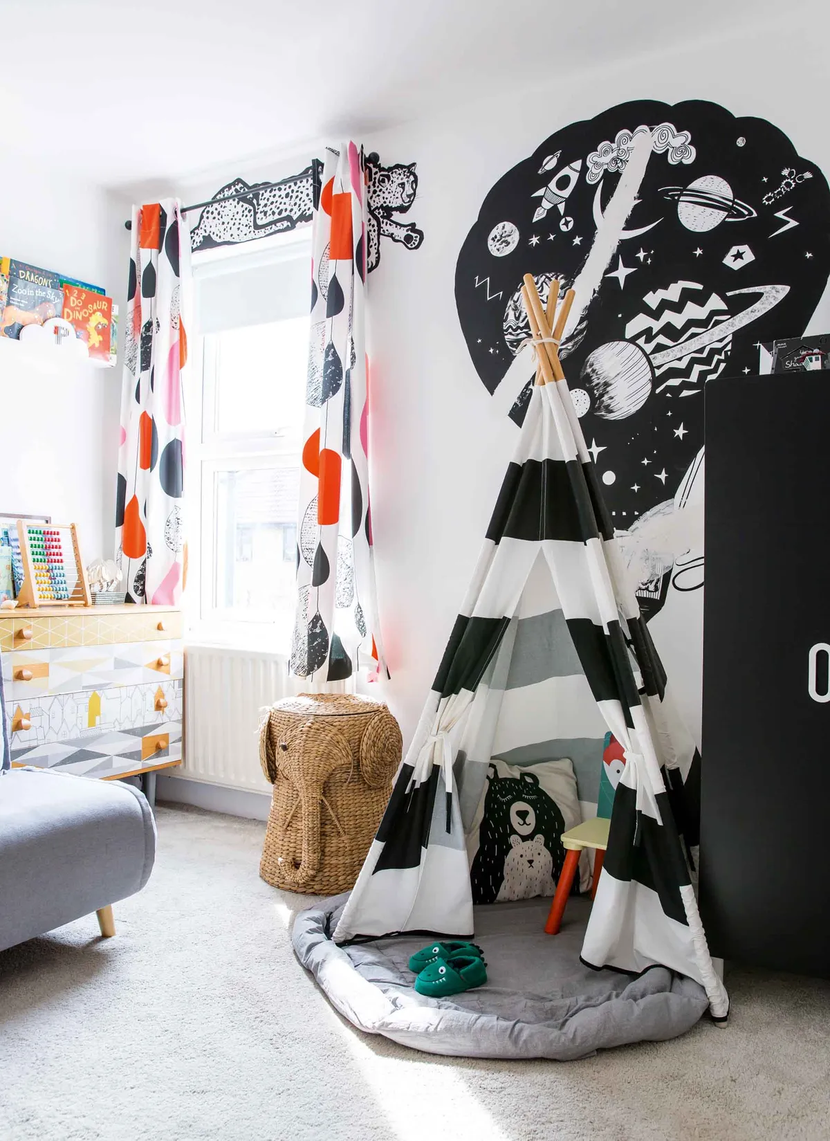
‘My son’s room is a work in progress. Phoenix was only six months old when we moved into the house and I didn’t want to decorate his room in a way that was too much like a nursery, as I knew he’d quickly outgrow it.
I got stuck on the idea of having a mural and came up with a monochrome design. A friend is an artist and she hand-painted it for us. Sadly, the builders accidentally put a hole through the wall when they did the upstairs bathroom, which led to cracking through the balloon – now it looks a bit like a graffiti patchwork!’
Feature Laurie Davidson, photos Lizzie Orme
