
I’m Francesca Kletz, a textiles and interior designer and writer. I live with my husband, Robert, and our son, Fievel.
Our home is a two-bed flat in Hackney, east London.
The challenge… Originally, you had to walk through the small kitchen to get to the bright bathroom at the far end of the flat. Not only was the layout clumsy but the kitchen was so cramped and dark, and the bathroom got all the light. We knew we wanted to swap them around.
How I made it work… We had the wall between the kitchen and bathroom taken down and moved the kitchen to the back of the house, to make the most of the natural light.
My favourite part… The new layout means we now get the evening sun when we have dinner, which is so gorgeous. I also love the return of my cabinets as it gives me the perfect area to prepare food, as well as the extra storage space.
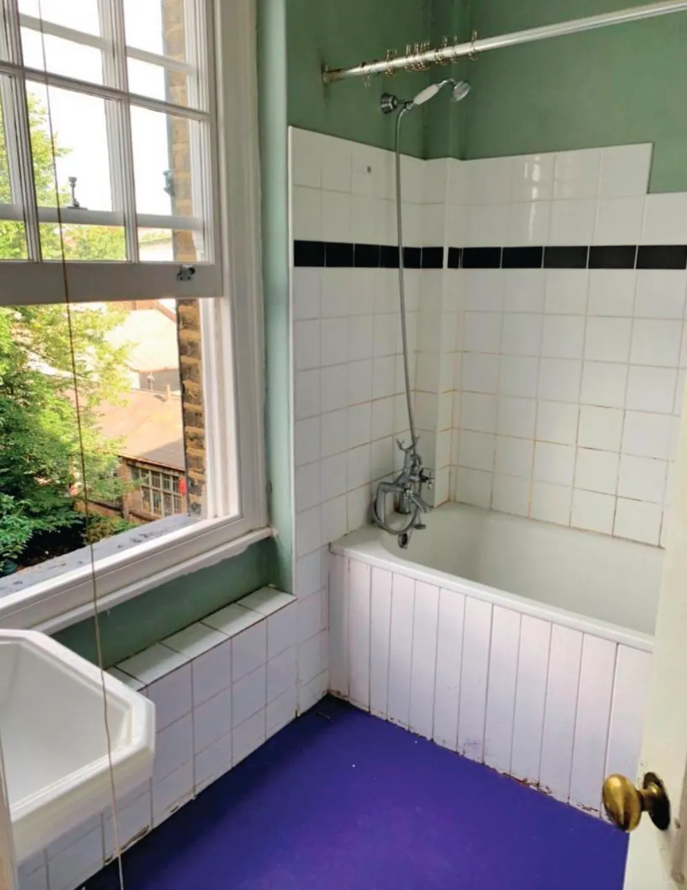
The moment we saw the flat we loved it. All the rooms are really spacious, and I love the sash windows and the great views, and there’s so much light in here. We get the sunrise at the front and the sunset at the back, which is a real bonus, but the layout desperately needed re-thinking. It was also quite dated and needed modernising too, but we were excited to put our own stamp on it.
We totally gutted the kitchen and bathroom and then started changing the layout around. Originally, you had to walk through the kitchen to get to the bathroom at the far end, which was a real pain. The bathroom got all the light with the sash window, and often we would have a drink in the evening in there! That’s how much we liked that room.
I started to hate the kitchen because it had no natural light and I love cooking, so it’s where I spend a lot of time. We decided to swap the rooms around and the builder explained how we could remove the adjoining wall and move it back to create a bigger kitchen and smaller bathroom.
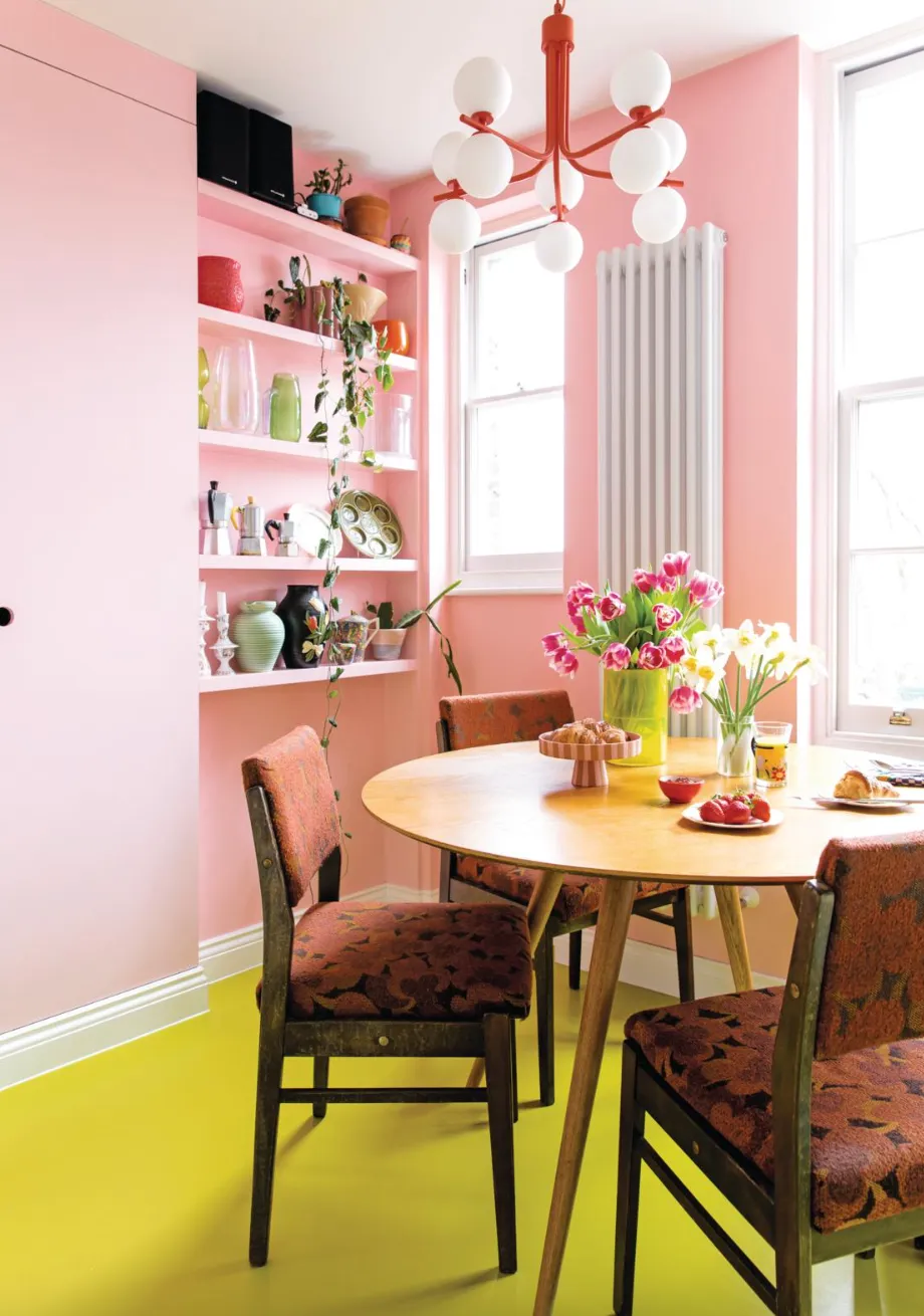
While doing this, we exposed an old fireplace that created a handy nook for our kettle and toaster. I also wanted to make use of any available wall space, so we put up shelves to display my antiques and cookbooks.
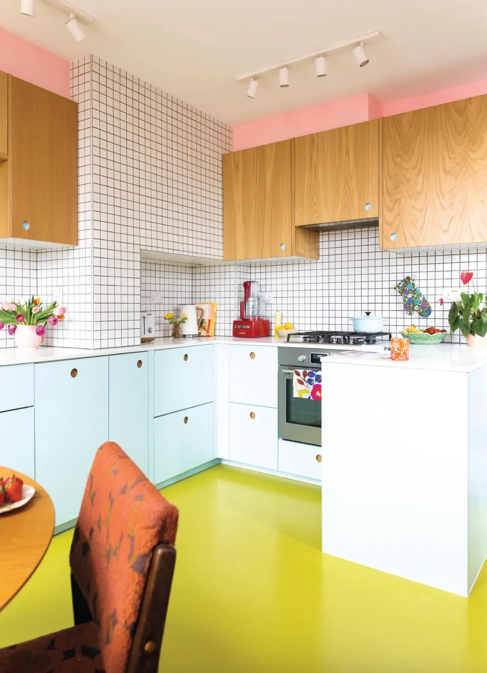
It took six weeks from start to finish and although there was a bit of mess along the way, the renovation was so worthwhile and has made a huge difference to how we use the flat. The fun part was adding our personality. It’s a little bit mid century, a little bit millennial, part Scandinavian and a little bit Barbie!
Francesca's three style tips
Colour crush
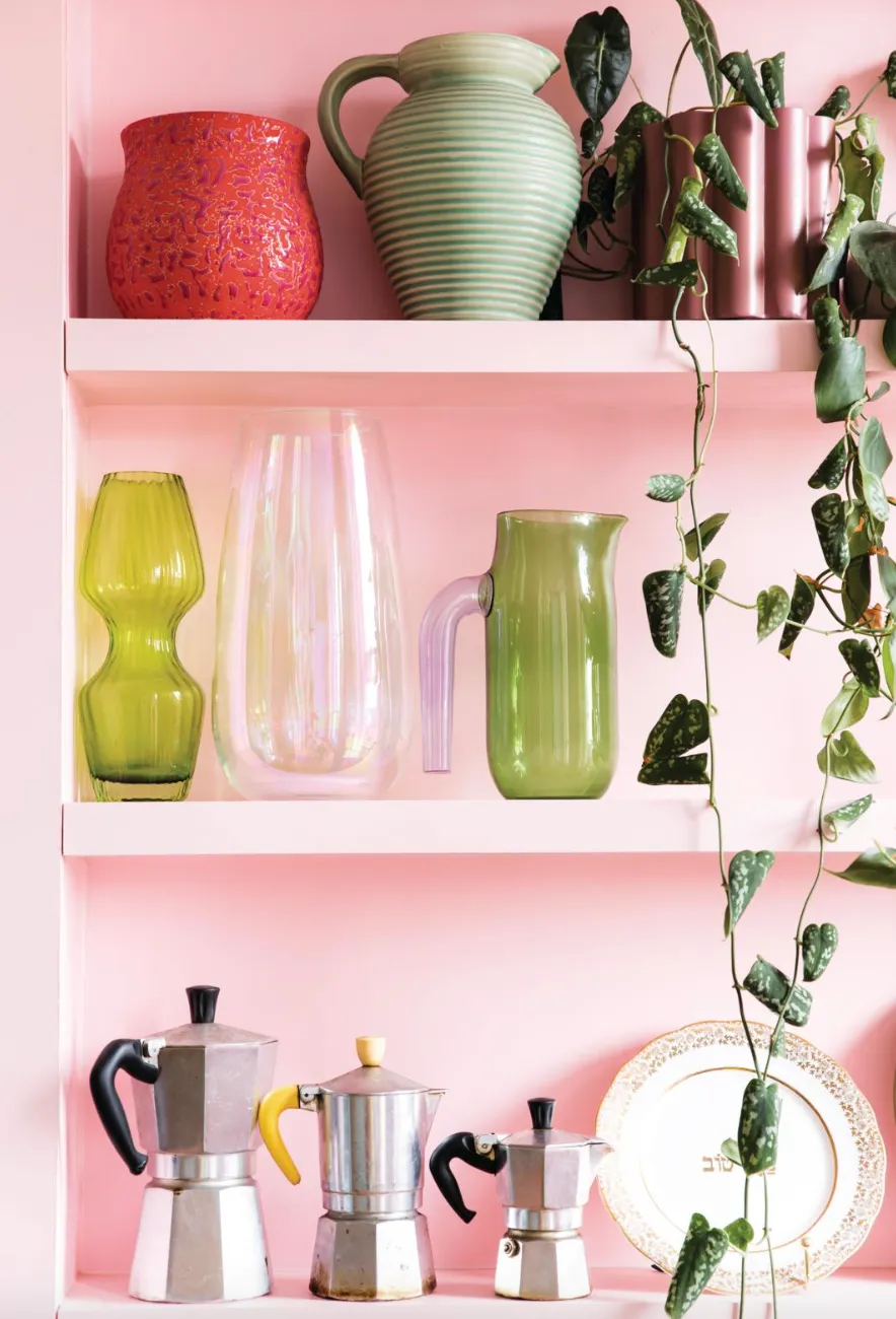
Make sure you factor some fun into your kitchen by picking shades that spark joy. Francesca had always wanted a baby blue kitchen and chose other sorbet shades that she’s drawn to, such as the pink painted walls that tie in with her hallway and living room.
‘I wanted to use the floor surface to add extra colour and decided on a citrus green to counteract the sugary blush walls,’ she says. ‘I love the flat colour rubber flooring gives you and it’s easy to clean and warm underfoot so it’s really practical, too.’
Customise kitchen cupboards
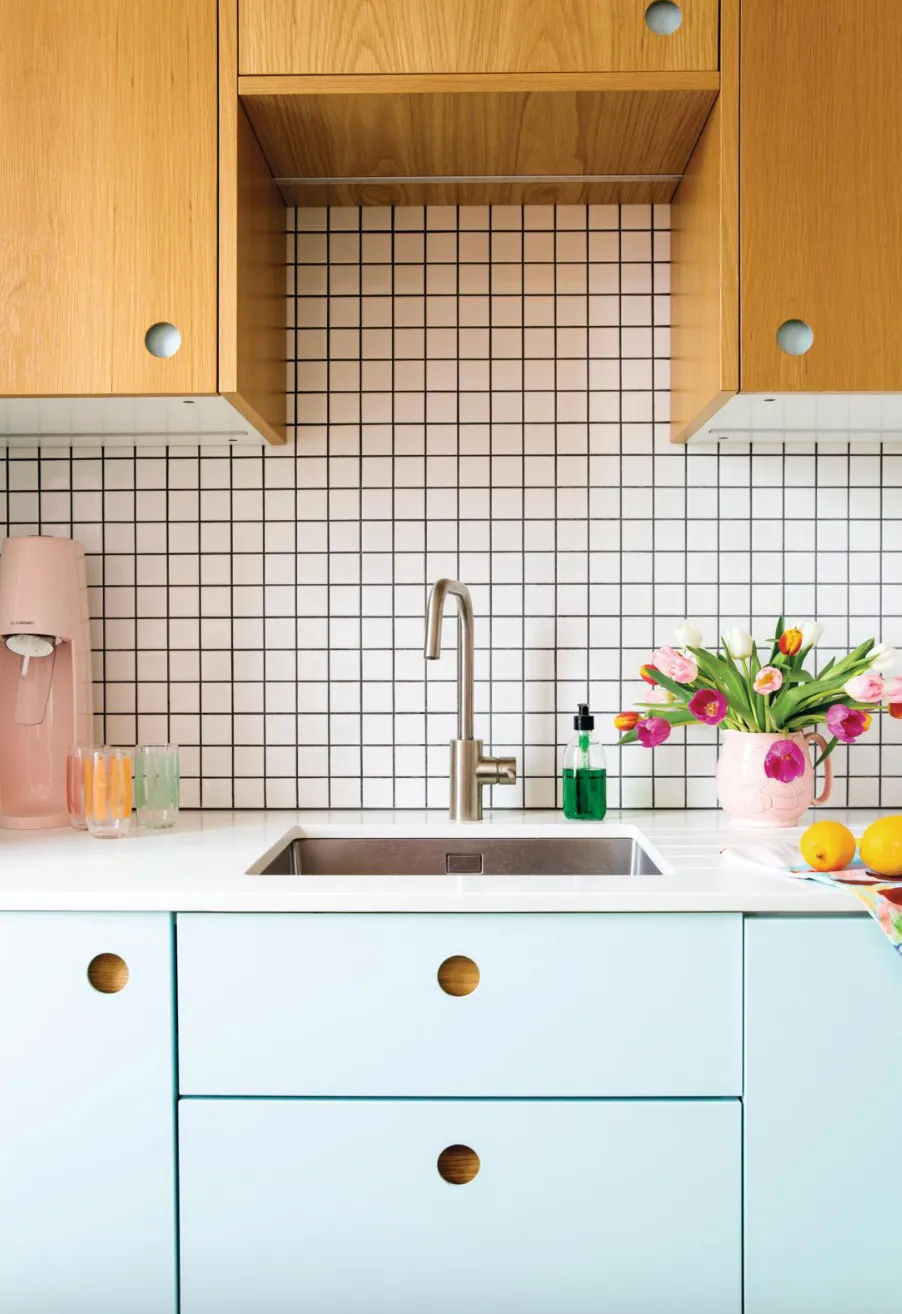
To keep costs down, Francesca chose kitchen carcasses from IKEA and customised the look with doors from Naked Kitchens, painting some of them in Valspar’s Salty Blue. Keeping a select few in their natural oak finish has given the whole look a contemporary edge while a circular cut-out shape makes an interesting alternative to traditional handle.
Plan your space
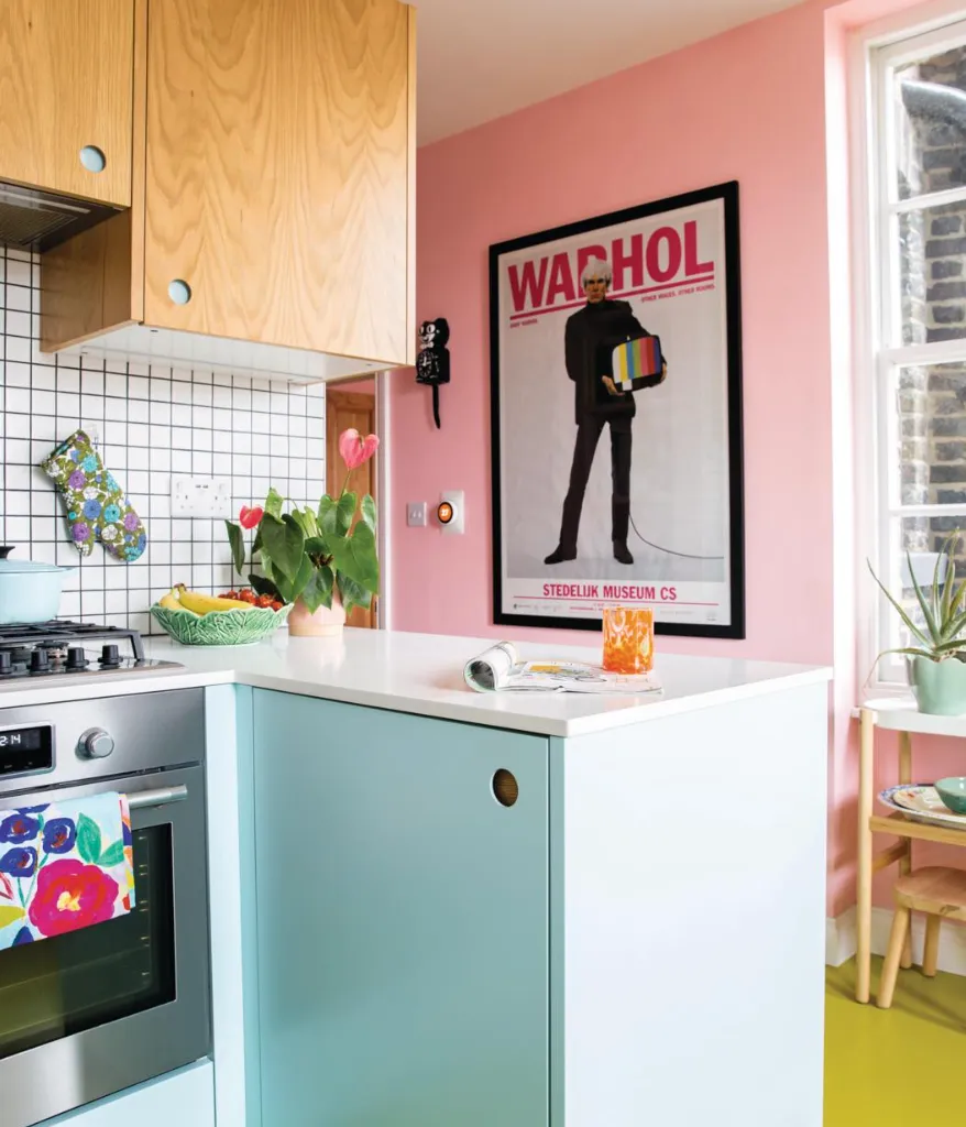
When designing your layout, think about how you will use your kitchen and consider any features that could improve your day-to-day. As someone who loves to cook, Francesca was keen for her kitchen to have enough worktop space so she could prepare meals, so plans included a return on the worktop to create an extra work surface with handy storage underneath.
‘The return has given me room to prepare food without being cramped and I get to face the window and have the lovely light streaming through. It makes all the difference being able to chat with my family and friends sitting at the table while I’m cooking,’ she says.
Photos Lizzie Orme
