Within ten minutes of viewing the house, we both knew this would be our first home together. We got that excited ‘this is the one’ feeling and weren’t put off by the state of the place – it was just about liveable. We were realistic about our budget and knew we wouldn’t find a property in top condition. It also had a second bedroom; space for my much-needed home office. The sale moved fast and three months later we moved in.
However, because we needed to save, it was another two years before we started any major work. The advantage of living here first meant we knew exactly what we needed and wanted. Luckily, Dominic worked as a builder before becoming a teacher, so he has vast experience in renovations and was great at strategic planning and the logistic side of things.
I focus more on the decoration and small details, so we really are the perfect team and were very hands-on with most of the work. The process was fairly straightforward, although we did definitely underestimate the time needed for the bathroom and kitchen makeovers.
We needed to reroute the pipes under the bathroom floor and reroute a gas pipe in the kitchen and both jobs took longer than expected. When it came to the décor, I think visually, and knew from the offset how I wanted each room to look. This was my very first interior styling project, and I was excited to use my favourite textile designs in my own home.
It really was our dream to buy a house and recreate it from scratch. We have gained such a huge amount of experience and expertise by doing so much of the work and making this house our own. While it may be too small to be our forever home, it is our very much-loved home right now.
Owner profile
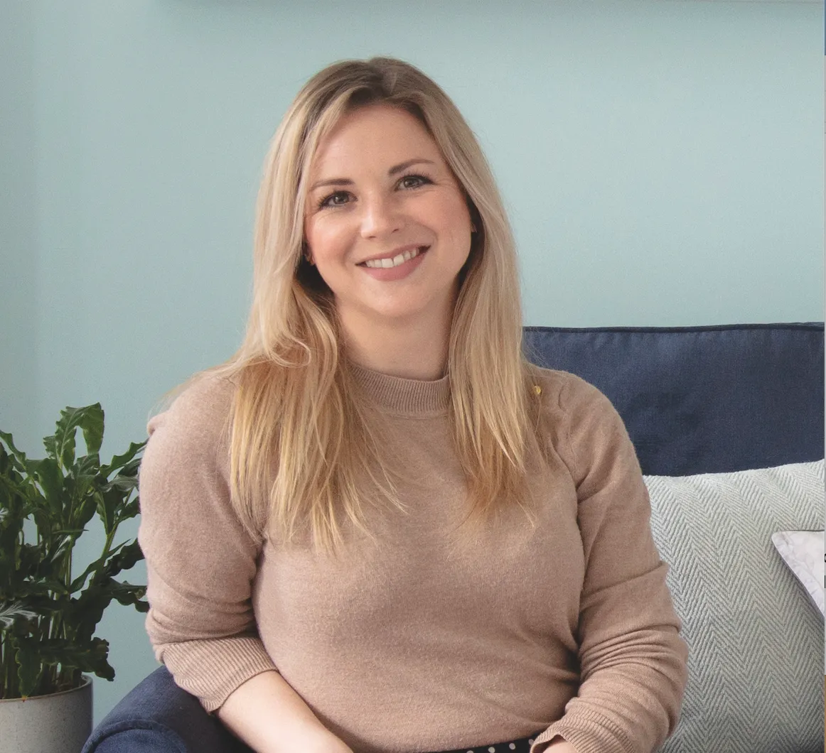
A bit about me I’m Laura Milligan, owner and textile designer at Laura Felicity Design. I live here with my husband, Dominic, a PE teacher, and our dog, Bailey.
Where I live Our home is a 1980s two-bedroom house in Henlow, Bedfordshire. We’ve lived here since July 2016.
What I wanted to change The dated décor made the house look unloved and unattractive. Nothing had been replaced or improved since it was first built.
How I made it my own A new kitchen and bathroom were the big changes needed, along with new décor and fresh colour choices.
My favourite part Our bedroom, with the combination of dark walls and co-ordinating wallpaper, lampshades and headboard, is my favourite room.
Sitting room
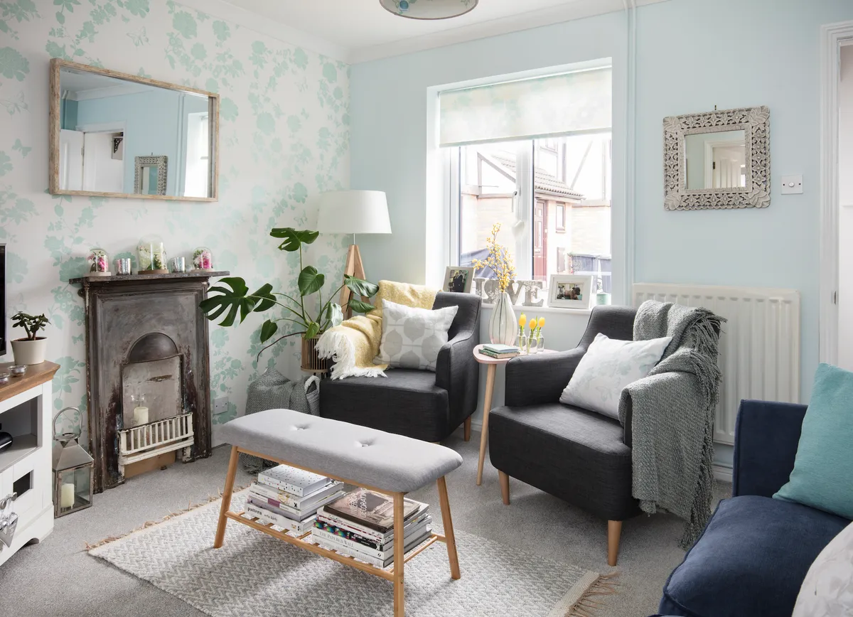
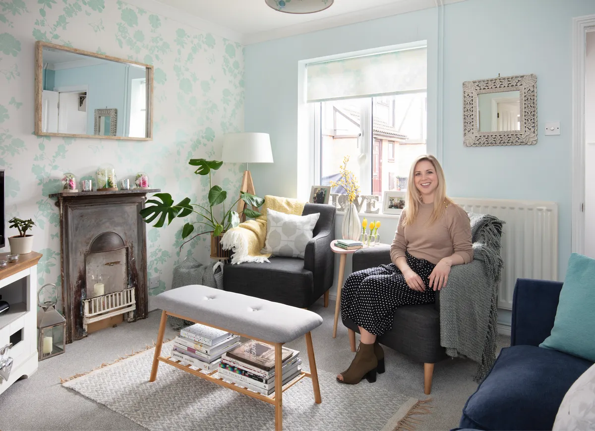
‘Like the rest of the house, the original Artex ceiling had to be replastered by a professional. The previous owners had created a makeshift fireplace, with an electric fire in a purpose-made hole in the wall. I felt this wall should be the main feature and by pure chance, when walking Bailey one day, I literally stumbled across a discarded wrought-iron fireplace that was the perfect size for the small chimney area. The aim was to strip and repaint it but we actually loved its raw state.

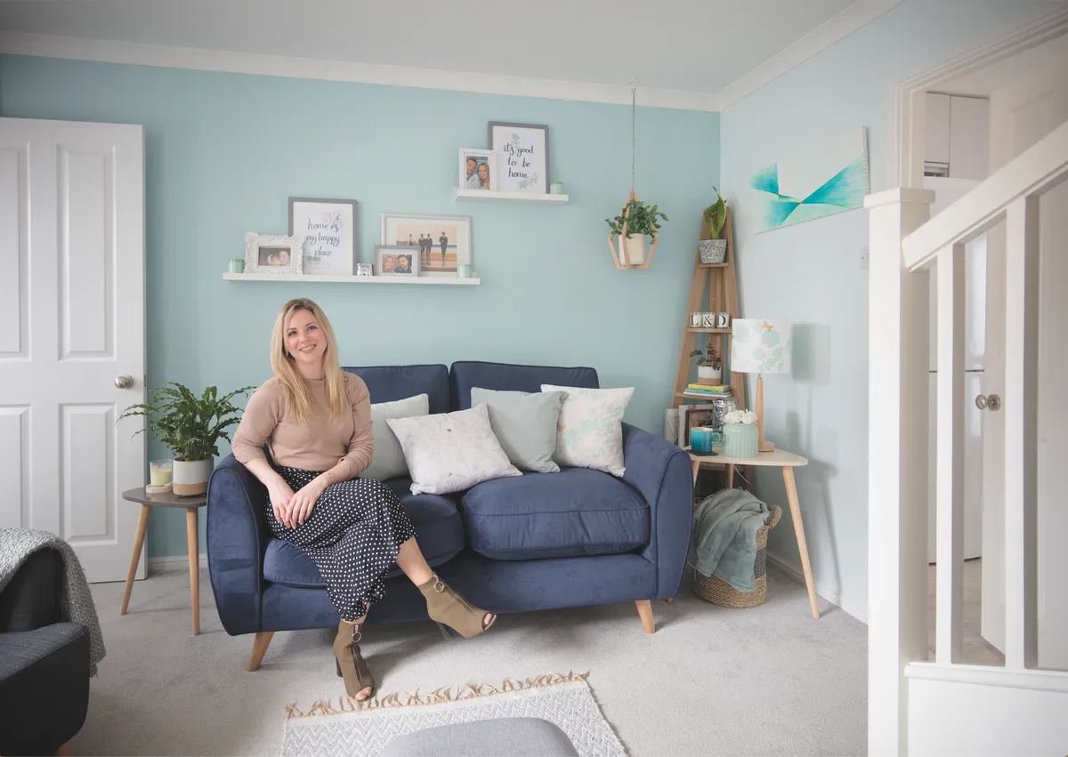
A wallpapered feature in duck egg tones around the fireplace really makes it stand out. I felt the opposite wall, with the sofa, also needed some character and so I painted it a more vibrant shade than the other walls. Dulux’s Mint Macaroon did the job nicely.’
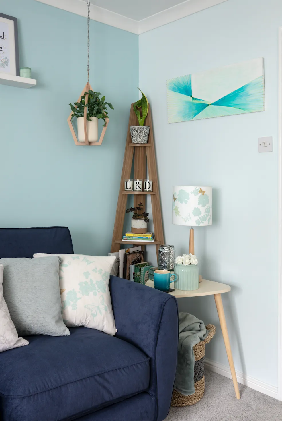
Steal Laura's style
Jazz up your walls with a nod to the geometric trend, just like Laura
Home office
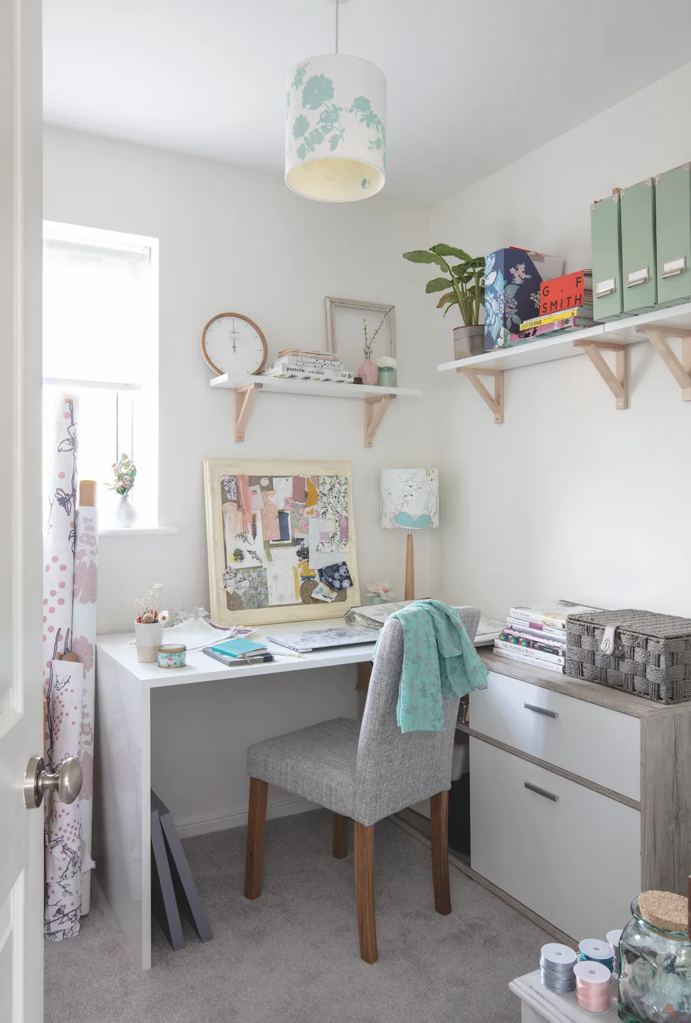
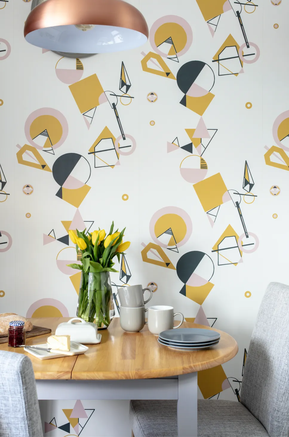
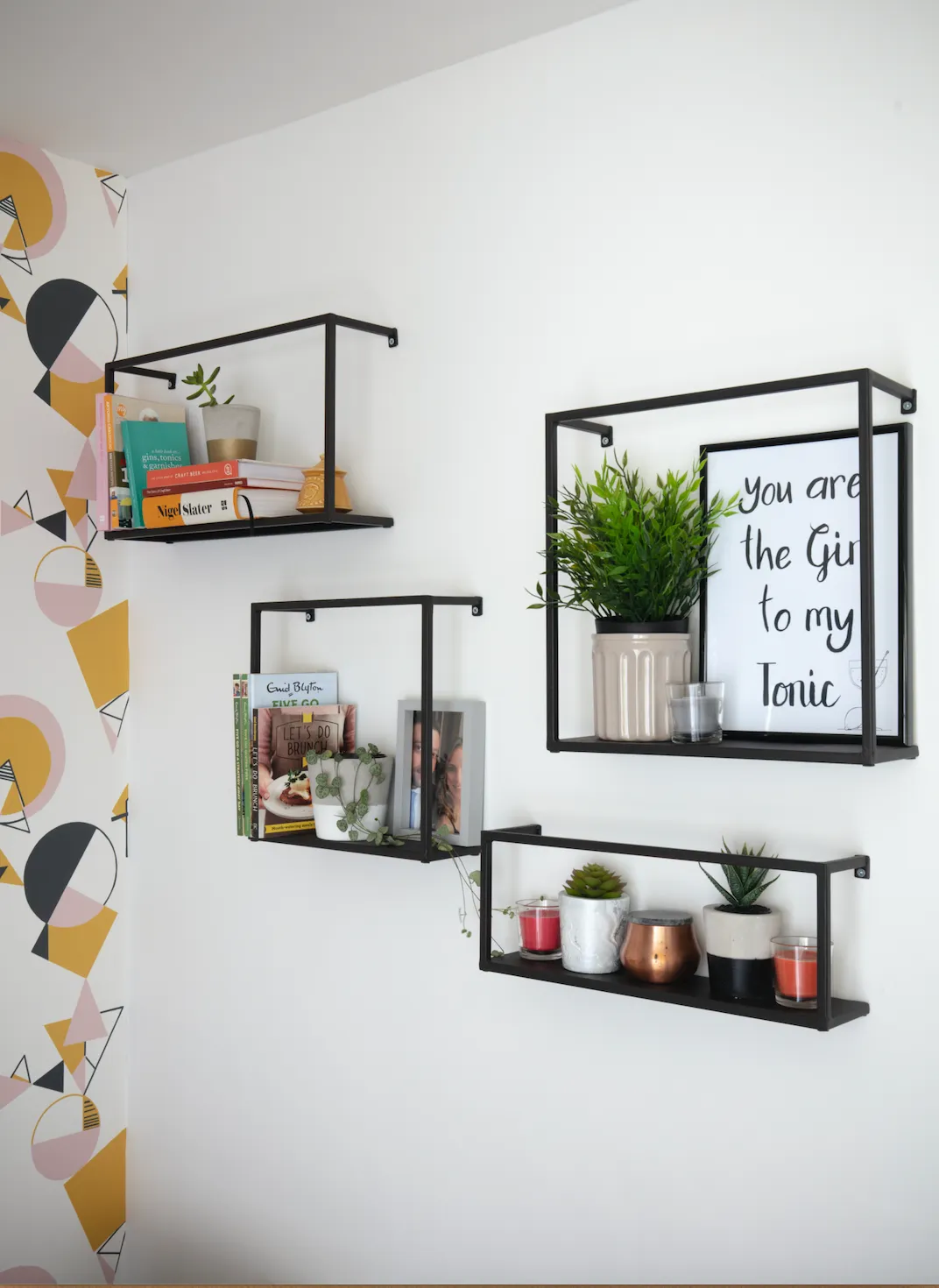
Laura converted the small guest bedroom, with garish yellow walls, into a stylish home office. It was a labour of love, as she wallpapered and painted the room and then installed the shelving. ‘The office is where I run my business, Laura Felicity Design. For the first couple of years I used an oversized desk and chair inherited from Dominic’s parents and the space was used as a dumping ground.
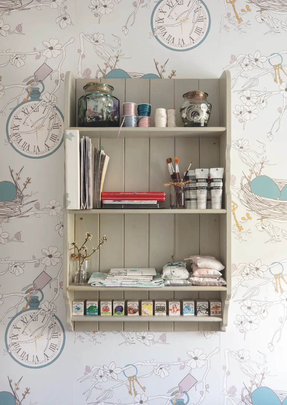
Over this period, I was able to figure out exactly what I needed to make this a functioning and inspiring place to work. I didn’t want to crowd it with different storage units and felt that shelving was my best option for files, books and fabric samples. We also kept the room bright and light; my Nest Egg wallpaper and fabric, in mustard and light pink, was the obvious choice.’
Kitchen
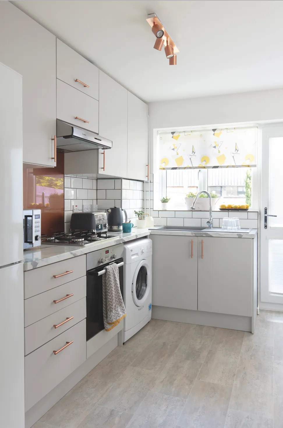
Dominic and a couple of friends ripped out the old kitchen, including the fixtures and fittings. The couple saved around £4,000 by sourcing items individually rather than going through one company. While they employed a professional fitter to help Dominic do the job, they did a lot of research before any work started.
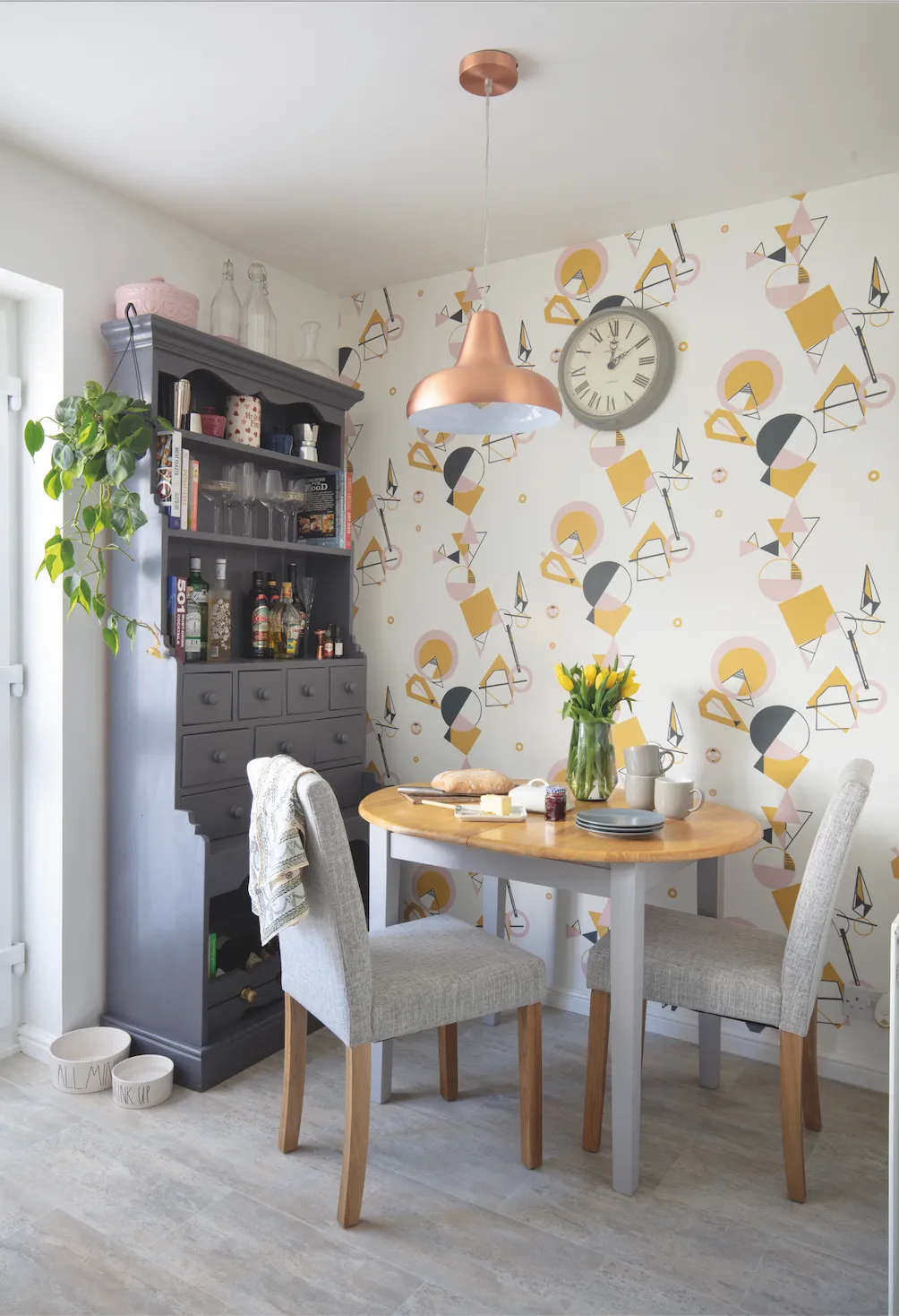
‘We did a lot of homework for the kitchen units,’ says Laura. ‘We went to B&Q for the basic cupboards and the Kitchen Door Workshop for the neutral grey cupboard and drawer fronts. We didn’t change the layout but going for taller cabinets, simple lines and colours has created the illusion of more space.’
Bedroom
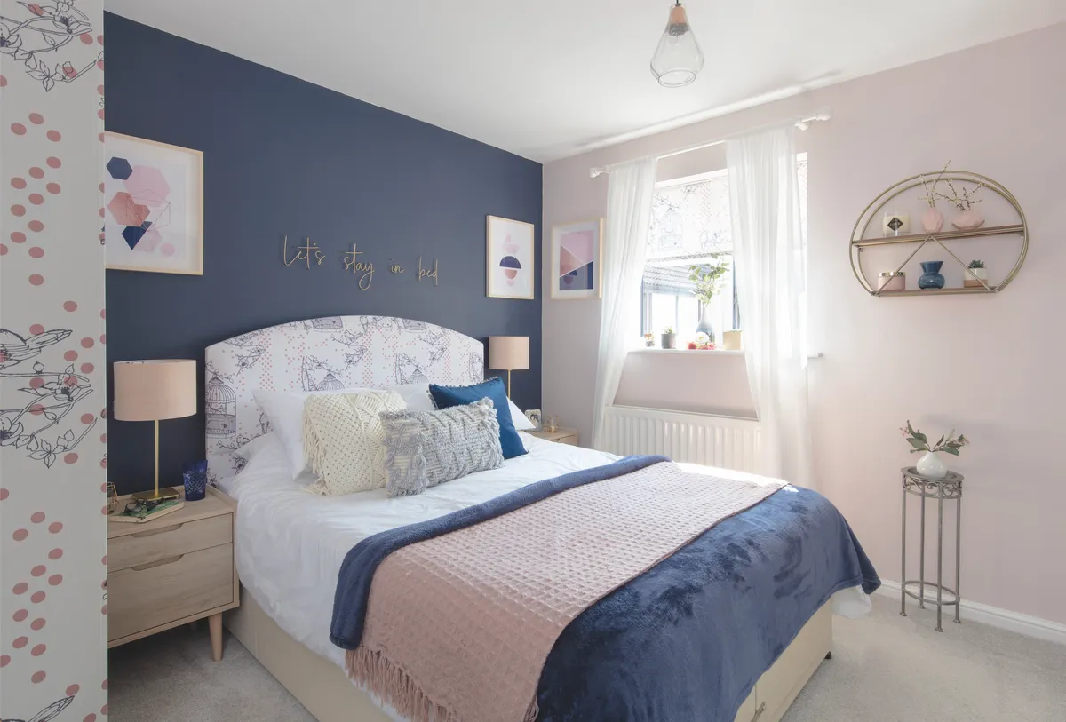
Laura and Dominic inherited a dull, plain bedroom, which required new carpet and a wardrobe. Its bare state made the perfect blank canvas for the couple. ‘I could literally see how the room should look and was excited to decorate and make it a relaxing, romantic haven for us both.
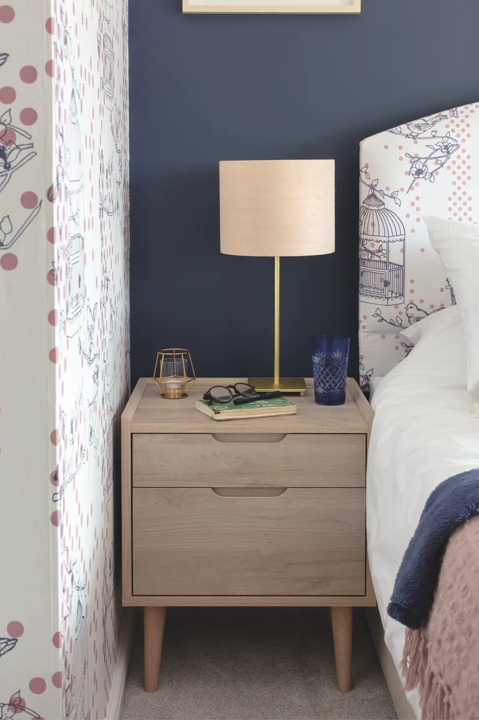
'I was drawn to using the navy and blush combination for our bedroom scheme and once the wallpaper was up and the walls were painted, I knew the design needed something more. I then introduced the headboard, roller blind and reversible lampshades.'
Laura's top tips
We spent a lot of time researching and sourcing things online to try to keep the costs down. In the kitchen, the units came from one place, the appliances from another, and the handles from elsewhere. We ordered the worktops online.
I think the mass of plants really brings something different to our home; they give it an almost jungle feel and brighten up the place. Plants do take some looking after though. We water them a few at a time in the sink.
Although we have renovated a house before, as this was a larger-scale project, we learned a lot about the planning application process. It seemed a bit daunting at the beginning, but we got there in the end!
Bathroom
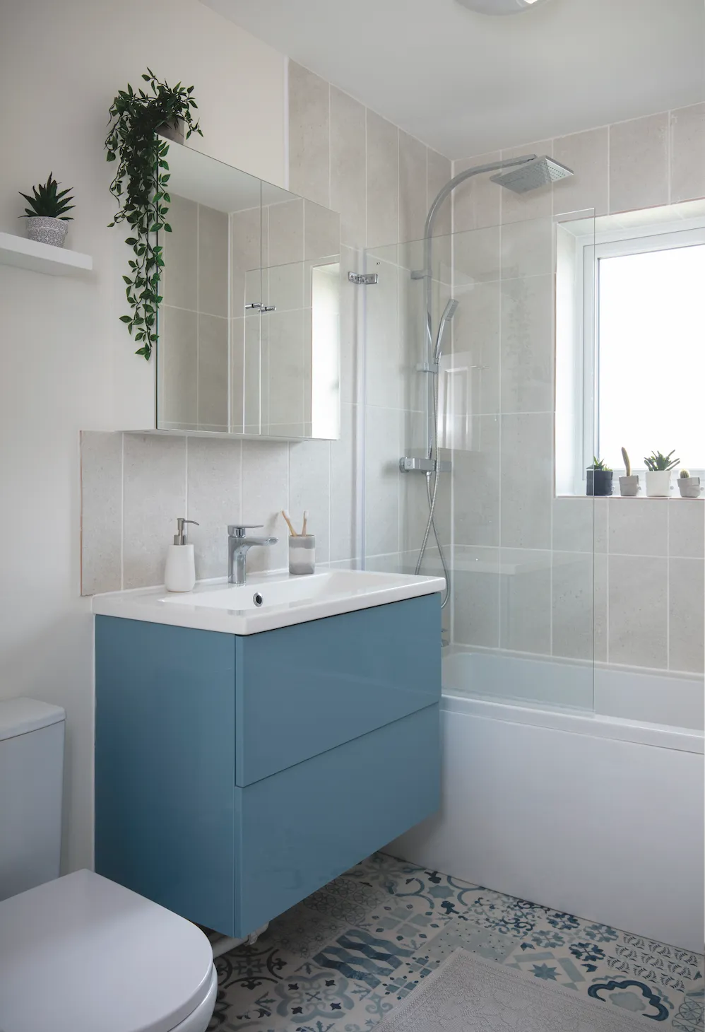
‘The bathroom was long and narrow, with no storage space, and only one of us could go in at a time,’ explains Laura. ‘Dominic had the idea to change the layout to create more space and maximise storage.’ Along with removing the old peach bathroom suite, the couple ripped out the airing cupboard, which blocked the room’s entrance.
‘By switching the bath and basin around, we have created more floor space. We opted for an all-white suite but wanted a touch of colour to come through and fell in love with the decorative Konkrete matt ceramic tiles that work so well with this vanity unit, all from B&Q.’
Expert advice
How to tackle some basic DIY
- Be well prepared before tackling your home decorating to-do list. Make a professional wallpapered feature by hanging the central panel first and working outwards. This allows a perfectly centred pattern across the wall. Be sure to mark measurements in the middle of your wall and find the centre of the first panel of wallpaper, allowing a perfect centre line for your wallpaper hanging.
- Preparing walls and ceilings for painting takes time but achieves neat paintwork. Walls must be clean, sanding down bumps and filling holes. A quality masking tape along wall boundaries, such as skirting boards and the ceiling, gets a clean finish on the wall edges. Always remove tape when the paint is semi-dry to avoid cracking paint.
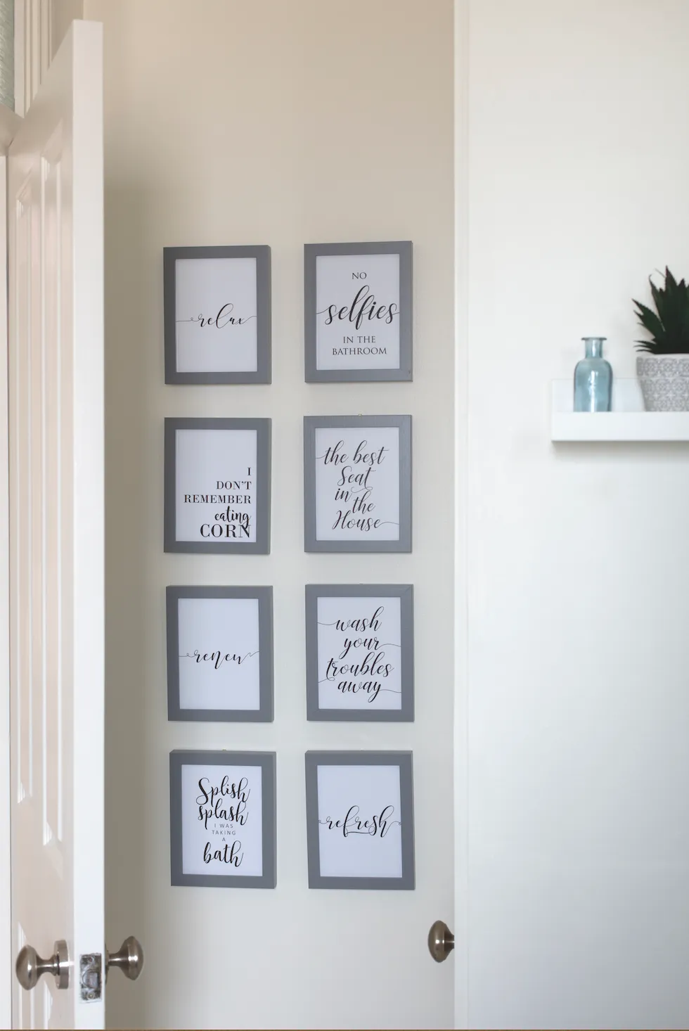
- When creating a gallery wall, first mark out your wall size on the floor and try different compositions and spacing between the frames. Take photos of layouts and note the measurements. This reveals what works best before a nail hits the wall.
- Always take window handles into consideration when installing roller blinds. If you can see the roll at the top of the blind when it’s wound down, make sure your fixtures are installed 1-2 inches away from the windowpane. When you wind down the blind, the bottom will not hit the top of the handles. The same applies to reverse roll and Roman blinds.
This is a digital version of a feature that originally appeared in HomeStyle magazine. For more inspirational home ideas, why not subscribe today?
