Having lived and worked near Addlestone, Surrey, for many years, Anthea O’Neil was keen to stay in the area, and she and partner Griff were looking for a house they could put their stamp on. ‘This house was a bit of a project, but not massive, and we could do it bit by bit,’ says Anthea. ‘Our previous house had already sold, and we were renting, so we could swoop in as cash buyers when we found the right place. We saw it in October 2019, knew immediately, and moved in just in time for Christmas.’

I'm Anthea O’Neil, 55, a deputy head. I live with my partner, Griff, also 55, a contract owner for a communications company, and my son, Jacob, 26, who has a separate annexe in the garden – plus dogs Polly and Arthur, as well as frequent visits from my daughter, Megan, 30.
Our home is a two-bedroom, semi-detached Victorian cottage in Addlestone, Surrey, which we moved into in December 2019.
The couple kicked off the renovations by turning one of the bedrooms into a large bathroom. ‘We made a major decision early on to go for a large, luxurious bathroom by knocking two rooms into one to give us more space,’ says Anthea.
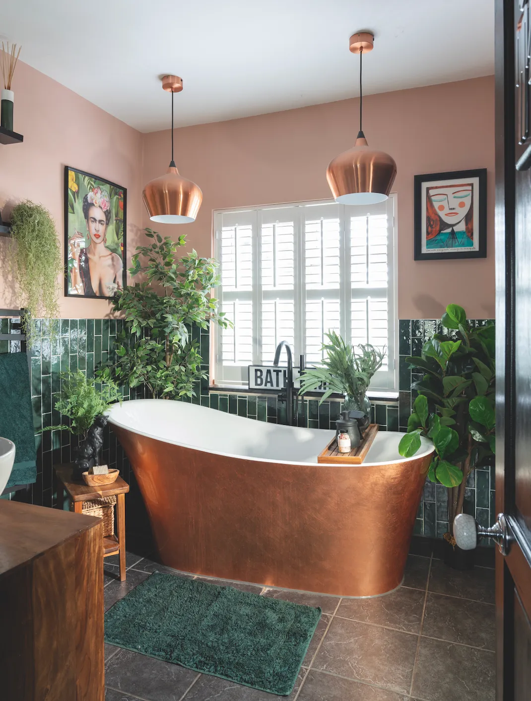
‘We craved a big, open space with a free-standing bath and a wet room area, which meant no shower screen to clean and just a wipe down of the tiles once a week. I’d always wanted a copper bath and when I heard about an ex-display model in a bathroom shop window near Richmond Bridge, I knew it had to be mine and we’d build the scheme around it. The shop also sold lovely dark green brick tiles that look Victorian, so we bought our wall and floor tiles there, too, in one fell swoop.’
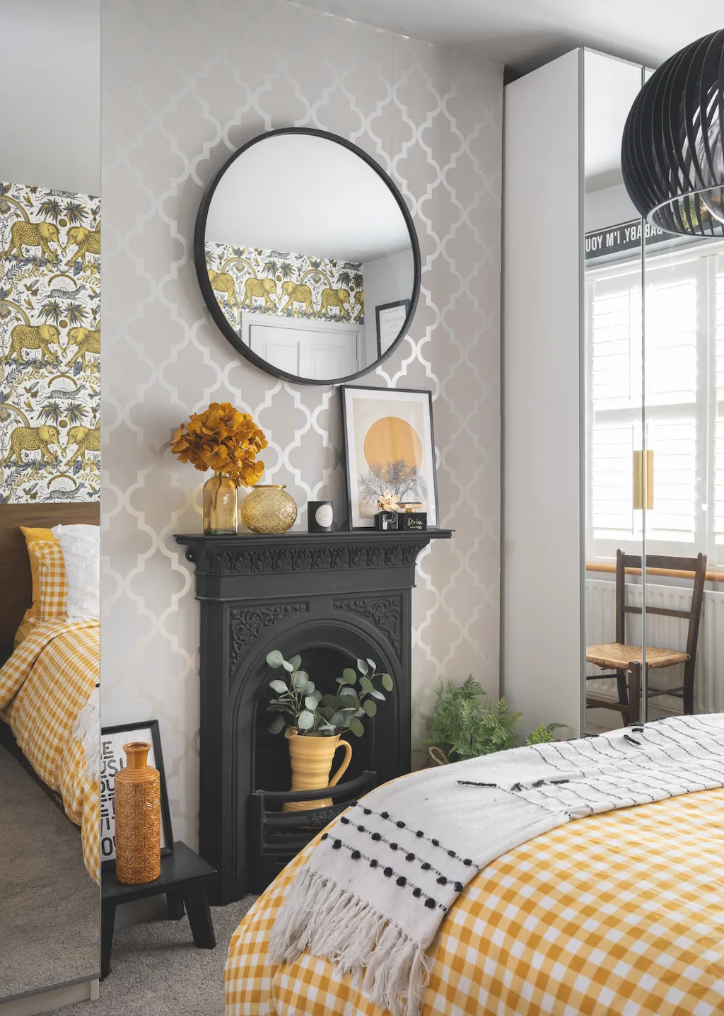
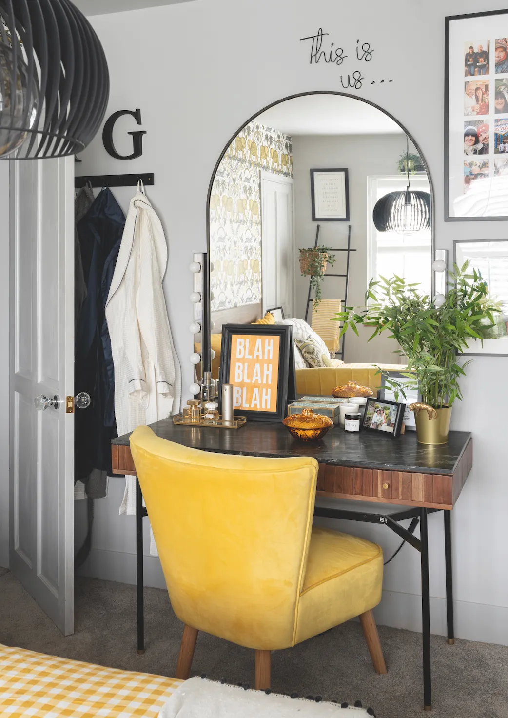
It was when they realised that they could reinstate the fireplace in the front bedroom that the couple decided to make the move into this space: ‘We never intended this to be our bedroom, but it’s beautifully light and airy. When we came to decorate this room in May 2021, we discovered we could put a fireplace back into the chimney breast, and the rest is history,’ smiles Anthea. The fireplace makes a perfect focal point and allows plenty of styling opportunities.
‘Putting a fireplace back in here made a huge difference,’ says Anthea. ‘The wallpaper on the chimney breast is quite plain, so as not to fight with the wallpaper opposite, and the wardrobes have mirrored fronts which throw light around the room.’
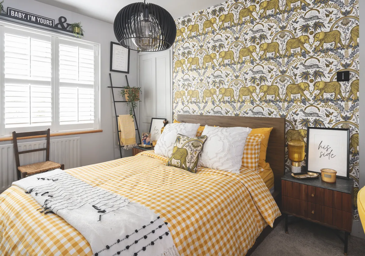
‘The inspiration for the colour scheme in this room started with the wallpaper, which has leopard print elephants and is called Zambezi. As a child I lived Zambia with my parents and two younger sisters, and we spent many holidays visiting the banks of this great river and exploring Victoria Falls. I’ve taken the yellow from the wallpaper and added splashes of it around the room in the furniture and accessories.’
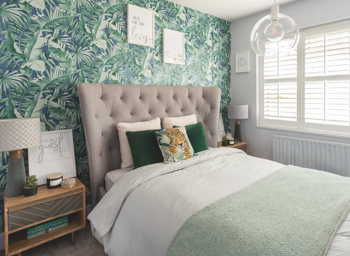
Anthea has given the guest bedroom a tropical feel with wallpaper and splashes of green. ‘I like my guests to be comfortable, and this bed from Dreams is lovely to sleep on,’ she adds.
Once they had finished the upstairs rooms, the couple contacted an architect and started on the planning process for the downstairs reno. ‘I had a design in my head, which I drew out on a piece of squared paper, and that’s pretty much what we ended up with,’ says Anthea.
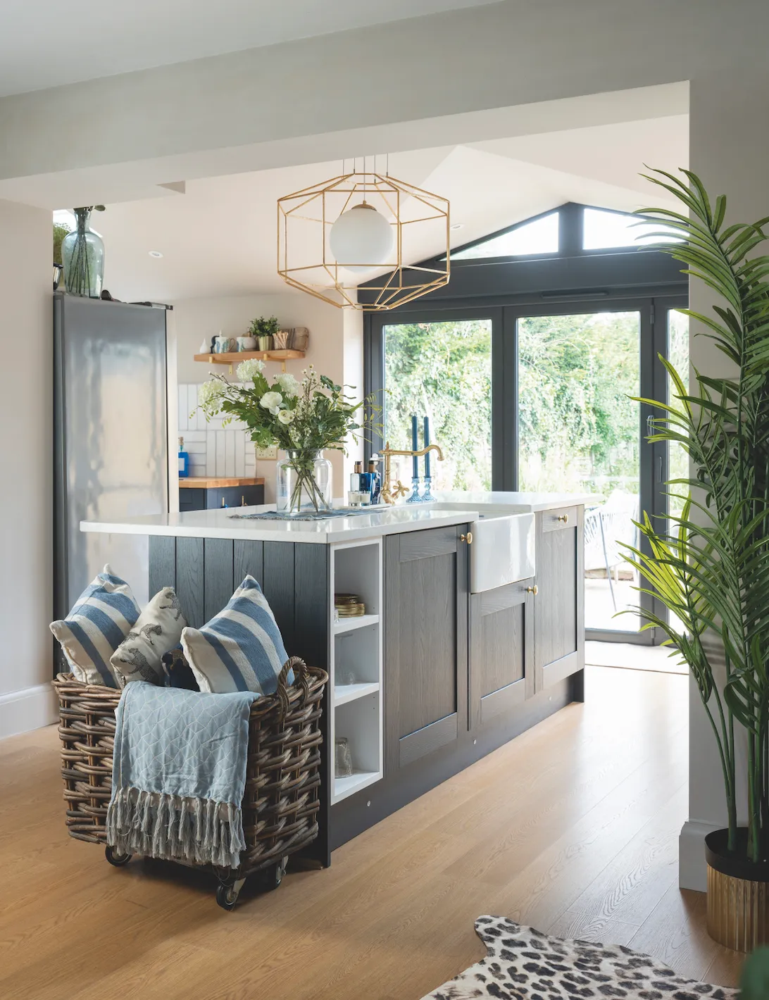
‘We inherited a tiny kitchen, and a run-down outdoor patio area that we hardly used. We saw how we could transform the back of the house and get the big open-plan space that we really wanted with an extension. The whole thing took three months, finishing in October 2022. It’s brought in so much light and changed the way we use the house. It’s now the hub of our home.’
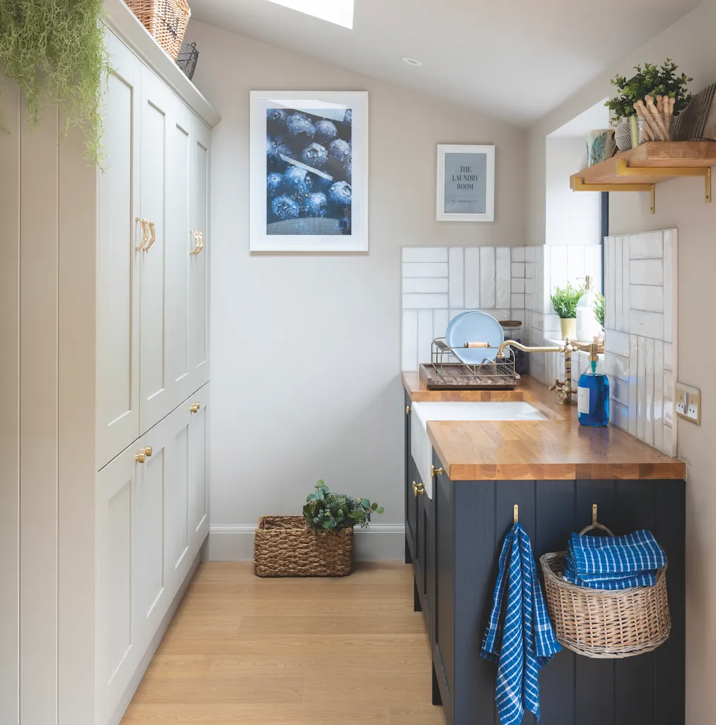
The separate utility room is an invaluable space, and features the same Shaker-style units as the kitchen, but in Stone, which gives a pleasing contrast.
When decorating the downstairs rooms, one of Anthea’s main concerns was how the spaces would flow together: ‘There are two separate areas in the lounge, both with their own focus – there’s the cosy corner with the armchairs where you can sit and chat, or read, and then there’s the big sofa with the fireplace and the TV,’ she explains.
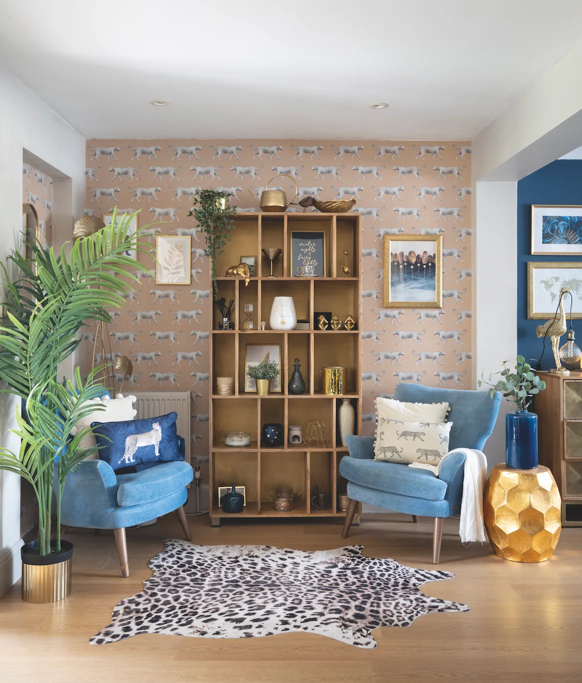
‘The space lends itself perfectly to creating these different zones as it transitions towards the kitchen. It’s so easy to move from one area to another.’
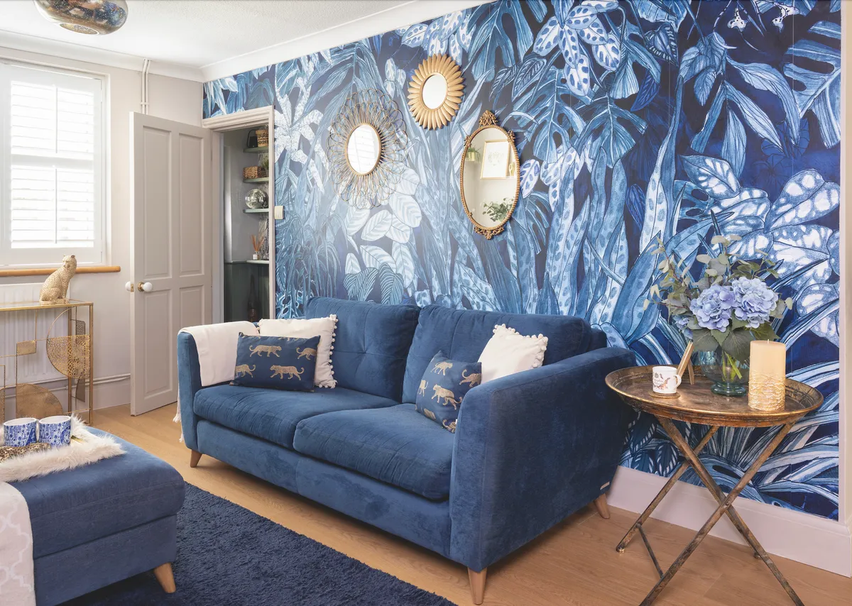
One whole wall is taken up by a dramatic mural, which tones perfectly with Anthea’s velvet sofa and carefully chosen accessories. The three mirrors above bring a touch of glam – the oval Art Deco one is particularly special as it belonged to Anthea’s mum.
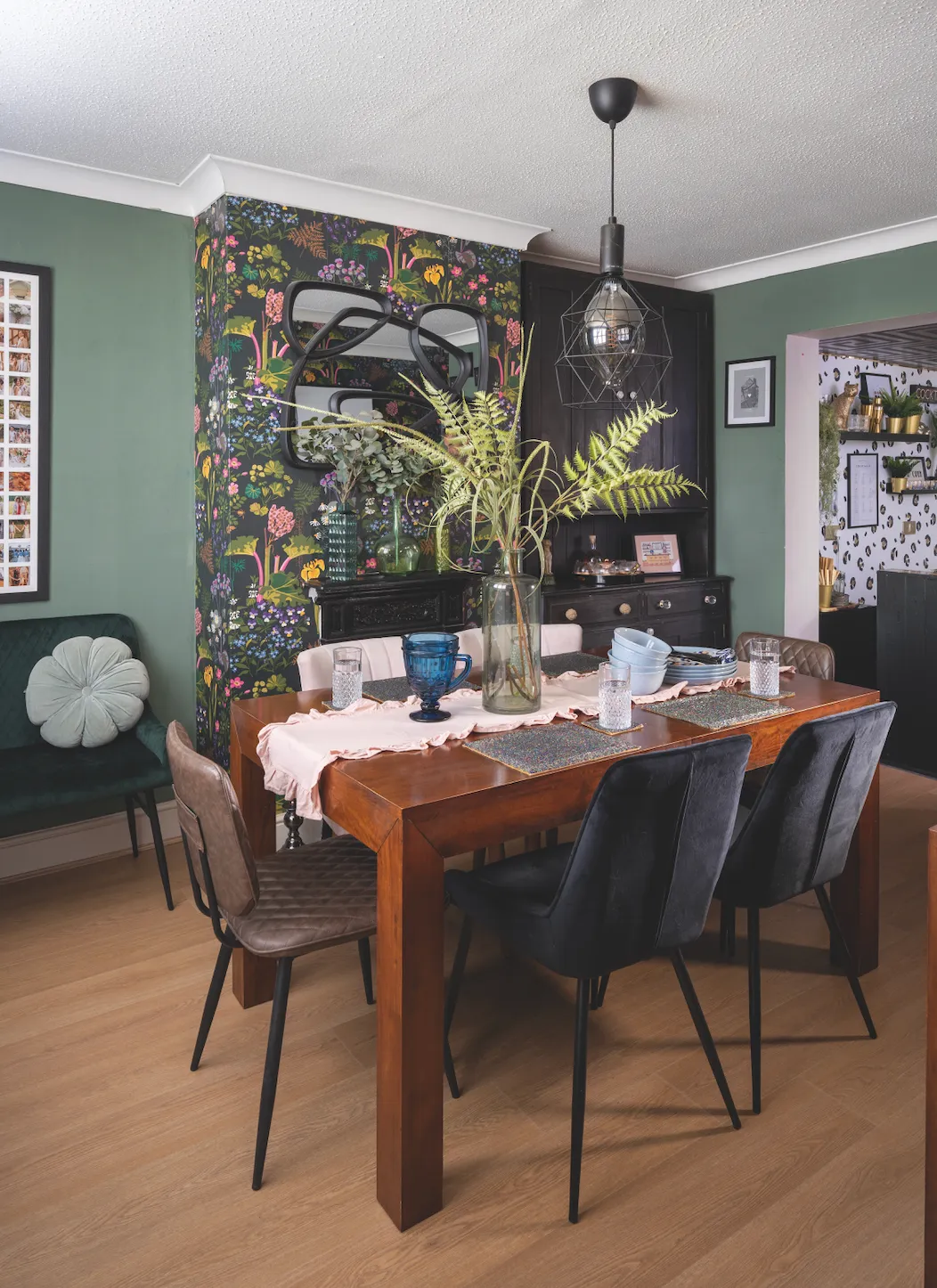
As she loves hosting, Anthea wanted to create an inviting dining space. ‘My table and chairs are constantly in use,’ she says. ‘The wallpaper was only meant to go on one wall, but I liked it so much I put it on the chimney breast, too.’
The couple also made use of an awkward space where the old kitchen used to be, by turning it into a home bar area.
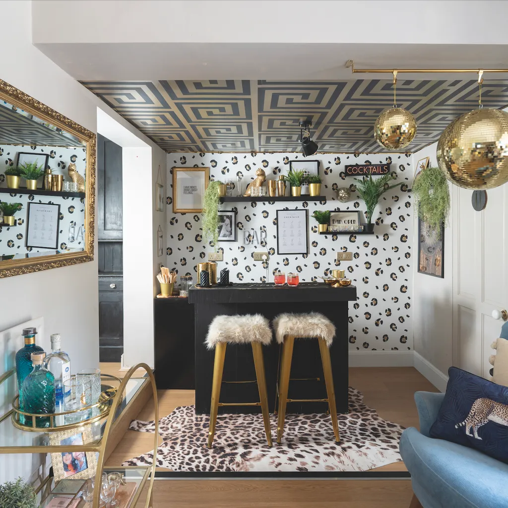
‘Our bar, The Tipsy Leopard, was the last major thing to be finished,’ says Anthea. ‘We got a sturdy bar made by a small business I found online, then added the leopard wallpaper and touches of gold.’
Anthea’s fearlessness when mixing colours and patterns has given her the vibrant, sociable home she dreamed of. ‘Colour, colour and more colour does it for me,’ she says. ‘No room is neutral. I love to experiment, and I’m not afraid to try new things. You can always change it!’
Photos David Giles
Feeling inspired by Anthea's beautiful home? If you're not sure where to start when it comes to using more colour in your decor, check out Dulux creative director Marianne Shillingford's guide to creating the perfect colour palette.
