Bright colours, bold patterns and ingenuity have transformed Liz Moore’s once bland, unloved home. Here, Liz talks us through the incredible result...
My story...
It was love at first sight when we viewed this house. I had seen it online, but it looked filthy and decrepit and I thought it needed too much work. But the estate agent persuaded us to take a look and as soon as we walked in, the light, bright hallway sold it to us.

Even the fact that the back of the house was only held up by a few bricks under the joists didn’t put me off, and as I left I kissed the wall and said ‘I’ll be back.’

We spent the first few weeks eating microwave meals in the bedroom, watching TV on the bed and washing up in the bath, while the builders did the rewiring and plumbing and opened up the kitchen.
Welcome to my home...
A bit about me I’m Liz Moore @niceinnotts. I live with my fiancé, Rick, and our 13-year-old daughter, Ava.
Where I live Our home is a four-bed detached house built in 1937 in Nottingham. We moved here in 2014.
What I wanted to change Literally everything needed doing, from installing new central heating and windows to rewiring the whole property. The décor needed an overhaul too.

We kept part of the partition as it would have cost too much to shore up the back of the house, but it’s given us more wall space for units and worktops, so it worked out well.

Though we did nearly lose everything when Rick put the money to pay the builders in the microwave for safekeeping. I turned it on to see if it worked and all the money set alight! Thankfully the bank replaced it all.

With the decorating, I love colour and wanted a look that’s unique, though we’ve tried to choose décor that will last rather than following trends. As Rick says, although we’ve gone for bold and bright, classic never goes out of fashion. And although our look isn’t for everyone, we absolutely love it and wouldn’t change a thing about our home.
A bit more about my home...
How I made it my own We created a large kitchen-diner and installed new kitchen and bathroom furniture. I also went wild with patterned wallpaper and colourful furniture.
My favourite part The hallway. Every time I walk through the door, I breathe a happy sigh. I also love the panelling and fireplace in the living room.

Living area
‘We get a certain look when we tell people we have black walls, but when they actually see them, they’re amazed at how light the room is and how stunning it looks. I love colour and have a taste for maximalist wallpaper, and the black really allows the colours of this Divine Savages design to stand out. It’s not cheap but it completely transforms the room.

‘Originally, we had white-washed walls, but when the stove was installed it really stood out, so going to the dark side helped it to visually take a back seat.
‘This white tree was in the sale from M&S and it really reminded me of old-fashioned Christmases, especially when teamed with the retro Thomas Pacconi hand-blown glass baubles. It feels really nostalgic and reminds me of my grandma.’
Dining room
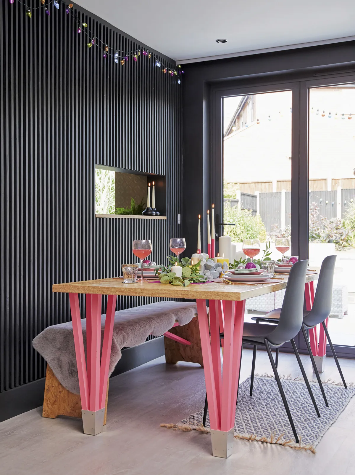
‘We investigated extending the back as originally there was just a small door out to the garden, but it would have been a big, expensive job so we decided to work with the space we had. Adding these big glass doors transformed the room and on warm days they are a real gamechanger.

‘Rick and I are not really handy, but we’re lucky that my dad gives us great practical help. He did the panelling for us using a cheap pack of timber from Wickes.

‘It took lots of measuring to get the spacing exactly right, but I love all the shadows that reflect off the panels and the mid sheen finish. I suggested creating the hatch to link through to the kitchen so that we can still chat in the space.’
Kitchen
‘The original kitchen was tiny, so we decided to knock the back two rooms together to make a big kitchen-diner and extra living area. We considered moving the kitchen but my dad pointed out it would be pricey because we would have to move all the plumbing, so we decided to leave it in place.

‘We wanted as much storage as possible so we included loads of high cupboards, though if we ever redo it, I think I’ll lose the top cabinets as we don’t actually need all the storage, and I think some open shelving would be nice in the future.
‘We wanted to balance the dark walls and cabinets with a lighter floor and this soft grey vinyl flooring, from B&Q, really brightens up the space.’
Bathroom
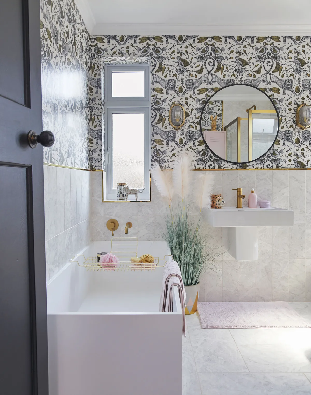
‘We lived with the bathroom as it was when we moved in, and we’ve only just finished its transformation. The original room was an avocado colour, and I wonder sometimes how we put up with it for so long, but it didn’t feel as much of a priority as the other rooms.

‘We kept everything in the same position to avoid moving the plumbing, and tried to maximise the look of the small space as much as possible, so we chose a basin without a pedestal and a large glass shower screen.
‘We wanted to keep the room light and bright with matching floor and wall tiles which give a seamless look.’
Master bedroom
‘I’ve always loved interiors, pattern and colour, and I’m constantly thinking of new ways to change up our home. This room has already gone through different fazes – the last one being a very dark navy blue – but I wanted to create a pretty, more relaxed space.

‘We’re lucky to have a small spare room where we can store our clothes, so we ripped out the fitted wardrobes that were in here to make the room more uncluttered and spacious, and then we used Valspar to match the wall colour to an expensive brand we liked.

‘I love a gallery wall and wanted to create a 3D effect above the bed. This wall is a growing collection of beauties that I find.’
Ava's bedroom
‘Ava’s room was done first as we wanted her to enjoy the house and feel settled. We replaced the windows and carpet and then decorated.

‘It was originally all pink, but recently Ava has redesigned the room herself to be more on trend and grown-up. She just went for it with masking tape, creating a random design, and then used a few bright pastel-coloured tester pots to fill in the triangles.
‘It was a really quick and cheap makeover. The curtain of lights – from Urban Outfitters – adds a bit of sparkle.’
This is a digital version of a feature that originally appeared in Home Style magazine. For more inspirational home ideas, why not subscribe today?
