Laura Chambers transformed a series of dark, cramped rooms in her 1930s semi into the hub of family life. Here, she tells us all about her home makeover...
My story...
When we first bought this house it was very rundown and needed modernising throughout. For six months we lived in a rental property while the sale went through and then the entire house was replastered, rewired and given new woodwork over four months.
Luckily, we knew lots of good tradespeople as this is our third renovation. Knocking out two walls to make the kitchen, diner and living room all open-plan was the biggest change. Installing French doors to the garden has made it much lighter too.
Welcome to my home...
A bit about me I’m Laura Chambers, an inclusion manager and interior stylist at homebirdsinteriors.co.uk. I live with my partner, Craig, a sales manager, and our children: Rory, six, and Freddie, three.
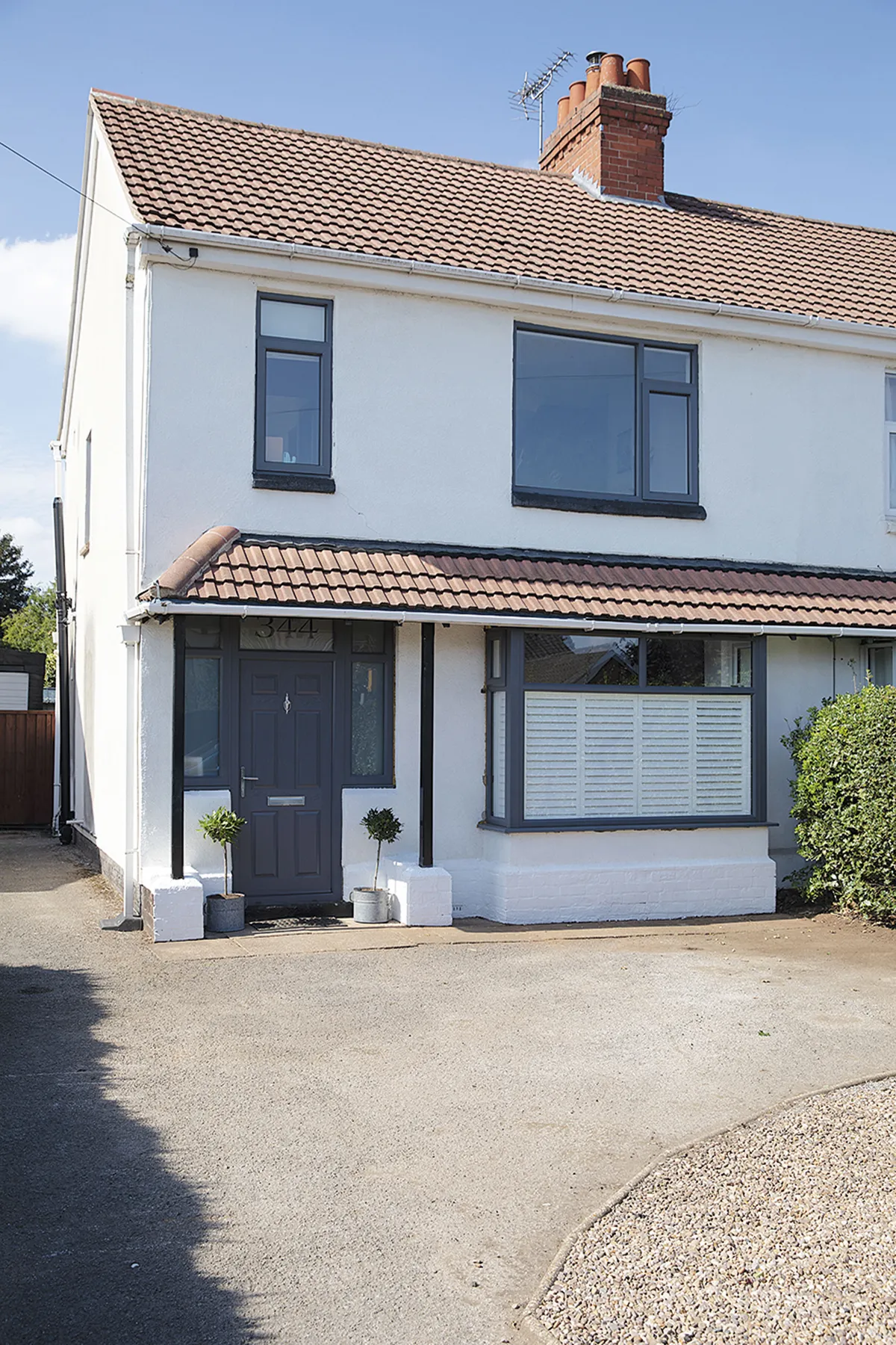
Where I live We bought our three-bedroom 1930s semi in Hucknall, Nottingham, in October 2019, and moved in four months later.

We also squeezed in a downstairs toilet and changed the front door. In fact, the only thing we managed to save was the fireplace in the dining area, which I revamped in pink and now love.
If we were staying long-term, we probably would’ve extended at the back, however we didn’t want to spend too much time and money as we plan to resell the house in a few years. I still wanted to make it as nice as possible for the family though.
A bit more about my home...
What I wanted to change Everything! There were Artex ceilings and awful carpets throughout, but the pokey galley kitchen was definitely the worst part.
How I made it my own We’ve opened up the two reception rooms and kitchen, reinstated fireplaces and added family-friendly features like a ground-floor toilet and separate shower cubicle in the main bathroom. A colour scheme of white, grey, green and blush pink has been given an edge with industrial and boho touches.
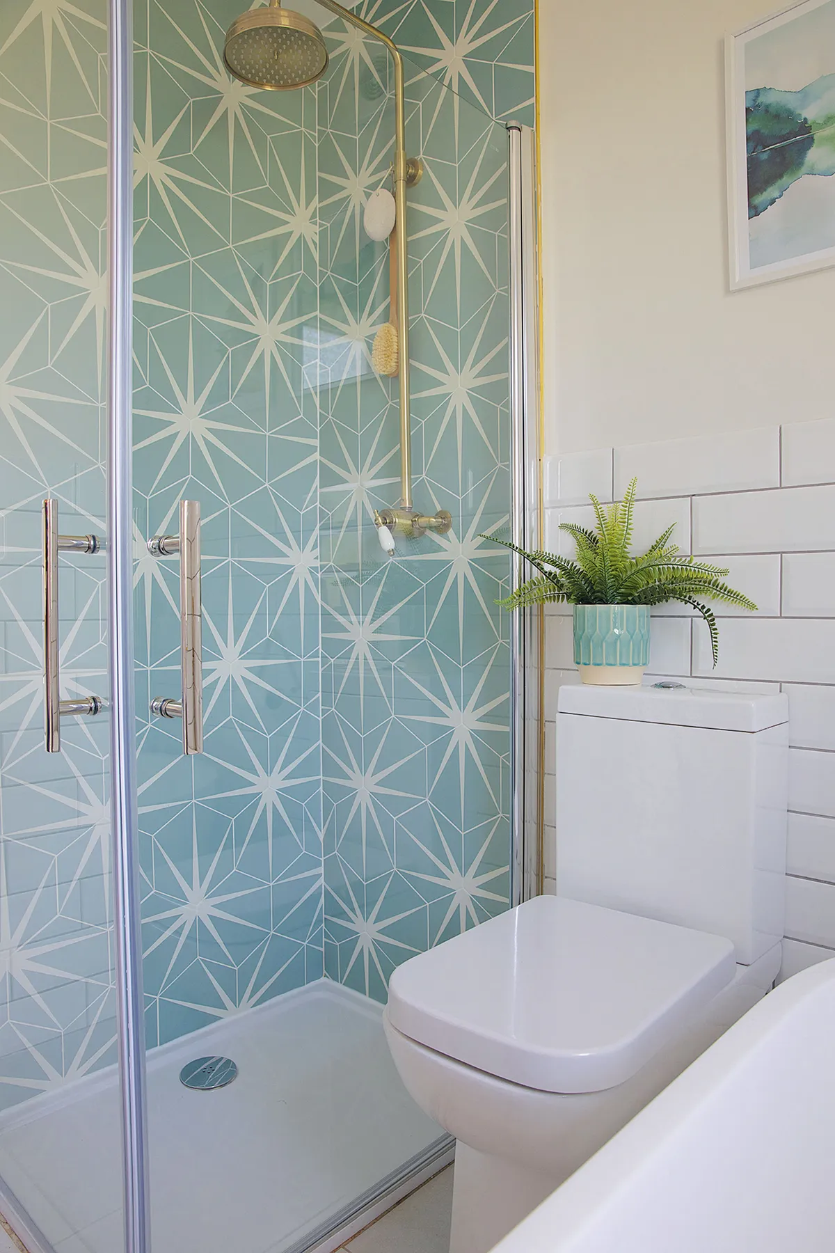
My favourite part The transformation of the ground floor has definitely been the most successful part as it works so well for family life. I’m so glad I splashed out on the indulgent tiles in the shower too.
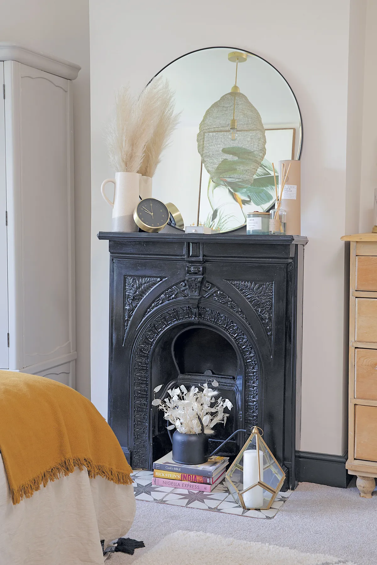
I’m drawn to Scandi and industrial interiors but here we have a mix of traditional features too, like reclaimed cast-iron fireplaces, which we put in to add character. Eventually, we’d love to build a home from scratch, where I can be even more daring with the interior design.
Kitchen
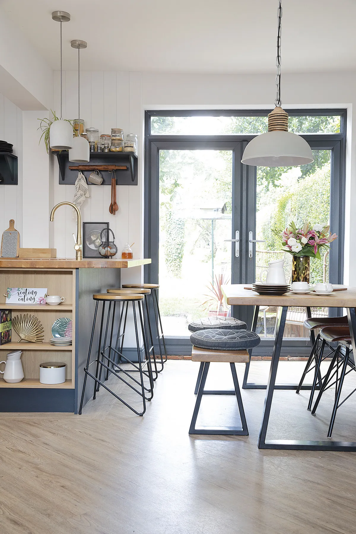
‘The previous galley kitchen – with its dark brown units, peach walls and ugly boiler – had to go. Not only was it cold and damp, but it also led to an awful lean-to conservatory, which the previous owners used as a dumping ground. Blocking up two windows has made better use of the wall space for cupboards and we created a downstairs loo where the door used to lead from the hall to the kitchen.
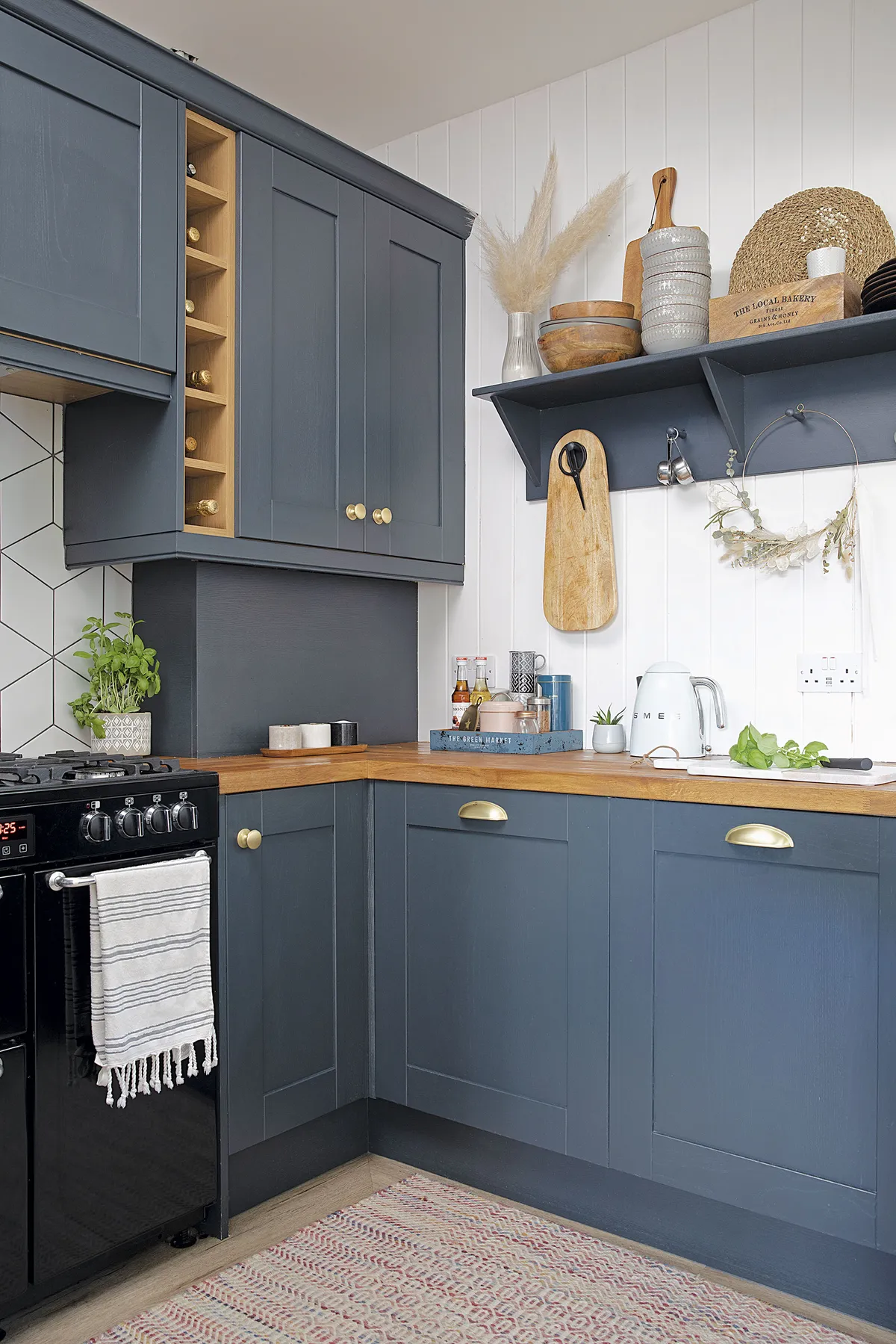
‘Our previous home had a blue kitchen, but I wanted to go more dramatic here so I chose graphite grey units from Inspirational Interiors. I’ve combined them with fresh white Scandi-style panelling, open shelving, brass accents and concrete pendants by Vaunt Design.’
Dining area
‘With a dark brown fire surround, yellow-painted alcoves and an ugly fan light on the ceiling, the dining room was pretty uninspiring. After it was opened up to the kitchen, I wanted to keep things fresh and bright, so I used Farrow & Ball’s Wevet on all the walls.
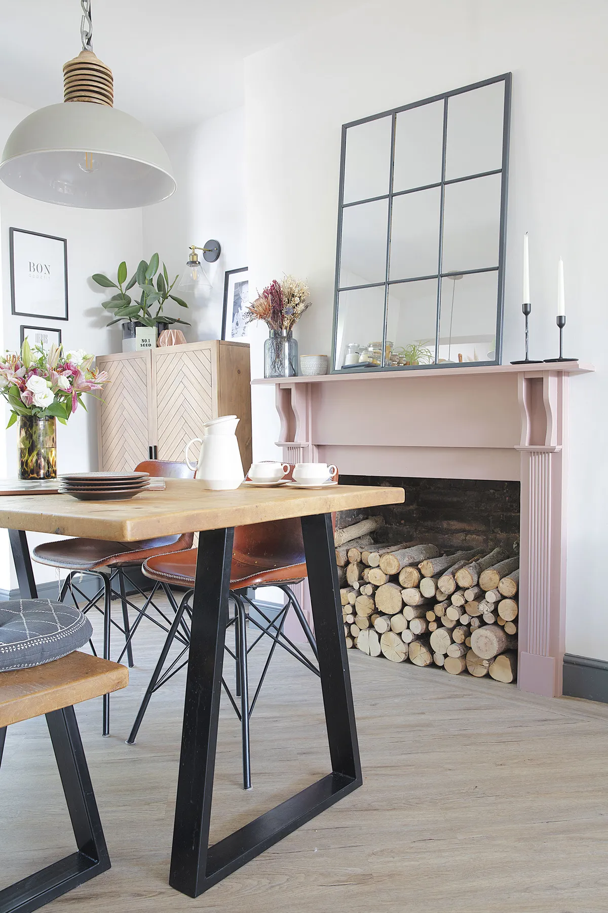
‘Adding French doors where there used to be a window has made a huge difference too. I now love the old fire surround after giving it a lick of pink paint and filling it with logs. I’m quite proud of the grid mirror too. I upgraded it by glueing beading onto a cheap mirror from The Range and painting it with Farrow & Ball’s Railings. Similar designs cost over £100 but my DIY version was about £30 in total.’
Living area
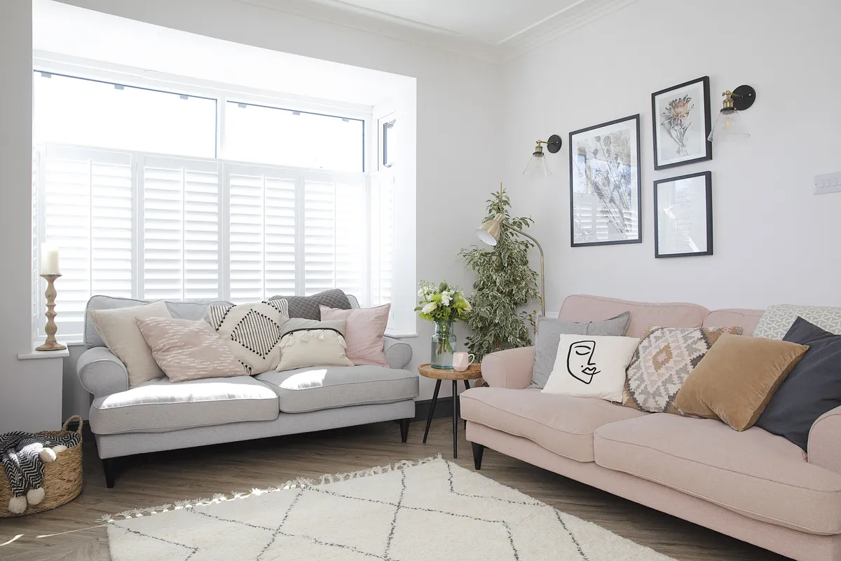
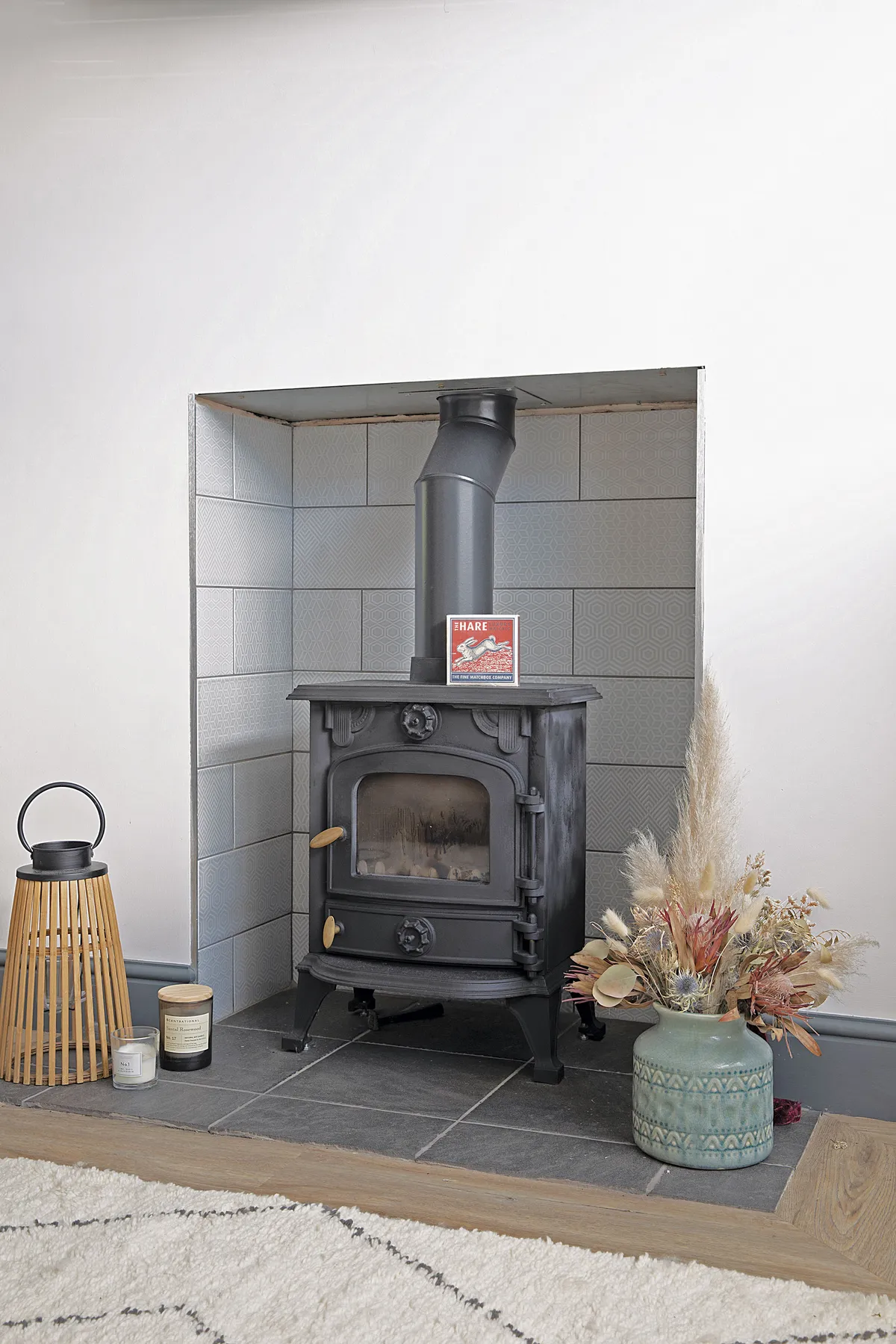
‘After ripping up the patterned carpet in here, we got our builder to create a better focal point by opening up the fireplace and replacing the unused gas fire with a wood-burner. Now the space is open-plan, it’s so much lighter and works brilliantly for both entertaining and family life.
‘I picked two three-seater DFS Viv sofas from the So Simple range as they have a timeless, classic shape. They’re super spacious and can comfortably seat three adults. Since I wanted a touch of pink somewhere in the house and the boys didn’t want any in their bedrooms, I opted for one sofa in Quartz Blush and another in Steel Grey.’
Bathroom
‘With a poorly planned layout, making the best of our small bathroom was a real challenge. Fitting in a shower cubicle as well as a bath was our priority. In the past, when installing showers over baths, we had to experiment with different sealants to avoid leaks and even then we still found water coming through the living room ceiling once or twice. That wasn’t a road we wanted to go down again!
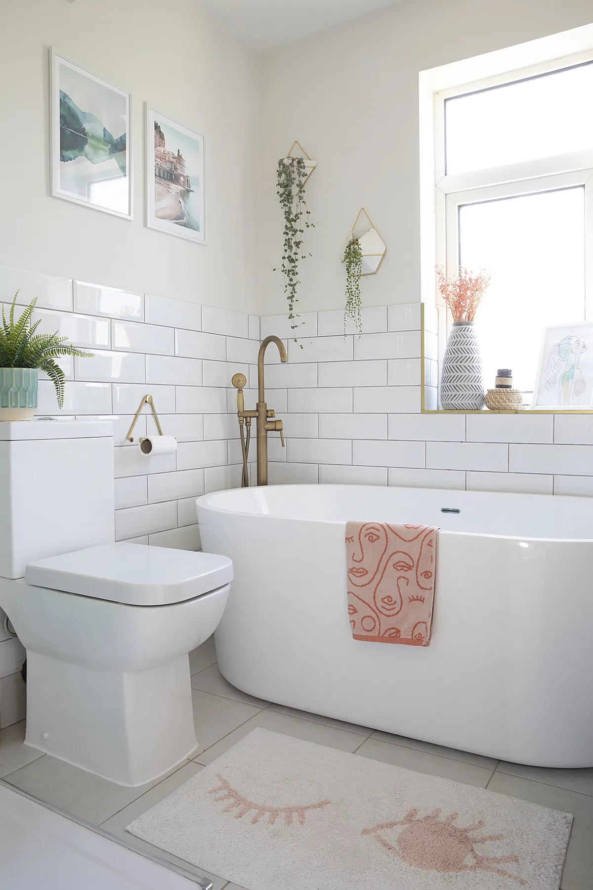
‘The solution was finding a compact, free-standing bath that would fit under the window, a short projection toilet and a clever folding shower door that opens inwards so it doesn’t encroach too much on the space. Swapping the inward opening entrance door for a sliding door was a great space saver too. In total we spent around £4,000 in here.’
Master bedroom
‘Our bedroom design was centred around the gifted print from Graham & Green, which I wanted to make into a feature. I felt the natural rattan vintage-style bed from Time4Sleep would tie in well with it.
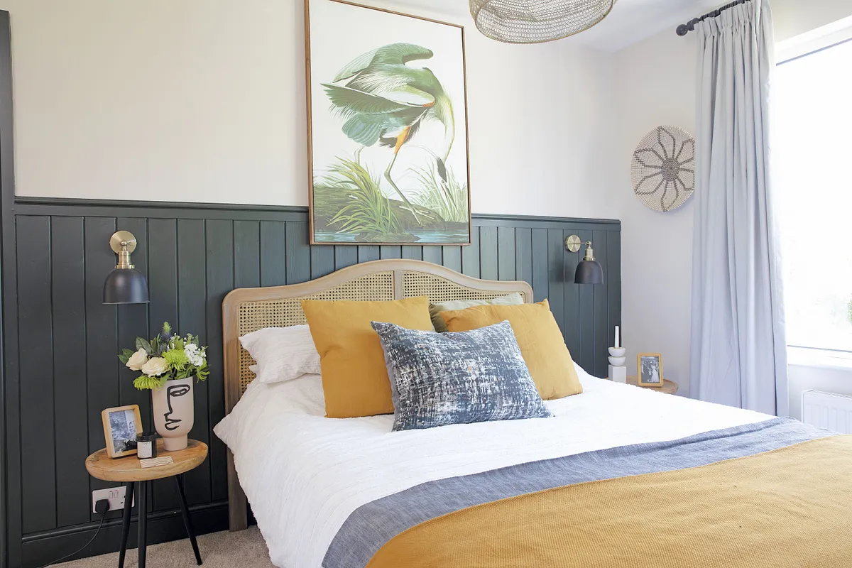
‘The new dark panelling sets it off too. There was no fireplace before, so we found a reclaimed design on Gumtree and sandblasted it. Craig built a frame around it, so it looks like an original. Painting the walls in a warm light grey – Skimming Stone by Farrow & Ball – has tied everything together.’
Rory's bedroom
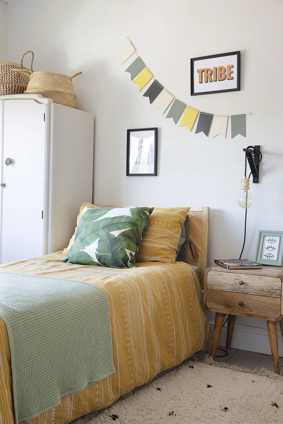
‘The larger of the two front bedrooms was previously decorated in an awful lavender purple colour. So, we painted the walls in Strong White by Farrow & Ball, as well as sanding the floorboards and painting them grey. I let my little boy choose what he wanted.
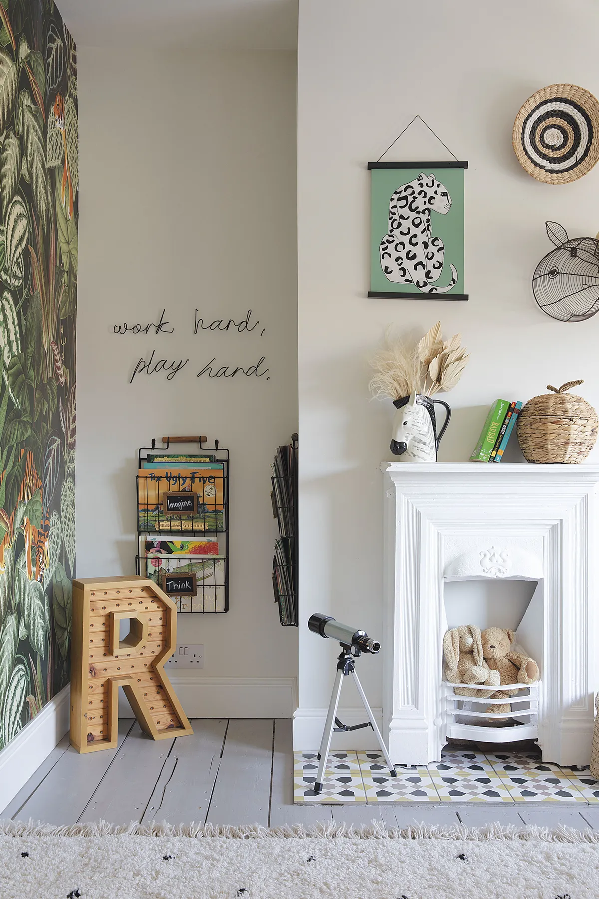
He picked a jungle-themed wallpaper from a few options I showed him. As it’s quite dramatic, I tried to tone down everything else and keep it neutral with a simple La Redoute rug. Adding in another reclaimed fireplace has made a big difference too and I love the hearth we made with some lovely patterned tiles from Topps Tiles.’
What I learned...
It’s essential to set a timeline when you’re project managing. We gave ourselves four months to renovate the house so getting a time frame for jobs from the various trades ensured all the materials were ordered on time.
Having the smoke-stained uPVC windows spray painted, rather than replaced, has totally transformed the front of the house. It cost about £250 for a medium-sized window and we’ll be getting the company back to do the rear of the house as well.
Sticking to your budget is important, but don’t be afraid to have a few mini splurges here and there. It’s those things that will make a big difference to the final look.
This is a digital version of a feature that originally appeared in Home Style magazine. For more inspirational home ideas, why not subscribe today?
