After four years of living in a 1.5-bed flat, Shrez and her husband Tom decided that they wanted a bigger home.
They couldn’t afford to stay in Woolwich, so they started a property search nearby at Plumstead, which was much more affordable.
They soon fell in love with the area as it was an altogether greener part of south-east London with lots of great spots for dog walks.
The house they fell in love with, however, was in need of a complete renovation, with crazy room layouts and outdated decor. Here, Shrez shares her home makeover story...
Welcome to my home
A bit about me I’m Shreenal, but I’m known as Shrez, 27. I live with my husband, Tom, 28, and Maui, our Cavalier King Charles.
Where I live Our home is a four-bedroom Victorian terraced house in Plumstead, south-east London. We’ve lived here for two years.

My story...
‘When we moved into this house, you had to walk into the garden to access the kitchen and the main bathroom led off from a bedroom. We kept the original footprint of the house, but changed the layout.
‘In May 2018, our builders stripped the entire house back to bare brick. The kitchen was ripped out and walls were put in to divide up two bedrooms to make way for two new bathrooms.
‘We also swapped the living room and kitchen to make better use of the space.
‘Our new home was a building site, so we continued to live in our flat up the road. At 6am every morning, I’d visit the site to answer the builders’ questions and drop by again in the evenings to check on the work.
‘By October 2018, we were finally able to move in. The downstairs was finished, but we still had to do the upstairs rooms. We taught ourselves DIY skills by watching YouTube videos and learnt how to put up coving and fit skirting.
‘Weekends and evenings were spent up ladders painting. Although we’ve made some of the bedrooms smaller, our home works for us now. It’s such an incredible feeling to have built somewhere like this that we enjoy living in so much.’
A bit more about my home
What I wanted to change The house was a wreck. It had been rented for years and all the original features had been stripped out.
How I made it my own We renovated it all. We flipped the layout and installed new bathrooms and a kitchen.
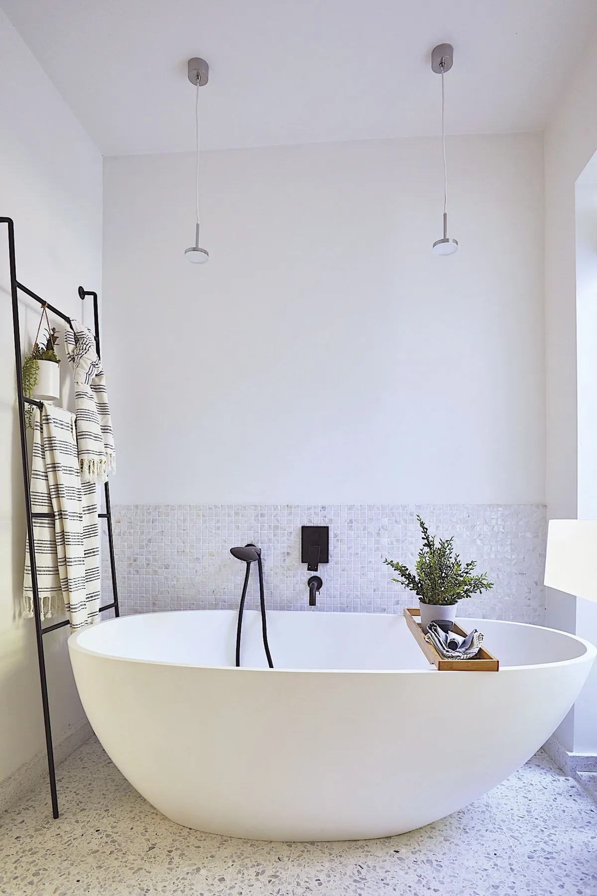
My favourite part Our bargain stone bathtub that we placed by a window. Now when you take a bath, you can admire our side courtyard, while remaining private.

Kitchen
‘Originally the kitchen was used as the main living space with magnolia walls and old beige carpet. It was a very long, empty room that lacked heart or soul,’ says Shrez. ‘When we plastered the wall, it was one of the turning points in our build.
It felt like the end was near and I fell in love with the texture, colour and feeling that fresh plaster gave me. It didn’t feel right to cover it with paint, so we left it unpainted as part of our design and saved money on paint as a result! ’
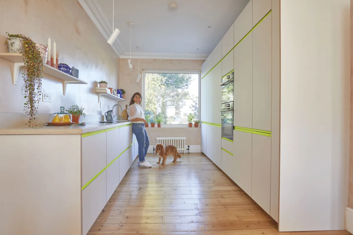
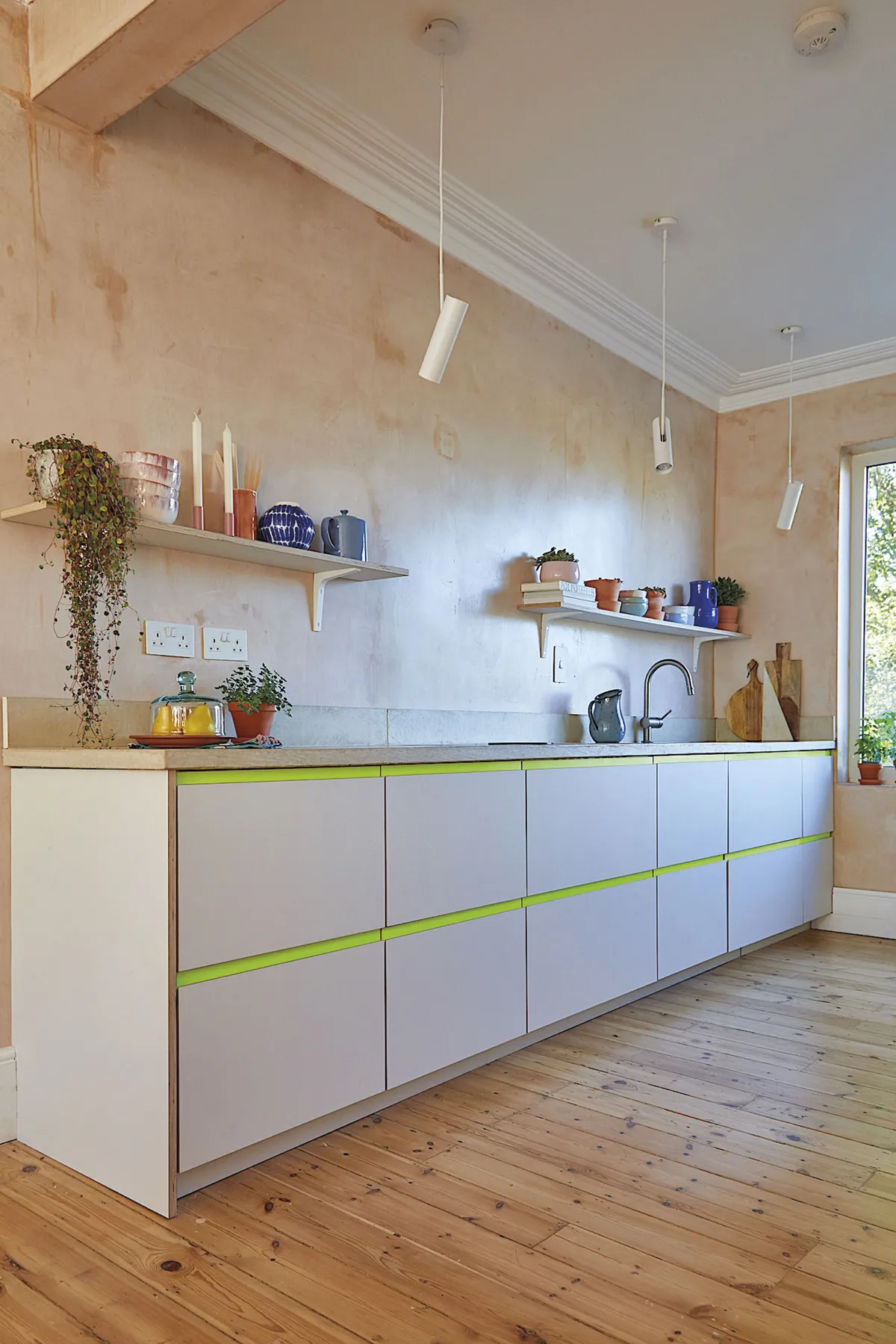
The couple installed a large window at the rear of the property to allow daylight to flood the room. They bought IKEA base units, but got their unusual door fronts from Plykea.
‘We kept our original floorboards, but replaced any that were damaged with ones from upstairs,’ explains Shrez.
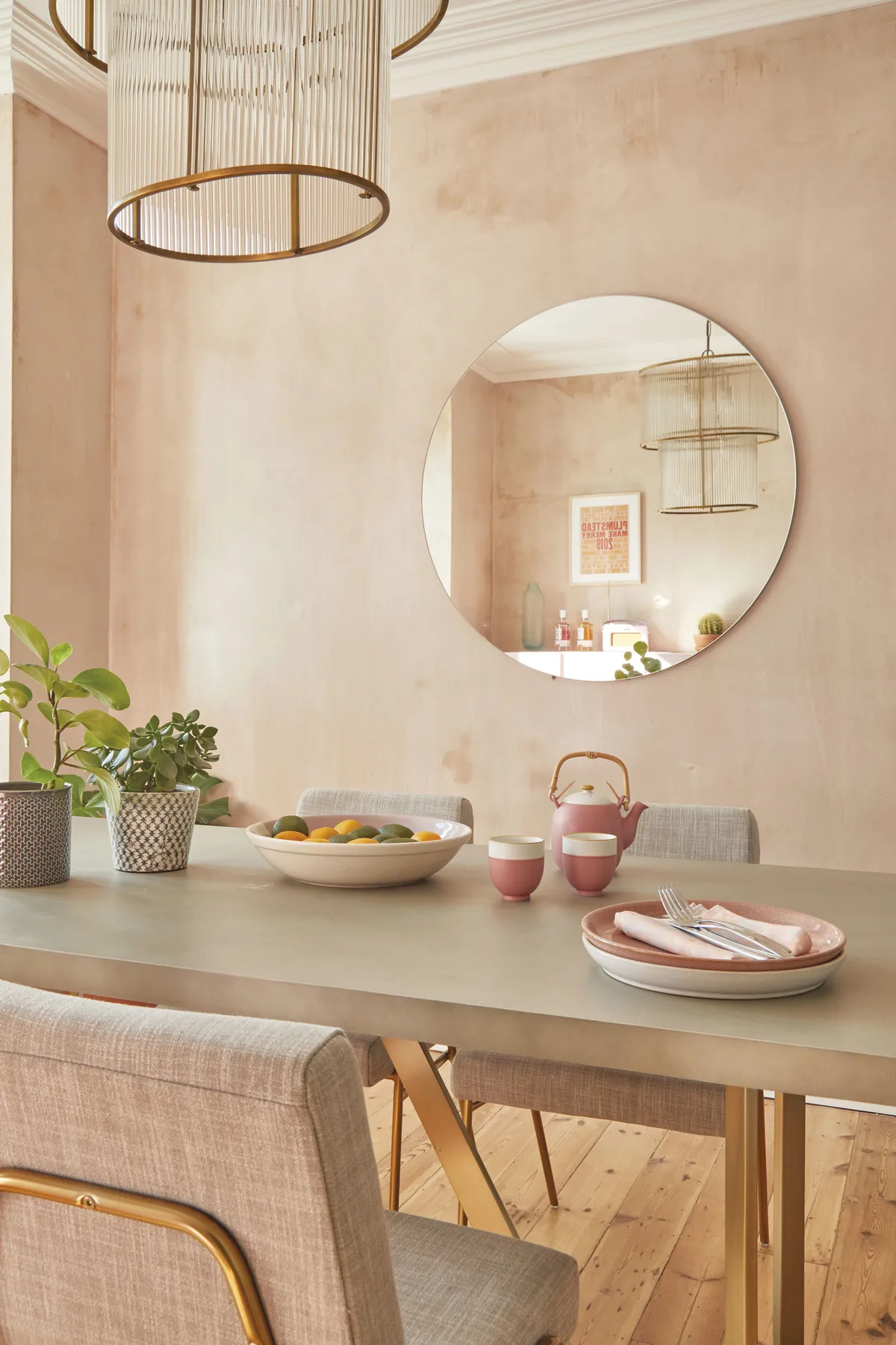
Dining room
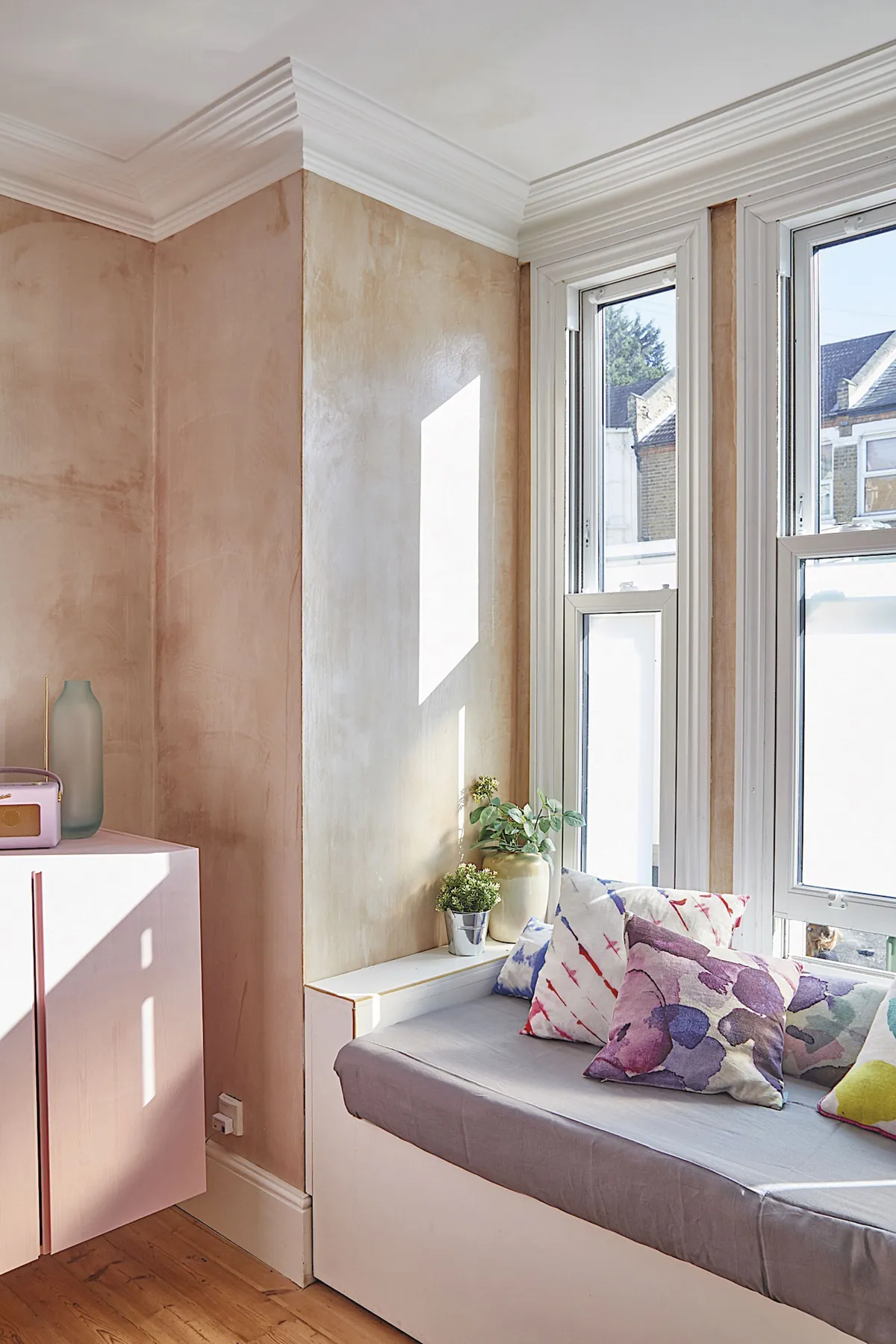
‘We replaced the old uPVC windows with new sash-style ones. They block out sound from the street and keep the house warm in the winter months,’ says Shrez. On the wall, the couple hung a row of IKEA Ivar units, which they painted in Nancy’s Blushes by Farrow & Ball.
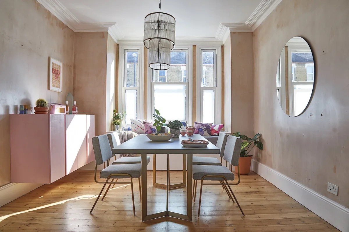
A handy made-to-measure window seat decorated with cushions by Bluebellgray and John Lewis & Partners makes the perfect spot to watch the world go by. The dining table and chairs are by West Elm and above them hangs a chandelier by Pooky.
Living room
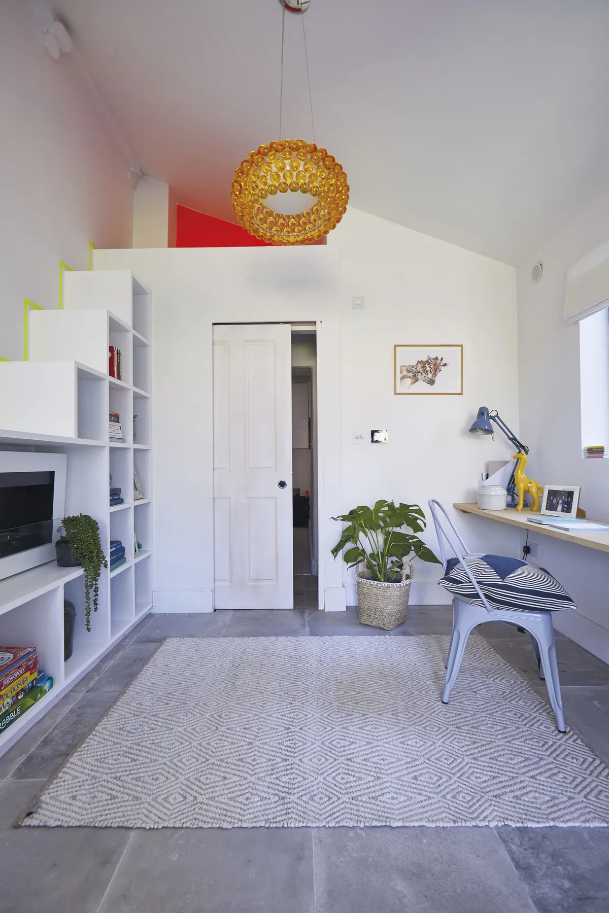
‘This was originally the kitchen, which you had to access through the garden. There were old-fashioned wooden cabinets on the walls, lino flooring and a cheap laminate worktop,’ Shrez remembers.
‘We ripped it all out and put in sliding doors on two angles, so we would get a 180° view of the garden.
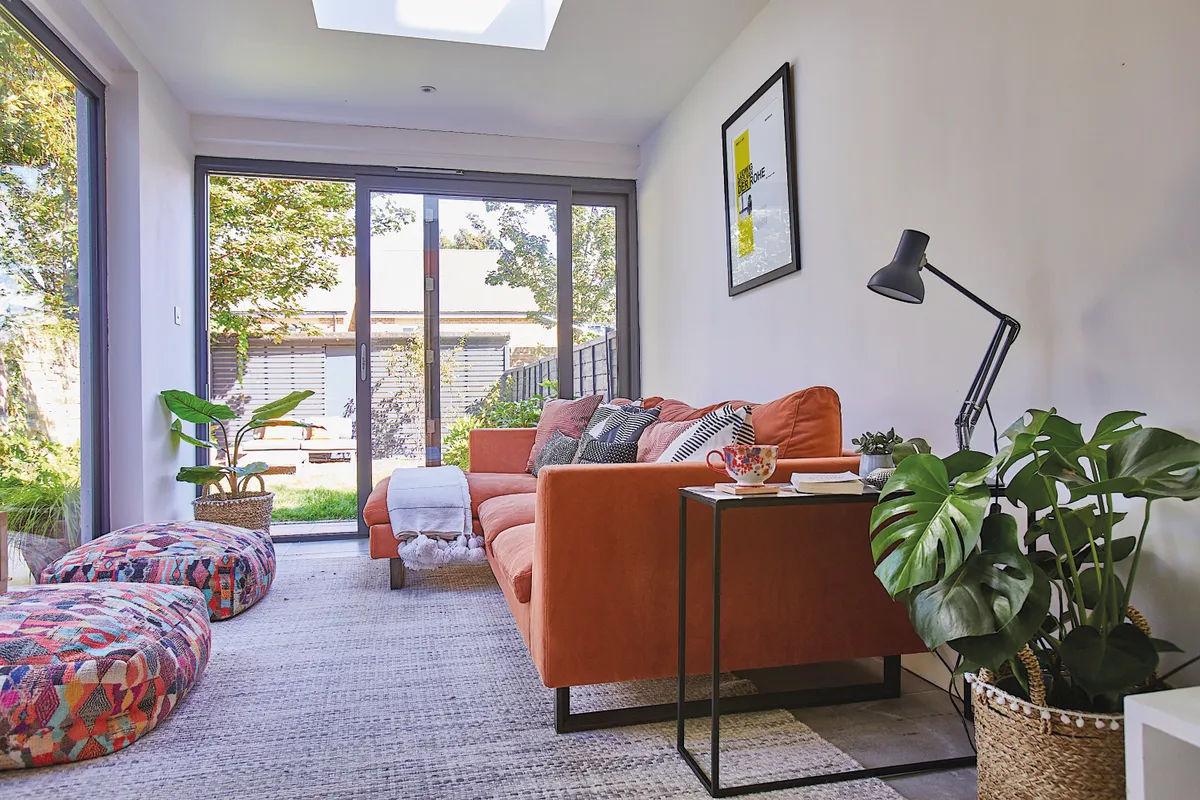
‘On the floor, concrete-effect tiles were fitted that run out onto the garden patio to give that feeling of indoor/outdoor living. We took the ceiling off the extension as we liked the idea of a sloped roof with a reading nook at the top.
‘We had shelving made that you can walk up to reach the loft area and installed an eco-friendly bioethanol fireplace to keep the room cosy in the winter.’
Bathroom
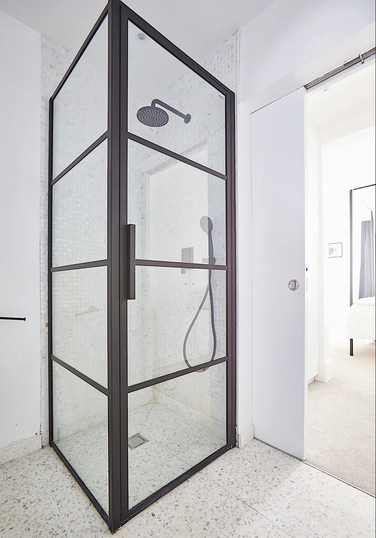
To create an en suite, the couple stole space from their downstairs bedroom. ‘We had a wall and sliding doors installed in our master bedroom to create our new bathroom,’ Shrez says.
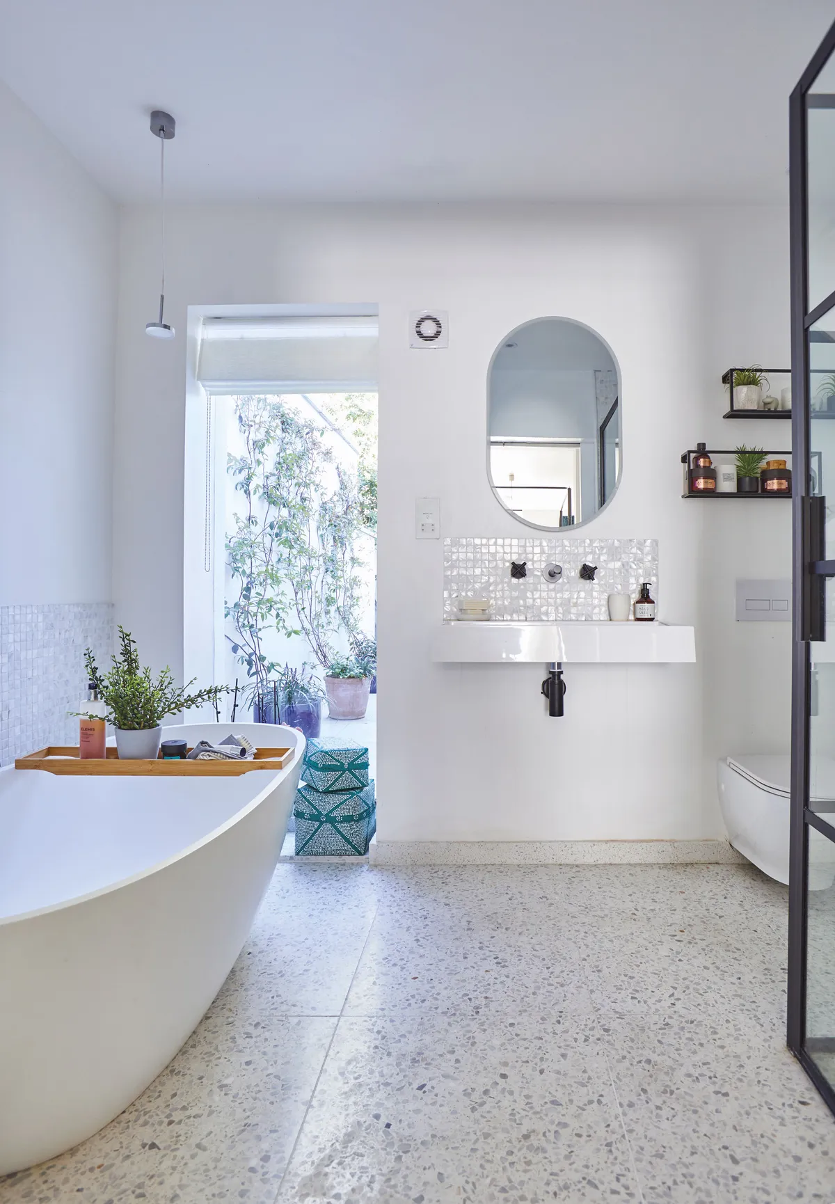
The stone resin bathtub was a bargain find on eBay and on the floor are tiles from Diespeker & Co. ‘We positioned the bath so that you can look out of the window onto the garden when having a soak.’
The pill-shaped back-lit mirror, by Roper Rhodes, turns on by touch.
Master bedroom
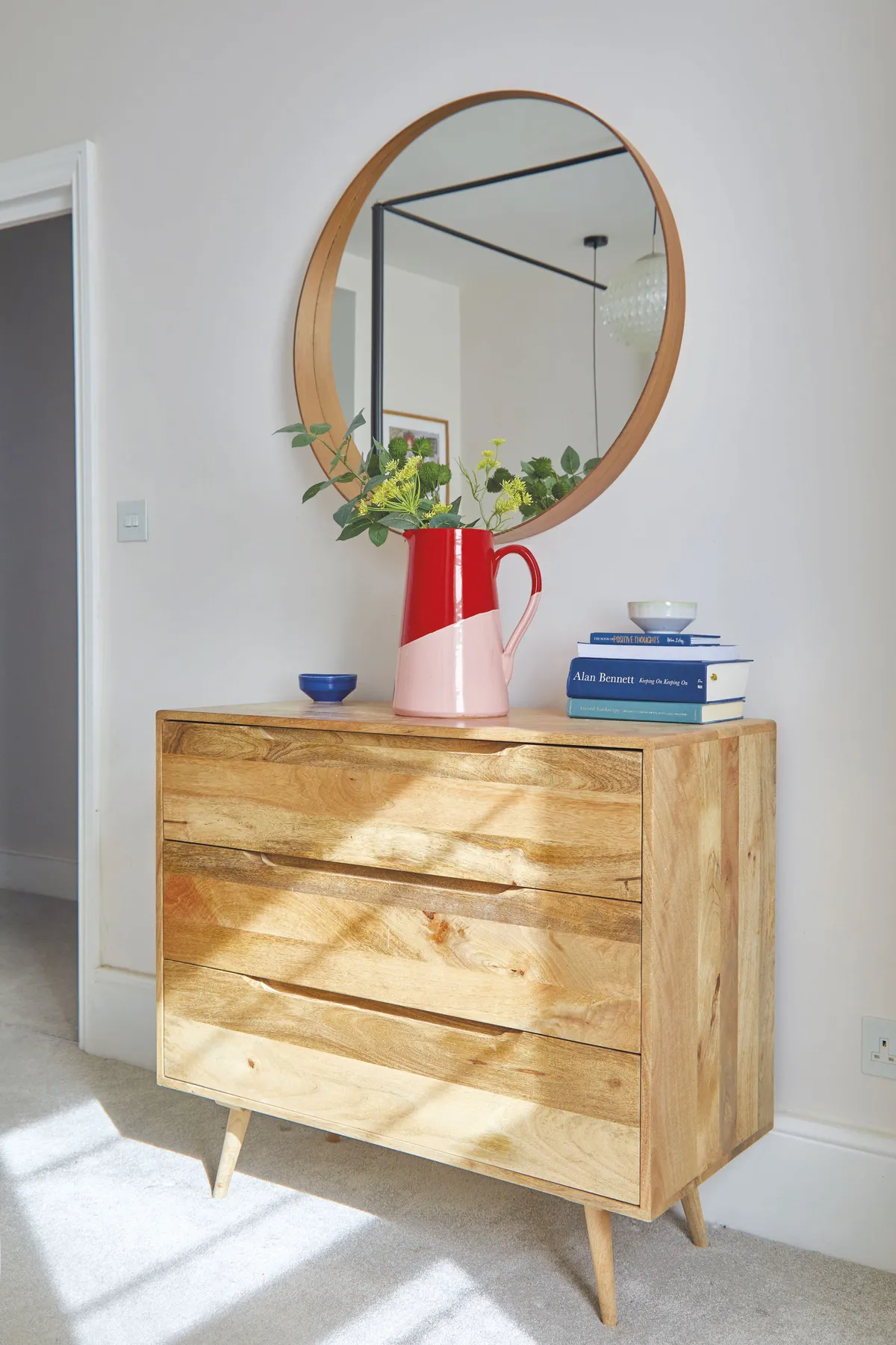
The couple taught themselves how to paint and decorate. ‘We pulled up all the carpets and repaired the lumpy walls. Every room was plastered and we fitted new skirting ourselves,’ says Shrez.
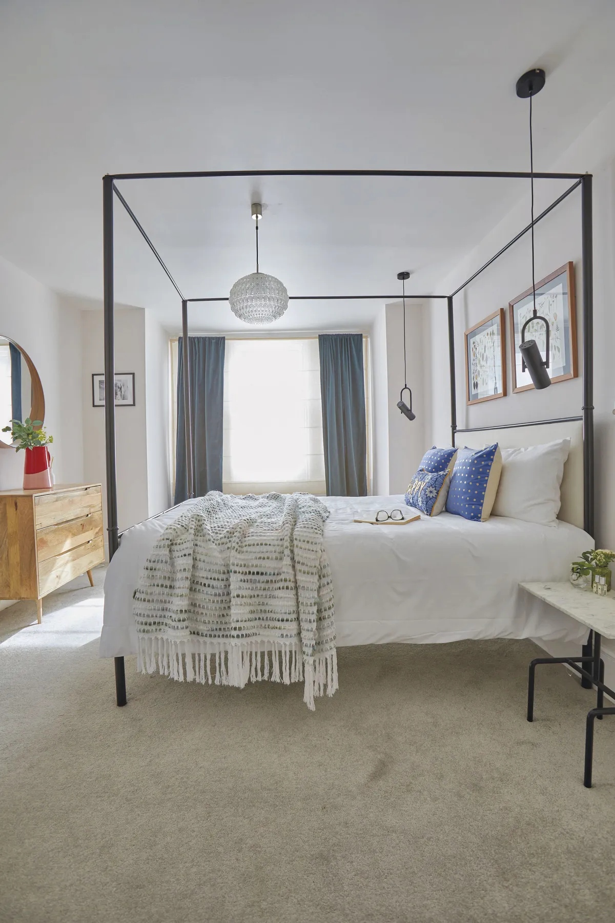
‘We tore down the fake polystyrene coving, which looked out of place and put in statement lighting we found at a flea market.’
Above the bed hang pressed flowers from Shrez’s wedding bouquet made by Flower and Press.
What I learned...
Think about how your family will use the space and what sorts of layouts and colours will make you happy. Don’t choose the things that other people will like – you’ll be miserable and you’ll end up changing it to what you wanted in the first place.
If you have an idea and you know how to make it work, persevere with it. Just because it hasn’t been done before, or it might not be easy, doesn’t make it impossible. Work through it with your builders, create detailed drawings and share inspo images to show them how it could work.
It’s easy to get disheartened by looking at all the things left to do. It’s more rewarding and motivating to look back at how much you’ve done.

This is a digital version of a feature that originally appeared in Home Style magazine. For more inspirational home ideas, why not subscribe today?
