Charlotte Anderson-Fox converted her Victorian terrace from a small warren of rooms into one open-plan space, perfect for family life.
Here, she tells us all about her home makeover experience...
My story...
I fell in love with this house even before I went inside. The exterior had such a lovely Victorian feel that it ended up being the only house I viewed. I was living in a rental at the time but wanted to get on the property ladder with a house and garden.
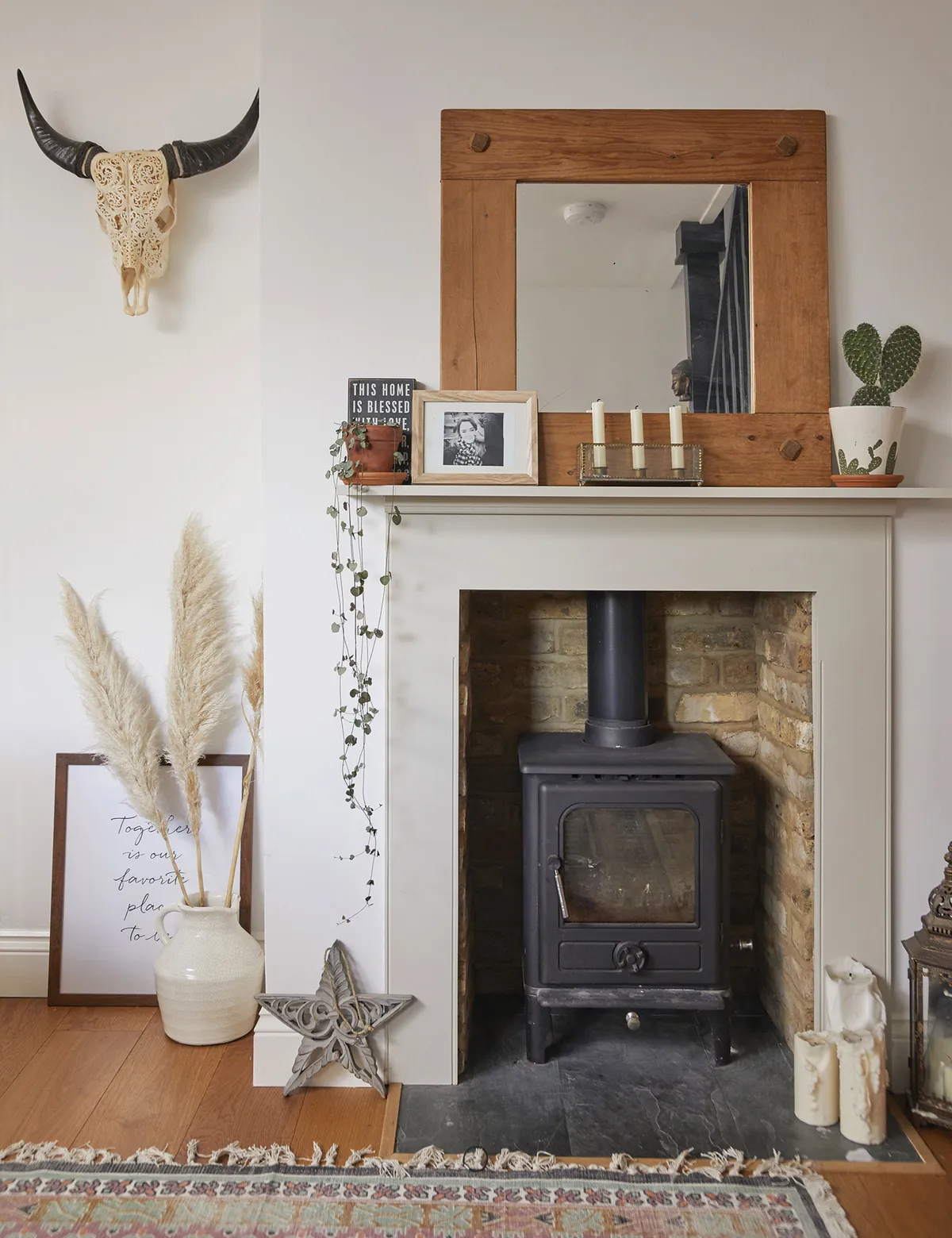
I bought the house in May 2015 and luckily most of it was in good condition as it had been a renovation project. The previous owners moved before they got onto the kitchen, so I decided to tackle it before we moved in.
Welcome to my home...
A bit about me I’m Charlotte Anderson-Fox, 33, a cake designer and maker. I live with my husband, Matt, 34, a greenkeeper, and my son, Archie, who’s 14. I Instagram about our home at @acraftylittlefox.
Where I live We live in a three-bedroom Victorian end-terrace in Benfleet, Essex. Myself and Archie moved here in May 2015.

We knocked through to create a bigger space and I replaced all the windows with modern sashes that look original but keep out the cold. I also freshened up the whole house with neutral paints, sanded the living room floor and installed a log-burner, before we moved in the August.
When I met Matt, we decided to do a two-storey extension, making use of the massive parking area at the side, as the house didn’t have a dining space, and the living room and Archie’s room were tiny.
A bit more about my home...
What I wanted to change The whole house had been renovated apart from the kitchen, which felt dirty and unsafe, so completely redoing it was the first thing on my to-do list. The living room and Archie’s bedroom were tiny so we wanted to create more living space.
How I made it my own I knocked down the walls to create a bigger kitchen space and then eventually we added a two-storey extension on.
My favourite part I love the extension as we now have a decent-sized dining area that we didn’t have before, so we can all eat around the table. It’s a lovely space to relax in but we can also entertain easily and chat to each other if someone’s in the kitchen.
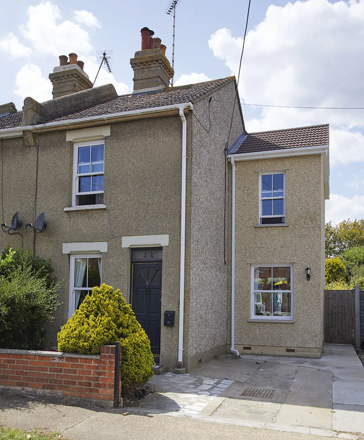
It took eight long months because of delays in planning and having to work around the roots of a neighbour’s tree. But now we’ve got a space that we can all live in comfortably and it’s completely changed how we use the house, for the better.
Dining area
‘We did the extension a few years after Matt moved in because the living room was tiny and we didn’t have a dining space. It should have been straightforward, but planning took ages, and we also spent a huge amount digging the foundations extra deep to protect the roots of a neighbour’s tree, which, annoyingly, they cut down shortly after.
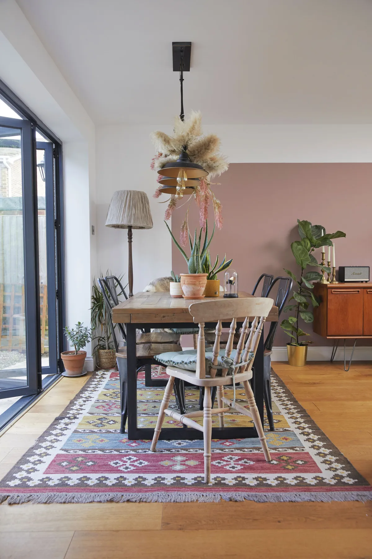
‘I would have loved Crittall doors, but everything needed to be done on a tight budget, so I chose these folding doors instead, which still look great.
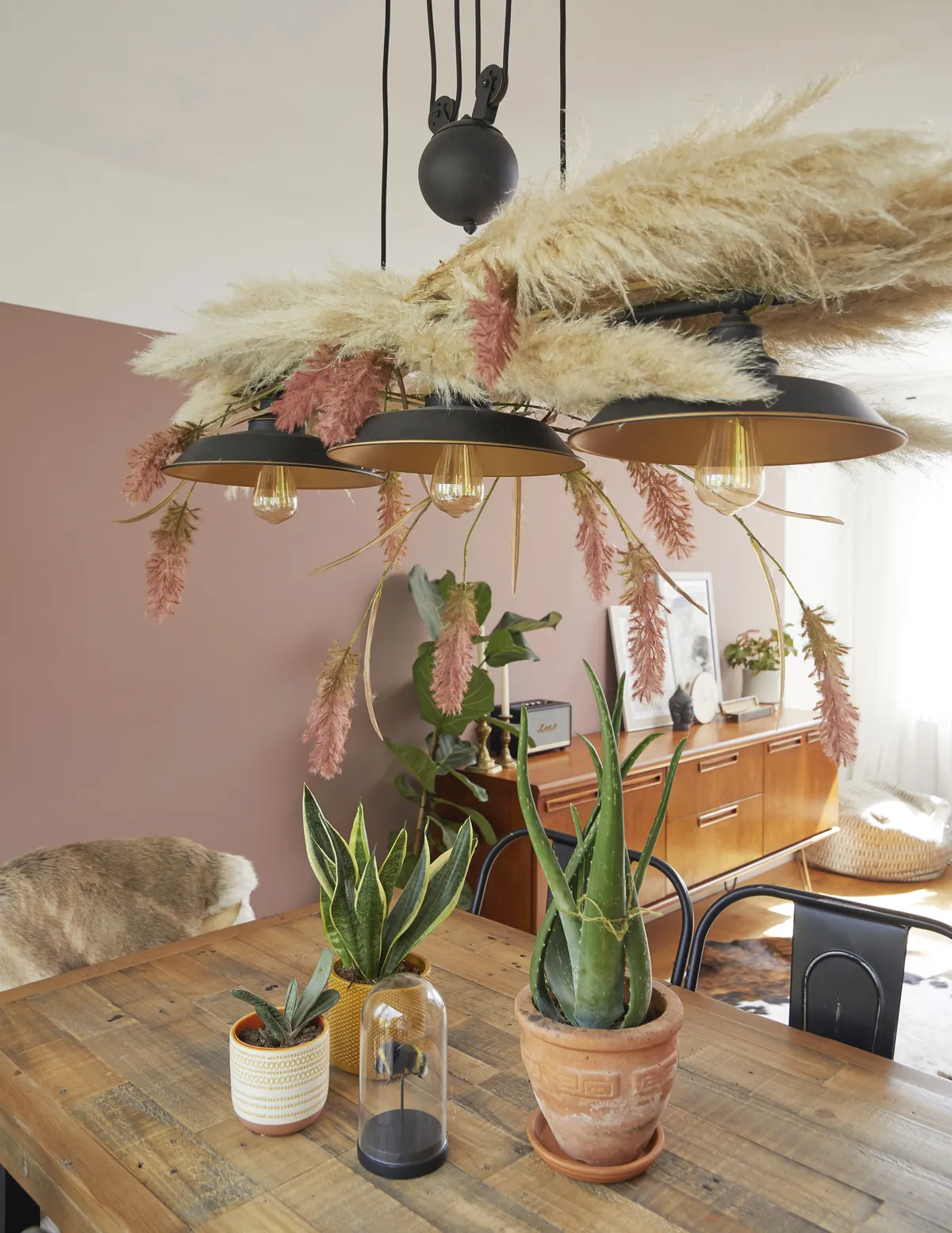
‘I’d have also liked to add extra features, but the most cost-effective option was a basic white box, so I’ve spent time adding character with paint effects, furniture and accessories. The extra space means we have room to all eat together at a table, which wasn’t possible before.’
Kitchen
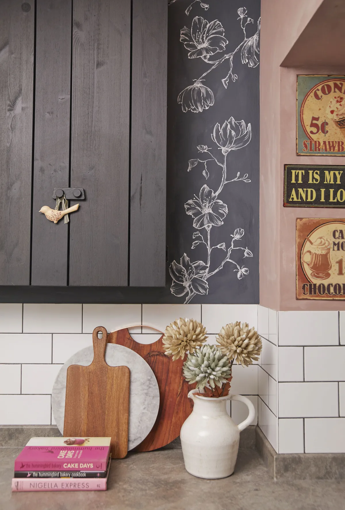
‘The kitchen hadn’t been touched since the 60s. There was a laundry room, a grimy old toilet and the actual kitchen space was tiny with a wall of ugly beige tiles and a side door to the garden. I wasn’t bothered about a downstairs loo, so I decided to open up the whole space.
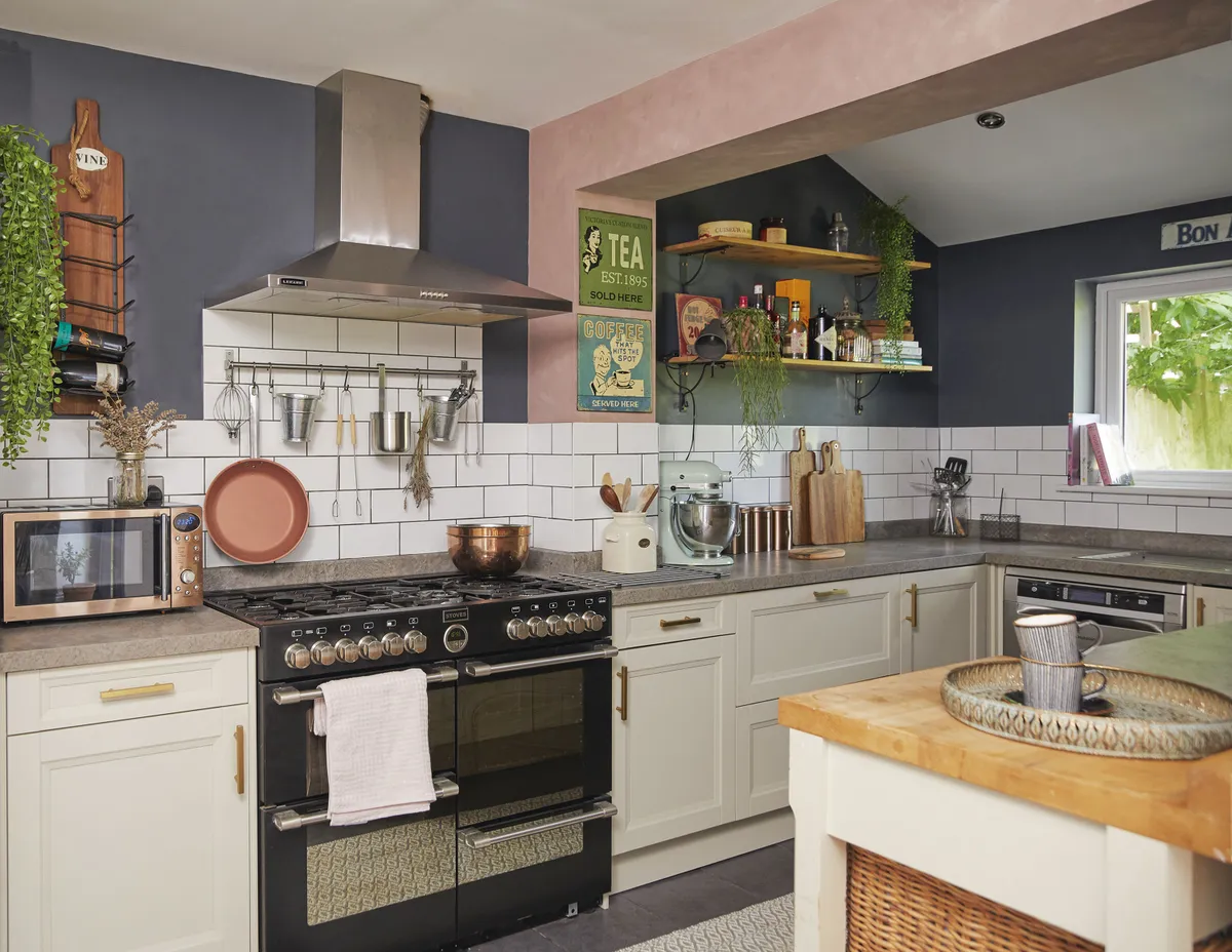
‘I originally wanted a black kitchen, but I was on a serious budget and the cheapest option was B&Q who didn’t have any dark choices.
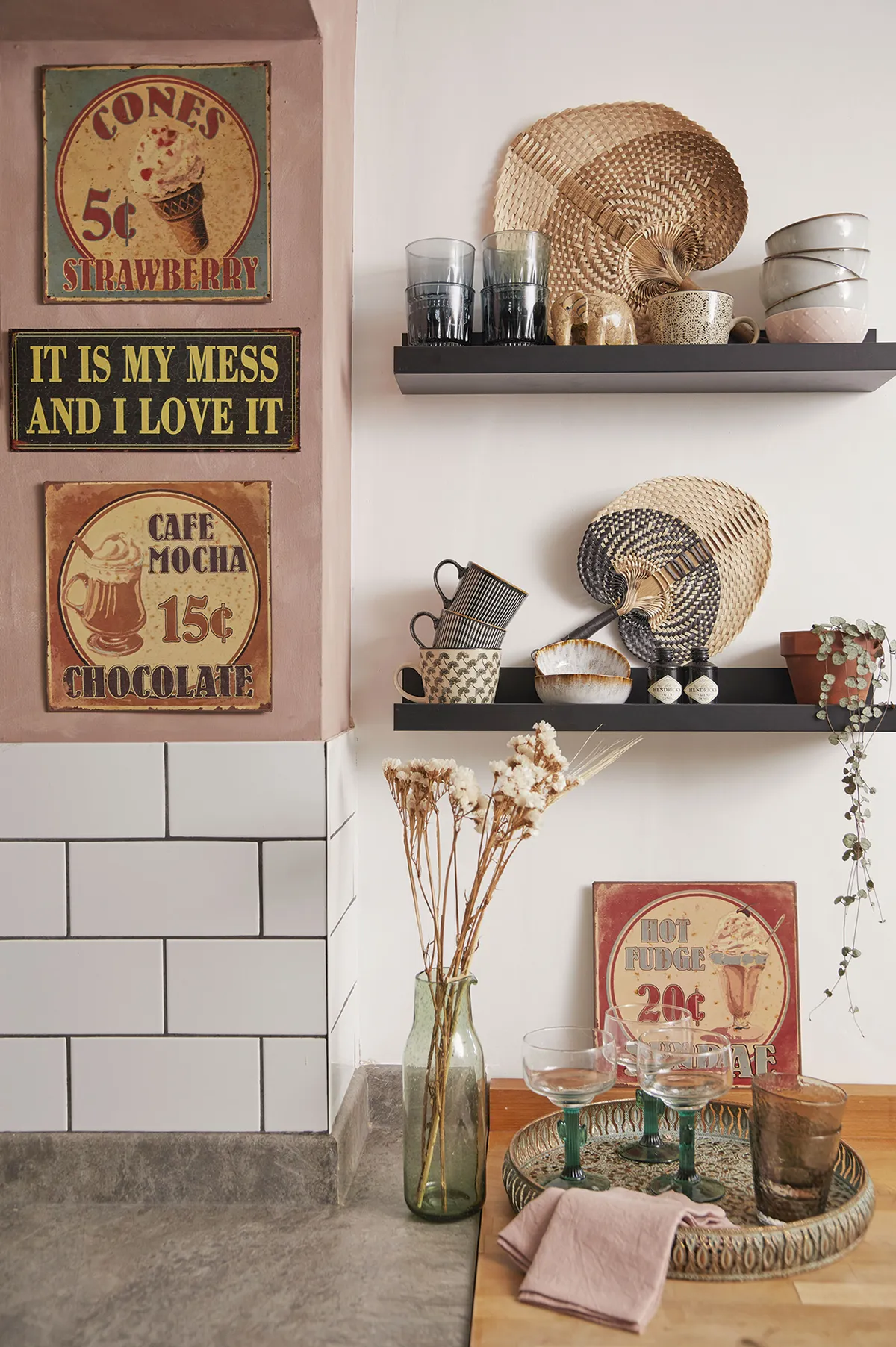
‘In the end I decided on this lovely light Shaker-style design and went for dark walls instead. When the builders were ready to finish the job, the upstand hadn’t arrived with the worktop, so I had to return that worktop and quickly ring round to find a local place that could supply what I needed that day, which was slightly stressful.’
Living room
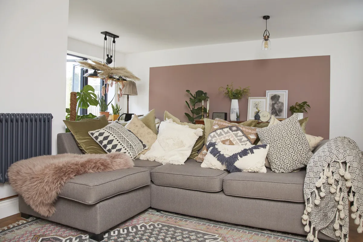
‘Before we moved in, I painted everything with a neutral base so that I could choose the colour scheme over time without having to rush. I also ripped up all the flooring downstairs; it was cheap laminate that was buckling so I took a chance, pulled it up and thankfully there were lovely floorboards underneath that I sanded and then stained.
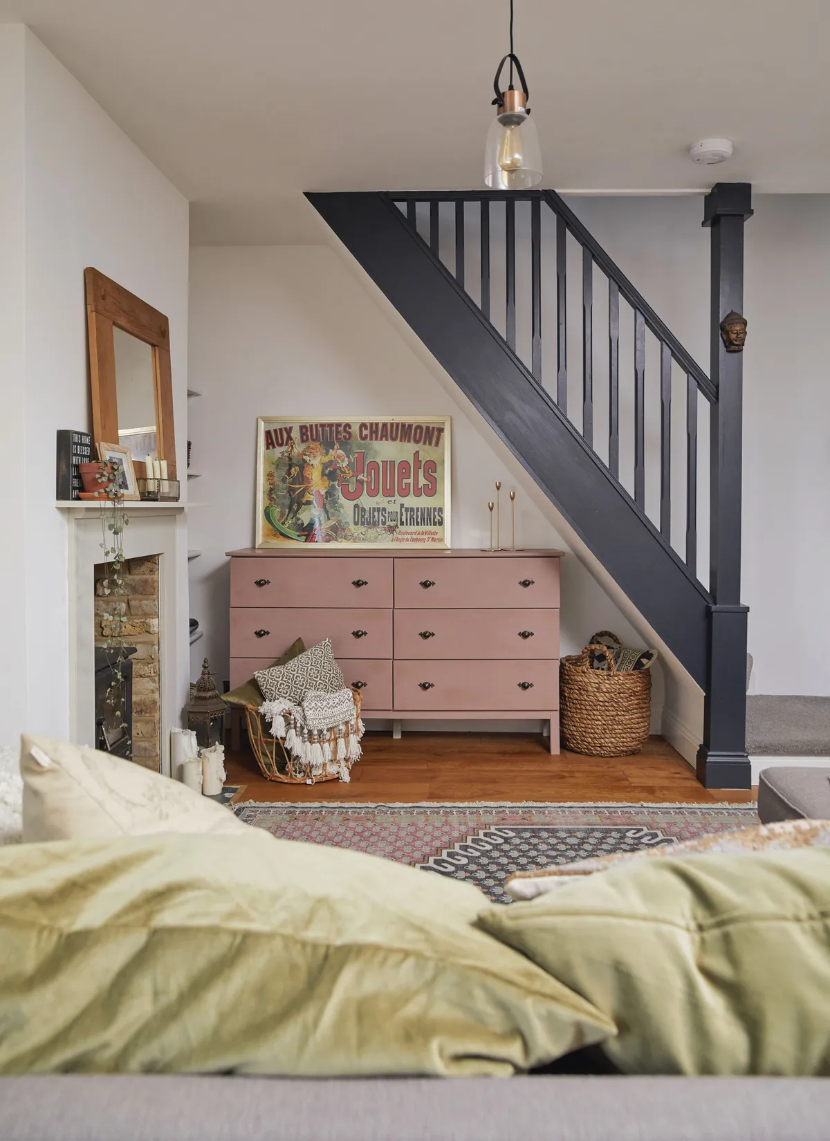
‘I replaced the original dated gas fire with a log-burner and attached a new fire surround. The original wall was where the back of the sofa now is. The room was tiny, so extending has made a huge difference as there’s room for a large sofa that we can all use at the same time.’
Office
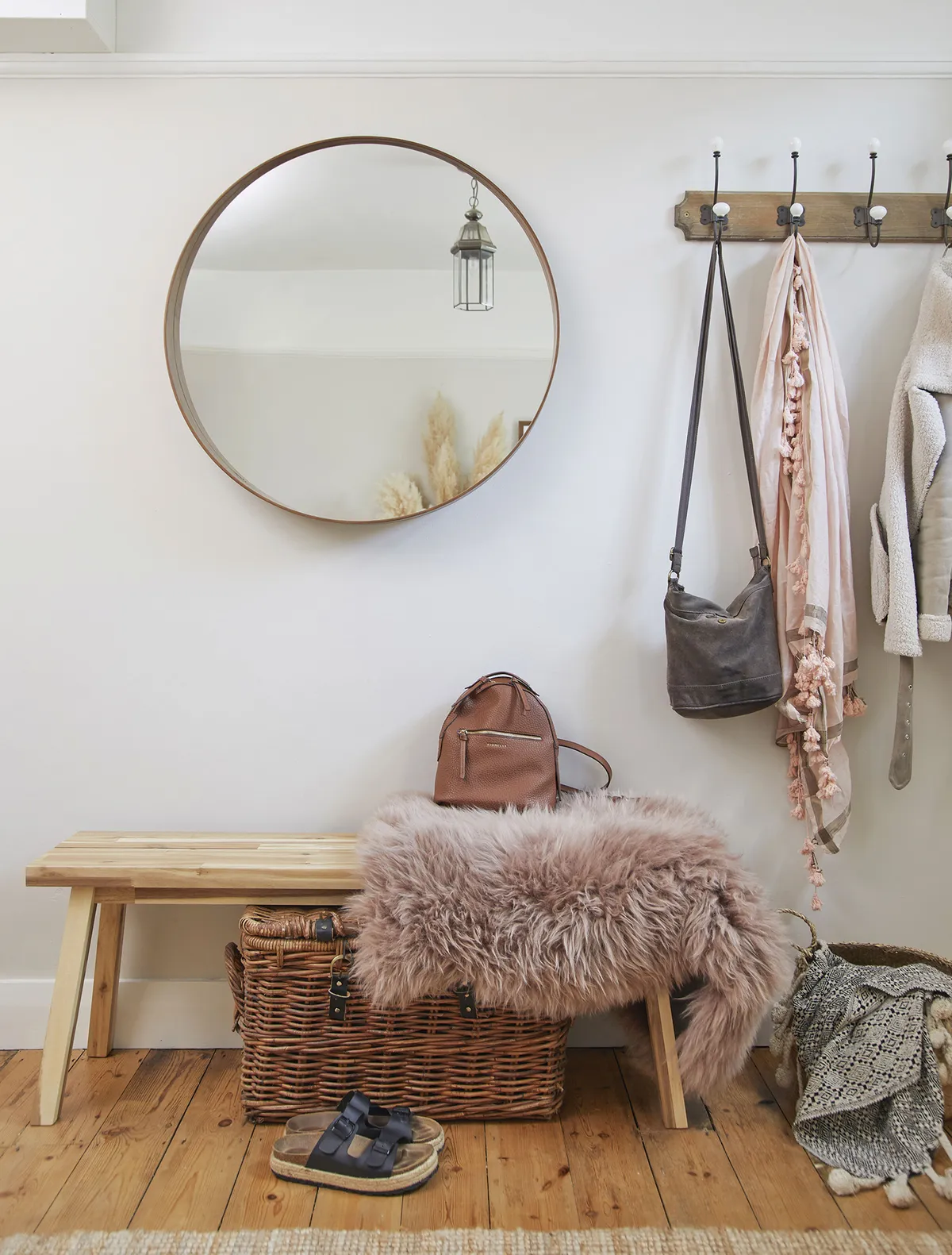
‘This room is basically our hallway as – with a lot of small Victorian terraced homes – we walk straight into the house. I use it as my home office and it’s a lovely bright room so it’s perfect to show off my cakes. Also, when clients come to look at my designs, they don’t need to go into the main part of the house, which is a bonus.
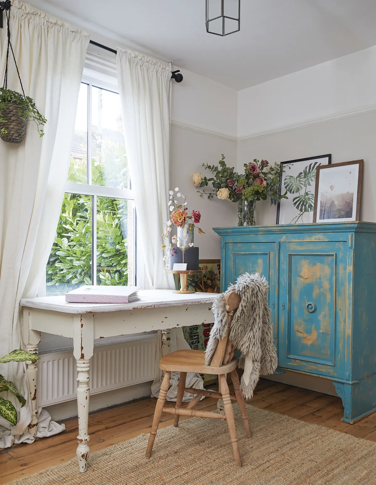
‘I got the cabinet from a family member and painted it peacock blue then rubbed it down to give it an aged effect. I’ve had the second-hand table for years; it used to be the dining table in our old flat, and I love the chips and knocks as they really add character.’
Master bedroom
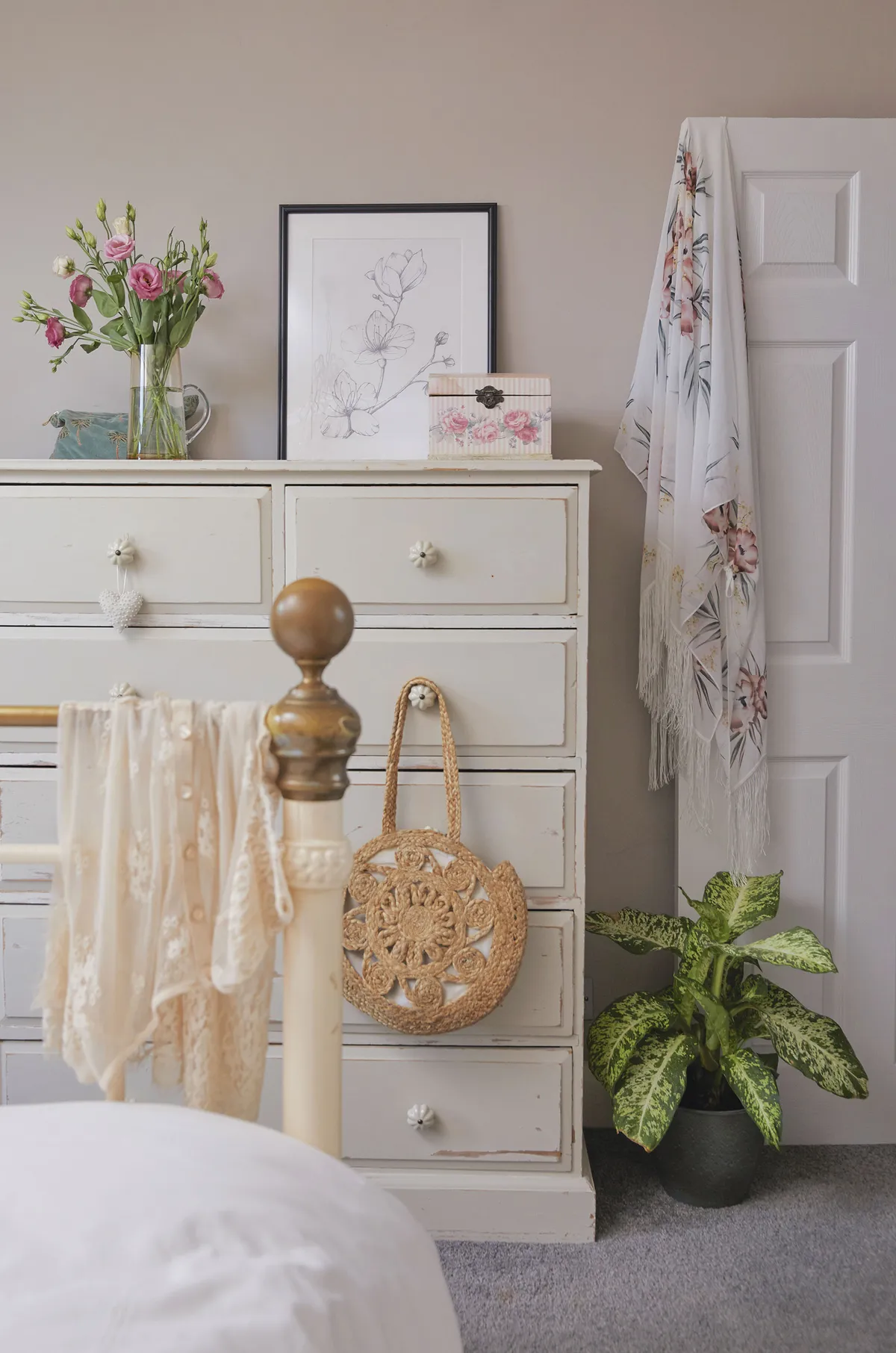
‘I wanted to give this room a Victorian feel as the bed is originally from that era; it was mine when I was a child and has followed me around all my homes. I painted the walls in Farrow & Ball Elephant’s Breath for a calm and relaxed feel. I love the coving and all the little touches of original features we have.
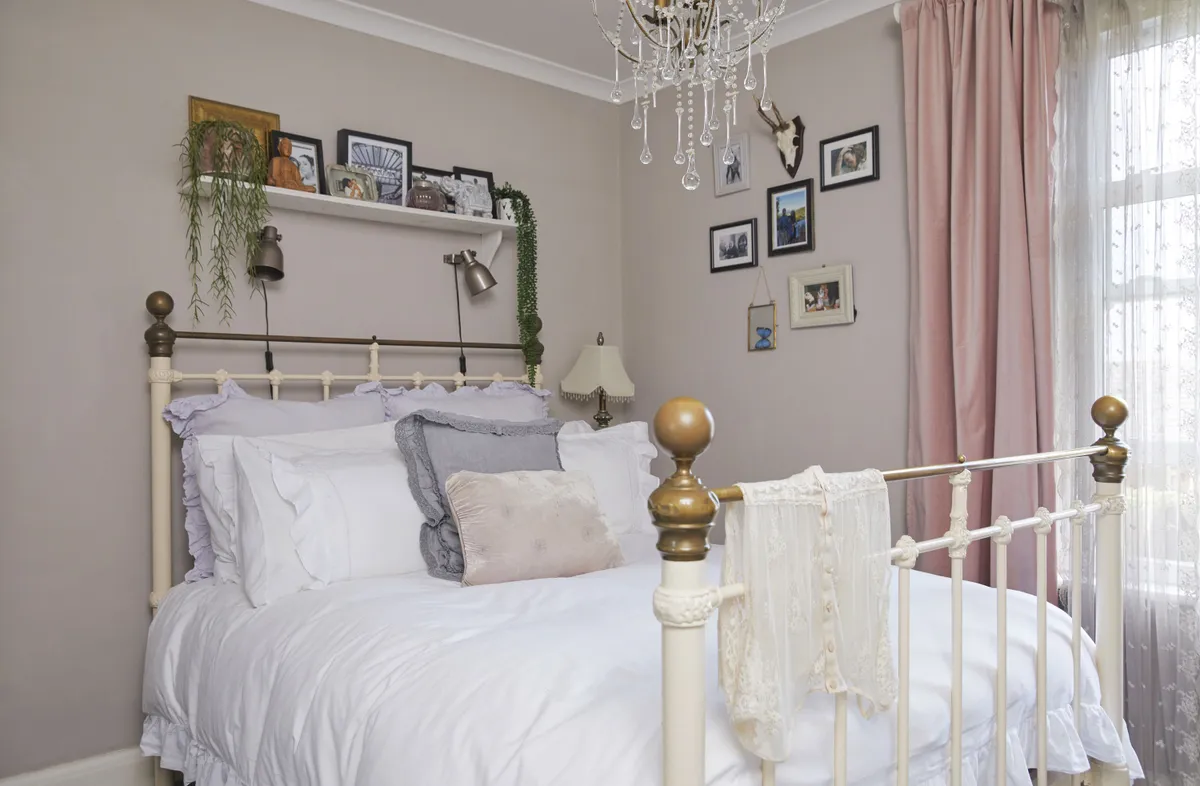
‘I wish there were more, and I’m gradually trying to add extra charm to the house. We inherited the carpet when we moved in and I would love to rip it up but I’m not sure what the quality of the floorboards are, so I need to investigate – that’s my next project.’
Bathroom
‘The bathroom was in good condition when we moved in, so thankfully I didn’t have to do much to it initially. When I started thinking about giving the room my own stamp, I saw some real copper used on a shop wall and loved it. I knew it wasn’t practical to use in my home, so I did some research and found this copper-effect paint from Craig & Rose.
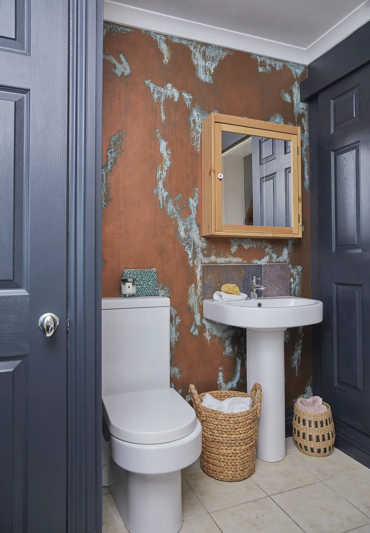
‘You just paint the wall, dab it with a sponge then paint on the solution where you want the patina effect to be. I finished off the room by painting the doors and woodwork in Farrow & Ball’s Railings.’
Feature and styling Lisa Moses. Photos Katie Jane Watson.
This is a digital version of a feature that originally appeared in HomeStyle magazine. For more inspirational home ideas, why not subscribe today?
