Home makeover: 'A layout reshuffle made the most of our outside space'

Home makeover: 'A layout reshuffle made the most of our outside space'

Creating a new floorplan to introduce plenty of colour and adding bi-folds to look out over the garden has given Sarah Sephton and her husband their ideal home

Published: June 15, 2021 at 12:45 pm

Once they decided to move back to their roots in the Midlands nearly three years ago, Sarah and Colin Sephton wasted no time in changing their teaching jobs and looking for the right house.

‘We’d been living in Oxford for 15 years because of my job,’ said Sarah, ‘but we were both keen to move closer to family and friends, so we started looking around Nuneaton. We knew we’d get a lot more for our money there and both our grown-up sons lived in Birmingham, so it all made sense.’
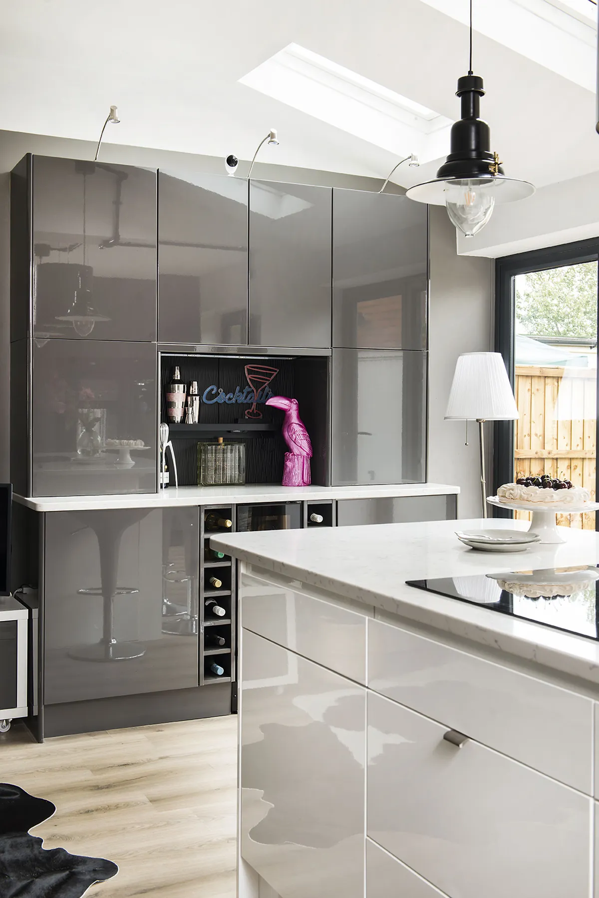
Choosing a subtle palette of grey and white for the units and Farrow & Ball’s Mole’s Breath for the walls means Sarah has been able to add bright accents, like the 80s-style neons in her mini bar area

Sarah is a keen gardener with a thriving Instagram @thecuriousglasshouse, so outdoor space was a major driving factor in the search for a new home. ‘It had to have a big garden, and we also wanted a solidly built property created between the 1930s and 1950s.’
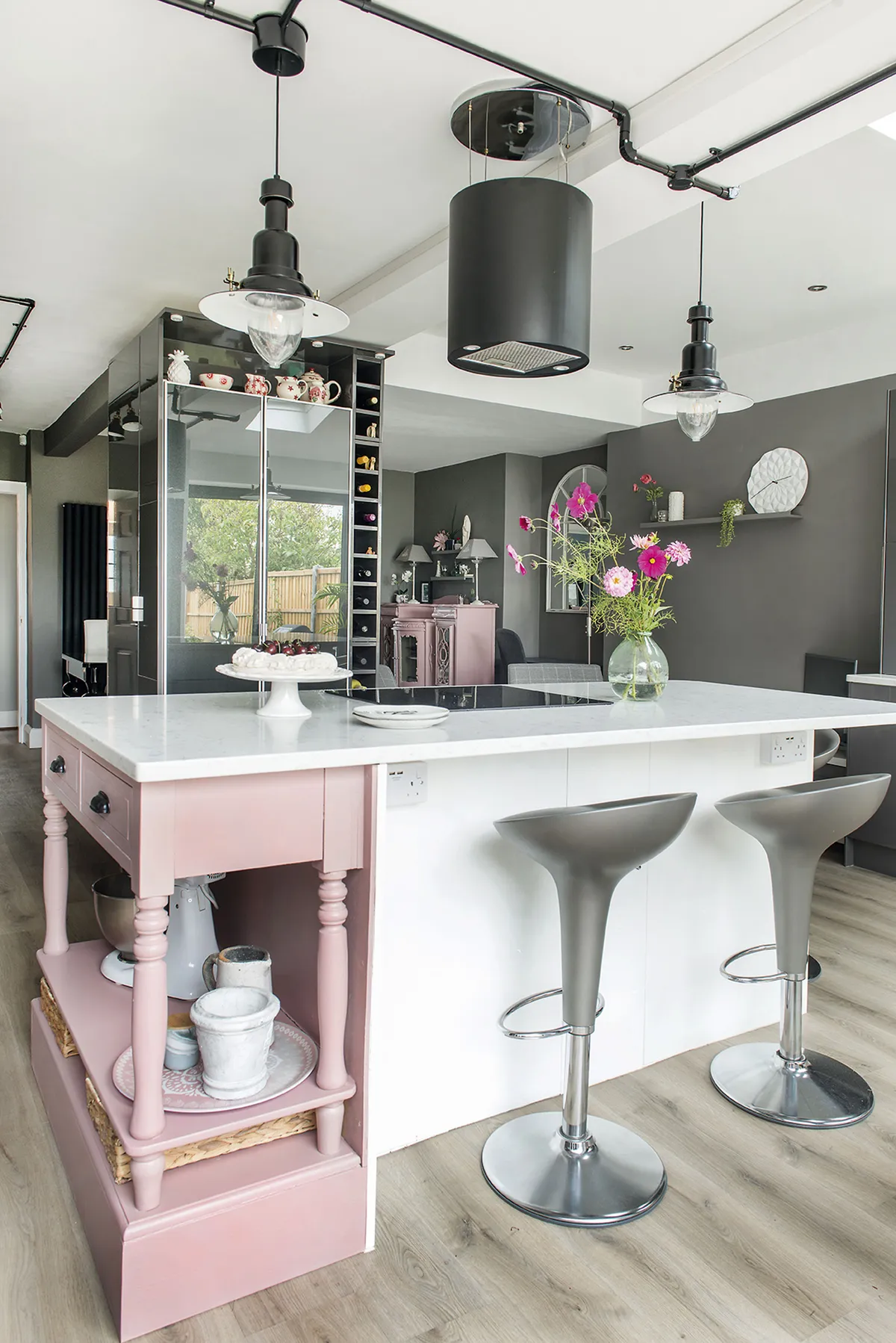
Sarah has softened her modern scheme with splashes of baby pink, including an upcycled console table, which she’s painted in Farrow & Ball’s Sulking Room Pink and built into the island unit, styled with Bombo stools from John Lewis

The couple even knew exactly which area they wanted – the outskirts of the town in a semi-rural location. ‘We’d narrowed it down to two roads, and we kept a keen eye out for what properties were going on the market in those areas. We found out that some of the houses had extra-large gardens because of former paddocks at the back, so one of those was top of the list, and by chance one of them came up, so we swooped in,’ says Sarah.
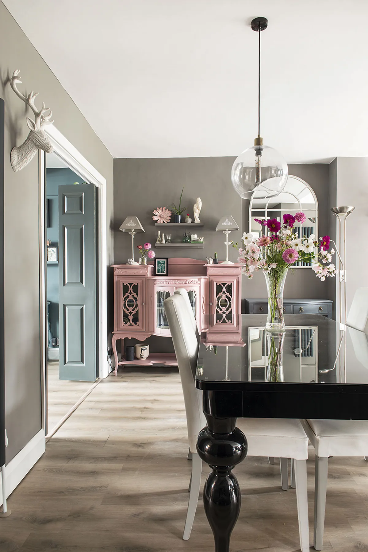
To keep costs down, Sarah designed her scheme around furniture she already owned. She brought the black table, won on eBay, and grey Next chairs, from her previous home and painted an existing cabinet in Farrow & Ball’s Sulking Room Pink to tie in with the island

Although the property was in good structural condition, it wasn’t to their taste. ‘It was all a bit bland for us, to be honest. The people who sold it moved into a new-build and that was obviously what they wanted.’

The downstairs layout also left a lot to be desired, as an extension added in 2010 to provide a utility room blocked the view. ‘When you walked into the kitchen you looked partly at a brick wall, which was a no-go for me as it completely cut off the view of the garden.’
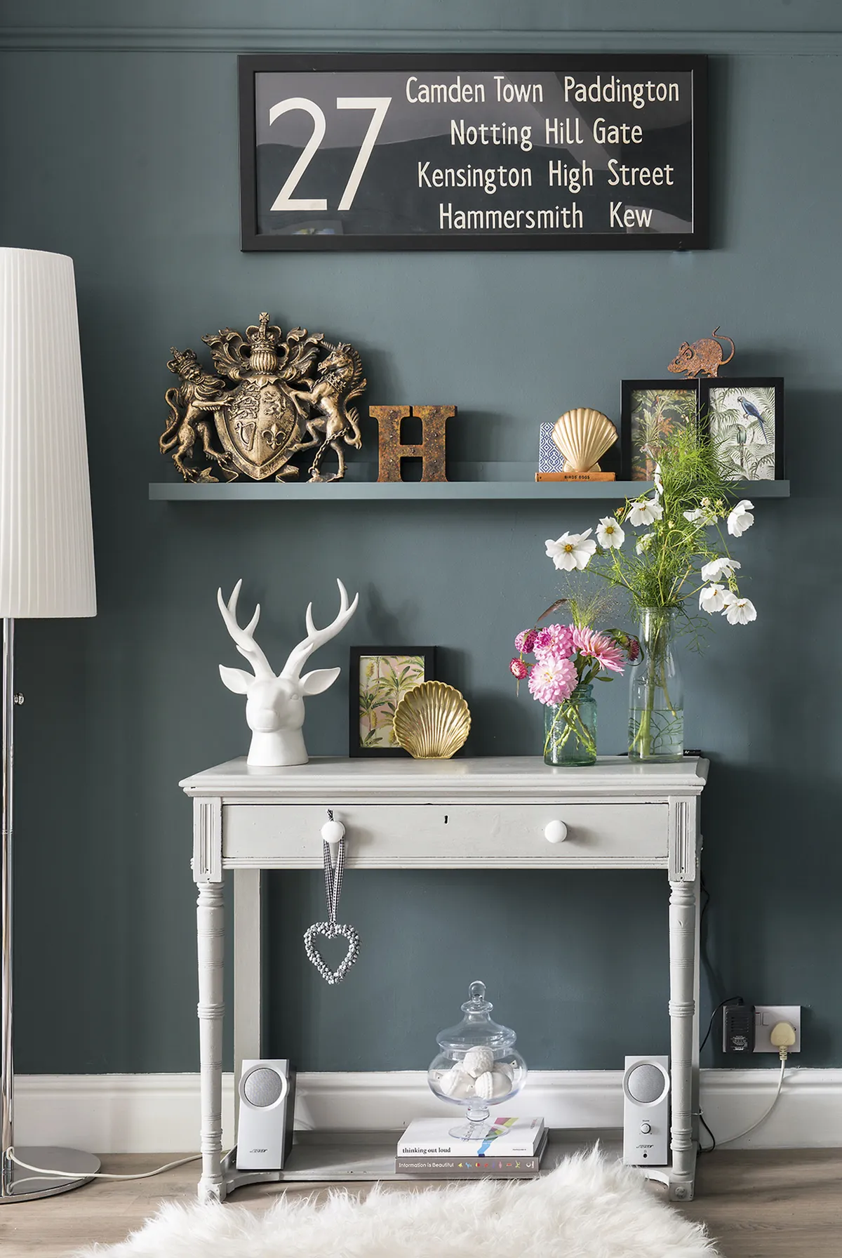
Sarah spotted a console table at The Quiet Woman Antiques Centre in Oxfordshire and painted it in Annie Sloan’s Paris Grey. In keeping with its vintage look, she has added retro accessories, including the London bus blind, found on eBay, on the wall above

The couple looked at taking down internal walls to provide a large kitchen-diner with a seating area and two sets of bi-fold doors leading onto the garden. ‘We wanted to use local tradesmen, so we asked friends for recommendations. We’re friends with a lot of the people we went to school with, who live in the area, so we got tons of help with that.’
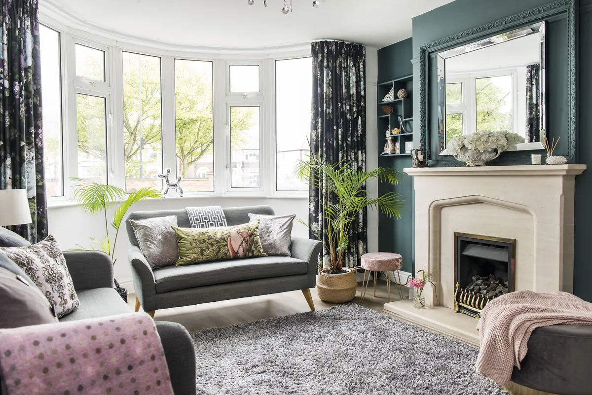
Sarah used neutrals as a base for layering colours and prints in the living room. She created her scheme around the Oslo sofas from John Lewis and a grey Wayfair rug, adding rich textiles such as the Dunelm curtains

With a large, empty space to play with, the couple thought carefully about how to divide it all up. ‘We decided to put the kitchen along one side with an island in the middle, then the dining section and finally a seating area, so you can move easily from one to the other. We like entertaining and, outside of lockdown restrictions, our sons and their partners come to visit regularly, so this open space worked so much better for us than a series of small, cut-off rooms.’
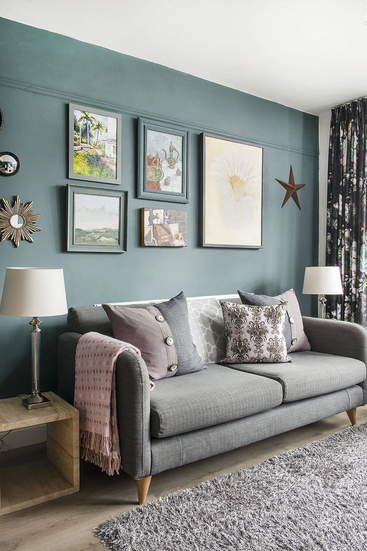
A gallery wall behind the sofa displays paintings by Sarah’s husband, Colin, along with the Moroccan Teapot by Clova Stuart-Hamilton. Accessories from Garden Barn Emporium and textiles in a mix of plains and prints add to the arty vibe

A new kitchen was an essential, but the couple wanted to add character. ‘We’re fans of contemporary style, but we also like an eclectic mix of old and new. We chose a mixture of grey and white gloss units, and adapted an old console table we bought in a junk shop for the end of the island to use as a shelf unit. We took the top off and painted it pink, which added personality.’
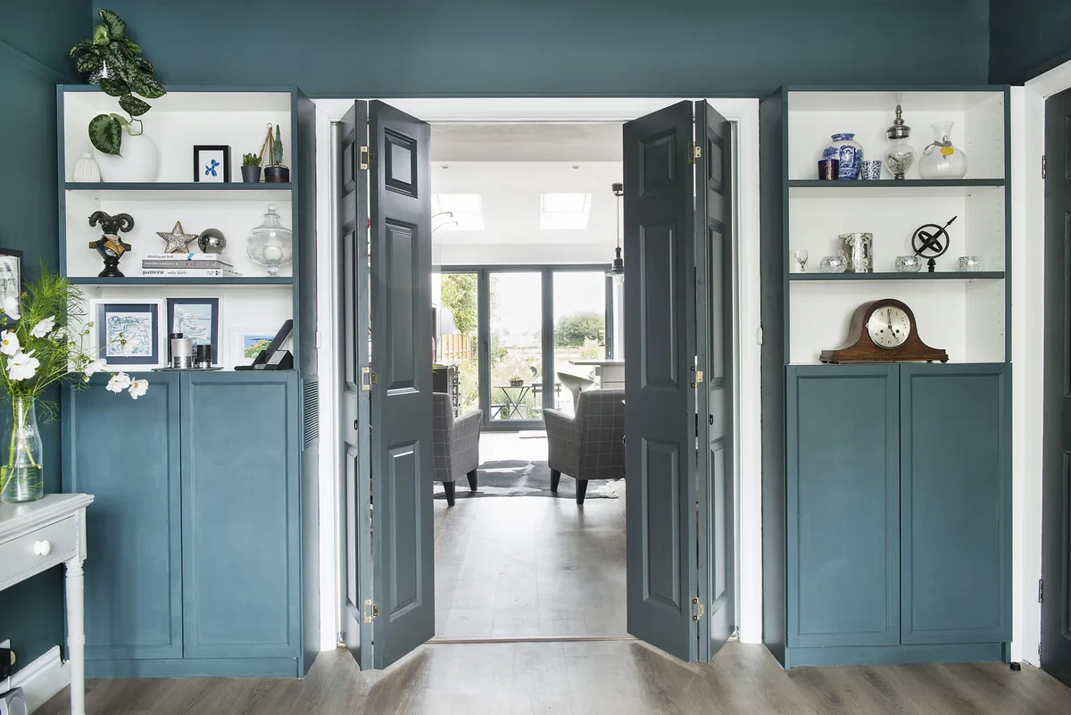
A space for post-lockdown socialising was high on Sarah’s wish list, so she chose bi-fold doors between the kitchen and living room, which create an open-plan area when folded back

Sarah and Colin chose grey as the colour that runs through the house, pairing it with blue, yellow and green accents. When it came to the upstairs, there was plenty of room for improvement, too. ‘The house originally had four bedrooms, three doubles and a box room. As it only had one bathroom, there were queues if we had guests. We were determined to find a solution.’
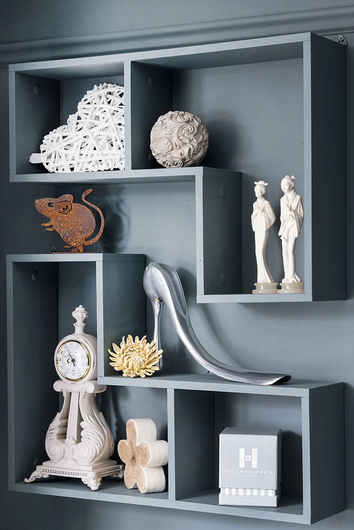
Sarah’s box shelves in the alcove are painted in the same Farrow & Ball Inchyra Blue as the walls for a seamless look

The couple decided that the bathroom, which was next to the main bedroom, would make a roomy en suite for them, while the box room off the landing would make a much better family bathroom and could fit in a bath.
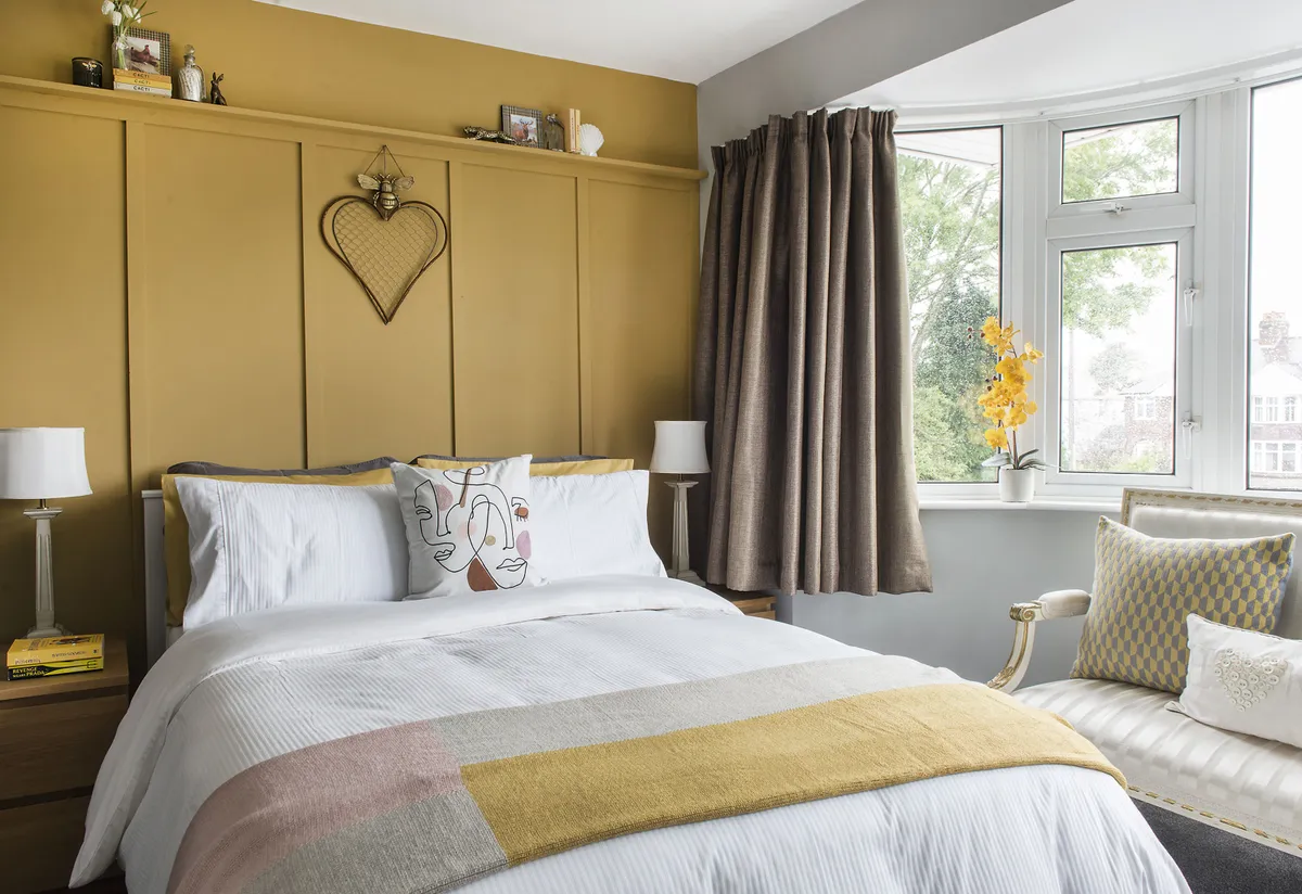
Sarah used a warm palette for her inviting guest bedroom, with panel detailing created by Colin and painted in India Yellow by Farrow & Ball. She’s kept the accessories simple, with co-ordinating bedding and a throw and an abstract cushion from Dunelm

Although the first phase of the building work went as expected, when it came to the upstairs work, they were hit by lockdown last year, which held up the plans for the rest of the house.
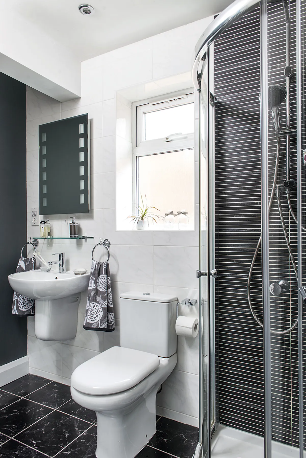
Sarah chose three different tiles from Supatile, going for a monochrome scheme to tie the styles together, complemented by graphic towels from Dunelm. Black marble floor tiles give a luxe spa feel, while narrow tiles in the shower zone the space

‘It delayed us by about four months because the plasterer wasn’t working, mainly because he couldn’t get the supplies. Plus, all the carpet shops closed. But a family friend of the neighbours came to theirs to measure up, so I nabbed him in the drive and asked him if we could be next on the list after the neighbours when everything opened up.’
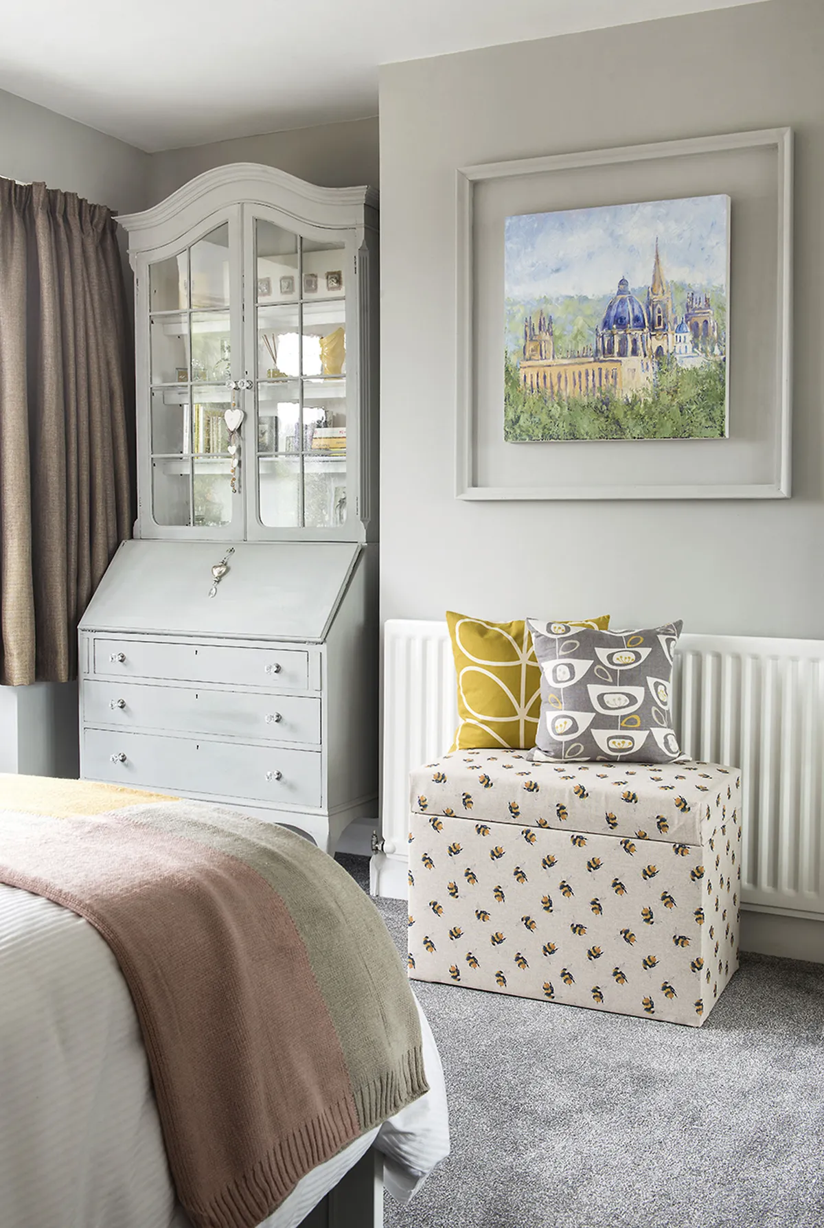
Ensure a guest bedroom has plenty of storage, as Sarah has with an old bureau, painted in Annie Sloan’s Pure White for a French farmhouse feel. She re-covered the Dunelm blanket box in a bee print to tie in with the nature-inspired details throughout

In the spirit of adding more character, they panelled several walls and painted them in deep blue, mustard and grey.

‘It was mainly Colin, but he bought the beading from a local DIY shop and worked out where it should go. It looks really effective, and it was pretty inexpensive.’
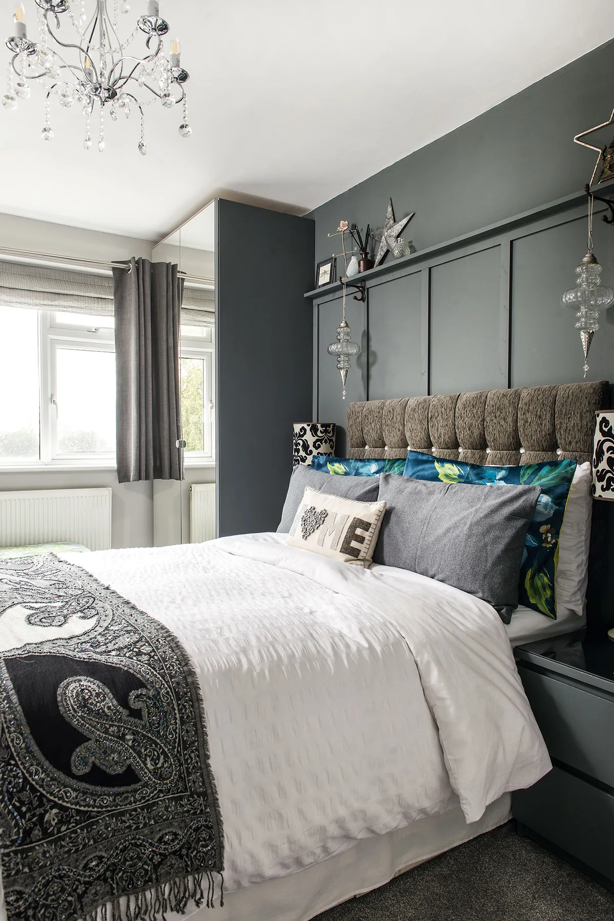
The couple have combined panelling, painted in Farrow & Ball’s Down Pipe, and a velvet headboard from eBay to create a luxurious sanctuary in their main bedroom

Lockdown also gave Sarah a chance to make a start on the garden and fill the house with colour in the form of original artwork. Colin is a talented artist (@oxfordartist) and his work is displayed on many of the walls.
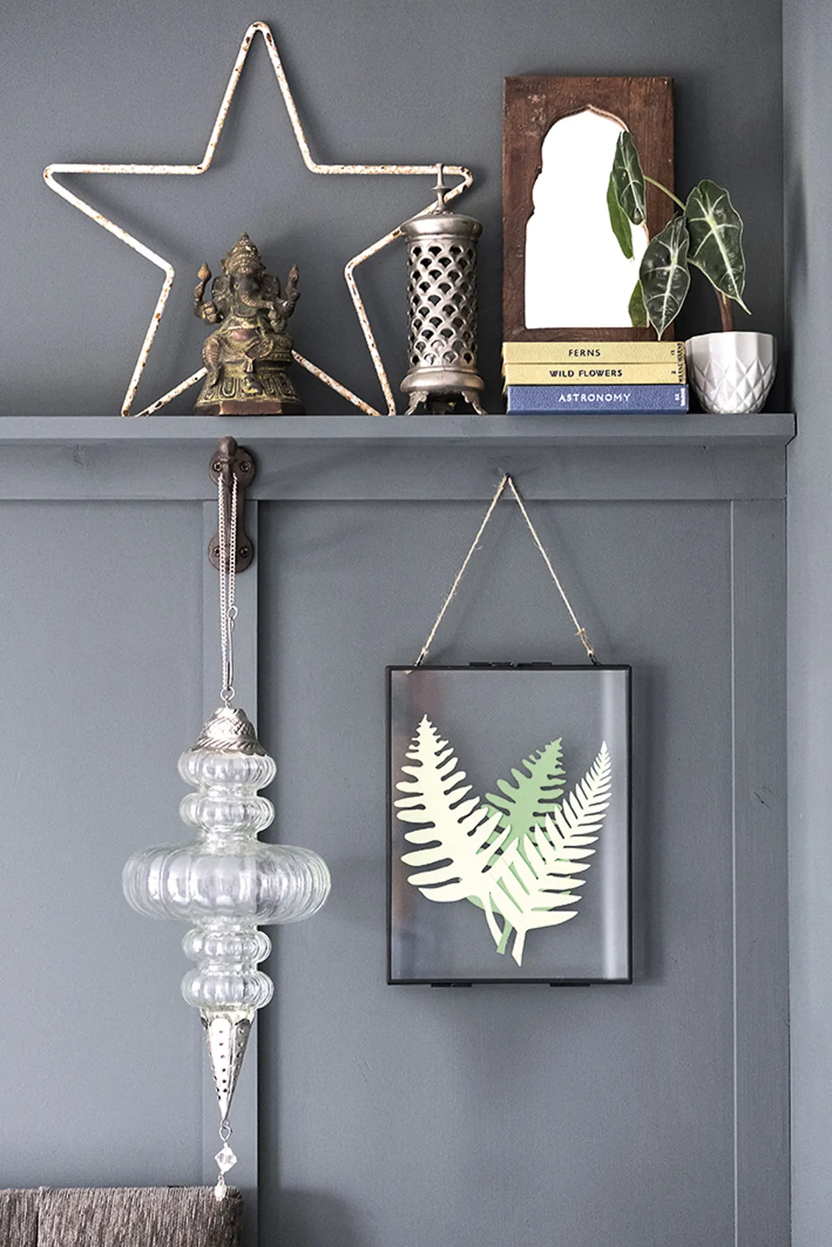
Colin added a ledge shelf for prints and trinkets, and Sarah framed the bed with glass ornaments hung on hooks to add interest. The botanical artwork is Colin’s – he created it from cut-out paper leaves

The renovation may have taken two years, but the couple are thrilled with the results. ‘It’s our forever home and we’ve got it just as we want it.’

Photos Colin Poole.

This is a digital version of a feature that originally appeared in HomeStyle magazine. For more inspirational home ideas, why not subscribe today?

This website is owned and published by Our Media Ltd. www.ourmedia.co.uk
© Our Media 2024