My story...
‘Despite only being 23 when we bought our home, we knew exactly what we were looking for. We wanted to move out of the city to the south side of Glasgow, which we’d heard promising things about.
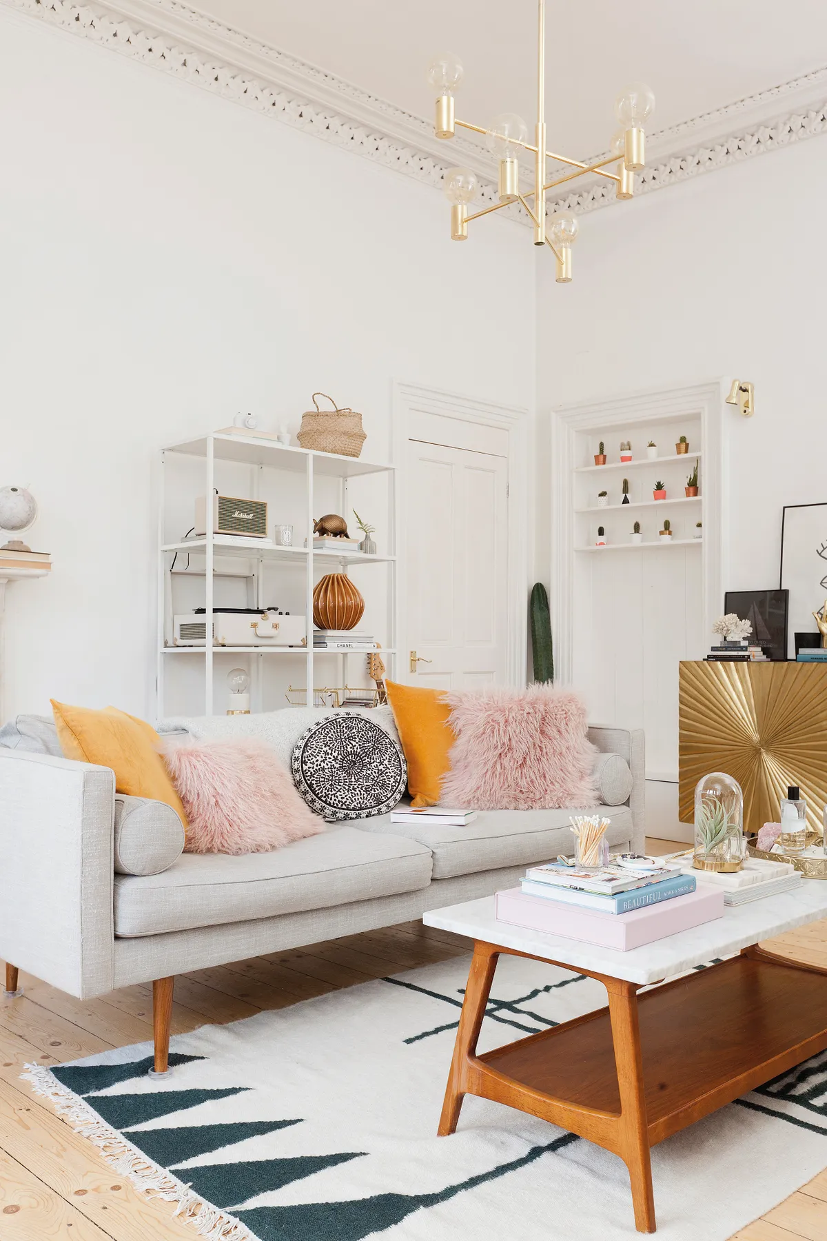
‘I love period properties and so we were hoping to find a Victorian tenement with original features – ornate cornicing, wooden floors, high ceilings and big windows.
‘Since I knew we would be slowly updating the place, I looked more at the layout of the rooms and what we could do to the space, and we were lucky to find a place that didn’t need too much done to it.
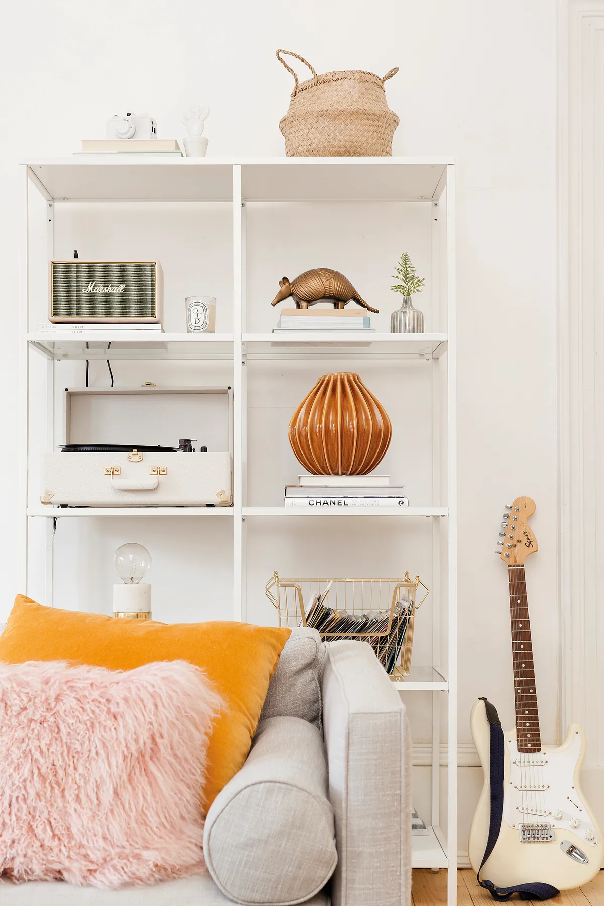
‘Growing up partly in New Zealand, I was keen to make the most of the bright outlook that the third floor offers. I love how much light we get, so I chose white as a base colour and used it throughout each room. This makes the high ceilings, ornate cornicing and ceiling roses really stand out.
Welcome to my home...
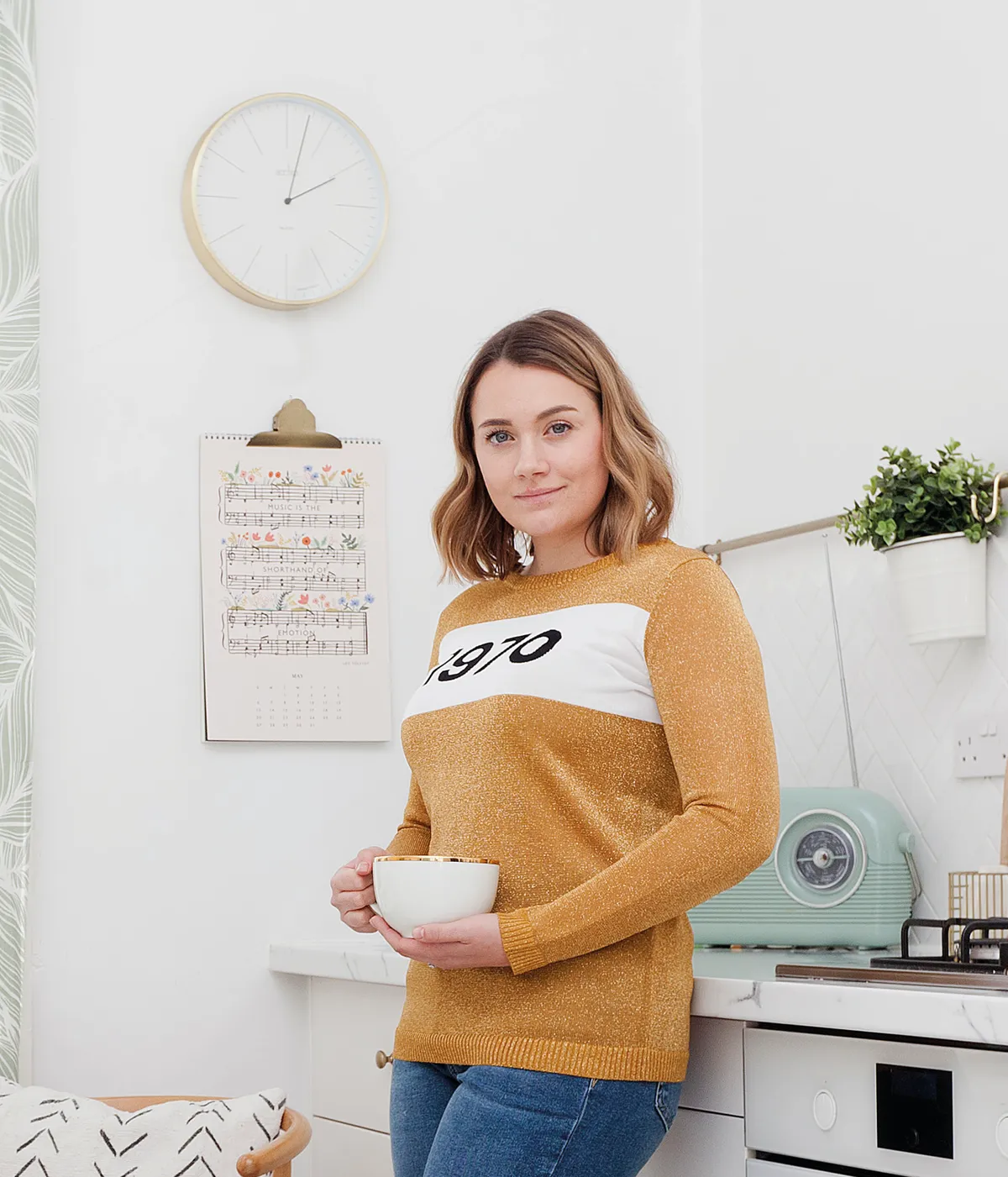
A bit about me I’m Kate, a lifestyle blogger at Kate la Vie. I live here with my husband Jordan, who owns a coffee shop, and our two cats.
Where I live I live in a two-bedroom traditional Victorian tenement flat in the south side of Glasgow.
‘I’ve definitely held off on being too crazy until recently – I really didn’t want to make any big changes until I was a bit more comfortable with my style.
‘There are so many things I’d do differently now. For example, we sanded down the old, over-varnished floorboards to reveal the lighter pine underneath but we didn’t finish them properly so they’re looking a little worn.
‘Admittedly, it does work with the style, but I’d love to get them fixed. The biggest job that we undertook was to put in a new kitchen and reconfigure the kitchen for added storage.
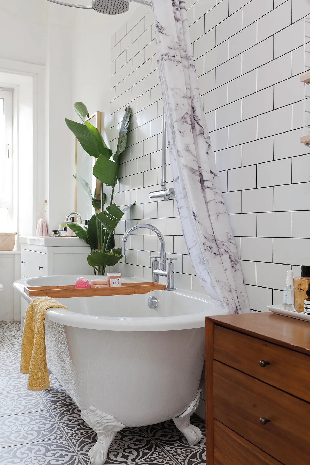
‘I’m still planning on making a few more changes and I want to experiment with colour on the walls. I think that will be next on my list: a more colourful bathroom and hallway.’
Living room
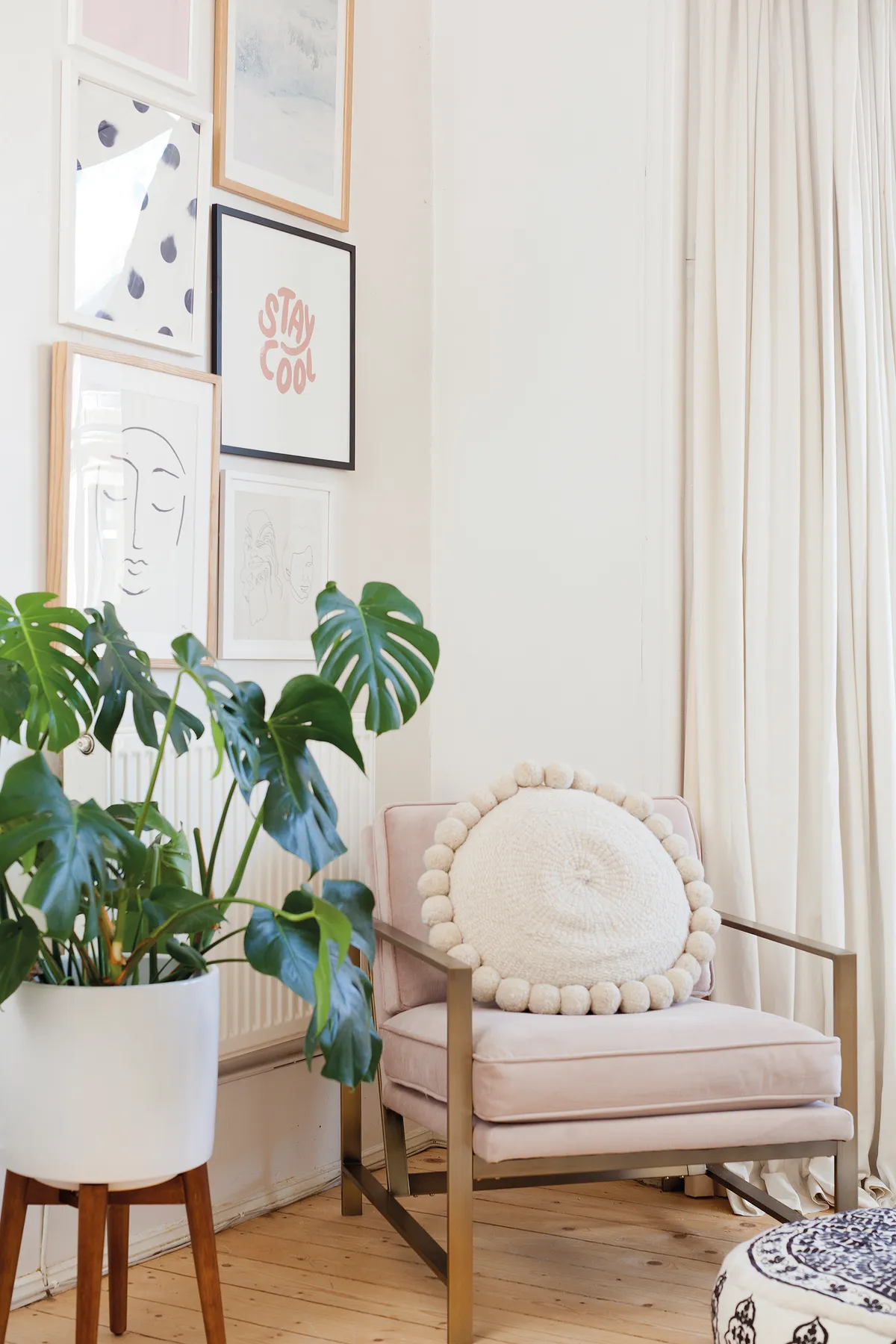
Kate has used a mix of grey, pink and cream in the living room, along with a variety of plants, in order to create a homely look.
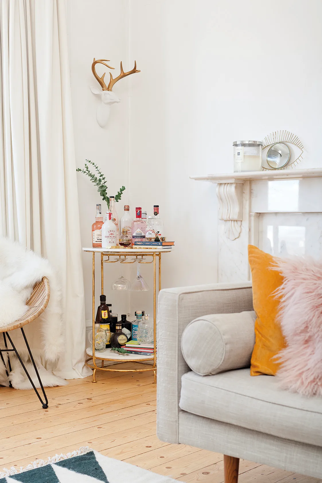
‘Our living room is such a bright space, with so much personality,’ she says. The white walls and stripped-back sanded floorboards provide a plain canvas to show off carefully chosen pieces of furniture.
A bit more about my home...
What I wanted to change I wanted to make the most of the light-filled rooms by redecorating. The flat also desperately needed a new kitchen.
How I made it my own We have decorated all of the rooms to suit our taste, sanded the floors and added some mid-century pieces of furniture, plus a few favourite artworks.
My favourite part The kitchen. I also love all of our accessories that we have dotted around the flat.

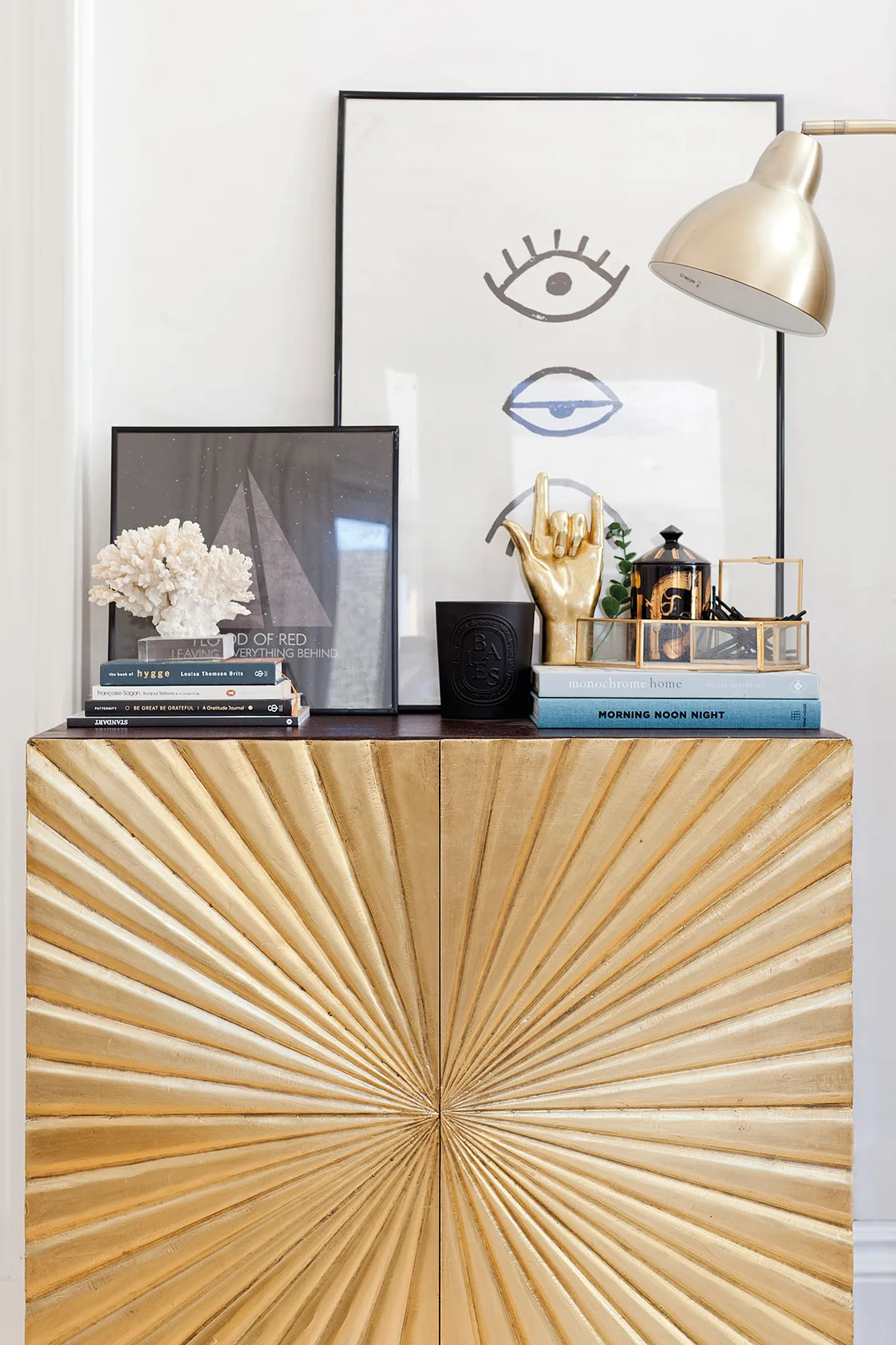
The white palette accentuates the features of the room and makes the pink and grey seating stand out. Splashes of metallics in the accessories and the stand-out sideboard add warmth to this bright room, which is anything but stark, despite the cool colours.
Kitchen
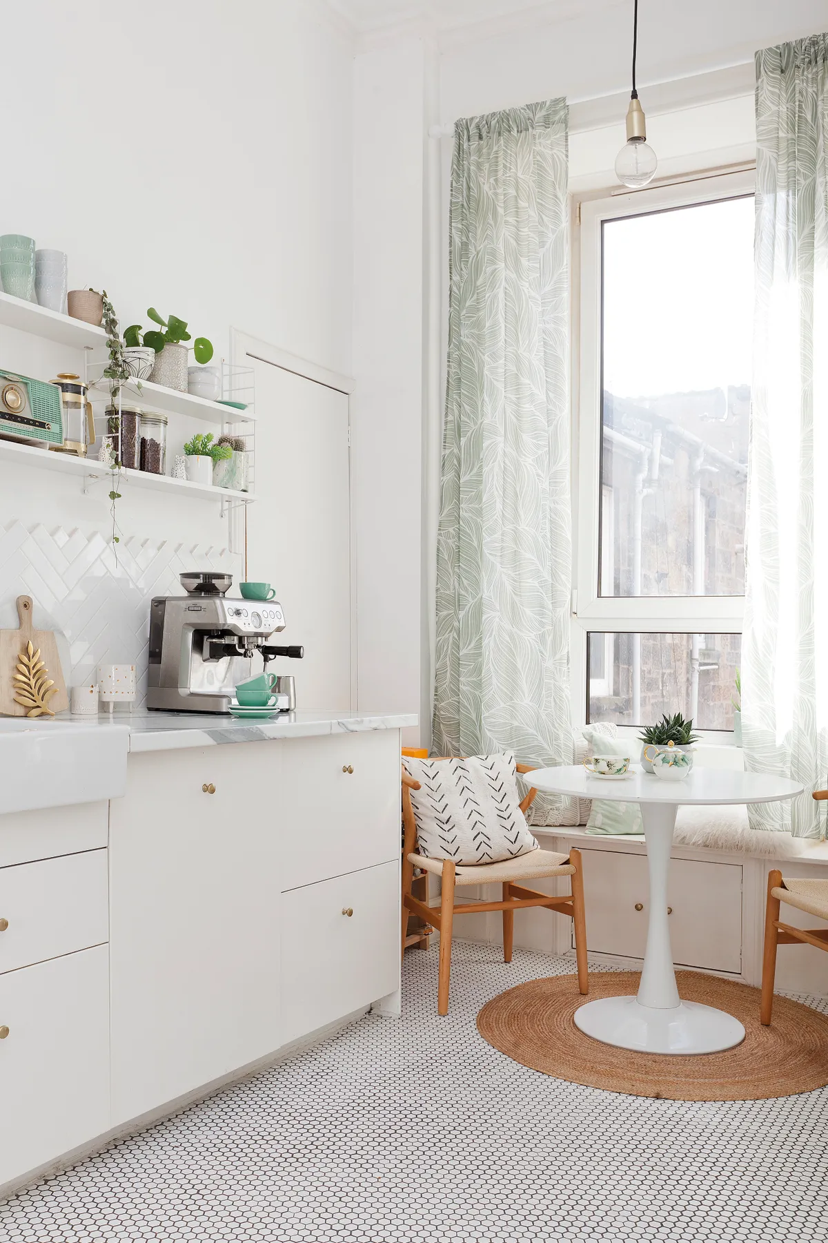
Kate has gone for a white and mint green colour scheme in the kitchen, with lots of gold accents and patterned accessories. ‘My advice for the kitchen is to keep it pretty but practical,’ says Kate.
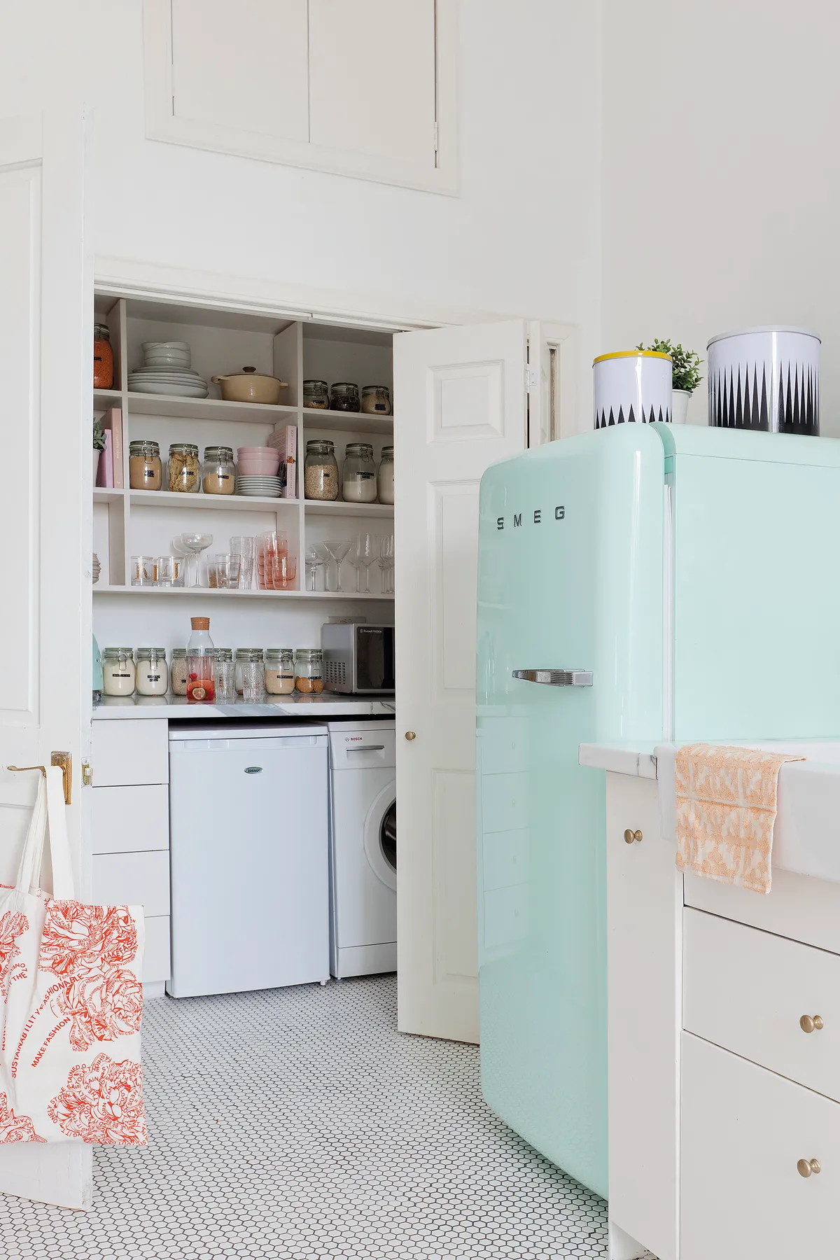
‘I don’t mind a bit of organised clutter. We have a lot of open shelving, which is great for putting favourite jars, vases and pots on display. We hide the rest away in the cupboards…’
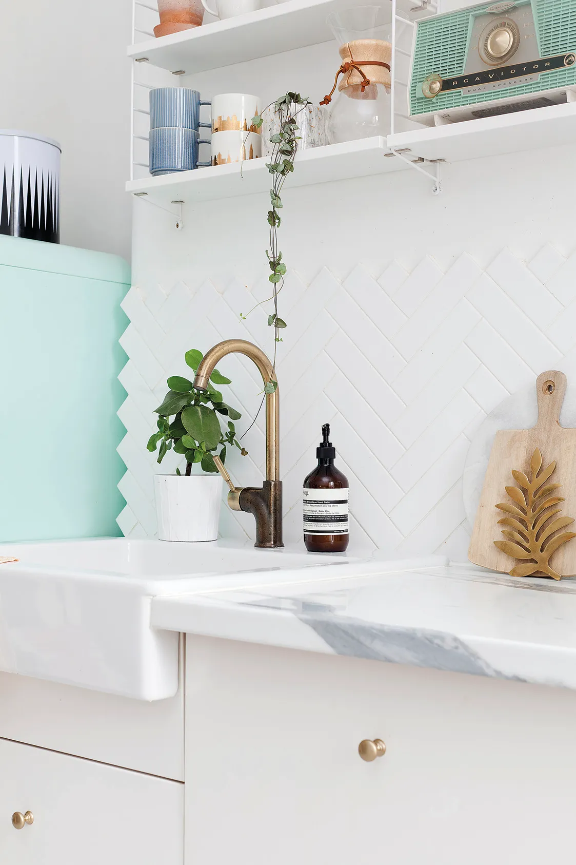
Kate’s larder is as picture-perfect as the main room, with labelled storage jars creating an Instagram-worthy space.
Bedroom
A mix of modern and vintage styles creates an eclectic look in the bedroom. The couple wanted to keep the space light, airy and uncluttered, splurging on key pieces, such as the dressing table and bed. ‘A bedroom should be a palace!’ says Kate.
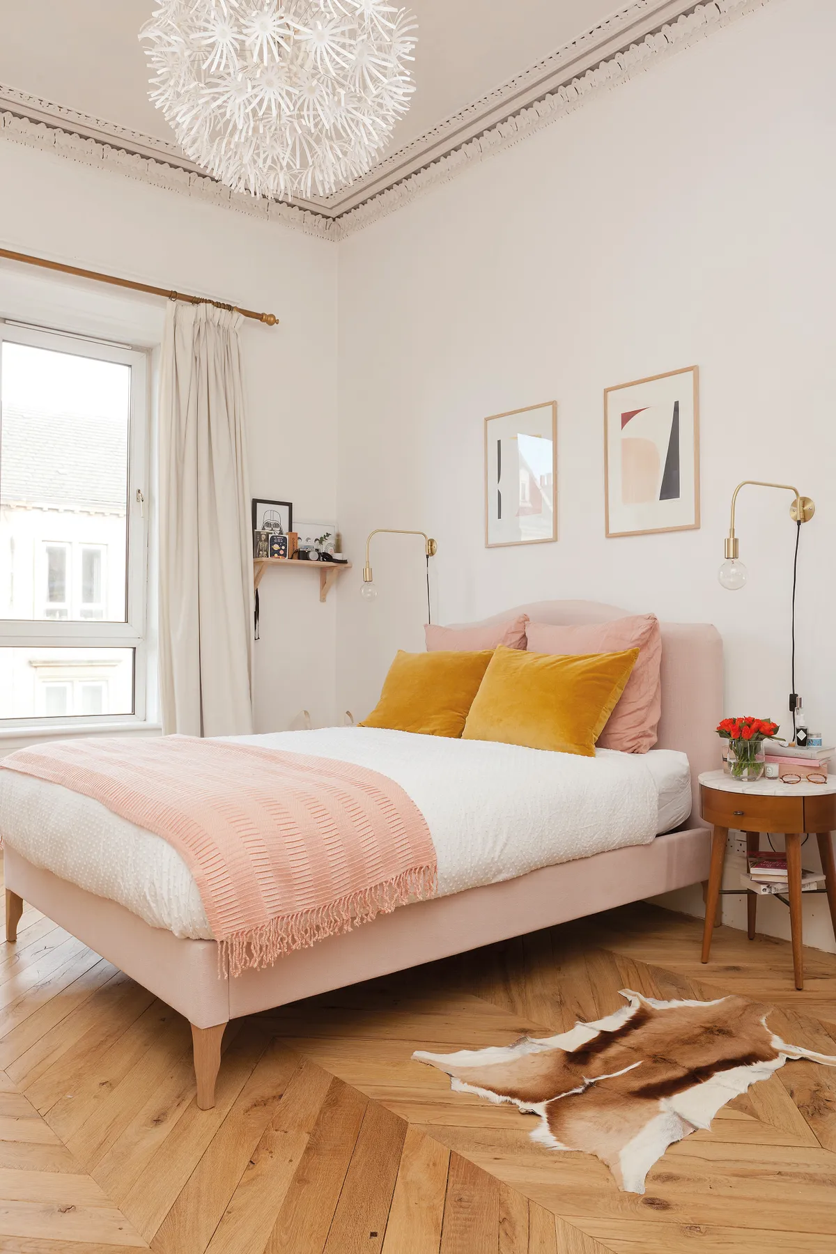
‘I spent big on bedding and found bedside tables that offer storage, but are also pleasing on the eye. Clever storage makes it easy to keep the room tidy.’
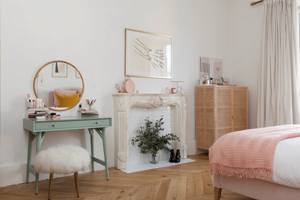
Simple hooks on the wall makes for a handy space to hang up hats, bags and other accessories as well as providing some pretty décor.
Keeping to the low-key theme, Kate opted for neutral colours with lots of soft furnishings and a mix of textures for added interest. The reclaimed wooden flooring, laid in a parquet style, adds a sophisticated finish to the bright space.
Study
Kate’s mid-century-style desk and chair are complemented by a blush pink sofa and gold open shelving on the other side of the room. The addition of a few pieces of wall art was the finishing touch to the considered space.

‘Our white walls were looking a bit bare, so I knew it was time to hunt down some nice prints,’ says Kate. ‘I didn’t want just anything hanging on our walls; I wanted cheerful art that I’d never get bored of.’
A wire noticeboard means Kate can easily swap and change bits and pieces that inspire her.
What I learned…
Creating your ideal home is a long process! Even now, I still have a few odd jobs on my DIY to-do list.
Living in your home for a while before you start any renovations is important. It really helps you get a feel for the space in each room and how you want to utilise them. I’ve definitely held off on going too crazy until recently – I really didn’t want to make any big changes until I was a bit more comfortable with my style.
Don’t be afraid to experiment with colour on the walls, especially in the form of wallpaper. I played it safe with colour, but I think I’m going to try out some more shades in the bathroom and hallway.

This is a digital version of a feature that originally appeared in Home Style magazine. For more inspirational home ideas, why not subscribe today?
