Shopping second-hand and upcycling has helped Evelyn Lindley create her one-of-a-kind house, full of vibrant colours, luxe finishes and bold patterns.
Here, she tells us all about her home makeover experience...
My home makeover
When we were looking for a house together, it was important to find a place where I could express my creativity. We’d been living in Lee’s family home and although I’d done some decorating, it didn’t feel like my own. As soon as I saw this house, I knew it was perfect for us.
When we first moved in, parts of the kitchen were painted in a shocking pink, and the bedroom was bright red. Luckily it didn’t need any building work so it was only cosmetic changes we needed to make.
Welcome to my home...
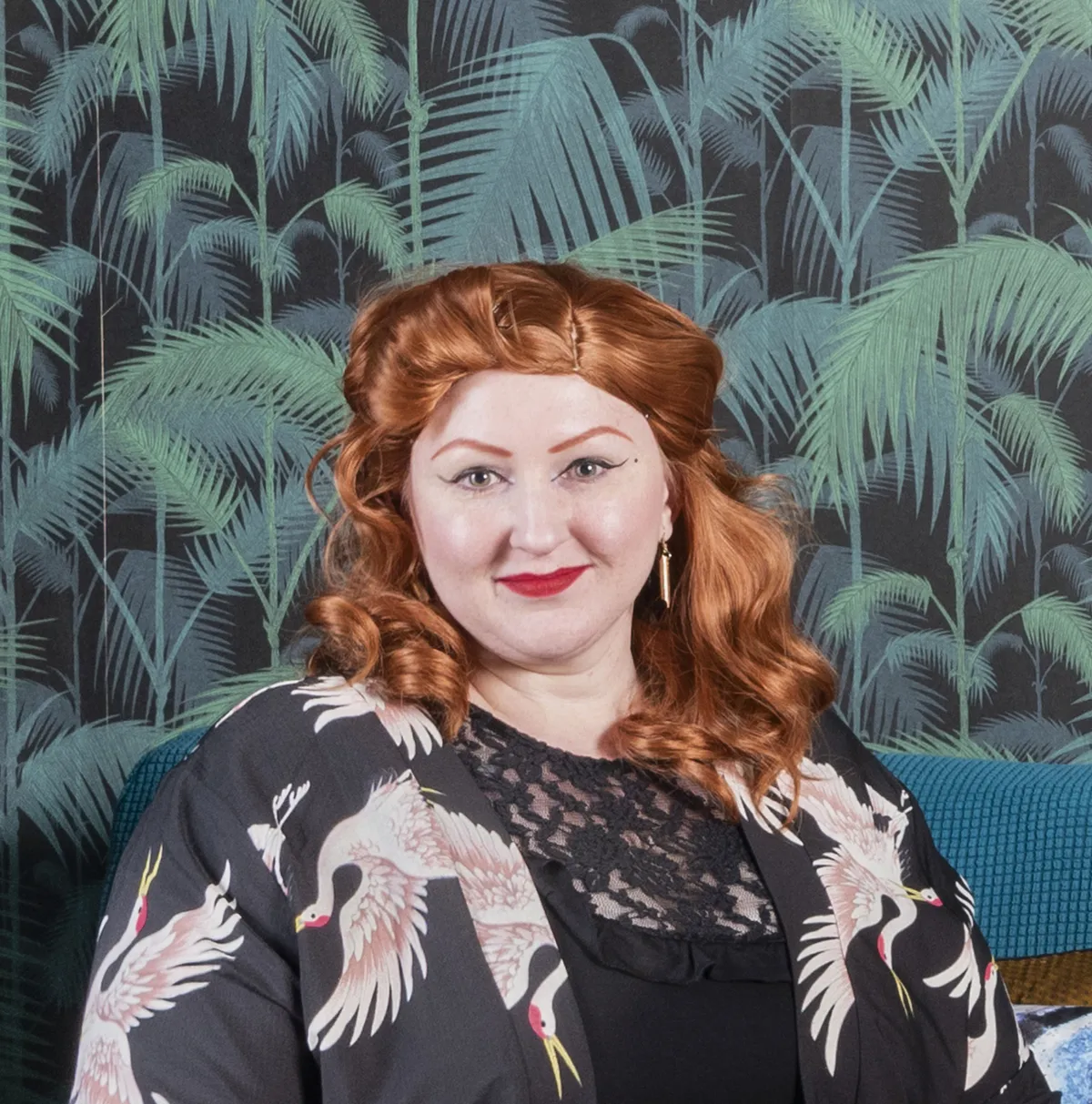
A bit about me I’m Evelyn Lindley, an interior designer. I live with my partner, Lee Bass, a print finishing team leader, and our three cats – Scout, Duke and Brough. I Instagram our renovation journey @evie_polkadot.
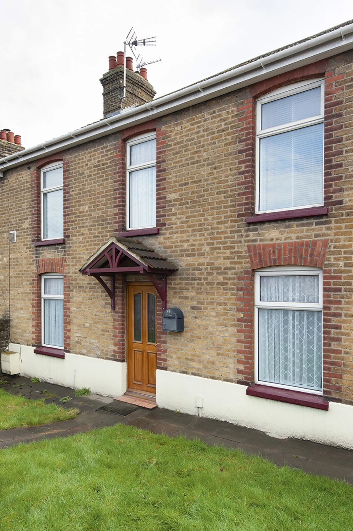
Where I live My home is a 1920s three-bedroom end terrace in Sittingbourne, Kent. We bought it in October 2019.
As Lee works really long hours, and I’m at home a lot due to health issues, I began decorating straight away. I started with our bedroom as I wanted to have a space we could relax in.
Then I worked my way around the house room by room. I would save up for the products I needed, like wallpaper, paint and accessories, and then I’d work on the room while thinking about the next one.
I have a photographic eye so I can visualise the finished look of a room before I even begin, which makes planning the work easier.
A bit more about my home...
What I wanted to change Although it had some splashes of colour, the house was mainly magnolia and had no character, but that was okay as it meant I had a blank canvas to work with. I wanted to go crazy and enjoy the process of making a home of my own.
How I made it my own I brought in loads of colour using a teal and pink colour scheme along with bold patterns. I’ve also included my love of peacocks with motifs dotted around the house. We’ve filled each room with vintage and upcycled furniture for an original style.
My favourite part I love the drama of our bedroom. It’s exactly how I pictured it before I began, and it’s such a cosy, relaxing space to be in, just how a bedroom should be.
Lee already had a lot of antique furniture that we brought with us, and I’m a real bargain hunter and love to find cheap pieces to upcycle. I think this mix has given our home a beautiful, unique look that really represents us both.
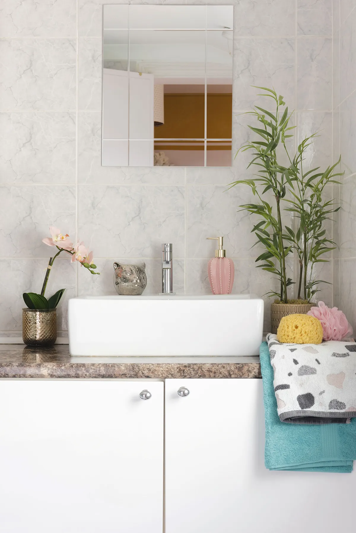
Kitchen
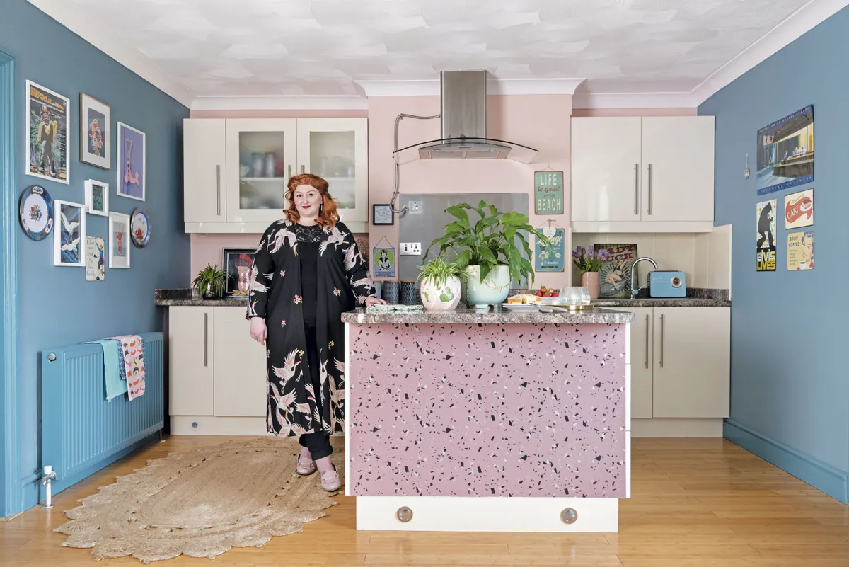
‘I was close to tears when I originally painted the kitchen because when I finished it, I hated the blue. But it had taken me so long to do that a friend suggested I just live with it for a bit and see how I felt in a few weeks. It was the best piece of advice I’ve been given, as I would have changed it straight away, but now I’ve grown to love it and I’ve actually started to bring in more blues that are similar to this.
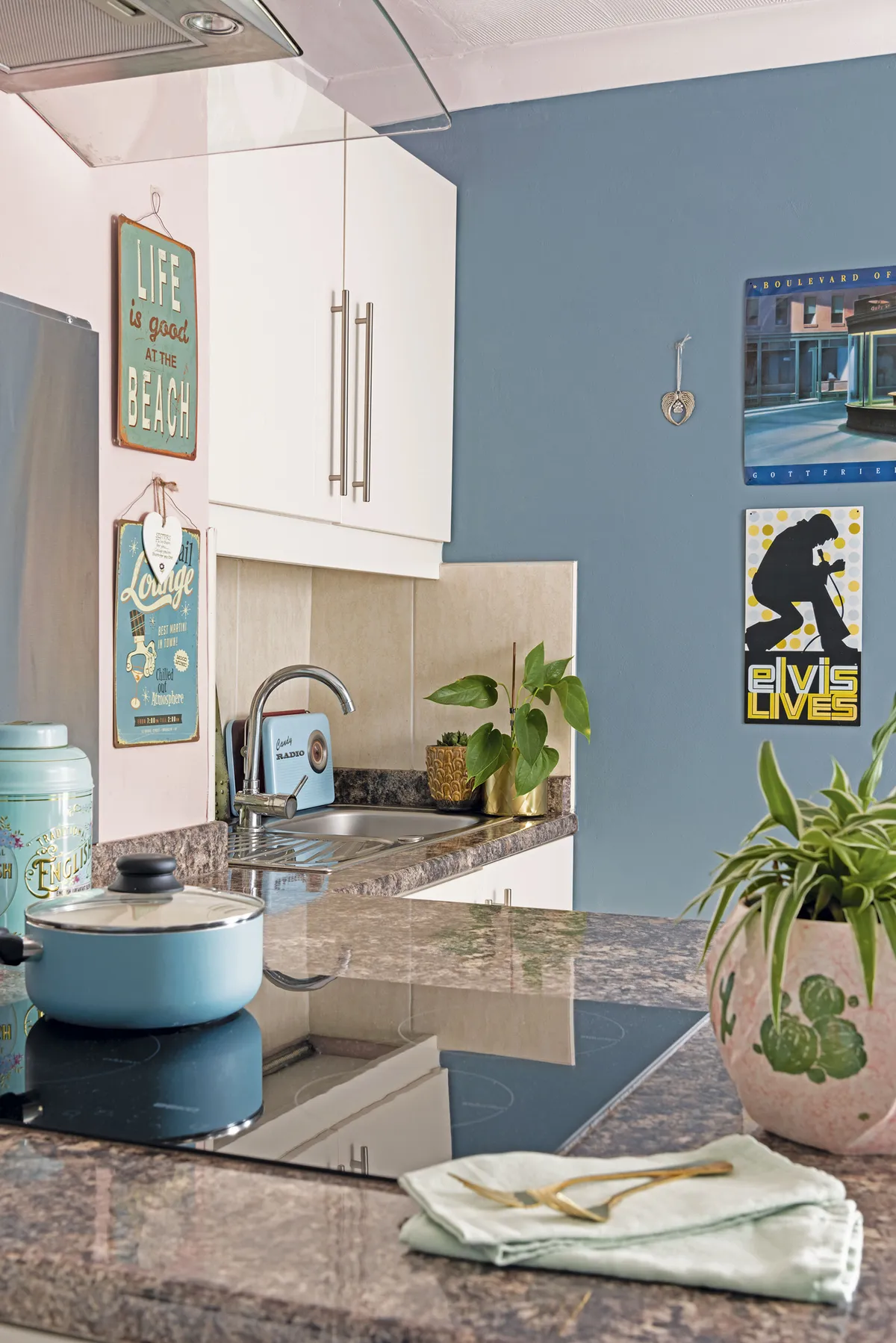
‘The front of the kitchen island has a perspex cover that was shocking pink when we first moved in. I tried to cover it with paint, but it went really patchy. Then I discovered Jes Rose, who encourages people to upcycle with vinyl. I went for the terrazzo pattern from her range because it complemented the pink of the chimney breast, and I think it
adds a bit of fun to the space.’
Dining room
‘This was originally used as a study by the last owner who thought it was too small for a dining room, but I think it’s the perfect size and can’t wait to have people round. I wanted to give the room a Victorian Gothic feel, and ultimately want to get a round table in here.
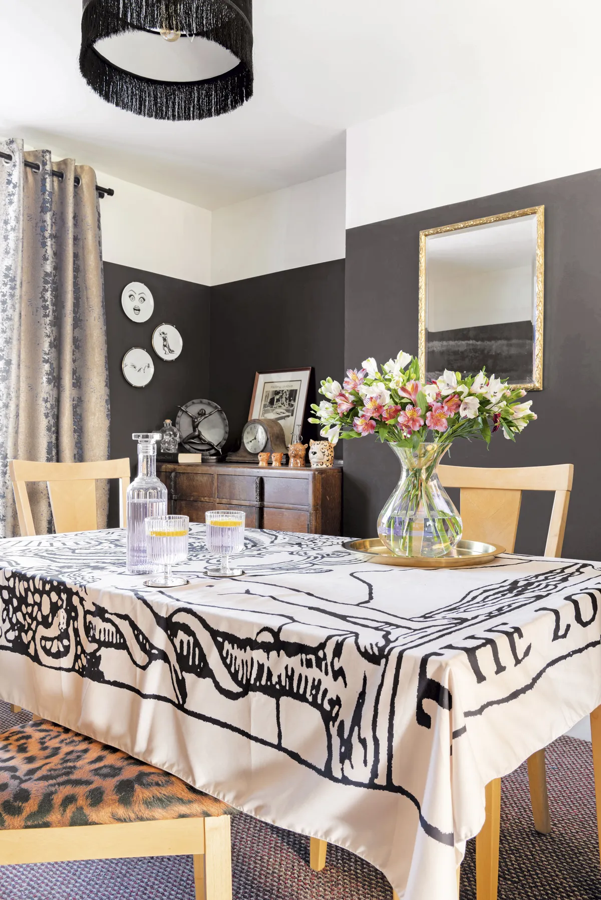
‘Lee bought the chairs years ago and I upcycled them with cheap leopard-print fabric. I decided to go for the three-quarter painted wall effect, so I painted the ceiling and woodwork a soft white.
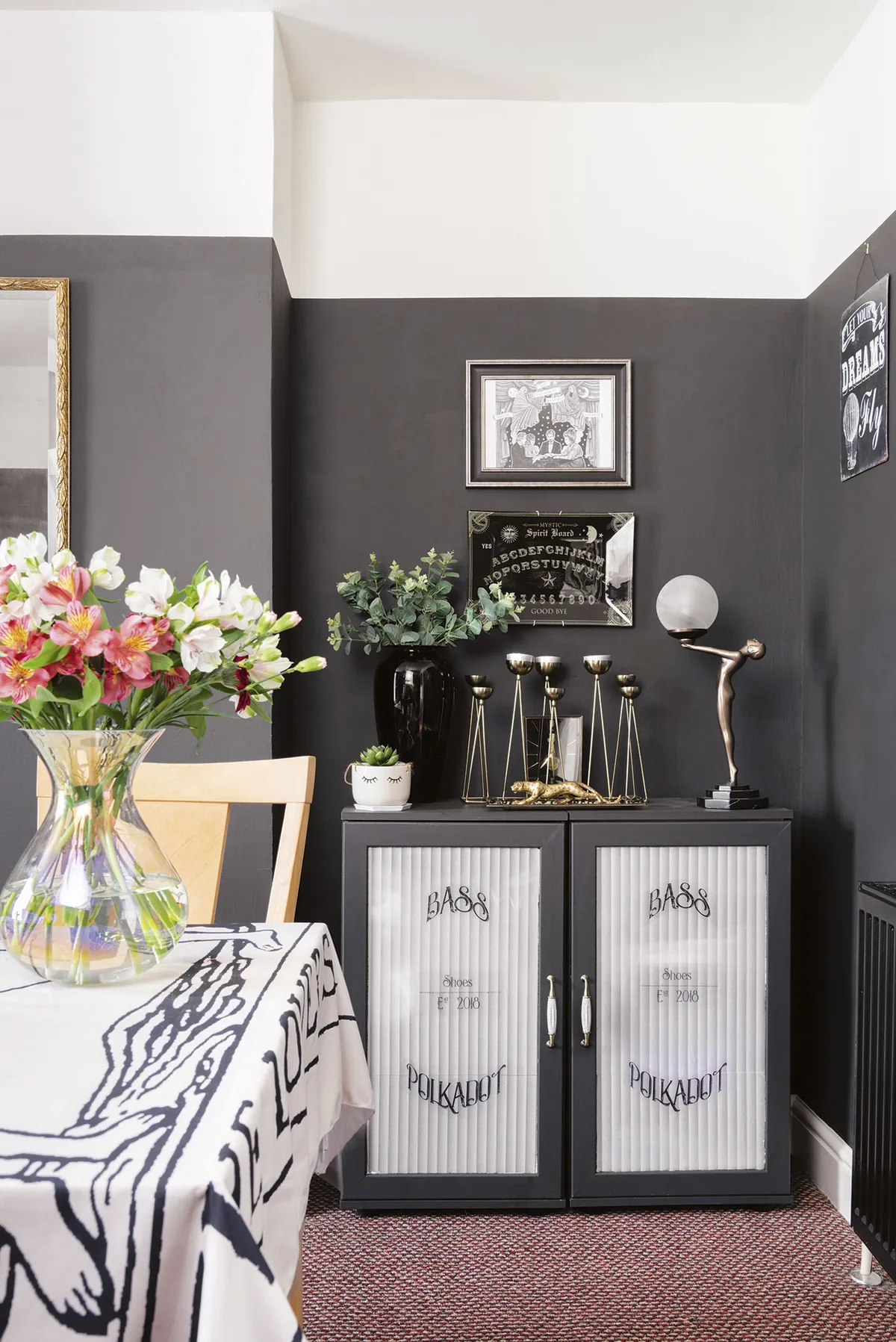
‘Sometimes I wish I’d been a bit bolder and painted the whole room black, but Lee was less keen, and creating a home together is about compromise. I write erotic poetry and love to work in here in the evenings as the dark walls give the room a moody, romantic feel, which inspires me to write.’
Living room
‘Lee has always collected interesting pieces and a lot of our furniture is vintage, second-hand or upcycled, which makes our home really eclectic. These pieces, along with my love of bold colours and pattern, mean we have a home that really reflects both our personalities.
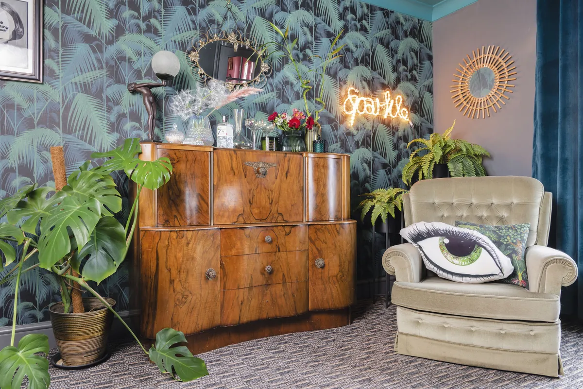
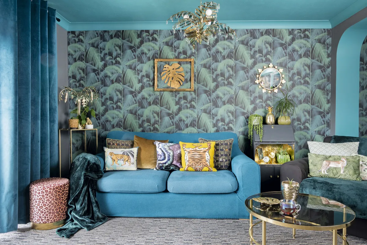
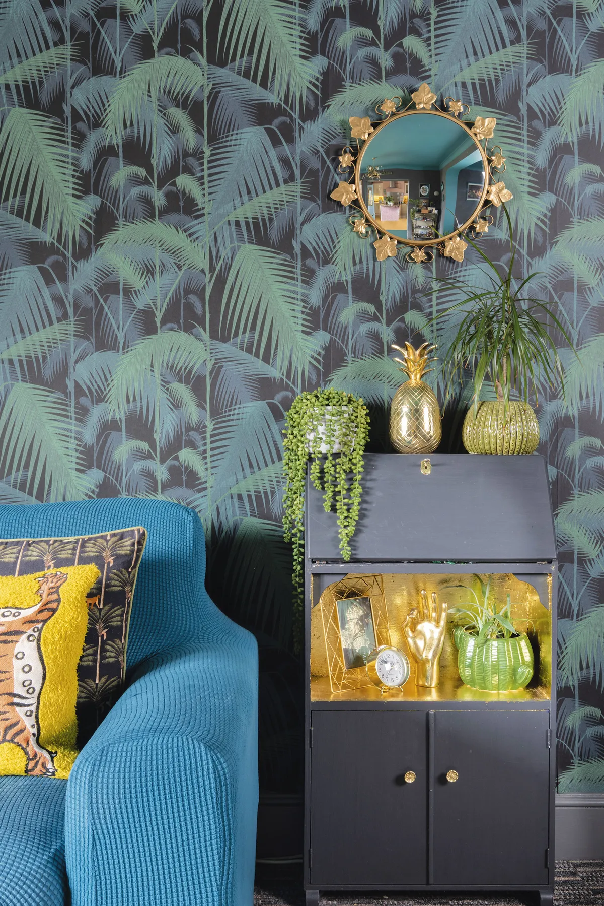
‘I bought the tropical wallpaper from Wallpaper Direct as I thought it would go beautifully with the vintage veneered cocktail cabinet.
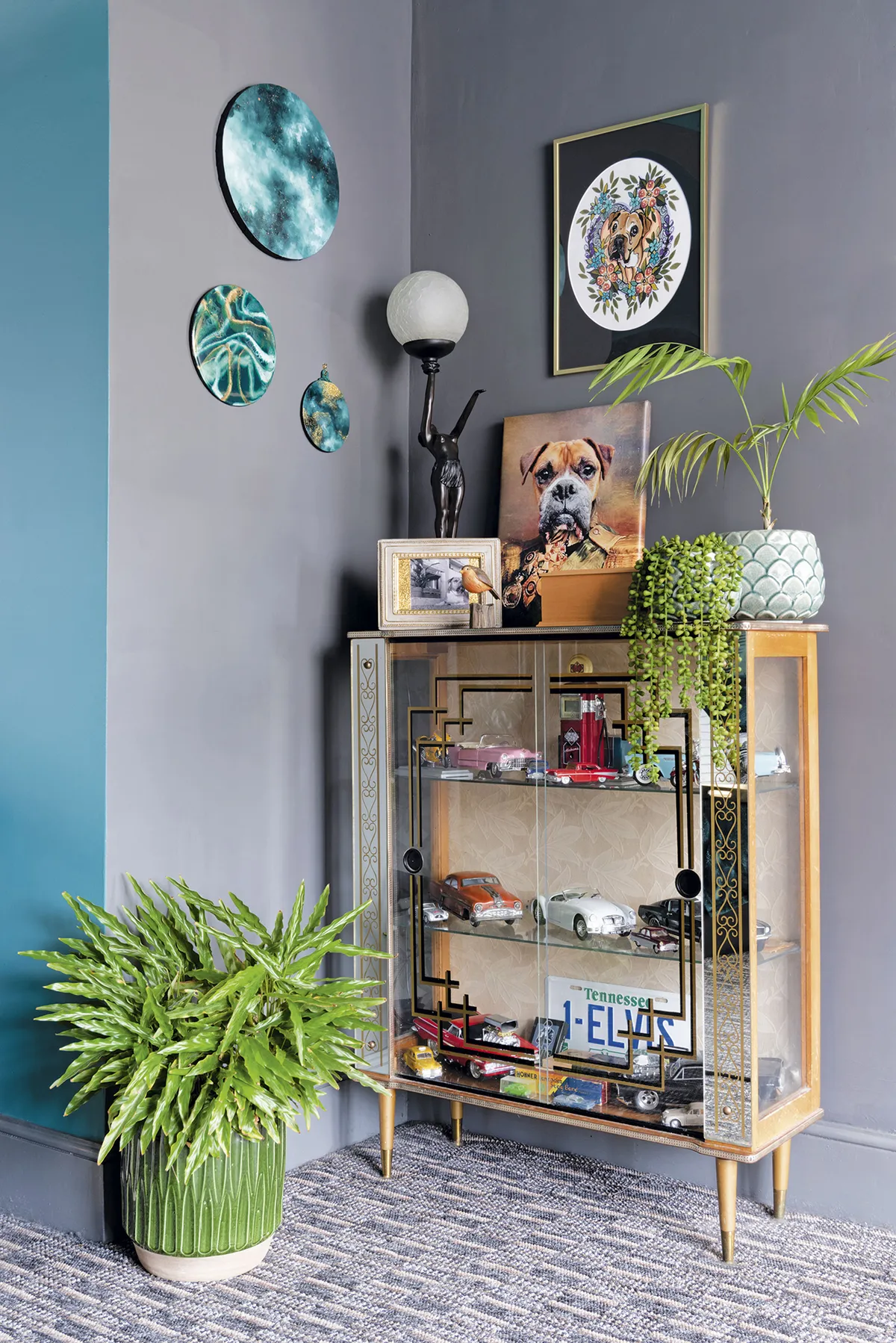
‘I initially painted the ceiling in here turquoise, but it didn’t work for me, so I went over it with Teal of Tunbridge Wells from Mylands and mirrored it on the arch. Then I painted the walls grey, which makes the teal really stand out.’
Hallway
‘I was originally quoted £700 to carpet the stairs, which was way out of my budget. Instead, I went to IKEA and bought four of their long patterned runners, which we attached ourselves.
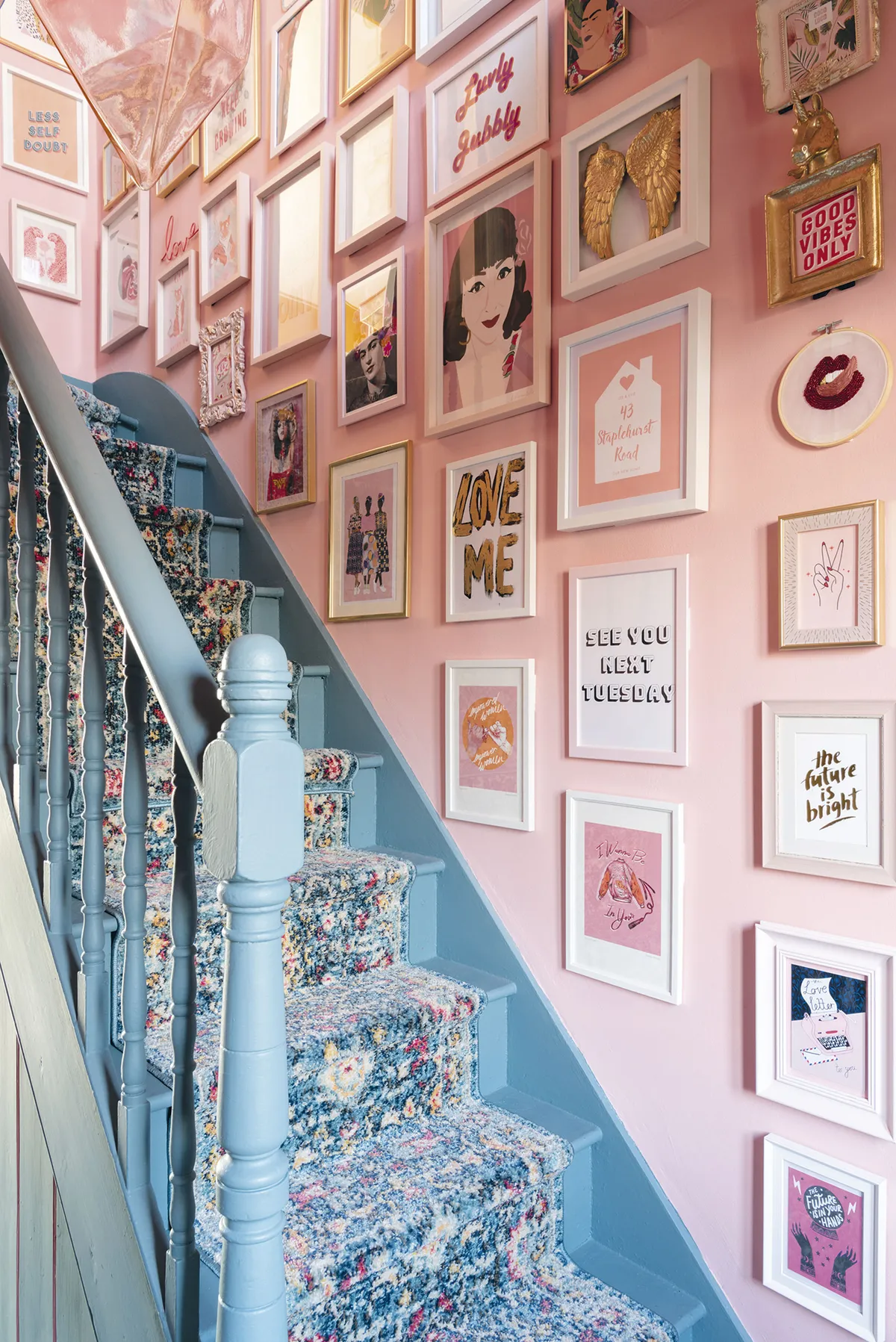
‘At only £22 each, the whole job cost under £100 and looks amazing. I’ve got over 60 pictures hanging along the staircase, so it took a few months to get them all up. I didn’t plan the whole look in one go like some people do, but just started with one picture and then arranged it all as I went along, doing about three rows at a time.’
Master bedroom
‘I knew this would be a dark room as I had planned to base it around a peacock theme, which I love for its opulent feel. I wanted a luxurious space with lots of sumptuous textures and elegant gold accessories. As I had already covered this headboard in the beautiful teal velvet fabric, I worked the room around that, including the Zambezi duvet cover from Emma J Shipley.
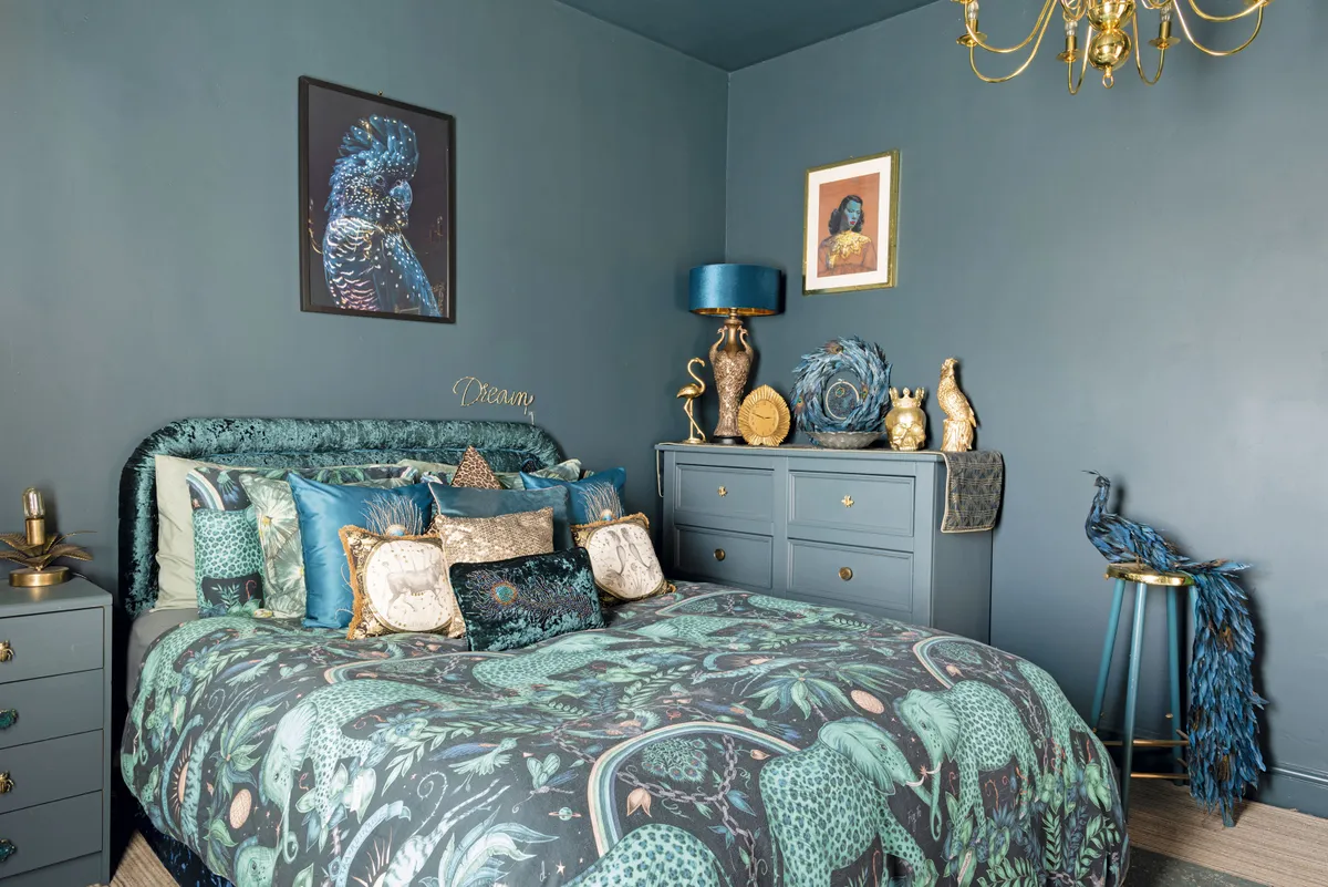
‘I pretty much painted everything in Blue Spruce by Valspar, as I think painting the walls, woodwork and furniture the same colour creates a bold and really modern look. People often forget about the ceiling and leave it white, but I think it should be treated as an extra surface, so I painted it this lovely rich colour too. My friends weren’t sure it would work but I knew it would look elegant and glamorous, but also cosy and relaxing.’
Spare bedroom
‘I wanted the décor in this room to be quite light and bright as a contrast to our bedroom, and I already had this Amazon Pink wallpaper from Wallpaper Direct as a sample, so I decided to use it in here. I chose this soft Green 01 from Lick for the walls and paired it with coral accessories.
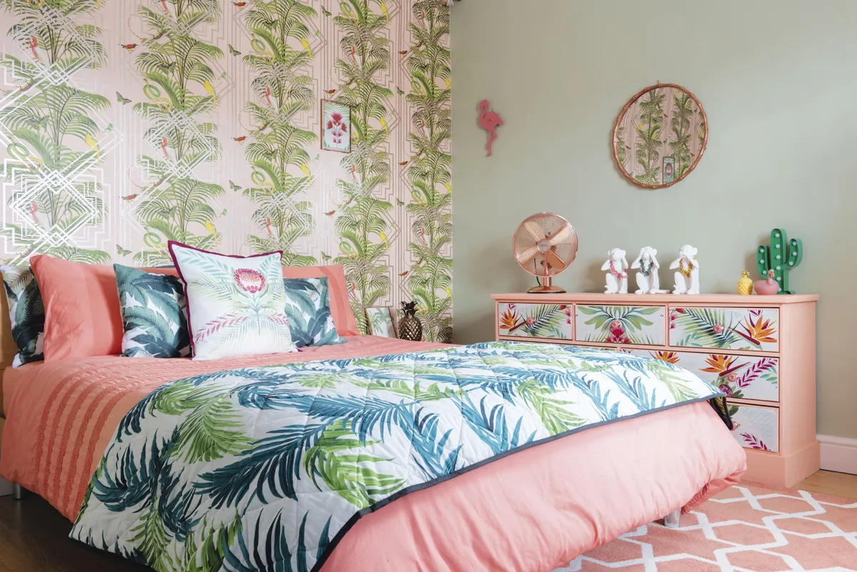
‘My mum was getting rid of this large unit, so I took it on as an upcycling project. It was originally a horrible orange pine, so I painted it with chalk paint from Hobbycraft, and then covered the draw fronts with the same design as the curtains and the cushion from Next.’
Feature and styling Lisa Moses. Photos Caroline Mardon.
This is a digital version of a feature that originally appeared in Home Style magazine. For more inspirational home ideas, why not subscribe today?

