Sam Hicks has transformed a lacklustre property into a comfortable family home using pre-loved pieces and upcycling hacks.
Here, she shares her home makeover story...
My story...
We’d only been in our three-bedroom Victorian house in Nottingham for two years when we moved to this bigger four-bedroom property on the next street.
The three-storey house had been rented out for 20 years, so the décor was dated, but there was a big driveway with scope to extend.
Our first job was tanking the cellar to provide storage.
Then we decorated the kids’ bedrooms and shower room on the top floor to create a haven away from all the dust.

Four months after moving in, we tackled the ground floor. The kitchen and dining room were knocked together and squared off with a single-storey rear extension, then we demolished the garage and added a two-storey side extension.
Welcome to my home...
A bit about me I’m Sam Hicks (@our_victorian_home), a geography teacher. I live with my husband, Gareth, and our children Martha, six, Barnaby, three, and Ralph who’s six months.
Where I live Our home is a four- bedroom Victorian semi in Nottingham. We’ve lived here since 2018.

This gave us a new garage with a utility room behind, plus a dressing room and en suite above.
We also added a downstairs toilet where the old kitchen door was blocked up. To save money the builders constructed the shell, then we project managed the second fix trades ourselves.
Originally, we considered a two-storey rear extension to give us a fifth bedroom, but the neighbours weren’t happy, so we scaled it down. It worked out for the best as it would’ve stretched the budget.
Having my friend next door to cook us dinner and help with the kids was invaluable during the three-month build and my in-laws have been great, cleaning up after the builders and project managing when we weren’t around.
A bit more about my home...
What I wanted to change There was woodchip and Artex everywhere, and the kitchen was long and thin with a utility room at the end. It just didn’t work for family life.
How I made it my own After extending and knocking together ground-floor rooms, I’ve experimented with dark colours, brought in vintage furniture and repurposed old pieces.
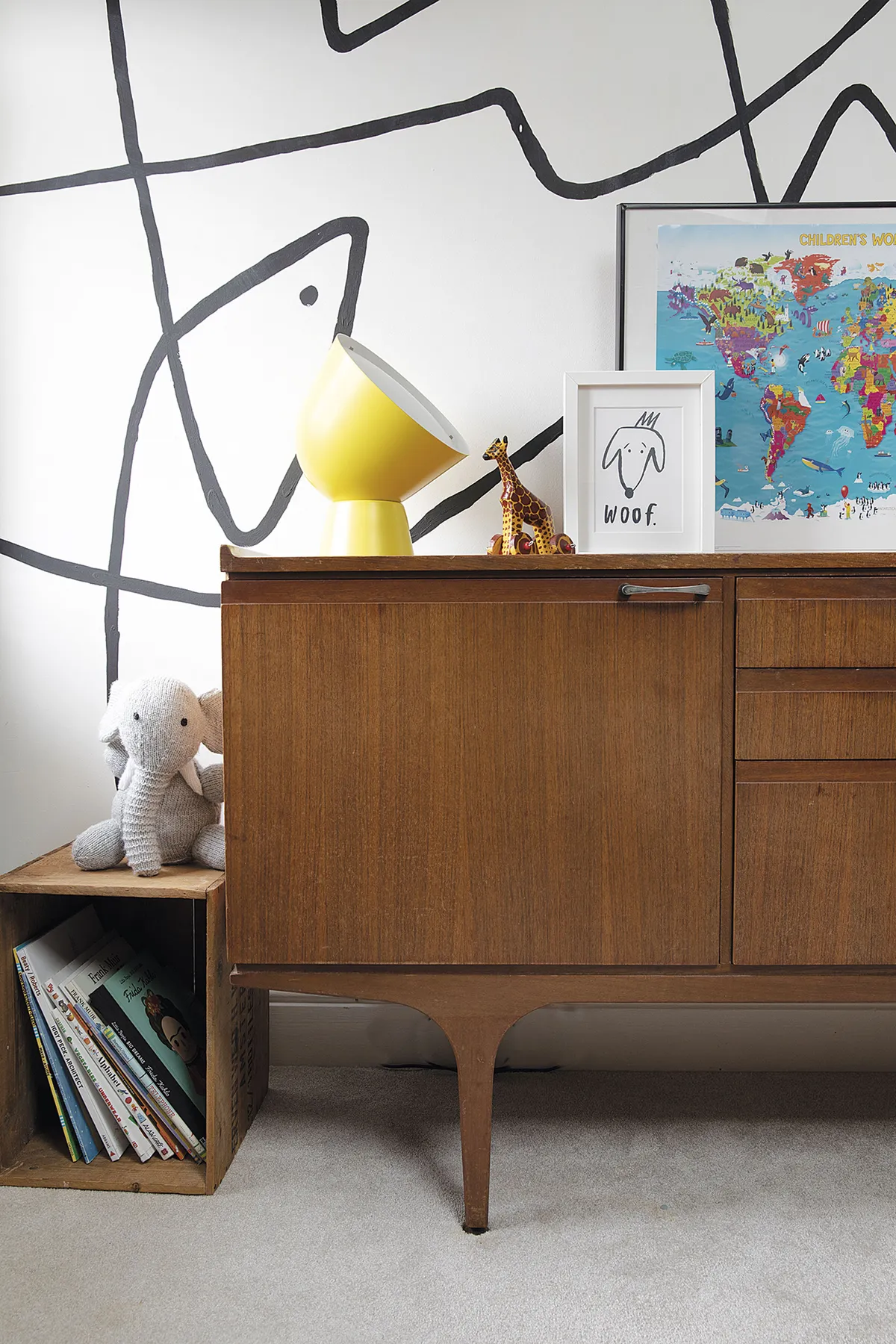
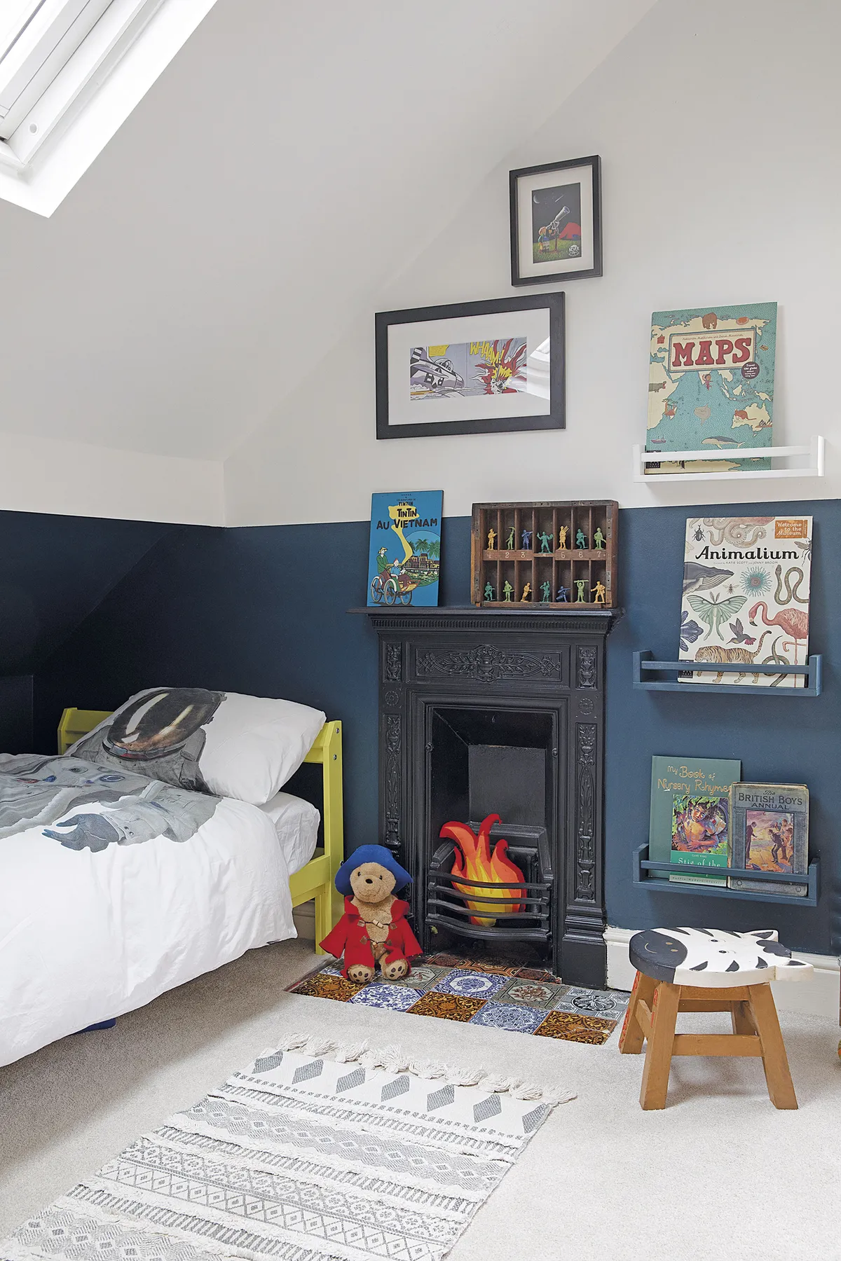
My favourite part I love Barnaby’s bedroom where I created a wall mural.

Since then, every room’s been decorated in a modern Victorian style with some mid-century thrown in too. I’ve even set up an interior styling business – samanthahicksinteriors.co.uk – which I hope will encourage people to be colourful, bold and not be afraid to try something new.
Kitchen
‘I’ve always been obsessed with deVOL Kitchens, but after visiting the showroom nearby, I realised their Arts and Crafts designs were out of our price range.
‘So we decided to recreate the look instead with an in-frame design from DIY Kitchens, which was colour matched to Farrow & Ball Railings and teamed with brass handles we sourced online.
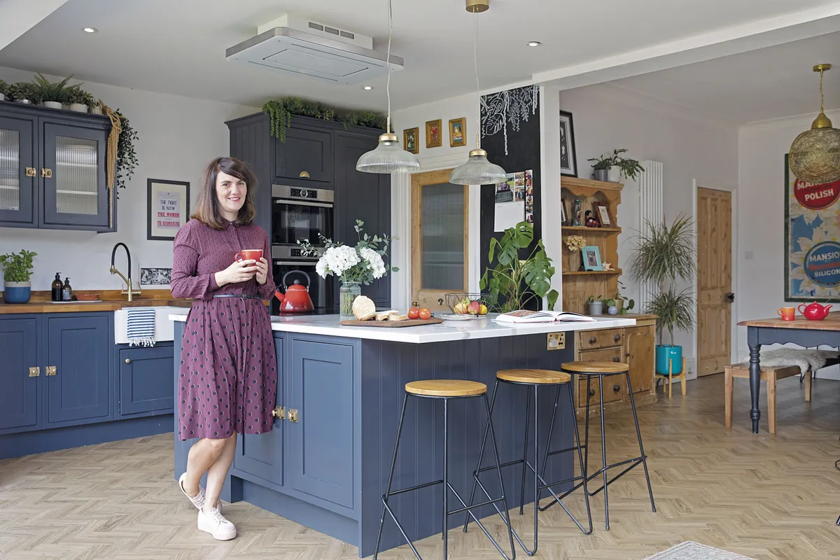
‘My old school friend Dan, who owns DW Kitchens, helped with the measurements and fitted everything. Although we’d originally wanted wood parquet flooring, it made more sense to go for luxury vinyl tiles because the seven-inch thick concrete floor would’ve needed five months drying out before we could lay it.
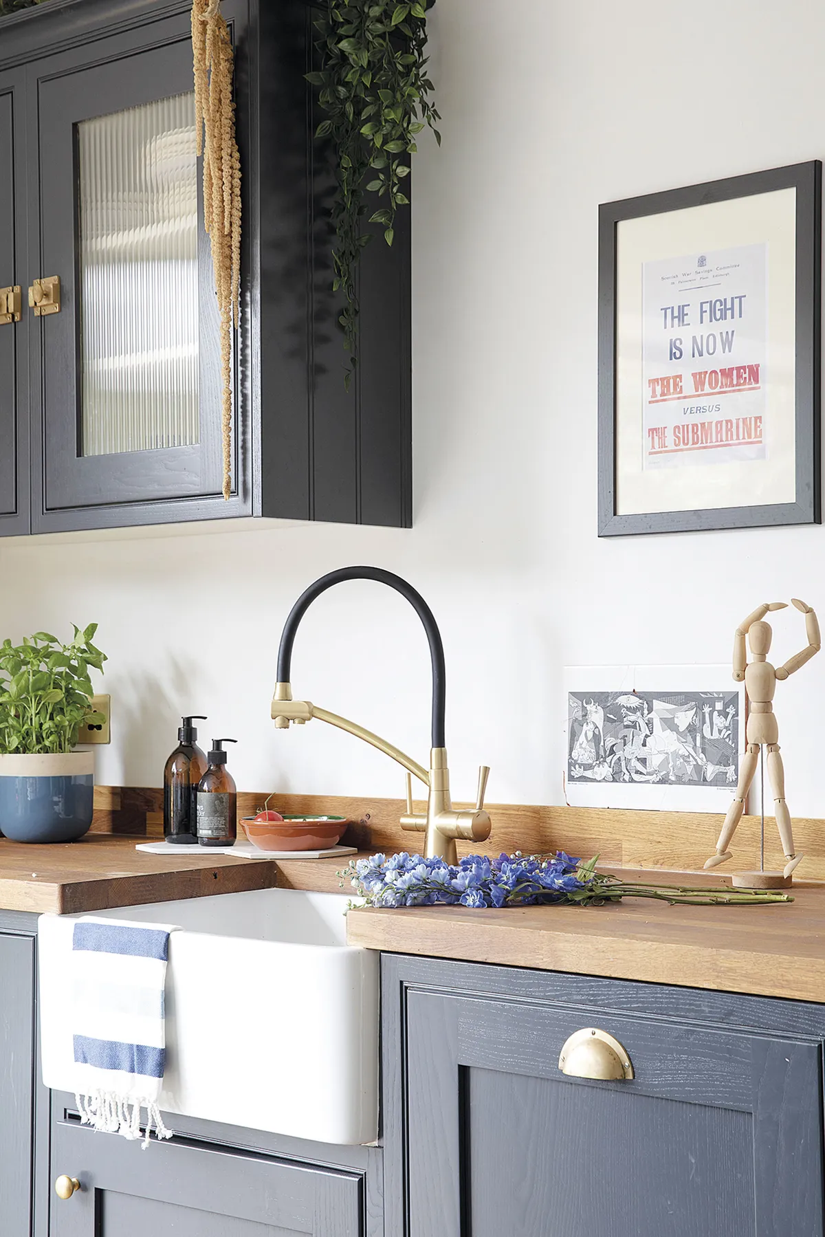
‘I love the open-plan layout and I’m so happy we’ve achieved our dream kitchen on a much smaller budget.’
Dining area
‘When we first moved in, this room was covered in woodchip wallpaper and had small French doors leading to the garden.
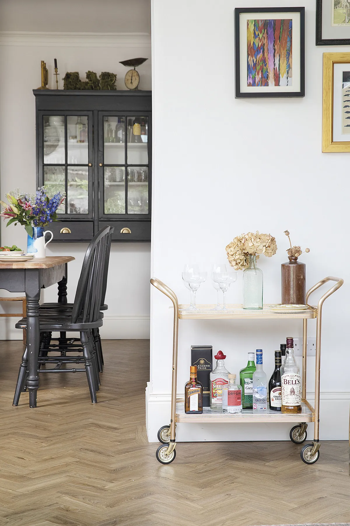
It made sense to square off the space with an extension and join it to the kitchen. Now the room is mostly filled with pieces from our previous home, such as the Victorian pine dresser we picked up at a vintage auction.
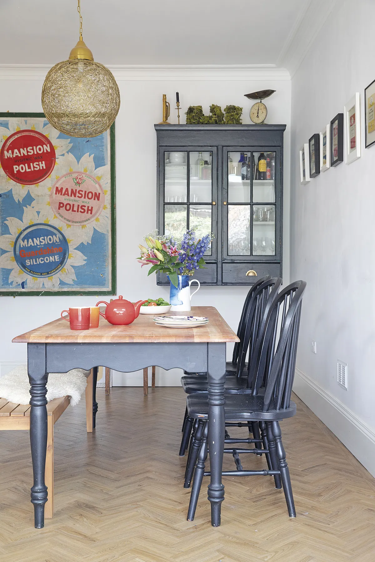
‘Our Laura Ashley farmhouse table has also had a makeover. I used matt black paint from B&Q on the legs to make it more contemporary than shabby chic, and we also sanded the top to make it lighter. I’ve kept it light by painting the walls in Wevet by Farrow & Ball as the space gets a lot of sun.’
Living room
Although Sam went more traditional with the kitchen, she’s gone for a bolder style in the living room as it’s less of an expense to change.
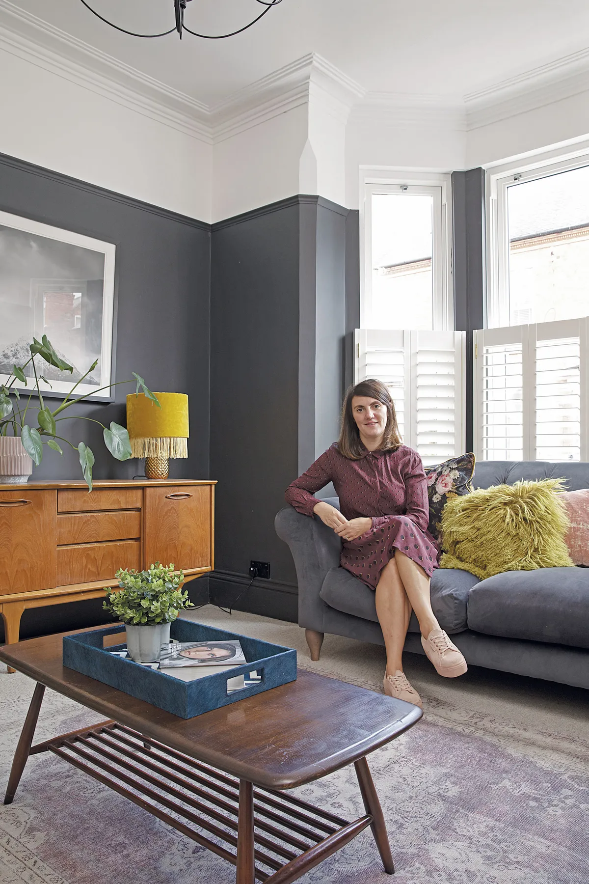
‘I was inspired by Kate Watson-Smyth (@mad_about_the_house) for the dark walls,’ she says. ‘Kate’s lounge is gorgeous, and I had some Pitch Black by Farrow & Ball left over, so we went for it.
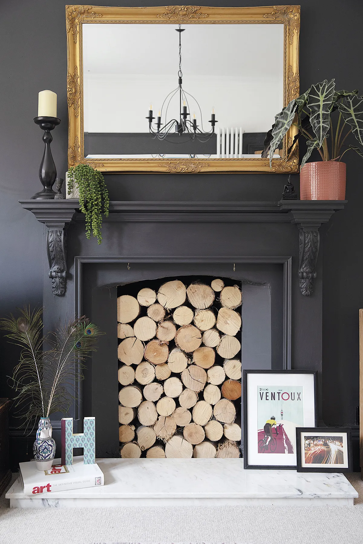
‘Painting the woodwork the same as the walls gave it a much more modern finish. The pair saved money by having Gareth’s dad help strip and paint the room, and his mum got a staff discount on the M&S sofa. ‘I love this room as it has a classic look, but with a quirky twist,’ says Sam.
Master bedroom
After replacing the old carpet and stripping the gold floral feature wallpaper, Sam was eager to create a sophisticated and elegant retreat. ‘Gareth wasn’t keen on panelling as he said it would take ages, so I did it myself,’ she says. ‘After putting up a dado rail, I used mouldings to create the panels. It just needs some coving to finish it off.’
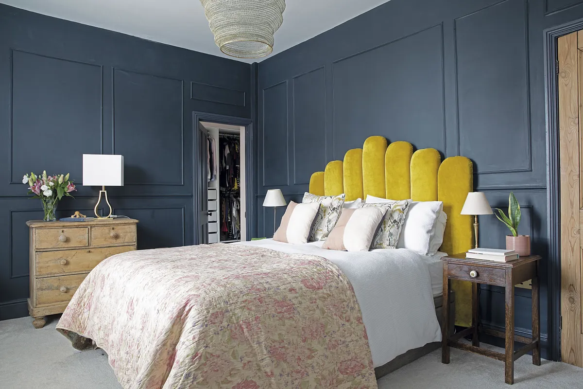
Having made a headboard for her previous home, Sam created a mustard yellow velvet design inspired by an Anthropologie bed that was only available in the US. ‘I made it from seven pieces of wood rounded off at the top and two types of foam,’ she says. ‘Then I stapled on the fabric and attached them to battens fitted at different heights on the wall.’
Ralph's bedroom
‘As we didn’t know the sex of our baby, I wanted a gender-neutral colour scheme in here. The terrazzo-effect ceiling was inspired by a wallpaper I saw on the @threeboysandapinkbath Instagram account. Since I had loads of tester pots left over, I picked ones that worked well together and practised the pattern on paper before painting the ceiling.
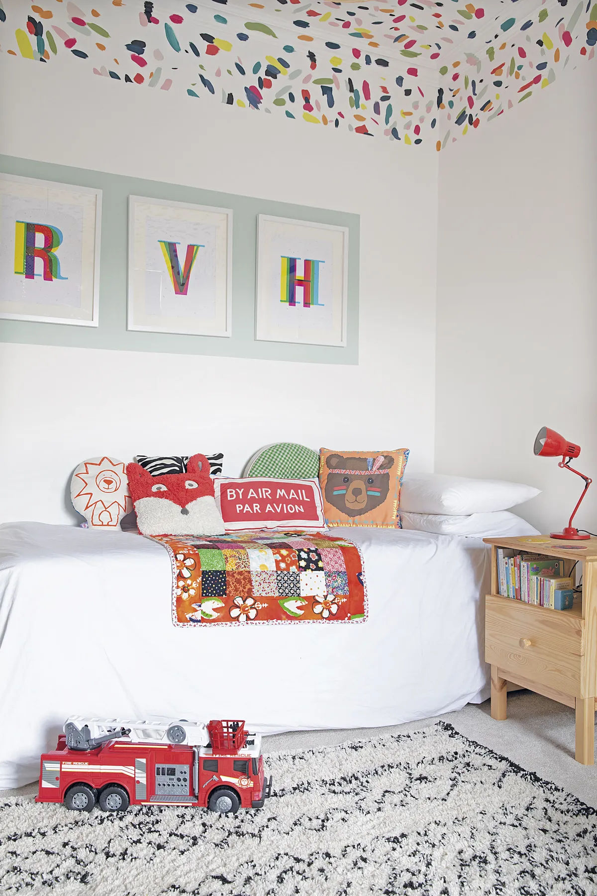
‘One of the colours – Teresa’s Green by Farrow & Ball – has been repeated behind the pictures. It breaks up the white walls and frames the artwork from Ink & Drop.’
What I learned…
In hindsight, I would’ve hired an architect rather than a draughtsman to give us some more innovative ideas for the extension. As everything happened so quickly, we ended up making too many decisions all in one go. Looking back, I’d take it a bit slower.
We’ve saved money by doing a lot of work ourselves, such as painting and tiling. Next time, I’d pay someone to do the tiling, as the en suite floor doesn’t look great.
You can always repurpose things to fit a different space. For instance, the chrome living room chandelier and shower cubicle were both spray-painted black.

This is a digital version of a feature that originally appeared in Home Style magazine. For more inspirational home ideas, why not subscribe today?
