Sodia and her husband Larbi looked at 22 houses in the search for their dream home. Sodia knew she wanted to live in Brockley because of its family-friendly nature, and loved the idea of living somewhere with lots of green spaces, independent shops and cafés.
The couple were searching for a Victorian house with high ceilings, period features and all the natural light you get with big windows. When they were 22 houses in, they came across a total fixer-upper for a good price, and bought it! Here, she recalls her home makeover experience....
Welcome to my home
A bit about me I’m Sodia and I have my own homeware brand, Beldi Maison. I live with my husband, Larbi, our two children, Zayd, eight, and Amani, six, and our cockapoo, Myla.
Where I live We live in a five-bedroom Victorian terrace in Brockley, south-east London. We’ve lived here since 2012.

My story...
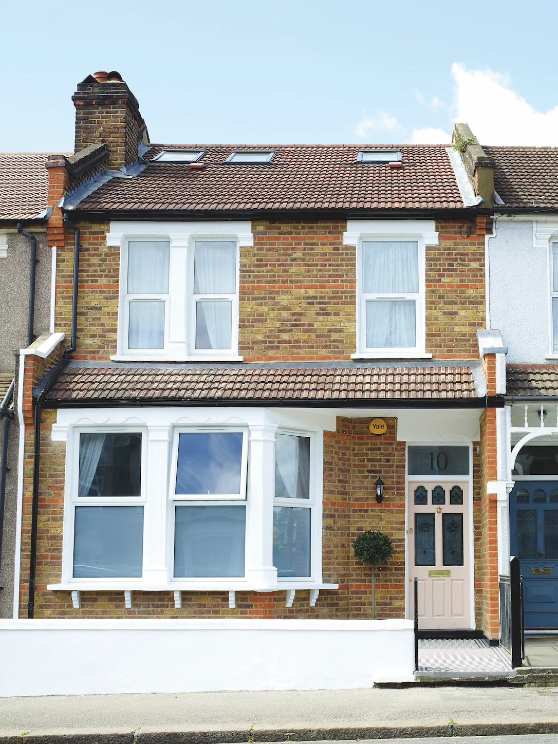
We chose this home because it provided me with the perfect opportunity to put my own stamp on something. Outside, the house was covered in cobble-effect cladding so it had the opposite of kerb appeal.
Inside, it was panelled in bright orange pine, crazy patterned wallpaper and carpets, all in terrible condition. It had been owned by an elderly person who slept in the living room and had boxed a basic bathroom into a corner of the kitchen.
About my home
What I wanted to change Everything! We reconfigured the existing extension to create a larger kitchen and converted the loft to create two bedrooms and a bathroom.
How I made it my own A palette of muted neutrals with pops of colour and lots of bohemian pieces allowed me to put my stamp on the house.
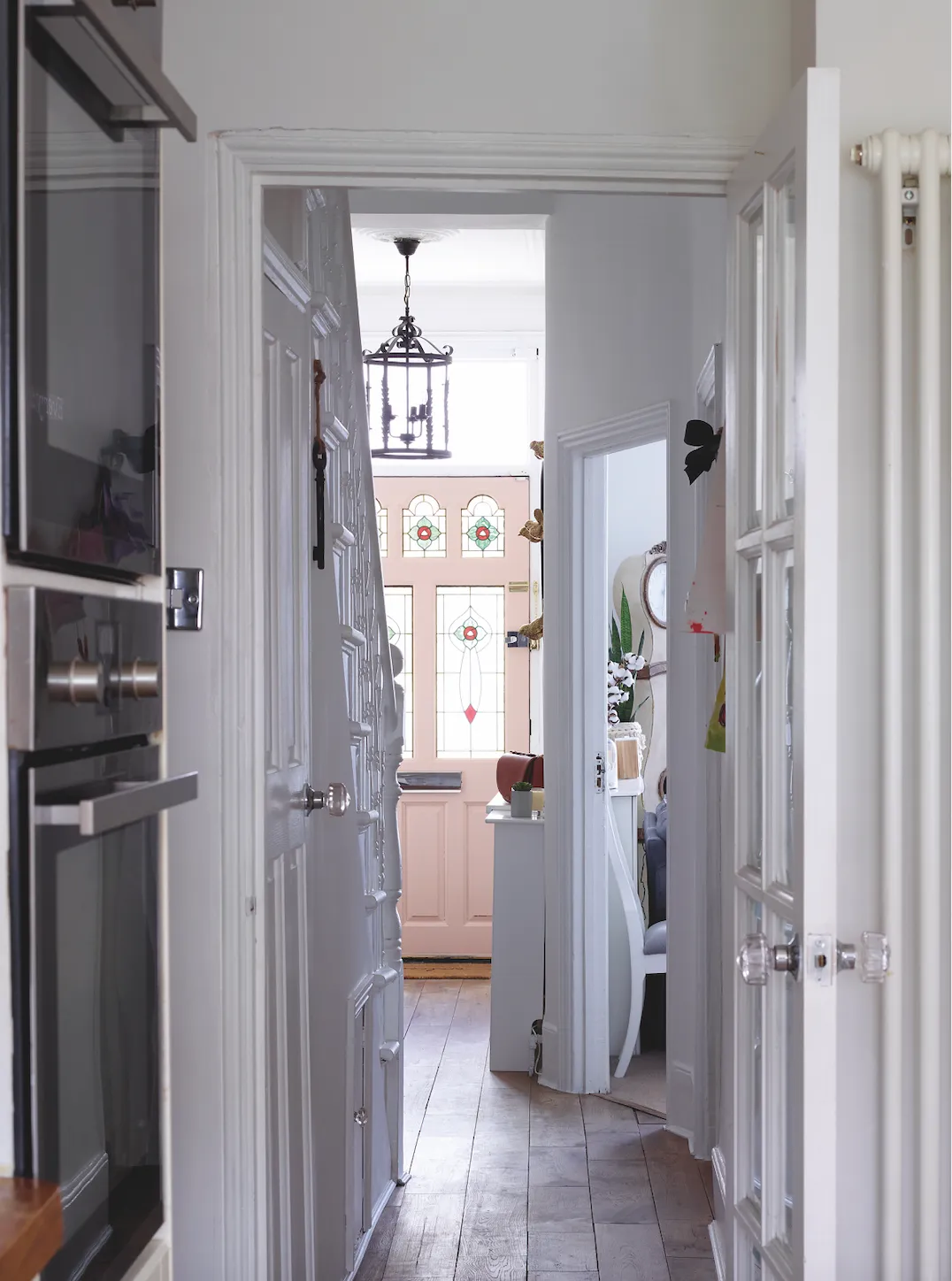
My favourite part I love coming home to my Victorian-style path and pink front door.
We decided to start on the bedrooms, so our baby son had somewhere comfortable to sleep and play, before moving onto the bathroom and, finally, the kitchen.
As soon as we moved in, it was all systems go. We had to replace all the floorboards and when we removed the wallpaper the plaster came off with it, so we had to re-plaster.
It was hard living here and doing the work with a young child. The low point was when the builders were banging around in our bedroom and the ceiling collapsed. We stayed with friends when it got really bad. We tackled the loft two years ago.
That all ran smoothly, apart from the scaffolders managing to put a foot through not one, but two bedroom ceilings – both over white linen bedding. Despite the setbacks, I love renovating and I’m getting a bit bored now there’s nothing left to do!
Kitchen
Although we didn’t extend the floor plan here, we removed a downstairs bathroom and boiler to make more space, as well as creating double doors onto the garden.
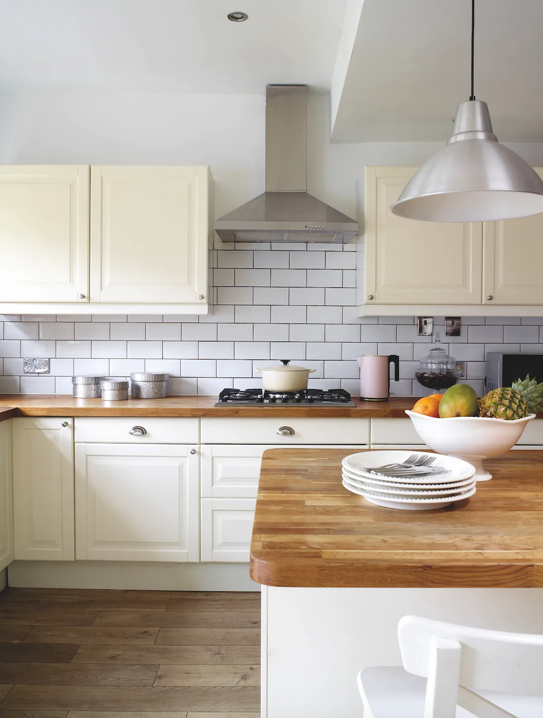
I wanted a modern take on the farmhouse look, mixing off-white cabinets with wooden worktops and white metro tiles. I used a grey grout to bring definition to the tiles – grey ages so much better than white grout.
I love my kitchen island. It’s great for cooking, eating, doing homework or crafting – family and friends seem to gather here naturally
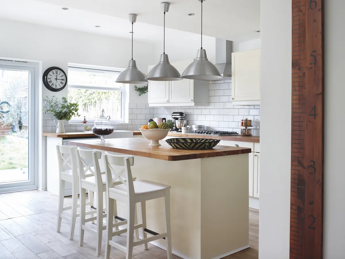
I’d always wanted an island because they create a focal point in a kitchen. We use it for casual meals and the children play and do their homework here when I’m cooking. Whenever we entertain, people always seem to congregate here.
The kitchen mixes white, cream and warm woods for a calming, modern-rustic look. An island was top of Sodia’s wish list. ‘I’ve always thought that there’s something very special about a kitchen with an island,’ she says
Living Room
This room was clad in orange pine and the original fireplace had been replaced with a gas fire. When we stripped it back, the ceiling fell down, so we lost the coving and ceiling rose. We installed simple coving that echoes the neutral décor. I wanted to create a clean, white Scandi-style backdrop and change things up with colourful soft furnishings and interesting art and objects.
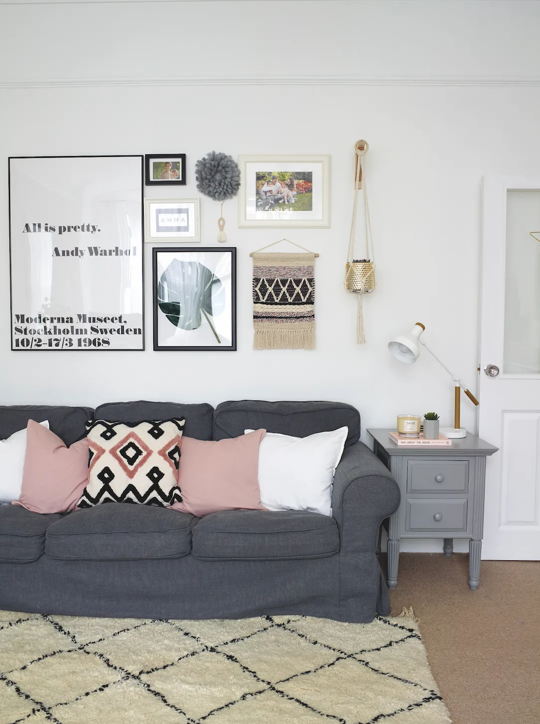
‘The living room is a good size with lovely proportions, so we decided not to knock through into the dining room,’ say Sodia. She managed to get a bargain by buying two fireplaces together in one eBay lot. The Berber rug is from Beldi Maison
Here I’ve gone for blush pink accents, my new favourite colour. I used a moody grey on the chimney-breast to break up the room and make a feature. To create a cohesive look, I’ve gone with a mostly monochrome colour palette but added interest through lots of texture and some 3D elements, like the macramé plant hanger. My favourite feature in this room is my gallery wall; it started with one Andy Warhol print and developed around that.
Expert advice
How to convert a loft space
Make the most of your extra space with these tips...
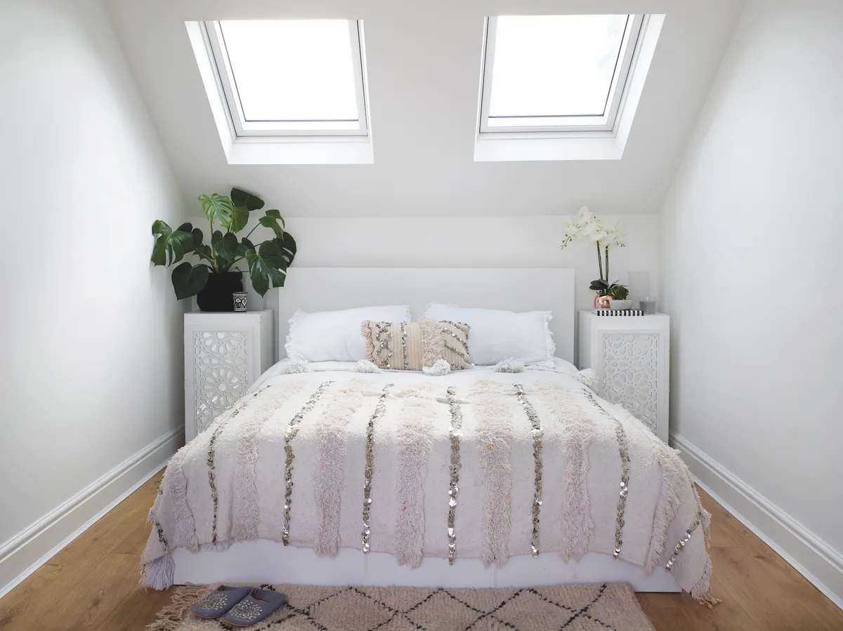
Visit the site often as the work progresses so you can envisage the space and make sure it’s making the most of your plans. With an L-shaped dormer extension, Sodia has created two bedrooms and a bathroom.
While extra bedrooms add value, not every family needs them, so consider other uses for your new space; a home office, dressing room, studio or den. Include a stylish sofa bed for maximum versatility.
Look for every opportunity to introduce light, such as adding additional windows to light the stairwell and, if opting for double doors onto a Juliet balcony, consider additional glass side panels.
Lofts can look plain in a period house, so consider installing detailing such as coving or a faux fireplace complete with chimneybreast to create a cohesive look.
Master Bedroom
I went for a romantic look here, with lots of French Rococo pieces and a crystal chandelier. Originally, we went for a wool carpet but it attracted moths, so we replaced it with an oak-effect laminate for a warm, neutral look. The walls are painted in a soft grey shade to create a calming atmosphere and contrast with the white-painted furniture.
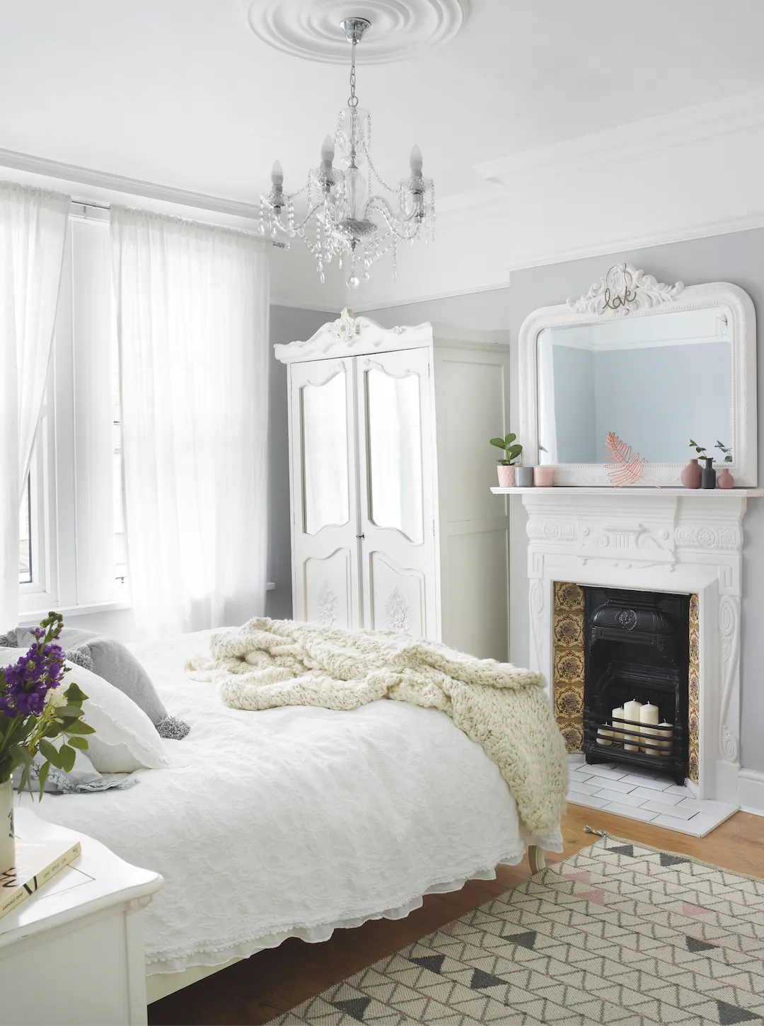
In the master bedroom, the romantic French-style furniture was all sourced on eBay while the TK Maxx rug introduces a graphic element. Sodia was delighted to rediscover the fireplace, which had been boarded up for decades. She created hearths for all the fireplaces using tiles from Topps Tiles
I’ve given the room some modern elements with simple white curtains, a graphic rug and touches of blush pink. I like to pile the bed with textured cushions and throws for cosy bedtimes. Pretty, feminine, hand-crafted accessories complete the look.
Bathroom
This is such a small room, so I spent a lot of time scouring websites for the absolute smallest toilet, basin and bath to maximise the space. I wanted a period feel, so I used a roll-top bath with tongue-and-groove wall panelling in white and grey-painted walls above.
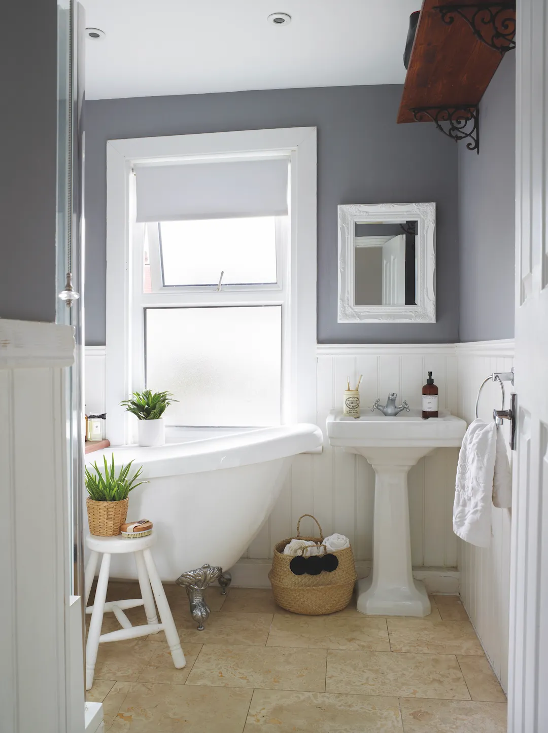
Sodia carefully sourced the smallest period-look pieces for the compact family bathroom, including a basin from Victoria Plum and a roll-top bath. The travertine tiles on the floor are from Topps Tiles
I chose crisp white accessories for a fresh look that’s balanced by the natural elements – from the travertine stone tiled floor to woven grass baskets and a reclaimed scaffold board as a bath bridge. A high shelf provides useful storage, as do the simple baskets which I have decorated with pompoms which I made myself.
Zayd's Bedroom
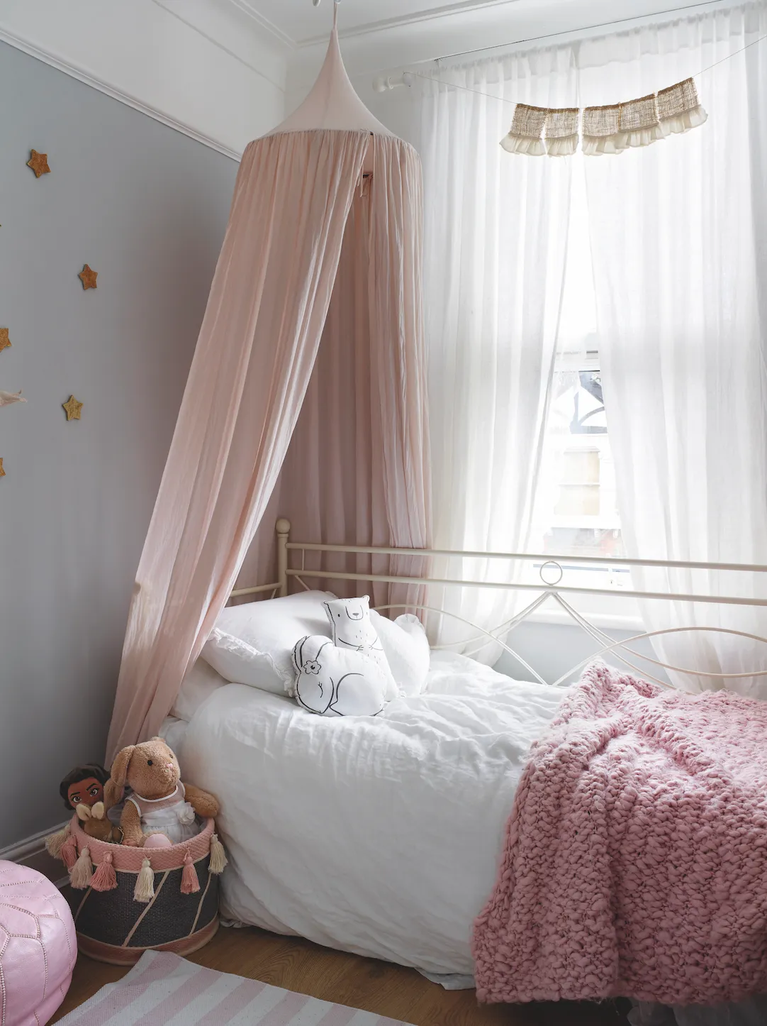
‘Our son’s room nods to Africa because of his part-Moroccan heritage and his love of animals, as seen in the bedding and decorative objects, like the zebra head and elephant light. Overall, it’s got a subtle but fun jungle-explorer vibe.

Sodia wanted to create an African wildlife theme and used H&M bed linen and a leaf garland from Rosie and the Boys. An IKEA mid-sleeper bed provides extra space for friends staying over
Between fitted wardrobes, I’ve created a desk and shelving area using recycled scaffolding boards and simple black brackets.’
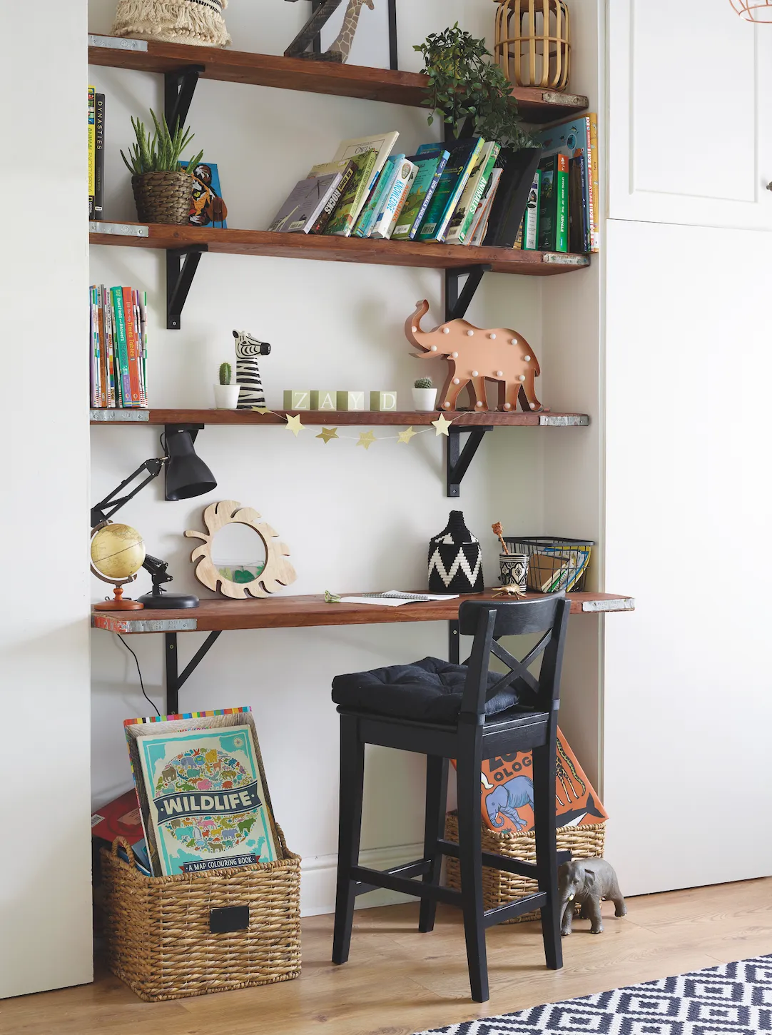
In Zayd’s bedroom, Sodia repurposed old scaffolding boards from Rugged London to create the shelving and desk area. The stool is from IKEA, while the rug is from B&Q and the Berber basket is from Beldi Maison
What I learned...
When you’re viewing a property, don’t be put off by the condition or dodgy décor – they might help you to bag a bargain. Instead, pay attention to the structure, proportions and layout.
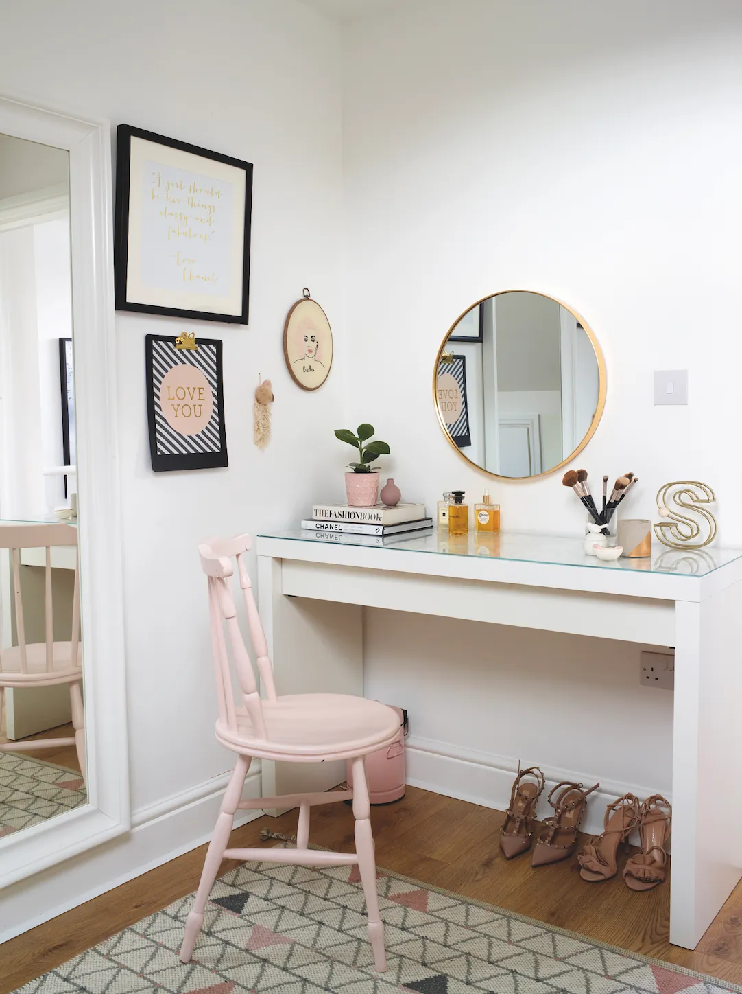
Save money on furniture by upcycling second-hand pieces, including street finds, Gumtree giveaways and eBay bargains. Use leftover paint to keep the costs down further. Search the internet for hacks to turn IKEA’s affordable, functional furniture into something more bespoke.
Add kerb appeal to period homes by reinstating a traditional tiled path. I opted for Topps Tiles’ Victorian-style chequered mosaic tiles, which come on a mesh so are easier and quicker to lay. They are also anti-slip, which is an added bonus with our British weather.

This is a digital version of a feature that originally appeared in Home Style magazine. For more inspirational home ideas, why not subscribe today?
