Pairing the beauty of Scandinavian design with the simplicity of the Japanese lifestyle, Isatu Chadborn has created a home full of stylish serenity.
Here, she tells us all about her home makeover experience...
My story
I love a period property, but after spending more time fixing them than enjoying them, we decided it was time to try something more modern and easier to maintain.
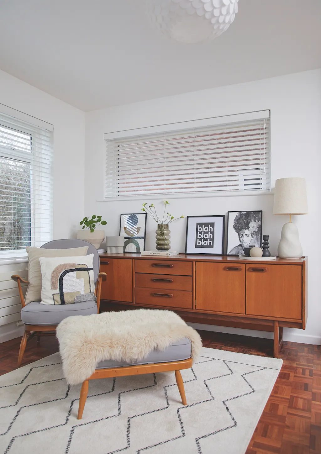
So, when we saw this 1960s house we were excited to transform it into an amazing family home. Our house sold quickly so before we completed, we spent seven weeks renting an apartment.
Welcome to my home...
A bit about me I’m Isatu Chadborn, a learning support assistant, aged 55. I live with my husband, Peter, 53, a financial planner, our son, Travis, 20, a student, and our dog, Ziggy. Our daughter, Millie, 24, left last year to buy her first home with her partner.
Where I live Our home is a four-bedroom extended 1960s detached house in Brightlingsea, Essex. We moved here in April 2012. You can see more of our home on my Instagram @life_of_isatu.

When we finally moved in, we freshened the whole house up with a lick of white paint. Then I started planning the reno, knowing the big project was converting three downstairs rooms into a sociable, open-plan kitchen-diner.
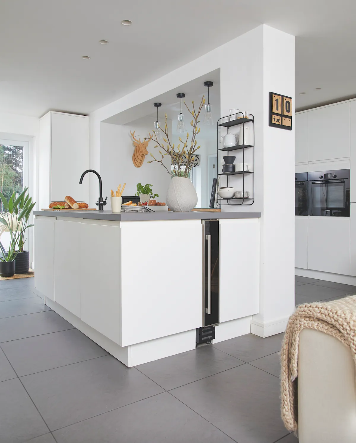
We talked with an architect, but the best idea came from our builder, who explained putting a supporting beam into the roof would be too disruptive to the rooms above and suggested making a feature of the dividing wall.
A bit more about our home...
What I wanted to change I wanted to create a relaxed home with one large space where we could all be together. This meant converting the warren of small downstairs rooms into a large, kitchen-diner, featuring a comfortable sofa area.
How I made it my own I chose a neutral colour palette of soft whites and gentle browns balanced with black accessories, vintage furniture and curved ceramics.
My favourite part It used to be the kitchen-diner, as it worked exactly as I wanted it to, being a place that the whole family could gather and socialise together. But having recently converted one of the bedrooms into a yoga room, I’m now in two minds.

I designed the kitchen with the help of our kitchen fitter, making sure to include plenty of storage to hide the ugly appliances.
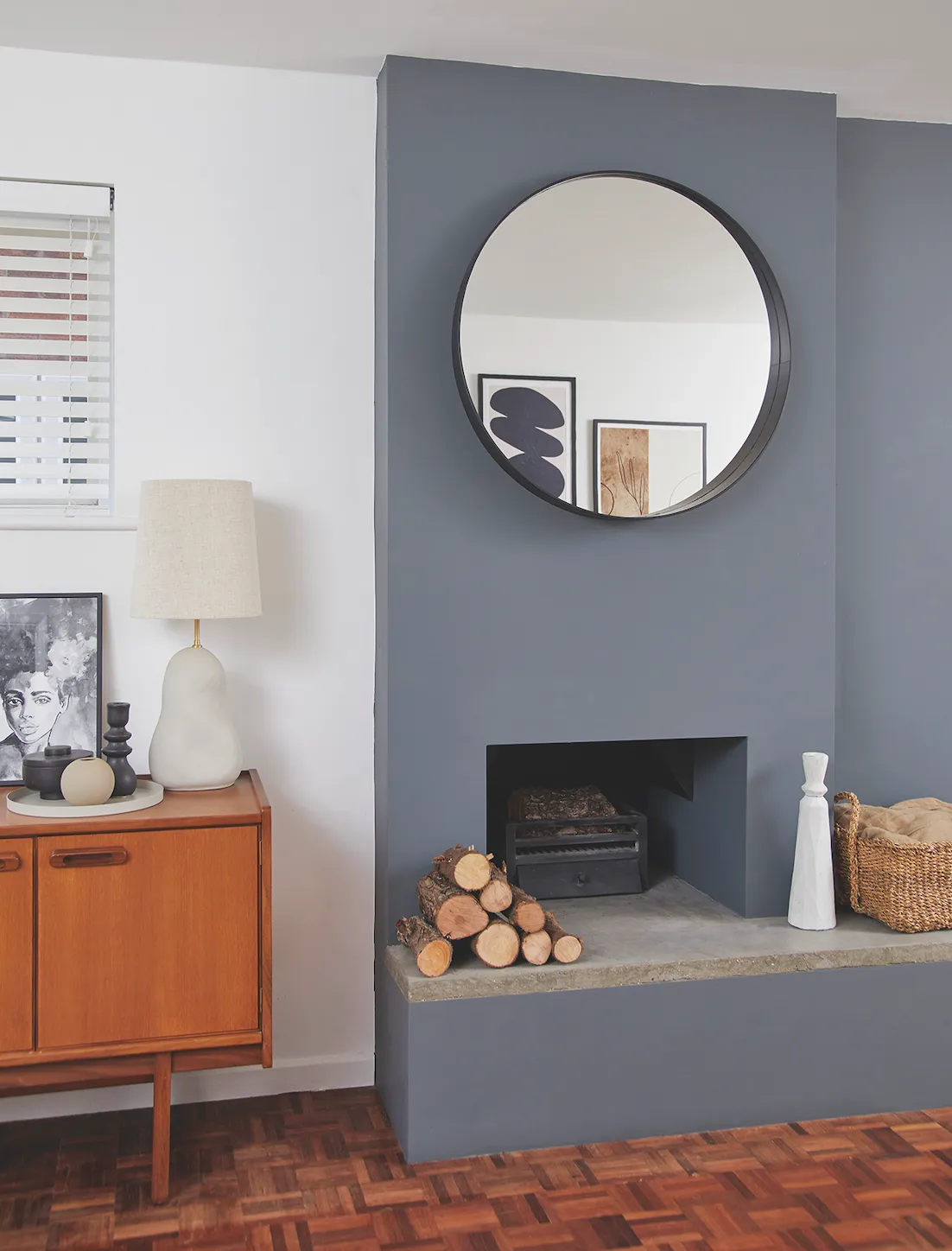
Then we moved onto the living room, where we made the most of the fireplace by building a false chimney breast and a beautiful hearth.
I wanted to embrace slow living and create a relaxed, calm home, so I decorated using natural textures, neutral tones and vintage furniture. Finding my interiors style has taken time, but it’s also been fun.
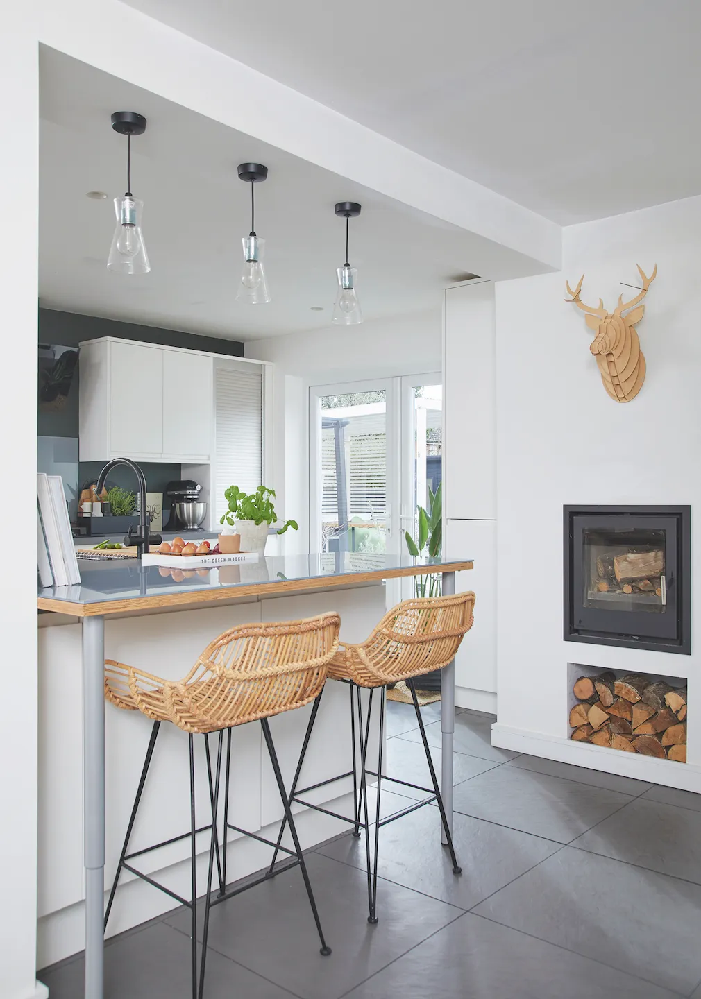
Kitchen-diner
‘This was the space that really sold the house to us. Although it was originally three separate rooms, we could see how it would work as the main hub of the house. We took time to live in the space and work out the best design rather than rush into it, as I wanted to design a hardworking, functional space where we could relax and socialise.
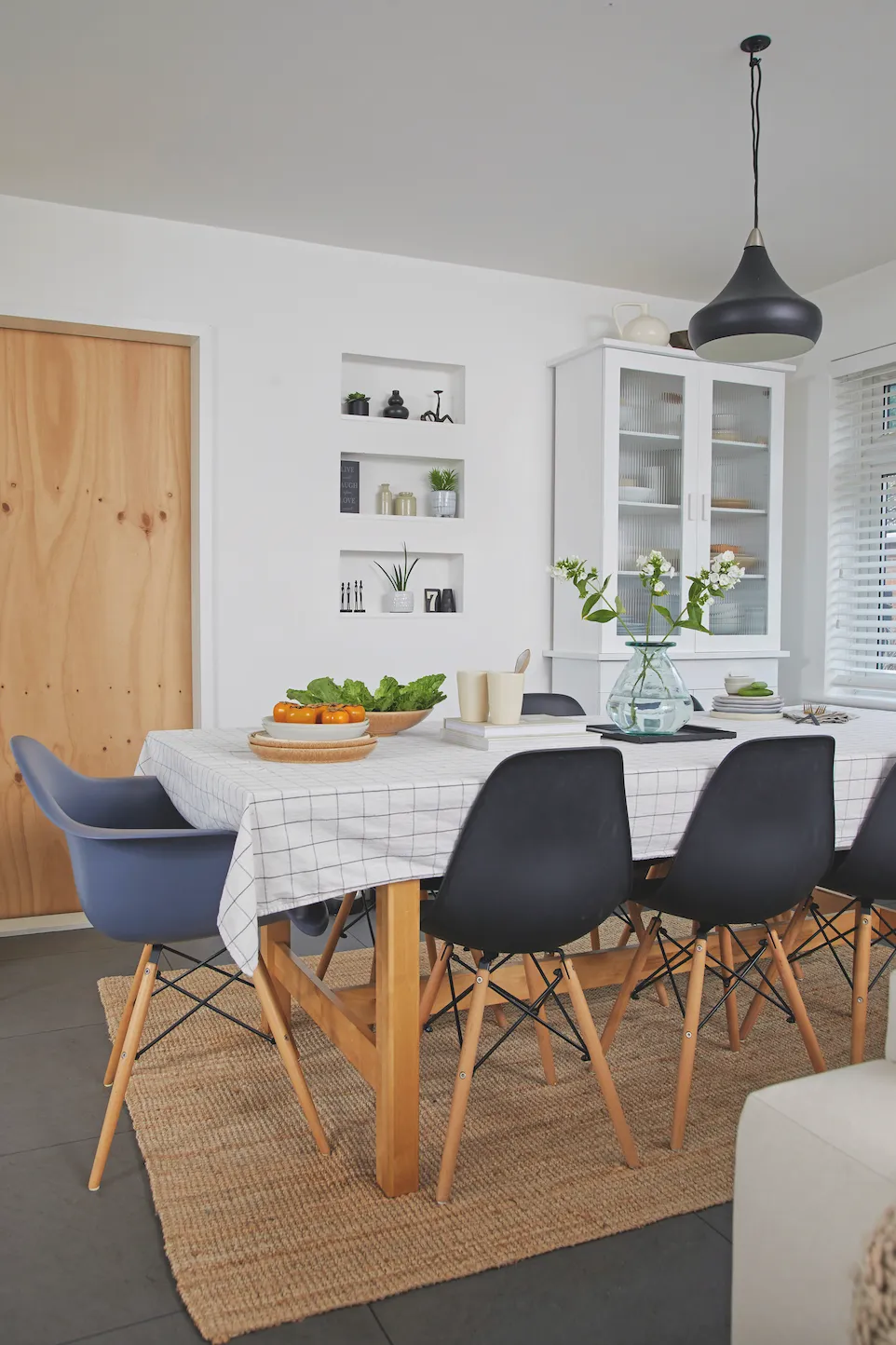
‘We had to keep part of the load-bearing wall, but I happily run with these ideas rather than see them as setbacks, so we made it a feature of the room and wrapped the island and breakfast bar around it. I knew I didn’t want gloss cabinets, which can quite quickly look dated, so I chose sleek, matt white, handleless units, for a classic, timeless look.’
Living room
‘The original living room was painted light blue and had an ugly gas fire. I painted the whole space white and then ripped up the carpets, and we were lucky enough to find some beautiful, original parquet flooring underneath. We opened up the wall to install a real fire, built up the chimney breast and then I commissioned a beautiful bespoke concrete hearth. I originally painted the whole room in Farrow & Ball’s Down Pipe, and although Pete loved it, I felt it was too dark and overbearing.
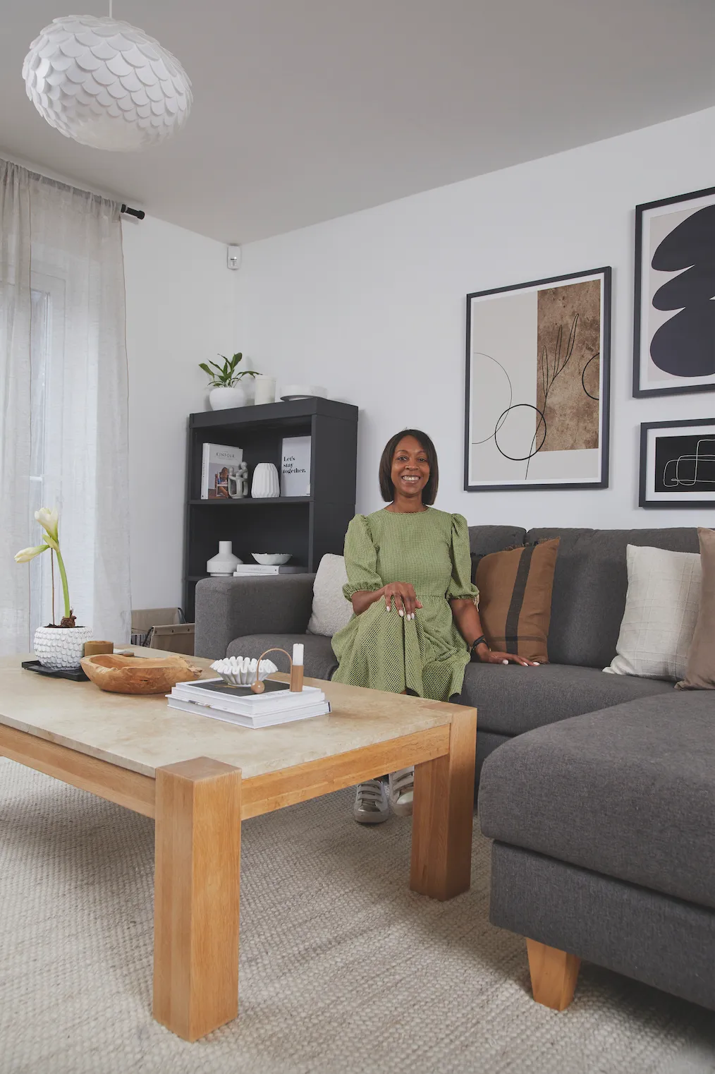
‘So, although it was a hard job, needing a colour blocker and three coats of paint, I decided to change it back to white, leaving just a feature wall with colour. I loved the difference immediately. It was then I realised how much I respond to light, gentle colours.’
Office
‘This used to be the playroom, and then the teenage den, but it got to the point when the children were in their bedrooms all the time. I thought it was a great idea when Pete suggested I make it into my own crafty workspace and home office.
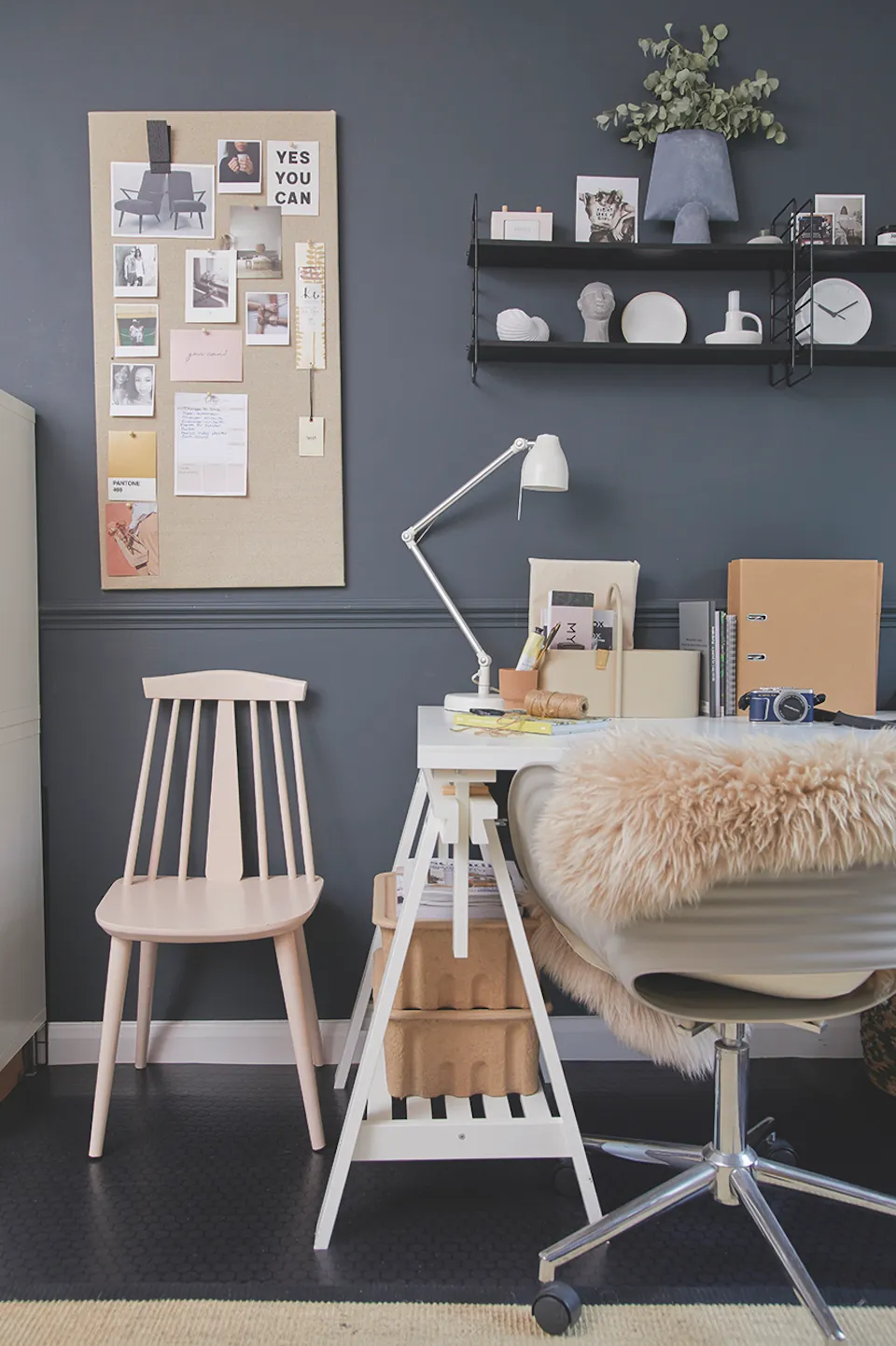
‘We painted the wall in Naval Night by Valspar, which is a nice contrast to the rest of the house. The desk is from IKEA and the shelves are from Bloomingville.’
Master bedroom
‘I had saved this panelling idea on a Pinterest board, not really knowing where I would use it. When it came to decorating our bedroom, I knew it was just what this room needed. Luckily, this was an easy DIY job – all we had to do was mark out the panels on the wall and then glue and tack on the pre-cut wood.
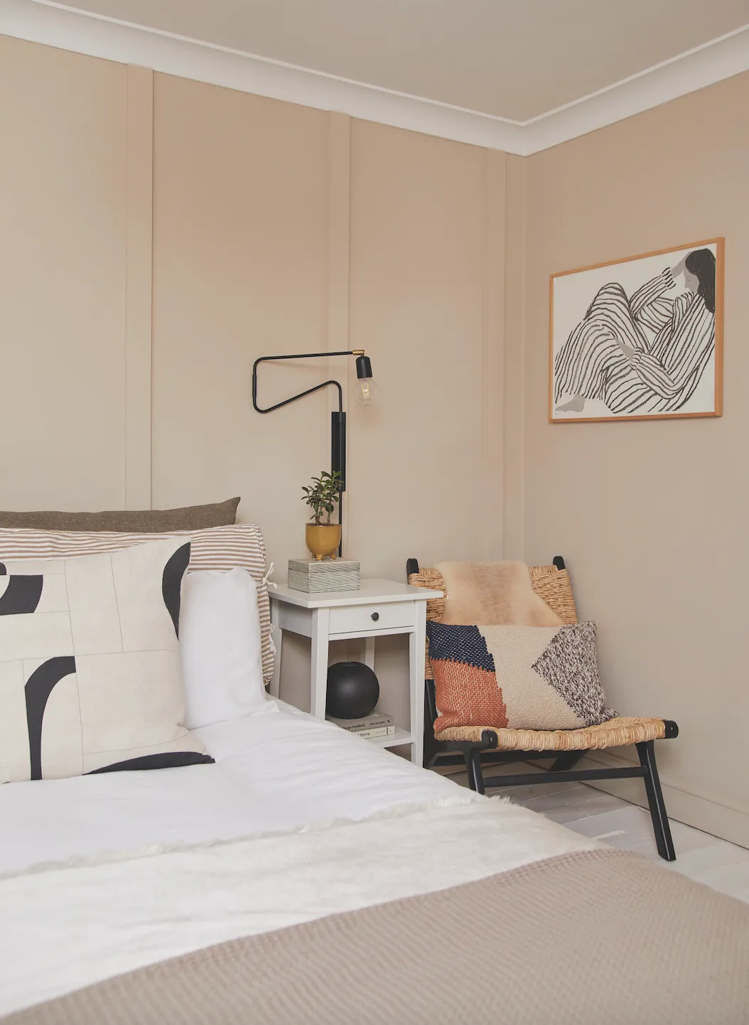
‘I enjoy simple palettes and soft tones, and wanted to create a warm, cocoon-like feel in here, so I chose Craig & Rose’s Pale Cashmere, a warm beige colour, which I’ve teamed with black accessories.’
Spare bedroom
‘This was originally our daughter, Millie’s room. She moved out last year, so I decided to redecorate and convert it into a guest bedroom. The simple, box-like space needed a feature, and wood panelling is an easy and cheap way to add interest.
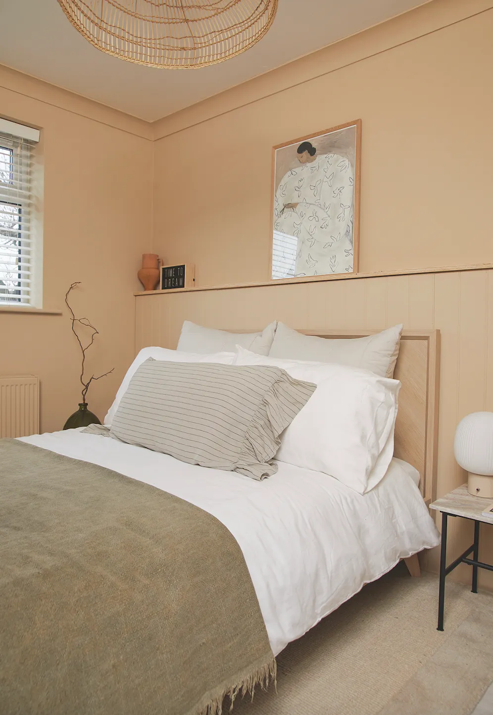
‘Pete built a wooden frame to create the false wall, and then we added a plywood ledge to display beautiful things, like this print by Sofia Lind. I painted the whole room, including the doors and radiator, in Well Grounded by COAT Paints, and put in a new bed from Next.’
Bathroom
‘I wanted a free-standing bath and separate shower, so we ripped out the airing cupboard and moved the water tank. To help plan the layout, Pete scaled down all the main parts onto small pieces of paper and I played around with them until we found the perfect floor plan.
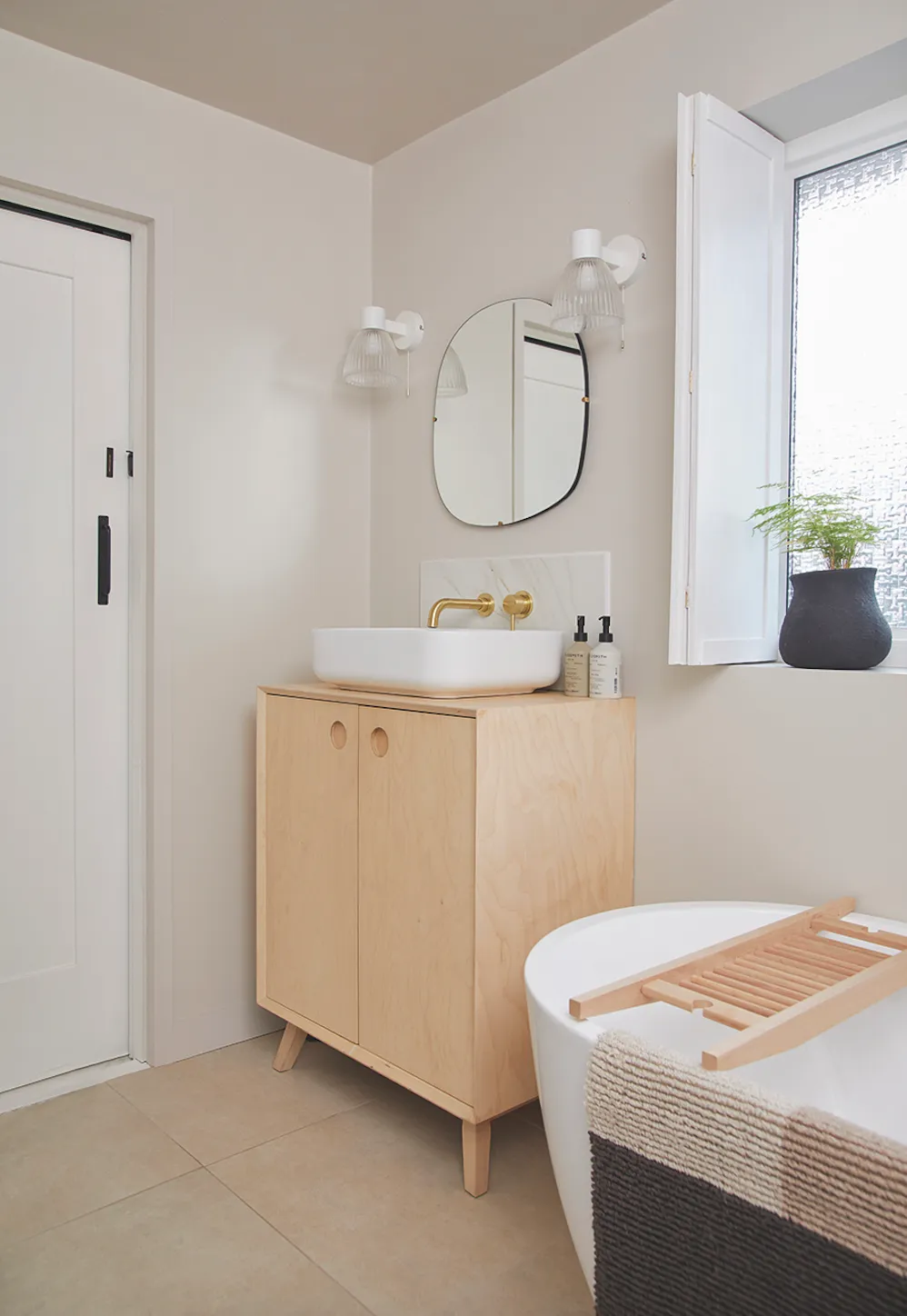
‘We chose three different types of lighting; task lighting above the basin, soft pendants for relaxed baths and spots in the ceiling for everyday use.’
Yoga room
‘This used to be Millie’s dressing room. When she moved out, it became a bit of a redundant space, so I turned it into a yoga room for myself and Pete. I painted the walls in Farrow & Ball Old White, a calming colour, perfect for creating a serene environment, and then painted the chest and drawers the same colour.
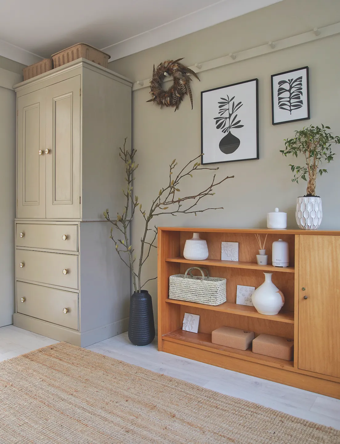
‘I swapped the original handles for stylish Zara Home ones, and then Pete attached the peg rail to give me a simple styling device.’
What I learned...
Most of the ground floor is white, so instead of choosing expensive paints with interesting names, I buy large tubs of good-quality trade paint, which saves me an absolute fortune.
Glass isn’t always the most practical material in a kitchen. I love the sleek look it has, but our hob, splashback and breakfast bar, all made of glass, show up stains very easily and need constant maintenance to keep them looking nice and clean.
If you take your time, you’re much more likely to create a home that better reflects your personality and that you’ll enjoy more, as your decisions will be more mindful and considered.
Photos by Katie Jane Watson.

