Blogger and body confidence advocate Natalie Lee describes her London terrace as ‘colourful, loud and sometimes messy’, just how she likes it.
Here, she tells us all about her home makeover experience...
My home makeover
The house was in a state of neglect when we bought it. However, it had so much potential with its amazing high ceilings and tonnes of Victorian period features. I wanted an old property with a story, but I also wanted something that I could renovate to my taste, so it ticked all the boxes.
The house was also in a great location. This part of east London has a real community feel, so I knew it would make a perfect family home. I had a clear idea of what I would do design-wise within five minutes of walking through the door.
Welcome to my home...
A bit about me I’m Natalie Lee, the author behind lifestyle blog, Style Me Sunday, and founder of the Warrior Woman campaign. I went from being a full-time midwife to a fashion blogger and body confidence advocate. I live with my two young daughters and our loveable family pets.
Where I live My home is a traditional Victorian terrace in the heart of east London. I bought the house in 2009 and fell in love with its potential to create the home of our dreams.

We lived with the space for a few years before any major work started because I wanted to see how we used each room and what the light was like.

We decided to extend at the back of the house into the side return and out into the garden to create a bright, open kitchen. The renovation took six months and we moved out for two of them.
A bit more about my home...
What I wanted to change There was lots of scope to open up the ground floor, so I wanted to create a bright open-plan kitchen and dining area. Having an open space was really important for us as a family as my eldest daughter has a rare genetic eye condition called Brittle Cornea Syndrome. Her impaired vision was an important consideration when designing the ground floor. I wanted there to be enough room for the girls to run around as safely as possible. It was an ambitious overhaul to create the space we wanted as a family, but it has transformed the house.
How I made it my own I love using colour. In fashion, I use it to convey how I’m feeling or change how I’m feeling. If I wake up a bit low, I’ll often put on a bright lipstick and a playful outfit to get me out of the lull. At home, I’ve used colour throughout the house to reflect my personality. I’ve gone for a Palm Springs-style vibe with lots of pinks, lilacs and gold accents.
My favourite part The kitchen has become the hub of our house. It’s where we cook and eat together but it’s also where we love to do dance classes and roller skate. The open-plan layout is perfect for a roller disco!

I didn’t want to play it safe; I wanted to see if I had an eye for design. I absolutely love what I have created, proving that you have to be true to your own taste.
I feel like I’ve rescued a run-down period property and created a modern family home by putting my own stamp on it. There are no formalities in this house. It’s a kick off your shoes, step over the dog and dance like no one is watching kind of home and I love it.
Kitchen
‘When you enter the kitchen from the hallway, there’s a wall of full-height IKEA cupboards, which store everything from coats and gym kits to scooters and even a washing machine. It’s an absolute life-saver. Because my eldest daughter is partially sighted, I chose cupboard doors that are textured and have knobs, instead of the push magnetic system.
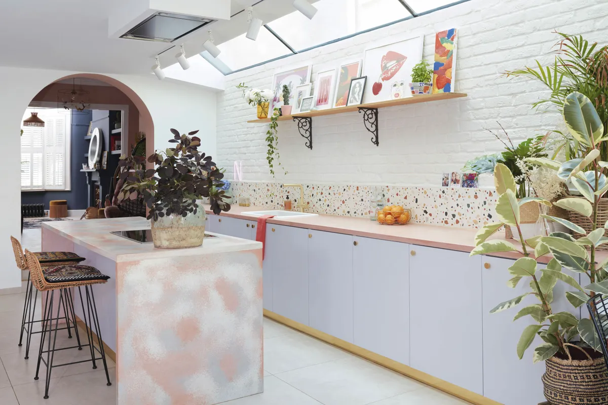
‘I love our pink concrete worktops and handmade island, with child-friendly rounded edges, that were custom-made by Smith & Goat.
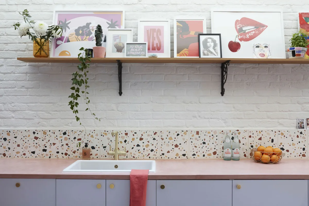
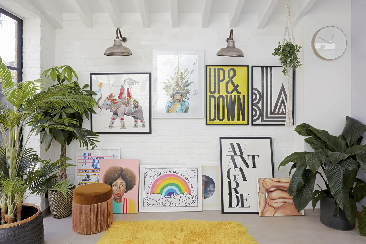
‘The brick walls are all painted in a bright white to reflect the natural light from the bi-fold doors and to allow the colourful art to pop. The artwork is an eclectic mix of art prints, including some of my children’s drawings, which I intend to keep adding to.’
Living room
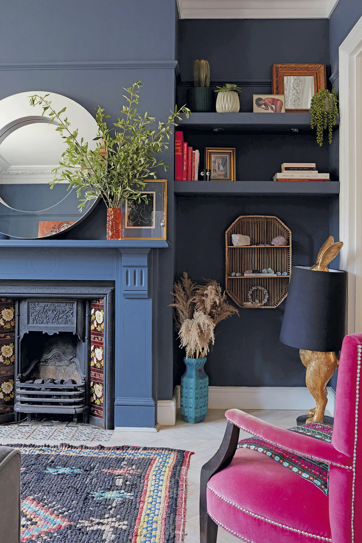
‘The living room is divided into two parts. The front half is a dark, cosy space where we curl up and watch TV together in the evenings. I like how the dark walls contrast with the traditional white shutters from Shutterly Fabulous and vibrant accessories.
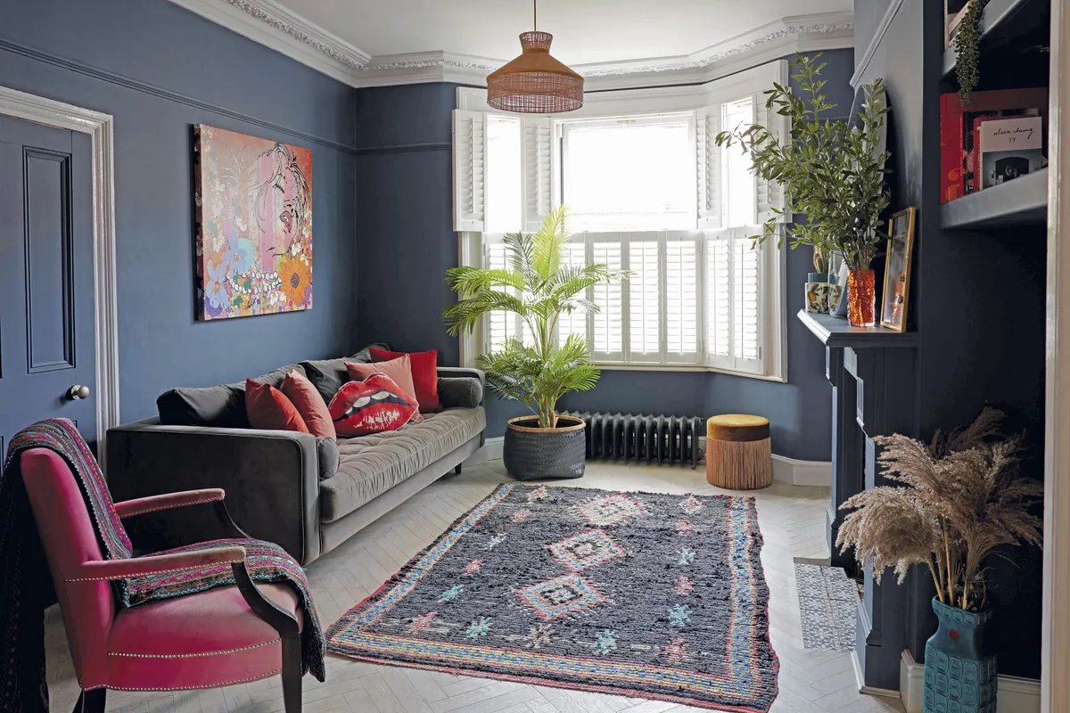
‘The walls are painted in a Crown Paints colour matched to Farrow & Ball’s Railings.
I dressed the MADE.com sofa with lots of colourful cushions. They’re all from John Lewis & Partners, except for the eye-catching mouth cushion, which is from Age of Reason Studios.’
Lounge area
‘The dark sitting room leads into another much brighter space, painted in Powdered Clay by Crown Paints. I’ve gone for a 1970s laid-back look in here. I don’t take myself too seriously and I think that’s reflected here; this room is all about fun! My fabulous peacock chair is from Oliver Bonas and I’ve thrown a pink sheepskin rug from Rockett St George over it to add texture.
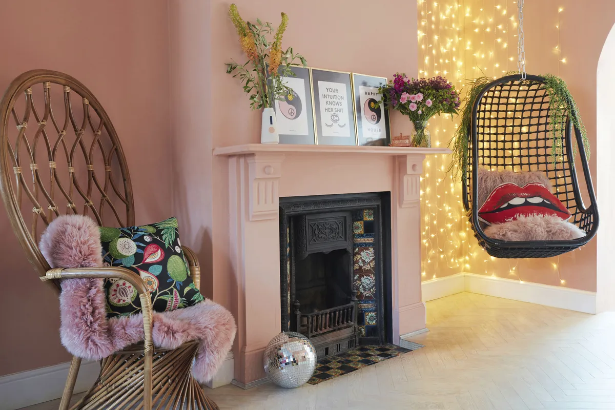
‘With the variety of textures and colours, including the wooden floors and sumptuous throws, it’s created a lovely cocooning effect. My woven hanging chair, also from Rockett St George, and cosied up with a MADE.com sheepskin, is just beside the kitchen and I often enjoy an evening drink in this little nook.
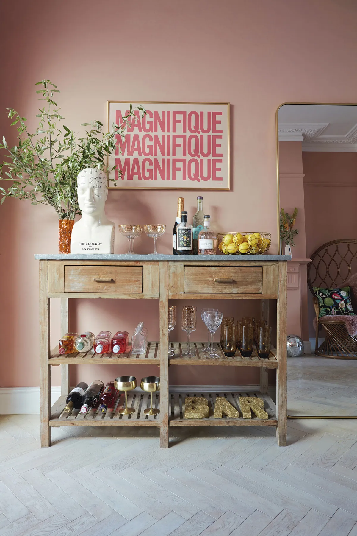
‘The distressed drinks table is a vintage find and I’ve hung my oversized ‘Magnifique’ print from Gayle Mansfield above it for a personal touch. A bohemian décor is never without indoor plants and I love these excellent faux ones from Rockett St George. Abigail Ahern also have fabulous fakes.’
Bedroom
‘This is my calm space, a sanctuary of my own. I’ve tried to keep a pared-back look in this room. Furniture throughout the house is a blend of vintage and new, and this room is no exception. My mid-century dresser was a lucky charity shop find that I’ve decorated with some fairy lights. I love how one man’s rubbish is another man’s treasure – obviously that should be woman!
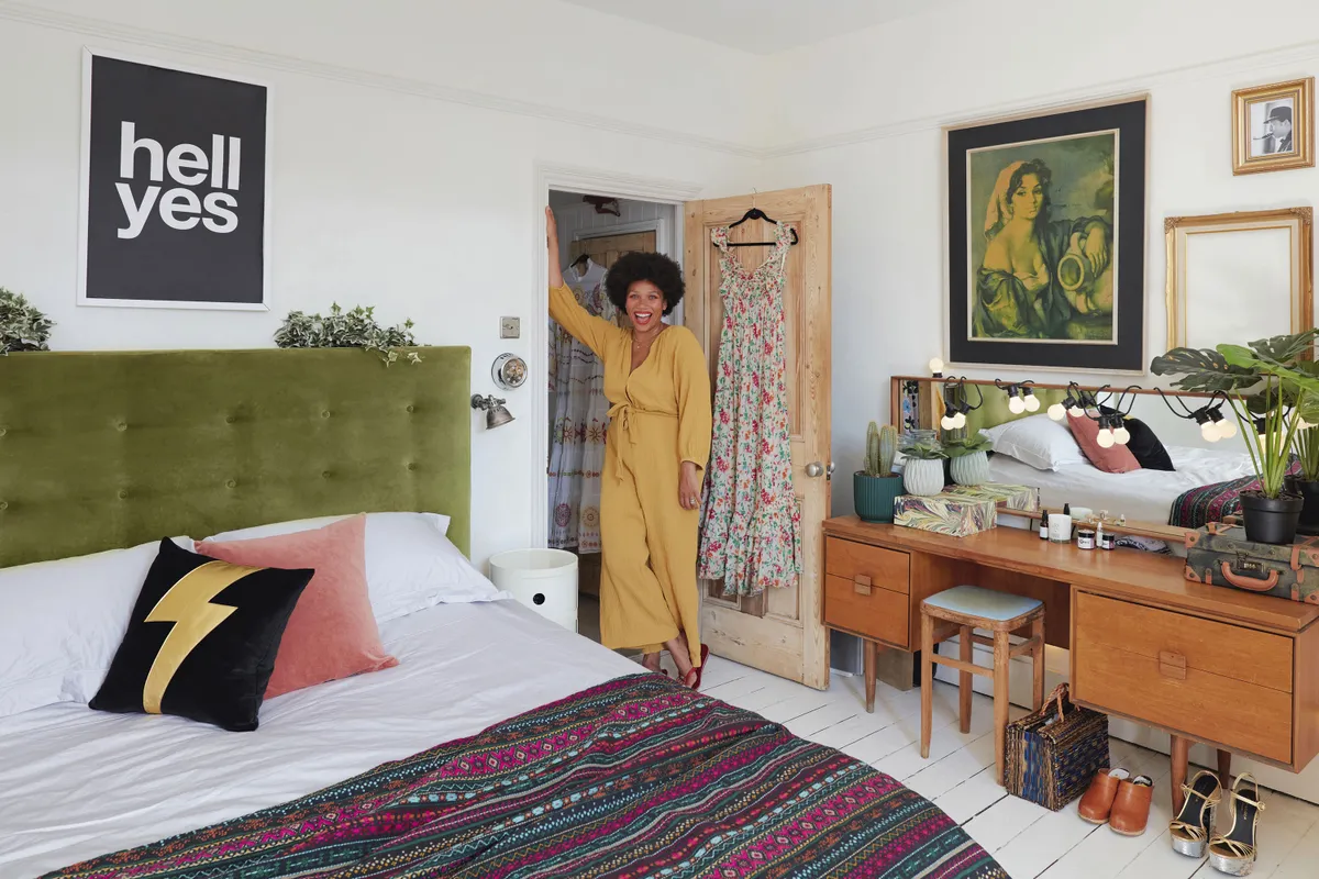
‘I’ve hung gold vintage frames and have personal objects on display, including some of my favourite outfits; things that I’ve collected over time. The walls are white and the room is flooded with light, so it’s a perfect spot to dress up and experiment with my fashion styling.
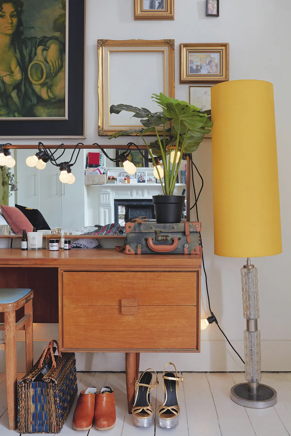
‘The ‘Hell Yes’ print is another great design from Gayle Mansfield and the rock and roll Ziggy cushion is from Sarah Baily. My original 1970s yellow lamp was a lucky win on eBay. I love having pieces in my home that have a little bit of a past.’
The girls' rooms
‘Motherhood has taught me that there is no bigger responsibility in the world than raising children, and I’m a big believer in positive affirmations. They are written all over both my girls’ rooms.

‘The children’s rooms are forever evolving as they grow, but I think I’ve kept that same sense of fun in both of their bedrooms. The wallpaper and leopard-print curtains are from Wild Hearts Wonder.
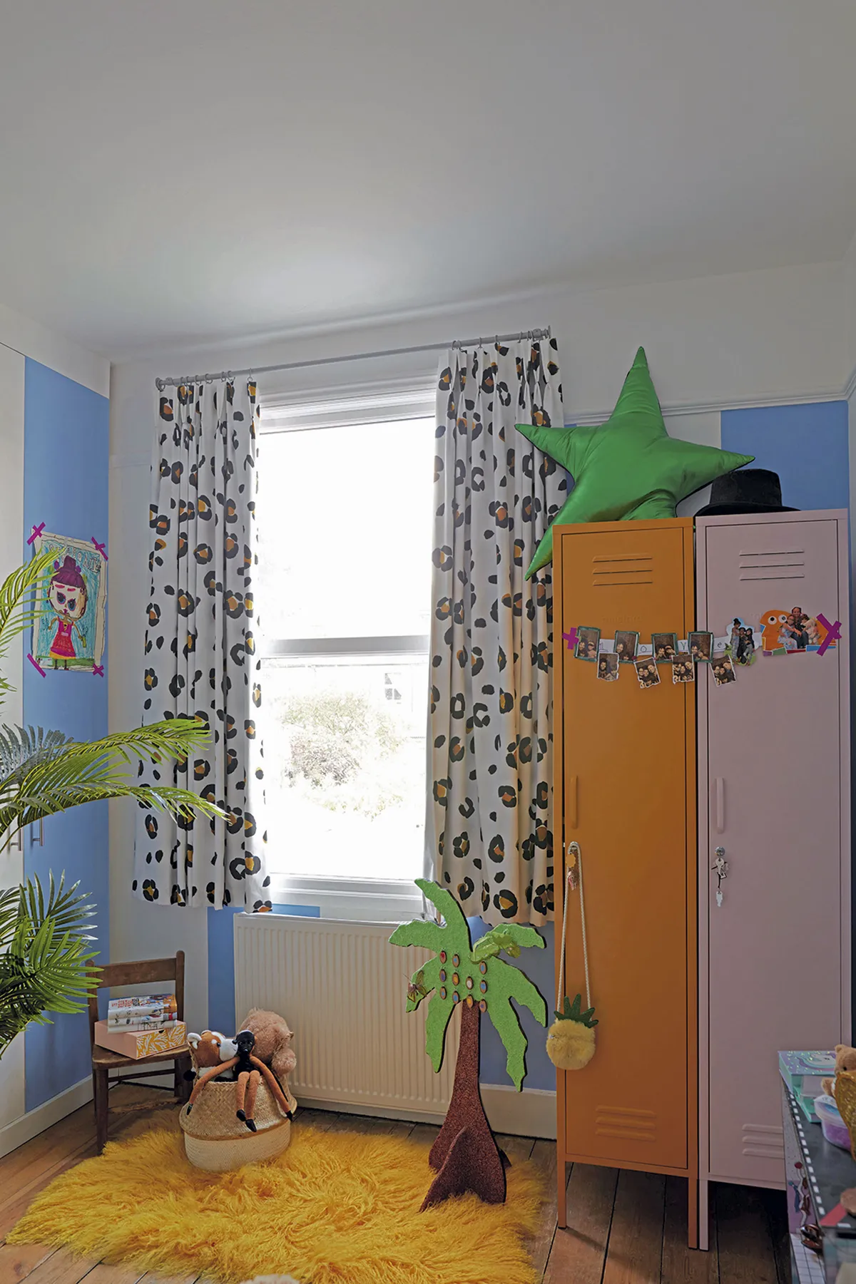
‘My girls love the storage lockers, which are from Mustard. I’m always amazed at the amount of stuff they both accumulate and these are great for hiding all of the mess.’
Bathroom
‘I love our bathroom, but I would probably have a bigger bathtub if I could as it’s my favourite place to relax and think. I love listening to podcasts in the bath.’
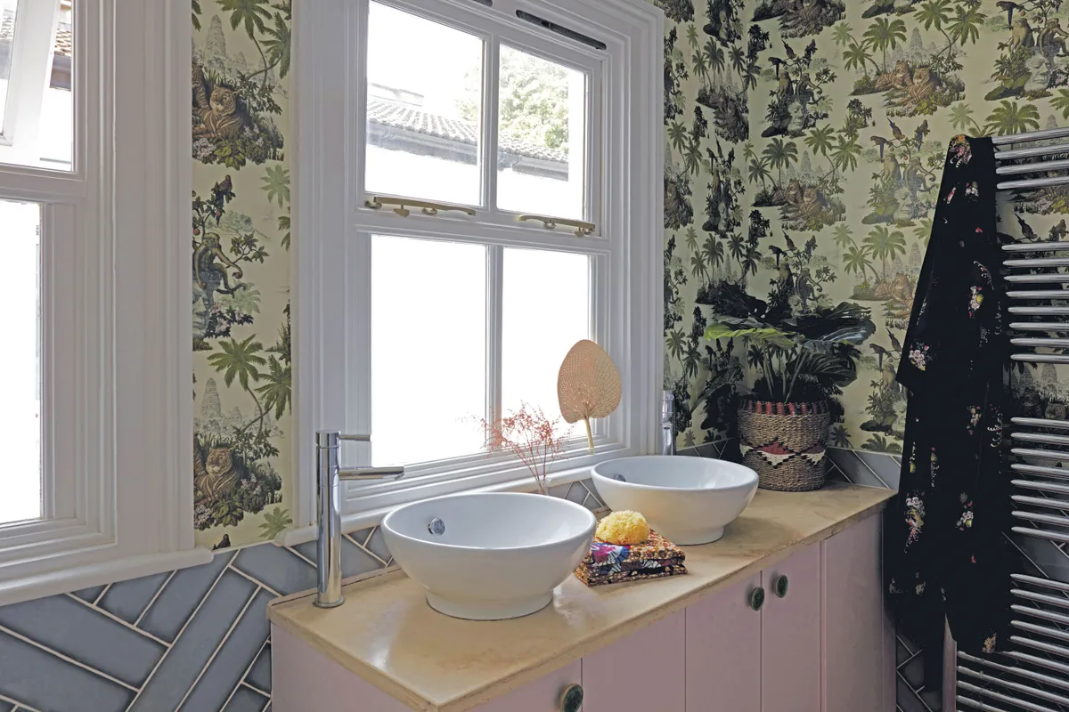
Natalie has kept the look simple with metro tiles and a burst of floral with the House of Hackney wallpaper, which she says, ‘makes mornings feel like summer all year round’.
Feature Jade Lovejoy. Photos Gap Interiors / Graham Atkins-Hughes.
This is a digital version of a feature that originally appeared in Home Style magazine. For more inspirational home ideas, why not subscribe today?
