With their two children growing up, more space was becoming something of a necessity for Maxine Hale and her husband Gareth. ‘We wanted more room and we were keen to stay in this area,’ says Maxine. ‘Beyond that, we were open to any possibilities.’
The couple looked at various options before picking a traditional Edwardian family house. The position was ideal and Maxine loved the elegant proportions, pretty period fireplaces and spacious, light-filled rooms.
The property was a complete contrast to the contemporary, open-plan home they were living in however, and needed renovating and redecorating. ‘There were floral wallpapers, old carpets, a worn kitchen and an old-fashioned pink bathroom suite,’ says Maxine. ‘We couldn’t really keep any of it.’
Come on in...
We are Maxine Hale, 52, husband Gareth, 47, a financial advisor, and their children, Ed, 15 and Nell, 13.
Our home Is a four-bedroomed, detached Edwardian house in Plymouth, Devon.

As most furniture in the house they were living in had been built-in, the couple found themselves starting more or less from scratch in the new property. That meant a bigger, more ambitious project than Maxine had anticipated. ‘At the same time it was a chance to make the whole house exactly how we wanted it,’ she says. ‘What an amazing opportunity!’
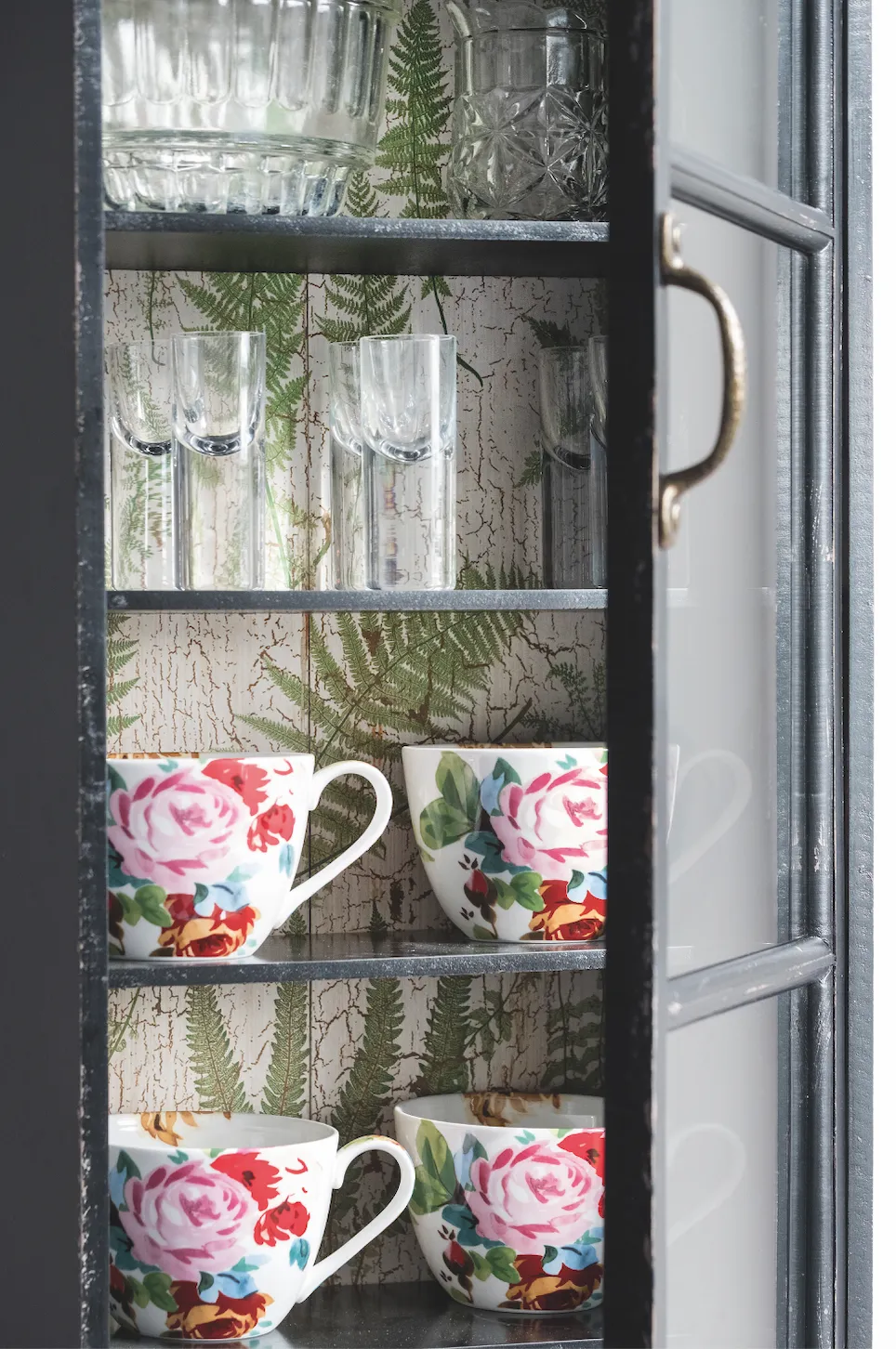
Maxine is a keen Instagrammer (@homebirdplymouth) and loves browsing Pinterest, interiors magazines and the high street for interiors inspiration. She likes simple Scandi style, but also wanted touches of industrial, mid-century and retro looks.
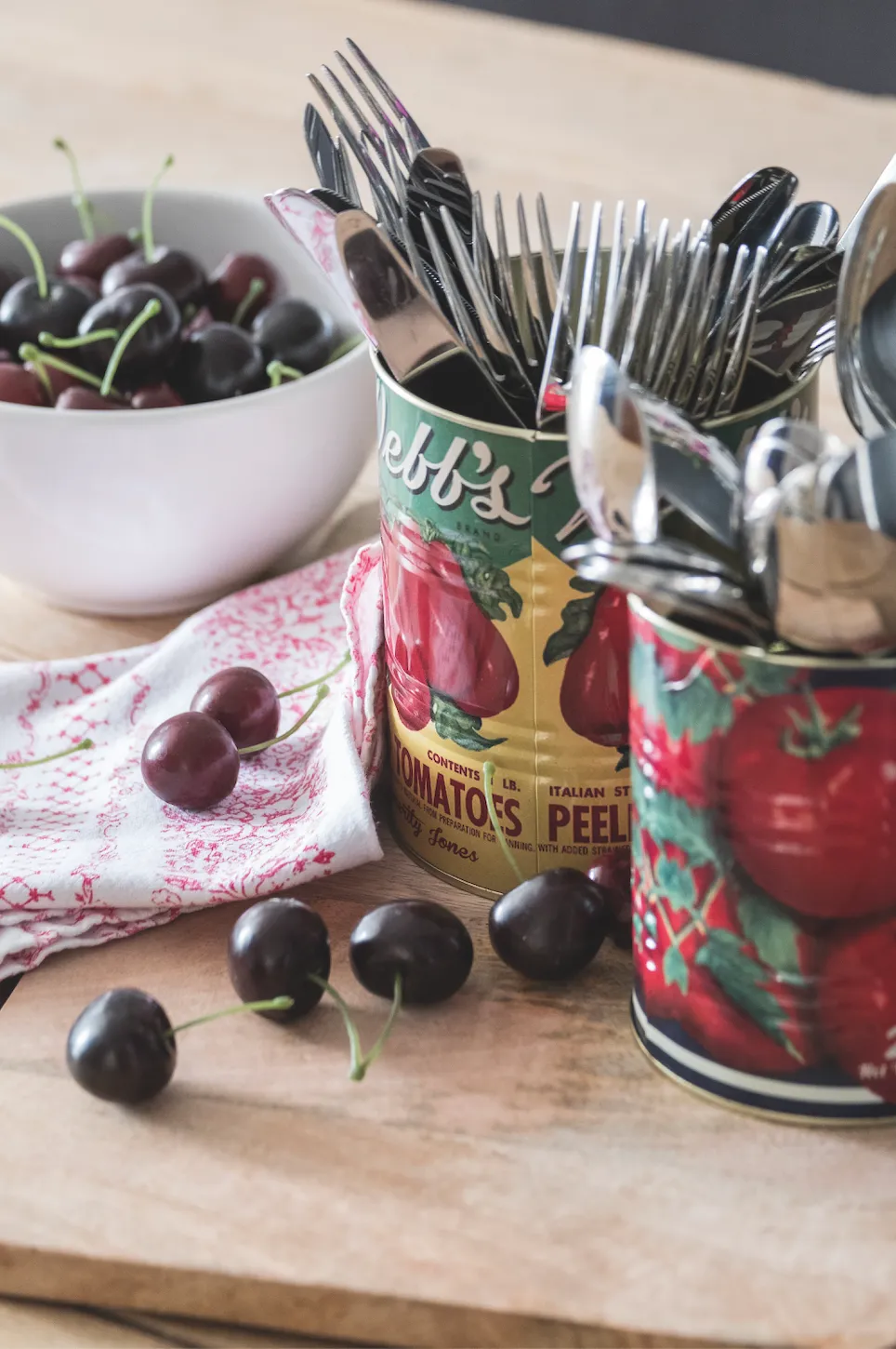
Practical, family-friendly spaces and an easy flow through the house, were also important. ‘There were so many decisions that it all felt a bit overwhelming,’ she says. ‘I decided to pick one key item in each room and make that the starting point.’
For the living room she chose a big, modern, geometric lampshade. The guest bedroom’s vibrant scarlet fireplace tiles caught her attention and the dining room developed from the inky blues in a huge art print she’d been given.
A bit about my home...
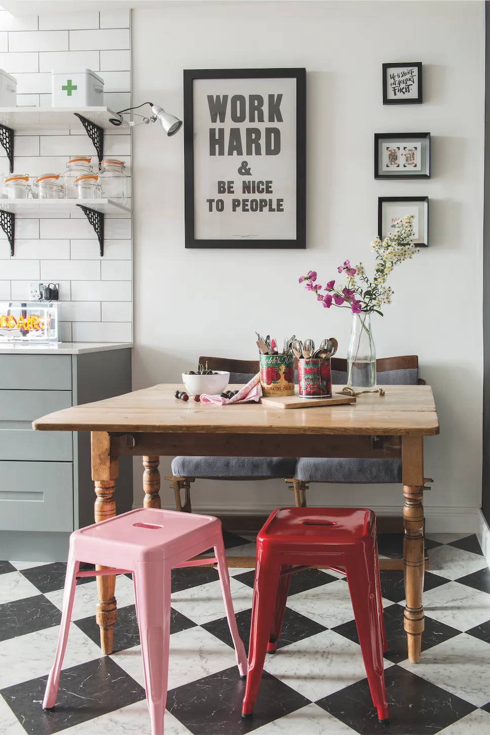
My favourite item Is the two-seater kitchen bench made from tip-up cinema seats. I’d been after some authentic cinema seats for ages, so when I spotted a couple in a local vintage furniture shop, I snapped them up. They’re really comfy.
My best buy Was the big rug in the living room, which was a steal at £85 from Very. It breaks up the dark grey carpet and brings texture and light into the centre of the room.

When it came to her kitchen, an essential family space, Maxine homed in on two strong features. ‘I’d seen pictures online of extractor fans with industrial-type metal tubing running along the wall and I spotted the pink pendant lights in a local shop,’ she says. ‘I just had to have them both!’

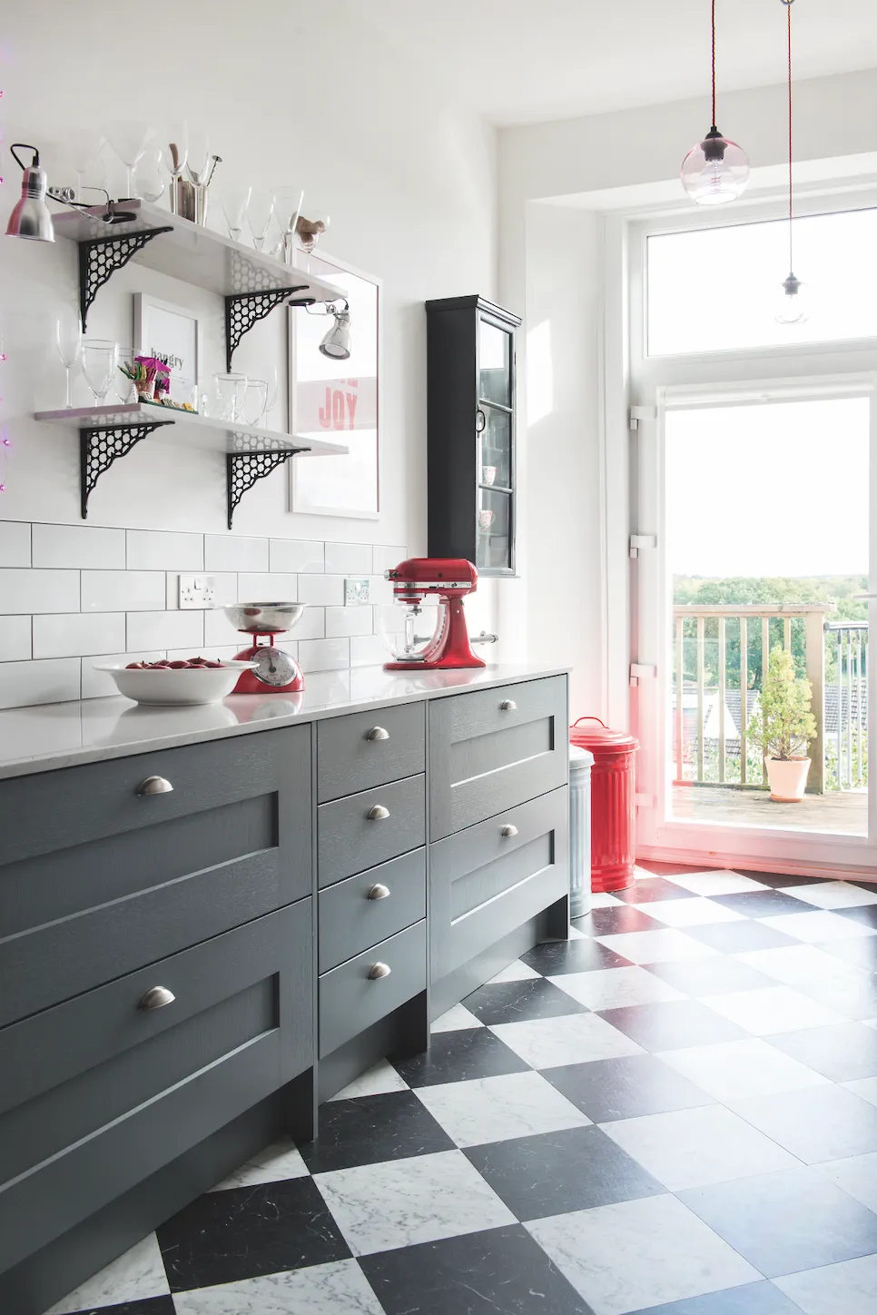
Maxine planned to mix her dramatic focal kitchen pieces with Shaker-style cabinets, a black-and-white floor and brick-style tiling to echo the functional feel. To bring her vision to life, she teamed up with a local expert. ‘Mark Fowdon [of Studio One South West] helped me create the kitchen of my dreams and it’s turned out exactly as I imagined,’ she says. ‘He and his team were completely on my wavelength and they went on to project-manage the whole renovation.’
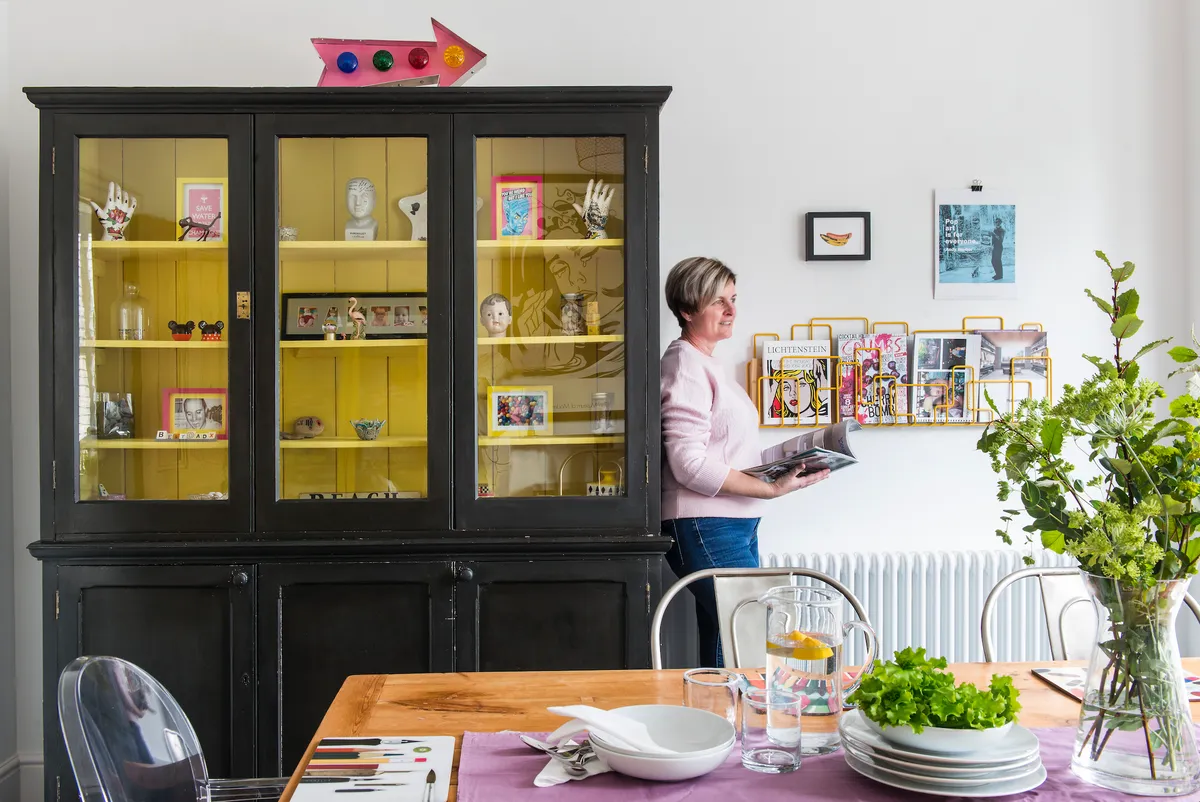
A little worried that her bold, contrasting styles could clash, Maxine knew that she needed a way to bring her different ideas together harmoniously. She came up with a solution – to repeat certain features through the house, which would help to link the separate spaces, while also enhancing the period style. ‘The key was to keep things simple and flexible, so I’ve duplicated the classic monotone flooring, white metro tiles, white walls and shades of grey to form a consistent theme,’ she says.
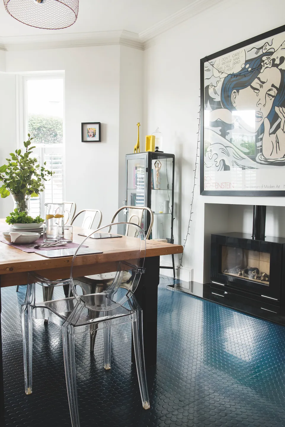
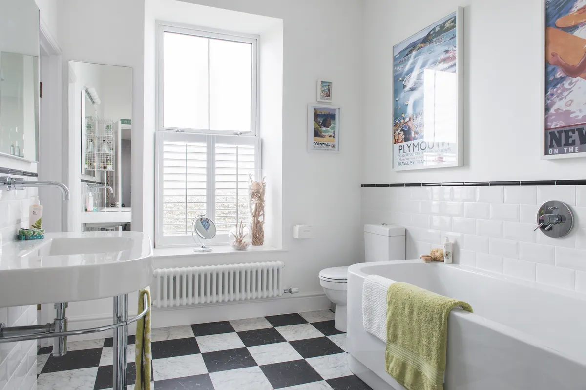
Some choices have been cleverly reproduced in varying ways. The checkerboard floor tiles were laid square in the bathroom, but in a diamond formation downstairs. The white metro tiles in the bathroom have matching grout while contrasting grey gives the kitchen ones a different effect. ‘Cutting down on style options saved me time and stress,’ says Maxine. ‘It also meant I could negotiate deals on large buys, such as the grey carpet in the living room and bedrooms.’
Maxine and Gareth were lucky enough to be able to stay in their old home while the majority of the work was done, but their builders were still finishing off when the family finally moved in. ‘We managed with limited bathroom facilities and a working kitchen tap but not much else,’ says Maxine, ‘There was mess everywhere, so it was hard for a couple of weeks until everything was completed.’
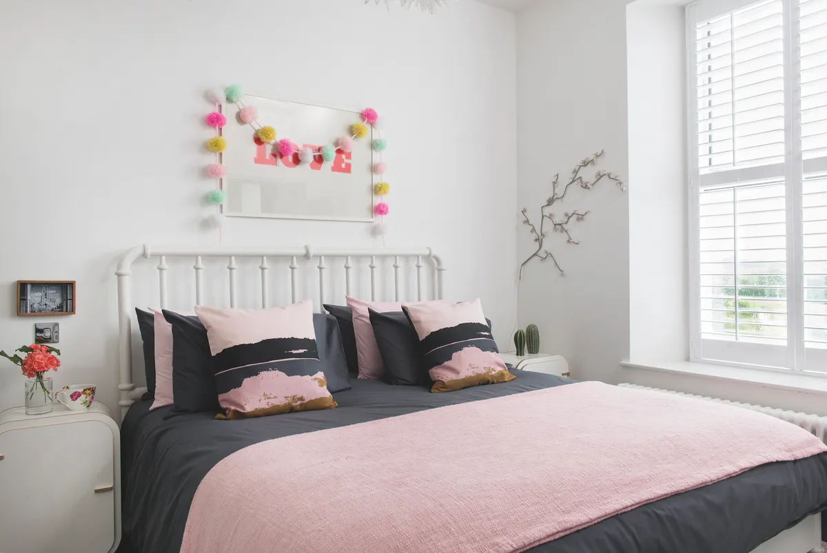
Since then, Maxine has added furniture and accessories for colour, personality and a homely vibe. With her eclectic taste, she shops widely online, on the high street and at smaller local independents, where she is as likely to pick up vintage or second-hand items as new ones, ‘I try to buy new bits every so often just to keep things fresh, but the basics are in place now,’ she says, ‘It’s been so exciting styling this house from scratch and I’ve loved getting creative. I feel very lucky.’
This is a digital version of a feature that originally appeared in Your Home magazine. For more inspirational home ideas, why not subscribe today?
