Home makeover: 'I mixed boho, industrial and vintage for a luxe look on a budget'

Home makeover: 'I mixed boho, industrial and vintage for a luxe look on a budget'

With savvy spending, Stephanie Emmerson gave her Kent property a top-to-toe makeover, creating a stylish, eclectic home for her young family

Treat yourself or a loved one with a subscription to one of our magazines! Get the Christmas feeling all year round with copies delivered direct to your door every month. Lock in the best prices today!

Published: August 11, 2021 at 7:29 am

Although it wasn’t love at first sight when Stephanie and her husband, Simon, viewed this Victorian property on the Kent coast, they were able to use their imagination to see past the dated décor and layout, and have spent the past three years transforming it into a characterful family home.

Good idea! Use large-scale rugs to help zone different areas within an open-plan layout, as Stephanie has done in her dining and living spaces

‘We were under pressure to move and demand in the area was high, so we had to be very open-minded while navigating the housing market,’ says Stephanie.

With its large window filling the room with light, this space is Stephanie’s favourite in the house. She’s paired a mid-century-style dining table from Cult Furniture with a textured rug from West Elm

‘Even though this property wasn’t perfect, I really liked its high Victorian ceilings, and the large bay windows meant the rooms felt bright and welcoming. It was crying out for some TLC and we knew that we’d update everything, so it was more about looking for the potential in each room when we decided to buy the house.’
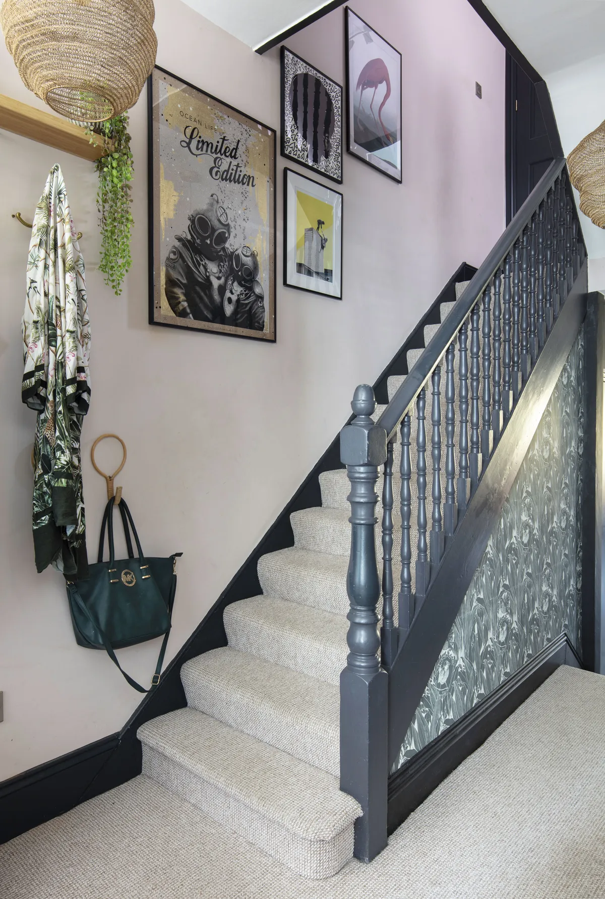
Most of the Victorian features were gone when they moved in so Stephanie made sure to highlight any that remain, like the woodwork in the landing, which she’s painted grey to stand out against the Valspar Dusky Pink walls

Having not been touched since the 1970s, the property was in desperate need of modernisation, but this didn’t faze the couple. They had initially planned to do a side return extension at the back of the house but took the decision to add a smaller extension instead, as the expense would have exceeded the ceiling price of the property.

Welcome to our home...

A bit about me We are Stephanie Emmerson, 41, co-owner of The Fern House plant store, thefernhouse.co.uk, my husband, Simon, 41, an IT consultant, and our son, Archer, four.

Our home is A three-bedroom Victorian terraced house in Folkestone, Kent.

My favourite room is In the house is the kitchen seating area, particularly on a summer’s day when we can throw open the bi-fold doors to the garden.

Stephanie Emmerson

‘The kitchen extension was done under permitted development rights and still gave us a generous amount of space,’ says Stephanie. ‘Having the living area off the kitchen makes the room so much more sociable and we can really enjoy the garden from here too, particularly in the summer when the bi-fold doors are opened up.’

‘We needed to slot an office into the house and the light in the dining room made this space the most practical,’ says Stephanie. She has zoned this area from the rest of the room using clever colour-blocking

As well as tackling the downstairs extension, the couple had electrical works carried out, a new heating system installed, and every wall was stripped back and replastered. Given this blank canvas, each room was decorated from scratch, which was a big project with their son, Archer, in tow.

Taking on a whole-house renovation meant Stephanie had to be smart with the budget: ‘We chose IKEA’s Kungsbacka kitchen and added brass handles to tie in with the industrial-style shelving and to lift the black cabinetry’

‘We lived in the house while all the work was going on and it was certainly challenging at times, as deadlines kept getting pushed back,’ explains Stephanie.

Open shelving from Naken provides additional storage where wall units would have been too bulky, and warms up the dramatic black wall with wood and gold tones

‘We started with the bedrooms, as I felt we needed somewhere comfortable to retreat to while everywhere else was a mess, and I remember longing for some carpet under my feet instead of dusty, plaster-splattered floors!’

Stephanie and Simon kept the steel beam exposed in the kitchen extension to enhance the sense of height. ‘I’ve painted it in a two-tone effect with black and pink to make it a feature within the room,’ Stephanie explains

When it came to the interior décor, Stephanie has introduced a mixture of different styles to give each space a real sense of character. ‘Choosing the kitchen was an exciting part of the project and we went for an IKEA design to help keep costs down,’ she recalls.

The seating and play area off the kitchen leads onto the garden via bi-fold doors. Stephanie has continued the bold monochrome look with paint and accessories, including a large IKEA rug

‘The black cabinetry gives the room an industrial feel and we selected wooden worktops to add a warmer tone. I was really impressed with IKEA, as you’re able to essentially design your own kitchen without all of the hard sell.’

A bit more about my home...

My best idea Was to create a panel for the kitchen island with a rust-effect paint finish; it adds a lovely texture to the room.

My best buy For the house was a limited edition print by Mark Petty, which takes centre stage in our dining room. I love his contemporary style and we have invested in a few of his pieces.

Stephanie Emmerson

As part of the renovation, the couple tackled a lot of the DIY work themselves, including sanding and whitewashing the existing wooden floors in the living room and two bedrooms to help brighten up the interior and make the rooms feel more spacious.

Stephanie has created a cosy main bedroom, with Farrow & Ball’s Hague Blue on the walls and pink and mustard accents. ‘I painted the headboard of the MADE.com bed frame blue to tie in with the décor,’ she says

Stephanie’s style is a mish-mash of different looks; industrial accents are off-set with luxe touches and boho-inspired pieces introduce texture to each room. ‘We like to mix old and new furniture to add character, and are keen art collectors,’ she says. ‘I love creating gallery walls for a maximalist look and am always on the lookout for new pieces.’

A family member restored Stephanie’s fireplace: ‘Several layers of old paint needed to be removed, and the surface was waxed to give it a fresh finish.’ She added black furniture to match for a cohesive look

As the co-owner of an online plant store, The Fern House, on Instagram @thefernhouse_plantshop, Stephanie uses houseplants to bring her interior to life and has an impressive array of planters to house her collection. ‘I use a mixture of different species to create a lush, indoor jungle vibe for a tropical feel and I particularly love ferns and palms.’

Vintage pieces, like this family heirloom armchair, add to the charm of Stephanie’s styling. ‘I had this chair re-upholstered by local designer Sylvia & Margot,’ she says. A low-hanging pendant provides essential task lighting

Taking on a whole-house renovation has been a learning curve for the couple and they’ve taken away some valuable lessons. ‘I was slightly gutted that the house didn’t still have all of its original period features when we bought it, but I feel we were still able to design an interesting and characterful home nonetheless,’ says Stephanie.

Archer’s bedroom is painted in French Turquoise by Craig & Rose, and the whitewashed floorboards keep the space feeling light. ‘His bedroom is a work in progress as he grows and discovers his own taste,’ shares Stephanie

‘I’ve also learned to be bold with colour and not shy away from it, as paint is the cheapest and easiest way to transform any room and it can be undone if it doesn’t feel right.’
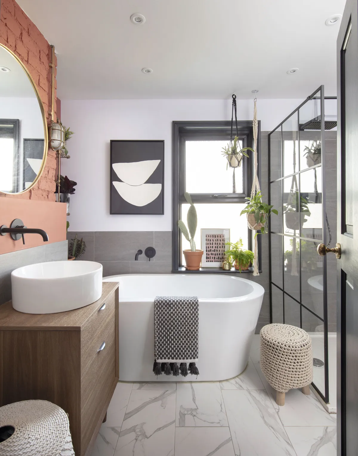
The family bathroom has been given a modern-industrial look, with a free-standing bath and walk-in shower enclosure. The Crittall-style shower screen, from Bathstore, ties in with the matt black fixtures and fittings

The project has been a labour of love for Stephanie, but her clever design ideas and practical approach to decorating have paid off in creating a modern home that her family can enjoy for years to come.

Feature Cassie Pryce. Styling Sabrina Giles. Photos David Giles.

This is a digital version of a feature that originally appeared in Your Home magazine. For more inspirational home ideas, why not subscribe today?

This website is owned and published by Our Media Ltd. www.ourmedia.co.uk
© Our Media 2024