Sarah Gibbons-Poole used her background in textile design to turn the plain rooms of her modern new-build into a colour-filled family home. Here, she talks us through her home makeover...
My story...
We’re only the second family to have lived in this house, so thankfully it was in great condition, and it was nice knowing that everything was in working order.
It felt like a house we could put our own stamp on, and it was a bonus that all the rooms were plain as it gave me a blank canvas to work with.
Being a new-build, we thought nothing big needed doing, but actually there was lots we wanted to do.
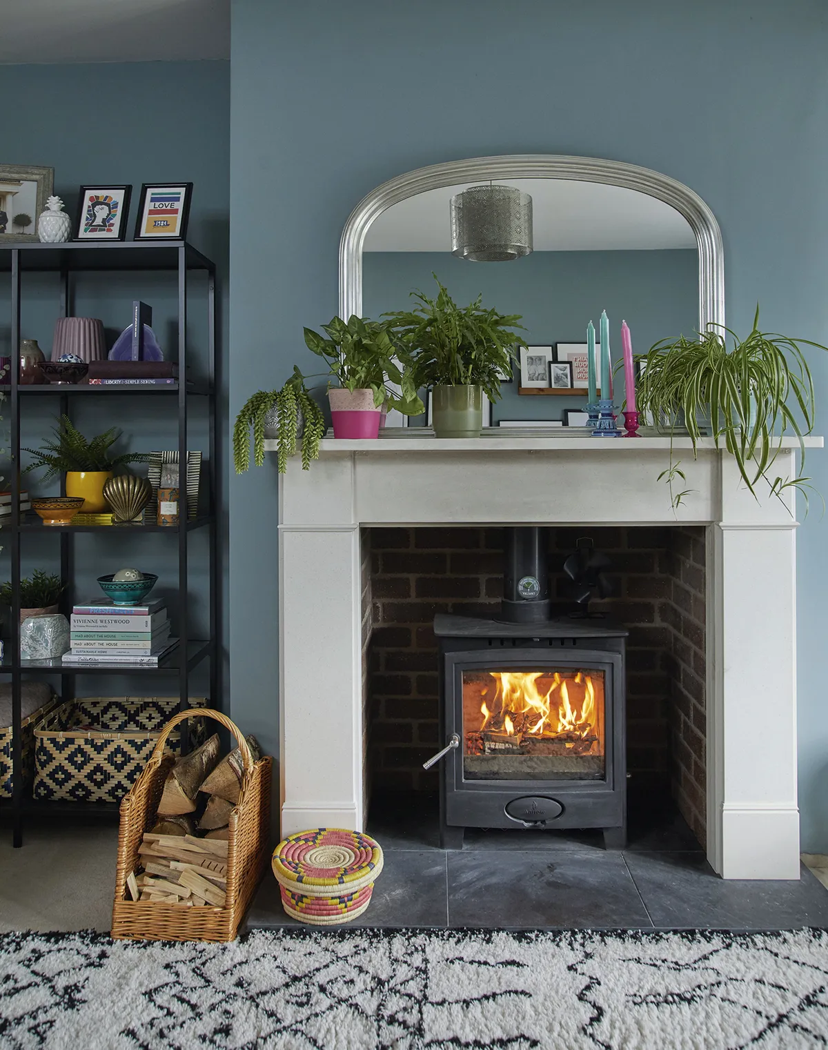
I love a roaring fire, so the first thing on our to-do list was getting one installed. It was actually really easy as it went on an external wall and only took the builders three days.
Welcome to my home...
A bit about me I’m Sarah Gibbons-Poole, 35, a fashion merchandiser. I live with my husband, Chris Poole, 35, a digital IT manager, and our one-year-old daughter, Cleo Valentine. I Instagram our home updates at @step_into_no.17.
Where I live Our home is a detached four-bedroom house in Wickford, Essex. It was built in 2014 and we moved here in October 2016.

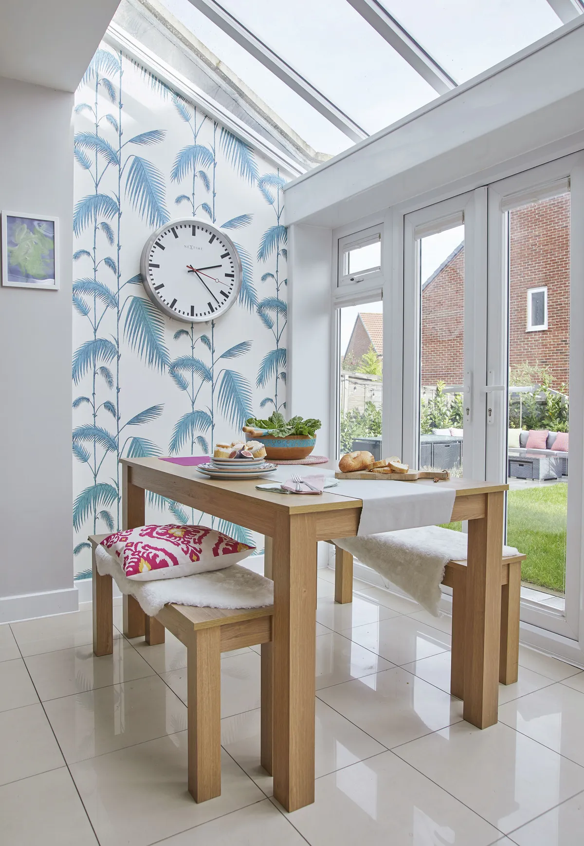
The kitchen hadn’t been tiled and we kept getting splashes on the walls, so that was the next job.
We don’t have spare money to keep changing things to follow trends, so we picked traditional tiles as we wanted our big spends to go on classic fixtures and fittings that would last.
I’ve got a habit of starting things but not quite finishing them, so Chris encouraged me to do one room at a time.
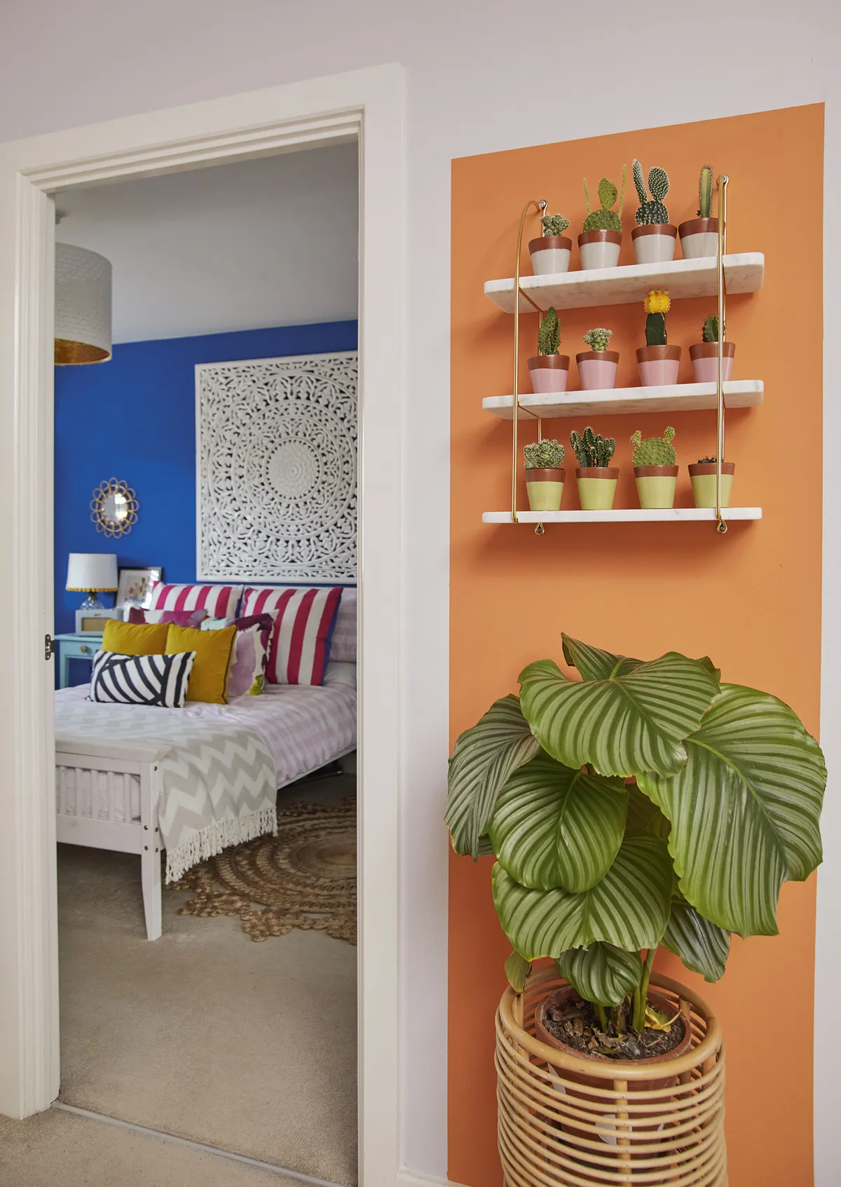
I worked my way around the house, giving each space colour on the walls, then I finished them off with bright furniture and accessories. We’ve managed to create a beautiful home that’s a true reflection of our love of bright colours!
A bit more about my home...
What I wanted to change Because it was a new-build, we didn’t have the renovation issues period properties often have, but the whole house was full of magnolia box-like rooms, so I needed to find ways to add lots of personality.
How I made it my own We both love colour so we did a few practical projects straightaway. I then chose paints, fabrics and home-made crafts to add character, pattern and texture to each space.
My favourite part Probably the living room, purely because we put a lot of work into it and we spend most of our time there.

Kitchen
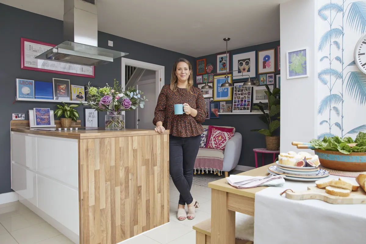
‘We didn’t choose the kitchen cabinets, but luckily I love them, and I’ll be forever grateful that the previous owners chose handleless doors as I love the clean, modern look they give. I do want to change the high gloss floor tiles. I’m sure they looked fabulous in the showroom, but I can’t keep them clean and most of the time they’re covered in cat pawprints.
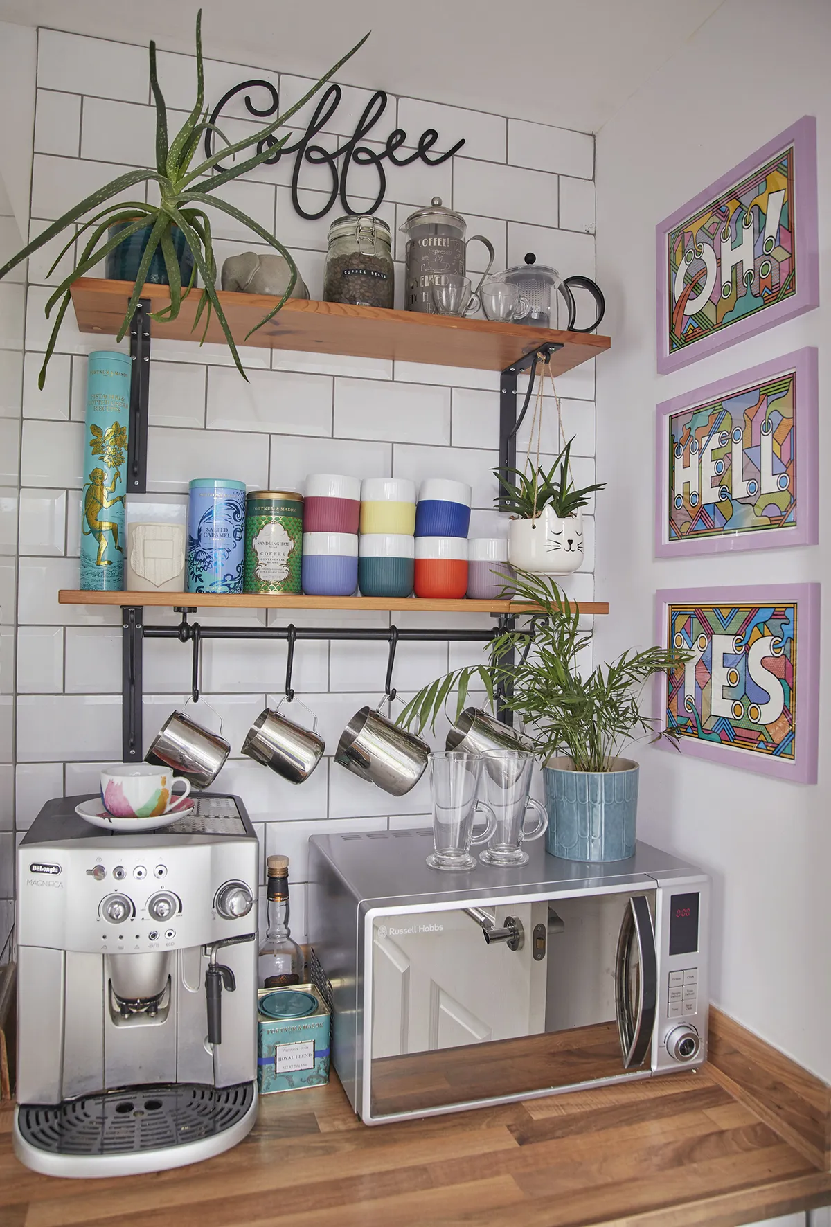
‘Chris called our last house the "Technicolour Dream Home" and I promised him this house would be neutral and minimal, which is why we chose these classic wall tiles. However, I can’t help bringing colour into a room, so the neutral look didn’t go far beyond this part of the house!’
Dining room
‘We wanted to give this room a big hit of colour so we decided to add some drama and go dark with this Breton Blue paint from Dulux. We love to entertain so we created the bar area in the corner by upcycling a vintage cabinet and adding IKEA shelves above it to store glasses.
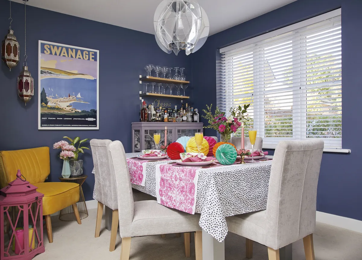
‘I like the way it makes people feel comfortable enough to go and help themselves, though Chris does love to make a cocktail.
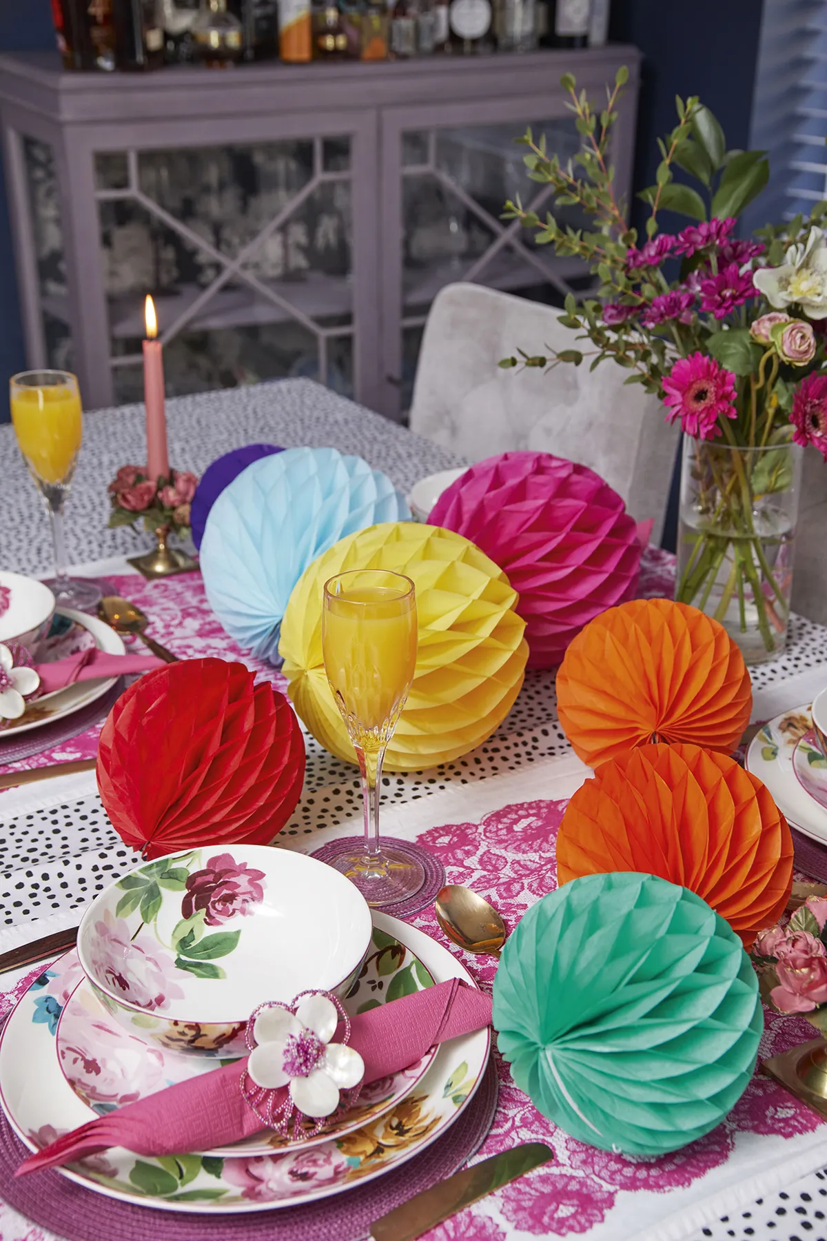
‘I love to create a fun tablescape when friends come round, and I’m still always amazed how much colour can transform a space. It’s a nice luxury having this as a formal dining room, but I think in the future we may turn it into a playroom for Cleo.’
Living room
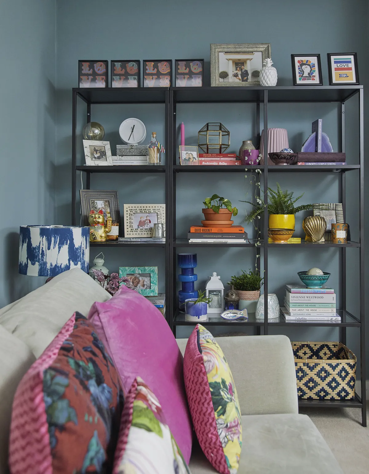
‘It’s easy to think that because it’s a new-build everything needs to be modern, but I don’t believe that. I really wanted to add charm and create a classic look, and once we had the fireplace installed and I’d put the mirror up over the mantel, I just wanted to run with the timeless feel in the room.
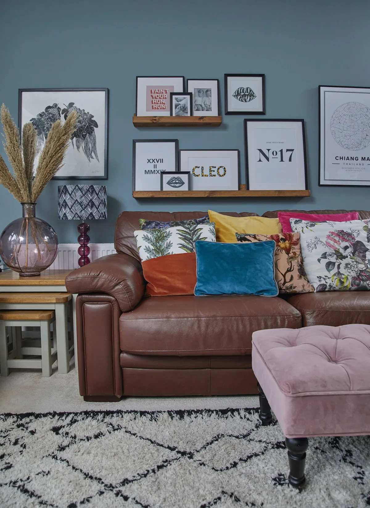
‘The Oval Room Blue paint by Farrow & Ball is quite traditional looking, but it’s an easy colour to live with and it goes with anything we put with it, which is just as well as we’ve chosen a lot of different textures and colours for our furniture and accessories.
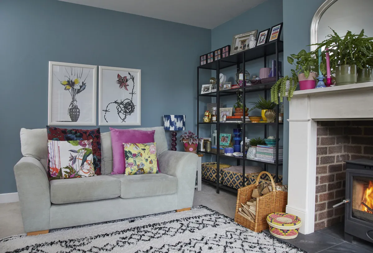
‘I studied Textile Design at college and enjoy sewing so I’ve made most of the cushions myself. I love a clash of fabrics, and I get some great designer bits from leftover projects.’
Master bedroom
‘I always wanted this room to be mint green as it’s such a relaxing colour. I discovered a company called Rebel Walls who make printed wallpapers to the exact measurement of your room, so I talked to them about a design and they sent this gorgeous Jungle pattern.
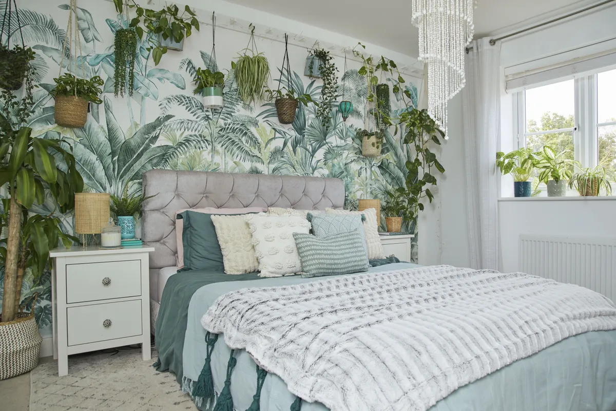
‘I’d never wallpapered before, but it came in strips that matched up exactly so it was easy to hang. I wanted to cover the whole room in plants, but I needed a way of adding them without distracting from the mural.
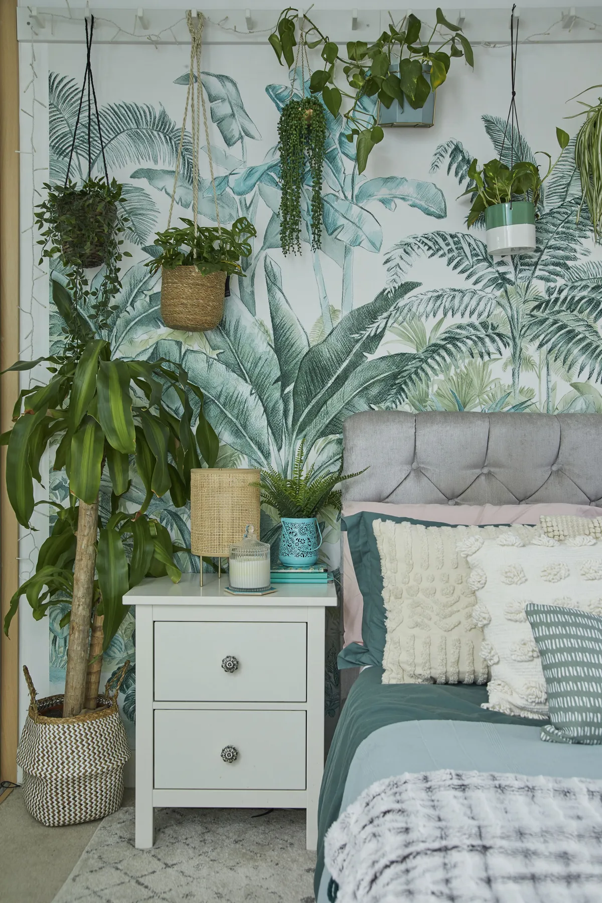
‘I initially thought I’d have a long, high shelf but then I saw people using pegs in their hallways and thought I’d give it a go on the wall. They’re really effective and the real hanging plants go really well with the mural behind.’
Cleo's room
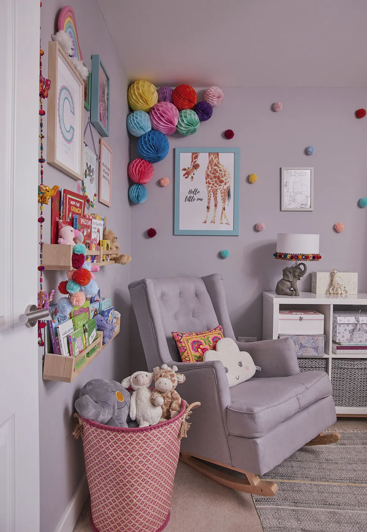
‘We chose neutral grey for the walls in Cleo’s room, which is quite unusual for us, but it’s a really calm, relaxing space. I wanted to add colour and make it fun with crafty bits that I made myself, like the bright edging I attached to the elephant lamp. Long-term, I want her to choose her own style when she’s ready so everything I’ve decorated with is removable.

‘I made the tiny pompoms from wool and fixed them on with Command strips. I’ve got paper pompoms dotted all around the house as they are such a cheap and easy way to add colour to any room, and they really stand out in the corner here, but they can easily be taken down if we want a change.’
What I learned...
It’s easy and cheap to decorate using colour and accessories. With good-quality, cheaper paint brands now available, it’s possible to update wall colours on a budget, and you can pick up cheap frames to mount your postcards to start off your own gallery wall.
Don’t be quick to change the bigger items; live with them for a bit and see how you can make them work for you. I didn’t like the bathroom tiles, but with a coat of paint on the walls and my choice of accessories, it’s a room I can now enjoy relaxing in.
Your home should be a reflection of you. We spend so much time here, especially over the past year, that we shouldn’t be afraid to make it our own. Very little can go wrong with painting a wall and if you don’t like it, you can always change it.

This is a digital version of a feature that originally appeared in Home Style magazine. For more inspirational home ideas, why not subscribe today?
