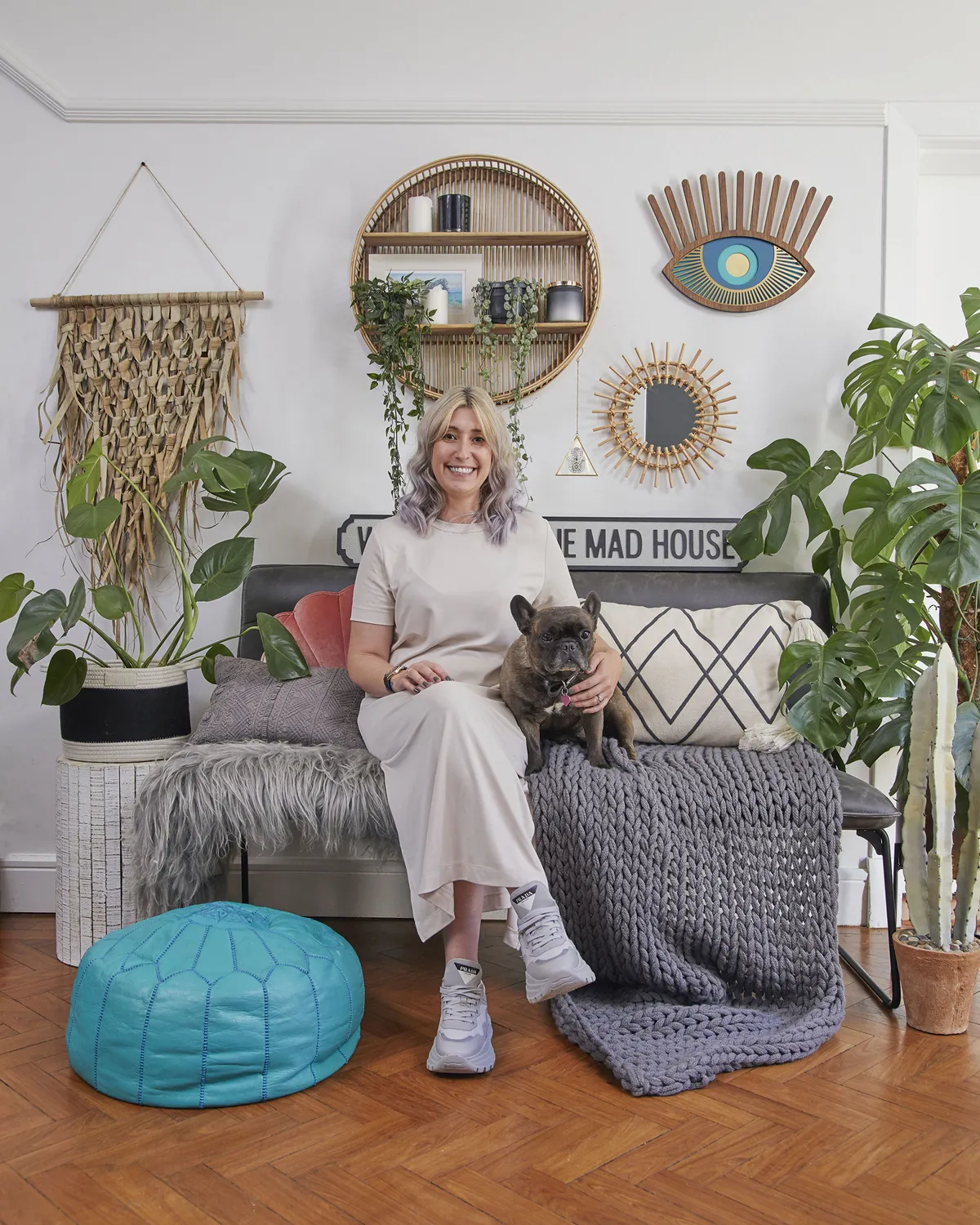
Using her love of real plants and a cool eye for display, Dani Sandels has created a hothouse of colour and serenity.
Here, she tells us all about her makeover story...
My story
My nan and grandad used to live here years ago, so when it came on the market, I knew we should come to view it.
On a practical note, it had three bedrooms, lovely high ceilings, and architectural features that I love. It’s also near to my parents and in the middle of parkland so it’s quiet and close to the city, which meant it ticked lots of boxes.
The kitchen and dining area were separate rooms and we wanted an open-plan space.
Welcome to my home...
A bit about me I’m Dani Sandels, 34, a content creator. I live with my husband, Tom, 33, and our two children, Cooper, two, and our four-month-old daughter, Banks. We have two dogs, Beau, a Dogue de Bordeaux, and Ruby, a French bulldog.
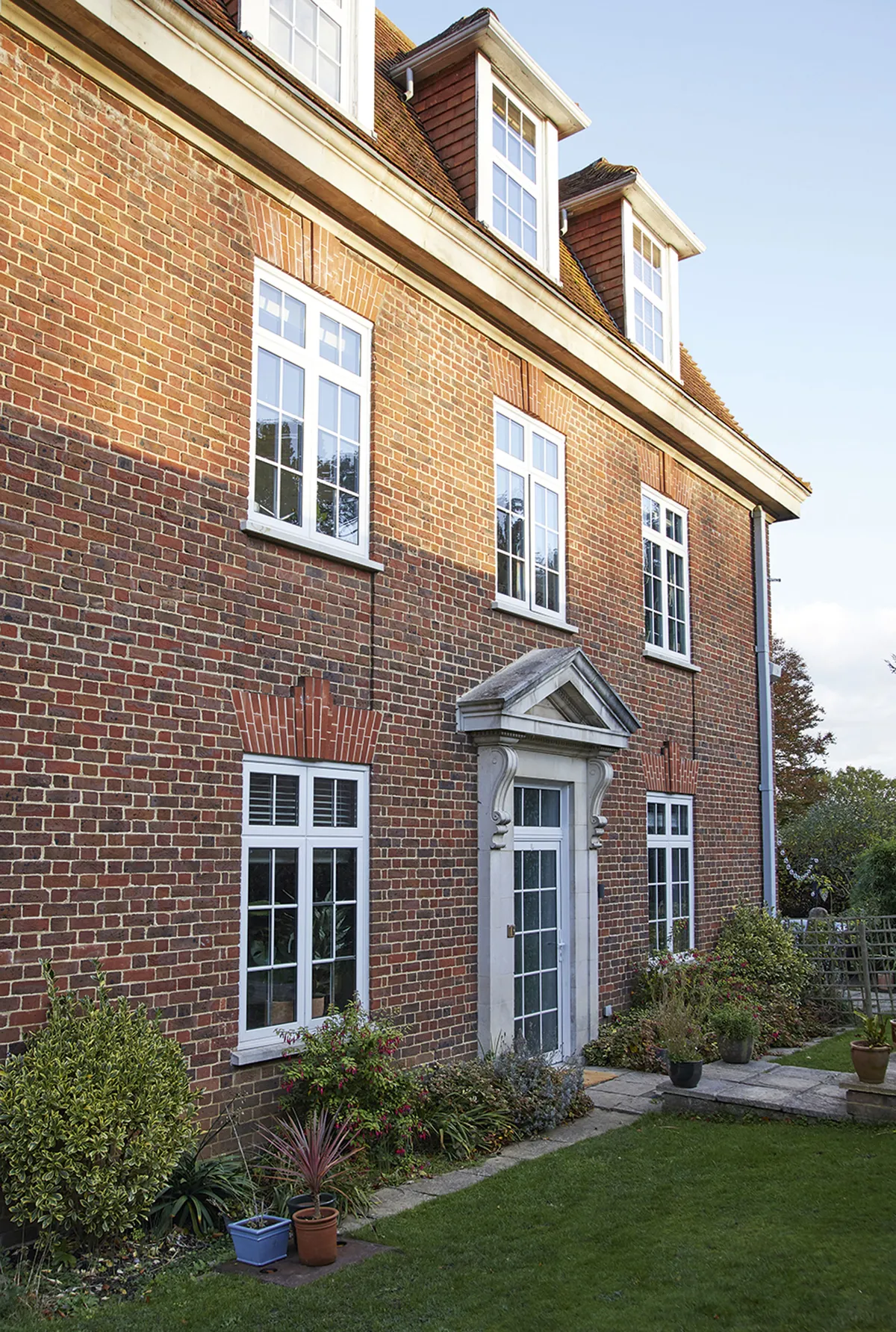
Where I live My home is a three-bed Georgian maisonette. It’s part of a conversion of old dormitories in a renovated boarding school in Ottershaw, Surrey. We’ve lived here since June 2018 and I’ve recorded my interiors journey on my Instagram @danisdomain.

We’d done an extension on our old place, so we knew taking down the wall was going to be the biggest job, and did the messy work before we moved in.
We decided to redo the bathrooms so we got all the tradespeople in at the same time. Good planning meant the work was all finished in four weeks.
A bit more about my home...
What I wanted to change Being a conversion in a large building meant the bones of the place were sound, but the décor was really old-fashioned; think red carpets and gold fittings and you’re there, which is really not my style.
How I made it my own We reconfigured the kitchen and dining space, knocking down a wall to make it open-plan. We also installed new bathrooms, then we decorated the whole space.
My favourite part I love our bedroom. It feels happy, I think because of the colours and the warm sunlight that streams through.
Though shortly after moving in, we had two massive leaks from both bathrooms, so we had to redecorate, which was frustrating.
Thankfully, I’m good at putting low points behind me and the priority now is getting the nursery done. I’ve seen fabulous wall murals so I may do something like that.
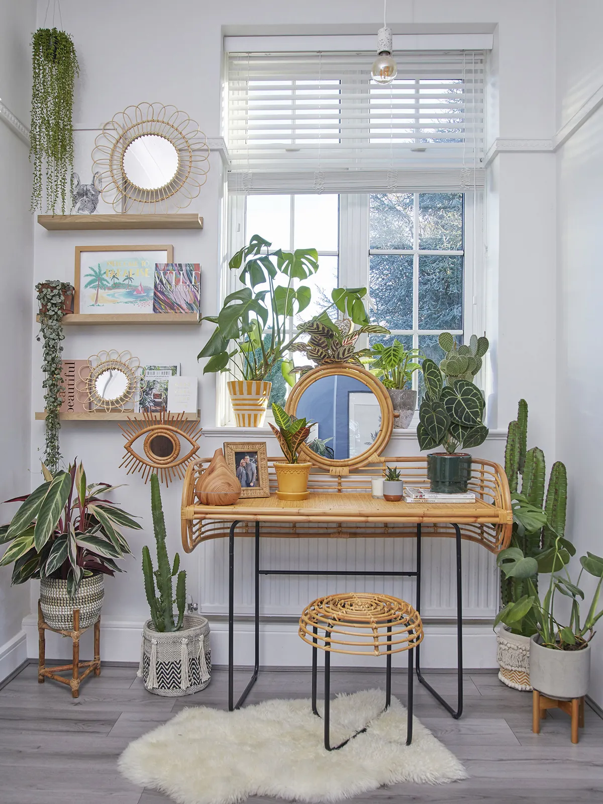
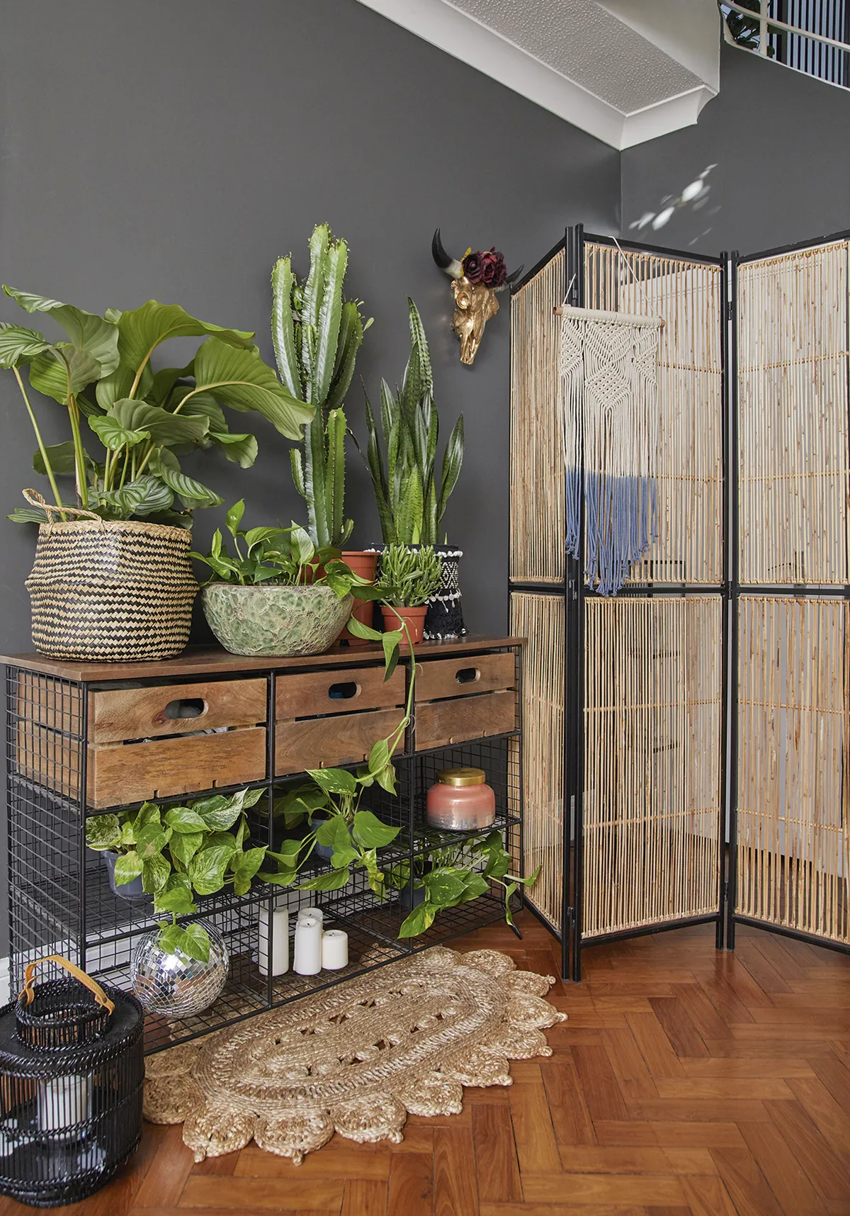
For now, there’s nothing we urgently need to do. I’m just going to keep watering my many houseplants and enjoy what we’ve done so far.
Kitchen
‘The original kitchen had plain white units, which wasn’t my style as I like a bolder, more fearless look. It also wasn’t in great shape, so I didn’t feel bad ripping it out to knock the wall down. We looked at Wren for kitchen inspiration and the Stealth island immediately stood out, so we ordered it before we even moved in.
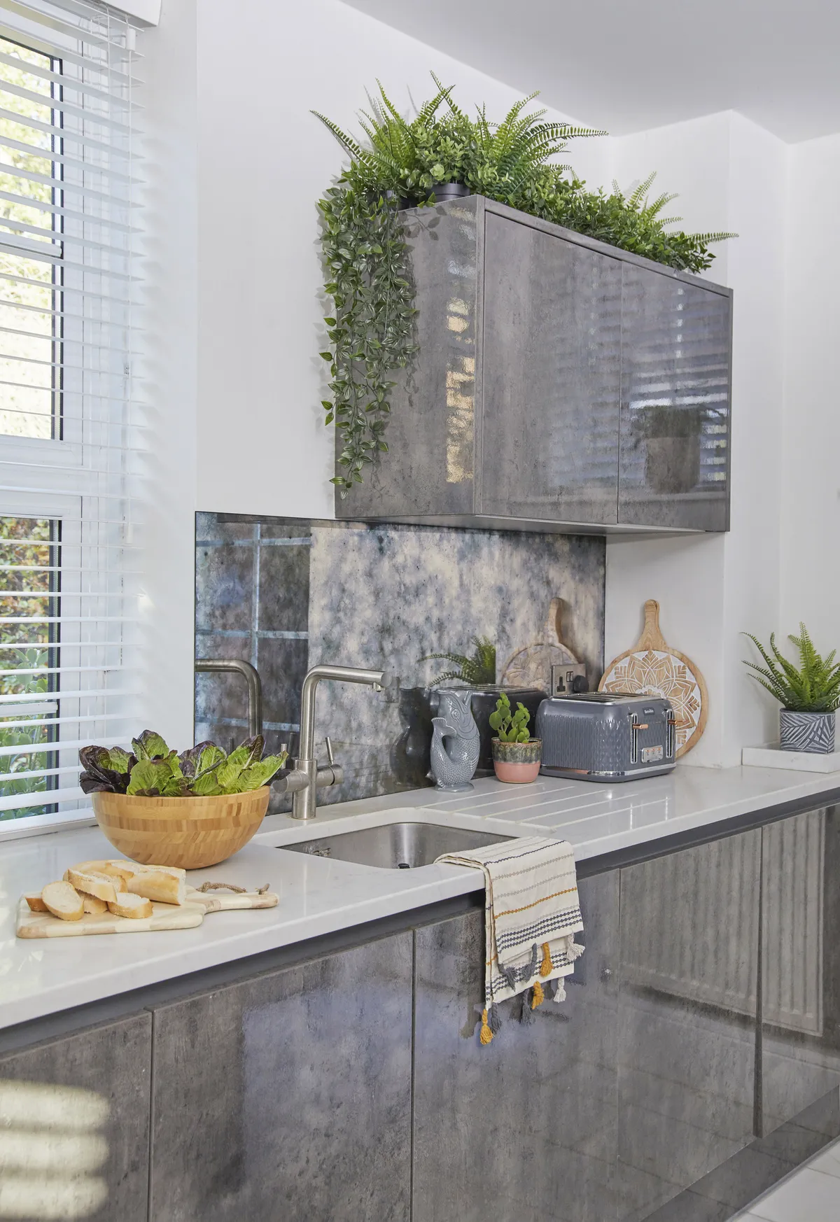
‘Fitting the kitchen wasn’t easy as the floor is solid concrete, so it was hard to drill and install things. The granite island came from a different supplier, in two massive made-to-order pieces, so it took months to arrive.
‘We had the units and base in place so we could get the hob working, though when the builders finally fitted the island, they had to do some cutting and didn’t cover anything, so the whole room got covered in a layer of granite dust.’
Dining area
‘We wanted a place to relax in – in addition to the more formal living room – especially as we like to chat while cooking, so we put another sofa in here. We fitted a false ceiling so that we could install spotlights as there were originally only two pendant lights in here, but we kept it as shallow as we could so we didn’t lose the height of the room.
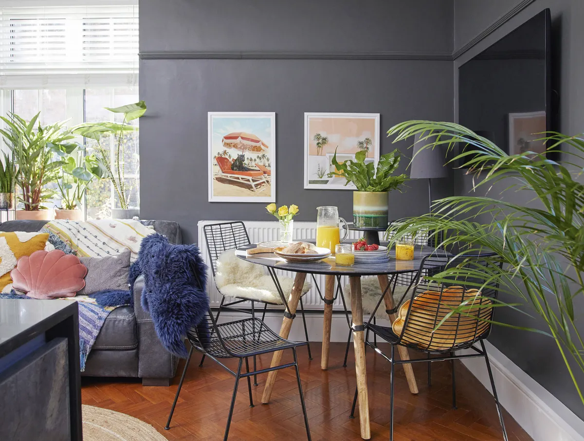
‘Pre-kids, we used to sit on the sofa to eat but I’m glad we made space for this French Connection dining table as now we eat together, and it can seat six when we have people round for dinner.’
Living room
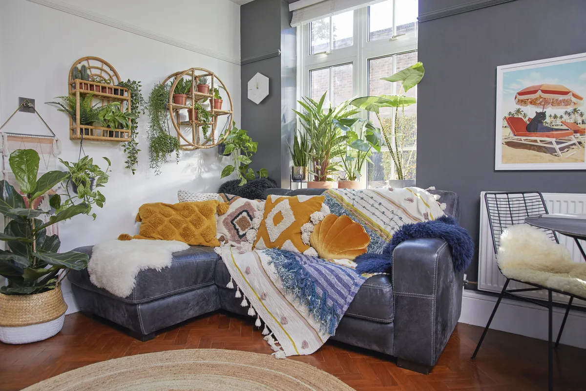
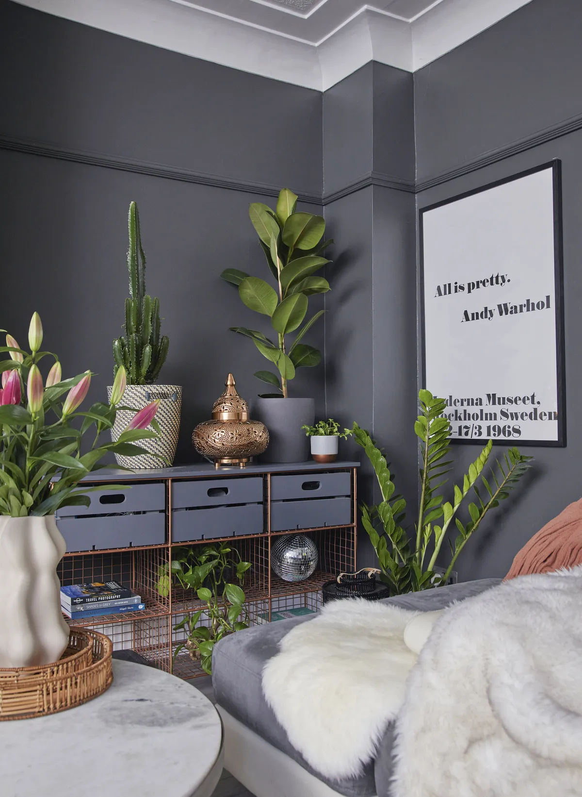
‘This room was originally beige with wooden cabinets everywhere, so we cleared everything out, gave the walls a bit of TLC and then added a lick of white paint to brighten the space. There was also red carpet in here, though we knew there was parquet underneath, but when we pulled the carpet up, we discovered a lot of missing blocks.
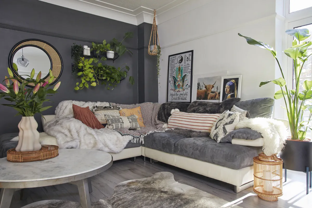
‘It’ll be a big job to replace, so we decided to use grey laminate as an easy, cheap fix until we can restore the parquet. I initially found this room quite tricky to use as it’s so long and I considered partitioning it. We’ve made it work by zoning the space using rugs and the corner sofa from Sofology.’
Master bedroom
‘The wall colour in our bedroom is Blue Slate from Dulux. We used the same colour in our last bedroom, but because of the light it looks completely different here. We had recently renovated our last home and spent a long time choosing paint, so when we moved here we were already armed with a list of our favourite colours. No one would fit a floor over the parquet because it moves with the heat, and it was hard to find flooring that would go on top.
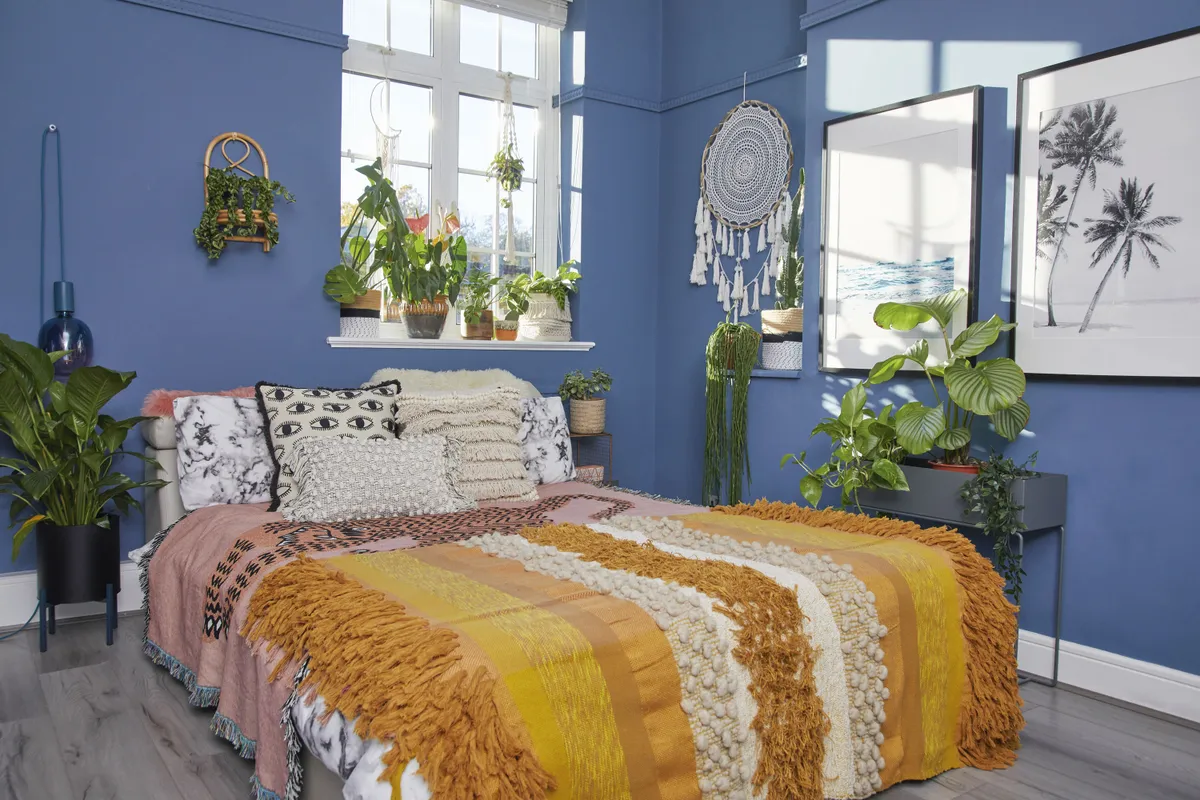
‘So, when we found the grey laminate, we decided to use it upstairs as it’s low maintenance – so also good for the kids’ rooms – and looks great. The wardrobes were already fitted but had ugly yellow tinted mirror glass and the inside needed redoing. We got it refurbed, though I was amazed at the high cost, and in hindsight we should have just bought a new wardrobe.’
Cooper's room
‘The level of toys we have is insane. Although it’s chaos behind the cupboards, having a clear space makes me happy, so I just scoop Cooper’s stuff into good-looking storage baskets and colourful crates, and at the end of the day it only takes 10 minutes to clear the mess and have calm again.
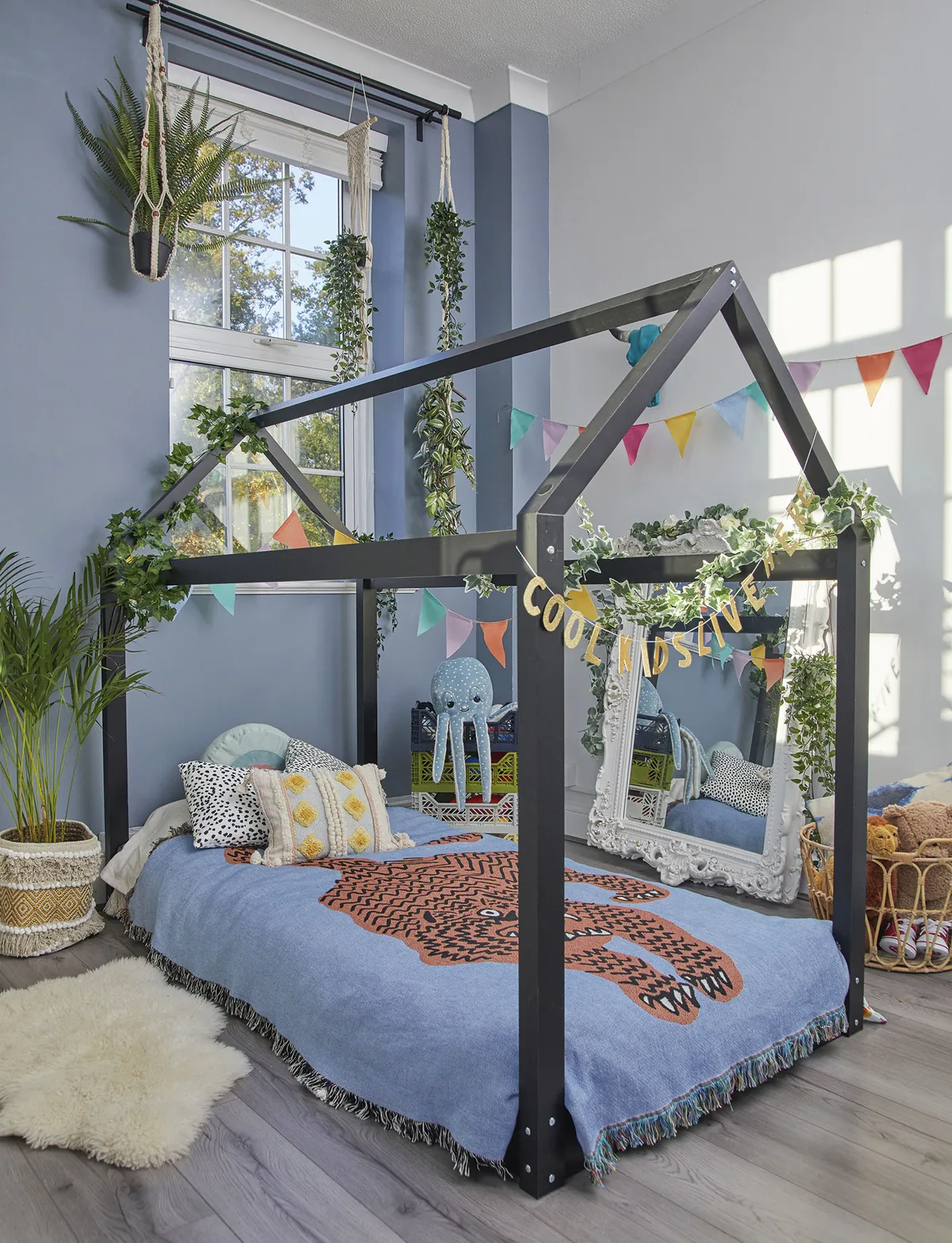
‘This room still needs work but temporary decorations like the bunting add colour without having to commit because I’m not sure what to do in here yet. I do love the Denim Drift Dulux paint that we chose for the walls so that’s definitely staying.’
Bathroom
‘The house has got two bathrooms so when we first renovated the place, Tom suggested just having a large shower in here, but I thought it would be nice to have a toy-free space with a bath in it. Looking back, I think we rushed the decision-making process and chose everything a bit too quickly.

‘I love the floor and wall tiles that I’d spotted in Wickes, but I might have designed it differently if we had lived with the space for a while. In hindsight, we could have actually just had a shower in here, or I might have gone for something free-standing. But we had the builders booked in, so I was under a bit of pressure to choose. I was also working full-time and pregnant, so I just made quick decisions. Though saying all that, I do still love the finished result.’
Feature and styling Lisa Moses. Photos Katie Jane Watson.
This is a digital version of a feature that originally appeared in HomeStyle magazine. For more inspirational home ideas, why not subscribe today?
