Joanne Hepburn has always lived in Victorian properties until she viewed this extended 1930s house and saw the fantastic back garden.
‘I’ll be honest, I wasn’t a fan of the architectural style at first, but I loved the extension, which opened onto a big garden,’ she says. ‘We’d been living in a terraced house with a small backyard and these qualities were exactly what we were looking for in our next home.’
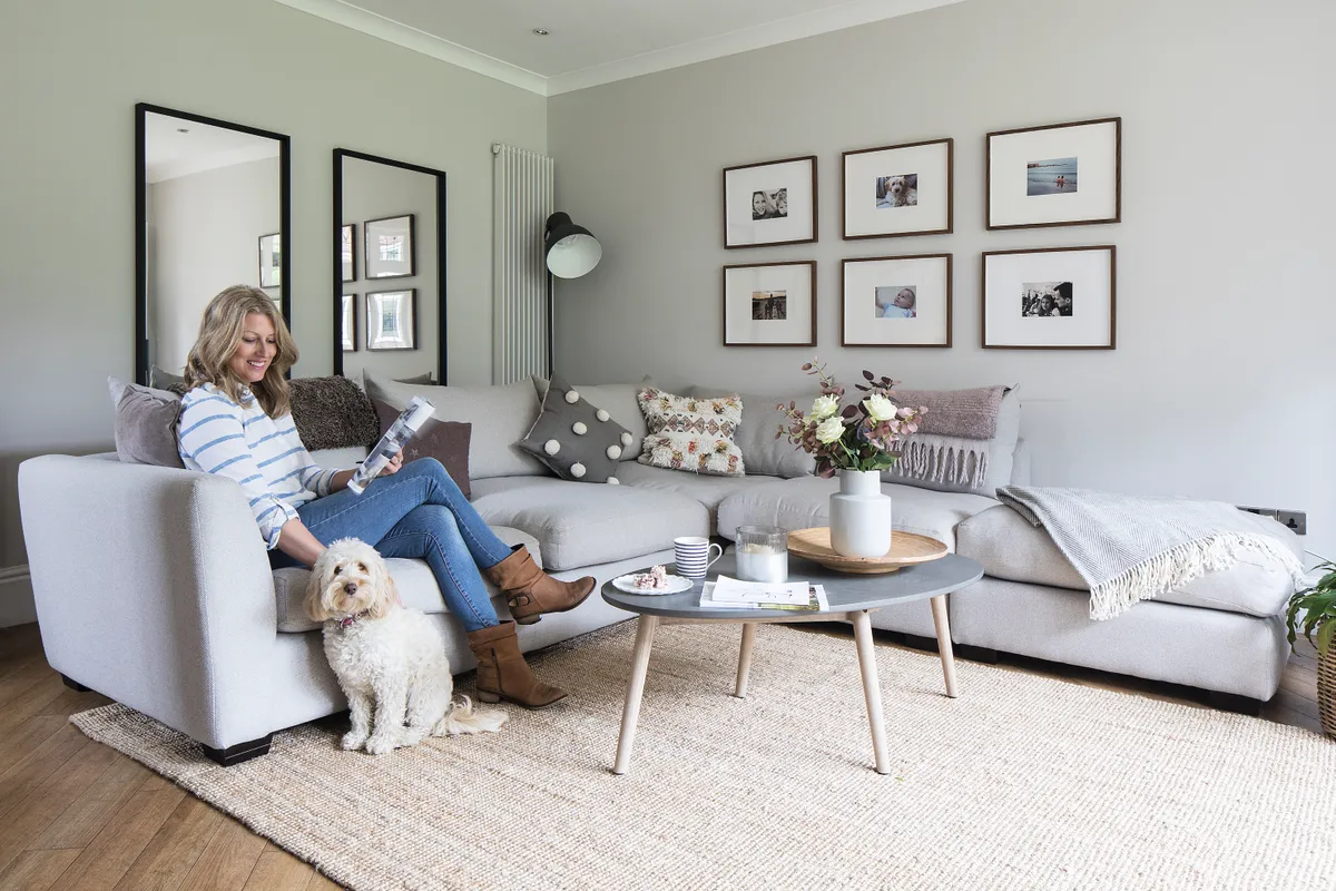
The property had been rented out for seven years and, although the extension was fairly new, the rest of the house remained stuck in the 1980s, with washbasins in bedrooms, chintzy wallpaper and heavy pelmet curtains.
‘A plus point was the lovely big hallway, but I really disliked the red, patterned, pub-style stair carpet and the heavy wood panelling,’ adds Joanne. ‘The rooms looked dark and gloomy and there was too much wood in the extension – my instinct was to make everywhere light and bright.’
Welcome to my home...
WE ARE Joanne Hepburn @semi_in_ suburbia, 42, a stay-at-home mum, my husband, Michael, 43, director of a town planning consultancy, our two children, Annabelle, nine, and Will, six, and Sadie, our cockapoo.
OUR HOME IS a four-bedroom, 1930s semi in Newcastle-upon-Tyne.

Luckily, no major building work needed doing as the extended house was big enough. But a survey confirmed the couple would have to update the electrics and heating, which meant plastering and decorating all of the rooms, too. Rather than moving out temporarily, the family decided to stay in the house while the work went on around them.
‘We shut the door on the extension and kept away from the mess during the day,’ says Joanne. ‘I underestimated the amount of decorating in the hallway, though, as they had to put up a tower scaffold. It was there for weeks and each time we came home we had to crawl underneath it to get through to the back.’
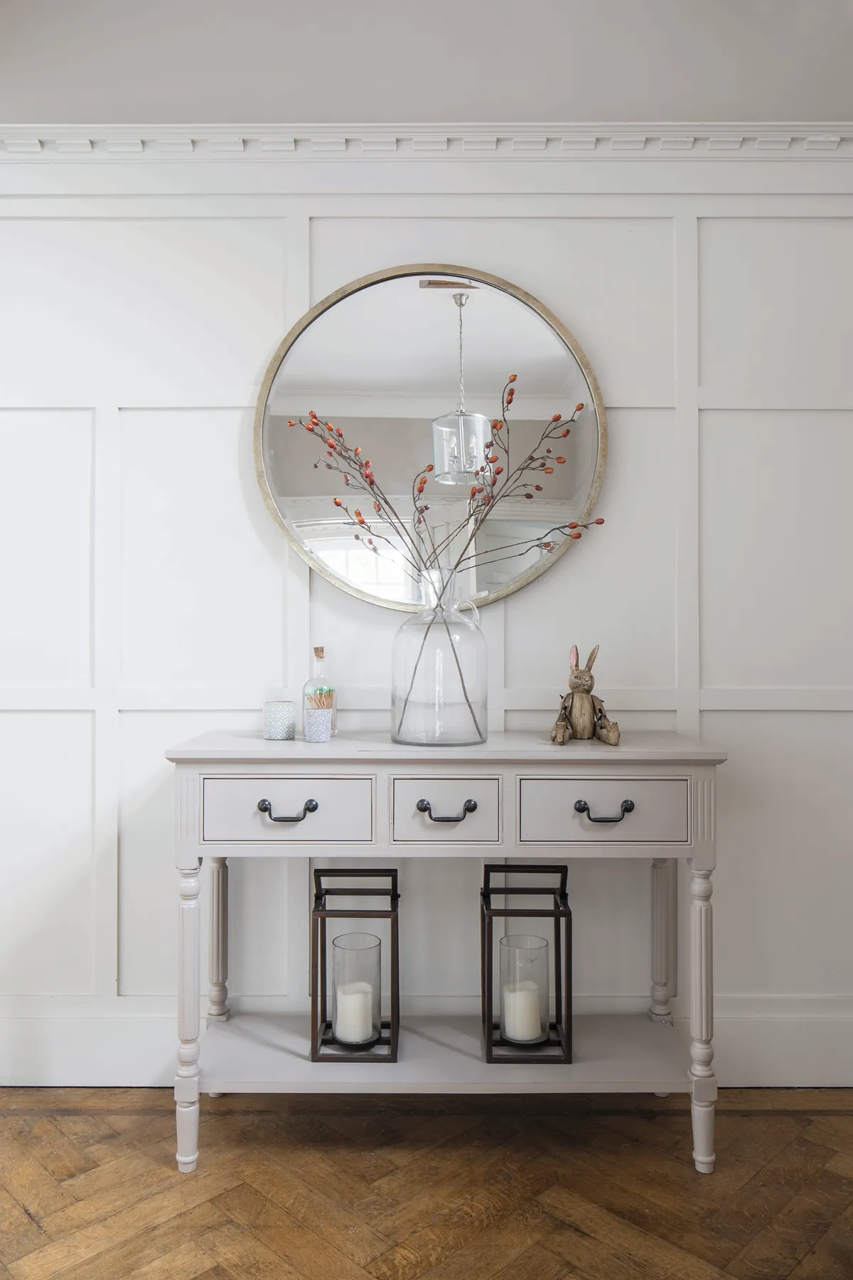
Painting the wood panelling in the hallway white was one of the biggest transformations. ‘It was a daunting prospect, but I was adamant it was the right thing to do,’ she says. ‘The hall looks light and no longer feels claustrophobic and the white looks great contrasted with the original parquet flooring.’
Once the decorators had finished painting the whole house, Joanne began arranging their furniture. Having been previously used to Victorian terraced houses with narrow rooms, the sofa and dining table looked small in the large extension.
‘This was a completely new way of living for us,’ she says. ‘The walls were big and bare and so I started thinking about how I could divide up the space and looked for inspiration on Instagram. I searched #kitchenextensions, #1930s and #openplan for ideas.’
Soon, Joanne had replaced their three-seater in the living area with a large corner sofa, which now frames and fills the space, facing the TV and the garden. The dining table and chairs were out of proportion until she created a zoned area for them with a large rug, and did the same in the living space, too.
A bit more about our home...
MY BEST BARGAIN Is our ex-display bed from John Lewis, which cost a third of the full price.
SHOPS I LOVE Are Homesense for storage baskets, IKEA for picture frames and rugs, and Wayfair for affordable alternatives to high-end designs.
TO RELAX I bake with the children or do gardening – I also love a declutter so everything has its place.
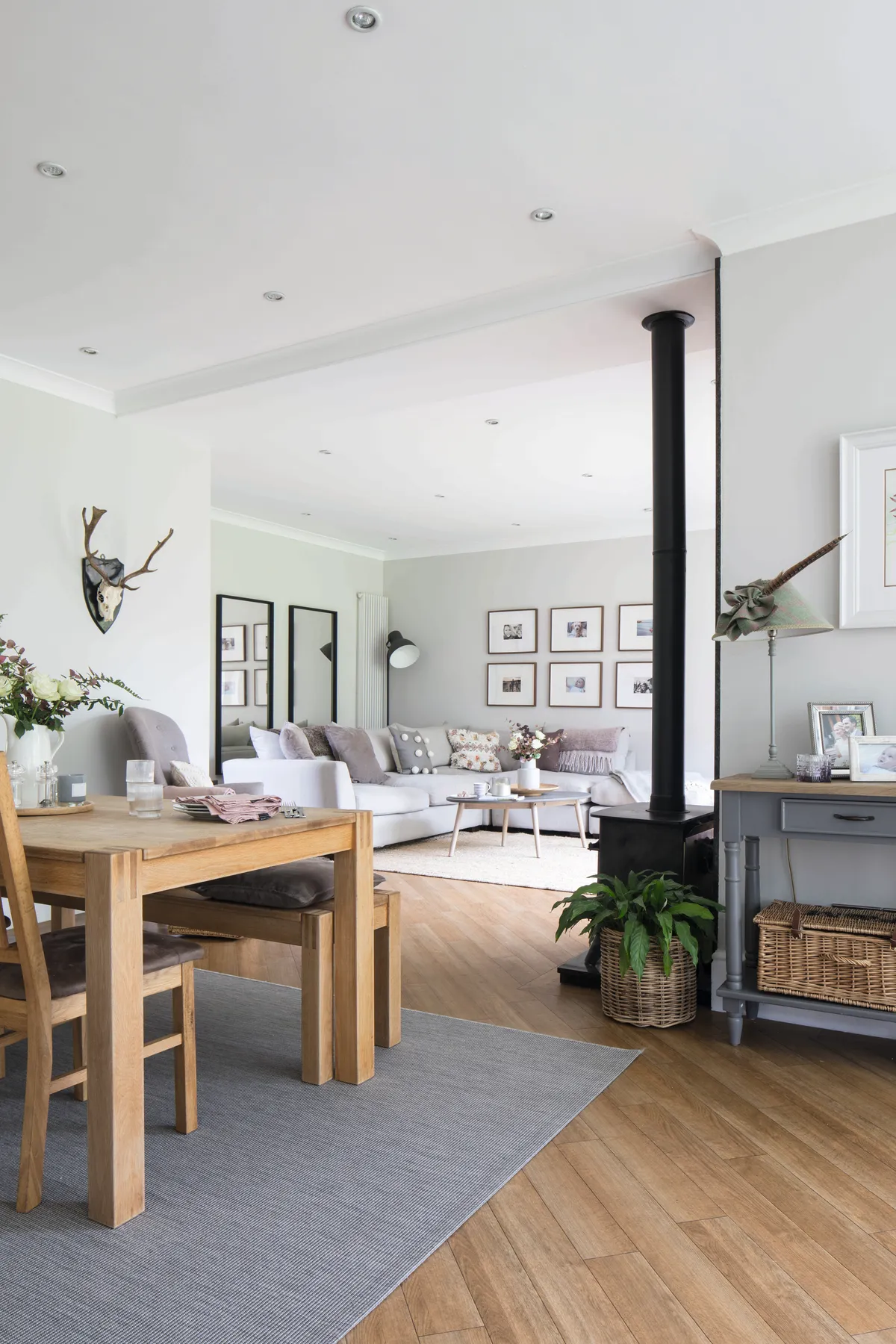
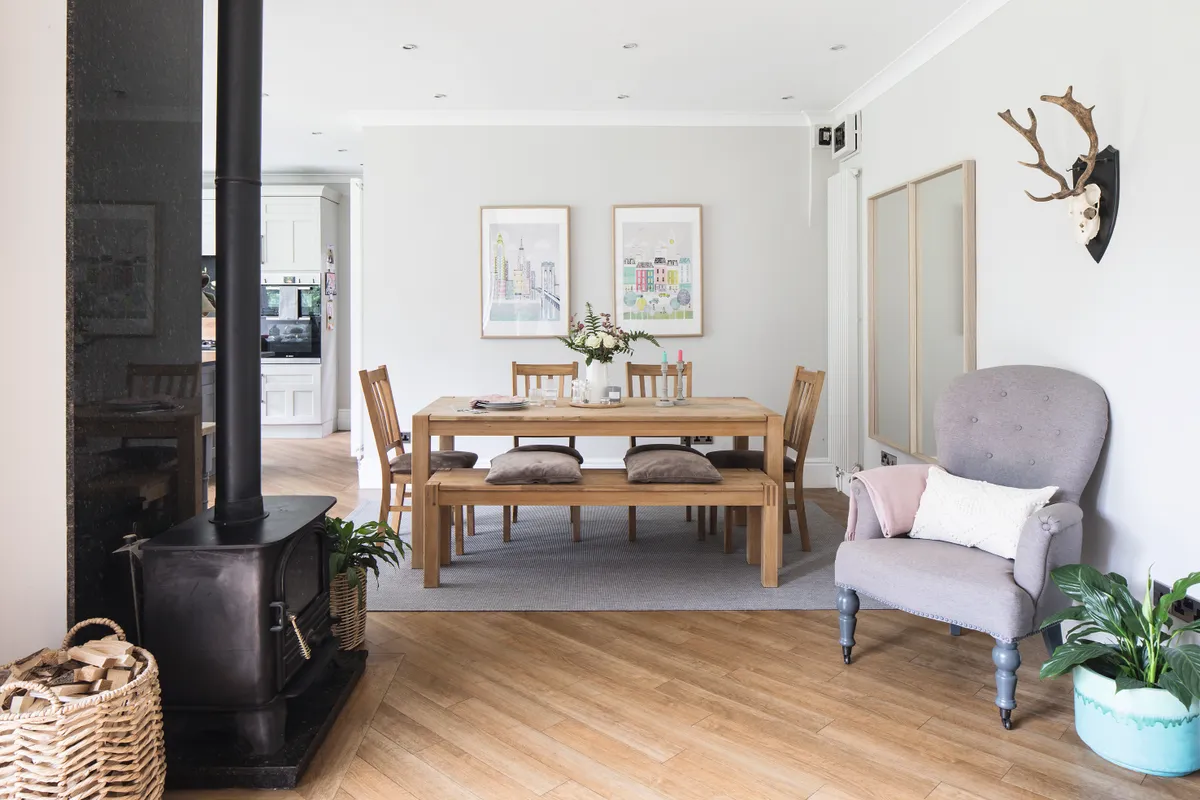
Another big change was improving the wood-heavy, open-plan extension. Joanne decorated all the walls in a warm putty tone and, understandably, couldn’t justify taking up the wood floor or ripping out the oak kitchen cupboards, so decided to update them herself instead.
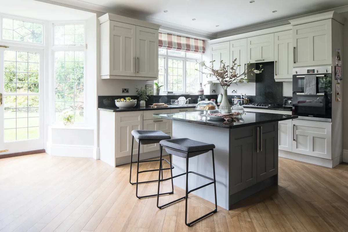
‘They were beautifully made and I was nervous about painting them,’ she admits. ‘It took four different paint colours until I was absolutely sure and I’m so pleased with the results now. Going for an off-white is a much better contrast with the wood floor and has made the room look brighter.’
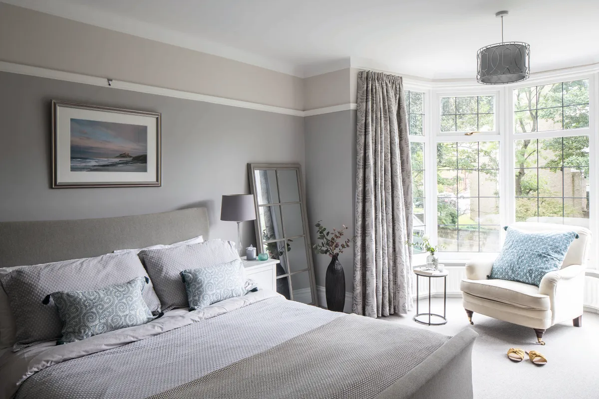
Upstairs, bespoke wardrobes were made for the main bedroom alcoves and Joanne bought a new bed. Despite purchasing so many new pieces, she was careful to keep her budget in mind.
‘I invested in big-ticket items, but I only ever bought things in the sale or ex-display,’ she says. ‘In fact, before I bought anything new, I looked for a discount code or for the same thing second-hand on Gumtree or eBay. Our bedside table is from IKEA but bought on eBay.’
Joanne took style inspiration from Neptune, loving their timeless designs and neutral palette, but also turned to Wayfair to source similar products at an affordable price. ‘I like classic pieces with a lasting look and warm neutrals in beiges and off-whites,’ she says.
‘I tried to think of the house as one big space. I like the colours to flow so there is a similar neutral tone throughout.’
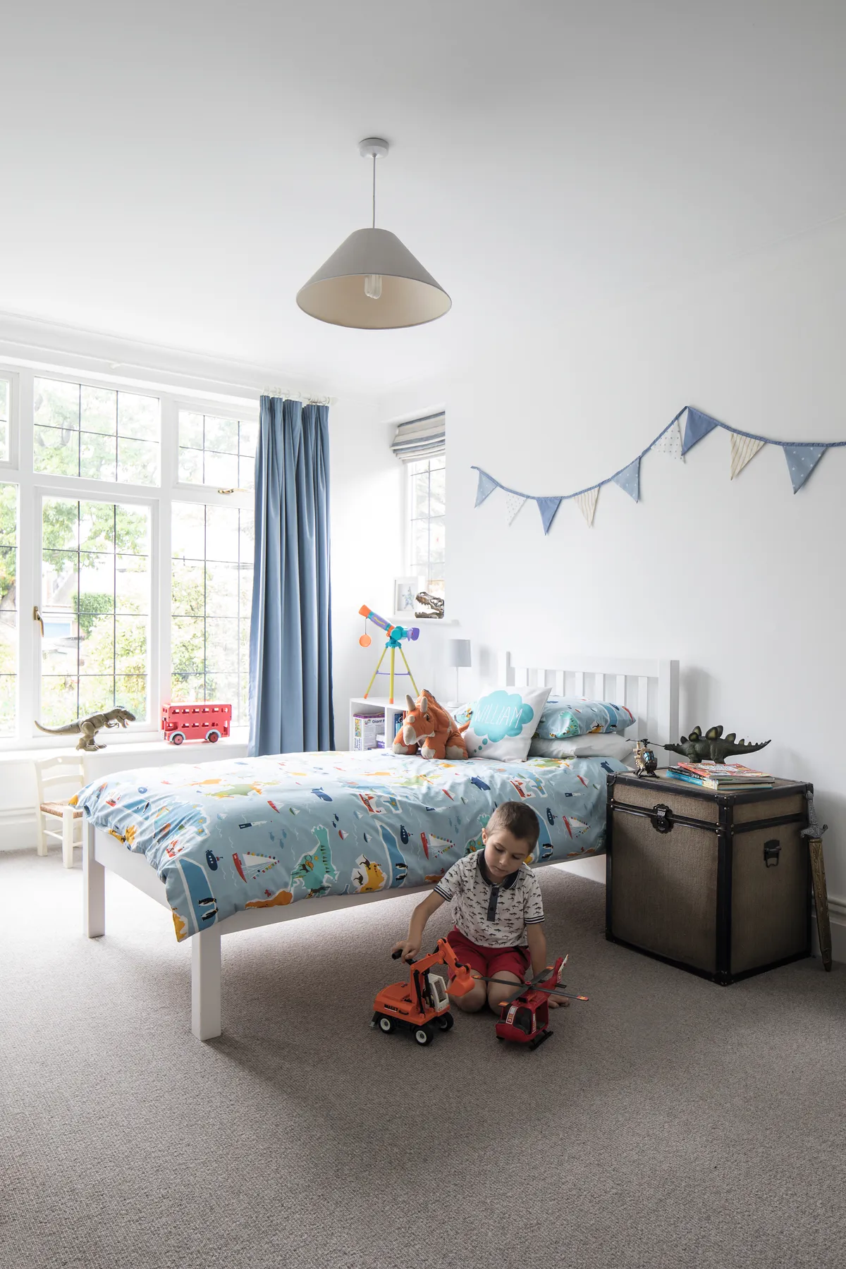
With a tonal and co-ordinated neutral scheme running throughout the house, all the rooms have shaken off their dark past. Joanne has added pretty finishing touches with seasonal cushions, baskets, plants and fresh flowers to make it feel homely.
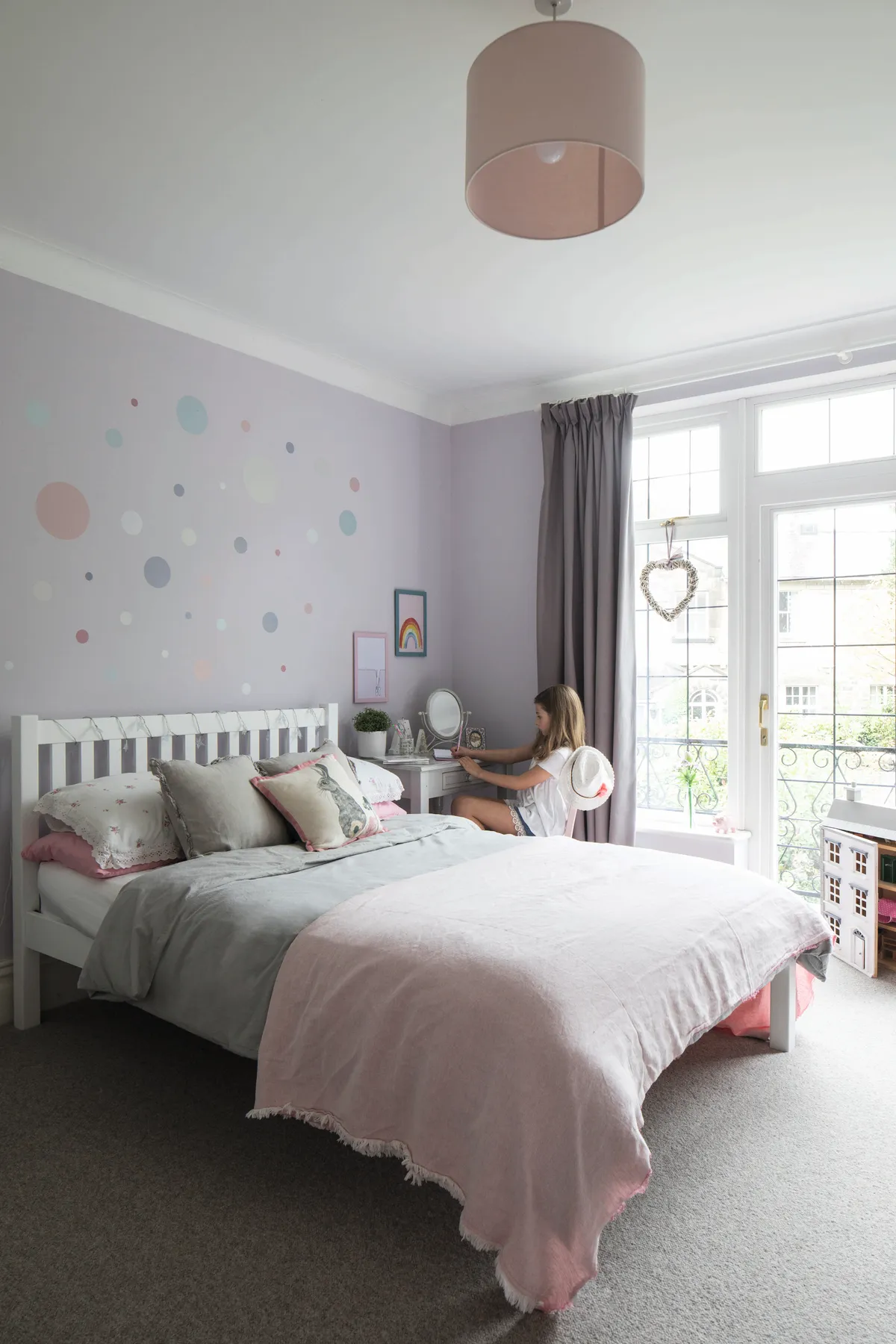
She isn’t quite finished with the redecoration yet, though. ‘We still have a bathroom to do, but I am really happy with the progress we’ve made so far. Despite my initial misgivings about living in a 1930s house, I’ve really enjoyed doing the interiors here. The open-plan space makes us feel much more connected as a family than in our previous home.’
This is a digital version of a feature that originally appeared in Your Home magazine. For more inspirational home ideas, why not subscribe today?
