Having never even painted a wall before, Becky and her partner, Ro, learnt the DIY skills to create their forever home. Here, Becky tells us how they did it...
My story
The moment I walked into this house I had ‘the feeling’. The décor wasn’t to our taste and we quickly realised that the house was being held together by wallpaper, but it had good bones and I loved it, so we went for it.
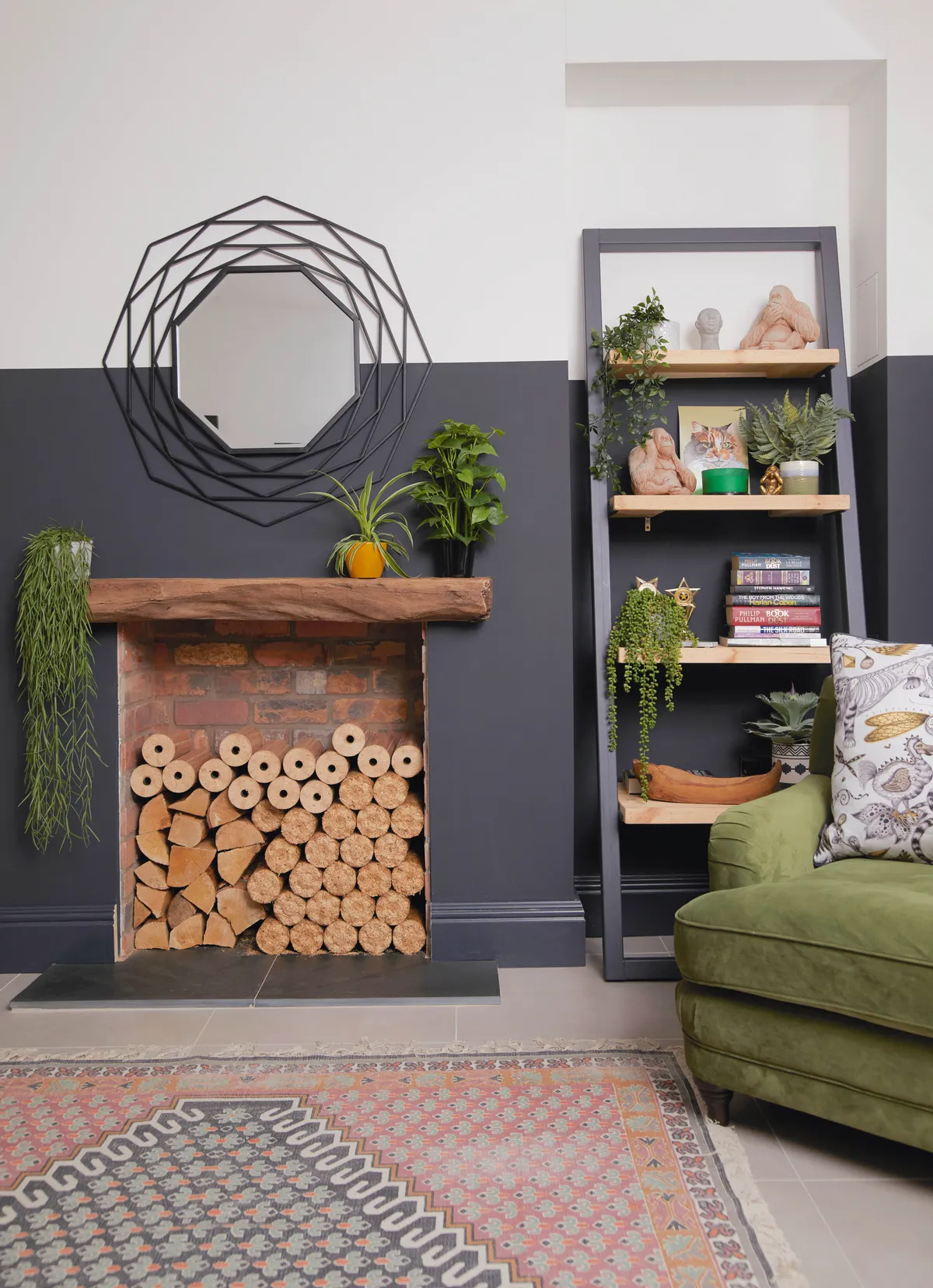
We had new windows installed straight away and then we redid the plumbing and the wiring and replastered throughout. We worked our way through the rooms, renovating each one until we got to the extension.
We wouldn’t have classed ourselves as DIYers before, but we had quotes to lay the herringbone floor in the bedroom and the labour was as much as the materials, so we thought we’d give it a go ourselves.
Welcome to my home
A bit about me I’m Becky Powley, a 28-year-old commercial estate surveyor. I share snaps of my home redecoration at @alittlevictorianrenovation. I live with my boyfriend, Ro, 30, who’s a lecturer, and our cat, Persia.
Where I live My home is a four-bedroom Victorian semi-detached house in Nottingham. We moved here in October 2018.

It was a slow job and we had to be really patient, but we watched online videos, and though it was hard, it went well and we thought, if we can lay a herringbone floor we can do anything!
We painted, decorated and tiled each room, and having done an Architecture degree, I even drew up the plans for the extension. We knew we wanted to extend even before we moved in, but the foundations weren’t as good as we thought so we had to do some underpinning.
This was our first project – and it was massive – but we’ve learnt so much, and created a beautiful home. I really believe, if we could do it, then anyone can!
A bit more about my home...
What I wanted to change The whole house needed renovating from the inside out, including plumbing, electrics, flooring, a new kitchen and bathroom… I could go on!
How I made it my own We decided to do the work ourselves as we knew it could be a forever home. We weren’t in a hurry, so we researched each project and then slowly tackled each room, asking for help when we needed it along the way. We also added an extension, which has given us more space.
My favourite part I love the extension. It has everything in it that we need, and we could actually just live in this part of the house if we needed to!

Snug
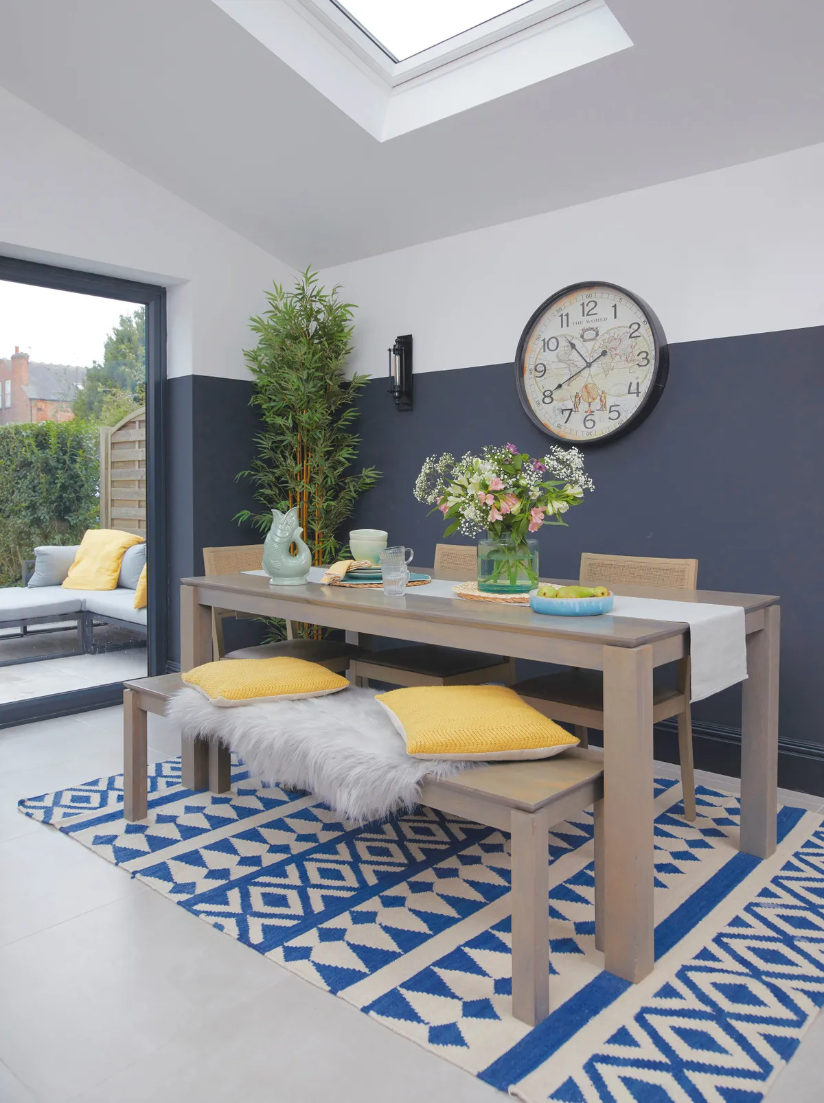
This was the original dining room and it only had a tiny window to let in light, and a side door to the back of the house. We knew we wanted a cosy, snug area in the extension and it made sense to put it at this end of the house where it gets the least sunlight.
I originally thought about wallpapering this wall, but Ro wasn’t keen, so he came up with the idea of the black stripe around the room.
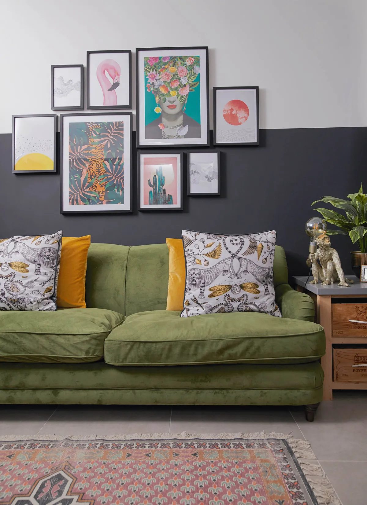
I was a bit nervous initially as it’s so bold, but it’s worked really well, especially as by levelling the line with white you don’t notice that the ceilings are at different heights. I love the way it allows the bright colours of the furniture and accessories to really stand out.
Living room
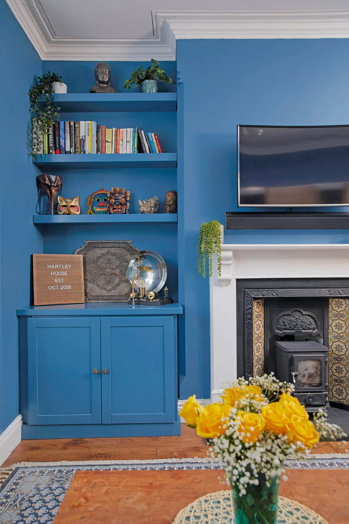
We were lucky that the previous owners allowed us to come and measure up while they were still living here, so we had new windows made and lined up to be installed just a few weeks after we moved in.

We laid the floor and did all the painting ourselves, choosing this lovely Braze Blue by Craig & Rose for the walls. When it comes to decorating, Ro does the larger areas and I’m the ‘edger’ as I’m a bit of a perfectionist.
Kitchen-diner
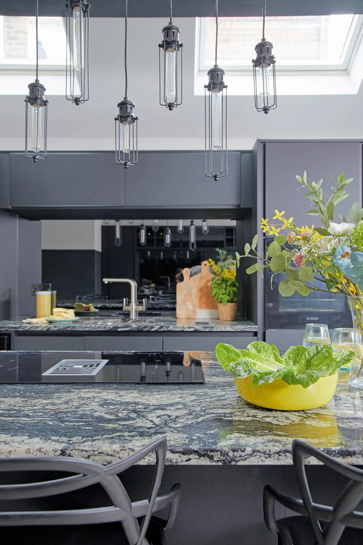
The original kitchen – which was very pink – was not to our taste at all. The kitchen design developed a lot as we lived in the space and as the project progressed. We liked the idea of keeping the steels exposed and a bit of the brickwork open. So, we decided to opt for something more modern and industrial, and this all-black, super-sleek option from Wren suits the space far better.
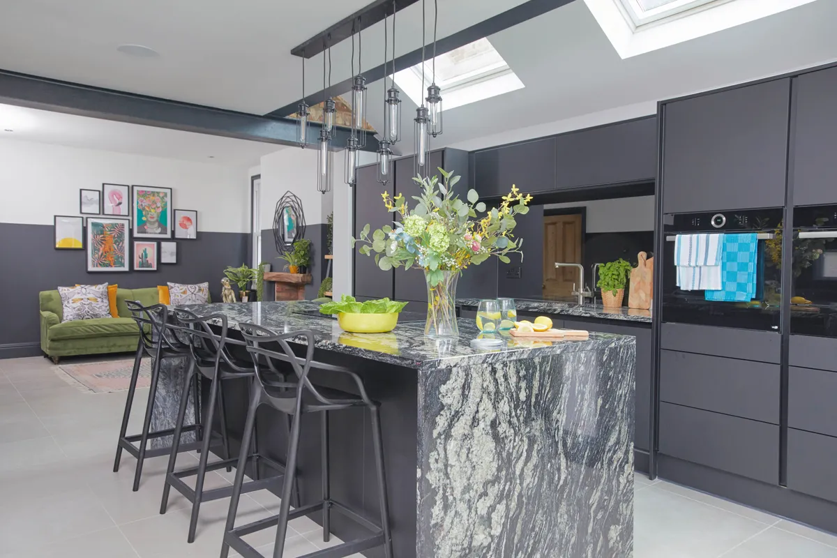
It worked in our favour that the house needed a lot of work, as it meant we got it for a lower price. This freed up extra money to do the extension work, including creating the dining area, and we found great builders who had a perfectionist approach to the job. It was important that we liked them as we had to practically live with them for six months!
We wanted to create a light, open space here with lots of glass at the back so that even on cold days we could sit and feel like we were virtually in the garden.
Master bedroom
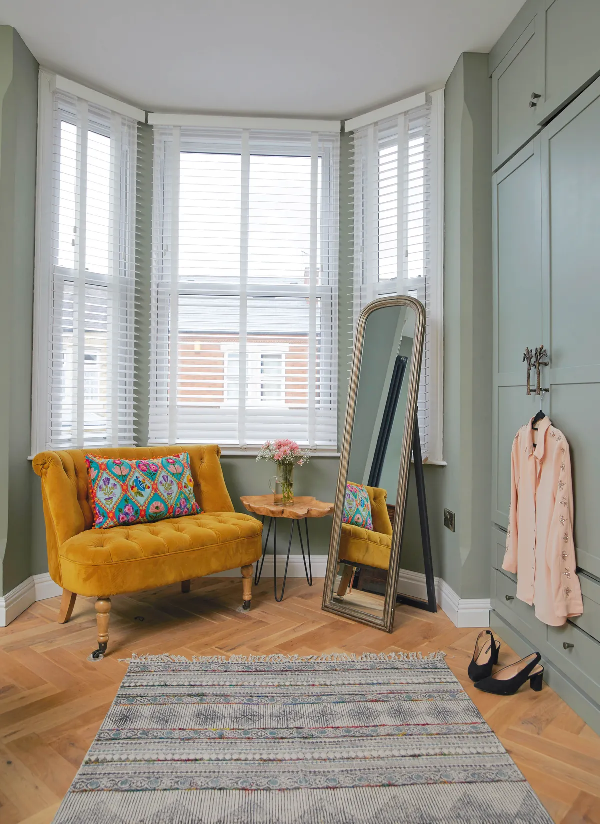
We decided to renovate this bedroom before anything else to give us a nice base to live in and somewhere to relax while we were doing the rest of the work. We stole some space from the middle bedroom to make an en suite and restored the fireplace so that we could install a Hobbit log burner.
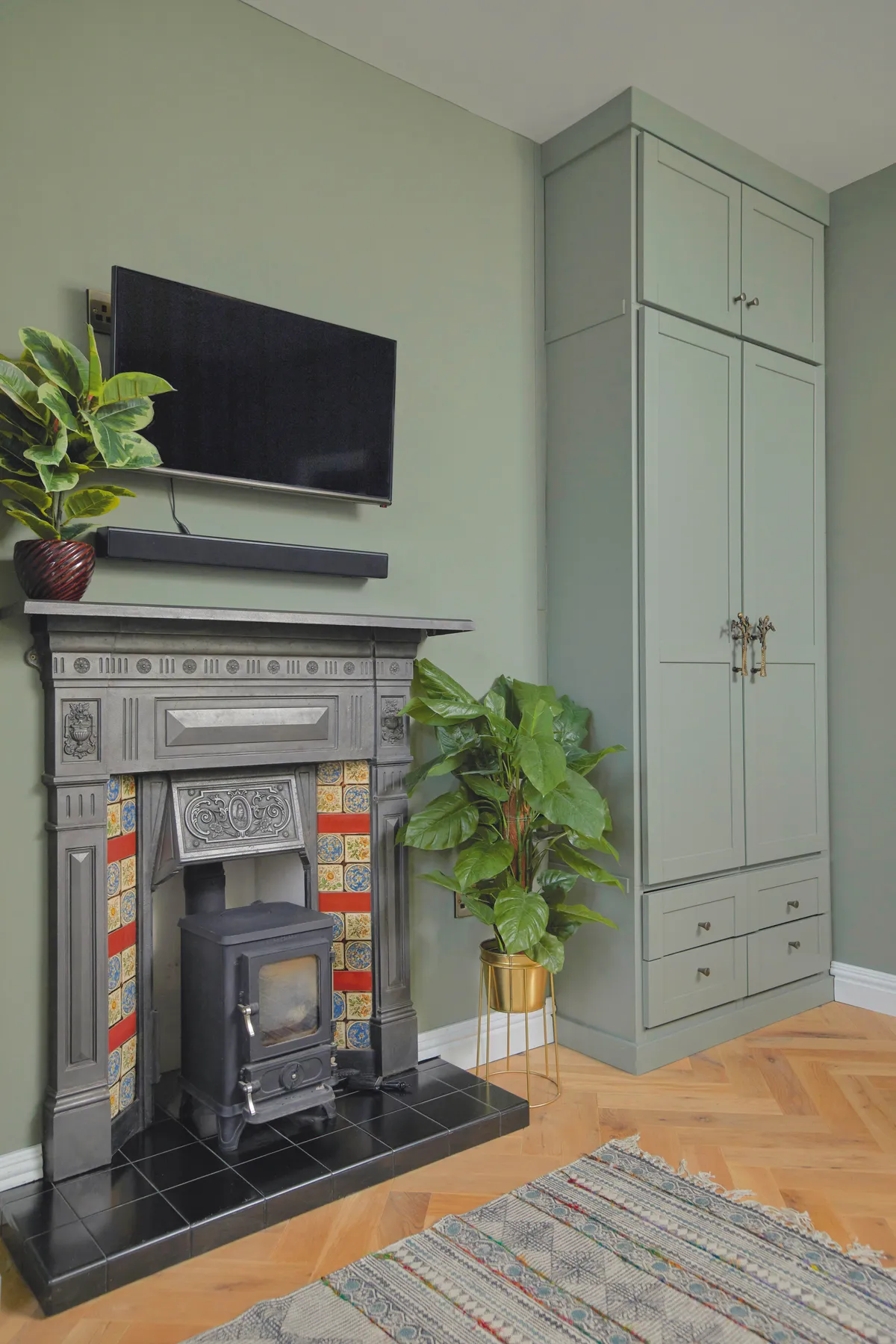
We had a TV wired in so we could use the space as a short-term living room and had floor-to-ceiling fitted wardrobes made. We decided to go full height with the wardrobes, as the top section is an often forgotten and unused but really useful space, and it’s perfect for storing spare duvets and blankets not needed every day.
Spare room
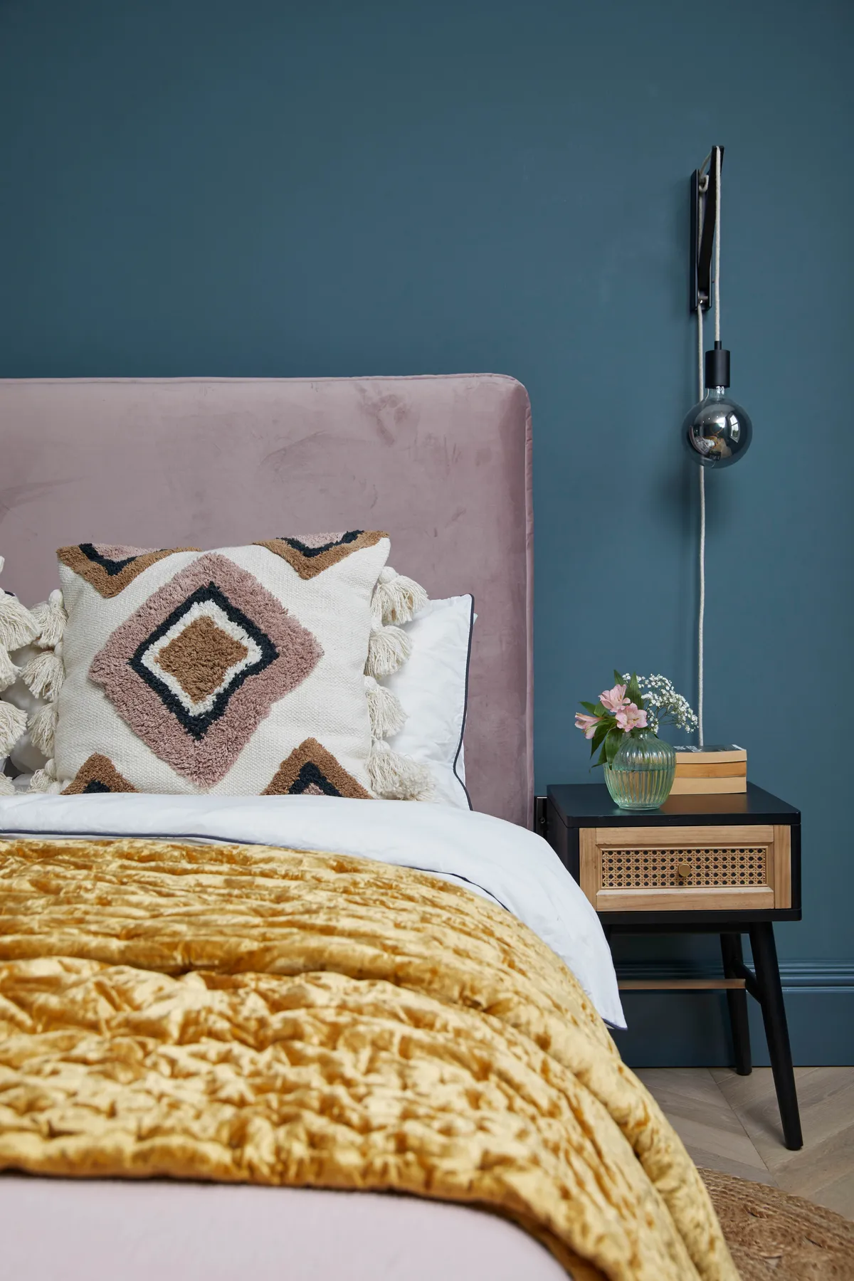
In the spare room, I wanted to create a calm, sophisticated feel that was also relaxing for me to work in. I love the blush pink bed from Danetti, and the pendant bedside lights, which help give the room a hotel-luxe feel, which is nice when guests come to stay.
Bathroom
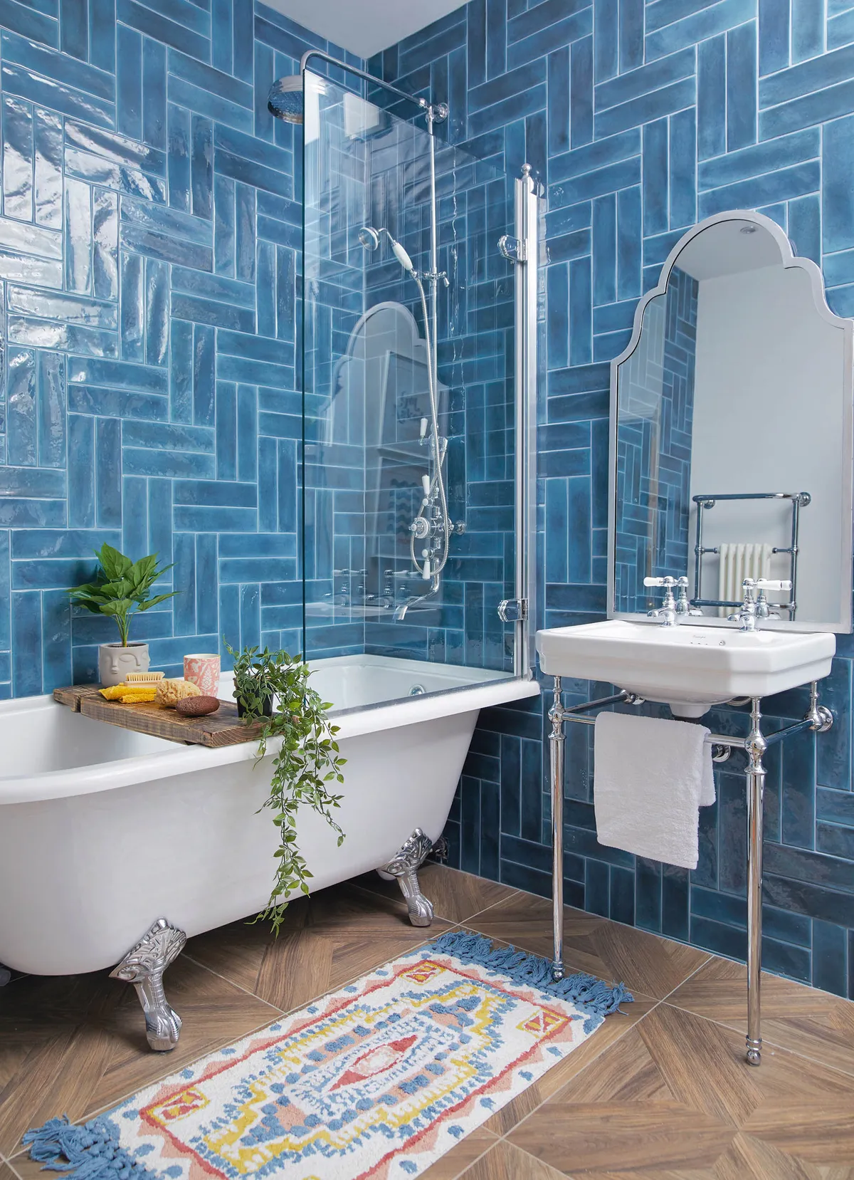
We thought about having a stand-alone bath and squeezing a shower into the bathroom, but since we’ve put a decent-sized shower in our en suite we decided it would be better to make it more spacious. The shower over the bath is from Burlington.
What I learned
That we are far more capable than we thought. This was our first project and it turned out to be massive, but by being patient and doing the research, we managed to finish everything we set out to do, and we did it well!
Get good brushes and you’ll never have to use masking tape again, which – though a popular solution for painting straight lines – often pulls off the paint so you end up having to do timeconsuming touch-ups.
Don’t be scared of colour. We’ve gone for a really bold colour scheme on all of the walls, but if it hadn’t worked out we could have just changed it. It’s only paint after all.
This is a digital version of a feature that originally appeared in Home Style magazine. For more inspirational home ideas, why not subscribe today?

