Why buy new if you can make it or do it yourself, says Keelie Hayler, who’s turned a dark, drab house into a light-filled haven.
Here, she tells us all about her home makeover story...
My home makeover...
When we were looking to buy our first home together, the main thing we wanted was a large kitchen-diner. We’d already had the luxury of an open-plan space in our rented flat and really liked how it worked as a sociable way of living.
So, finding this place was a win as the downstairs area is huge, and there’s a lovely big garden. Also, having three bedrooms meant we have a spare room for friends to stay over, and there was space for my longed-for dressing room.
We didn’t want a huge project, as we wanted to concentrate on the decorating side of things. As soon as we moved in, we painted the whole of the downstairs white.
We’ve decorated before, but the walls here were in bad condition and needed filling and scrubbing, and it took four coats of paint to completely cover the dark grey that the previous owners had used.
Welcome to my home...
A bit about me I’m Keelie Hayler, a science teacher, and I live with my boyfriend, Sean Mounfield, a web designer. I’ve recorded our renovation journey on Instagram, @keelieslife.
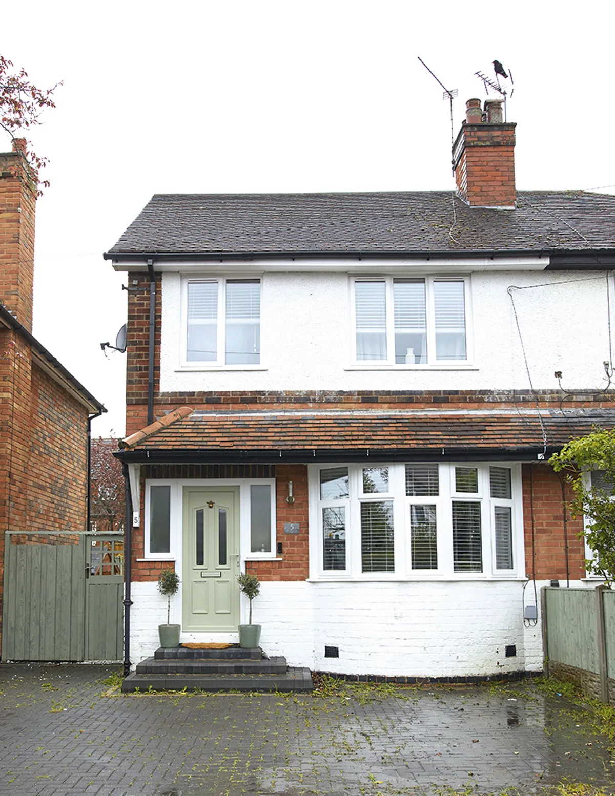
Where I live My home is a three-bedroom 1930s semi in Nottingham and we moved here in August 2019.
What I wanted to change The inside of the house was a dark grey box. The walls were dark grey, the carpets were dark grey, and to be honest, the whole house really needed some light and love put into it.

We didn’t have much spare money left over after we had bought the house, so we did small jobs each month after we had been paid. The biggest change was painting the kitchen cabinets, but even that was just the cost of the paint and new handles.
I’m really pleased with how the place looks now; it’s a real reflection of our taste. Since we’ve painted everywhere white, we have the perfect foundation to add to if we ever want an easy update.
A bit more about my home...
How I made it my own I painted most of the rooms white so I could start with a completely blank base and gradually added colour. I finished each room with accessories that suit the muted, relaxed vibe that both Sean and I prefer.
My favourite part I love the kitchen now it’s finished; it looks like a completely different space. I also love my dressing room and I’m still so happy every time I walk into it. It’s a real luxury to have it.
Kitchen
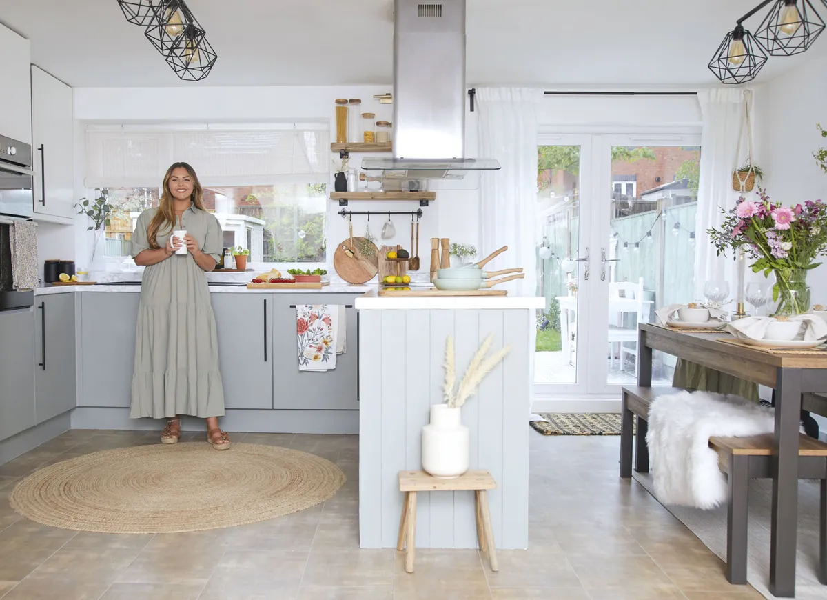
‘There was nothing wrong with the kitchen, though we didn’t like the original cream glossy cabinets and dark wooden countertops. We didn’t have the budget to spend on a new kitchen, so I decided to do a revamp instead. I took the handles off, sanded and primed the cabinets, and then painted them in Farrow & Ball’s Wimborne White and Pigeon estate emulsion, which is great for kitchen cabinets as it’s wipeable.
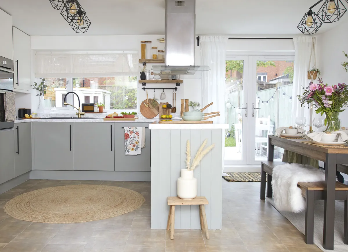
‘I did the painting in batches during the evenings and weekends, and then swapped out the original chunky silver handles for these slimline black ones to complement our accessories, as we already had a black kettle and toaster, and we had installed the black light fittings, from Amazon, when we first moved in.
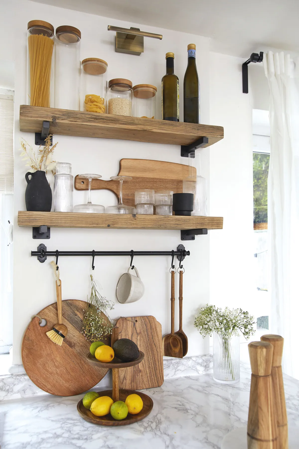
‘I then wrapped the worktops in marble vinyl. Although the entire makeover only cost about £150, it’s completely transformed the space and actually feels like a whole new kitchen.’
Dining area
‘My parents bought us the table and bench from Marks & Spencer as a moving in gift, and the double doors that lead out to the garden make this the perfect spot for dining. I wanted to add more wooden elements to complement the rustic industrial vibe of the table, so we made the scaffold board shelf ourselves.

‘I chose wooden kitchen accessories, as even simple pieces like chopping boards, the salt and pepper shakers and the wooden pan handles, add to the look. We’ve never liked the vinyl floor so ultimately I’d like to lay wooden boards throughout. It’s a big, expensive job that has to wait until we save up for it, so for now I cover as much as I can with rugs.’
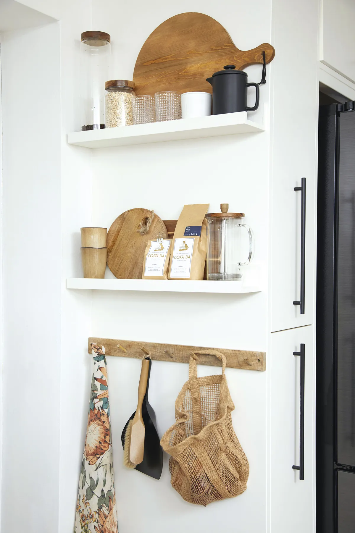
Living room
‘This is a big room with very little natural light, so the grey walls made it feel dark and gloomy. Also, one wall had geometric pink and grey wallpaper on it, which we really didn’t like. So, we stripped back the paper, painted the whole space in white emulsion, which saved a fortune, and then I put this large mirror on the wall to bounce some light around. The change was instant, and the room was immediately so much brighter and more welcoming.
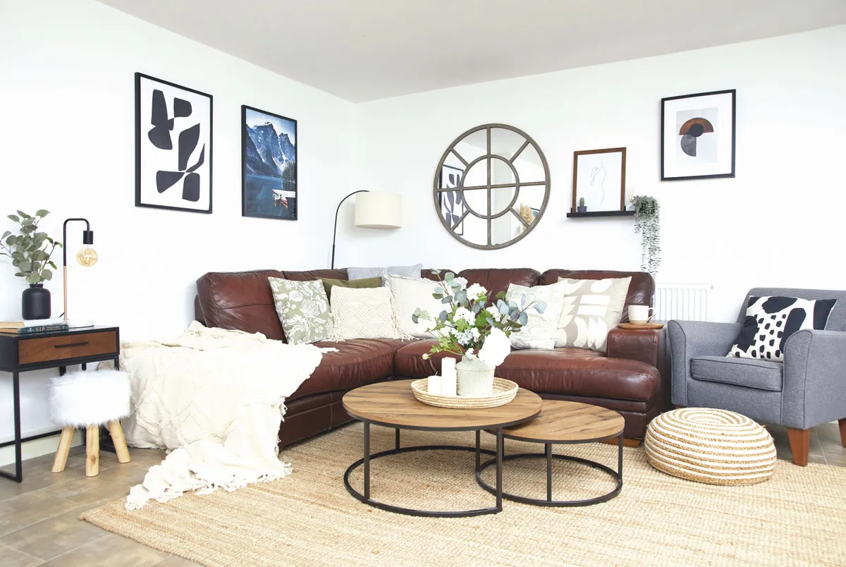
‘We knew this large space, incorporating the kitchen and diner, would become our most-used living area, so I wanted our main sofa and TV in here rather than in the front room. The corner presented a natural space for this L-shaped sofa from DFS, which my parents gave us.’
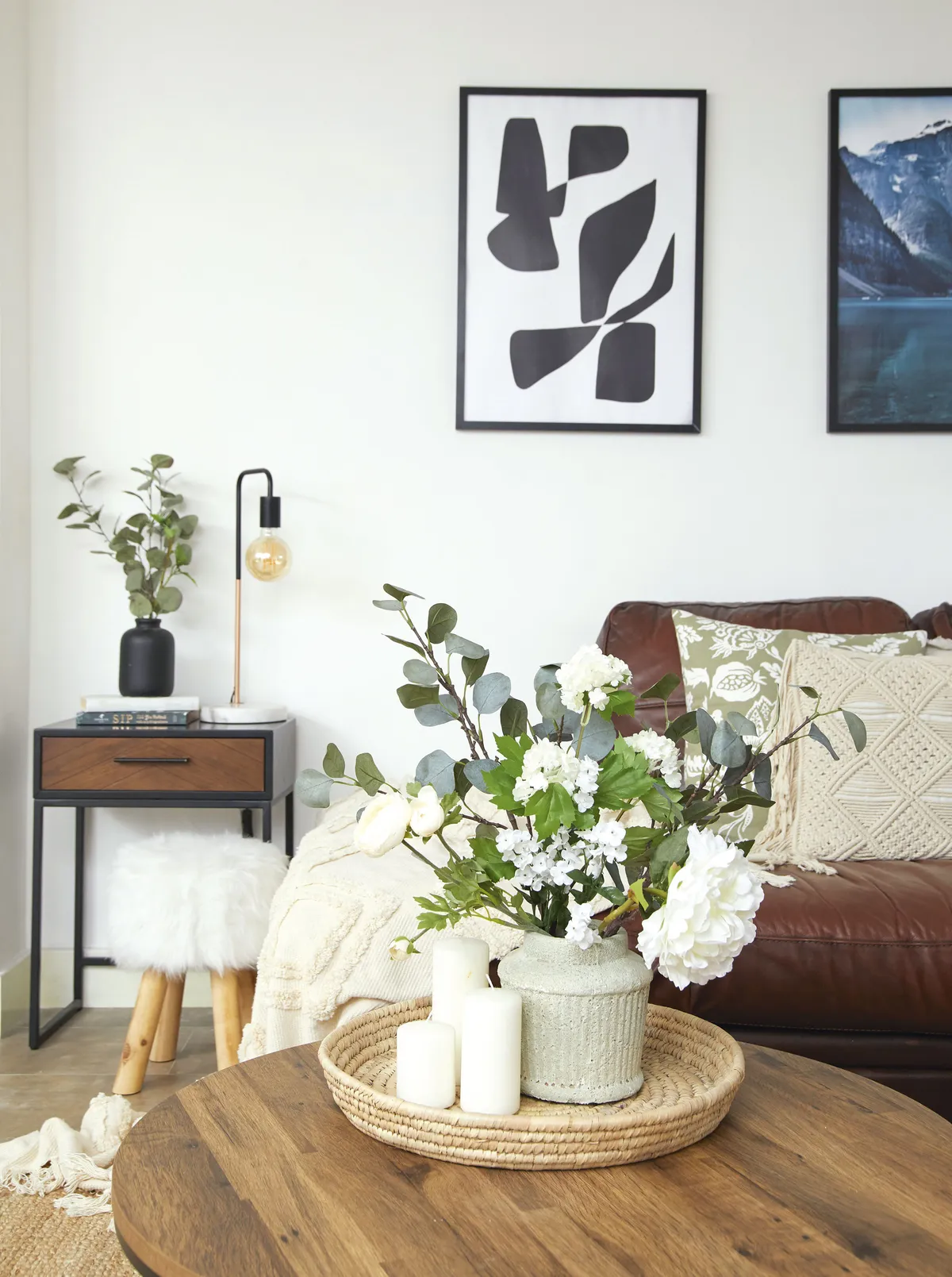
Living room/office
‘When we viewed the house, this room was being used as a teenager’s bedroom, and it had a carpet that was stained and covered in cat hair, which Sean is allergic to. So, we ripped that up and immediately uncovered holes in the floor and damp patches that we weren’t expecting, which had to be fixed.
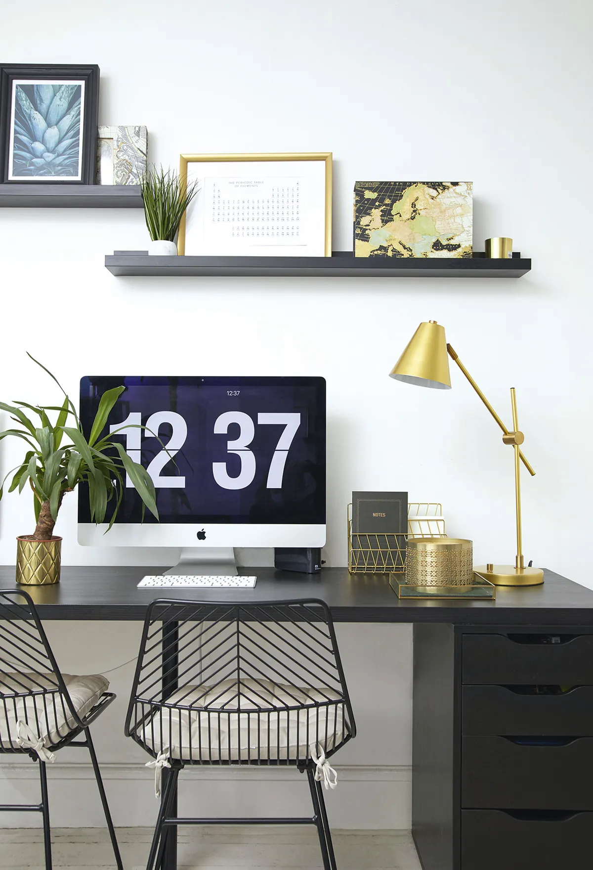
‘We painted the room in Pure Brilliant White by Dulux; this is the white we’ve used throughout the house as it’s inexpensive and gives an easy refresh.
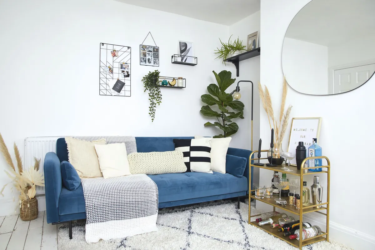
‘We knew this needed to be a hard-working room as it had to double as an office and extra guest room, as well as being a living room. I still wanted it to look good, so we bought this luxurious blue velvet sofa bed from MADE.com, and I chose gold and brass accessories to add a bit of extra luxe to the room.’
Master bedroom
‘Although originally painted a lilac colour, this room needed the least work as it was a fairly new addition, so instead of rushing to decorate it, we did the rest of the house first. Although Sean trusts my style ideas, we do talk through colours and Sean will rule some out.
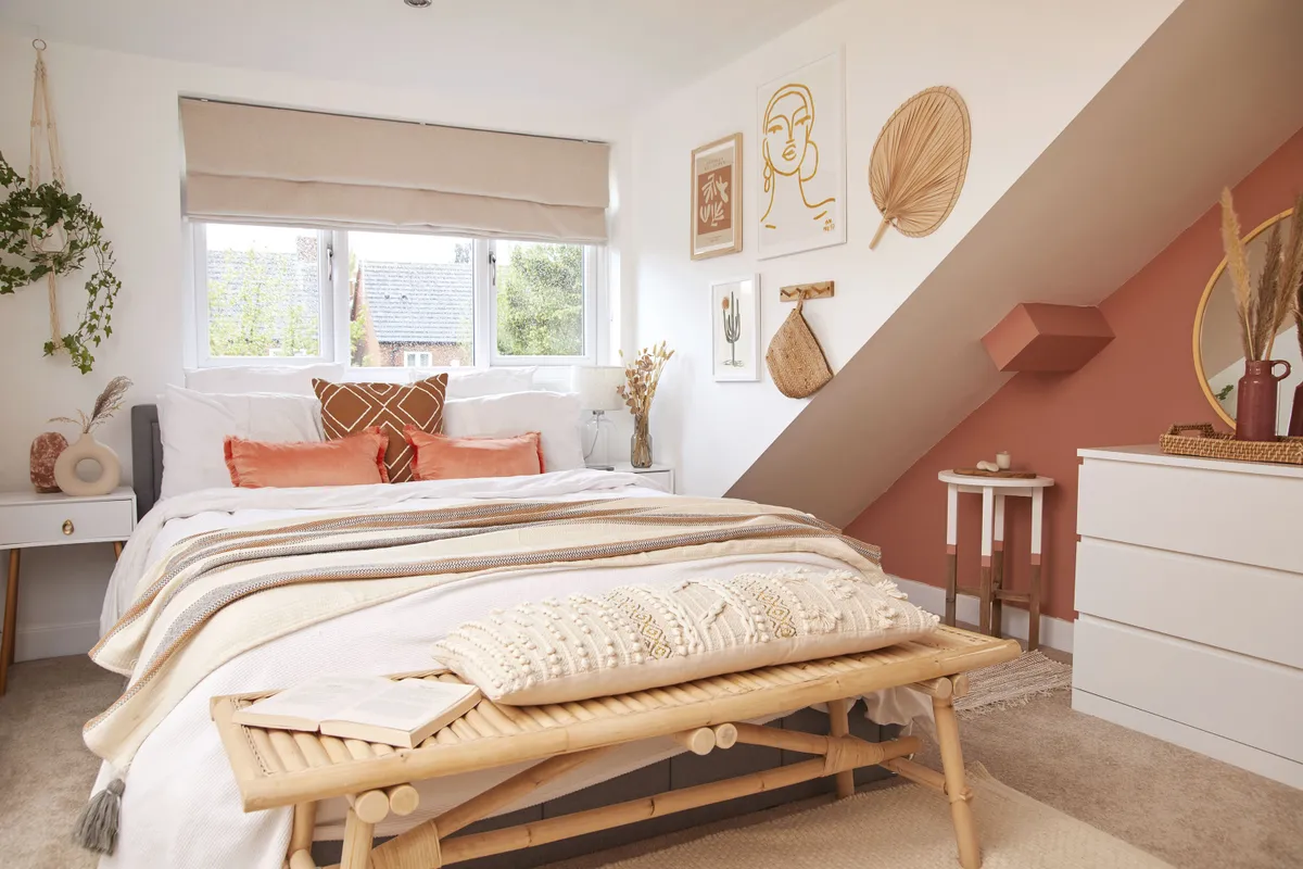
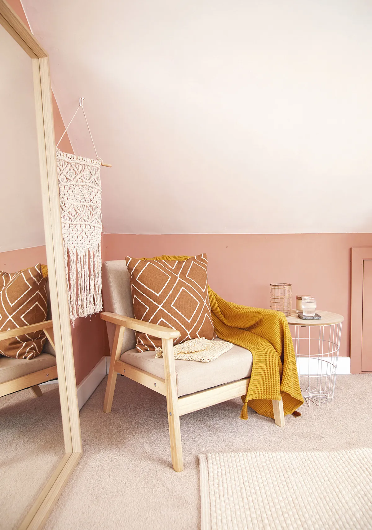
‘Although we both like muted tones, I generally put together a moodboard for Sean on Pinterest so he can visualise my designs. We wanted this room to feel warm, bright and cosy, and wanted a colour that had a nod to a freshly plastered wall, without being too pink, so we chose Copper Blush by Dulux. After painting everything white again, like the rest of the rooms, it was fairly easy to follow the flow of the room with the colour, as it’s all angles and not just a box room, which adds character.’
Bathroom
‘The original bathroom had slate grey flooring and beige wall tiles, which I covered with white tile paint. We had to use four coats of paint and a sealer, but it’s still holding up 18 months later. I also stencilled the floor, using a Dizzy Duck Designs stencil, which was a bit tricky as I had to finish it by hand, but it only took a couple of hours and looks amazing.
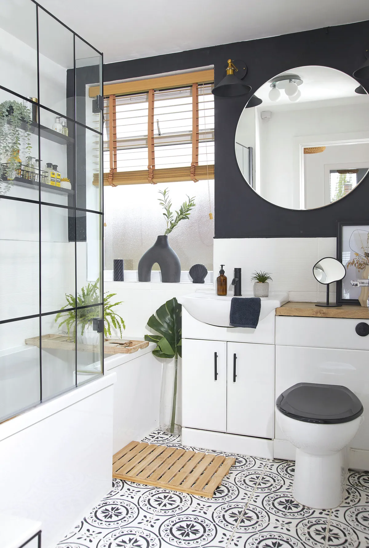
‘The back wall was originally white, but as I wanted a monochrome room I painted it black. The room doesn’t feel dark at all, though the extra-large mirror, from Dunelm, does help brighten it.’
Dressing room
‘I have a lot of clothes, so although it’s a bit of a luxury, I really wanted a dedicated dressing room to store all my dresses and accessories properly. It also makes life easier for Sean as he doesn’t have to share wardrobe space with me, and I have somewhere to get ready for work each morning. We stripped off the Eiffel Tower wallpaper and freshened the room with white walls.
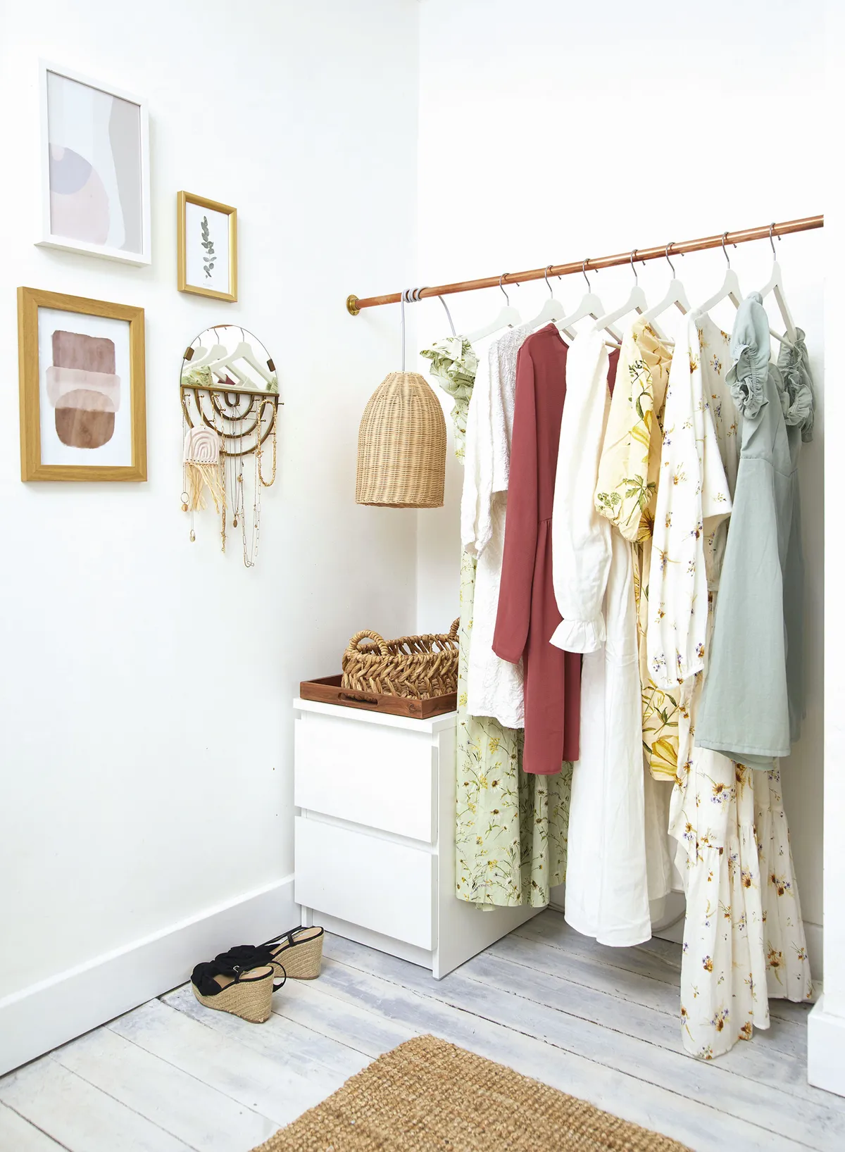
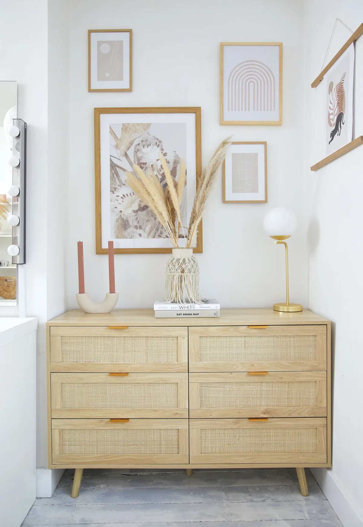
‘I wanted an exposed rail to hang some key pieces on, so we used some spare copper pipe and attached it to brackets. I wanted to bring in a boho theme, so I attached the rattan lampshade to a bulb and cable and wrapped it around the rail. Upcycling with rattan is really popular now and it’s hard to get hold of, so I was chuffed when I found this ready-made rattan cabinet on eBay.’
Feature and styling Lisa Moses. Photos Katie Jane Watson.
This is a digital version of a feature that originally appeared in HomeStyle magazine. For more inspirational home ideas, why not subscribe today?
