After five years in our two-bed new-build, we were desperate for more space.
Three-bedroom properties are scarce around here so there wasn’t much choice. Also, with running my own business, @perfectly.lovely.interiors, and looking after our son Jack, I didn’t have the time to take on a big, complex project.
This house was originally over our budget, but the owners wanted a quick sale, and we managed to negotiate a great deal. I loved the garden and spacious rooms, especially the kitchen-diner. I knew I could transform the jaded interior, but I definitely underestimated how much work there would be.
There were marks on the walls, a scruffy bathroom, and stained, grubby carpets everywhere. I spent the first night here thinking, ‘What have we done?’
Thankfully, I came well-prepared. I’d created moodboards, designed the look for each room, worked out our budget and had chosen things like paint colours, tiles and carpets. I even had the kitchen fitter here on day one, measuring up for the new cabinet doors!

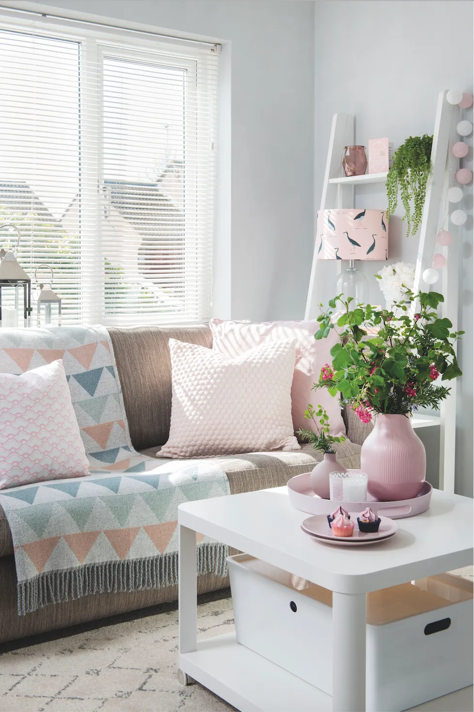
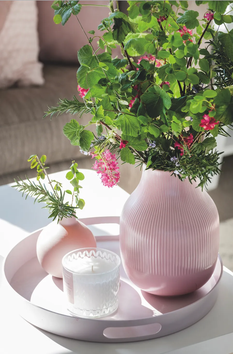
In terms of décor, I love a simple, Scandi style, with crisp geometric patterns. Colour-wise, I started with silver greys and whites. Pale pinks have gradually crept in, which I’m really happy with as they add warmth to the place. I’ve maximised light everywhere and layered up with lots of accessories for softness and interest.
The biggest challenges have been budgeting and finding time to do everything, especially since having our daughter, Tilly. This house probably isn’t forever, but for now, we’ve made it a fabulous family home.
Owner profile
A bit about me I’m Jen Jukes and I live here with my husband, Ian, our son Jack, five, daughter Tilly, one, and cocker spaniel, Charlie.
Where I live Our home is a three-bedroom detached house built in the early 2000s, in Williton, Somerset. We’ve lived here since March 2017.
What I wanted to change The whole house was drab, dated and felt disjointed. There were scuffed walls, dirty carpets and a very tired and tatty bathroom.
How I made it my own I’ve renovated the bathroom and kitchen, so they feel sleek and modern. I redecorated everywhere in calming greys, whites and pinks, so there’s consistency.
My favourite part The dining area is a big success. It’s so bright and works brilliantly for us as a family, or when we have friends here.

Sitting room

Jen wanted the sitting room to be a family-friendly space but also somewhere for adults to relax. ‘Ian and I love to chill here in the evenings, or entertain our friends,’ she says. ‘With candles and the fire on, it’s really cosy.’ When they first moved in, the main problem, apart from the magnolia walls and threadbare carpet, was the room’s lack of character.
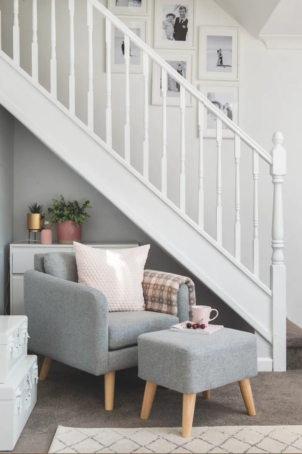
Ian built a simple wooden surround for a pretty, white electric stove, and Jen hung a round statement mirror above, creating a clear focal point for the room. A big, off-white rug boosts the light and breaks up the dark carpet. ‘We had to replace most of the carpets in the house,’ says Jen. ‘It was a big expense, but I got a great deal from a local fitter by choosing the same one for the sitting room, stairs and bedrooms.’
Steal Jen's style
Pair pink with grey for pared-back, playful style
Kitchen-diner
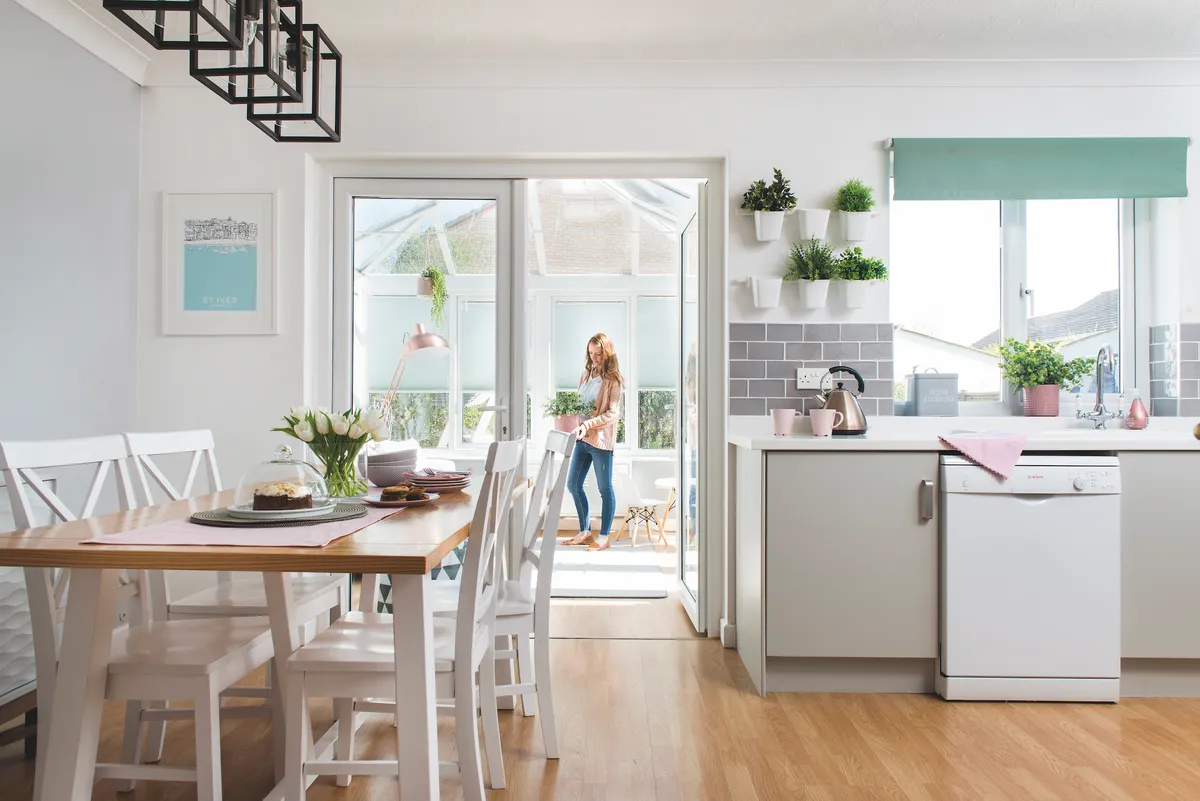
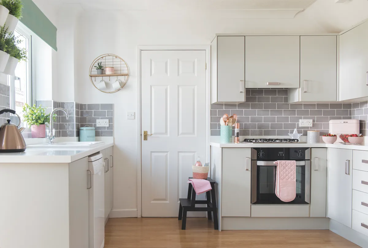
‘A sociable kitchen-diner was top of my list, so this room really sold the house to me,’ says Jen. ‘The existing kitchen had old-fashioned cream cupboards and a breakfast bar sticking out from the wall, cutting the room in two.
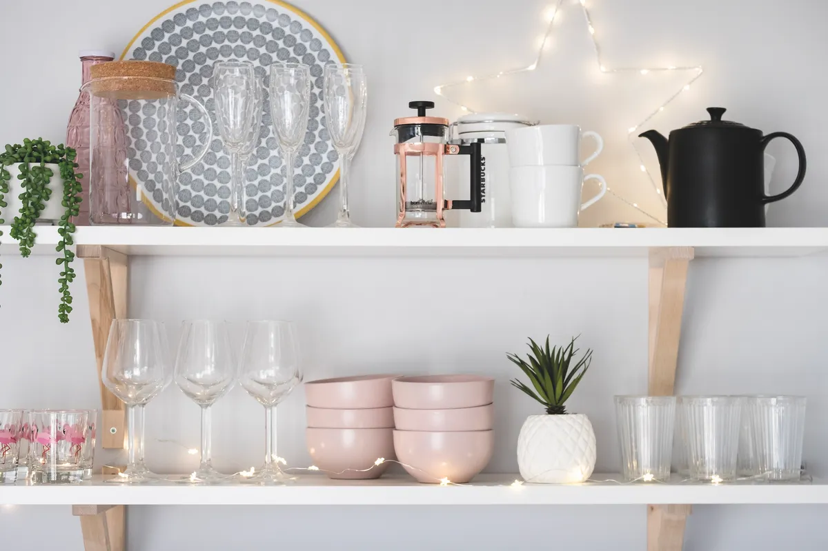
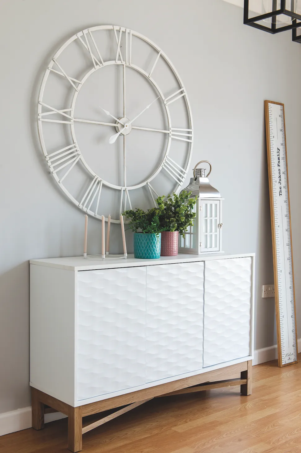
Once that was gone, we had a place for the dining table, and everything flowed much more easily. I couldn’t afford to pull the kitchen units out completely, and there was still some life in them, so I left the framework and just replaced the cabinet doors, drawer fronts and worktops. I kept the laminate floor too. It’s a bit scratched and probably not my ideal choice, but it would be a big upheaval to change it. I always try to think about where it’s worth spending money.’
Conservatory
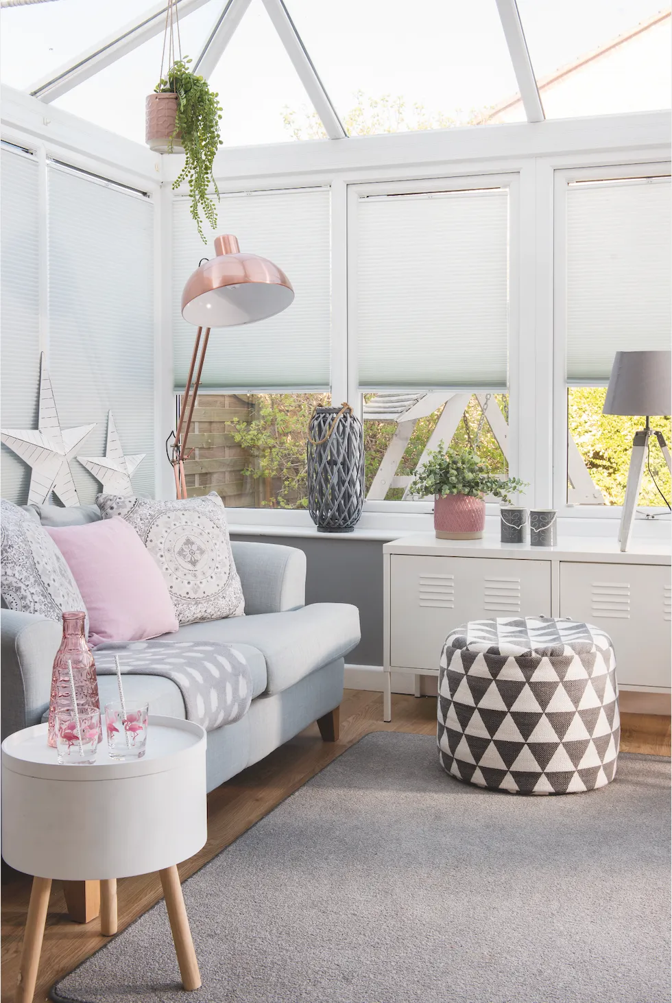
‘This room was a real bonus and we spend a lot of time in here,’ says Jen. ‘It’s ideal as a playroom for the children as it’s really bright, close to the kitchen, but a bit separate from the rest of the house. I haven’t had to do much to it, apart from painting the hideous deep-pink walls, which are now grey.
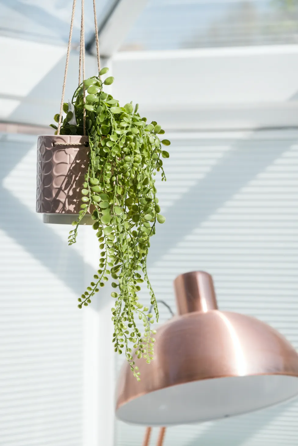
The blinds and flooring were already here and I’ve put down a really inexpensive rug, which I know will soon get battered, but is easy to replace. There’s no heating in here, which makes it too cold to use in the winter, so if I was doing it again and had the money, I’d put in underfloor heating.’
Main bedroom
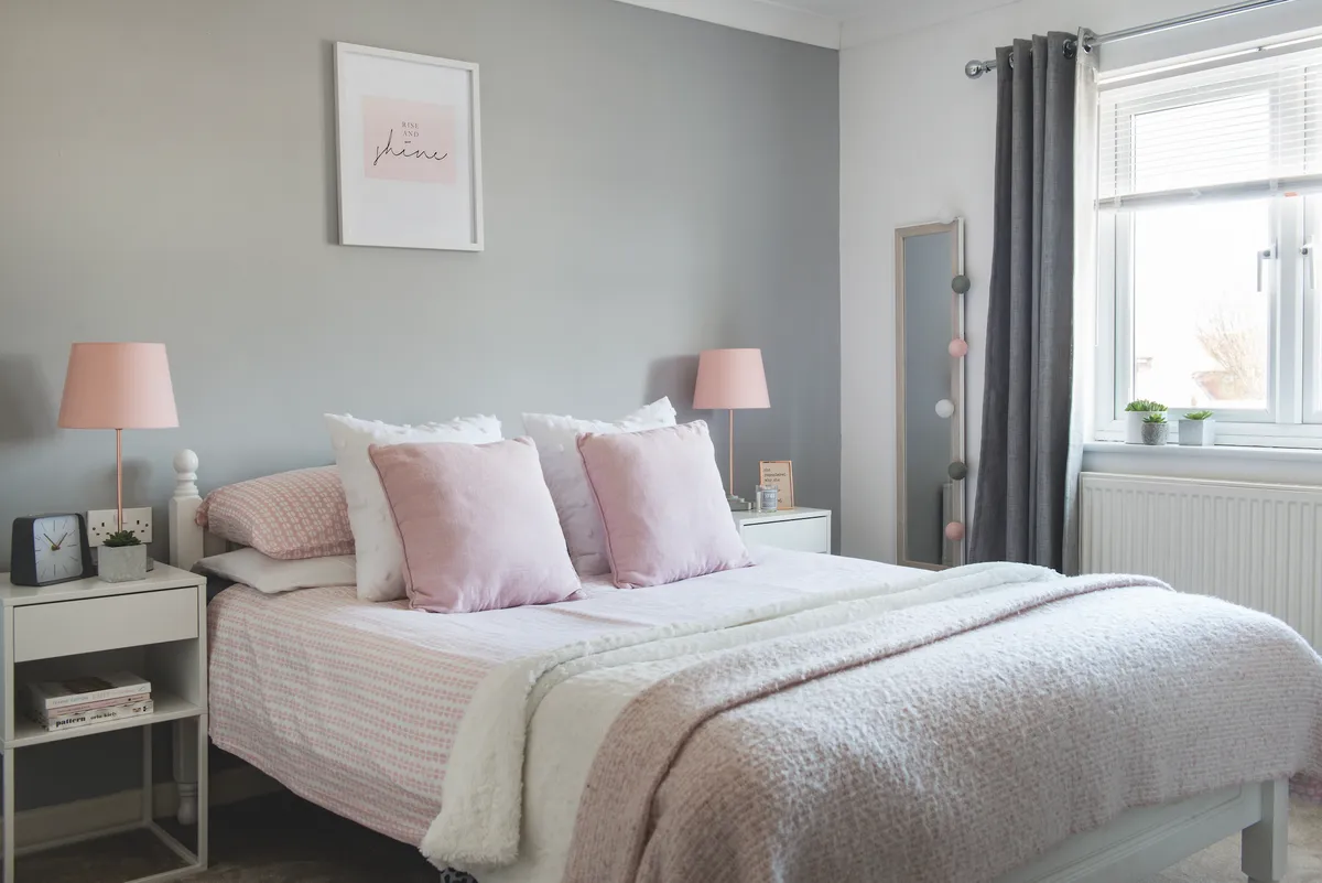
‘Keeping to a limited colour palette creates flow and a sense of calm which was important, especially for the bedroom,’ says Jen. ‘Grey and white is my go-to combination and I tried lots of different greys. I settled on Laura Ashley’s Soft Silver, which I’ve used in most rooms here, and had in my old house too. It’s warm, not too bluish and has a nice matt look.'
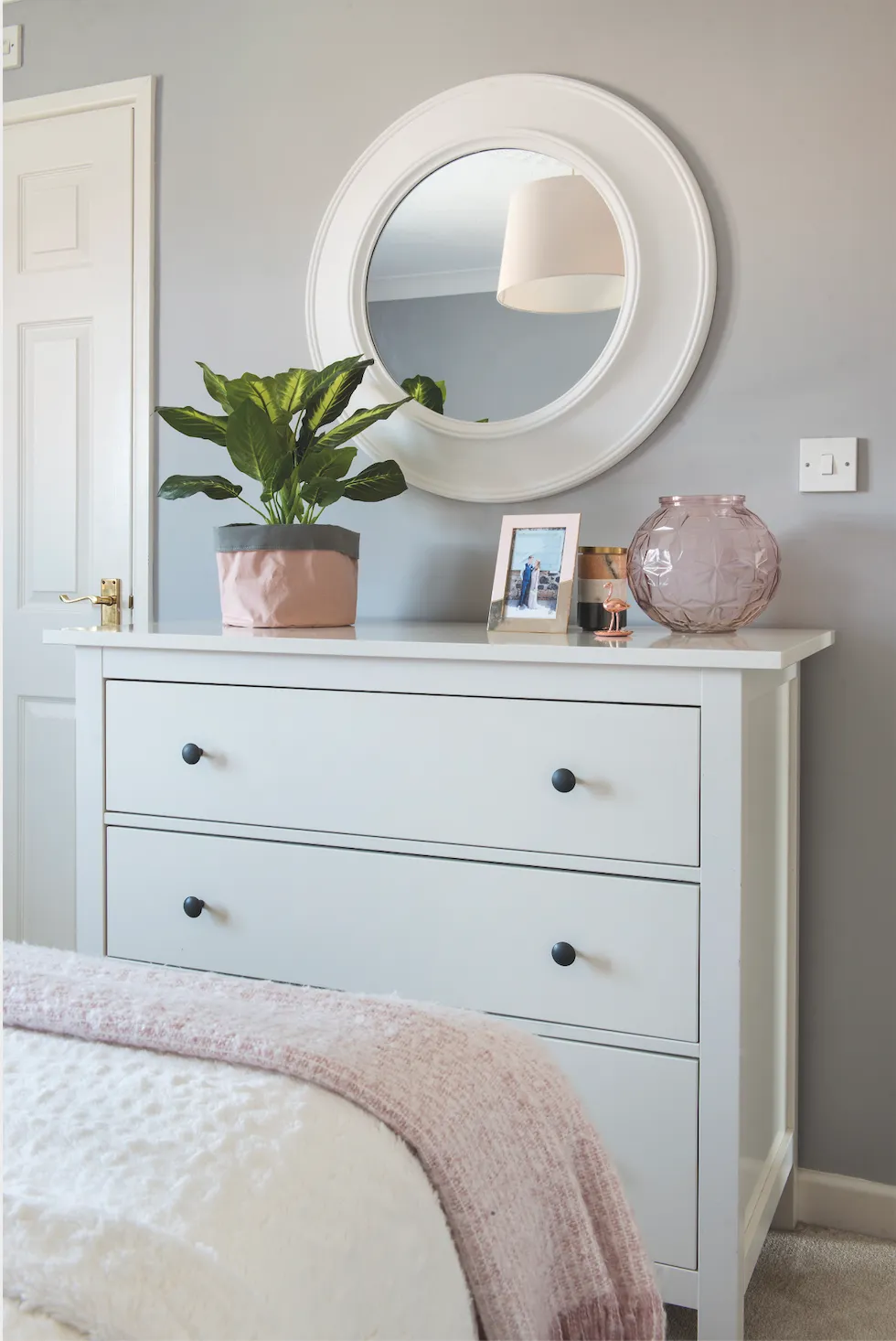
'I could have gone for something cheaper, but I think it’s worth investing in a good-quality paint that gives a really clean finish. We brought the bed from our previous home, but as I’m getting more into pared-back Scandi style, I swapped the decorative, French-style bedside tables I had for a more linear design.’
Jen's top tips
There was already a perfectly usable dishwasher in the kitchen when we moved in, so we hung onto it. However, in hindsight, I wish I’d thought a bit more about keeping it. Although it would have cost more, a new, integrated dishwasher would have looked smarter and made a difference to the kitchen.
I’d rather have a few main pieces than lots of small bits, and I don’t hold onto items that I no longer need or love. I often sell stuff on Facebook; it helps keep things fresh.
Renovating the bathroom was more disruptive than I’d expected. We haven’t touched our tiny en suite bathroom yet, but I might just leave it completely as I don’t want to ruin my bedroom!
Tilly's bedroom

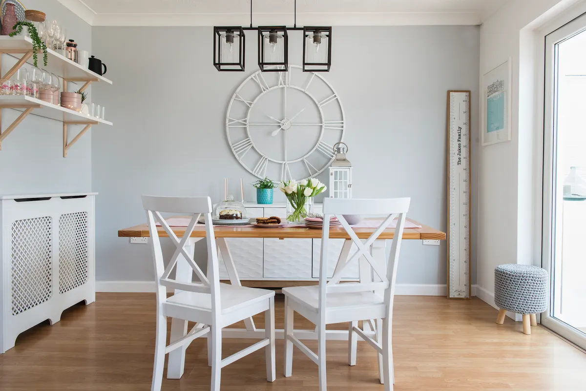
‘Tilly’s room isn’t the easiest space,’ says Jen. ‘It can be a bit dark, and the ceiling slopes. Usefully though, it doubles up as a guest room as there’s a sofabed at one end. I recently redecorated it for Tilly, using greys, whites and a bigger statement of pale pink, so now it looks softer and prettier.
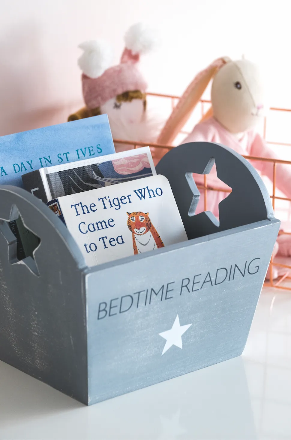
There was wallpaper in here before, and we had a lot of sanding to do once it was off to get a smooth surface for painting. The white furniture and silver touches maximise the light. The big chest of drawers, from IKEA, came with black handles originally, but I’ve changed them for sparkly crystal ones, which makes it feel less bulky and a bit more girly.’
Jack's bedroom
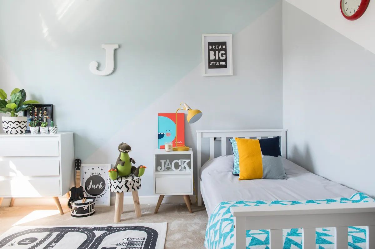
Jen continued the grey and white theme in Jack’s room, but was soon checking Pinterest for ways to add a more lively, fun vibe. ‘I wanted something quick, easy and effective. The idea of using paint to add colour and interest to the walls was perfect and it doesn’t dominate the room,’ she says. ‘I just masked off the lines by eye, and Jack helped choose the turquoise colour and did some of the painting too.’ It looks a bit like mountains and he’s really happy with it. The grey and white are still there, so the room feels lovely and light, and links in with the rest of the house.”
Bathroom
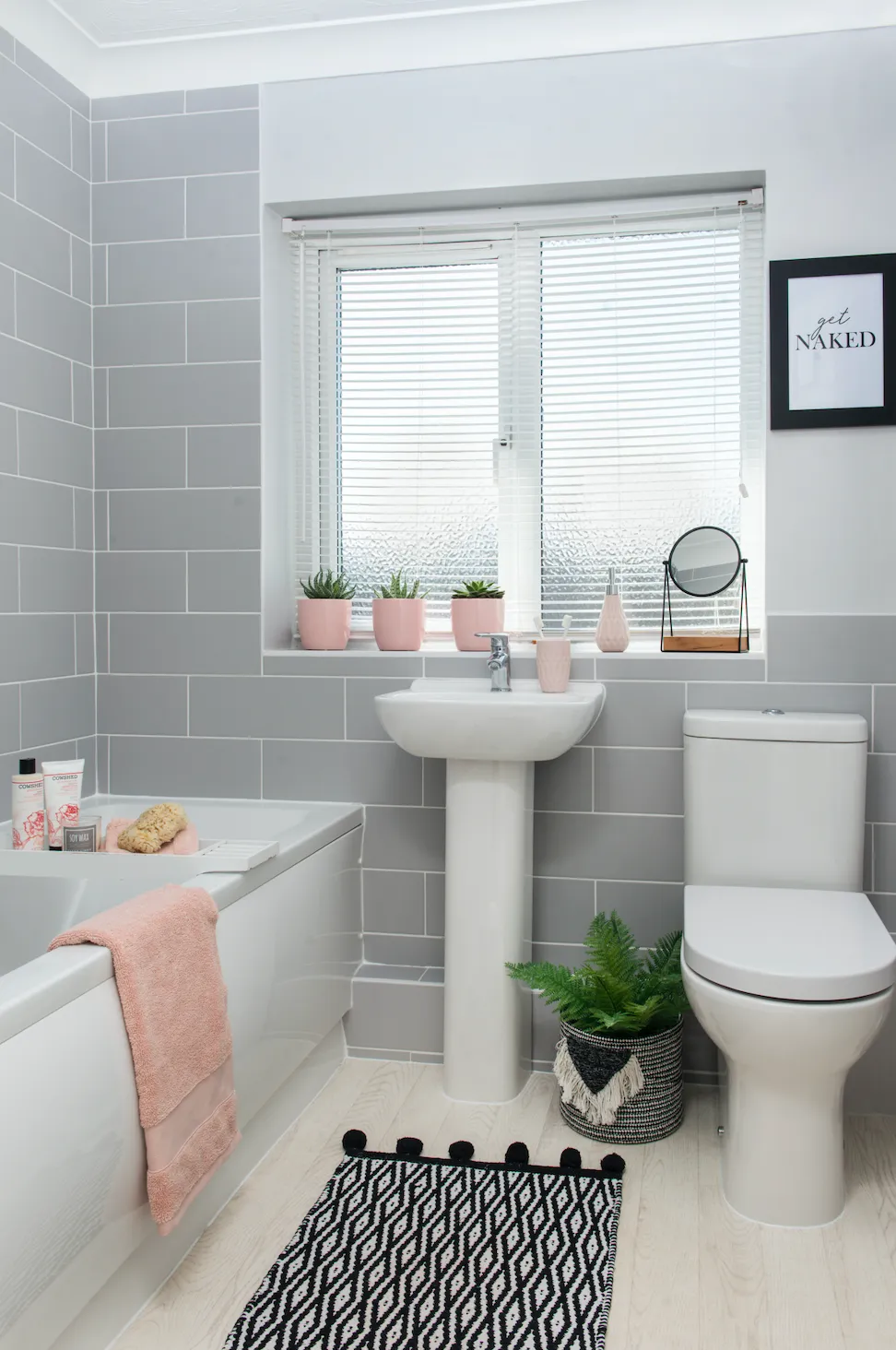
‘I had to rip up the bathroom carpet the day we moved in as it was in such a poor state,’ says Jen. ‘We put down cheap lino as a stopgap until we had the budget to refit the whole bathroom last year. It was really hard living here while the renovation was being done. It took just over a week, and there was so much dust and mess. Getting the old sanitaryware pulled out and taken down the stairs was really tricky and the walls had to be replastered after all the broken, blue tiling had come off. In the end, I went for a luxurious, hotel spa feeling, with rectangular grey tiles and an understated white suite from Wickes. The flooring is a pale, wood-effect lino, which adds light and helps the space feel bigger.’
Expert advice
Buying carpets
- Jen recarpeted all of the rooms, apart from the kitchen, conservatory and bathroom. Here are some guidelines for getting the right product for your home: Choose from 100 per cent wool, wool mixes or synthetics, depending on where the carpet will be fitted in your home. Wool is warm and luxurious underfoot, but wool-nylon mixes and man-made fibres like polyester are more durable. Polypropylene is the most stain-resistant option, so it’s ideal for children’s bedrooms, high-traffic hallways and any dining areas.
- The look and texture of your carpet depends on pile length and structure, as well as fibre type. The most popular is Twist Pile, a practical, multi-purpose option. Saxony carpet has a long, soft pile, giving a luxury look, while Berber has a more knobbly texture and velvet is smooth, dense and plush.
- Carpet can be either woven or tufted. Woven carpet is a premium product. It comes in both plain and patterned forms and can cost around £80-£100 per square metre. Most carpets in the UK are tufted, meaning the yarn is fixed into a fabric backing. A wool mix or good-quality synthetic tufted carpet should cost from £20-£40 per square metre. Don’t forget to budget for new underlay, grippers and a trained fitter as well. Some firms will lift and dispose of existing carpet too, but do check as there may be an extra charge for this service.
This is a digital version of a feature that originally appeared in HomeStyle magazine. For more inspirational home ideas, why not subscribe today?


