With a passion for a bargain, Sarah is constantly switching up her style by upcycling second-hand pieces and making use of charity shop finds. Here, she tells us how she transformed her home...
My story...
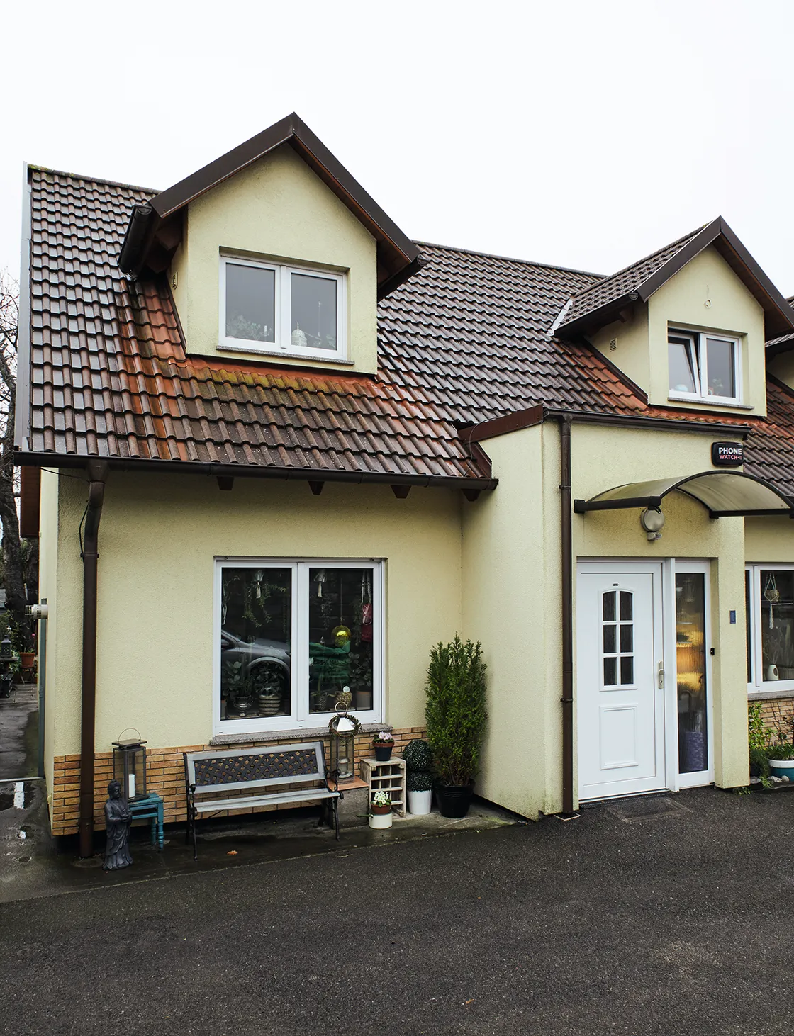
Having looked at several houses – none of which ticked the right boxes – we were persuaded to take a look at this timber-framed bungalow. The house was in good condition, but we didn’t like how it’d been decorated.
After buying the bungalow, we didn’t have much money, so we mainly did cosmetic changes.
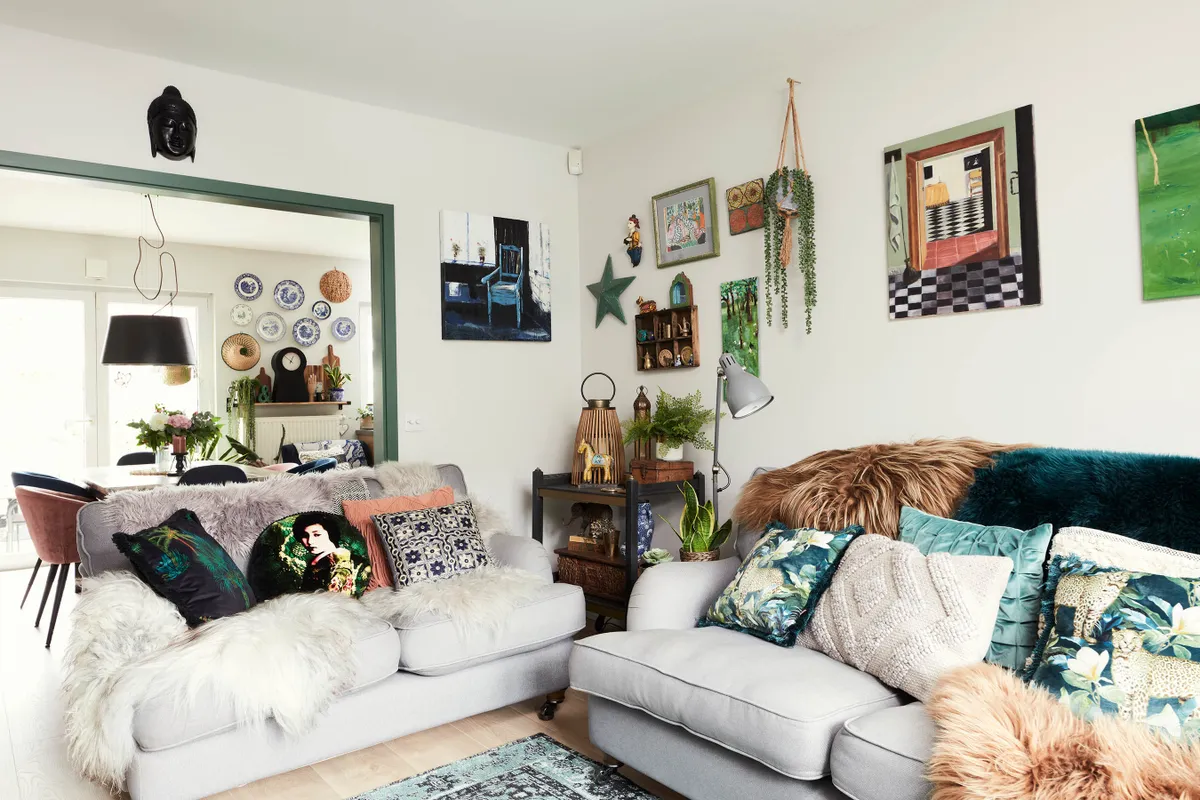
We replaced the laminate flooring in the living/dining room and added built-in storage to all the bedrooms, the cloakroom and utility room. Every room had strange textured wallpaper, which we removed. Since connecting with other homeowners on Instagram, I’ve definitely become much more adventurous with colour.
Welcome to my home...
A bit about me
I’m Sarah Doyle, a colour consultant, stylist and blogger @retwiggdstylist. I live with my husband, Gavin, a senior VP for
a software company and a part-time artist, and our children, Noah, 14 and Olivia, 10.
Where I live
Our home is a three-bedroom dormer bungalow in Bray, County Wicklow, Ireland. We bought it in 2008.

Not having lots of money to furnish the house has definitely made us more creative. We’ve got used to mixing practical IKEA pieces with second-hand finds for a really unique style. I wanted our home to show that you can create a bespoke look on a limited budget, and that it can feel completely different to anyone else’s.
A bit more about my home...
What I wanted to change
Every room needed to be updated. A lot of the house had originally been painted in a custard yellow, which hadn’t been changed since it was built. It also needed much more storage and the floor in the living / dining room needed replacing.
How I made it my own
I made some brave choices when it came to painting. Art plays a huge part in making a house feel like home to me, and I’ve filled the place with pieces I love, along with all my bargain finds.
My favourite part
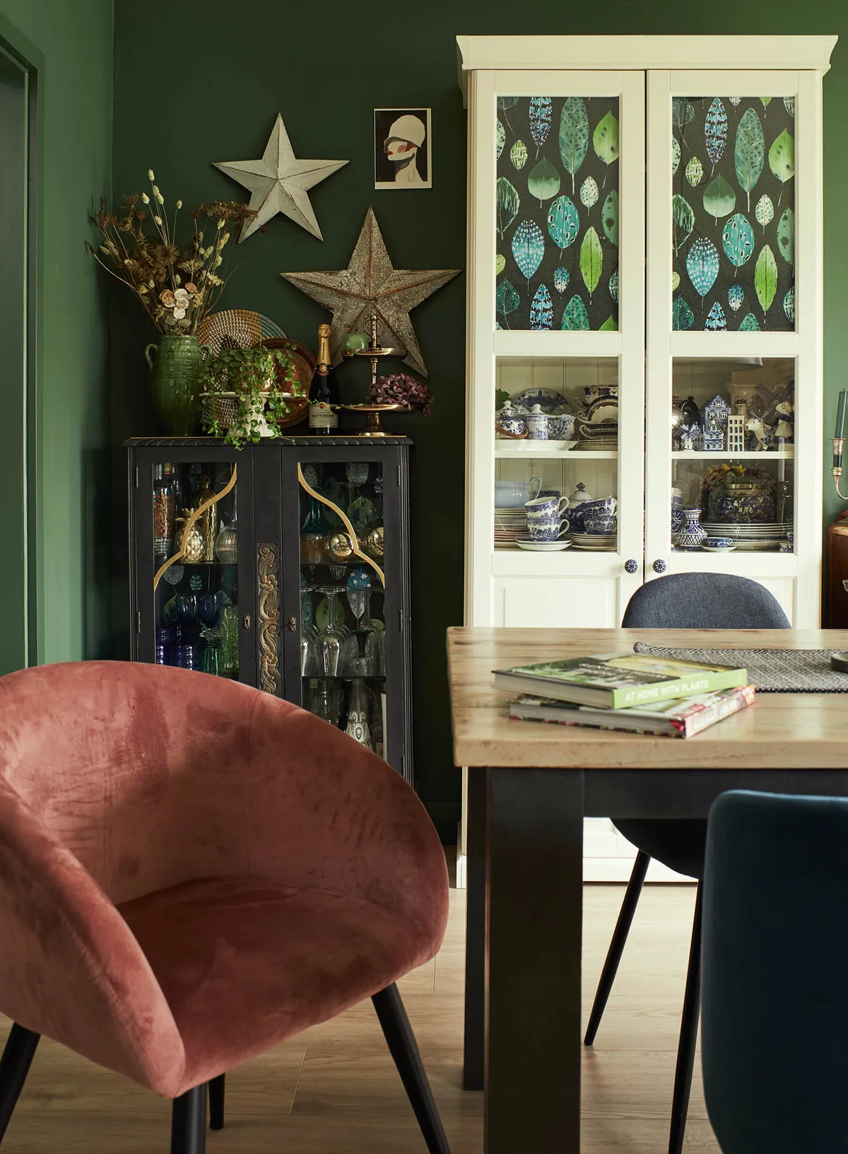
The dining room. I love the dark green walls as they add a richness and character to what was once a very bland space.
Living room
‘Before, the living room was dull and dated without any character. To make it brighter, we replaced the floor and painted it in Ammonite by Farrow & Ball. Filling the room with lots of plants, colourful artwork and plenty of cushions has given the space so much warmth and personality.
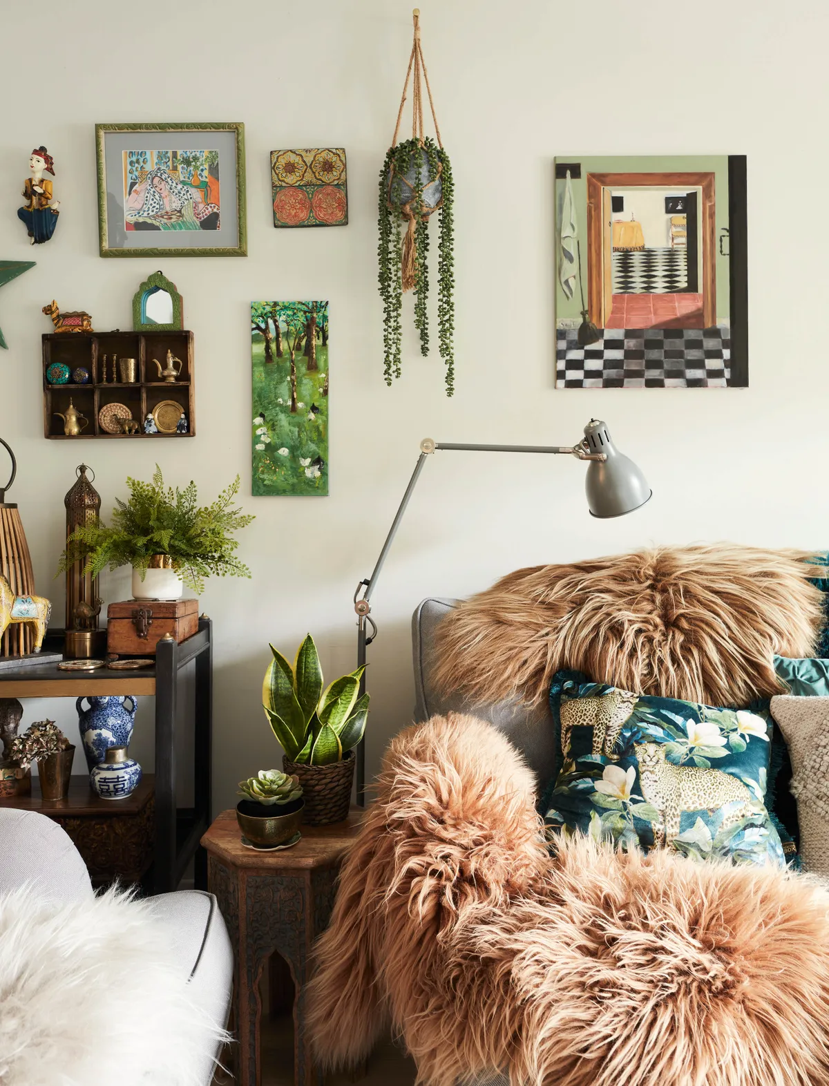
I’ve furnished the room with second-hand pieces that I’ve upcycled with chalk paint, which is a great way to give furniture a new lease of life. I dream of replacing the DFS sofas with green velvet designs, but they’re lasting so well I can’t justify replacing them any time soon.’
Dining room
‘This was the first room where I started experimenting with colour. It started when I won a competition by Stillorgan Decor for a Mylands Paint voucher. I knew I wanted to go green and was helped to pick the right shade – AGY23 – from their 900 colour collection. I’m glad I was brave enough to go for it, as this colour has completely transformed the space.
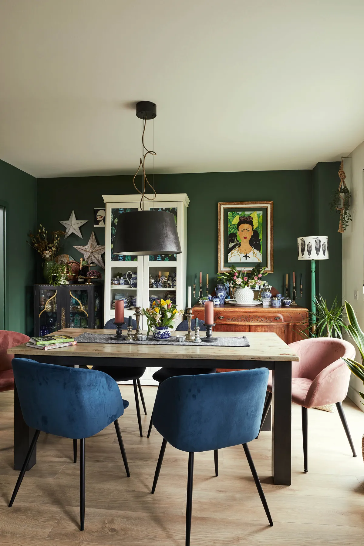
As I love collecting old pieces of china, it was important that I had plenty of storage, and for an eclectic look I teamed an IKEA cabinet with two bargain units. To bring the space together, I fitted an oversized pendant light over the table and introduced some extra colour with my deep blue and dusty pink velvet chairs.’
Kitchen
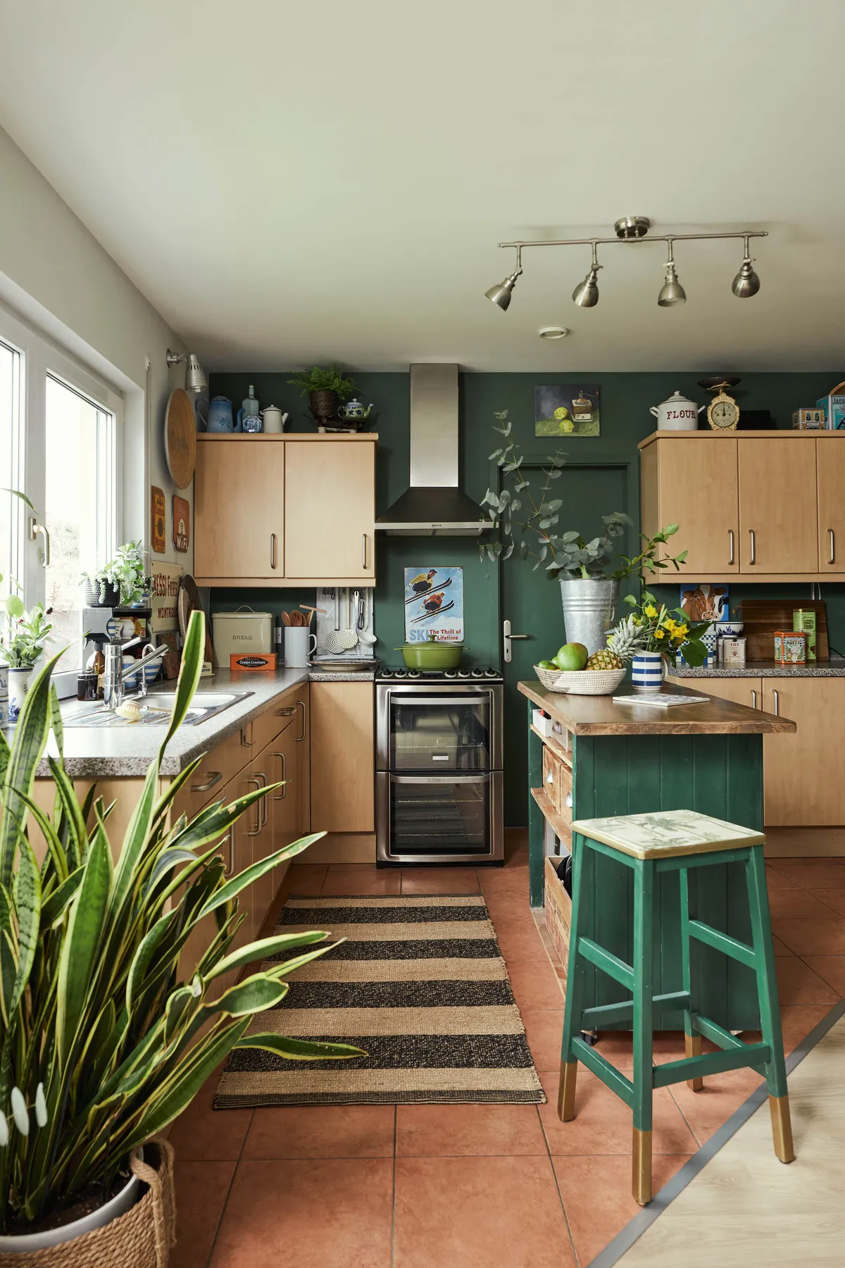
The striking green paint used in the dining space is continued into the kitchen, including the doors and woodwork. The kitchen units are original to the house, but they’re on Sarah’s upcycling to-do list. However, other kitchen design details – like the flooring – have grown on her. ‘Funnily enough I didn’t like the terracotta floor tiles and was determined to change them,’ she says, ‘but the trend for them seems to be coming back, so maybe I was right to wait and not get rid of them.’
Study
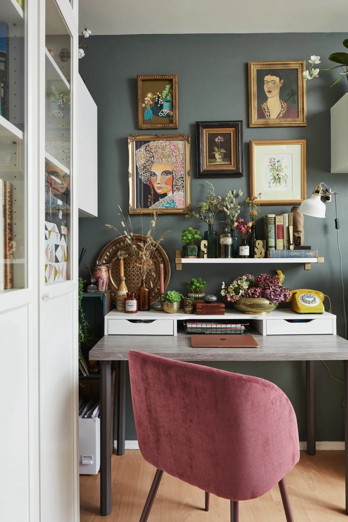
The study area is painted in Green Smoke by Farrow & Ball, with artwork by Gavin and Penny Feathers Studio adding interest to the wall. The practical IKEA furniture is decorated with dried flowers, a retro telephone and a stack of vintage books.
Master bedroom
‘To keep this space light and calm, we painted the walls in Great White and Peignoir by Farrow & Ball. The bed, from Irish chain Dunnes Stores, was originally brown leather and I had it upholstered in neutral fabric so it suited the space better.
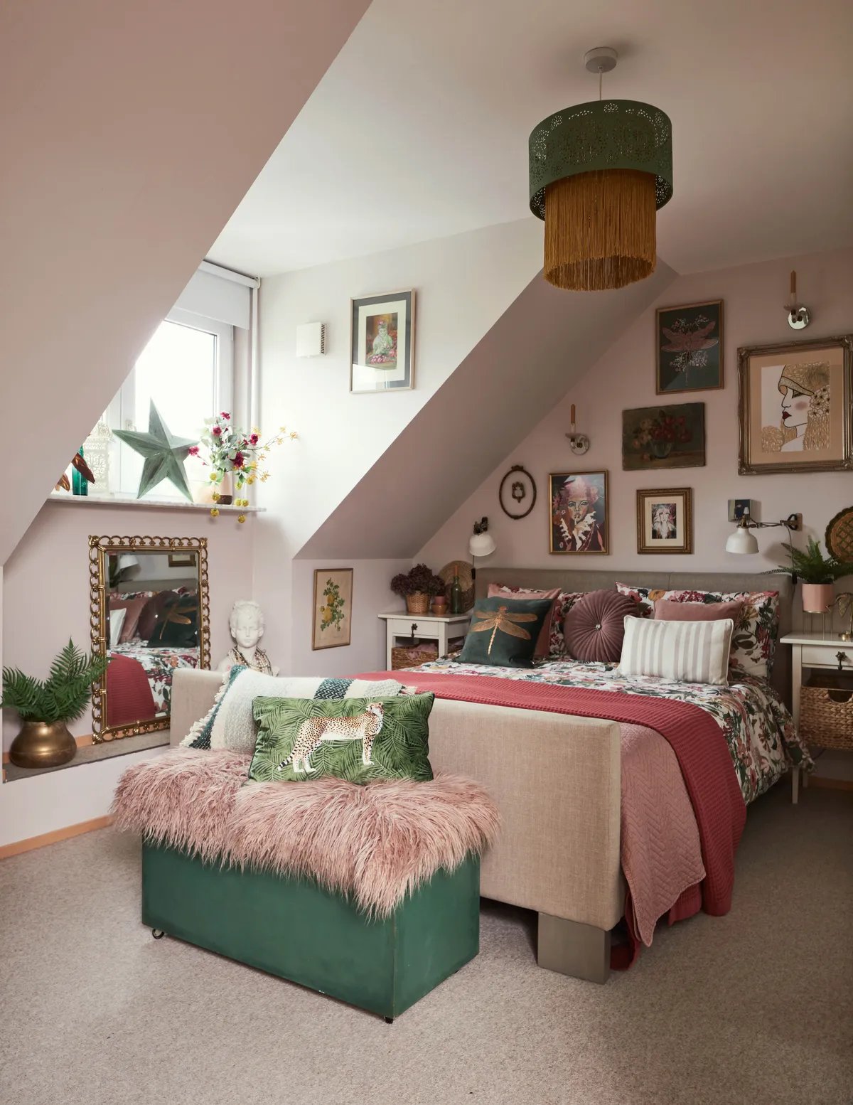
The IKEA bedside tables fit perfectly at either side of the bed and they’re handy for displaying little knick-knacks. The blanket box was another charity shop find – it was originally brown melamine and I painted it in green chalk paint and reupholstered the top. A shaggy sheepskin and cushions finish it off.’
Bathroom
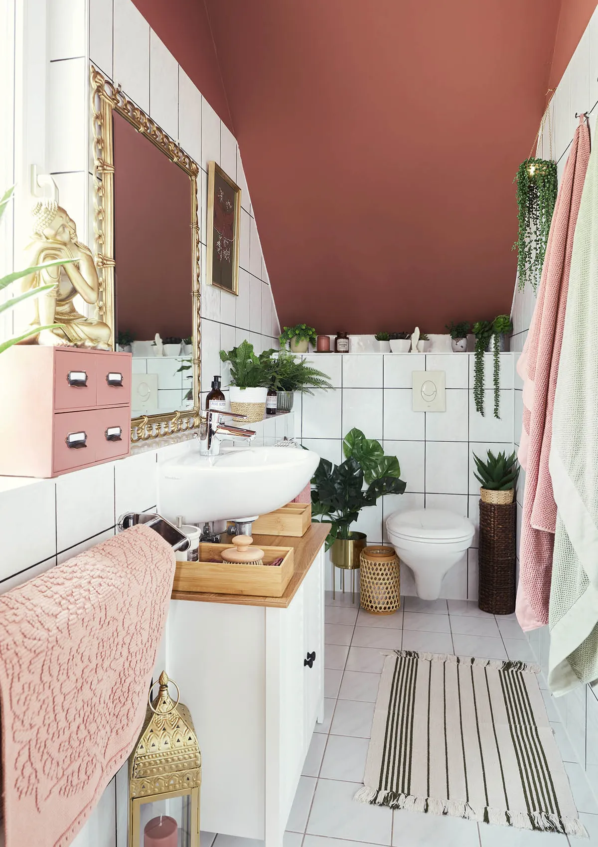
Sarah recently revamped her en suite, which is painted in Ashes of Roses by Little Greene. To freshen up the tiles, she used a grouting pen from Amazon. The towels and bath mat – along with small drawers that fit snugly under the sink – are from IKEA and the mirror was an auction find.
Olivia's room
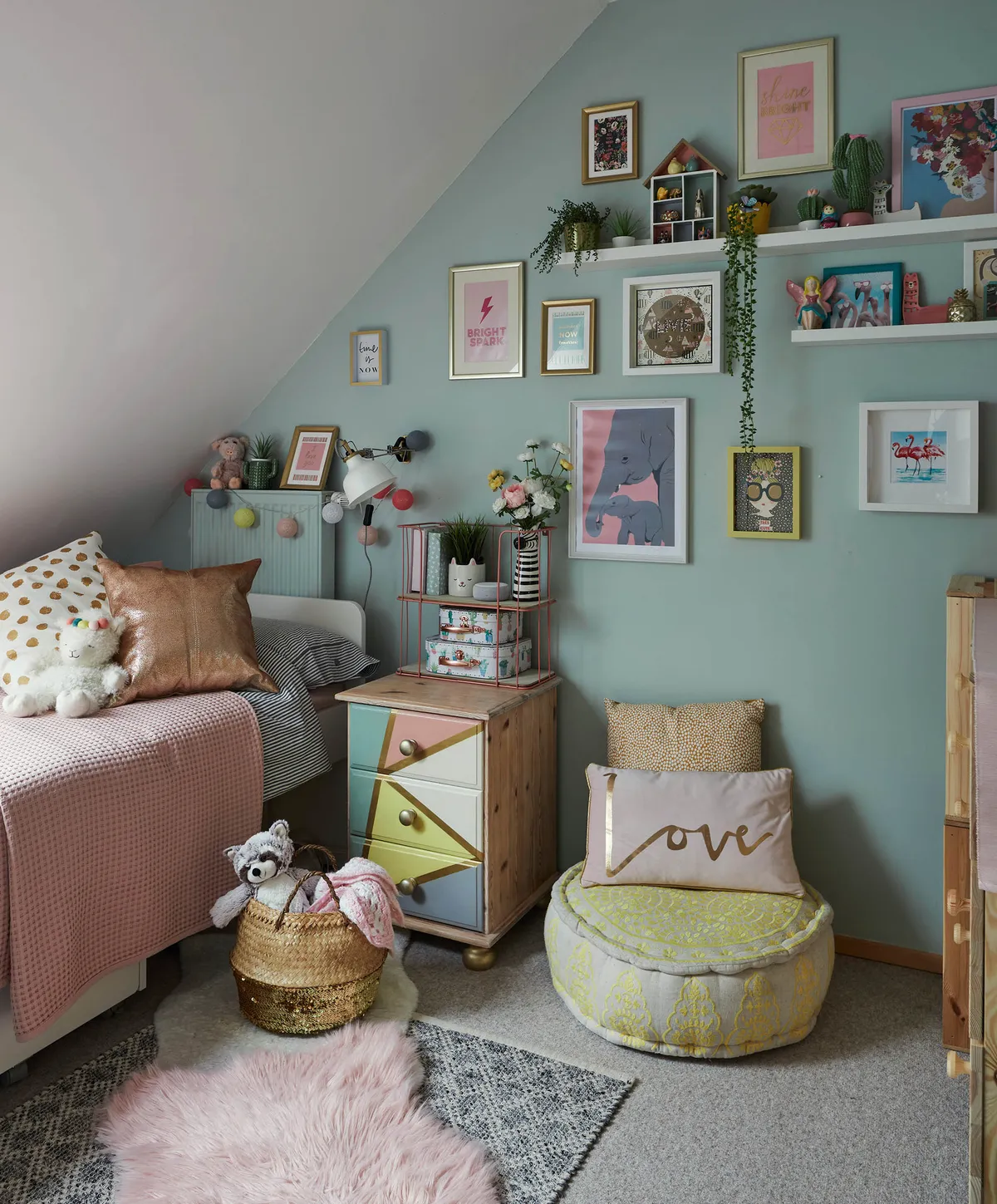
‘This is a really cute space for a little girl,’ says Sarah. ‘We wanted to keep the space light and airy so we decorated with lots of accessories in pretty pastel shades and painted the walls in Teresa’s Green by Farrow & Ball. The bedside table was a skip rescue that I painted using a mix of tester pots and sealed with varnish. The floating shelves are from IKEA, and on the wall we put up some of Olivia’s favourite prints.’
What I learned
Pick a colour you want to run through your home. For us, that’s green and we’ve carried that through the rooms with accessories, upcycled furniture and lots of houseplants.
Decorate with things you love – you don’t need to follow trends. Look through your wardrobe to see what colours you like – very often the colours you wear are a reflection of what you really love. I always feel happiest when I’m surrounded by nature, so having lots of plants and flowers are my key to wellbeing in the home, particularly in the winter months.
Use vintage and second-hand pieces to add character to your scheme. A new-build doesn’t have to be boring; you can easily addyour personality with the little details.
This is a digital version of a feature that originally appeared in Home Style magazine. For more inspirational home ideas, why not subscribe today?
