Inspired by holidays to the seaside, Michelle Vanlint transformed her space with a brand-new look, creating a calming vibe.
Here, she tells YourHomeStyle all about her makeover experience...
You might also like...
- Coastal décor: how to turn your home into an ocean-inspired paradise
- Coastal Grandma aesthetic: how to use 2022's hottest decor trend
- 15 beautiful blue bathroom ideas to inspire you
Coastal bathroom makeover
'Our bathroom was never my favourite room in the house, but it was a great size, with a lovely fireplace. We decided to give the space a revamp when the floor tiles started to crack. We had inherited the black flooring from the previous owner, so they had definitely seen better days and the colour absorbed all the light in the room. Not to mention, they were a nightmare to clean.

'My inspiration, design-wise, came from our holidays by the coast. I wanted to introduce a beautiful blue palette to reflect the sea. I started looking through Pinterest and came across the fish design wallpaper by Harlequin. It was quite pricey, so I just bought a roll for one feature wall. I love tongue-and-groove panelled walls and felt it went well with the theme, so I found The English Panelling Company who make panels suitable for bathrooms.
Welcome to my home...
A bit about me I’m Michelle Vanlint, 50, a finance officer. I live with my husband, Neill, 60, and sons, Miles, 20 and Louis, 18. Our home is a five-bedroom Edwardian house in South Woodford.
My problem bathroom It was looking very tired and I hated the shower enclosure that cut the bathroom in half. It was bulky and being in the shower felt very claustrophobic. The black floor tiles made the room feel so dark and they had started to crack, while the wall tiles were coming loose. We knew with a bit of work it could look so much better.

'Pulling on all the teal and blue shades in the wallpaper, I painted them in Etruria eggshell by Little Greene, a soft blue to reflect the sky. For the flooring, I went for a practical vinyl from Karndean to introduce a rustic feel. The herringbone pattern adds a lot of interest and the wood effect looks very authentic. A big bonus is that it’s so easy to clean, too. We went for a large walk-in shower and chose some soft green tiles from Topps Tiles to add even more colour.
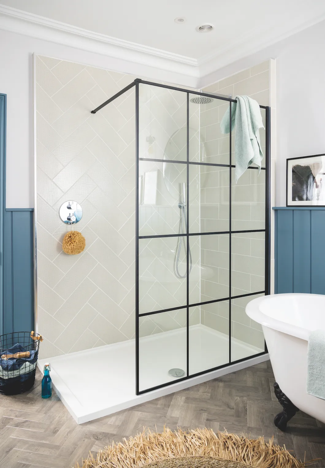
'For the finishing touch, I added a vanity unit for extra storage. It was the perfect size, but it only came in white, and I wanted to avoid making it look too clinical, so I painted it in Ambleside eggshell by Little Greene to complement other features in the room. Now that we’ve finished decorating, the whole family loves our bathroom so much. It brings the summer vibe all year round.'
A bit more about our makeover...
How I made it work We kept the bath, but got rid of everything else. A new herringbone floor replaced the tiles and we painted the wall panelling a soft blue to complement the ocean-themed wallpaper and accessories.
My favourite part It’s difficult to choose, but I absolutely love the walk-in shower that feels part of the room, unlike the bulky enclosure we had before. It feels so much calmer now and reminds me of our wonderful trips to the sea.

Styling ideas
Use empty space
‘When the builder removed the old cistern toilet, it left a gap behind the wall, so we decided to create a recessed shelf where we could keep bathroom bits and pieces,’ says Michelle.
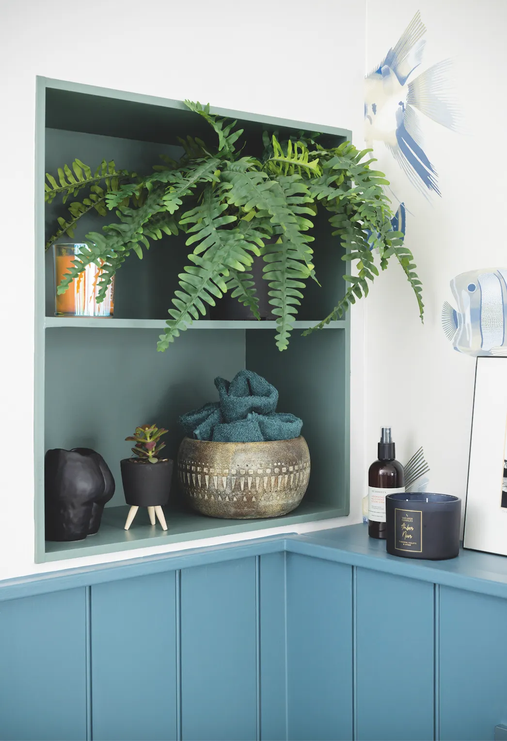
‘You can never have too much storage in a bathroom, so I thought it was the perfect spot for more shelving.’ Michelle painted it in Ambleside by Little Greene to add another splash of colour to the room, complemented by a mix of green, black and gold accessories.
Choose lighting carefully
Lighting can really enhance the atmosphere in a bathroom, but there are safety issues to keep in mind. ‘We wanted hanging pendants above the bath, to create a relaxing feel, so we looked for specialised splash-proof lights with a rating of IP65. We also had downlights fitted into the ceiling for when we want a brighter light.’
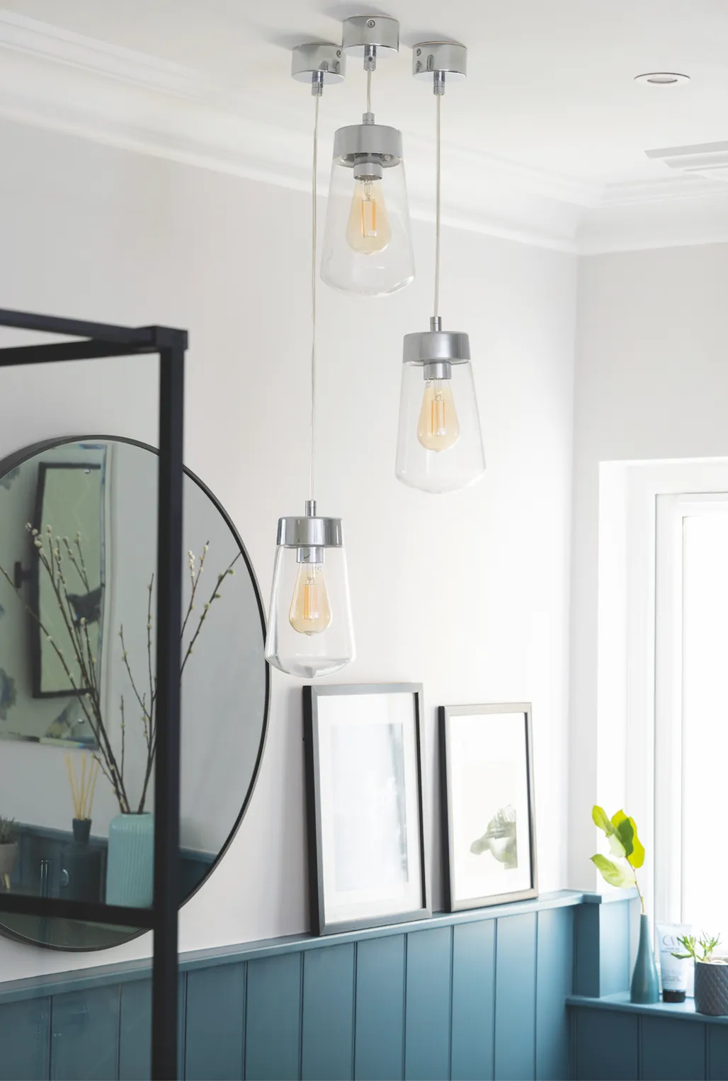
Michelle positioned the pendants by a mirror to maximise the effect and grouped a trio together to make a striking style statement.
Emphasise what you've got
‘We wanted to make the most of the architectural features, like you would in any other room in the house, such as the original fireplace,’ Michelle says.
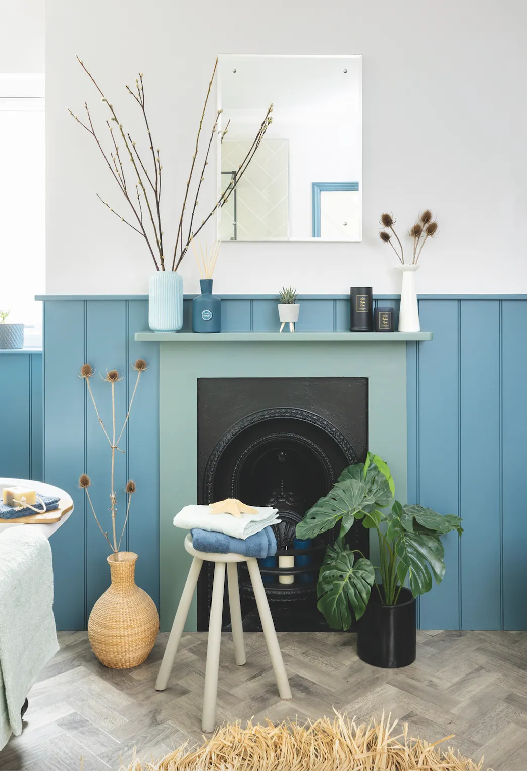
‘We painted the surround in Little Greene’s Ambleside eggshell to tie in with the vanity unit and filled the hearth and mantelpiece with scented candles and vases. To add further character to the space, we added tongue-and-groove panelling, which we then painted in a soft blue.’
Styling Emma Fishman. Photos David Giles.
