Before we bought this place, I was living with my mum just outside of Bristol,’ explains Bryony Critchley, ‘but, as I was spending most of my time at my partner Mark’s house in North Bristol, we decided it made sense to get a place together.’
The couple were looking to move closer to the city centre, but wanted something with a bit of outdoor space, too. Luckily, they found a property that provided everything they wanted – all it needed was a décor spruce- up.
You might also like...
- Minimalist 60s semi: ‘We extended our house to reflect our evolving style’
- Bedroom makeover: ‘We swapped plain walls for boutique luxury’
- Pink living room makeover: 'Bright colours make my rental feel like home'
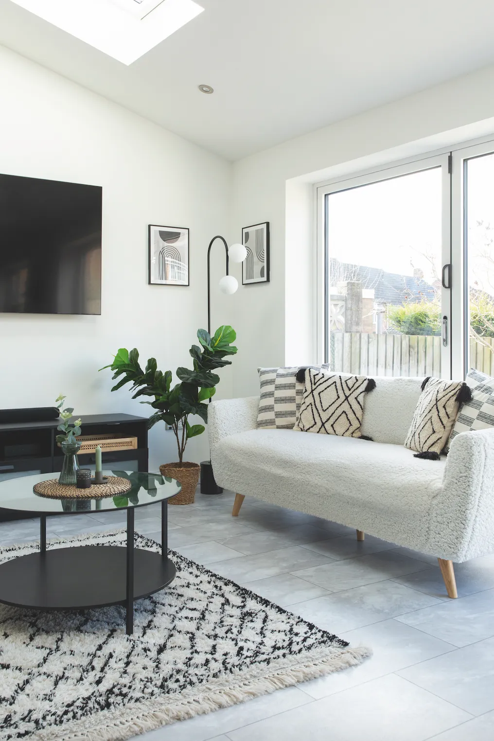
‘When we came to view this place, the street looked really nice and the garden was a good size,’ recalls Bryony. ‘I loved the little quirks of the house. It had lots of character and period features, and it didn’t need any building work, which was a bonus, but we could see how the space could be made to reflect our own style.’
The couple moved in straightaway and started updating the house, room by room. They loved the floorboards on the ground floor, which had already been sanded, but wanted to give the whole house a paint job as there were strong colours everywhere.
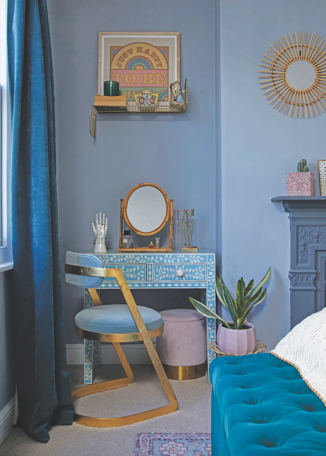
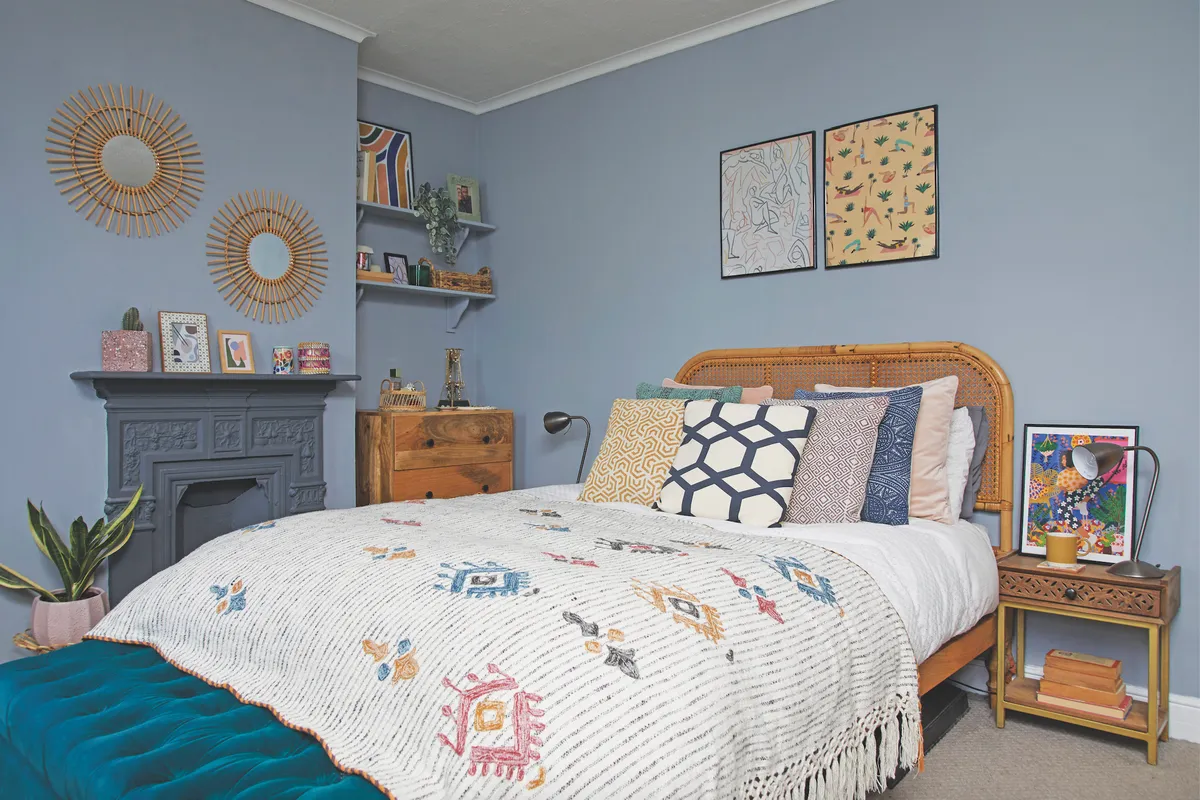
‘The living room was bright teal, and our bedroom was a mustard yellow – not awful but not what we wanted in our home, as we prefer a softer, more muted look,’ says Bryony.
Welcome to our home...
We are Bryony Critchley, 27, a Senior Product Designer at Waitrose, my partner, Mark Willis, 33, a UI Design Manager, and our cat, Binky.
Our home is A three-bedroom, Victorian terrace in Bristol. We moved here in October 2018, and I record our renovation journey on Instagram at @bryonycritchley.
My favourite room I love the living room, and even though it’s the first room we did, Mark and I still agree there’s nothing we would change about it. We both find it really cosy and welcoming, and still love our colour choices.

The first thing the couple did was decorate the living room, choosing timeless colours with a view to future-proofing their home. ‘If, down the line, we want a new look, all we have to change are the accessories rather than redecorating the whole room,’ Bryony explains.
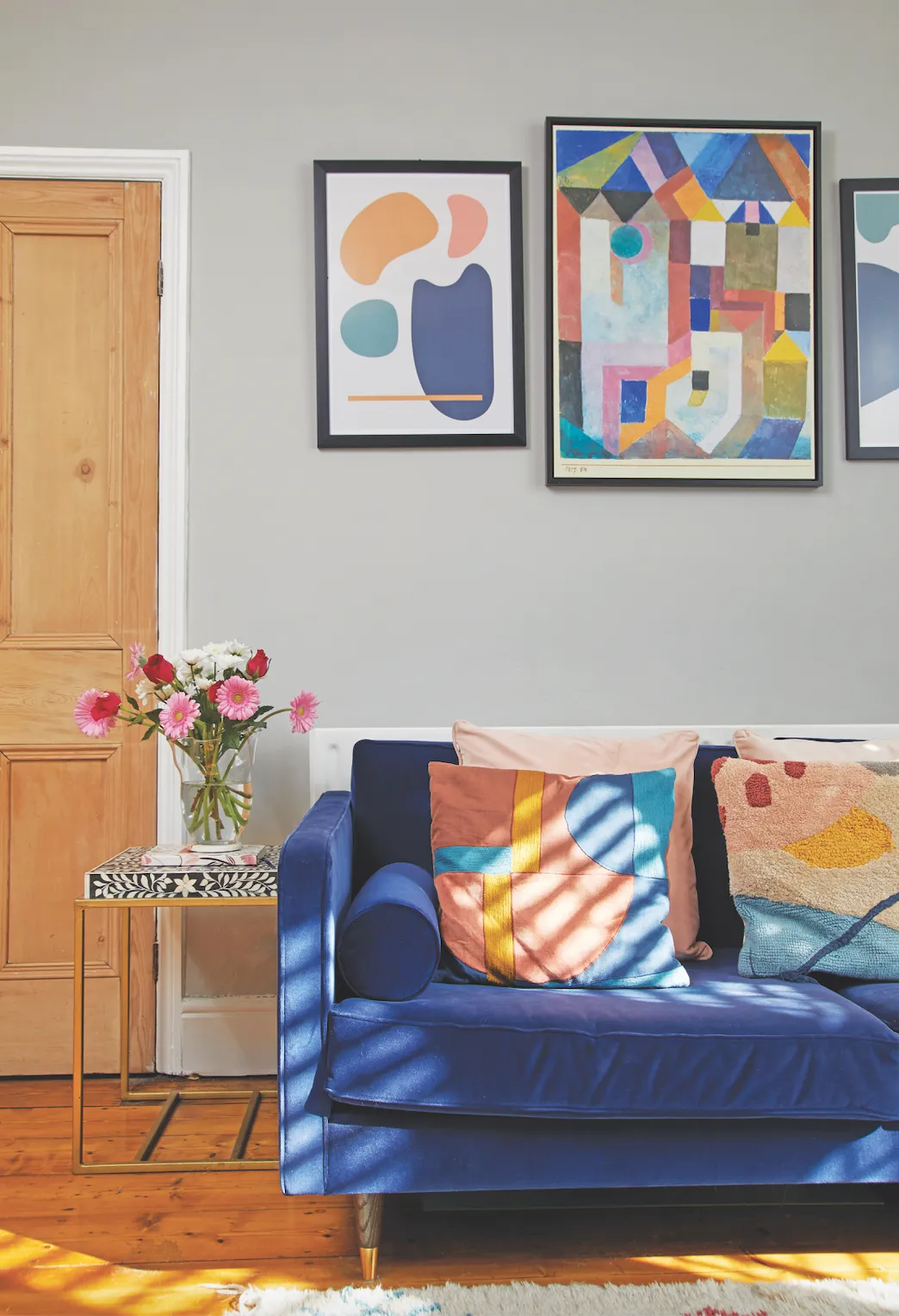
They chose Down Pipe and Pavilion Gray by Farrow & Ball to give the room a sophisticated look and did all the painting themselves. ‘We both enjoy it. We tend to earmark a weekend for it and get the work done in one go.’
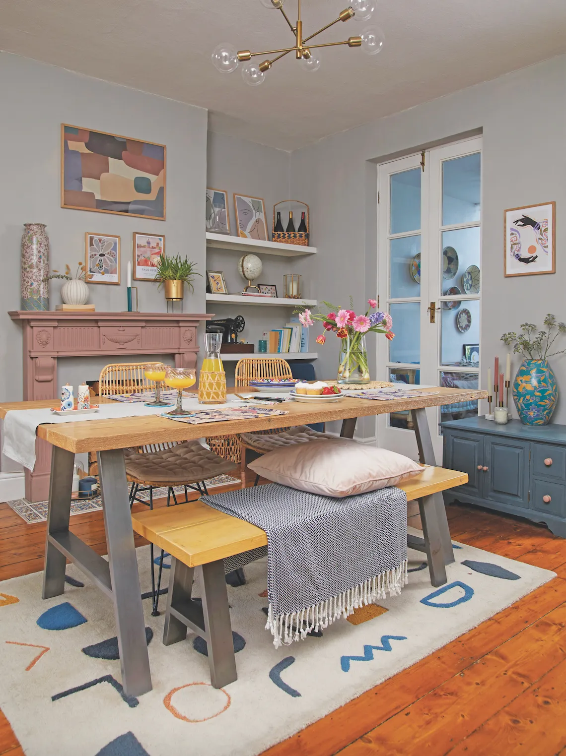
When the couple first moved in, there was a wall where the open stairs are now, which made the room feel dark. ‘We were
sat having dinner one evening, discussing how to brighten the room, and Mark started knocking on the wall because he thought it might be a stud wall that could come down fairly easily,’ says Bryony.
‘I’d also seen some images of under-stairs cupboards with wood panelling, which not only looked really useful, but also seemed like a stylish way to store our shoes and coats. So, we got a carpenter to remove the wall, attach a bannister and build in the cupboards to my design.’
When it came to the bathroom, Bryony admits there wasn’t much they could do, as the room is so small. That didn’t mean she couldn’t give it a splash of colour, though. ‘It was all too beige for my liking,’ she says. ‘So, we gave it a budget update by painting the walls green. We also painted the tiles white using a specialist tile paint, which, since we did it two years ago, has lasted really well.’
A bit more about our home...
What I learned Do your research. We made a few mistakes by not measuring properly, or not using the correct product. Although these errors didn’t add massively to the costs, they took time to put right.
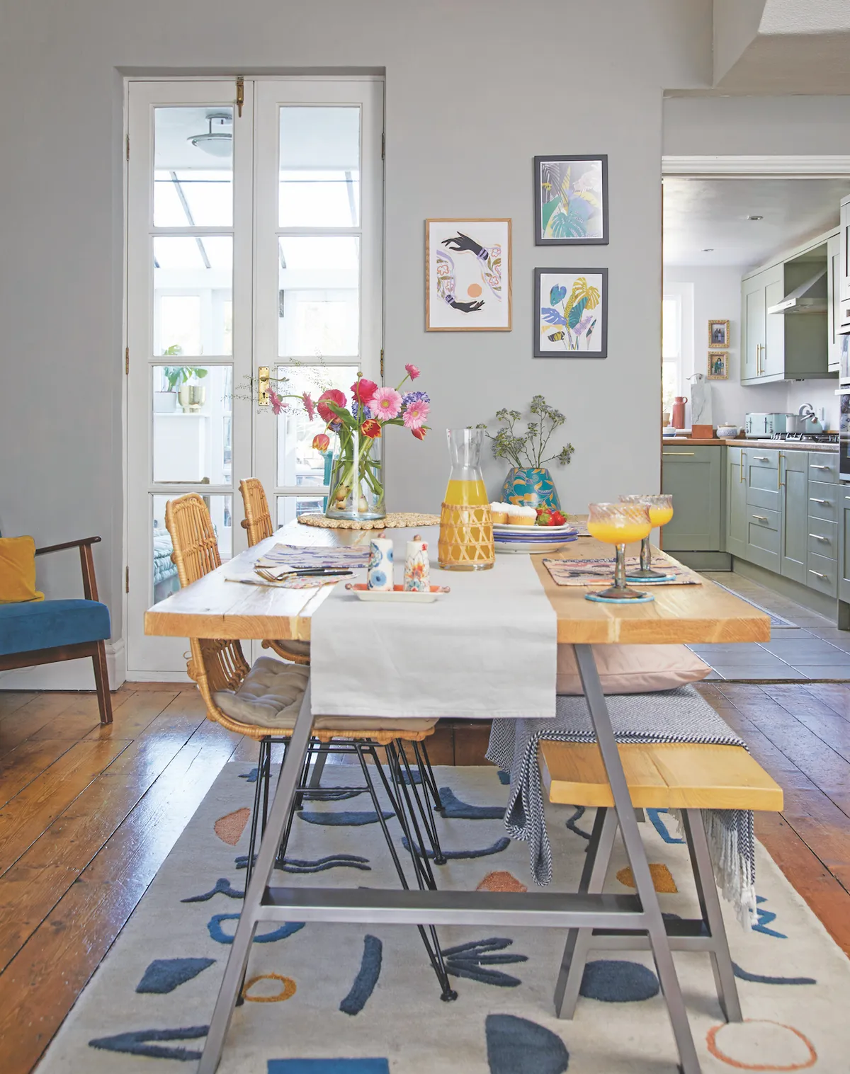
Our best idea was opening up the stairs. Because the dining room is in the middle, it gets little natural light, but now the space is much brighter, feels bigger and the added storage helps keep it uncluttered.
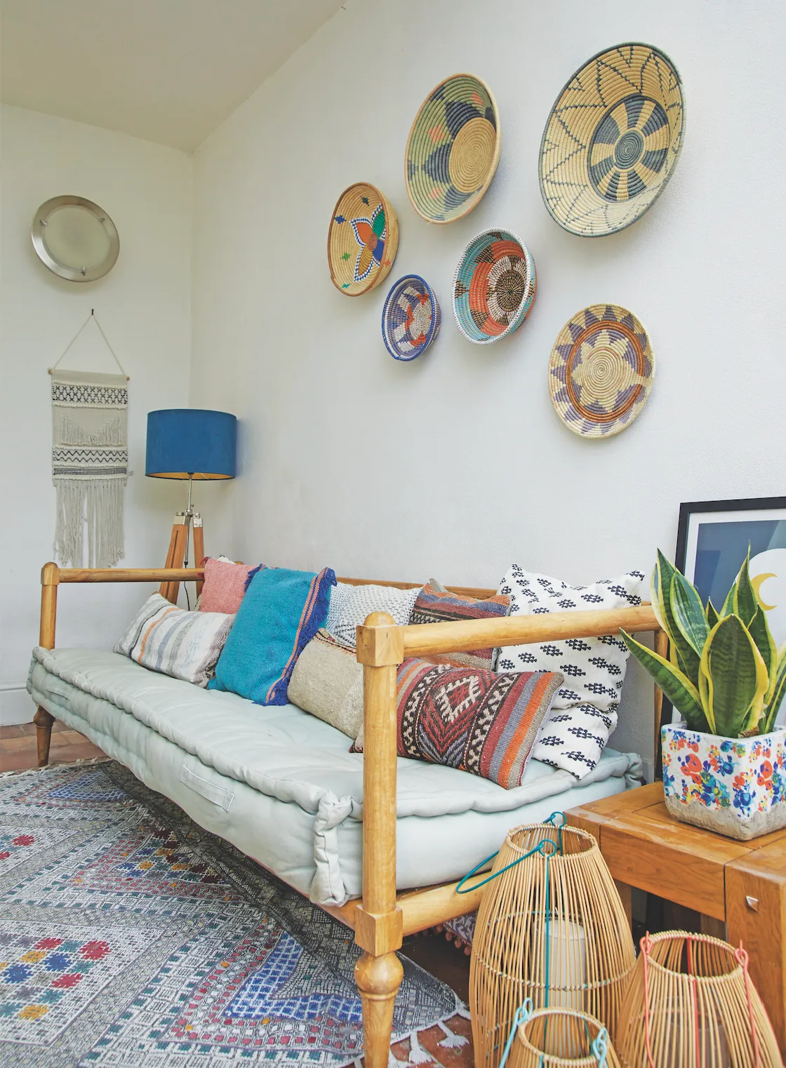
Next to do We need to give some thought to the summer room, now we’ve decided not to open up the space. It needs a refresh, as I love to sit there with a glass of wine in summer. I think I want to paint it a slightly darker colour, but we’ll see.

Then, during lockdown, the couple decided to give the kitchen an update. ‘We initially considered knocking through to the summer room to create a large, open-plan space, as I would have loved an island for when friends come over, but the costs and quotes kept spiralling.
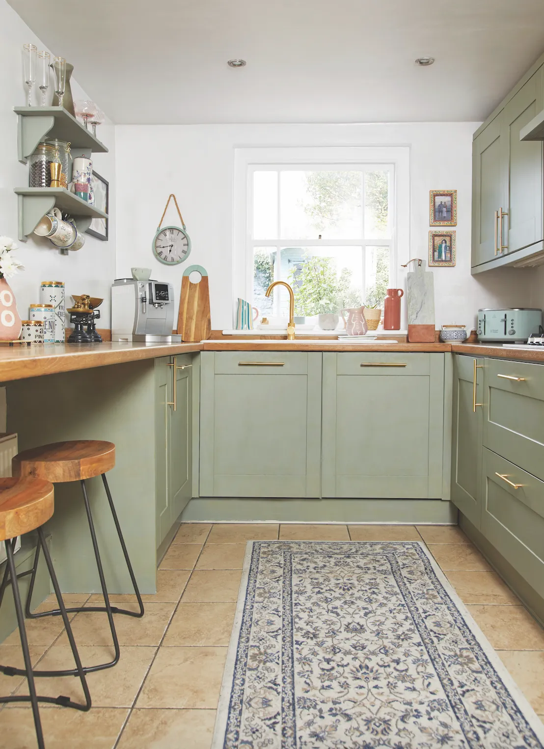
Although it’s not a huge room, the kitchen is actually designed well, so we decided to paint the cabinets to give it a new look on a budget,’ says Bryony. ‘We painted the cream cabinets a soft green, but as soon as we’d finished, the paint started peeling off. We’d used the wrong primer, so had to sand it all back and start again, which was a pain. But it needed to be done and the makeover only took a couple of days – as we were in lockdown anyway, we had the time.’

The final update was the spare room, which was another lockdown project. ‘The room still had the pink walls, horrible old carpet and red velvet curtains from when we first moved in, so we decided to give the whole room a complete overhaul.
‘We ripped the carpet up and then sanded the floorboards, which turned out to be a nightmare,’ explains Bryony. ‘It was a really hard job, especially as we only had a little electric hand sander and dust literally got everywhere, but the final effect was worth it.’
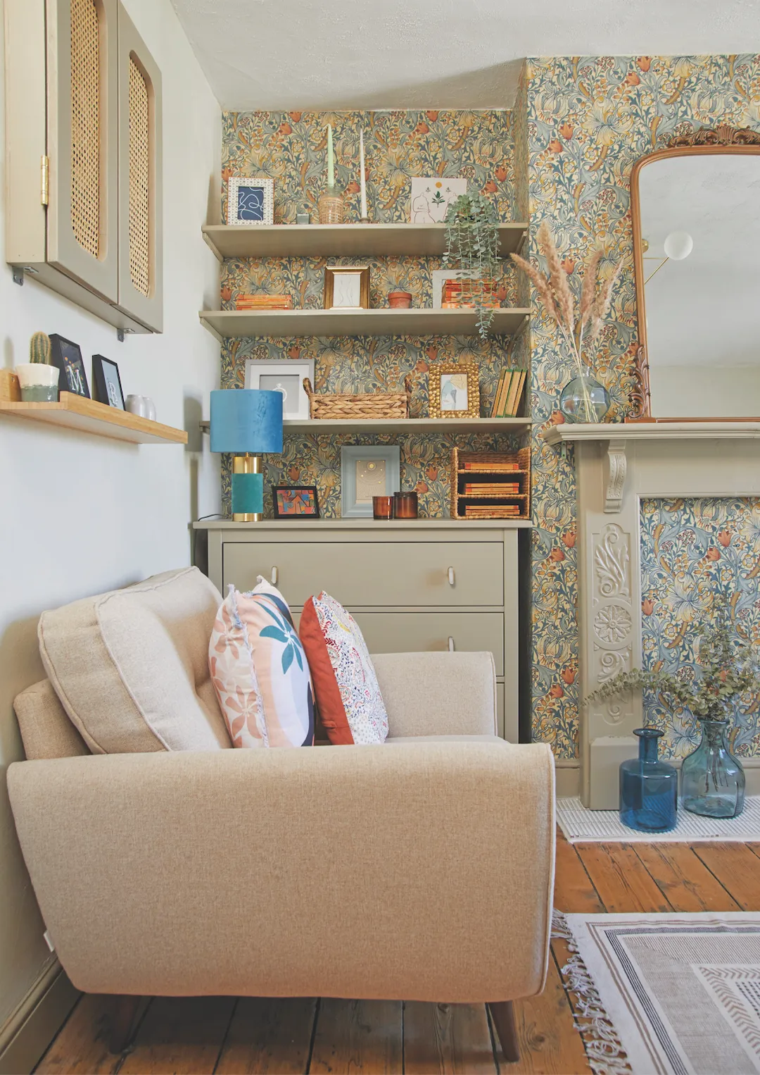
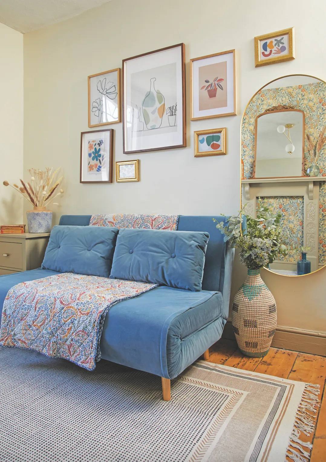
Then, the couple added the beautiful William Morris wallpaper that Bryony had spotted while browsing online. ‘It’s a bold pattern and I worried it might overwhelm the room. It was also really expensive, so we decided to just put it along one wall,’ she explains. ‘Although I still want to give the summer room a refresh, and maybe sand the bedroom floorboards, I’m really proud and happy with how we’ve transformed this house, especially as we’ve done most of the work ourselves.’
Styling Lisa Moses. Photos Katie Jane Watson.
