Faced with a dated red and beige colour scheme, Leanne Ward spent lockdown bringing a modern boho look to her 1930s semi.
Here, she tells us all about her home makeover experience...
My home makeover
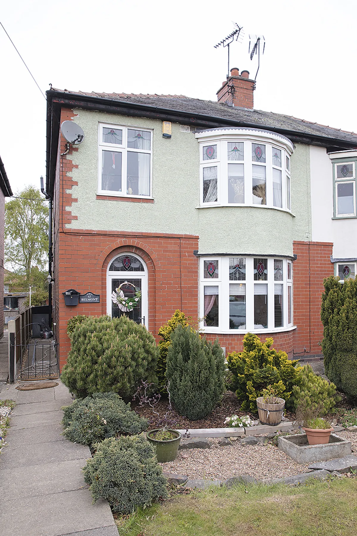
We weren’t actually looking to move but had always admired this row of 1930s houses on our daily dog walks, so when one came up for sale we acted fast. It was the big bay windows, high ceilings, coving and picture rails that made us fall in love.
When we moved in the overall quality was really good, just a little outdated, so we’ve modernised what was already there to make it more our style. I had just started painting a couple of rooms when lockdown started, so being furloughed during the first few months gave us a chance to really get stuck in.
Welcome to my home...
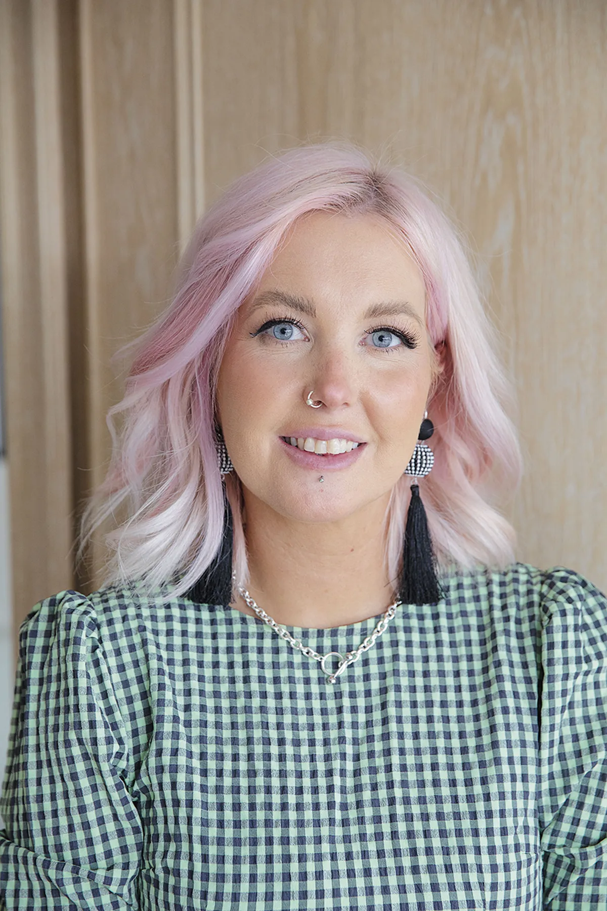
A bit about me I’m Leanne Ward, an art studio manager for a ceramic printers. I live with my partner, Ashley Simpson, a teaching assistant, and our two pugs, Jinxy and Hudson.
Where I live Our home is a three-bedroom, 1930s semi-detached house in Alfreton, Derbyshire. We’ve lived here since February 2020.
Most rooms have seen a paintbrush or two, except for the spare box room and hallway. We did all the work ourselves on a tight budget. For instance, we did the entire kitchen makeover for about £150 and the other rooms have only really cost us what we’ve spent on paint and soft furnishings.
I love finding hacks for changing up a style in a quick, affordable way and I love taking risks, like painting the dining room wall black or transforming the kitchen floor.
A bit more about my home...
What I wanted to change The house had been well looked after but there was lots of floral wallpaper and the dark oak kitchen with fruit-design tiles wasn’t my style.
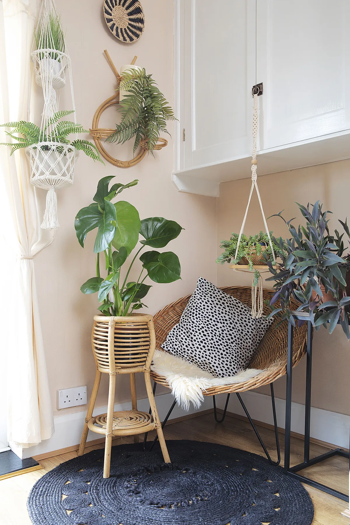
How I made it my own I’ve decorated it in a dark boho style with a hint of pink, lots of plants and the odd ceramic tiger. You can see more of my home style on my Instagram @sixtysevenbelmont.
My favourite part I change my mind quite a lot, but it’s probably the living room where we spend most of our time. When I walk in, it makes me really happy and so proud of what we’ve achieved.
Although each room has its own feel, I always use plants and quirky accessories to add personality. Looking back, the rooms are pretty identical to my Pinterest boards, so I definitely achieved what I set out to do.
Living room
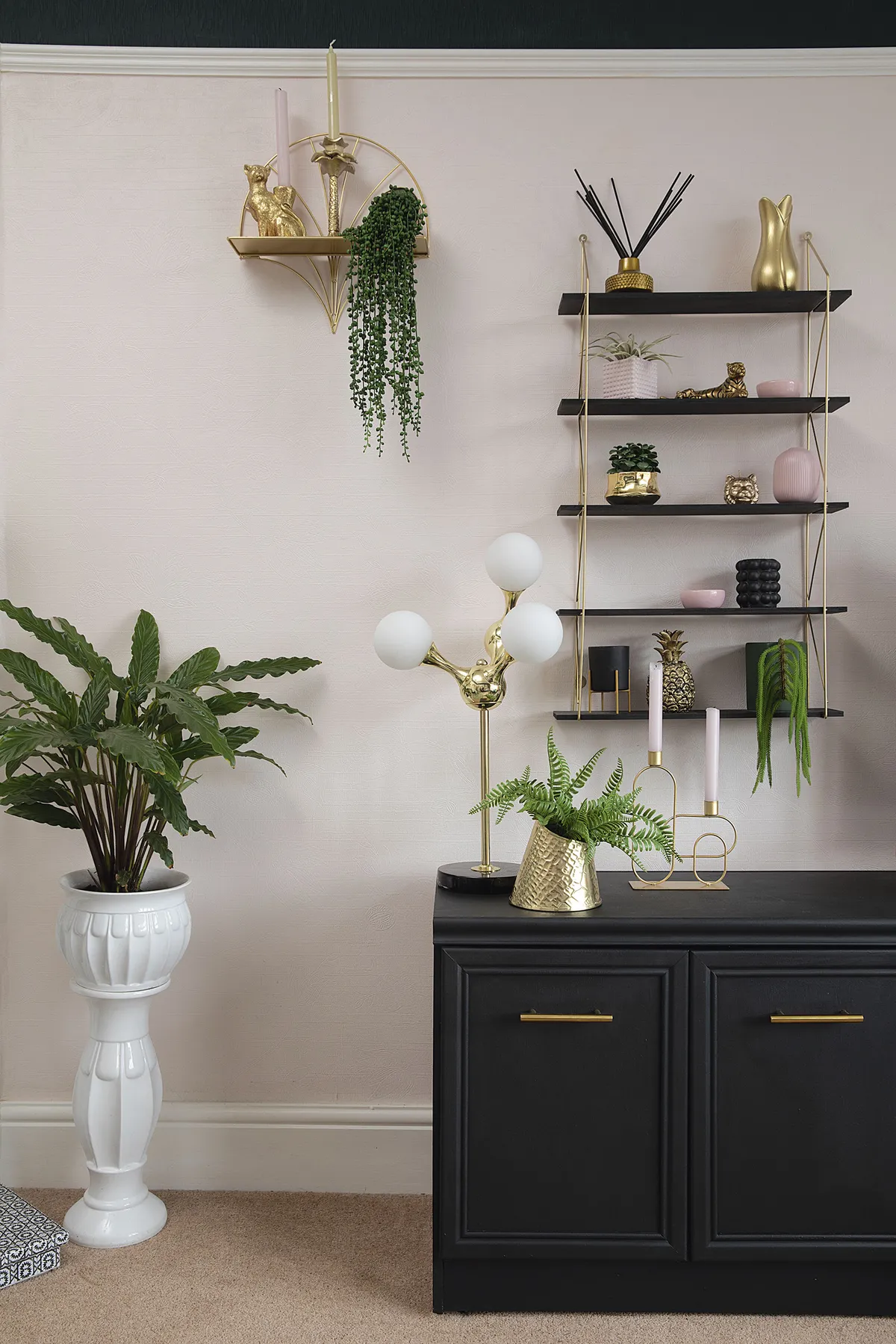
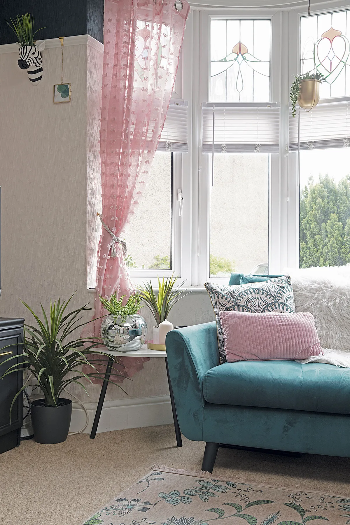
‘I was originally planning to scrape off the red and cream wallpaper in here, but I got impatient and just painted over the top. Wallpapering is such a big job, it seemed easier. At first, I went for a quick coat of cream to cover the pattern, then used Dulux’s Blush Pink. I was too scared to go full-on dark green across the top part, so I used a darker pink above the picture rail at first. It didn’t take long before I got brave and painted it in Johnstone’s Ivy Sky, which I think works so much better.
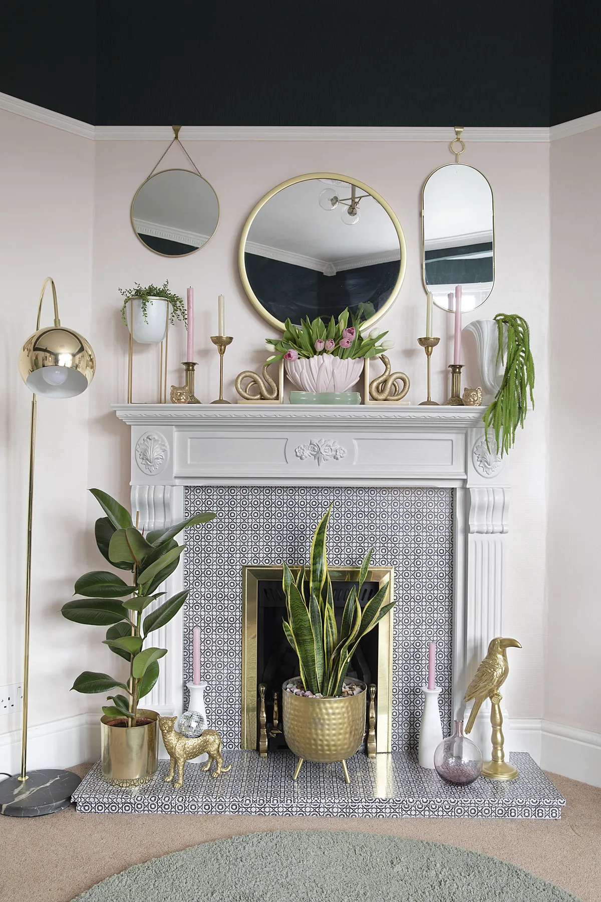
‘Plants feature heavily in every room. In the corner there’s a giant Dracaena fragrans plant, which cost £50 on Facebook Marketplace. The seller said it was eight years old, so there’s a lot of pressure to keep it alive! It’s my favourite thing in the room and makes such a statement. The colourful art print from Juniqe brings everything together.’
Dining room
‘When we first moved in, the idea was to have this room as a snug with a 70s vibe for listening to music. My friend helped me paint over the wallpaper with some brown paint for a retro feel, but we only got as far as the chimney breast before realising it was awful!
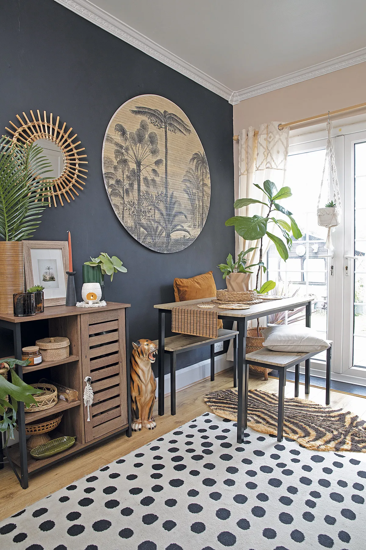
‘I painted the picture rail black for contrast and tried a peach arch behind the dining table too. However, during lockdown we took the wallpaper off and did it all properly with good-quality lining paper. I think I’ve achieved the tribal jungle look I wanted with lots of rattan, plants and a few ceramic tigers.’

Kitchen
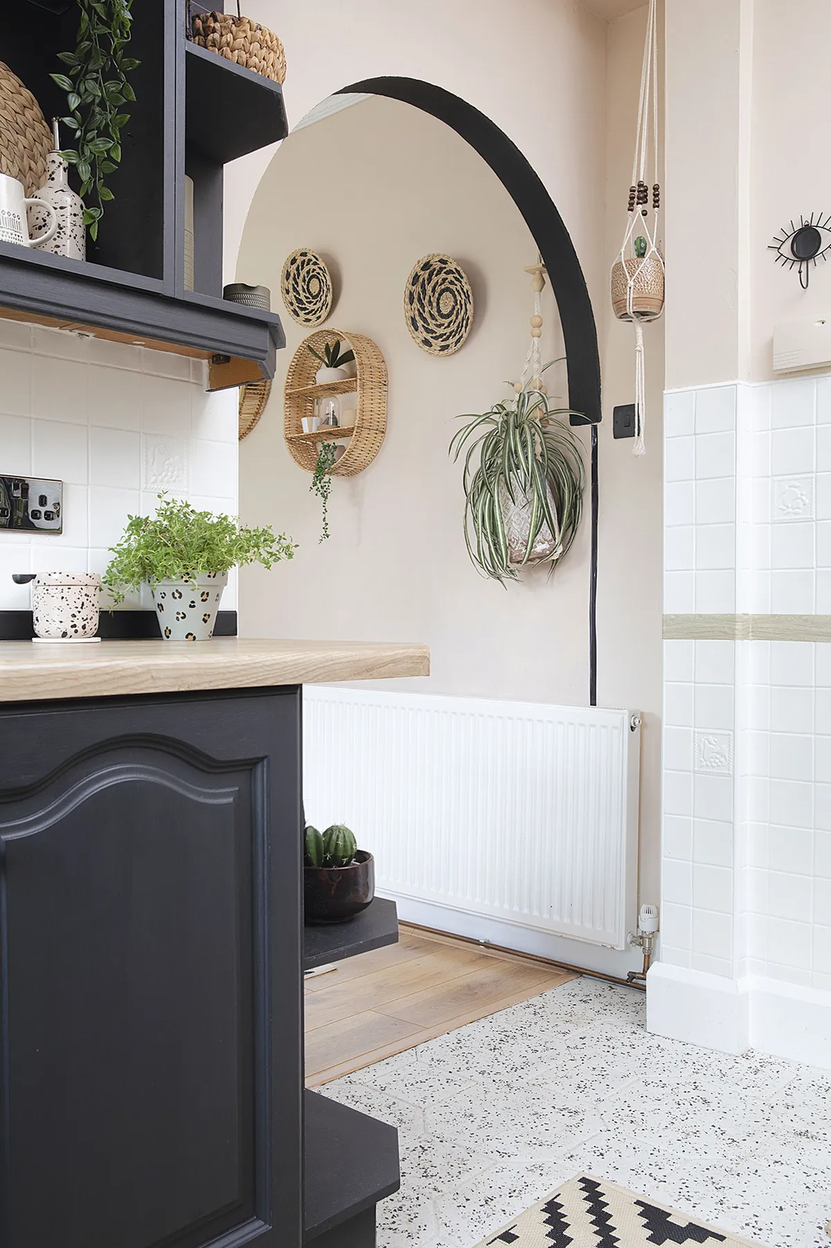
‘We didn’t touch the brown wood kitchen until last Christmas as we had hoped to knock through to the dining room and install new units. It soon became clear we’d need to wait a while for builders, so we decided to save our money and go for a quick fix makeover instead.
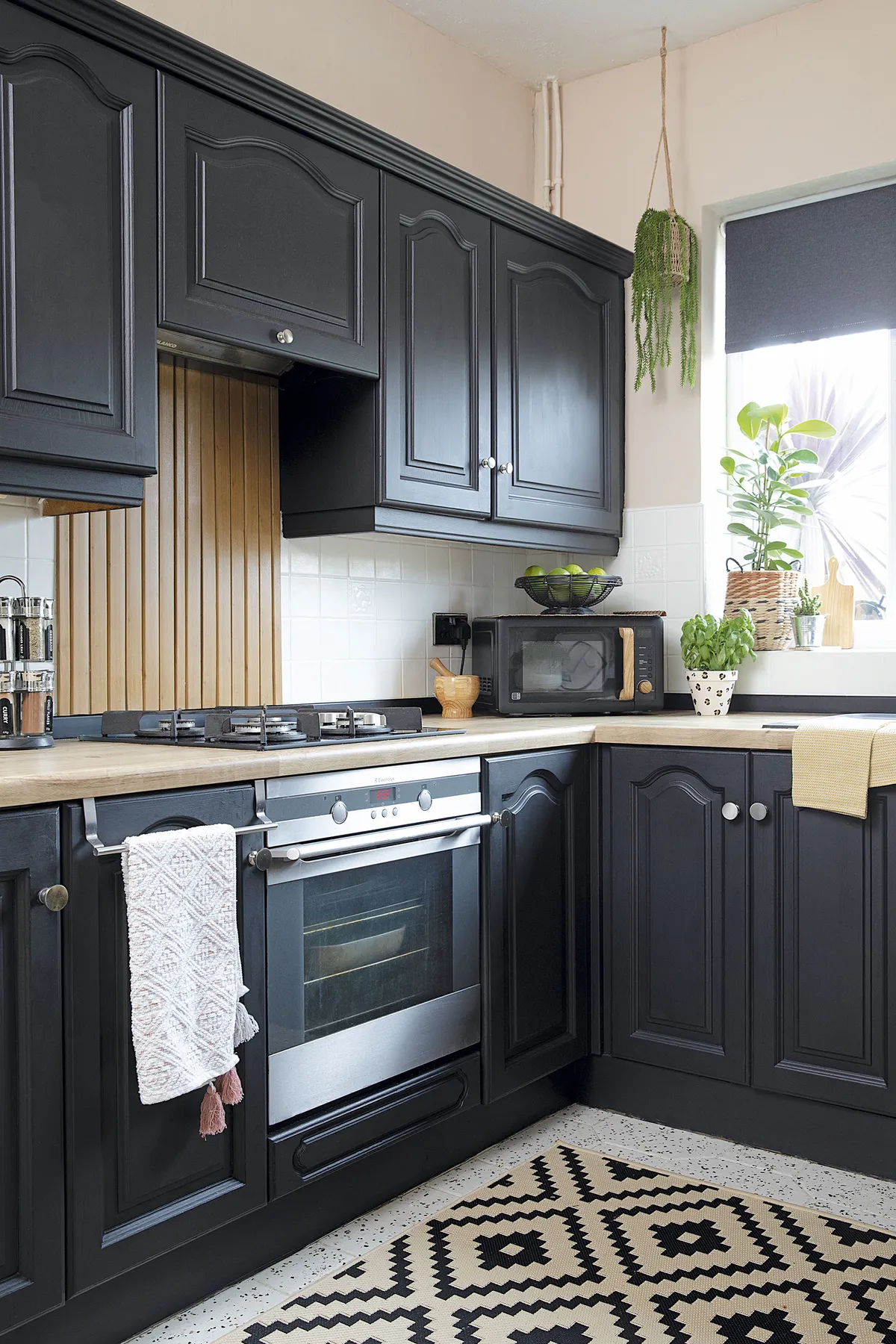
‘My first job was painting the terracotta hexagonal floor. I then added Rust-Oleum floor chips to give a terrazzo effect. I had seen a few painted kitchens on Instagram so opted for black to make it feel more modern. I took the doors off for the first few, but it was such a faff, so I finished the rest in situ. In total the whole makeover only cost about £150.’
Master bedroom
‘Over Christmas, we moved from the front to the back bedroom as it’s a lot quieter away from the road. When we took off the blue and brown floral wallpaper, the lining paper underneath was still good quality, so we painted the walls pink with a yellow stripe around the top.
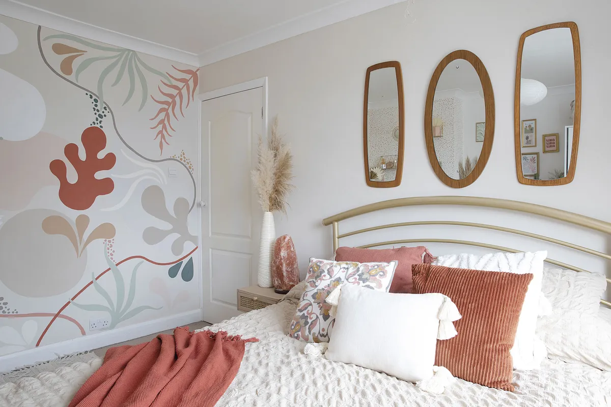
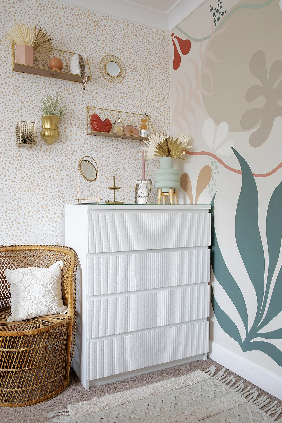
‘It wasn’t long before I fancied a change though as the colour scheme felt a bit childlike. I went more neutral, but that felt a bit too boring! To spice it up, I created a spotty animal print wall opposite the bed, which took two days. I started off using a stencil but then went freehand as it was hard to match up the shapes. Then I went even bolder with a nature-inspired wall mural on the side wall. I practised beforehand on paper to see what colours and shapes worked together and then scaled it up on the wall.’
Spare bedroom
‘We’ve gone for a relaxed boho 70s feel in here with lots of rattan. This is the only room where we needed to change the carpet and it’s made a huge difference as it was red with a floral pattern before.
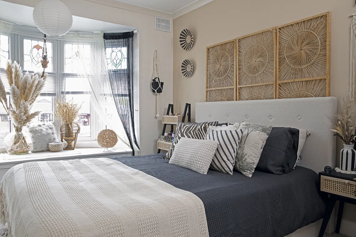
‘Luckily the cream and red wallpaper came off in full sheets when we stripped the room, which saved loads of time. There’s plenty of storage too since we kept the floor-to-ceiling mirrored wardrobes and have ottoman beds in both bedrooms.’
Bathroom
‘We haven’t changed much in the bathroom, but a few small tweaks have made a big difference. For instance, I didn’t like the marble-effect tiles, so I used white tile paint to cover them up. I wasn’t sure if it would look good against the off-cream suite, but it’s actually turned out well.
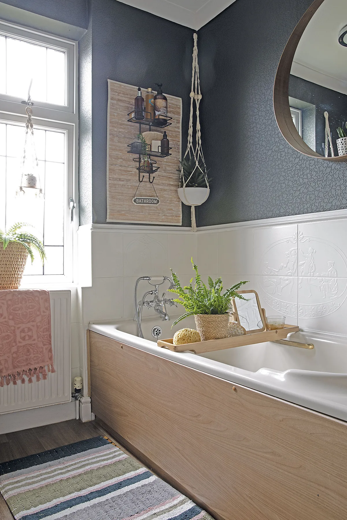
‘Painting the textured wallpaper above in black has given it a more modern look, and it matches with the granite-effect shower panel opposite. Although we’d like to eventually replace the bathroom and install a bigger walk-in shower with a tropical spa feel, it suits us for now.’
Feature Karen Wilson. Photos Katie Lee.
This is a digital version of a feature that originally appeared in Home Style magazine. For more inspirational home ideas, why not subscribe today?
