By making room for double doors out to the garden, a pop-up drinks area and breakfast bar, Stephanie Mitchell has created a sociable kitchen-diner that’s perfect for post-lockdown parties.
Here, she tells us all about her home makeover experience...
My kitchen makeover
When we moved here, the kitchen hadn’t been touched since the 60s, but this meant the original parquet flooring was still down, which was a win. An engineer confirmed the dividing wall wasn’t load-bearing, which meant we could create one open-plan room.
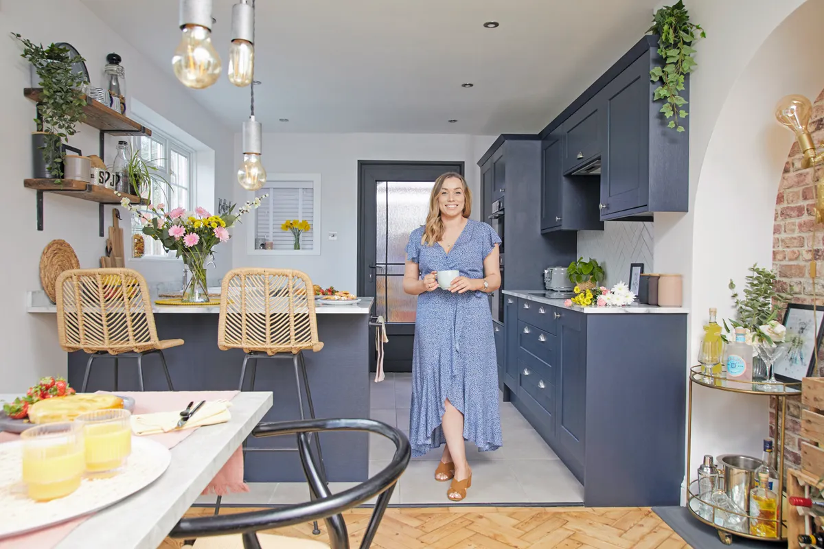
We knew we wanted a navy, Shaker-style kitchen to complement the traditional feel of the house. The UK had just moved into lockdown, so we had to plan via online appointments.
Welcome to my home...
A bit about me I’m Stephanie Mitchell, a product design teacher, and I live with my partner, James Bolter, a clinical researcher. We live in a detached 1920s three-bedroom house in Reading. I keep a record of our renovation journey on my Instagram @walkintheparquet.
My problem kitchen There was only a free-standing cooker, old sink and four cupboards in the kitchen when we first moved in, and the boiler was in there too. A wall separated the space into two small rooms, and the kitchen area was covered in old wallpaper from the 60s.
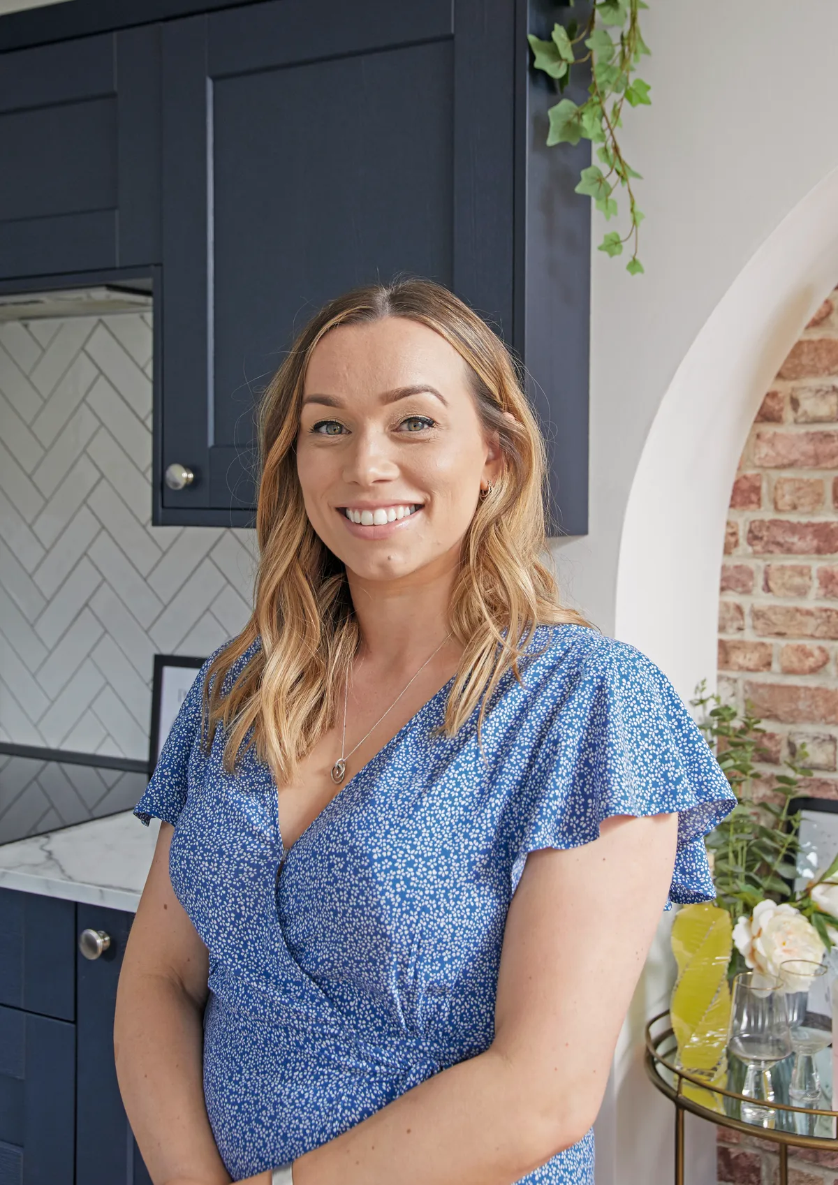
I kept a precise spreadsheet as managing money, product choices and tradespeople was a minefield. We finally chose a Howdens design that included a peninsular island, perfect for entertaining, and narrow wall cabinets, which helped the galley-shaped kitchen feel wider.
The fitting was straightforward as the units come ready-made, though we did drill through a gas pipe when we were levelling the floor, which sent us into panic mode until the plumber came to fix it.
A bit more about my home...
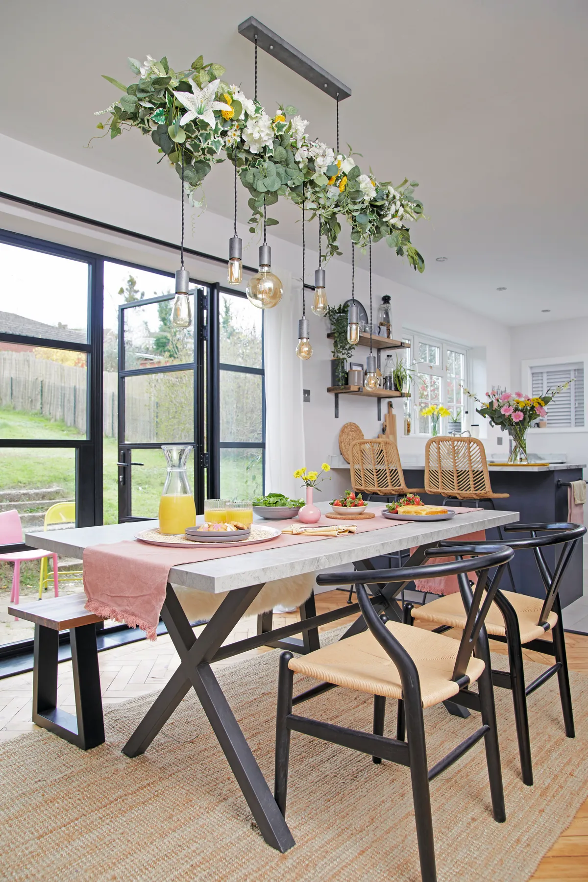
How I made it work I wanted to create a sociable open-plan space, so we knocked down the wall and stripped back the floor to restore the beautiful original parquet blocks. We designed the kitchen to include lots of storage and a peninsular island, and the dining area to house a large table, and then we installed doors out to the garden.
My favourite part The doors that lead out to the garden. When they were fitted the light flooded in, completely transforming the room.

We did the herringbone tiling ourselves, which was a little tricky as it’s all about finding that initial angle and cutting correctly, but once we did the first row it went smoothly, and we like to get stuck in and do jobs ourselves. We spent three days sanding the parquet floor back to its natural colour and used a finishing matt lacquer for a modern feel.
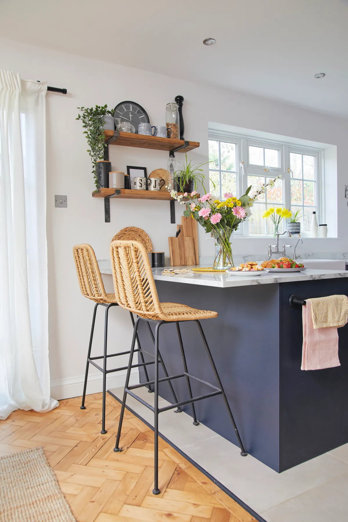
I felt that the space needed a splash of colour, so we went for a blue feature wall in the dining area to tie in with the cupboards. It was a memorable moment when the garden doors were finally fitted and the light flooded through. Looking at the finished space, we wouldn’t change a thing. We just need our friends round now!
Style advice
Add greenery
‘I specifically chose this type of light fitting so that I could have fun styling it. I first decorated it at Christmas and when the baubles came down it felt really empty, so I decided it didn’t need to be used purely as a seasonal display.
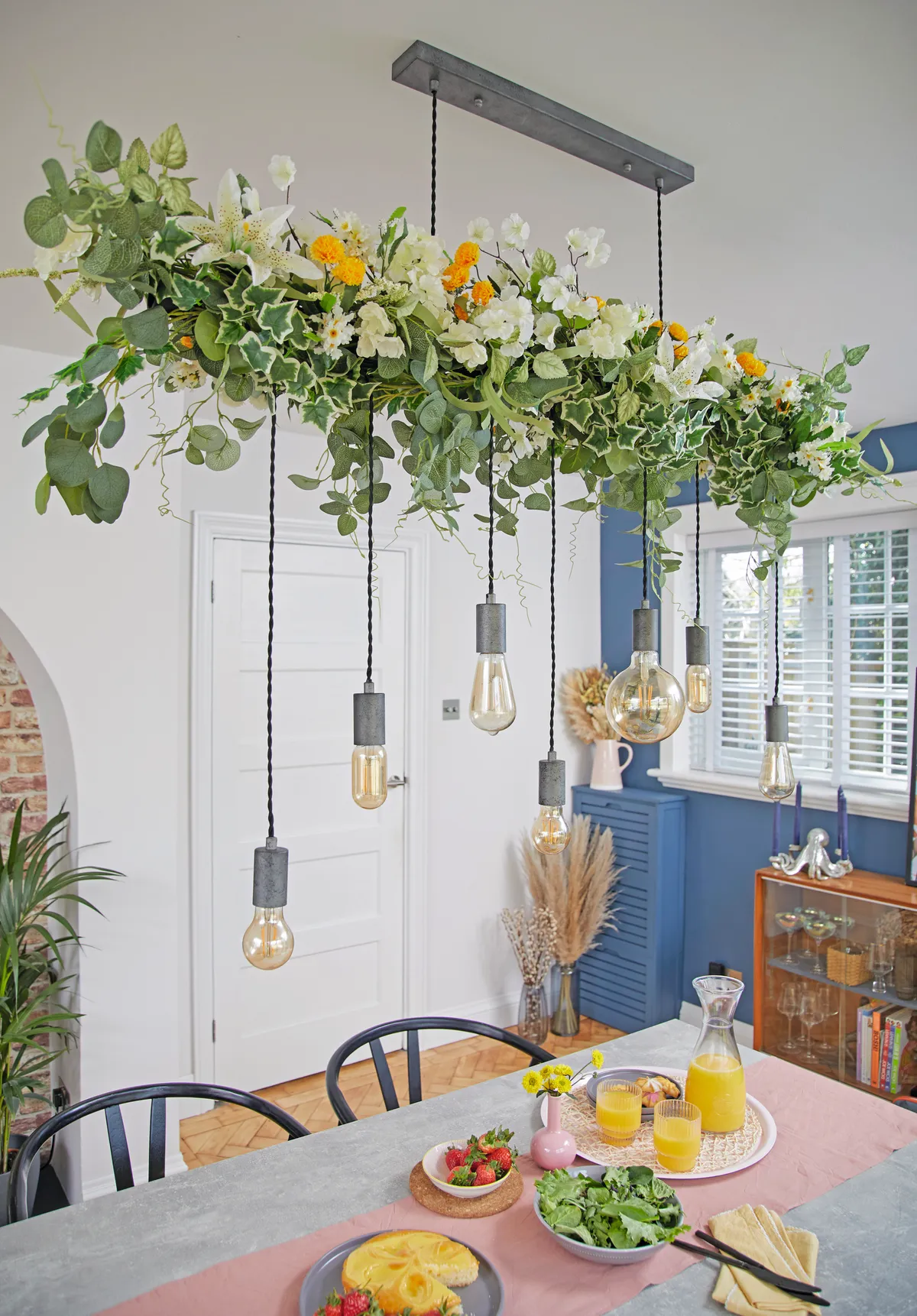
‘I now decorate it with some kind of greenery all year round. A dining table is usually taken up with cups and plates, so I decided to take the decoration higher. It still looks beautiful, but it leaves space on the table and softens the whole room.’
Shop smart
‘We wanted a vintage piece of furniture here to use as a display cabinet, but we needed something narrow that wouldn’t interfere with the walkway. We didn’t want to compromise so we spent a long time searching and finally found this on eBay for only £100.
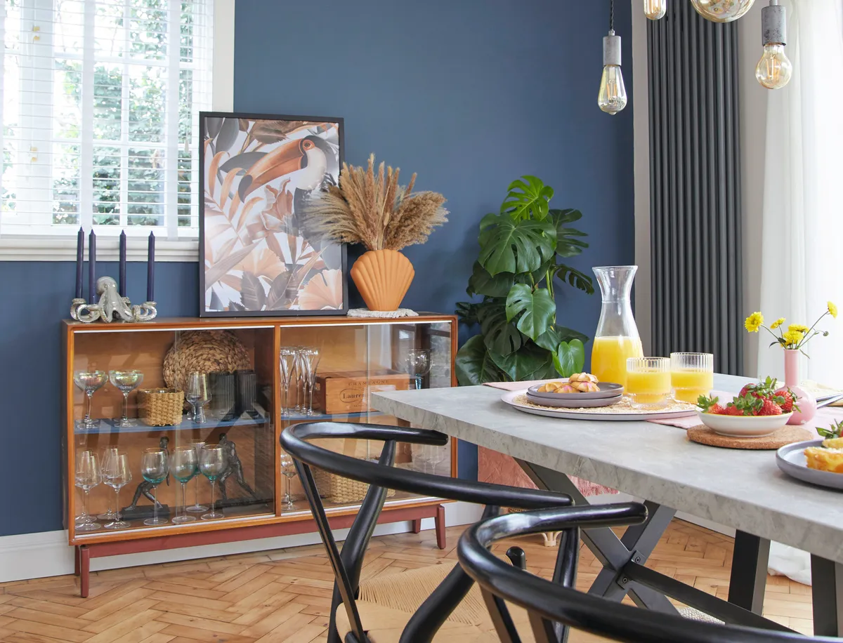
‘I love the glass front, which allows us to show off our glassware and it brightens this side of the room. There’s plenty of space on top to display flowers – a dried bouquet means minimal fuss – and to prop up an eye-catching art print.’
Embrace original features
‘It was important for us to keep some original elements in the house so we decided to make a feature of this unusual arch by turning it into a mini bar, which will be great for when we have friends round.
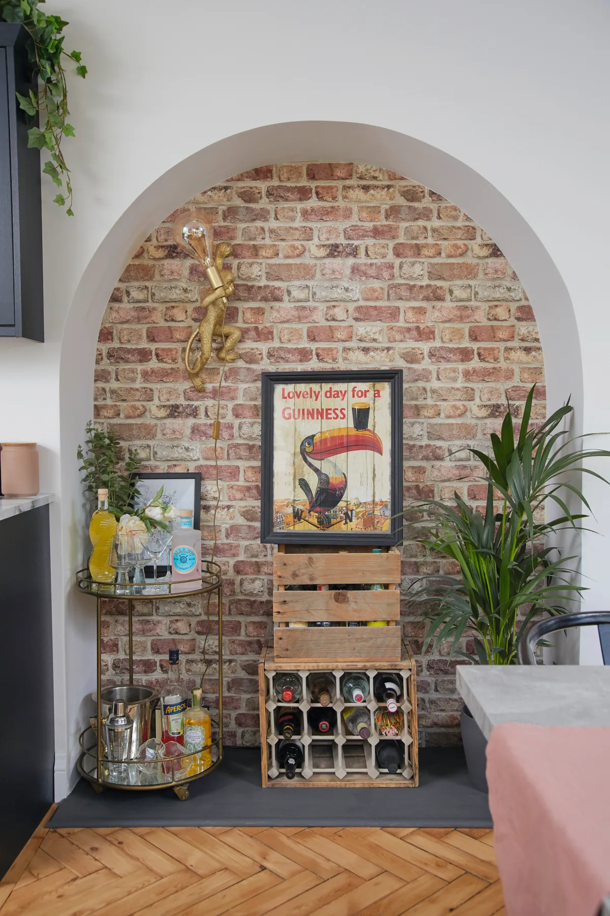
‘We initially chiselled a bit of the wall away hoping there would be real brickwork behind, but it was just breeze blocks, so we chose this fun faux brick wallpaper from I Love Wallpaper. I think it works really well and it complements our other industrial accessories that we have in the space.’
This is a digital version of a feature that originally appeared in Home Style magazine. For more inspirational home ideas, why not subscribe today?
