Siobhan and Joe had outgrown their small Leytonstone flat and were excited when they found the perfect house in the same area. Its mid-century build was the selling point as the couple share a love of 1960s and 70s design, but a major renovation was much needed to bring in some modern living comforts.
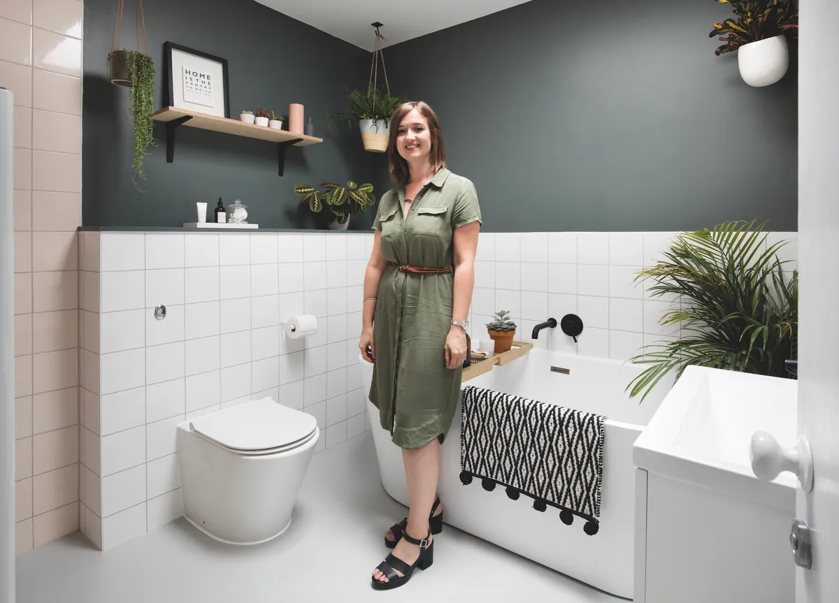
The bathroom was top of their list. As it was dated and dilapidated, the couple were forced to start the project quickly. ‘We moved out within a month of first moving in, staying with friends while the work was done,’ says Siobhan.
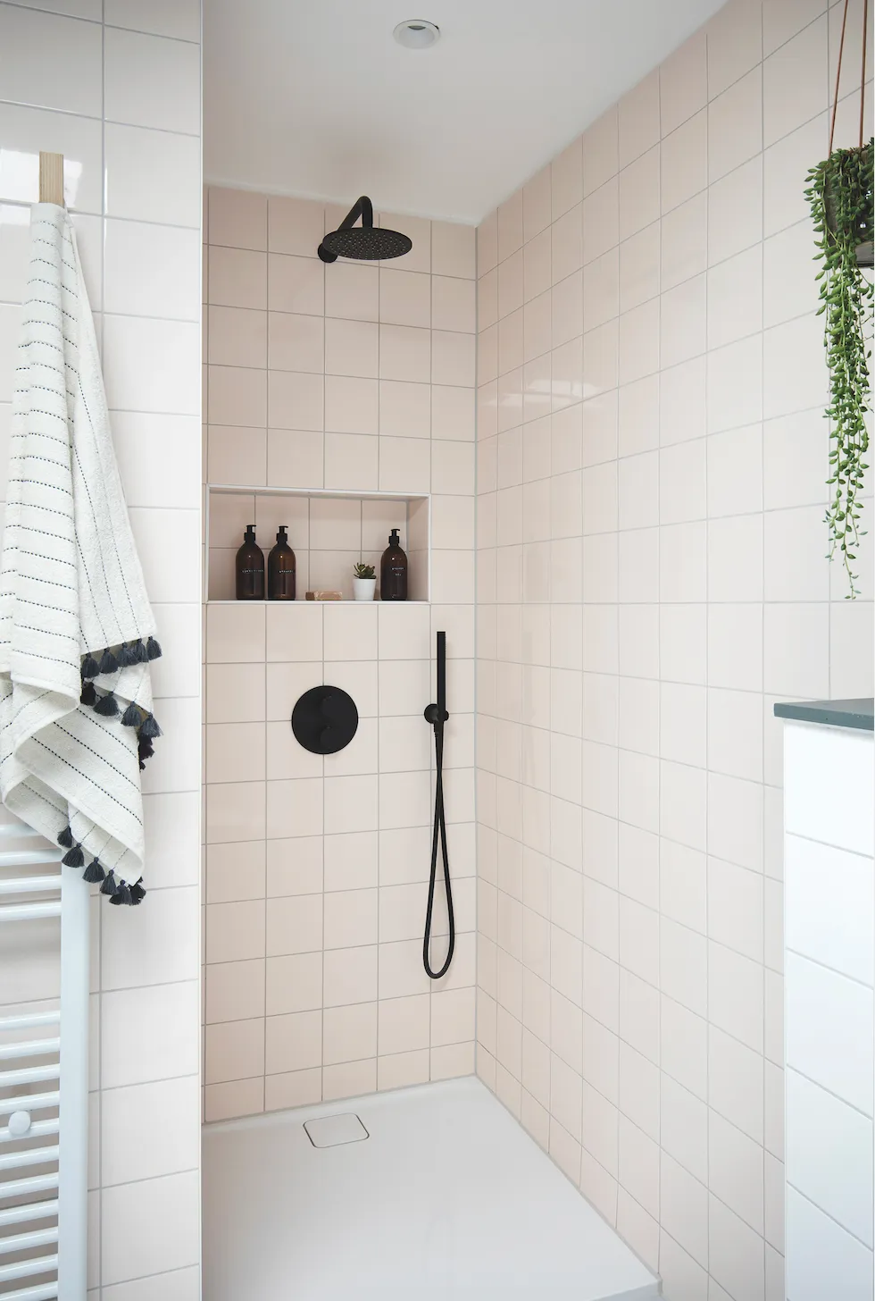
‘The original bathroom was far too small for a three-bedroom family house and we didn’t like the toilet being in a separate room. The bath was tiny, there was no shower and it only had boiling hot water running through the taps,’ she adds.
Before

Both spaces were in a really bad state: ‘The décor hadn’t been touched since the house was built in the 1960s – the walls were covered in a yellow textured wallpaper and no windows made for a very dark space.’
Owner profile
Who lives here? Siobhan Burke, 33, a project manager, lives in a three-bedroom, 1960s ex-council house in Leytonstone, North East London. She lives here with her husband, Joe, 34, an architect, and their cat, Marco. They have lived here since August 2017.
What was wrong with the old bathroom? ‘It was the worst room in the house, with a substandard separate WC and tiny bathroom, and with only a small bath and basin and no shower.’
What do you like most about the new room? ‘I love the separate shower and free-standing bath – it gives a luxurious feel.’
What did you learn during this project? ‘It is important to stick to budget! We overspent on one fitting then reduced the budget elsewhere to stay on track.’

Joe’s architectural skills were used to plan the new layout and necessary structural changes to integrate the bathroom and toilet, plus space from the master bedroom where the old water tank was located.
While the couple undertook most of the demolition work, Joe’s trade contacts came in handy to find a building team for the main project. ‘We had an overall budget for the full house renovation, which was tight for each room.
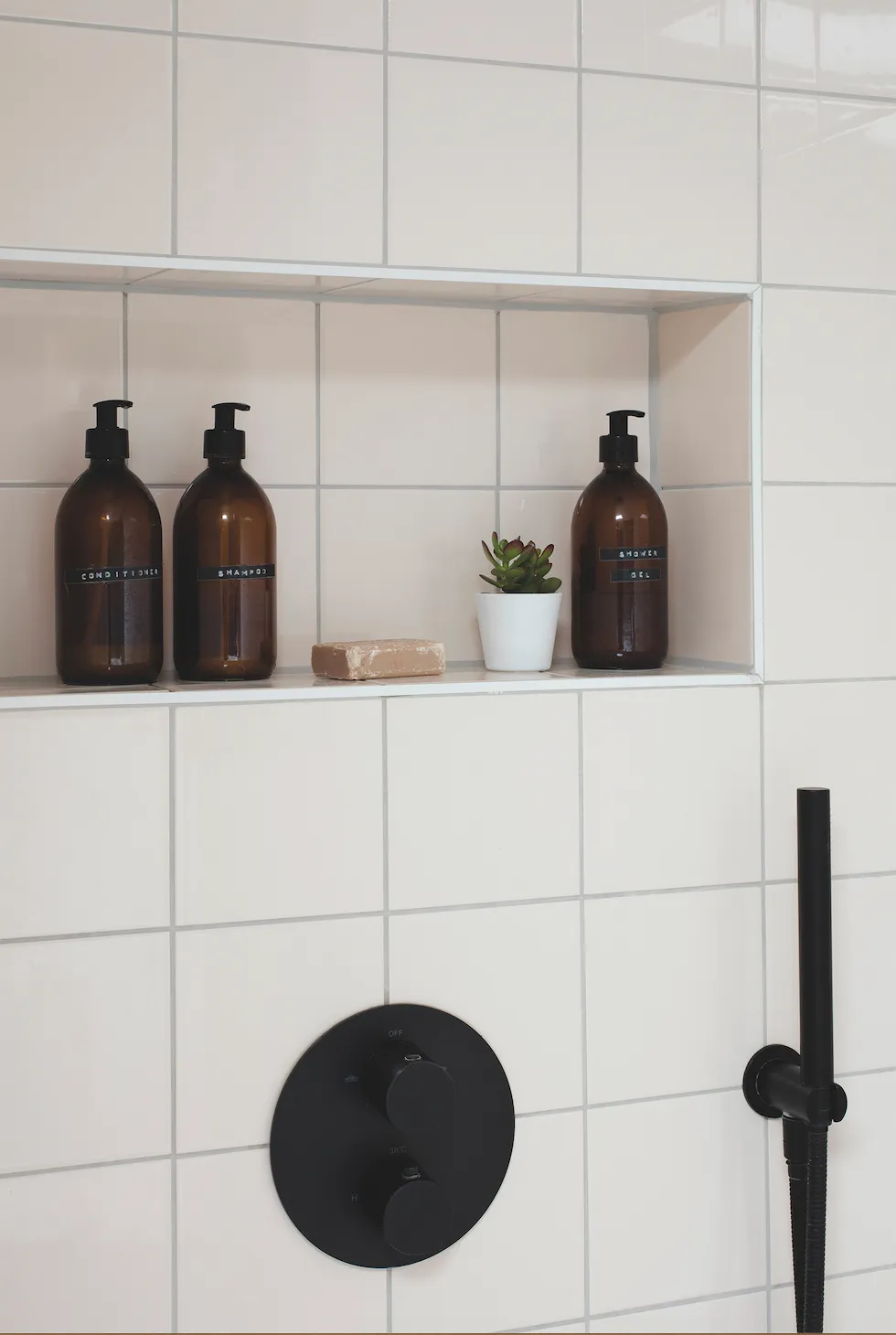
For the bathroom, this had to include everything from structural changes, installation of a roof light, as well as fixtures, fittings and finishing touches. It wasn’t easy, but by shopping around and looking for low-price alternatives, we ended up without any sacrifices.’
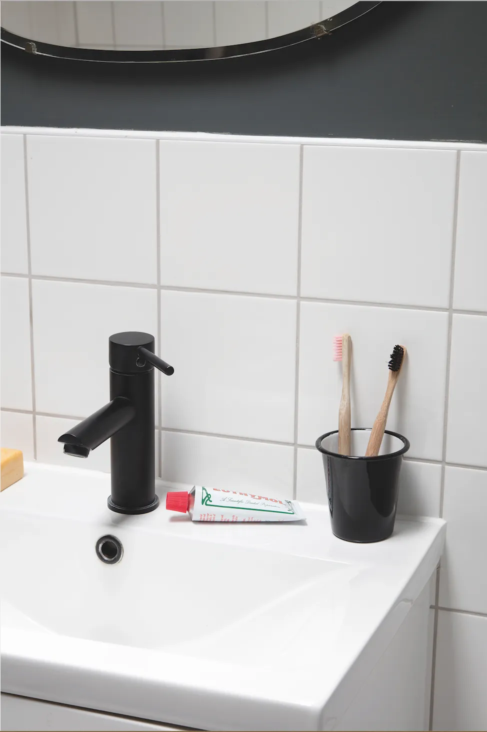
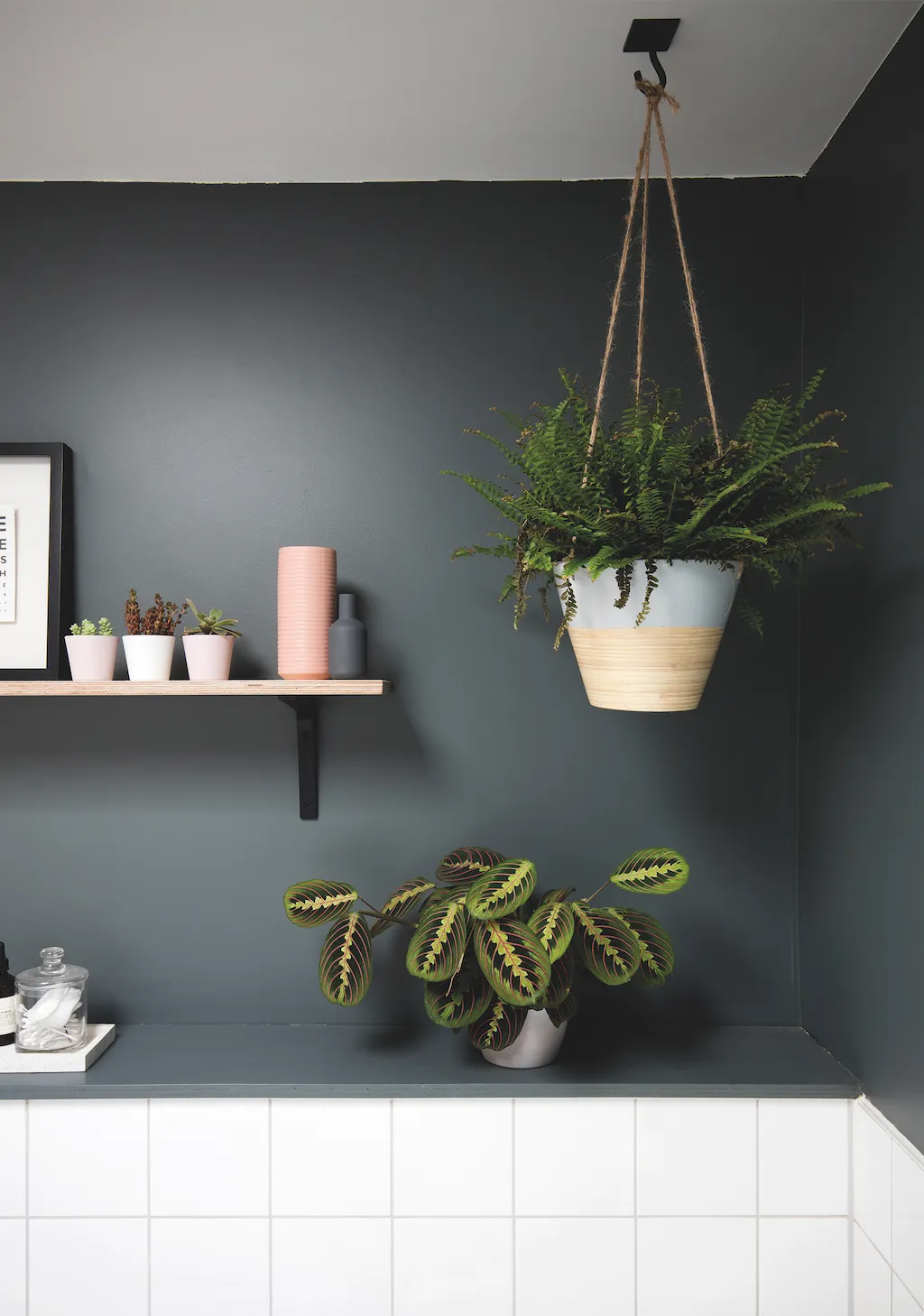
Despite creating a thoroughly modern bathroom, Siobhan was keen to reflect the mid-century vibe of the house: ‘Our décor throughout is quite Scandinavian, with lots of white and grey, but we wanted something a little special for the bathroom. The blush tiles were a nod to my grandparents’ 1960s peach bathroom suite, as well as a cost-effective choice,’ she says.
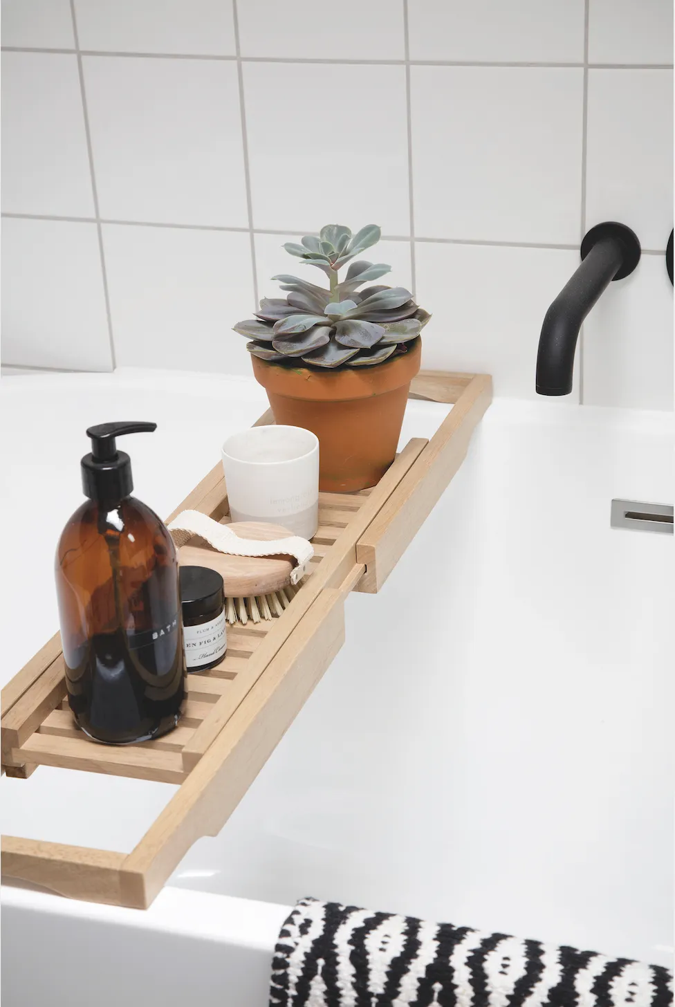
‘We dreamt of having a modern, decent-sized, relaxing room and that’s exactly what we have achieved, without any compromise on function and style.’
This is a digital version of a feature that originally appeared in Your Home magazine. For more inspirational home ideas, why not subscribe today?

