Moving from south-west London to the Surrey border enabled Jane Vincent and her husband Dave to get more for their money and a bigger garden - plus get their older daughter, Anya, 12, into a good secondary school.
But, when they moved into the three-bedroom 1920s semi in Shepperton two and a half years ago, Jane, a graphic designer and artist, and Dave, a homecare manager, knew they had a massive project on their hands.
‘We’d totally renovated our previous house from top to bottom, and we saw lots of potential in this house, but it was muddled downstairs. I was desperate to introduce a second bathroom. With two sporty girls, one just isn’t enough for all of us.’
The couple put together a plan to extend five metres into the garden, scoop out the middle of the house and open everything out to add a new kitchen and diner. Jane also knew exactly how she wanted to transform the downstairs bathroom.
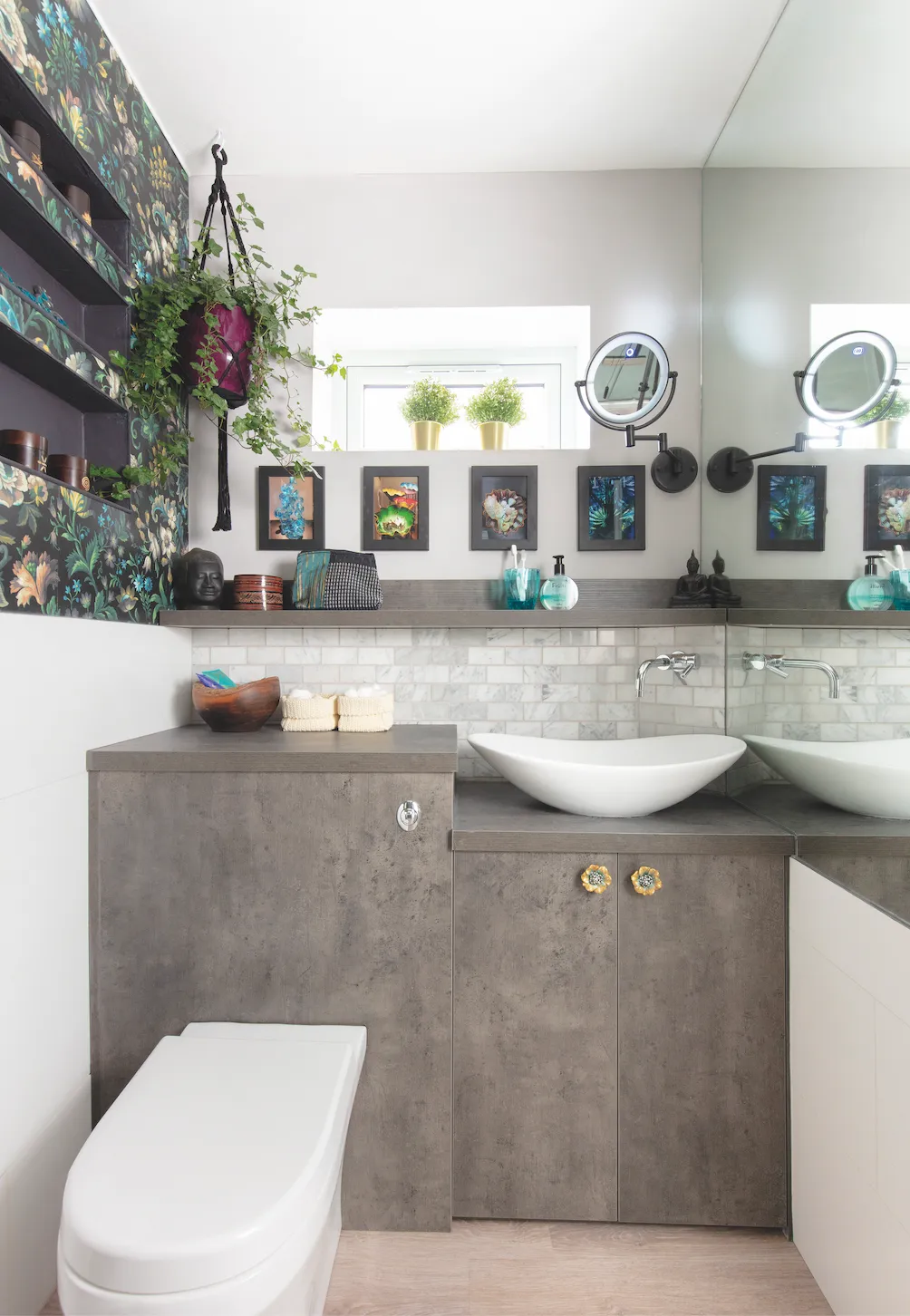
A small, cold toilet with a tiny sink on the side of the house was rarely used when they first moved in. But, as the couple opted to keep the side passage in the new extension, Jane could see a way of extending the toilet and making it into a much-needed shower room.
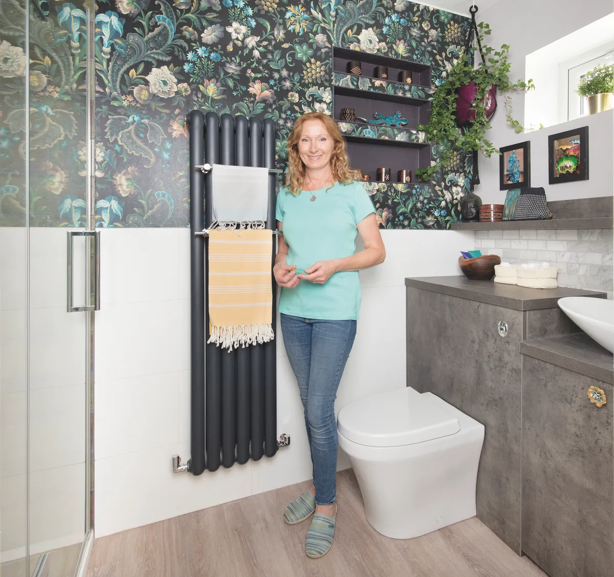
Once the plans were approved and the build completed, a long, narrow space was left for the shower room. ‘I wanted something dramatic and full of character, not just a bland shower with neutral tiles, so I put my design skills to work.’
Having decided that the shower should be as big as possible, the couple went for one the width of the room. ‘It had to be at the end away from the passage, as you couldn’t have a window in the middle of the shower, so that bit was easy.’
When it came to the other end of the room, Jane knew what she wanted: a section that housed the toilet and sink, as well as providing some storage.
Having been impressed with the grey kitchen units they’d chosen from Wren, Jane chose the same ones for the shower room as well. ‘I designed the space and Wren’s in-house designer helped me work out what sizes of units we needed. The shower room is off the kitchen so it ties the two together.’
The couple decided to use the same wood-effect vinyl flooring they’d used in the kitchen. ‘It made sense as it’s waterproof and practical, and it ties in with the grey units as it has a grey wash.’
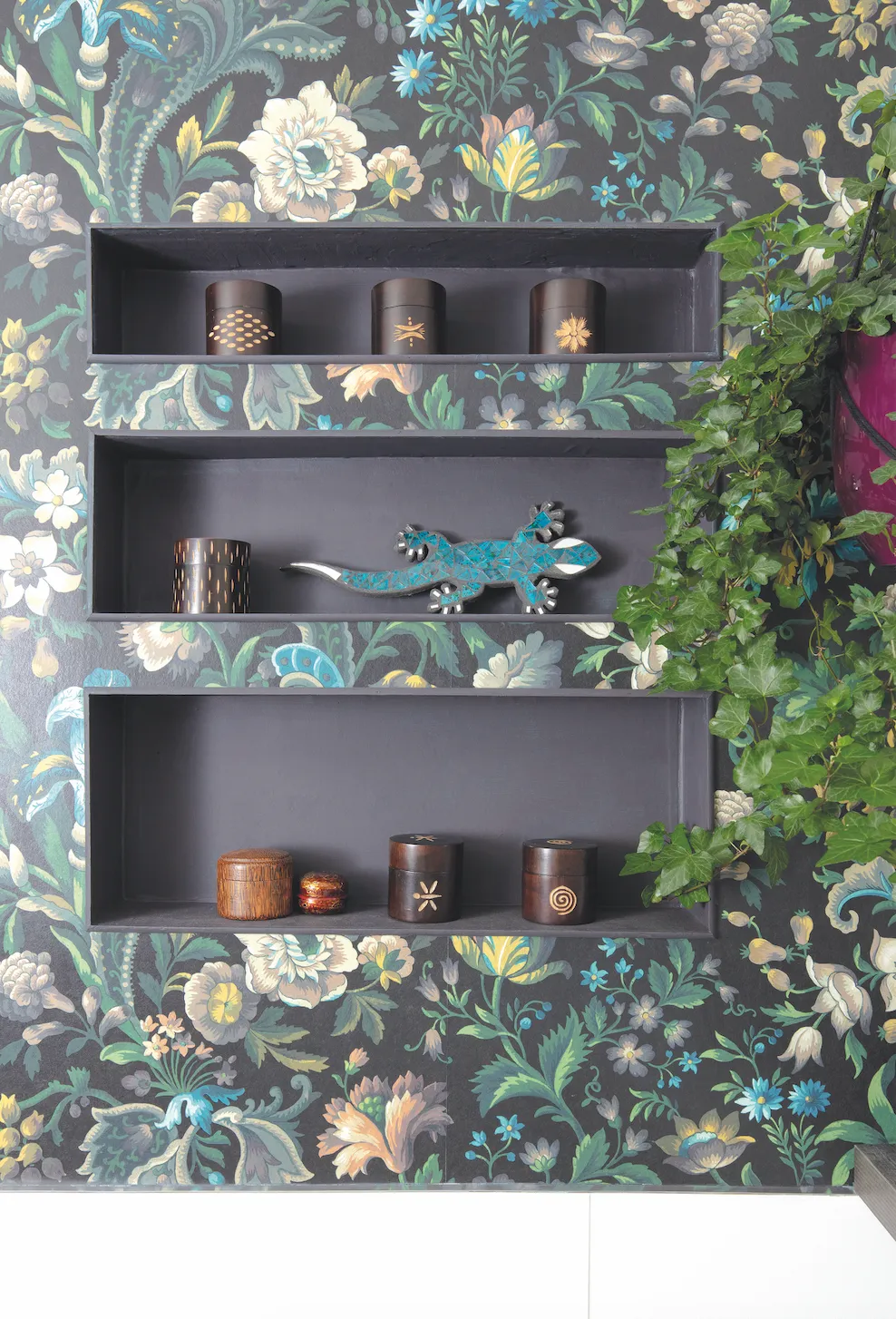
They also tiled in white gloss tiles halfway up the wall and had some shelf inserts put in near the back corner. With the basics in place, it was time for Jane to ramp up the colour and character.
‘I’d been obsessed with the House of Hackney Florika wallpaper for ages and was itching to use it. I love all the flowers and plants, and the dark background. It’s expensive, but you don’t need much.’
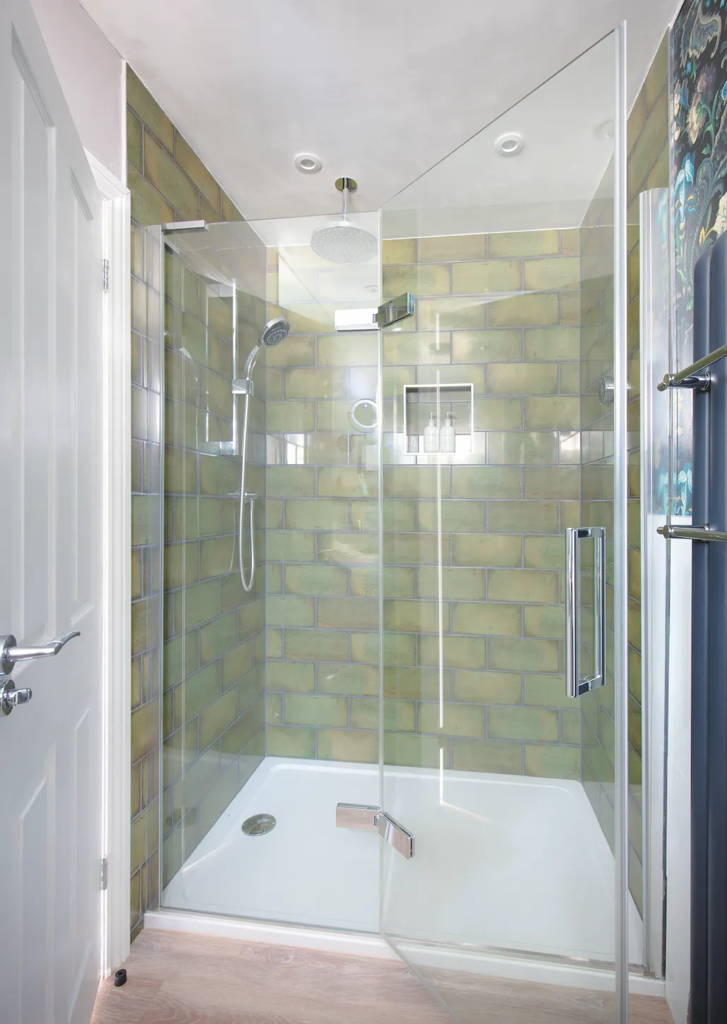
Jane then used some of the colours in the wallpaper as inspiration. The wallpaper’s green hue was used as the basis for the tiles in the shower, while the pale grey was tracked down for the walls above the tiles. The yellows and blues have been matched in the hammam towels and Jane has added accessories in darker tones from her travels in the Far East.
She also framed photos she’d taken of plants at Kew Gardens. ‘It’s such a vibrant wallpaper I didn’t want to add any new shades and tones that might not complement it, so my tip is to pick the colours you want from the paper itself. Now everyone’s desperate to use this room.’
Get the look
This is a digital version of a feature that originally appeared in Your Home magazine. For more inspirational home ideas, why not subscribe today?
