Fed up with a tatty bathroom in the wrong place, Sina Luck rejigged her floorplan before decorating in a subtle, Scandi-inspired style.
Here, she tells us all about her bathroom makeover...
My experience
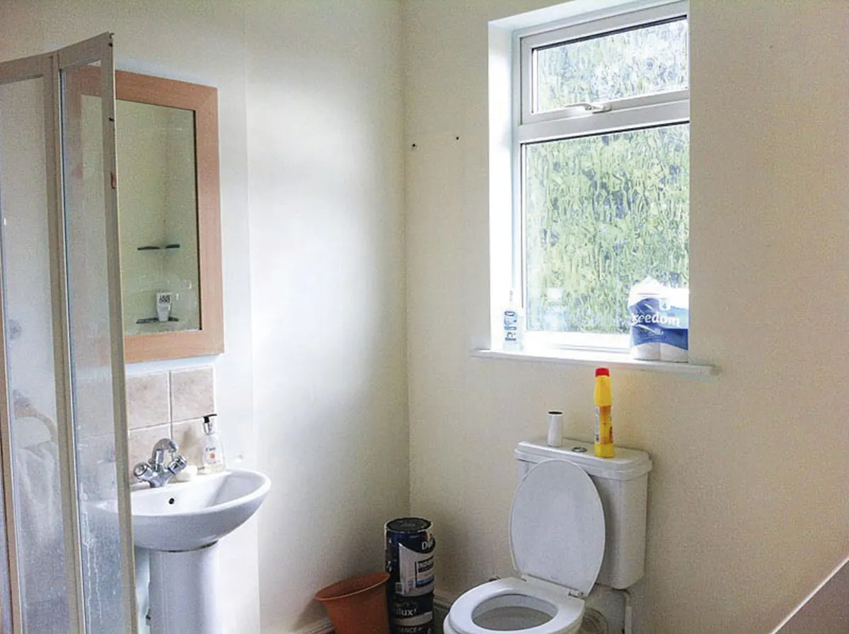
Once we had redefined the space, planning for the new bathroom could begin. As we might move at some point in the future, I didn’t want to overspend.
Leaving the bath and basin in the same places helped minimise plumbing costs, although I did shift the toilet along for a more streamlined layout and to make space for handy built-in storage.
We were both keen on a pared-down, hotel-inspired look, which works perfectly, as I like bright, open-feeling spaces, clean, simple lines and no clutter.
Welcome to my home...
A bit about me I’m Sina Luck, an interior designer at s-i-l-u.com. I live with my husband, Gavin, in a two-bedroom maisonette in south London.
My problem bathroom Our old bathroom was cold, old-fashioned and often messy as there was no storage. Even worse, it was disproportionately big and sandwiched between the kitchen on one side, and the garden door on the other. Walking through the bathroom to get outside just didn’t feel right.
I started looking at brass taps to add impact, but realised I wanted something a bit more unusual.
The matte black taps and fittings were ideal, as they’re chic and modern, and I could get everything to match, which was important for that sleek look.
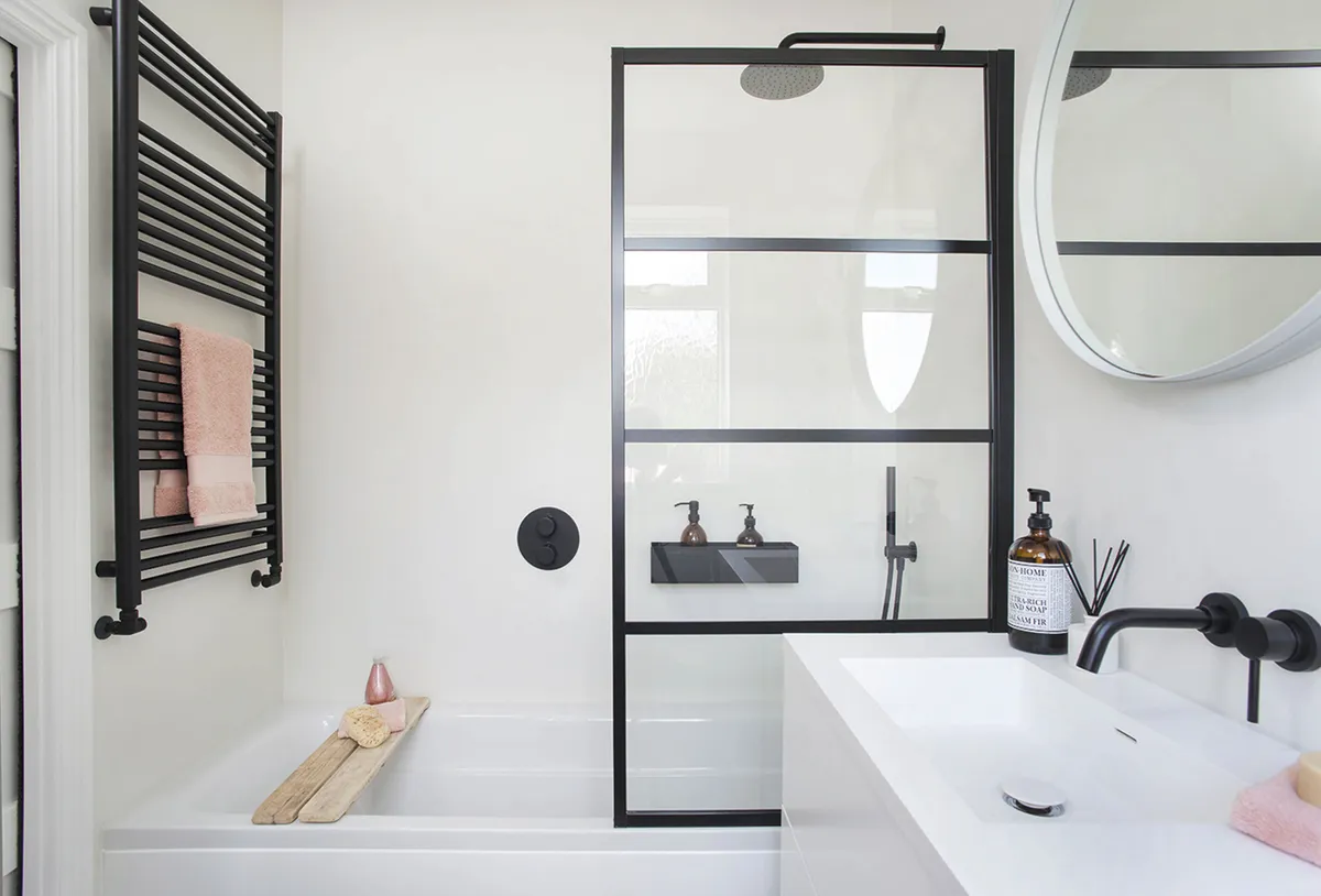
Tracking down the Crittal-style bath screen was a challenge, but I eventually found what I wanted online. The final touch was a simple painted MDF cupboard, built into the available space, to hide all the spare towels and toiletries.
Luckily, we could stay with Gavin’s parents while the work was done.
A bit more about my home...
How I made it work We took a slice off the bathroom with a stud wall and created a passage directly from the kitchen to the garden door, with a new sliding door into the bathroom. We made the space more user-friendly, with white sanitaryware, offset with black brassware and a herringbone tiled floor.
My favourite part I love starting the day in a warm, comfortable, tidy bathroom where everything works properly. Also, it’s great now we don’t have to walk through the bathroom to go outside!

There was a lot of dust and constant cleaning for a couple of weeks after, but we’re absolutely delighted with our lovely new bathroom. It’s so relaxing, neat and easy to use.
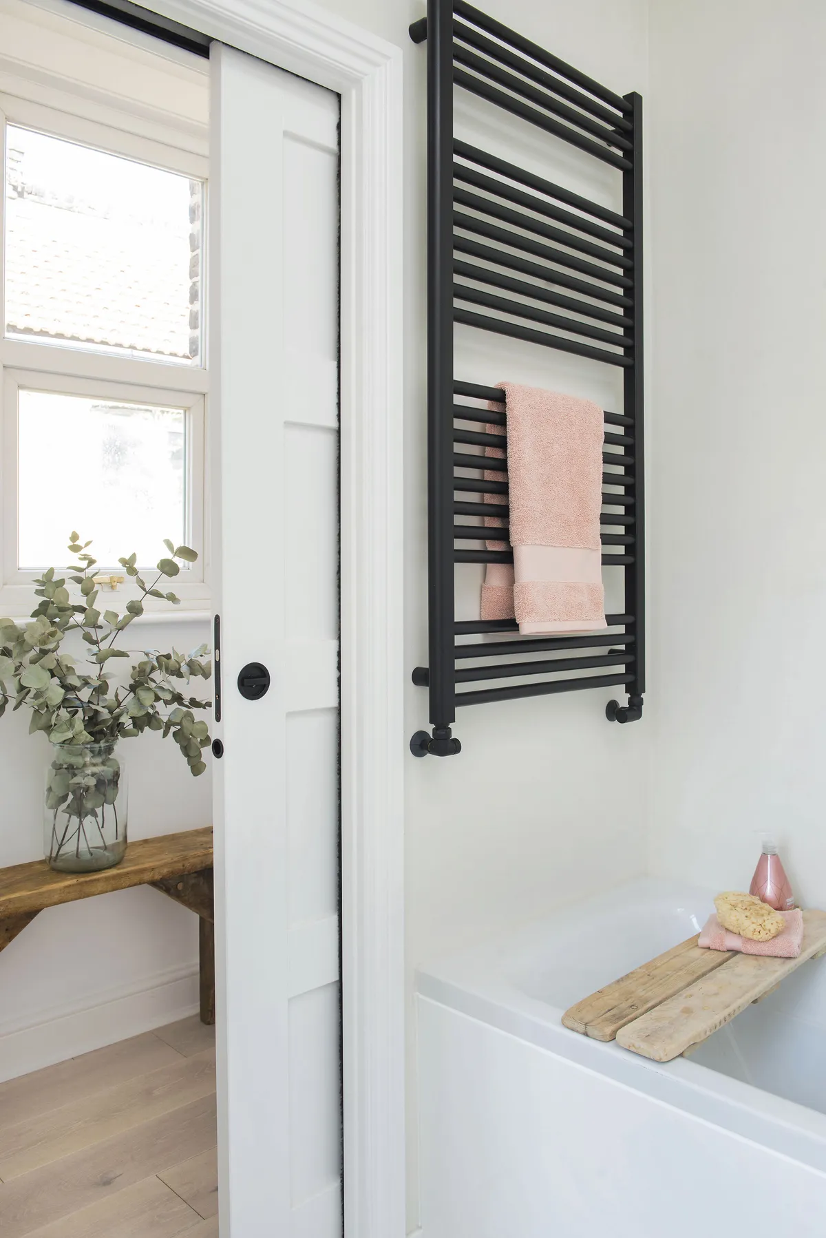
Reducing the room size was no problem and everything flows much better now. People usually want bigger rooms, but in this instance, smaller definitely works better.
Style advice
Consider different wall treatments
‘I felt tiles could look too busy, so I opted for a specialised waterproof micro cement coating, which gives a smooth, seamless finish,’ says Sina.
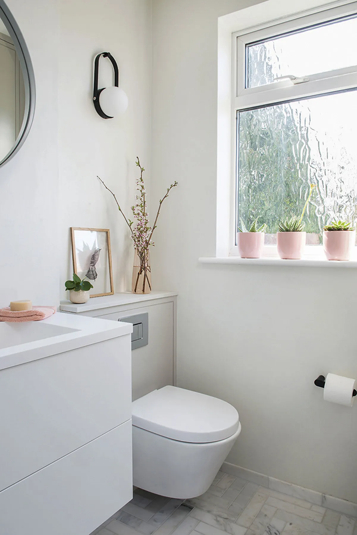
‘It’s applied in layers, so it took about a week to do, but I’m so pleased with it. It lets the herringbone floor tiles – that I had fallen in love with and had to have – stand out. The floor tiles were quite expensive, but they’re really special and it’s such a tiny area that they didn’t blow my budget.’
Plan clever storage
‘Storage was a priority as I would rather not have toiletries and cleaning materials on display,’ says Sina. ‘This was a tricky corner with a slanting ceiling, so a made-to-measure, built-in cupboard meant there was no wasted space.’
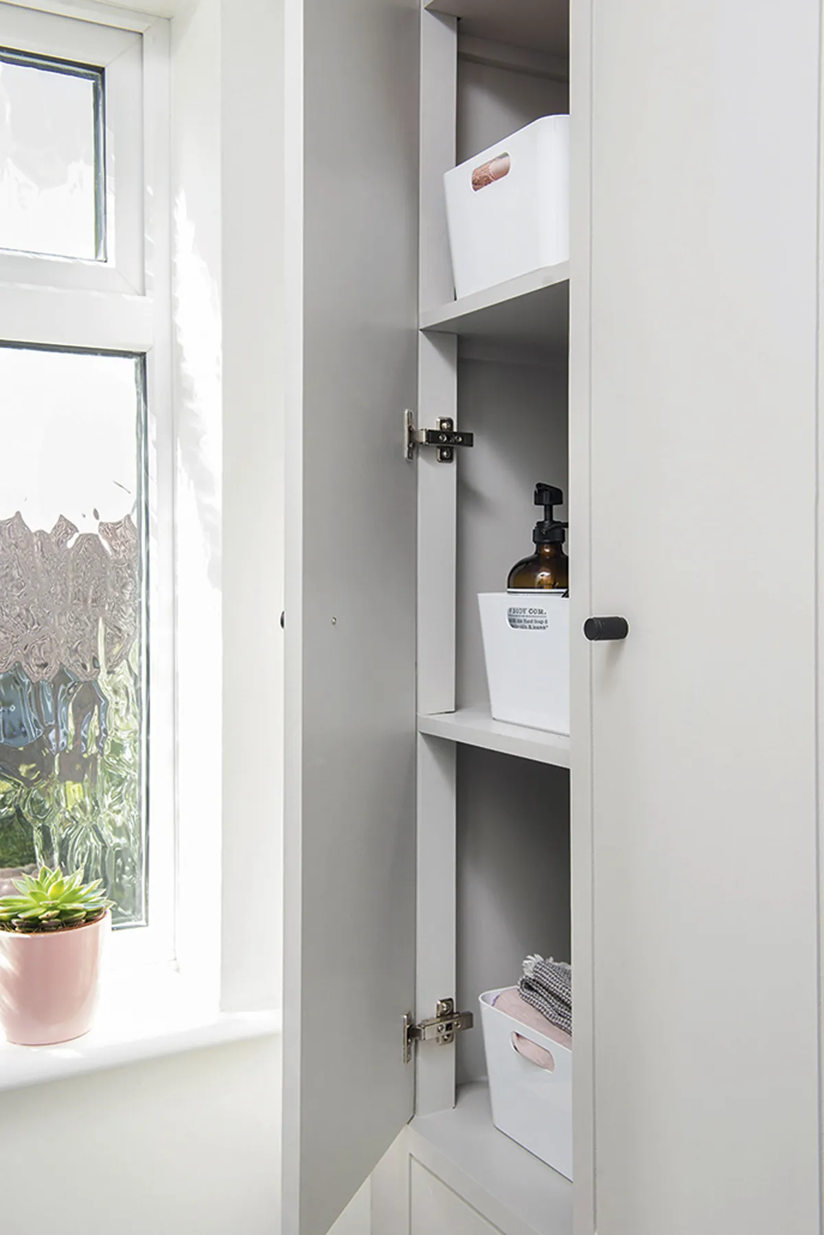
Other storage solutions the couple have used in the space include a minimal, box-style shelf over the bath that keeps essential beauty products tidily within reach, and ensures the bath surround stays clutter-free.
Co-ordinate with other rooms
For a cohesive look throughout your home, match elements in your bathroom with features in other rooms. A subtle, stylish way to tie your home style together is with matching fixings and fittings, like Sina has done.
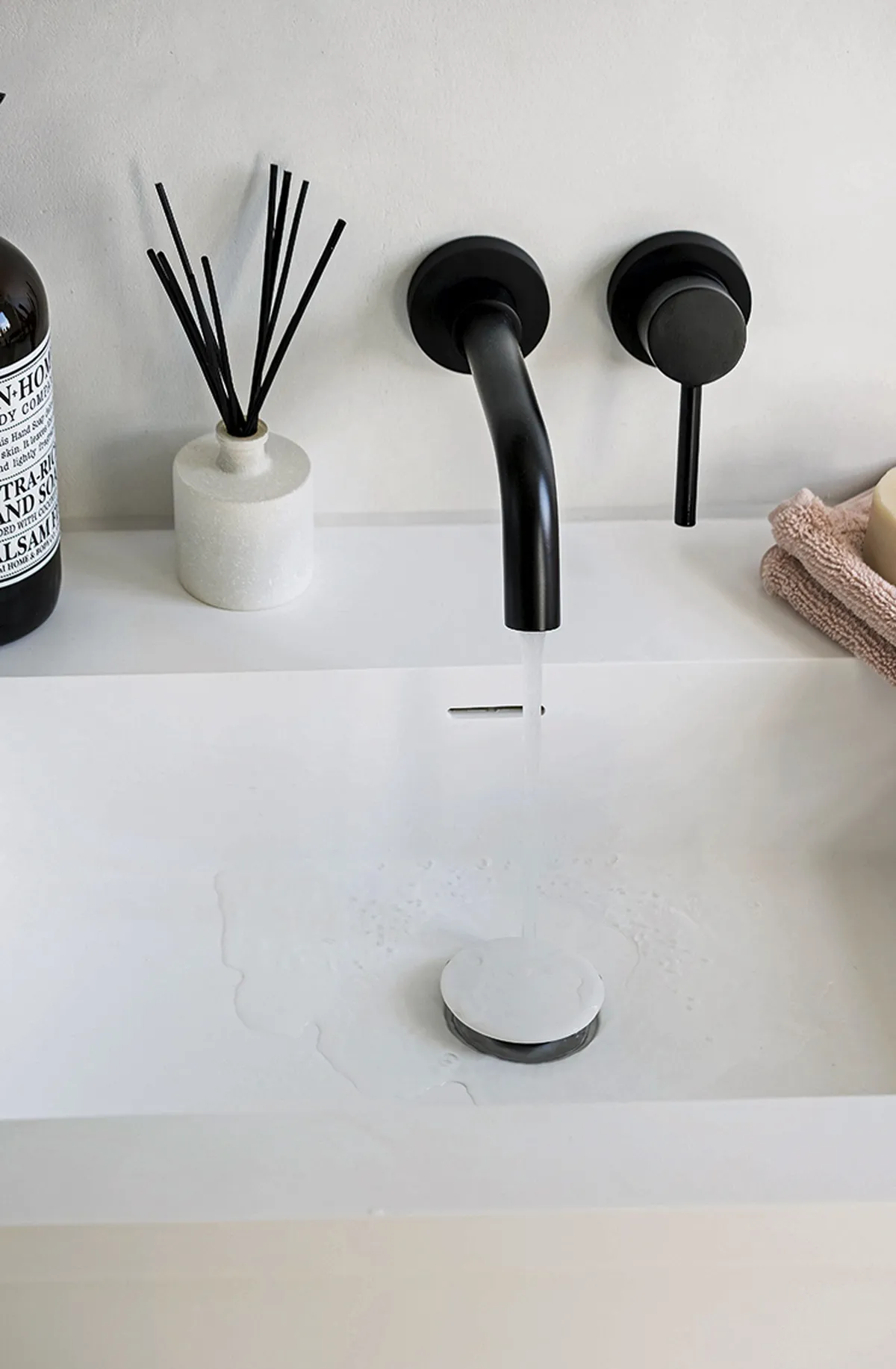
‘I’ve got black kitchen taps, and black light switches everywhere, so it felt right to go for a similar look in the bathroom,’ she says. ‘It adds continuity to our home and when we decide to sell, I think the contemporary feel will have wide appeal.’
Feature Annabelle Grundy. Photos Colin Poole.
This is a digital version of a feature that originally appeared in HomeStyle magazine. For more inspirational home ideas, why not subscribe today?
